When it comes to making rankings, everyone’s ready to weigh in on what’s best and what’s worst. In this series of posts, I’ll be showcasing the world’s best logos. Today, it’s Apple’s turn.
Of course, any ranking starts from a completely subjective point of view—so this list of the world’s best logos is entirely subjective as well.
About this section
To decide whether a logo deserves a spot among the world’s best, I’ve considered the following factors:
- It’s visually appealing
- It reflects the product or service it represents
- It’s widely recognized
Here’s why these matter:
When it comes to logos and design, visual appeal is absolutely essential.
A good logo should also reflect the product or service behind it—this is fundamental.
Recognition shouldn’t necessarily be a deciding factor in what makes a logo one of the world’s best, but I’ve included it because I want to highlight logos that are known around the globe.
What I haven’t considered is brand reputation. This isn’t a ranking of brand prestige, even though it features some of the world’s most famous brands.
All clear? Let’s get started.
The world’s best logos: Apple
Apple. Predictable, right? I put it first to appease the Apple fanboys—there would be an uproar if it didn’t make the list. Now you can relax and enjoy the post without any anxiety.
Now that we’ve got that out of the way, let’s talk about the logo:
Designed by…
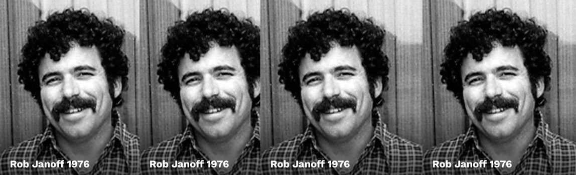
The original logo was designed by Rob Janoff in 1977. The image above shows the current version, which is a redesign of the original, though it remains almost identical.
Logo meaning
The meaning behind the logo is tied to knowledge, referencing the apple of knowledge bitten by Eve—knowledge through computers.
According to the designer, the logo wasn’t explicitly intended as a biblical reference. The bite was simply a way to make sure it was recognized as an apple, not a cherry.
Logo evolution
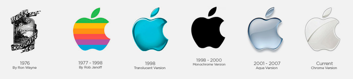
The first version of the Apple logo, with its rainbow-colored apple, is rumored to nod to the hippie culture of the 1970s. However, Janoff has said the real reason for the colorful design was to highlight that the Apple II was the first PC with a color display.
Over the years, the logo has changed very little. The concept and shape have always stayed the same, aside from the very first iteration.
You can see how the logo has adapted to the times. In the 2000s, it embraced gradients, glows, and chrome effects—the kind that filled our screens everywhere.
Today, in the era of flat design, the Apple logo still retains its original 1977 form, but now it’s completely flat—no bevels, no chrome, no gradients.
Visual aspects of the logo
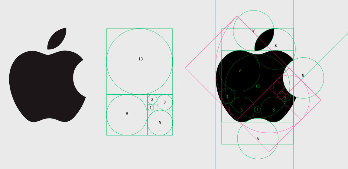
Visually, it’s a balanced logo, with geometry that’s pleasing to the eye. Its minimalism makes it timeless and easy to adapt to new graphic trends.
Even though it isn’t technically symmetrical, it looks symmetrical at first glance. The shapes are fairly predictable—in a good way.
As for whether the golden ratio was actually used in the grid, I’m not sure if that’s fact or just a myth. It’s a topic worth exploring, and I plan to dedicate a future post to investigating it.
To wrap up
I hope you enjoyed this first installment of the world’s best logos. Today, we’ve had the Apple logo at the table with us. The next one is still to come.
If you’d like to learn more about what makes a great logo, check out this post where I talk about designing a standout logo.


