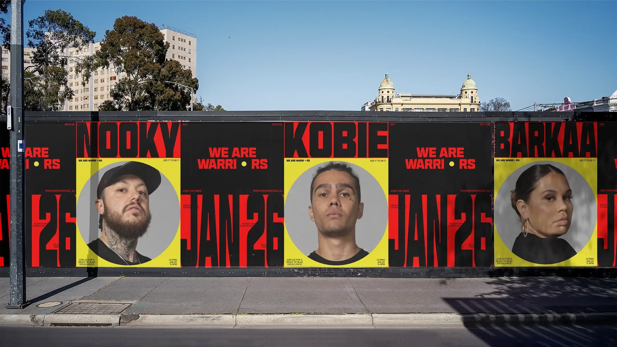
We Are Warriors lands like a poster slapped up in a hurry—yet every detail is intentional. Electric yellow, bold black, tense red, a typeface with bite, and portraits that don’t just decorate—they carry the message. The campaign doesn’t water down its cause to make it more palatable; it gives it substance, voice, and an unmistakable identity.
What stands out isn’t the number of assets, but the precision with which they’re used. Few elements, maximum impact. Short phrases, direct composition, manifesto-like visual rhythm, and art direction that works just as well on a screen, a wall, a feed, or a folded poster in your hand. Here’s the key takeaway: when a campaign has a clear point of view, visual memory kicks in before you’ve even finished reading.
We Are Warriors — typography with a manifesto pulse
The first impression is all about type. Here, the lettering doesn’t just support—it commands. Phrases appear as physical blocks, almost like posters pasted right in your line of sight. No unnecessary flourishes, no timid gestures. The design recognizes that a social campaign needs clarity, but also conviction. And here, conviction is in the weight of every word.
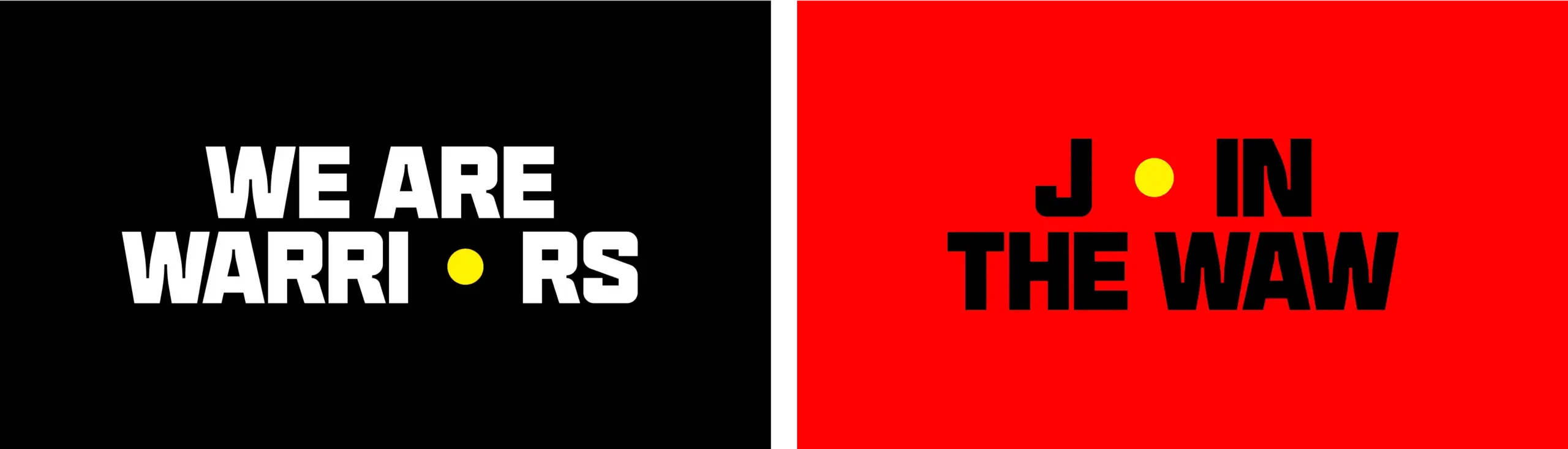
The black and yellow contrast delivers a specific energy: alert, focus, urgency. Red adds heat—a visceral, less institutional layer. This palette isn’t meant to be pleasant; it’s meant to be unmistakable. That distinction is crucial for campaigns with cultural ambition, because perceived value isn’t just about “looking good”—it’s about having a presence that can’t be mistaken for anything else.
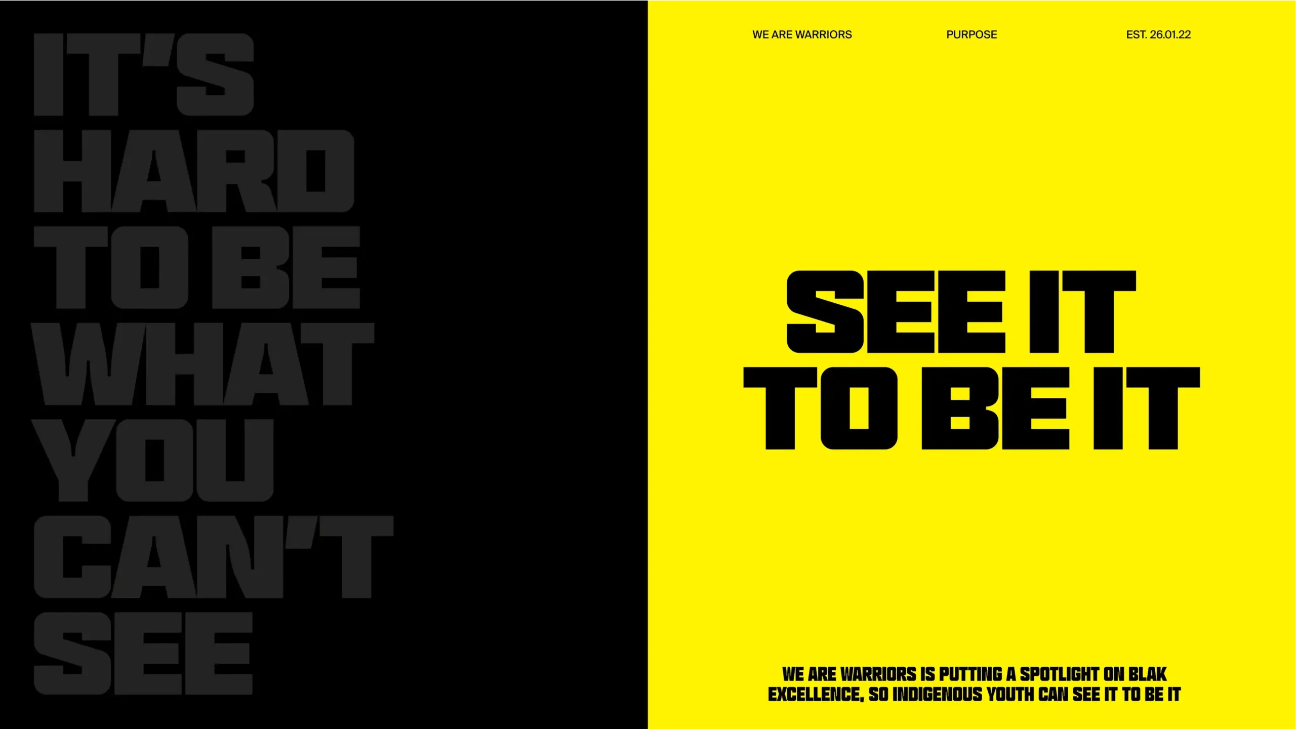
The message is broken into short lines—almost like breaths. This fragmentation creates visual rhythm and boosts quick readability, which is essential when a piece needs to work in scrolling environments. The user doesn’t need to “enter” the campaign patiently; the campaign reaches out with a phrase that lands in seconds.
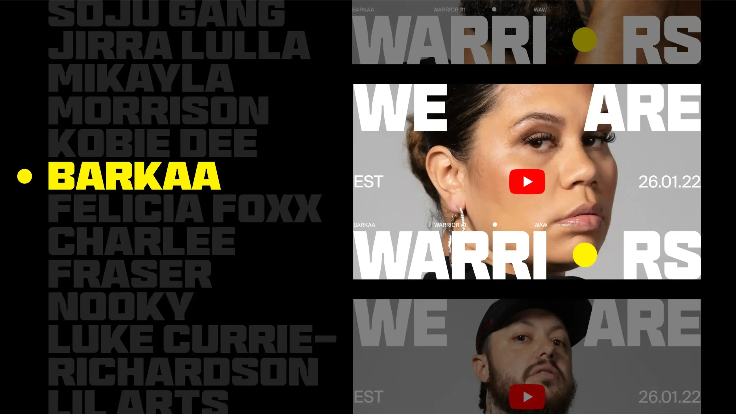
The layout also has a modular feel. Each piece can shift format, crop, or proportion without losing its identity. That flexibility is a masterclass in art direction: a strong brand doesn’t rely on a single hero image, but on a language that holds up across variations. When that happens, design stops being an isolated asset and becomes a communication infrastructure.
There’s also sharp UX/UI thinking in the hierarchy. Despite the campaign’s bold graphic character, the reading flow is clear: first the verbal punch, then the identity, then the context. That sequence reduces friction. On social, a landing page, or in editorial, this clarity ensures the visuals never overshadow the message.
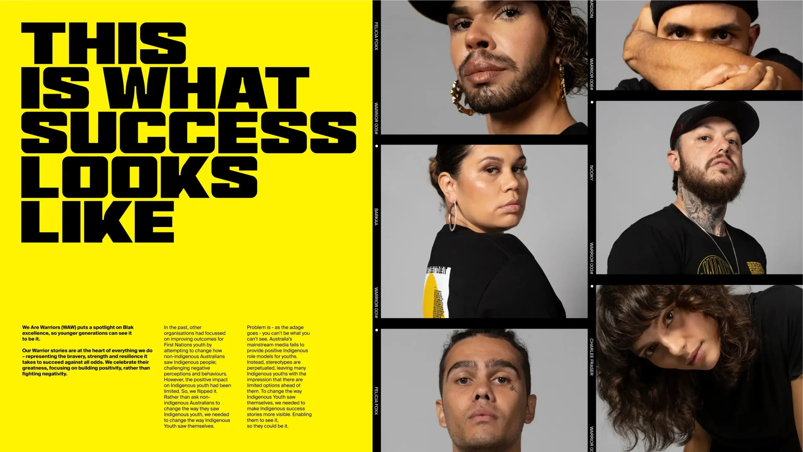
Portraits act as a counterbalance. Typography brings strength; people bring authenticity. That balance keeps the system from becoming purely graphic or overly harsh. The identity has muscle, yes, but also a face, presence, and community. This creates a deeper atmosphere: this isn’t just a style exercise, but a campaign that needs to be seen to spark belonging.
We Are Warriors — from poster to scroll without losing identity
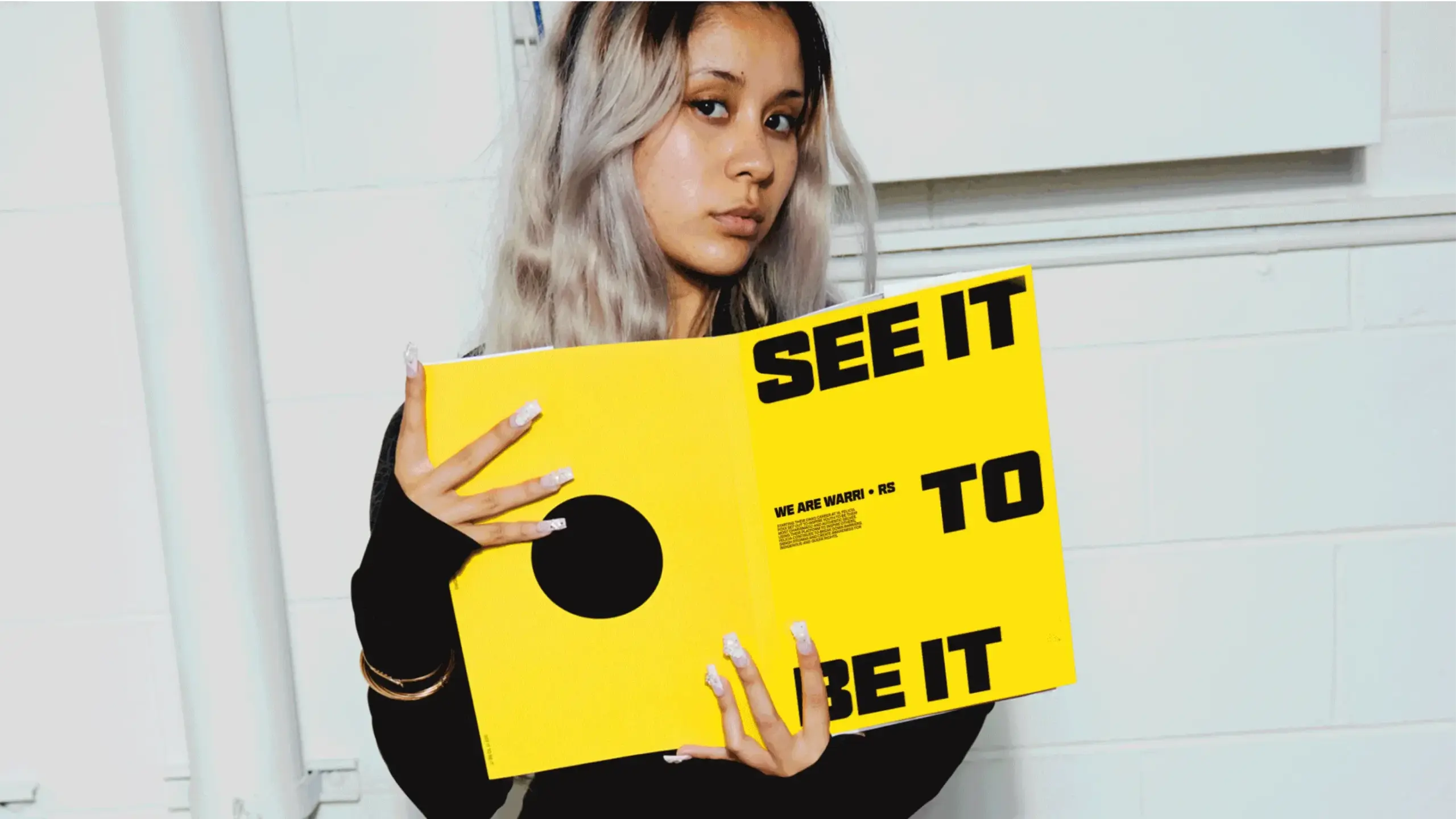
One of the most enjoyable aspects of this campaign is how it shifts between formats. While many pieces exist as static images, everything has a sense of motion: clipped words, blocks that seem to move in and out, portraits treated as sequences, hints of social interfaces. The campaign doesn’t need to explain its digital nature—it shows it through composition.
The social-first format doesn’t feel like an afterthought. On the contrary, it seems like a natural habitat for the brand. Vertical blocks, direct messages, and the presence of portraits work so well because the system understands platform logic without pretending to be generic content. It keeps its own voice, even when adopting familiar short video, profile, story, or feed formats.
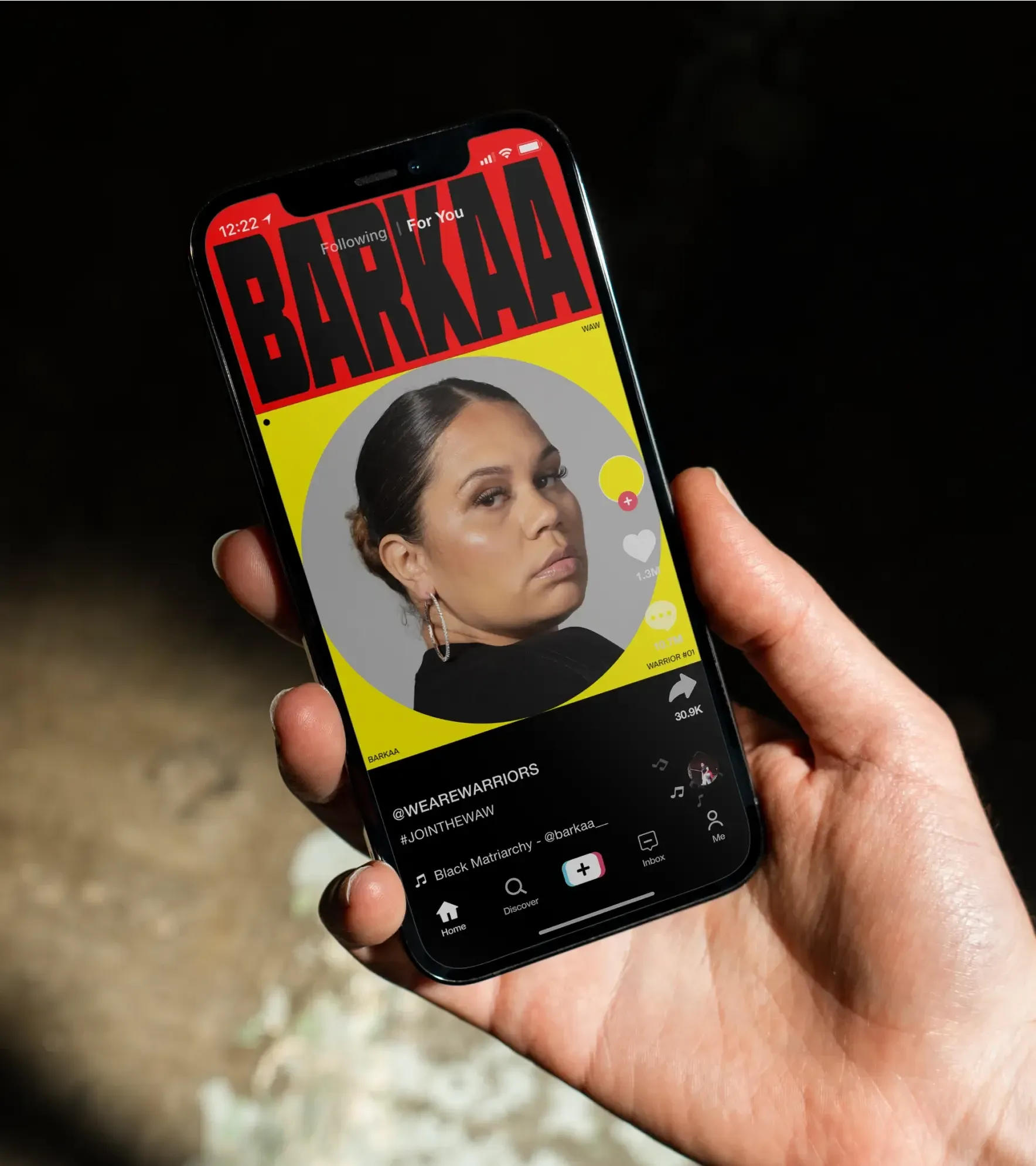
The key is that the identity doesn’t get watered down on mobile. Many campaigns lose their edge when moving from key visuals to social content. Here, the opposite happens: the vertical crop works, the typography gains tension, and the mix of portraits and headlines keeps a strong editorial pulse.
There’s also a great lesson in lightweight interaction. You don’t need to overload a campaign with complex assets to make it feel dynamic. Sometimes, it’s enough to design a piece as if it could move: bold cuts, words partially filling the frame, portraits in mosaic, play icons, tension between image and text. That sense of movement increases visual appetite and keeps users wanting more.
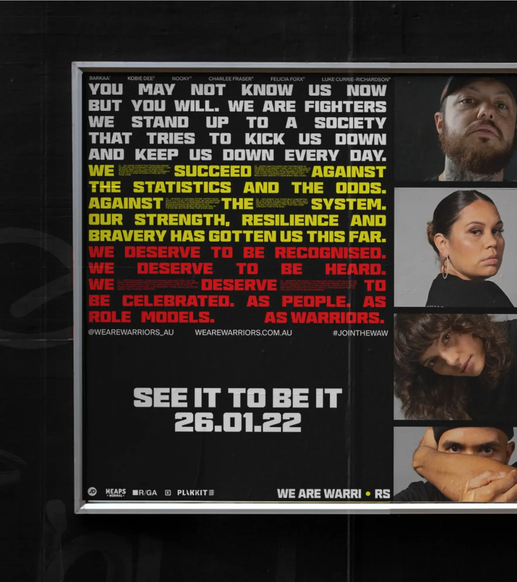
When the system steps out of the digital world and appears in hands, on walls, or in physical spaces, it gains credibility. The identity stops feeling like a mockup and starts to feel lived-in. That builds trust, because a brand activated in real contexts conveys scale, community, and continuity.
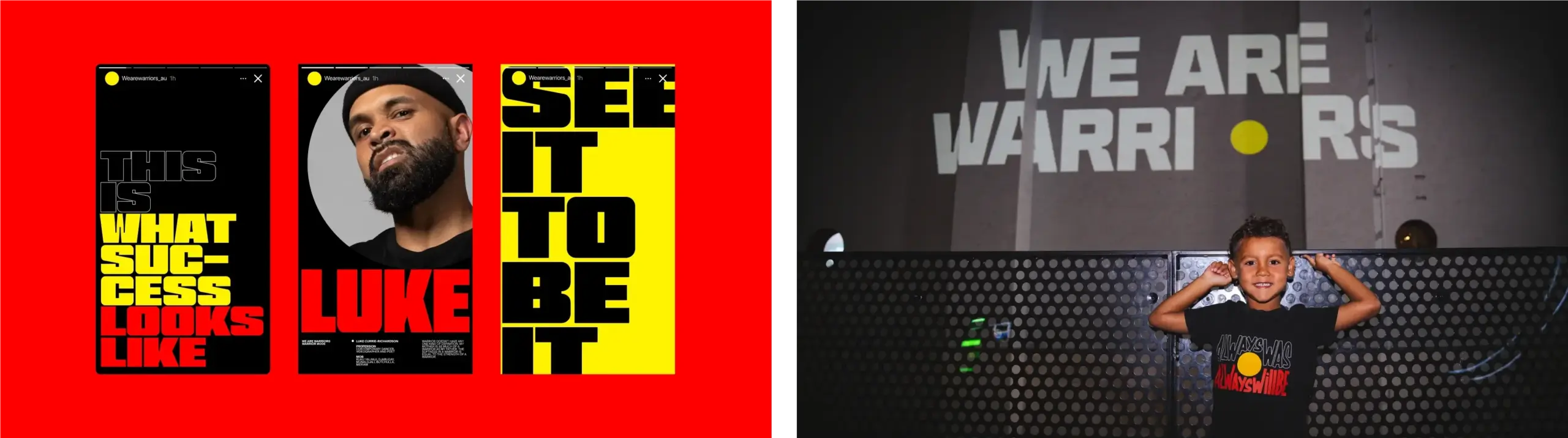
The street completes the idea. In large formats, the system keeps its punch: flat color, portrait, phrase, repetition. The composition works because it doesn’t rely on fine details; it’s built for distance, speed, and recall. That kind of design gives any brand a huge advantage: it’s recognized before it’s even fully read.
Takeaway: less decoration, more visual direction
We Are Warriors stands out because it’s clear about what should dominate the frame. It doesn’t try to show everything at once or dress up the message with unnecessary layers. The campaign sticks to a simple formula: a punchy phrase, a memorable palette, authoritative type, and portraits that ground the cause in real people.
For B2B brands, creative teams, or founders, the inspiration isn’t about copying the black, yellow, or poster look. The lesson is in the decision-making. When an identity knows what it wants to make you feel, the website, campaigns, and social assets stop feeling like disconnected deliverables. They start building perceived value, piece by piece.
It’s also a reminder—often forgotten in digital design—that consistency doesn’t have to be rigid. It can be bold, flexible, streetwise, editorial, social, and human all at once. The key is to maintain a recognizable visual memory while letting each format breathe in its own way.
This reference sticks because it turns representation into a memorable image. And for any ambitious brand, that’s a powerful clue: if your visual system has its own voice, your message doesn’t need permission to take up space.


