Looking for visual references for your next brand project?
Good graphic design is not only about style. It is about clarity, positioning and consistency. At Code Barcelona, we create visual systems for brands that need to communicate better across digital and physical touchpoints.
10 Graphic Design Projects Shaping the Visual Future of 2025–2026
Graphic design is undergoing a profound transformation. Artificial intelligence, environmental awareness, inclusivity, and typographic technology are not only changing the tools we use—they’re redefining the very purpose behind each project. In a world searching for balance between humanity and digital progress, the best work of recent years proves that creativity remains the driving force that gives innovation its meaning.
From cultural identities that blend tradition with modernity to social campaigns that challenge contemporary values, design asserts itself as both critical thinking and a catalyst for change. International awards—such as the A’ Design Awards, iF Design Awards, and Best Design Awards—recognize not just aesthetics, but the impact and coherence of a well-executed idea.
At Code Barcelona, we’ve curated ten outstanding projects awarded in 2025 and 2026—works that stand out for their conceptual clarity, flawless execution, and ability to connect with people. These are proof that contemporary design can be emotional, functional, and strategic all at once.
Here are the 10 most inspiring graphic design projects of the moment—a selection that reflects where global visual communication is headed, and why design remains essential to understanding the world ahead.
Culture to Technology Identity — Hefei High Tech Digital Technology Co., LTD.
https://competition.adesignaward.com/gooddesigner.php?profile=368190
In the heart of Anhui, a Chinese province with a cultural heritage as deep as its drive for innovation, one of 2025’s most significant graphic design projects emerges: “Culture to Technology Identity”. Conceived as a poster for Hefei’s high-tech zone, this piece distills a complex idea—the journey from an ancient culture to a scientific future—into a visual statement that is clear, symbolic, and elegant. It’s a perfect example of graphic design as a bridge between tradition and progress.
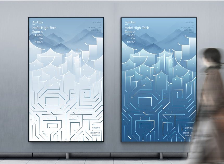
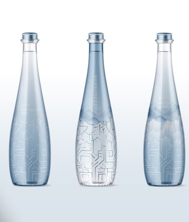
The poster begins with a simple gesture: the Chinese character for “Anhui,” framed by the classic outlines of Huizhou architecture. From there, the composition gradually transforms. Architectural lines dissolve into electronic circuit traces, and the cultural symbol becomes a technological metaphor. This transition, executed with near-artisanal precision, visually narrates the evolution of an entire region—from legacy to future, from heritage to innovation. It’s a design that is not just seen, but read as a story.
The art direction, led by Ji Chao and Xu Ning, reveals a deep understanding of the visual balance between the tangible and the conceptual. The use of gradient blues—a nod to Jiangnan, the historic region where Huizhou culture flourished—creates a serene, almost poetic atmosphere. In contrast, the circuit lines, highlighted with spot UV varnish, add shine and texture, evoking energy and technological precision. The interplay of these layers builds a visual identity where the ancestral and the digital don’t clash—they complement each other.
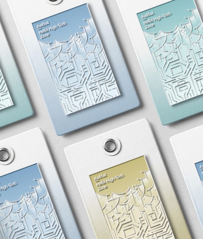
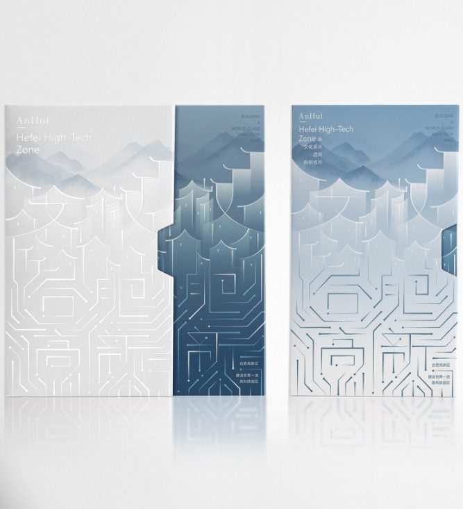
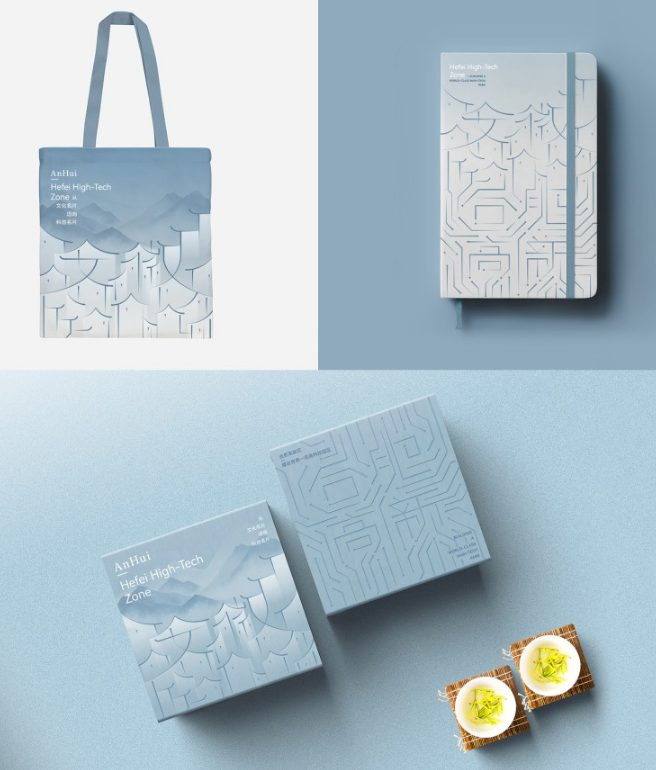
What makes this project truly remarkable is not just its technical mastery, but its conceptual synthesis. In just a few square centimeters, the poster encapsulates a cultural story, a political stance, and an economic aspiration. The design breathes modernity without abandoning its roots. In a country where rapid technological development threatens to dilute the symbolic, this work restores dignity and meaning to public visual identity.
The Hefei High Tech Digital Technology Co. team elegantly solves a complex challenge: fusing traditional architectural profiles with the digital geometry of circuits. Proportion, rhythm, and light are orchestrated with almost architectural discipline. Nothing is superfluous, nothing disrupts. The result is a design that feels inevitable—as if culture and technology were always destined to meet at this precise point.
“Culture to Technology Identity” stands out not only for its aesthetic quality, but for what it represents: a new kind of visual patriotism that celebrates modernization without forgetting history. It’s a reminder that graphic design can serve as a diplomatic language, communicating the essence of a place and its vision for the future. Between tradition and modernity, this project achieves something rare: balance, elegance, and purpose.
No Blanket Value — Social Value Aotearoa x Noa Blanket Co x Motion Sickness
Winner of the Gold Award in Business Communication at the Best Design Awards 2025, “No Blanket Value” redefines how design can embody a social message. Created by Motion Sickness Design Office in collaboration with Noa Blanket Co for Social Value Aotearoa, this campaign challenges how we understand and measure value in impact investment. It’s a powerful example of design as a tool for cultural repair and contemporary dialogue.
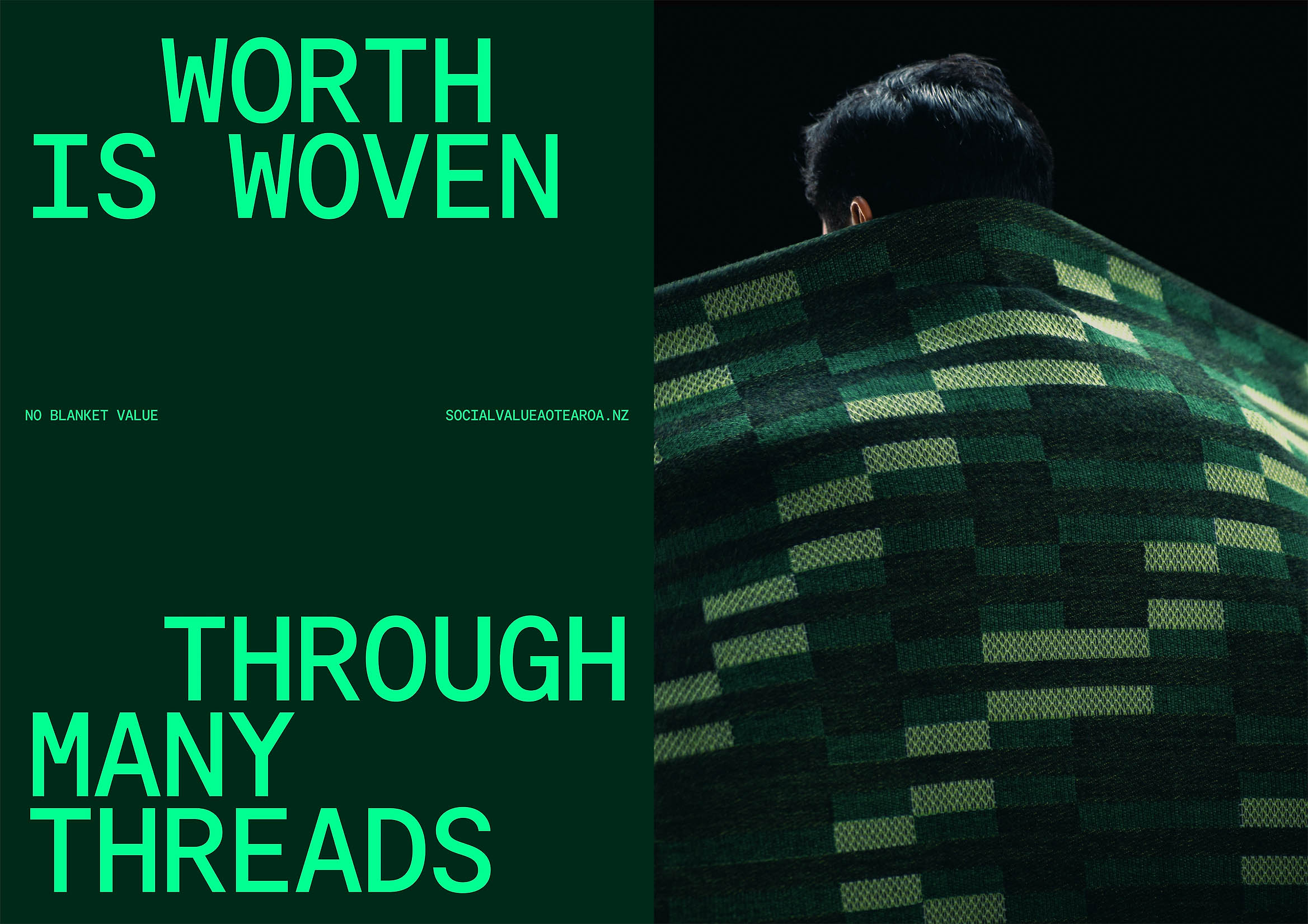
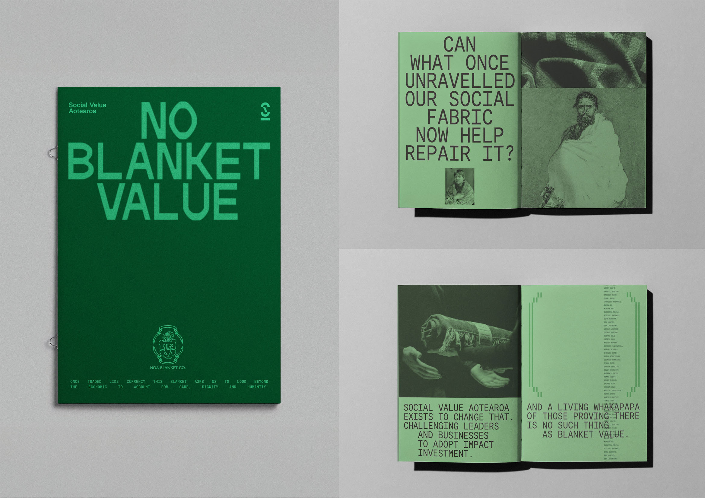
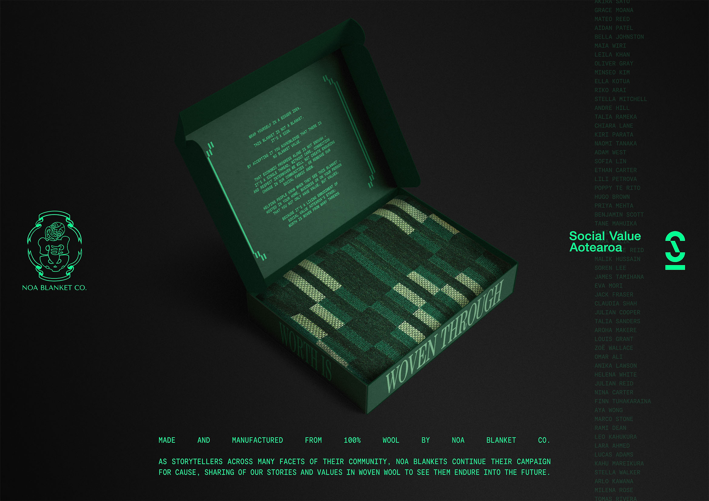
Instead of releasing a traditional report or media campaign, the team—led by creative directors Jordan Stent and Sam Stuchbury, with Katene Durie-Doherty as cultural lead (Pou Taketake) and Patrick Hickley as design director—turned a critique into a tangible object: a woven blanket. In Aotearoa’s (New Zealand’s) colonial history, blankets symbolized unequal exchange, used by colonizers to acquire land, resources, or taonga (cultural treasures). Here, the blanket is redefined: it’s no longer a bargaining chip, but a gesture of reciprocity. It isn’t given—it’s accepted. It doesn’t signify loss, but alliance.
The work of Noa Blanket Co, rooted in care, community, and cultural integrity, ensures the object is not just a visual metaphor but a living symbol. Every woven fiber embodies the idea that value is measured not by capital, but by commitment and relationship. The blanket itself is an ethical statement. It’s not a communication medium—it is the communication.
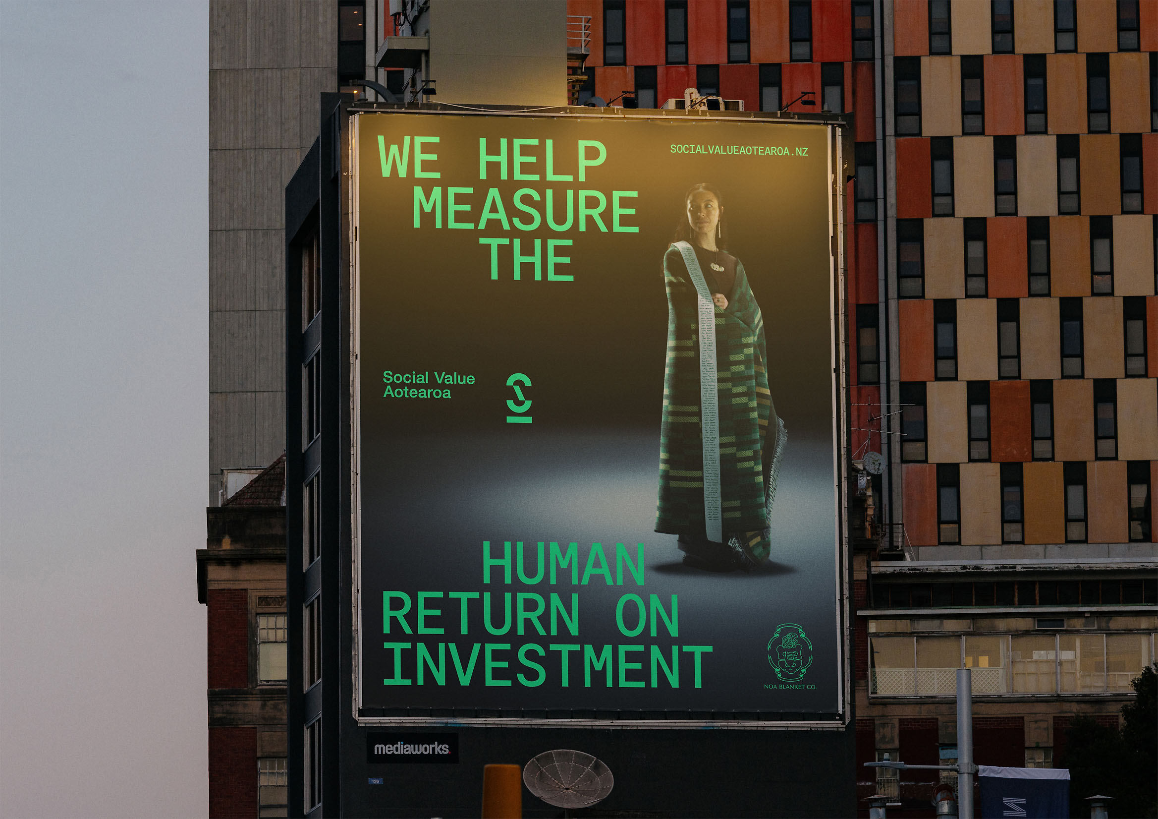
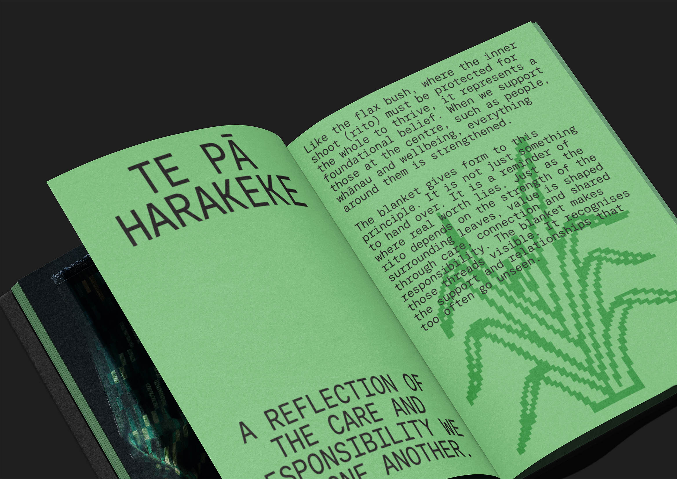
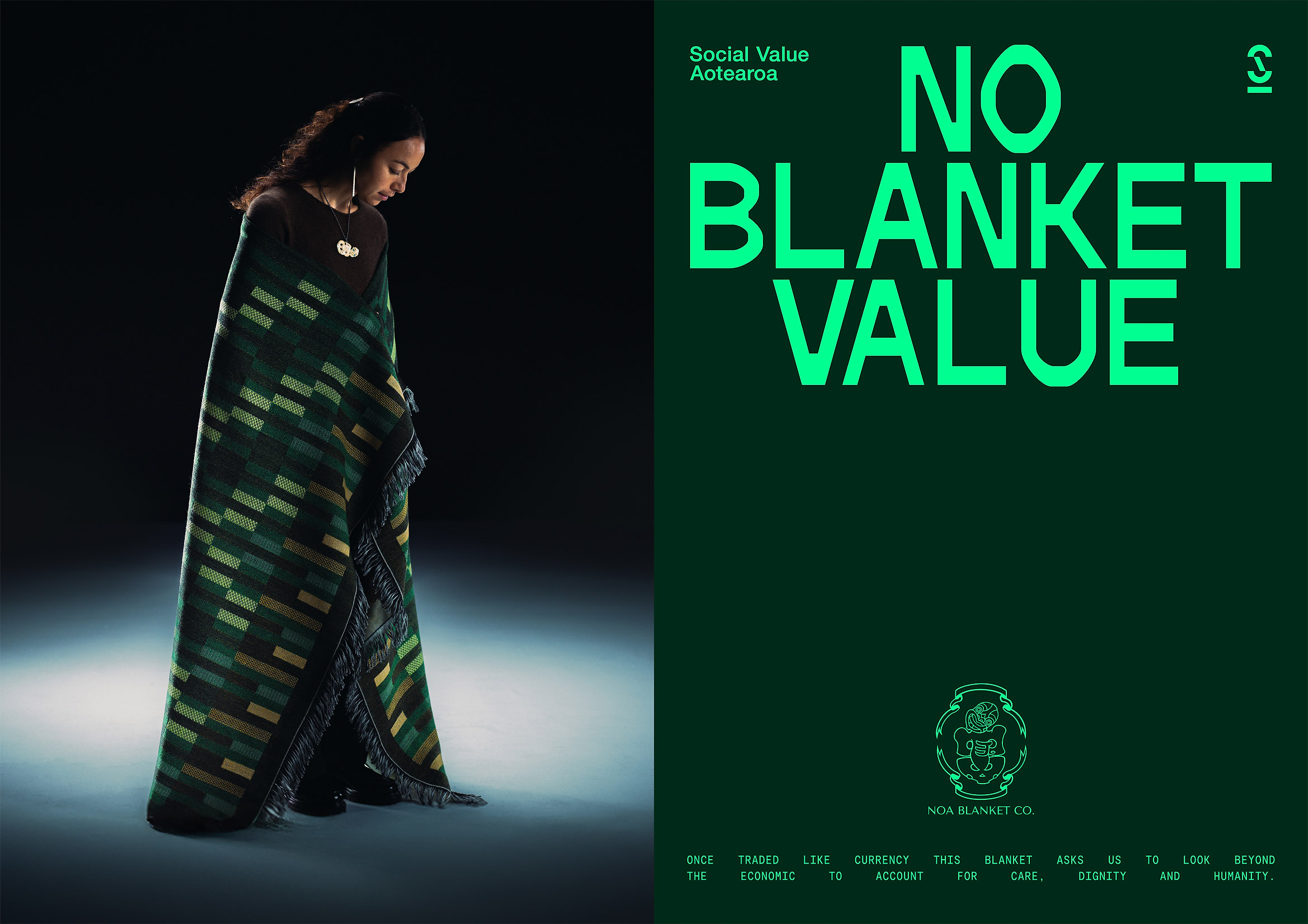
The campaign’s visual language is understated, intentional, and ceremonial. Warm-toned photography, natural light, visible textures. The composition avoids advertising rhetoric, letting the object’s presence speak for itself. This deliberate silence is powerful. In a world where corporate communication is measured in noise, “No Blanket Value” is measured in meaning. This project doesn’t try to persuade—it invites us to reflect on what we value, and how we express it.
The Best Design Awards 2025 jury called it “an incredibly smart way to unite people around a cause, deeply connected to a country’s history and the evolution of contemporary design language.” It’s no exaggeration. This work proves that design can bridge economy and ethics, history and future, symbol and action. It’s a lesson for everyone who believes design should not only communicate, but repair, connect, and transform.
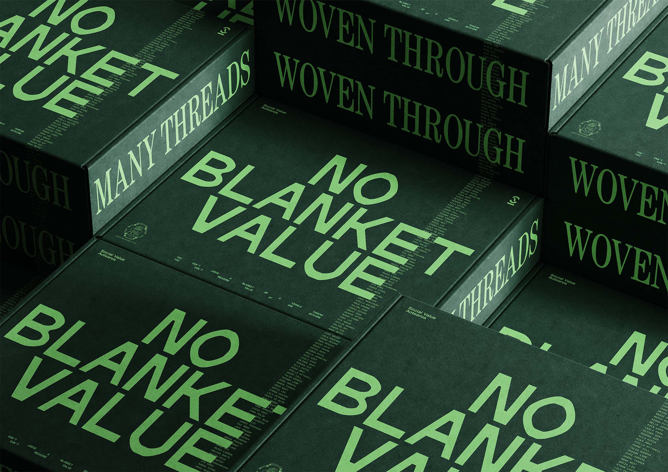
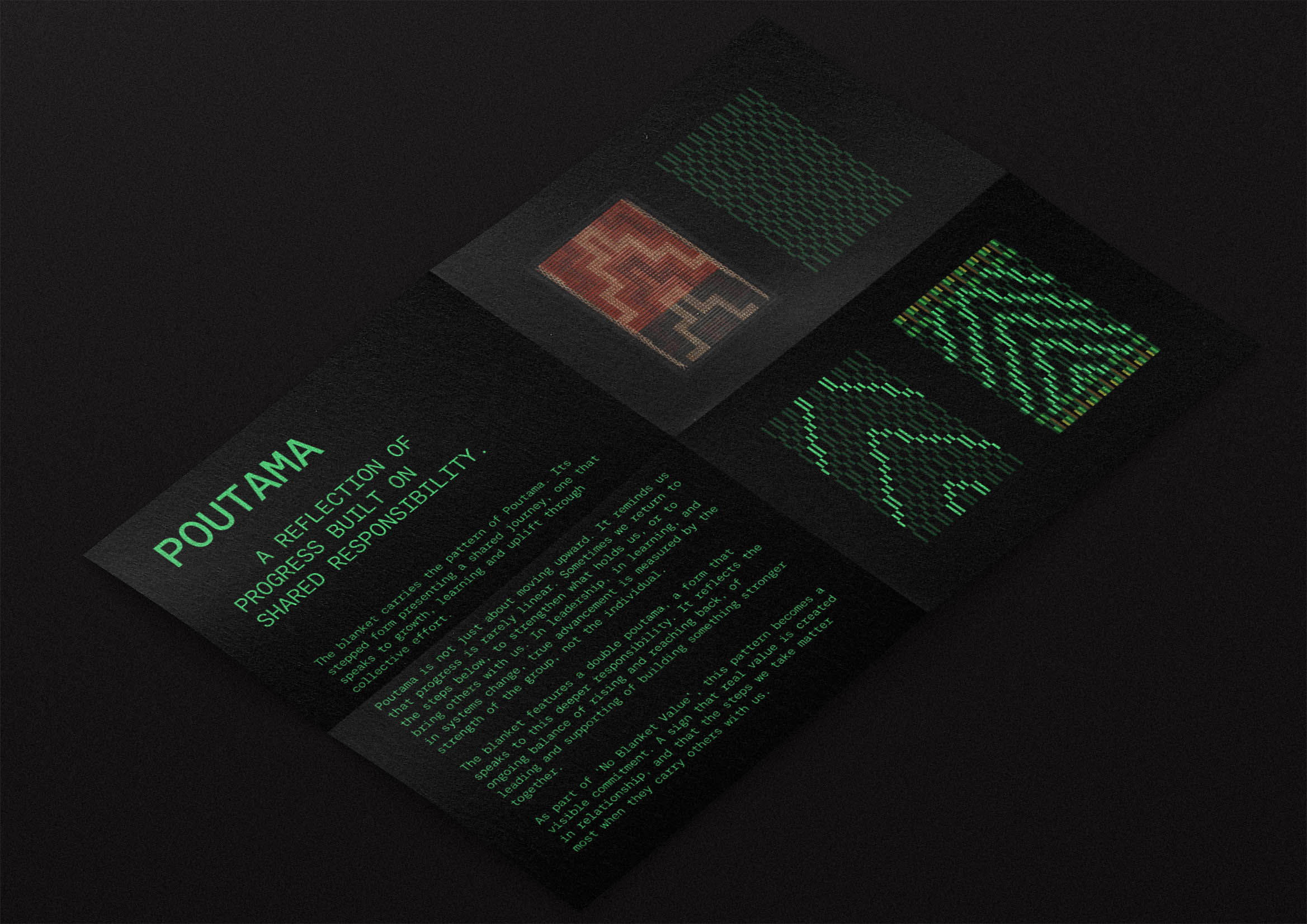
“No Blanket Value” is part of a new generation of projects where corporate communication becomes more human. The team—including Sylvia Humphries (copywriting), Joshua and Whakaawa Te Kani, Joseph McAlpine, Matthew Campher, Scott Hardy, Oliver Johnston, and James Gibb—has achieved something greater than an award: they’ve shown that when design is woven with purpose, it can change how a society understands the word “value.”
Love Creep — Clemenger BBDO x Assembly Ltd x Ministry of Social Development
https://bestawards.co.nz/graphic/colour-award-graphics/clemenger-bbdo-1/love-creep-5/
Winner of the Colour Award Graphics at the Best Design Awards 2025, “Love Creep” is one of the most impactful and daring campaigns of the year. Created by Clemenger BBDO and Assembly Ltd for the New Zealand Ministry of Social Development, the project is part of the Love Better program, a national initiative aimed at young people to teach them to recognize the signs of coercive control in romantic relationships. Its goal is as clear as it is urgent: to transform the visual language of love to make it more aware, more honest, and safer.
The cultural context couldn’t be more alarming: New Zealand has the highest rate of domestic violence in the developed world; one in three women experiences abuse at some point in her life. In this scenario, “Love Creep” not only communicates but educates. It invites young people to ask themselves an essential question: where does love end and control begin?
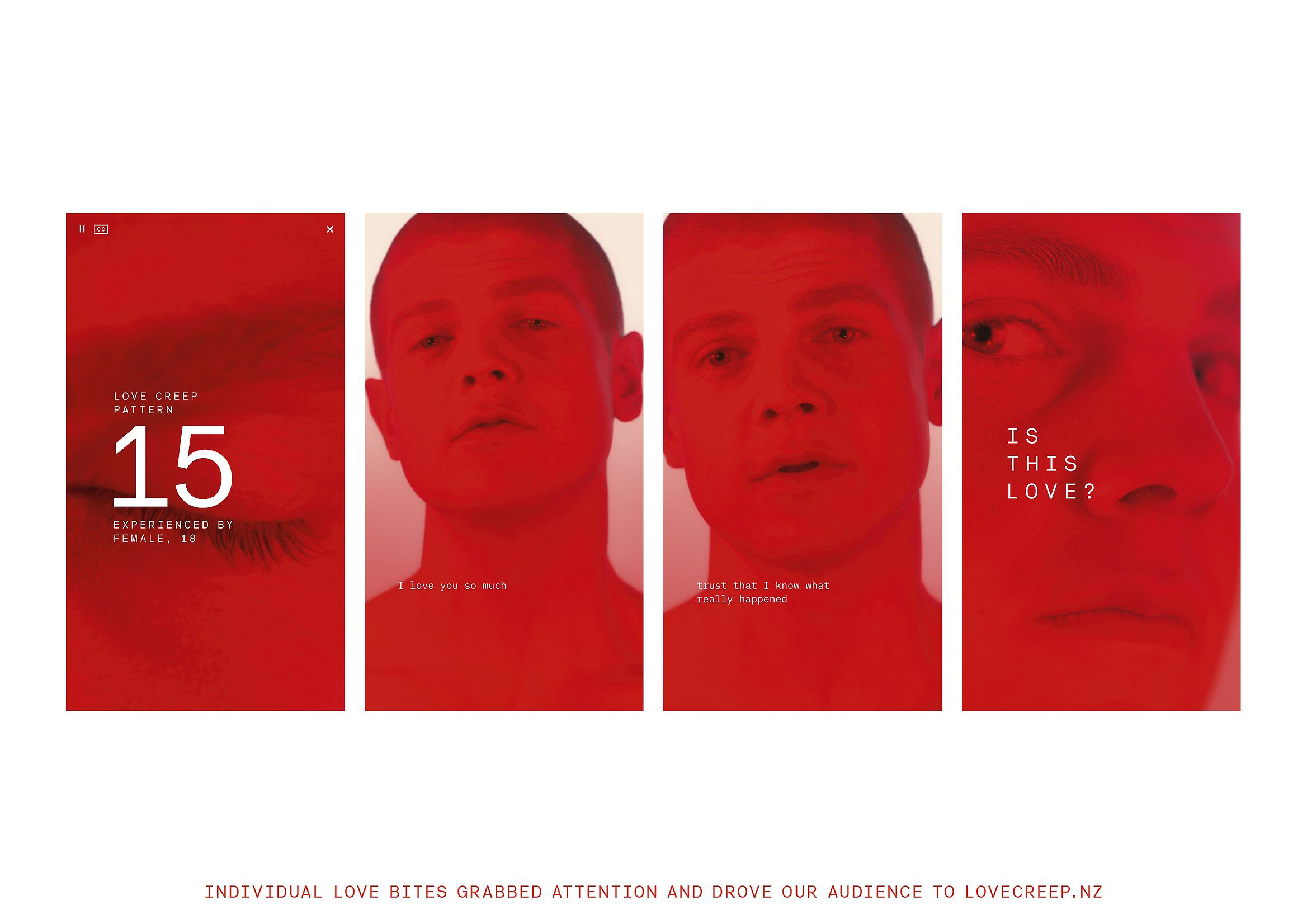
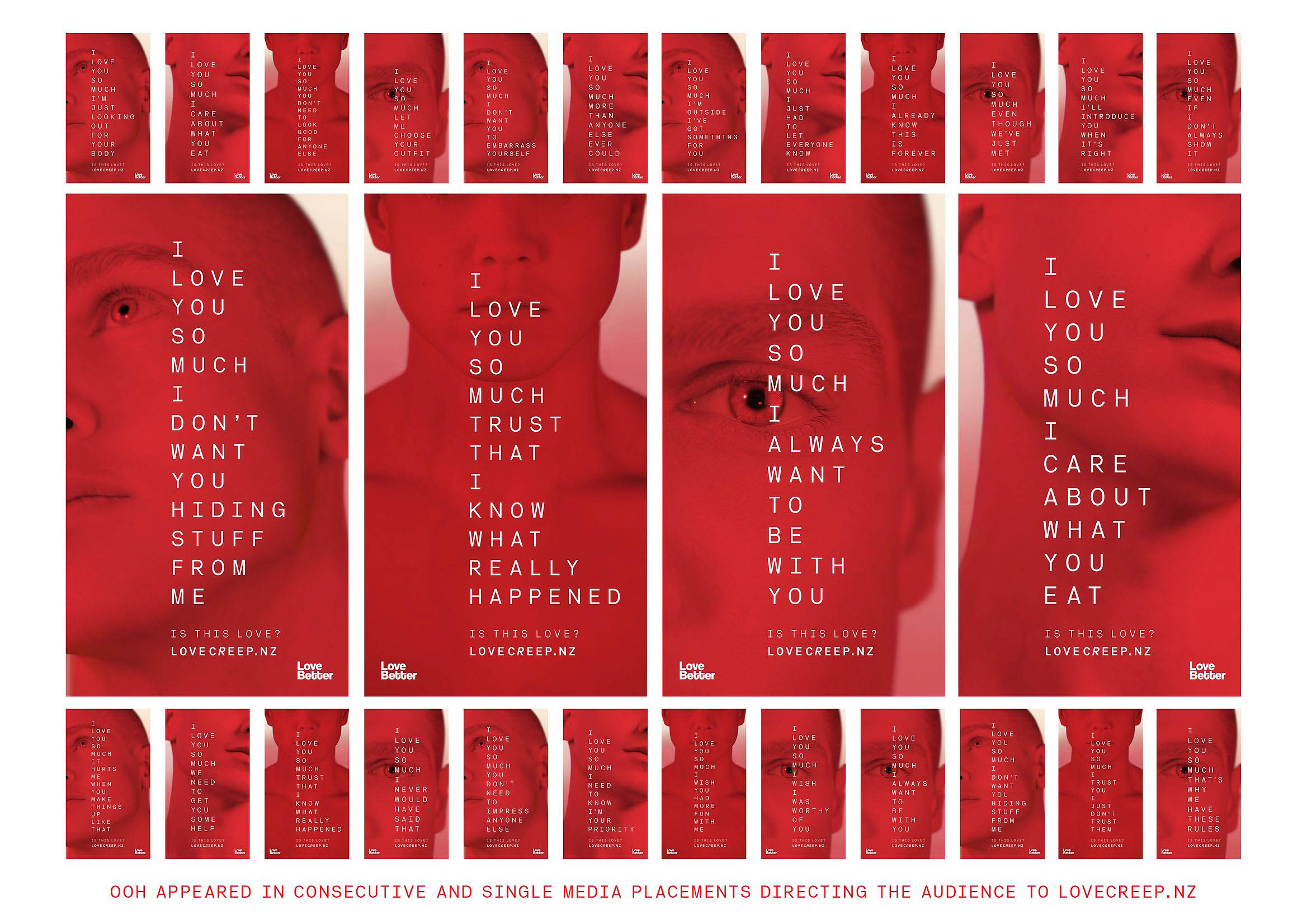
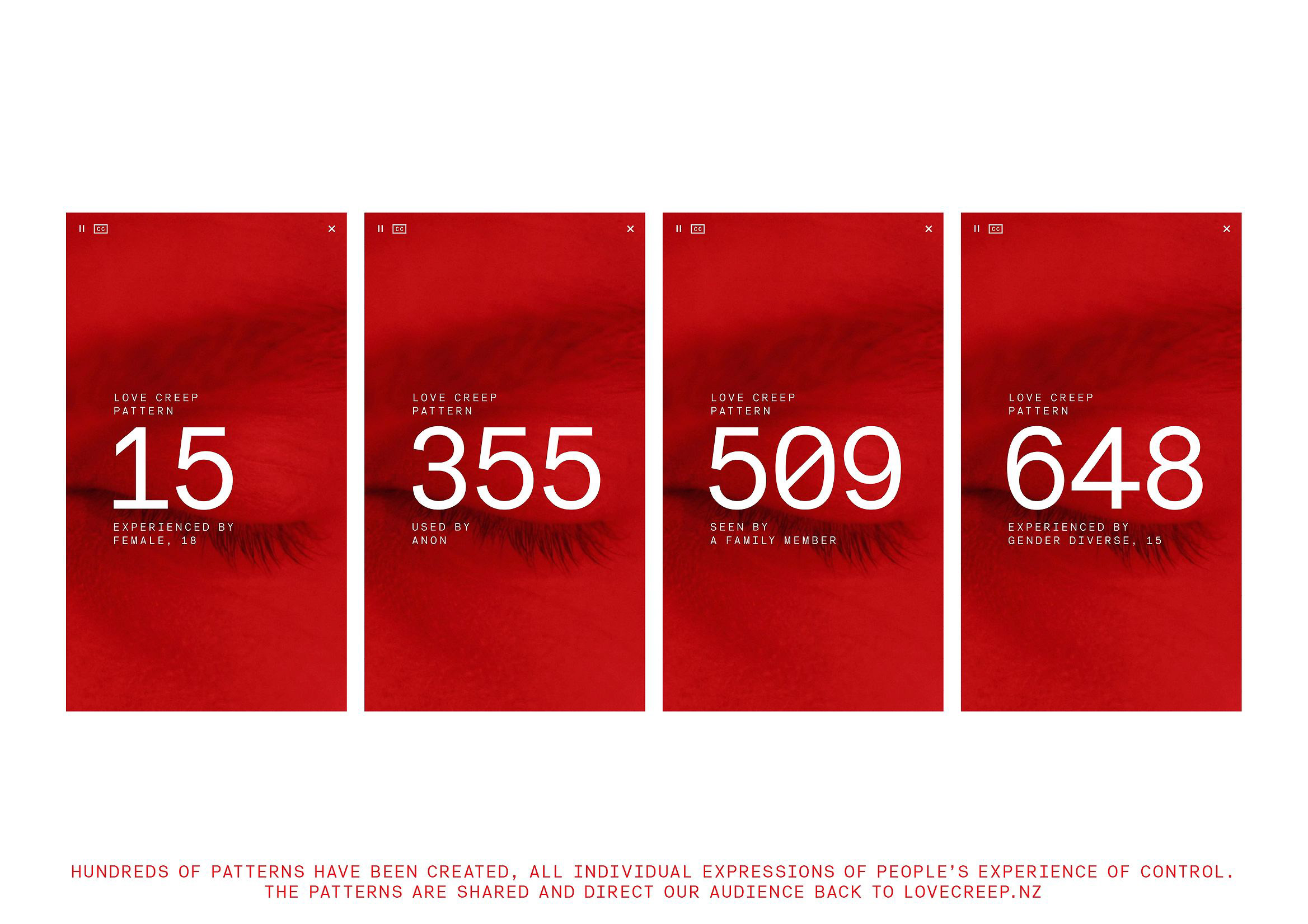
The creative team—led by Brigid Alkema, Alex Metson, Julia Ferrier, and Emily Beautrais as creative directors (Pou Auaha), along with Jake Firman in strategic direction (Pou Rautaki)—developed a radically immersive visual narrative. The digital experience LoveCreep.nz uses a deliberately suffocating mobile environment, dominated by a single chromatic idea: red. There are no nuances, no visual respite. Everything vibrates in the tension between desire and danger. Love and warning share the same color.
Red, omnipresent in every piece—website, shorts, social media, urban posters—acts as both metaphor and trigger. It is the thread that connects emotion and alarm. Inspired by brutalist architecture, the art direction dispenses with ornaments to reveal the rawness of the subject. The rough aesthetic, intense color blocks, and direct typography create a sought-after sense of discomfort: the design does not seduce, it unsettles to awaken. Love here is neither soft nor idealized; it is a terrain where violence can appear if not recognized in time.
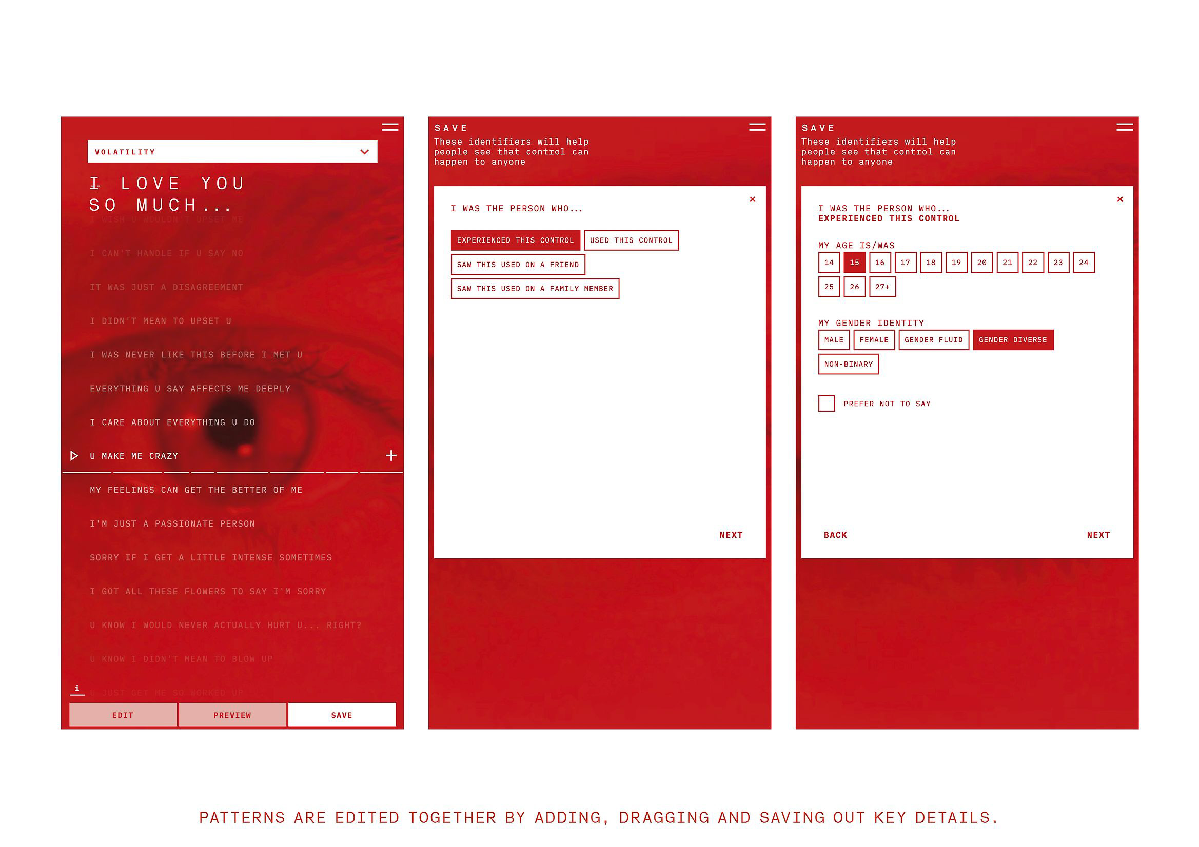
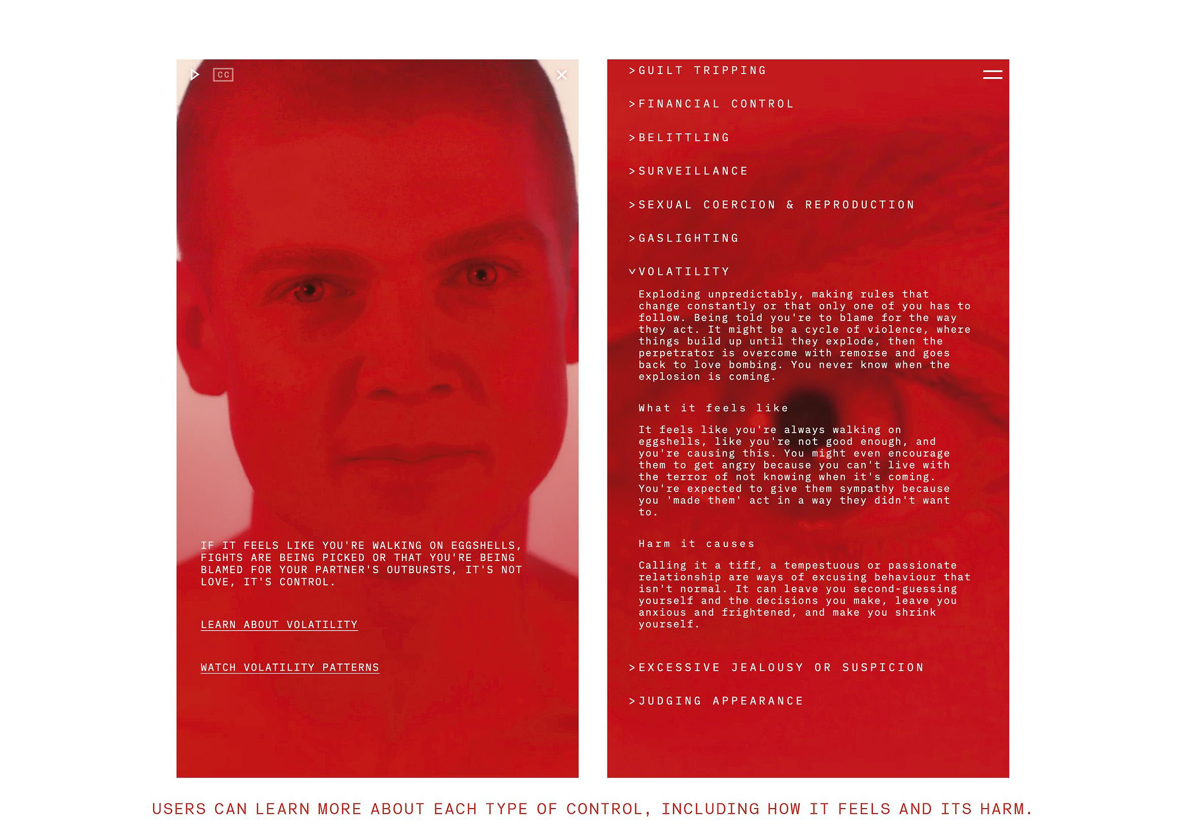
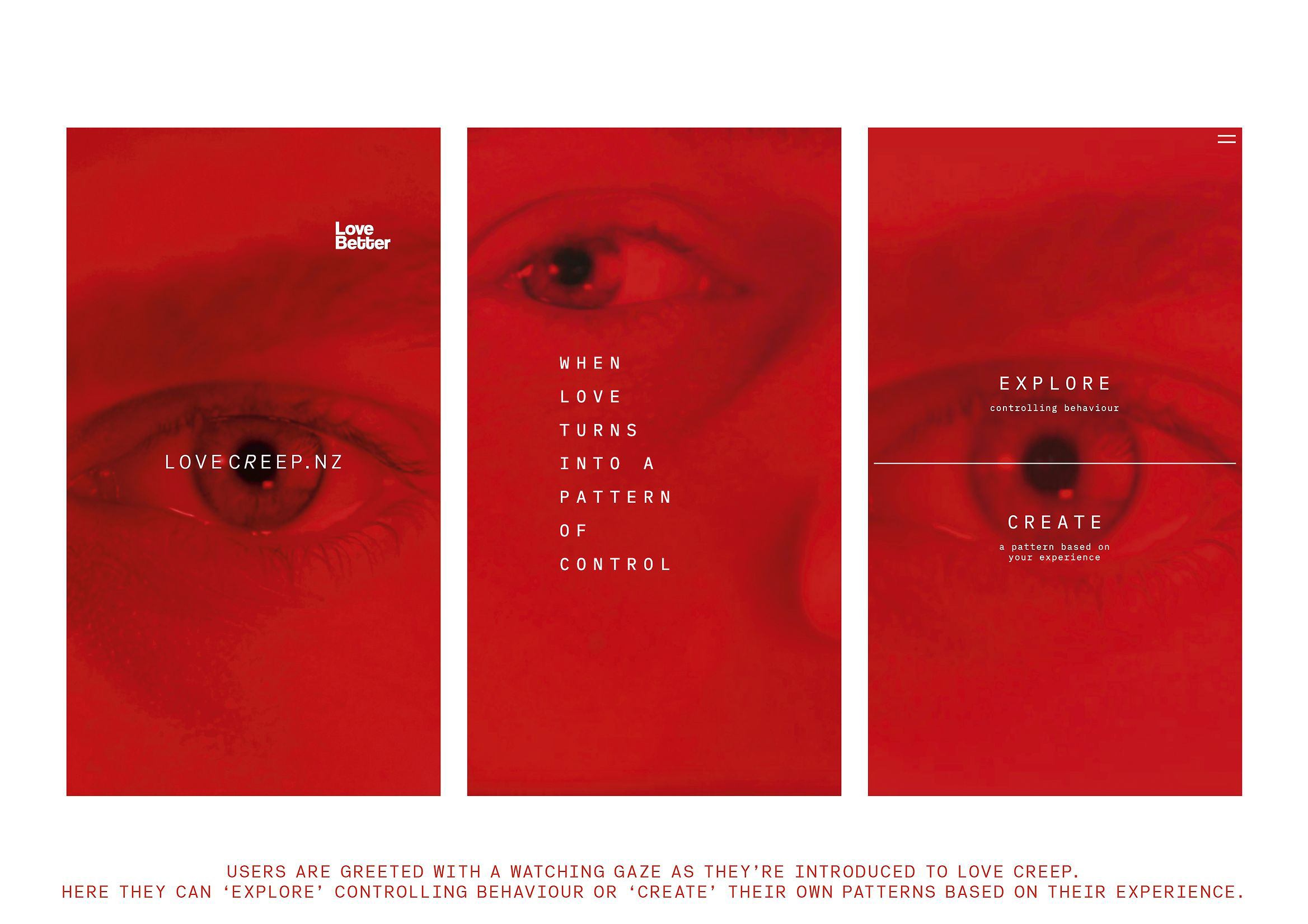
The digital strategy transforms emotional education into an interactive experience. Through what are called “Love Bites”—phrases and fragments collected from interviews with hundreds of victims and survivors—users can identify patterns of control and reflect on their own behavior. They are not told what is right or wrong: they are invited to discover it for themselves. This empathetic approach turns the campaign into an exercise in collective self-awareness. The design stops instructing and starts accompanying.
The results speak for themselves. In the months following the launch, there was a 5% increase in the number of young people able to identify controlling behaviors in their relationships and a 5% decrease in those who normalized them. Calls to Youthline—a support line for young people—increased with a new common question: “Am I being controlling without realizing it?” Since then, LoveCreep.nz has been incorporated as an educational tool in schools across the country. The impact of the design transcended the screen to become a national conversation.
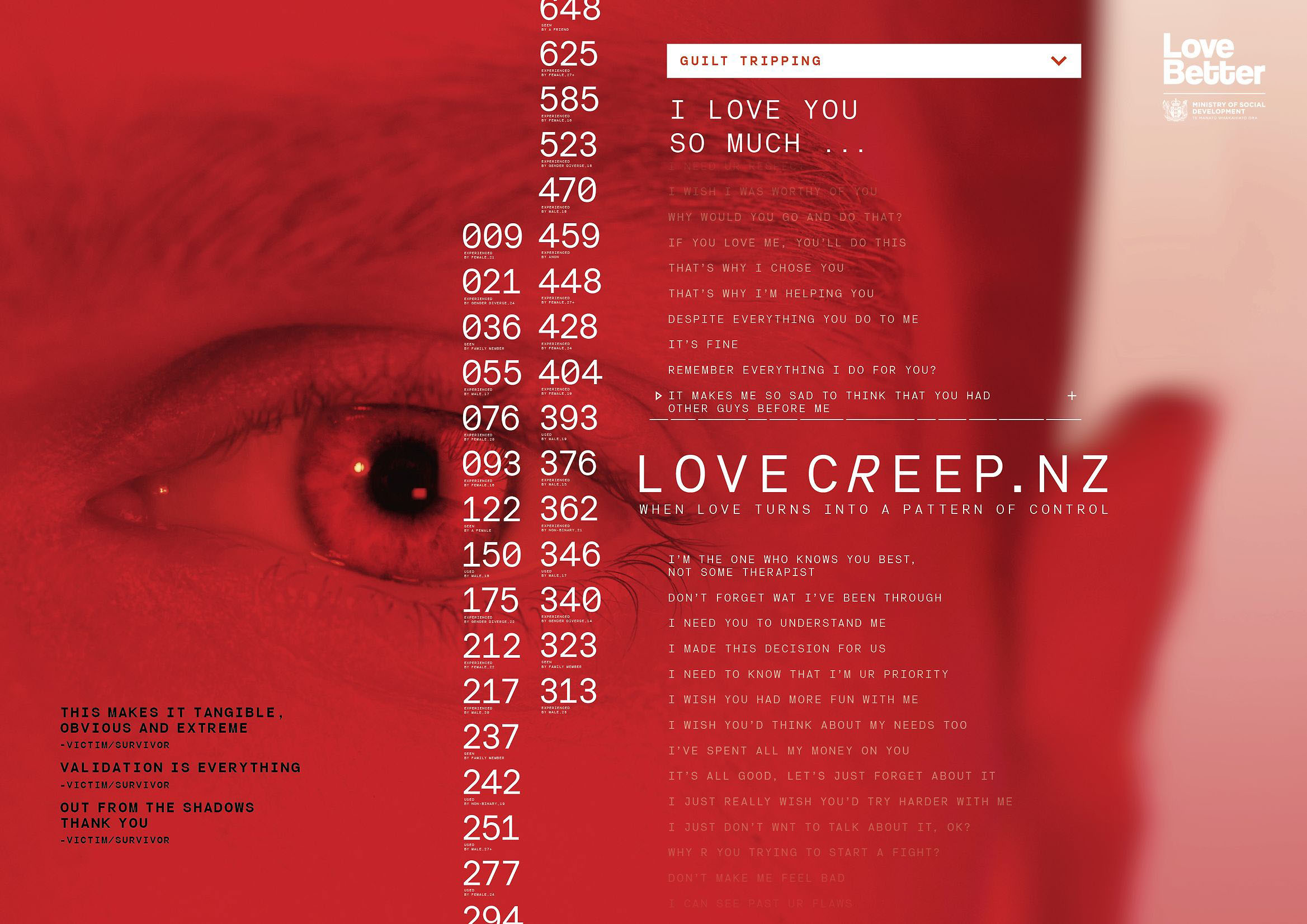
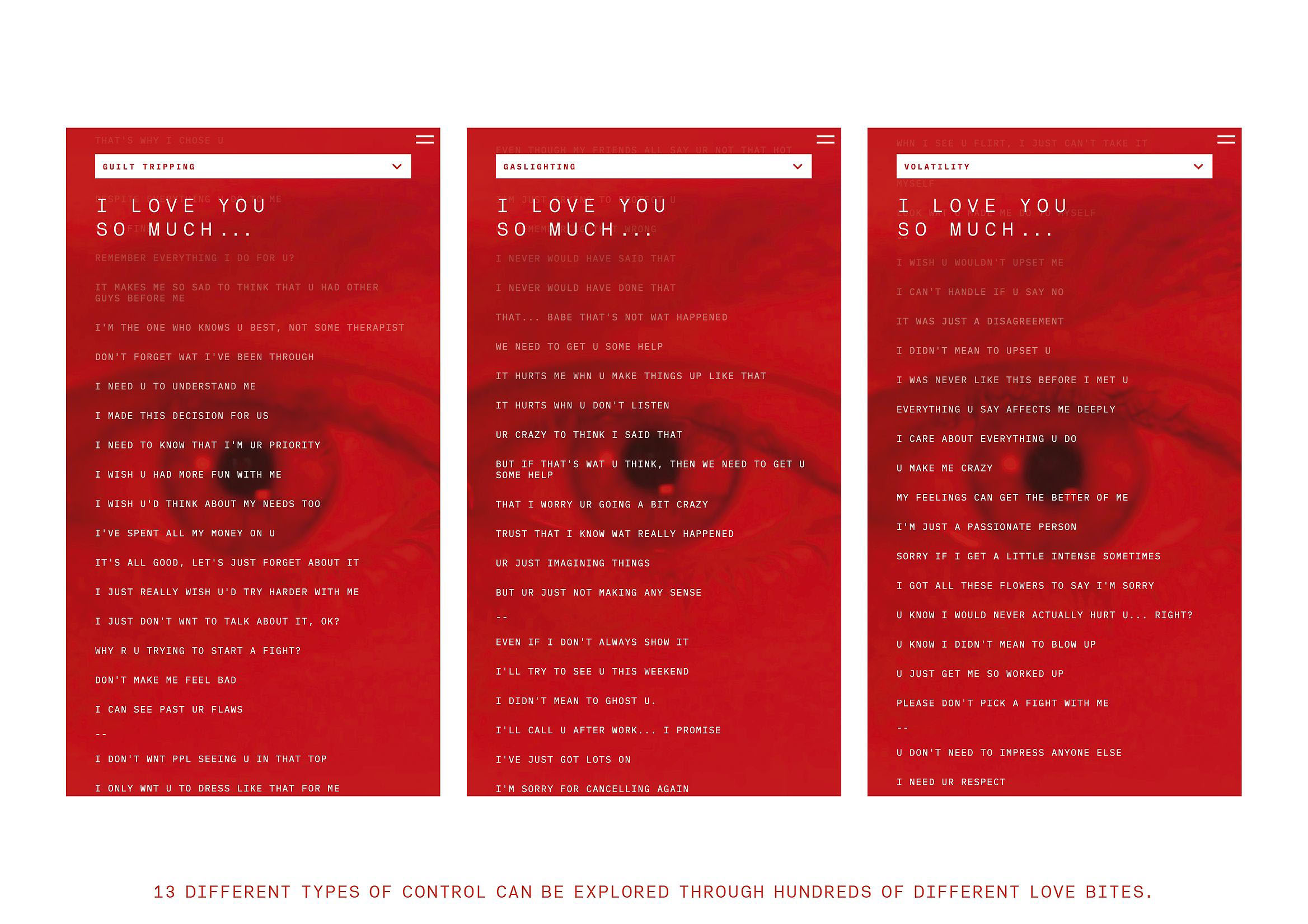
The jury of the Best Design Awards highlighted the project for its “masterful use of color as a narrative and emotional language” and its ability to “translate a complex social issue into a visceral visual experience.” In a landscape where many social campaigns seek to soften their messages, “Love Creep” chooses intensity, risk, and discomfort as forms of truth. And it succeeds. Because sometimes, love needs a red mirror to recognize itself.
Xijiu Matured Liquor — Chengdu Times Fashion Art Design Co., Ltd.
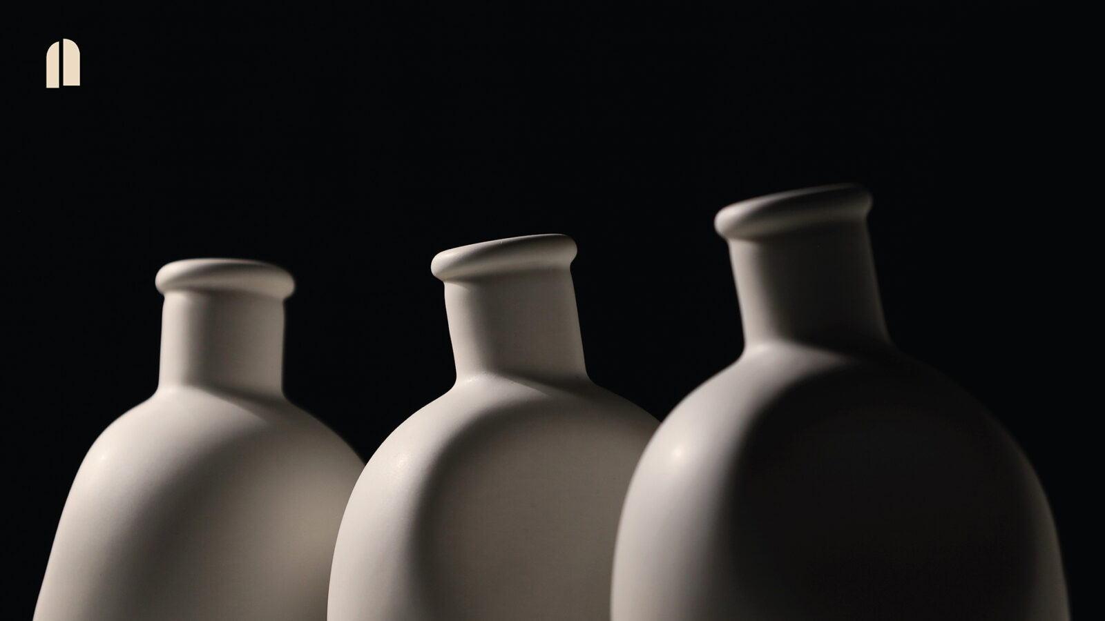
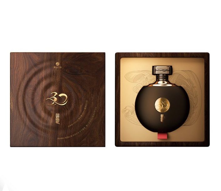 Winner of the Platinum A’ Design Award 2025 in the Packaging Design category, “Xijiu Matured Liquor” represents the perfect synthesis of art, culture, and contemporary design. Conceived by Chengdu Times Fashion Art Design Co., Ltd., this project elevates liquor packaging to the level of cultural artwork. In a market dominated by mass production, this piece asserts design as an act of memory and balance. Inspired by an iconic piece from the Palace Museum in Beijing, the design takes the circular drum shape as its starting point, an ancient symbol of wholeness and harmony in Chinese culture. From this perfect geometry, the packaging becomes a metaphor for time, nature, and the life cycle. Its rounded, smooth, and balanced silhouette communicates an almost philosophical serenity: luxury understood not as ostentation, but as a balance between the visible and the eternal.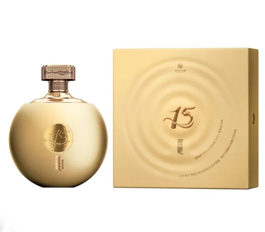
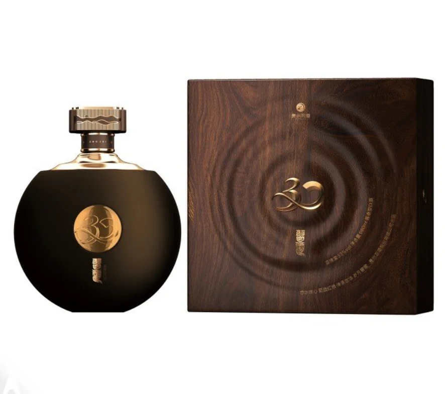 The creative team —Xiaohu Feng, Xian Huo, and Lei Wang— successfully reinterprets classical heritage with a contemporary sensibility. The laser inscriptions indicating the maturation years (15 and 30) unfold like ribbons that seem to float, a poetic nod to the tradition of literati who drank liquor while writing verses by the rivers. Each stroke unites the senses: sight, touch, and smell. It is a design that is not only seen but experienced. The cap, auspiciously shaped like Sihe Ruyi, represents the harmony between time, place, and people. Its smooth opening adds a ritual component to the user experience. Inside, a woodcut-style illustration depicts the landscape of the Chishui River —the birthplace of Xijiu— along with the liquor’s natural ingredients. The entire ensemble conveys a sense of living heritage: a story that continues through design.
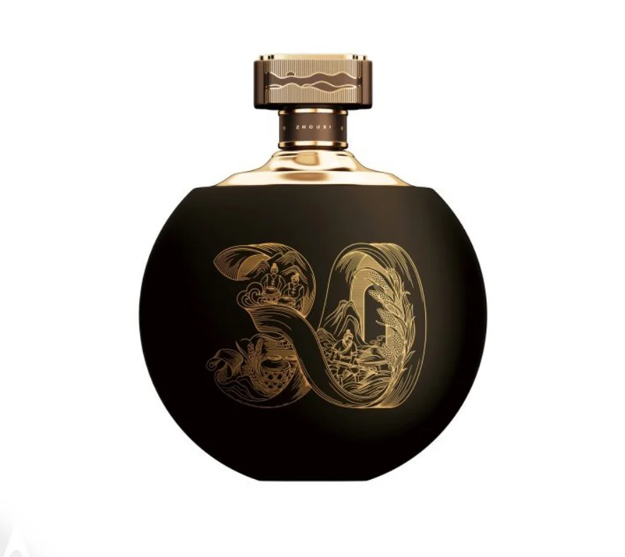 The project surpasses the challenge of balancing artisanal tradition with contemporary elegance. It does not seek to be modern: it seeks to be eternal. Against the trend of global minimalism, “Xijiu Matured Liquor” embraces symbolic complexity and visual richness as forms of aesthetic truth. The omnipresent circularity is not just a shape: it is a philosophy. It represents the union between past and future, between culture and desire, between matter and emotion.
 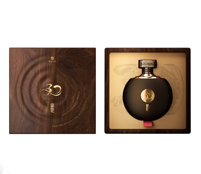 The jury of the A’ Design Award 2025 recognized the work as a masterful example of “fusion between cultural art and industrial design,” highlighting its attention to detail, symbolism, and impeccable technical execution. This project not only protects a product but preserves a legacy. It is proof that packaging, when conceived with sensitivity and purpose, can transcend its commercial function and become a piece of cultural heritage.
From references to real brand applications
These projects show how visual direction can help brands become clearer, more recognisable and easier to trust.
Mercado Novo — Greco Design
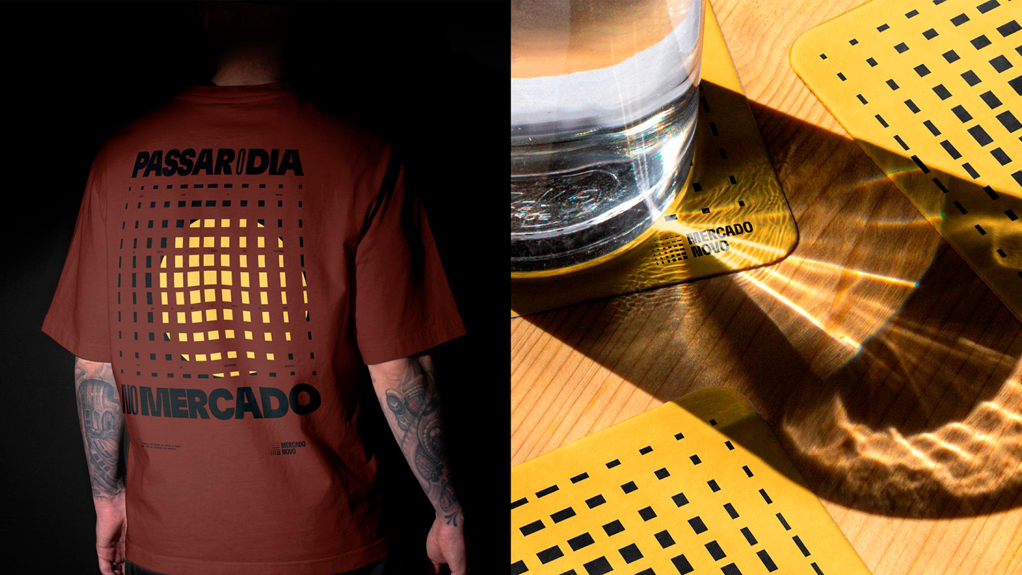
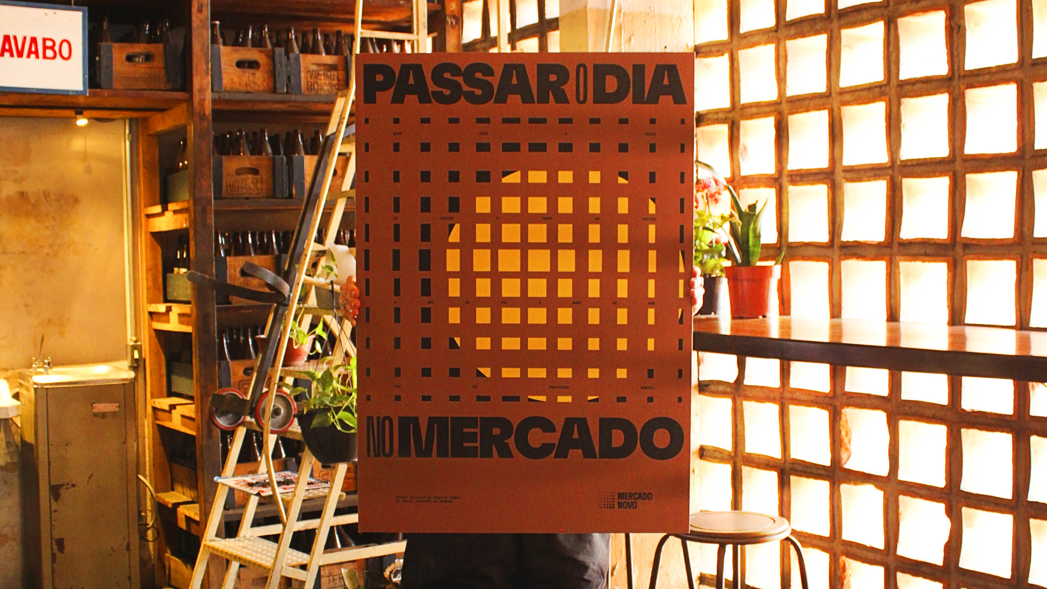 Winner of the iF Gold Award 2025 in the Communication & Branding category, the project “Mercado Novo” by Greco Design reinterprets an architectural icon of Belo Horizonte to transform it into a living, flexible, and deeply Brazilian identity. The Mercado Novo, built in the 1960s as a symbol of urban modernism, had fallen into oblivion until its rebirth in 2018 as a cultural epicenter. Today, its new visual identity celebrates that transformation: from commerce to coexistence, from market to movement.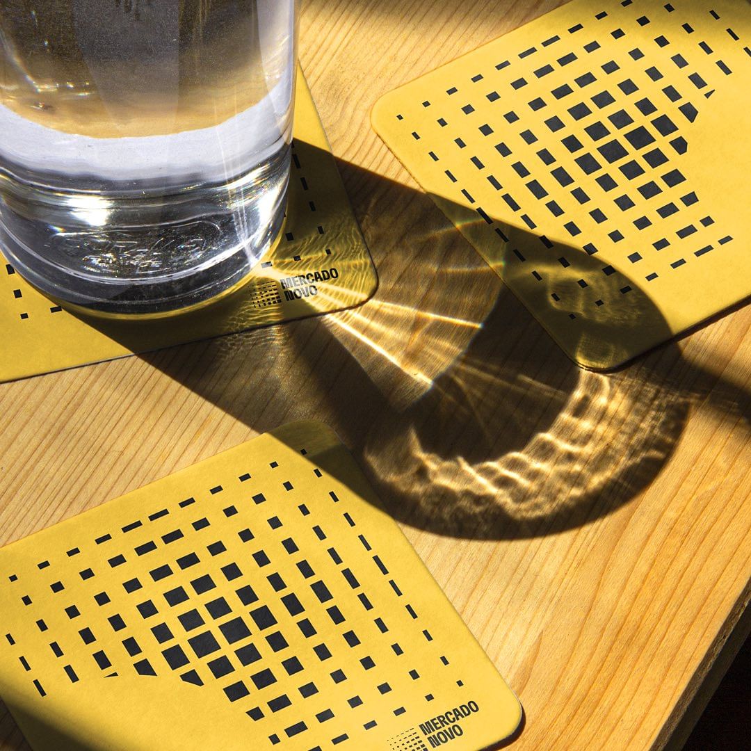
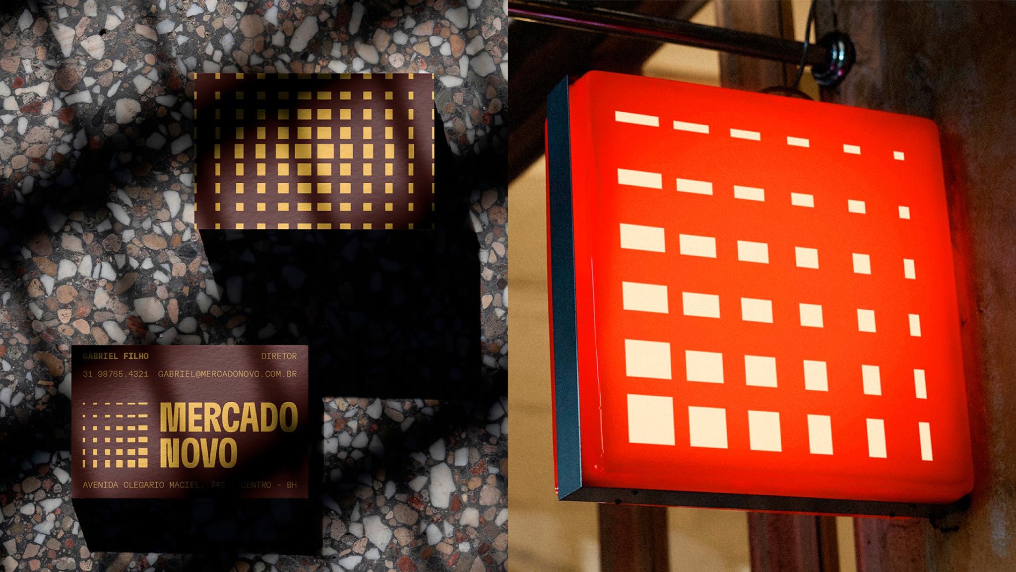
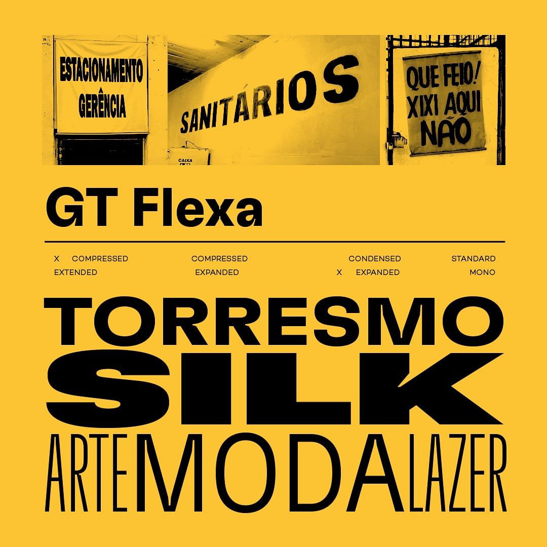 The team at Greco Design faced a complex challenge: capturing the contemporary energy of a space where gastronomy, art, music, and design coexist, without losing the memory of its past. The answer was found in the cobogós, the characteristic perforated ceramic blocks that form the building’s facade. These elements, typical of Brazilian architecture, create a dance of light and shadow throughout the day. This changing geometry became the essence of the new visual system: a pattern that evolves over time, just like the market itself.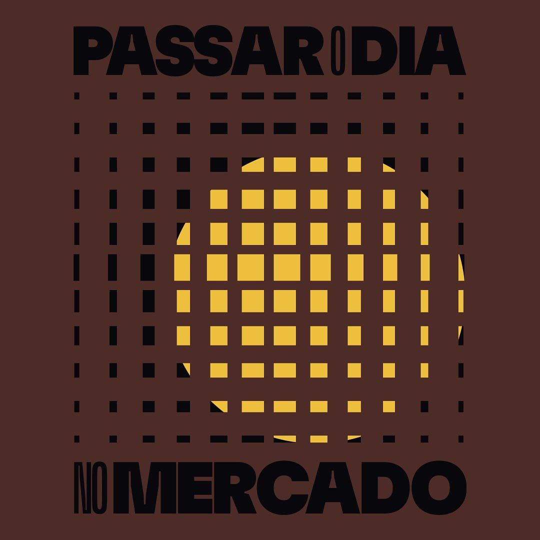
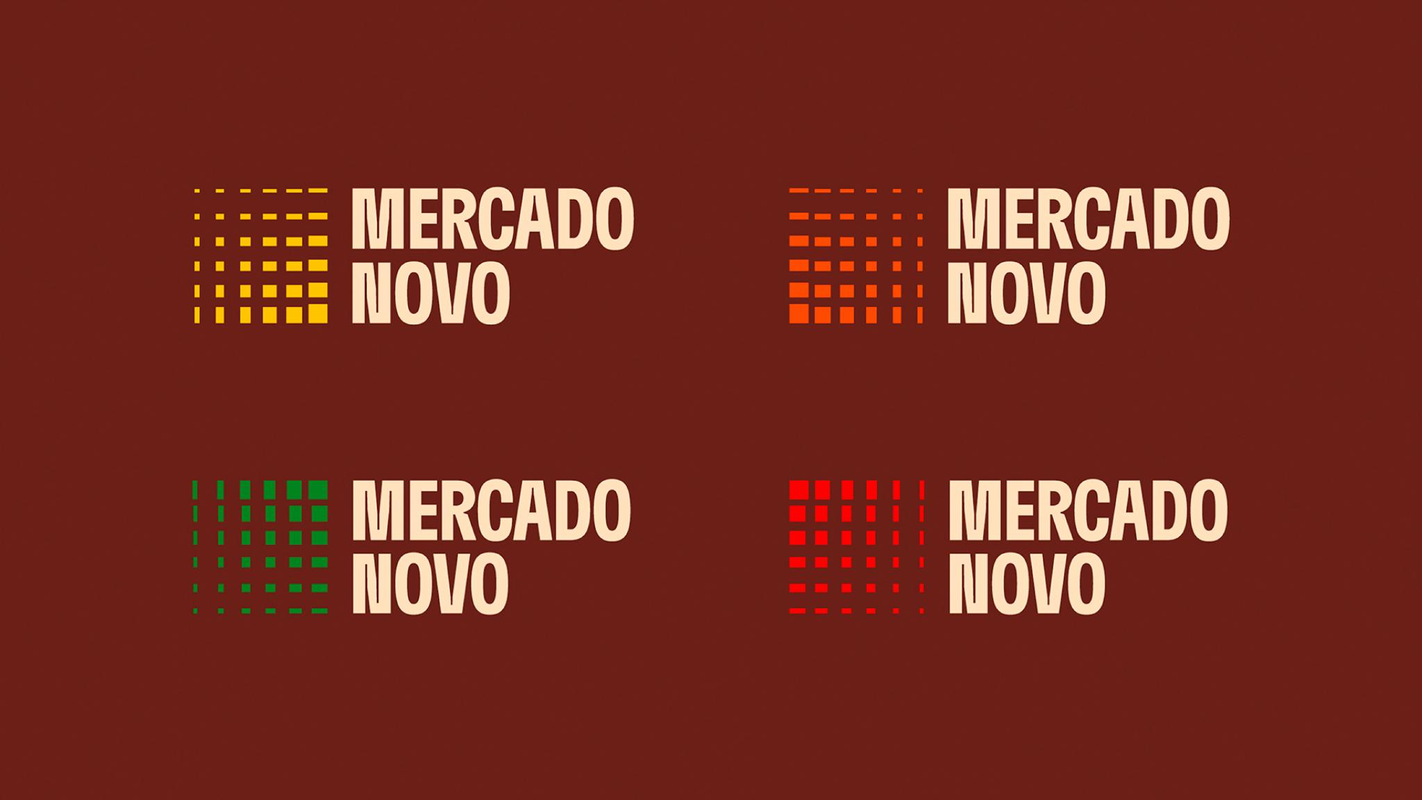
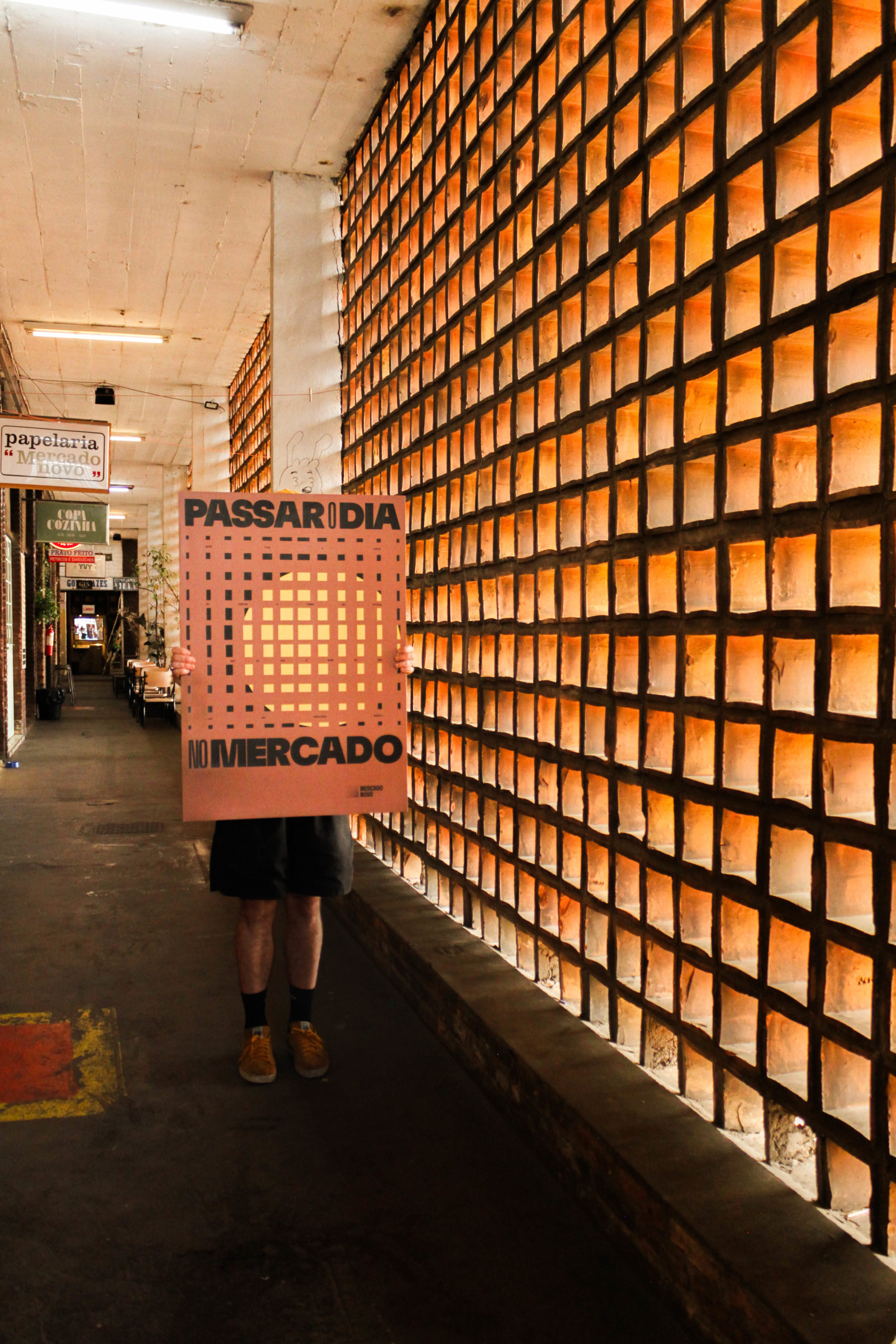 The identity is articulated through a modular grid inspired by the cobogós. Each grid can adapt to different media —from signage to digital pieces— and allows for infinite graphic combinations. Color plays a central role: a palette that reflects the different times of day, from the warm tones of dawn to the blues and oranges of sunset over Belo Horizonte. In this way, the logo and its variants function as a visual clock, a metaphor for the passage of time and the collective life that pulses within the building.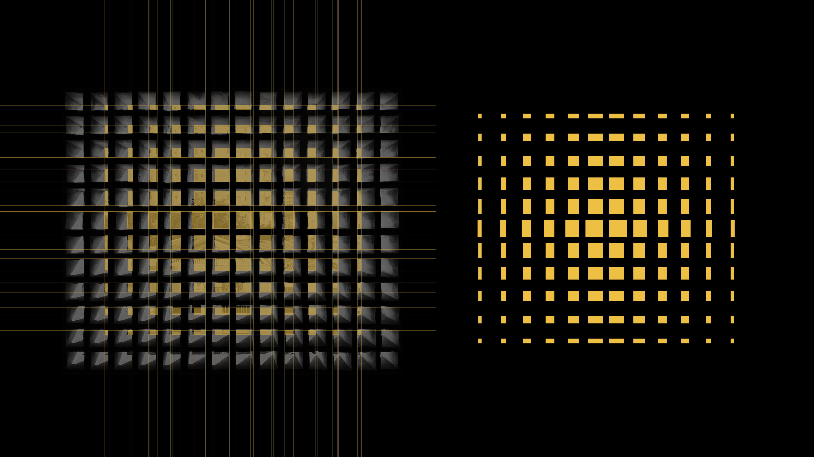
 The jury of the iF Design Award highlighted that the identity “embodies the perfect fusion between community, architecture, and nature,” and recognized its masterful use of a generative approach that adapts the market’s forms to changing cultural, climatic, and social contexts. It is not just a redesign: it is an interface between the physical and the emotional, between architectural structure and human experience.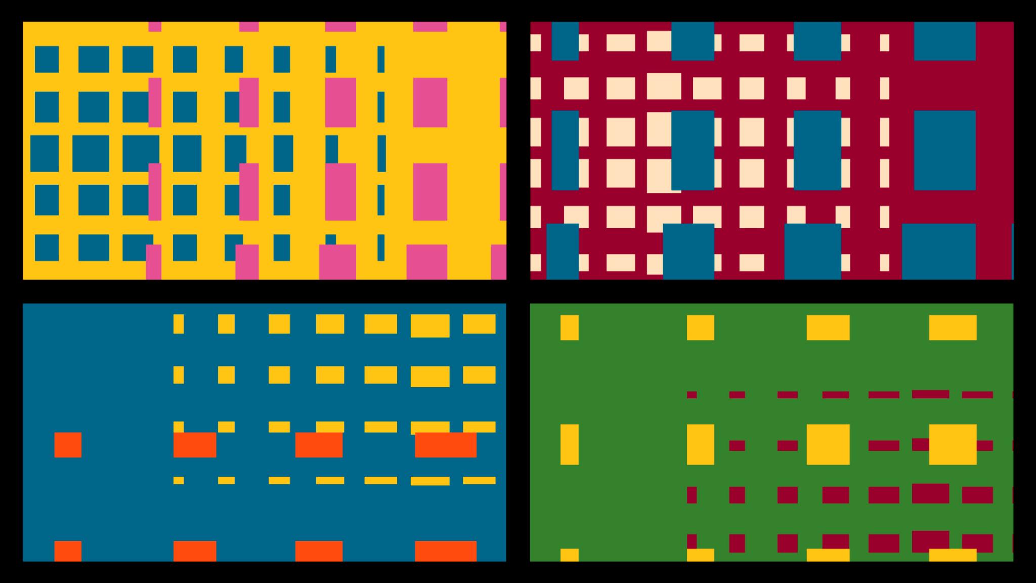
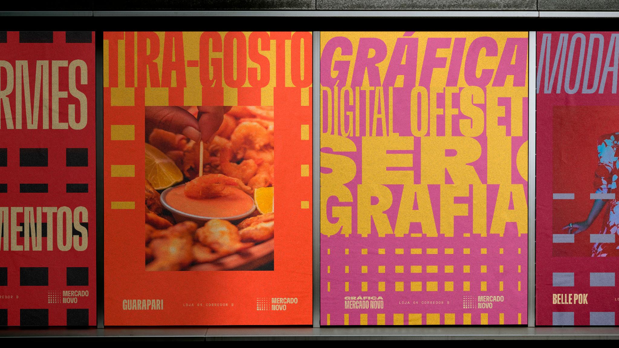 The Mercado Novo now functions as a cultural hub connecting past and present. Its new identity does not impose an image but proposes an open system, where each graphic piece is a possible interpretation of the same spirit. Thus, the market becomes a visual platform where the artisanal and the digital, the local and the universal coexist. It is a lesson in how design can preserve memory while simultaneously driving a community’s future. This project demonstrates that cultural branding can be much more than an aesthetic operation: it can be a tool for urban revitalization. The Mercado Novo brand not only represents a place but amplifies a way of life. In the words of the jury: “A project that breathes the pulse of Brazil and translates its collective energy into a timeless visual language.”
  https://ifdesign.com/en/winner-ranking/project/recicla-sampa/714880
Recicla Sampa — D4G Comunicação e Design
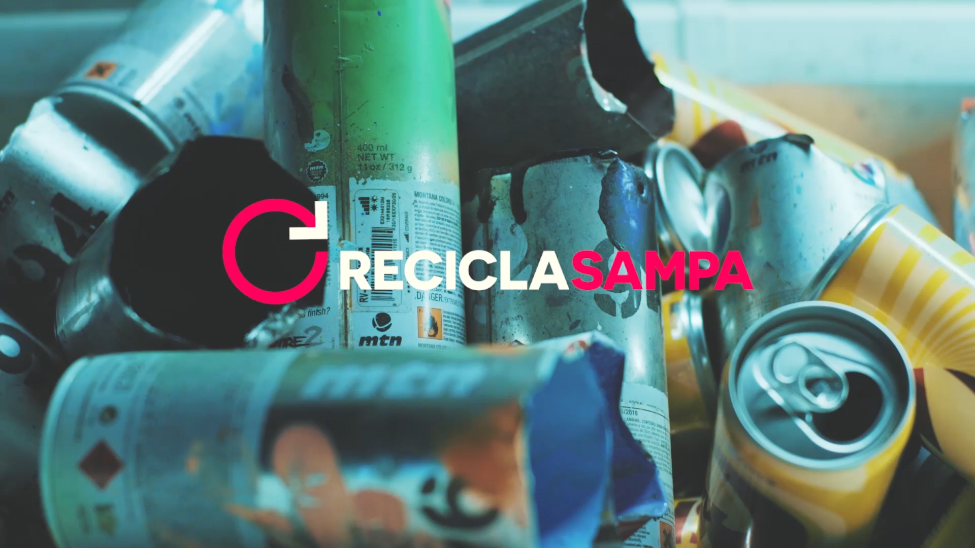
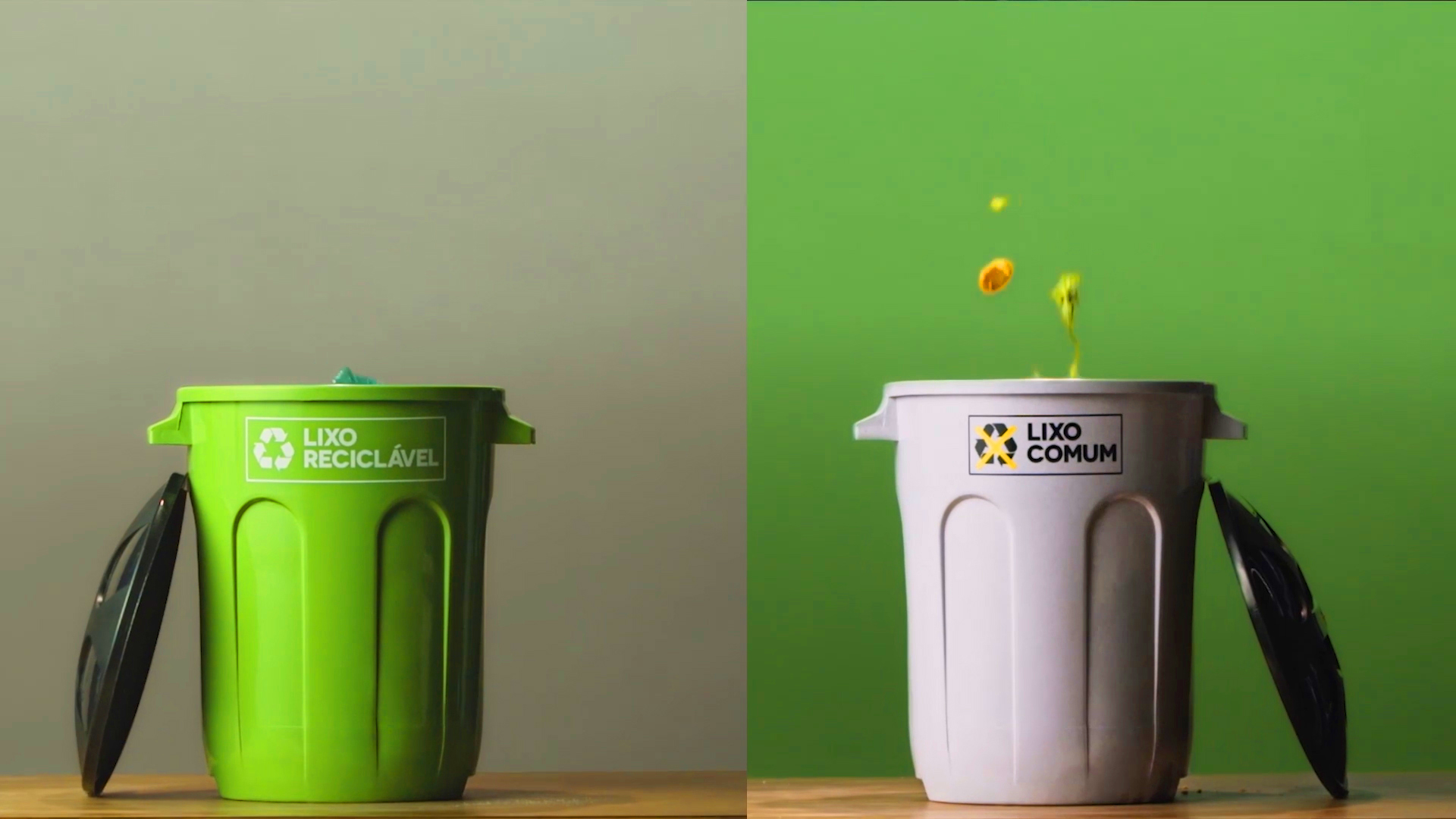
Winner of the iF Design Award 2025 in the Service Design category, Recicla Sampa has established itself as the largest environmental education platform in Brazil. Created by the waste management concessionaires Loga and EcoUrbis with the support of the São Paulo government, the project redefines how a metropolis of over twenty million inhabitants interacts with its waste.
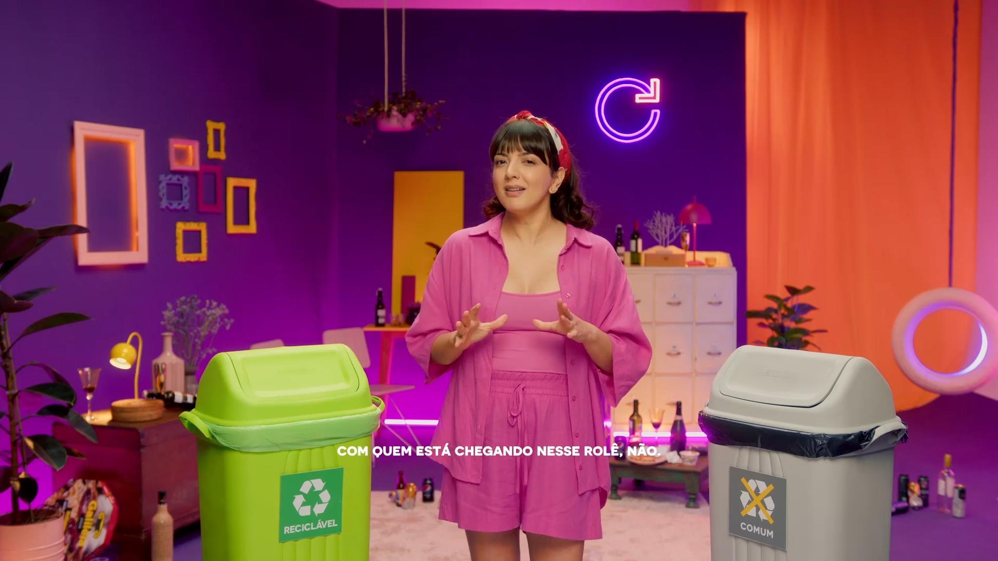
The Recicla Sampa movement arises from an urgency: to transform the relationship between citizens and consumption amid a global environmental crisis. More than just an awareness campaign, it is a communication and service system that educates, connects, and facilitates sustainable action. Through a digital platform, users can access practical information on waste separation, recycling points, educational content, and updated data on urban waste management.
The team at D4G Comunicação e Design designed an experience that combines pedagogy, technology, and social design. The intuitive interface, clear visual resources, and accessible tone ensure the message reaches diverse audiences — from students and families to businesses and public organizations. The service design is not limited to the digital environment: it is complemented by urban campaigns, educational materials, and in-person actions that reinforce environmental awareness in the community.
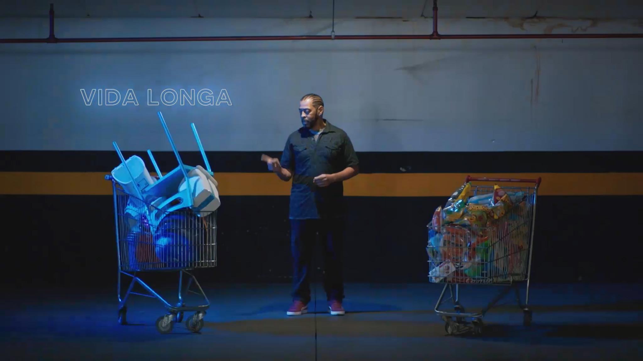
One of the project’s greatest achievements is its measurable impact. Since its launch, Recicla Sampa has increased the volume of recyclable waste in São Paulo and strengthened collaboration between citizens, government, and concessionaires. Its strategic approach demonstrates that design can be a powerful tool for social transformation, capable of translating complex data into everyday sustainable actions.
The jury of the iF Design Award particularly valued the coherence between purpose, form, and function. Every element of the experience — from the information architecture to the visual identity — is designed to inspire real behavioral change. In the words of the D4G team, “educating about recycling is not just about informing, but about generating pride and belonging around a cleaner and more conscious city.”
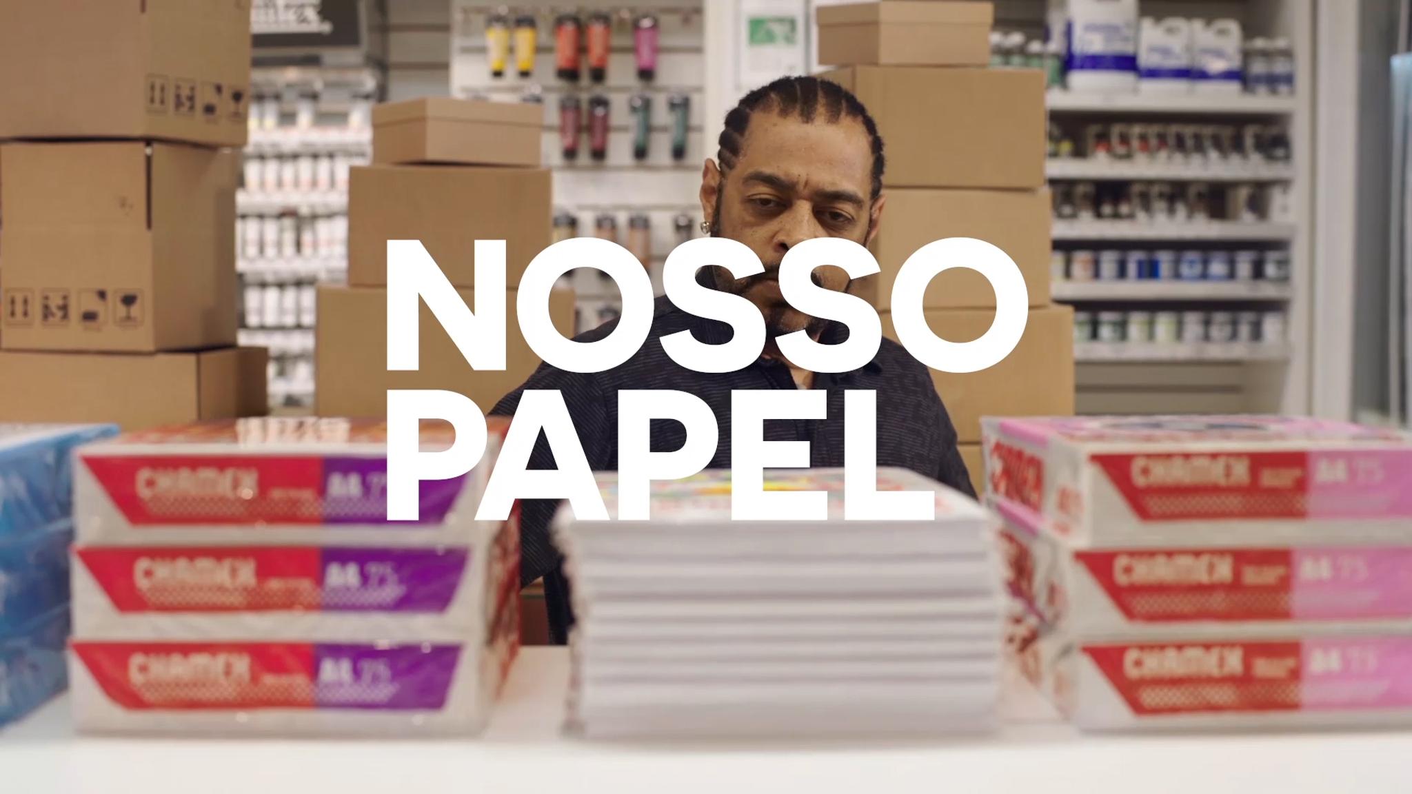
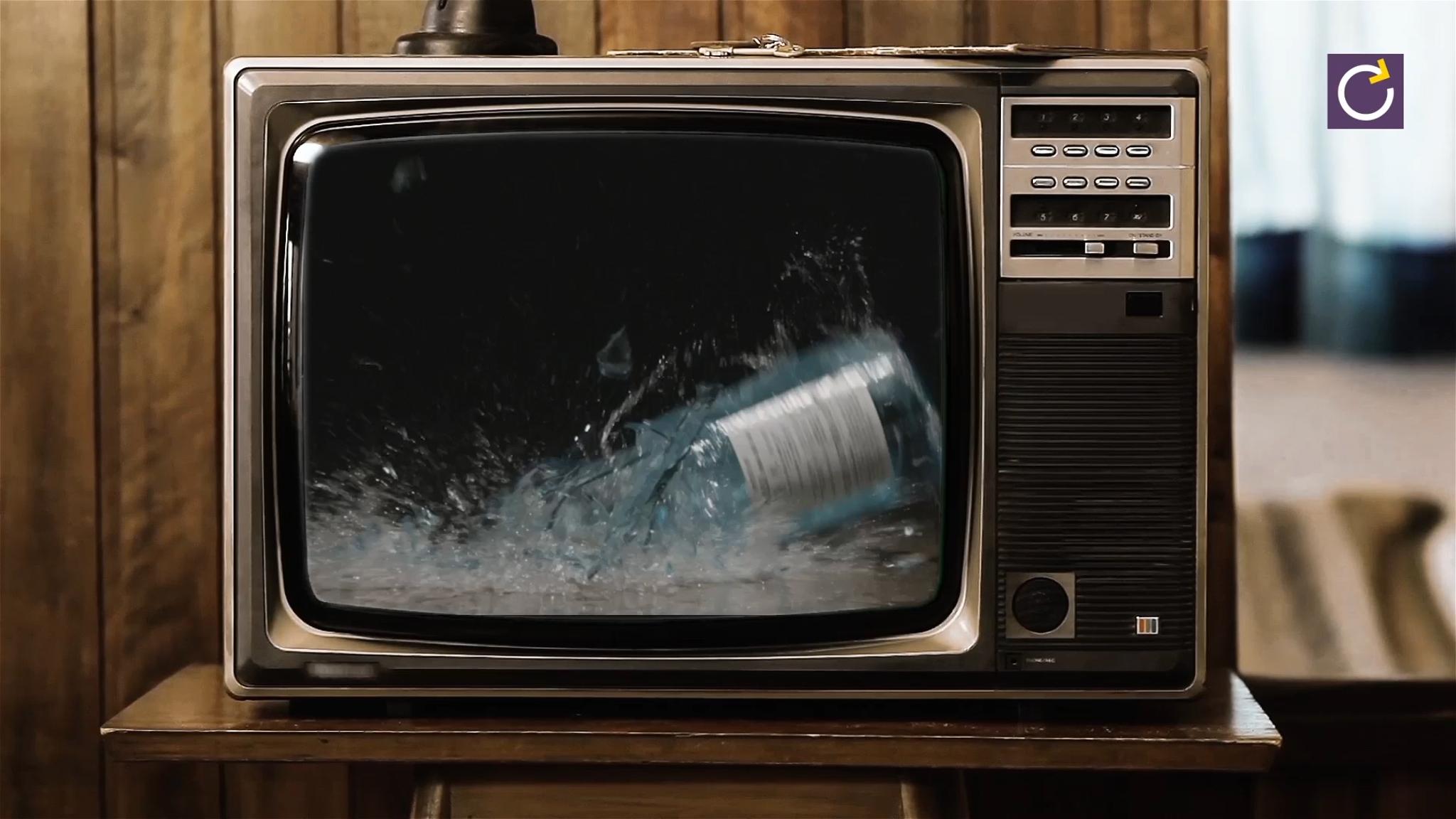
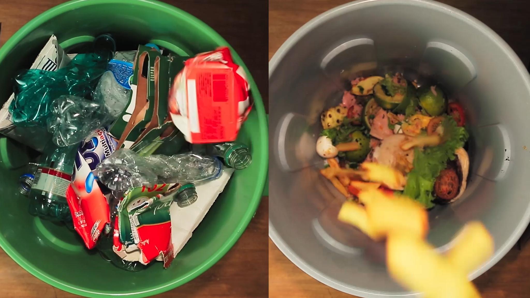
Recicla Sampa represents a new generation of public service design: projects where technology serves people, and design acts as a bridge between institutions and citizens. In a country of continental dimensions, its impact transcends São Paulo: it has become a replicable model for other Latin American cities seeking sustainable solutions through communication and design.
https://awards.europeandesign.org/winner/262593
Norwegian Logo — TRY / Apt
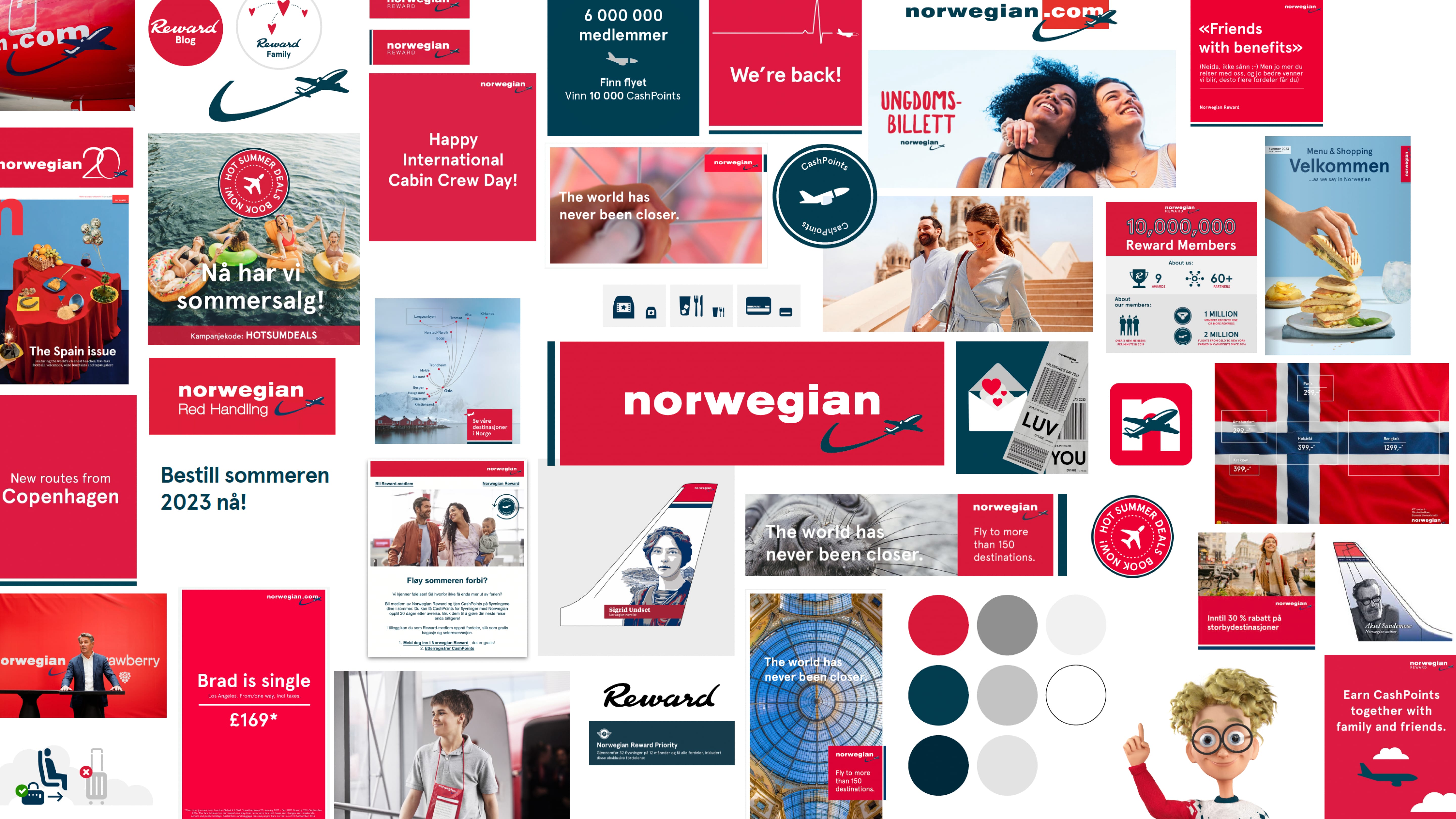
Winner of the Silver Award 2025 in the Company Logo category, the rebranding of Norwegian Airlines by TRY / Apt represents a strategic and emotional renewal of the European aviation sector. At a time when the pandemic completely transformed the business travel landscape and traditional airlines struggled to redefine themselves, Norwegian seized the opportunity to rebuild its identity from authenticity and national values.
The new identity is based on a clear idea: “A Fair Price Airline” and “The Norwegian Way”. Two pillars that combine honesty, accessibility, and cultural pride. The design moves away from Nordic clichés and the overly technical codes of its previous stage, opting for a modern, warm, and human aesthetic that balances the local and the global. The result is a brand that projects confidence, simplicity, and unpretentious quality.
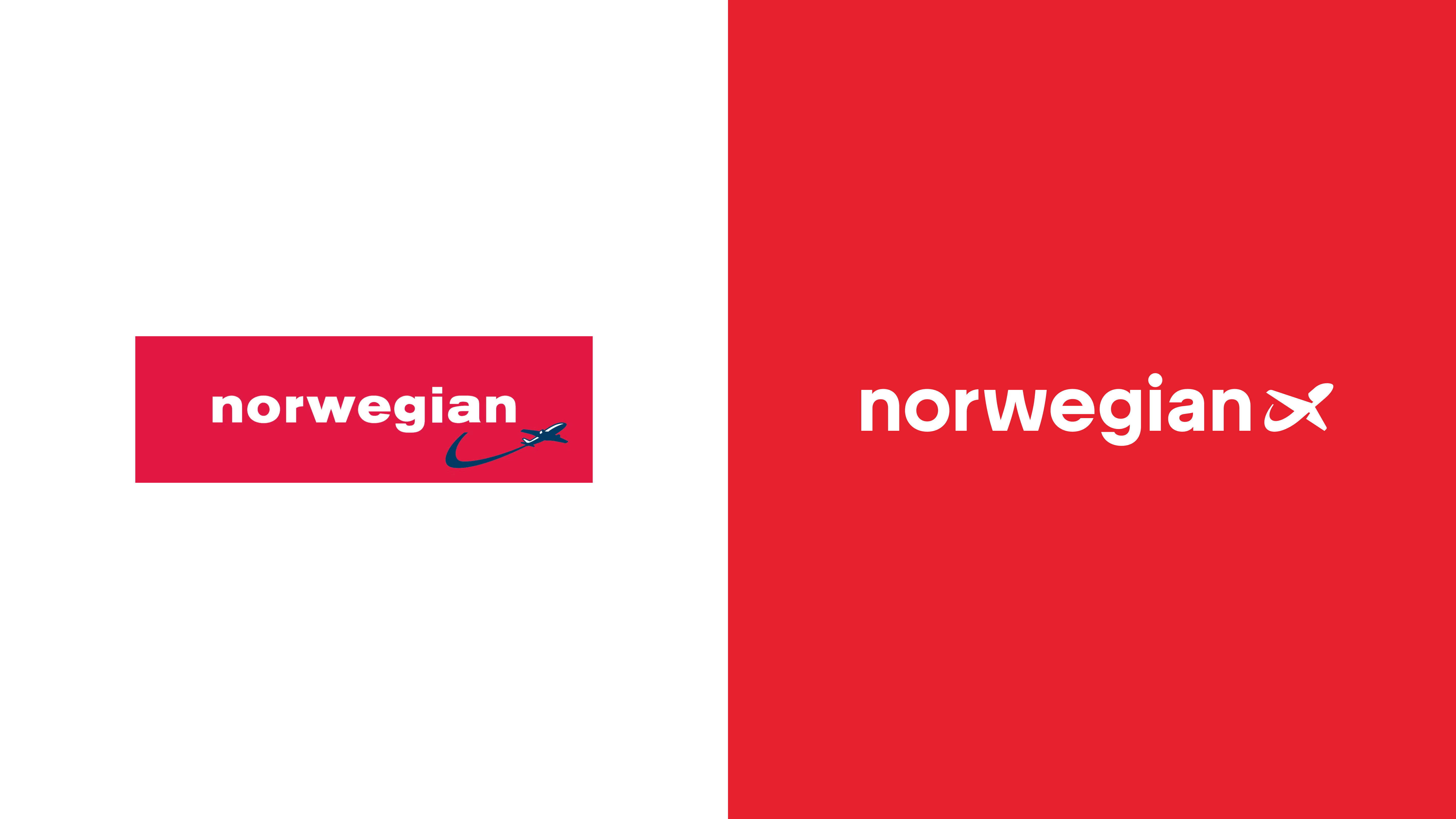
The updated logo retains the recognition of the original brand but has been refined to align with this new philosophy. The stroke is simplified, spaces are opened, and the whole breathes a visual clarity that reflects the Scandinavian values of precision and transparency. The red, blue, and white of the Norwegian flag remain as the chromatic base, but their application is more restrained, adapting to digital and physical environments with timeless elegance.
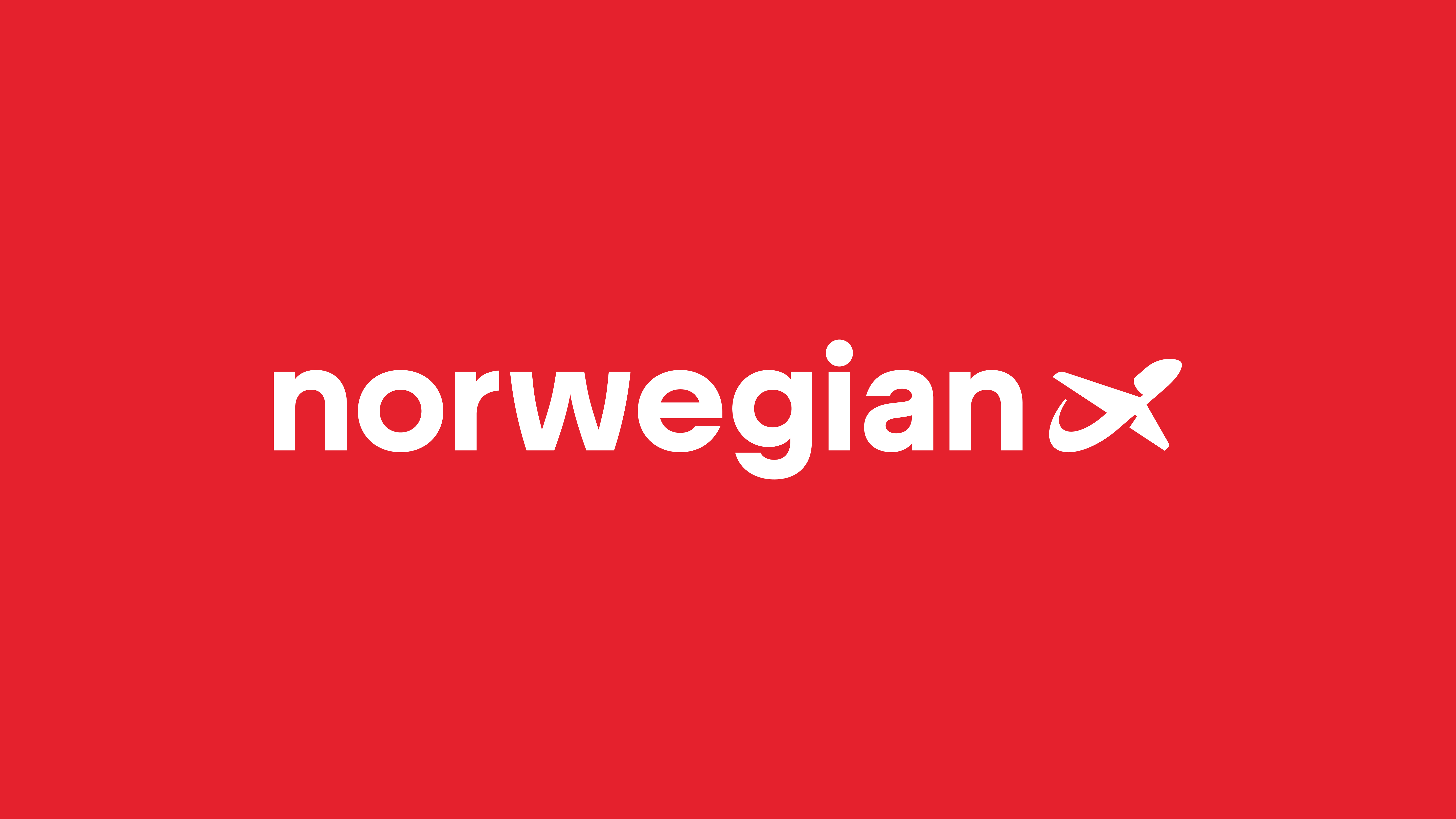
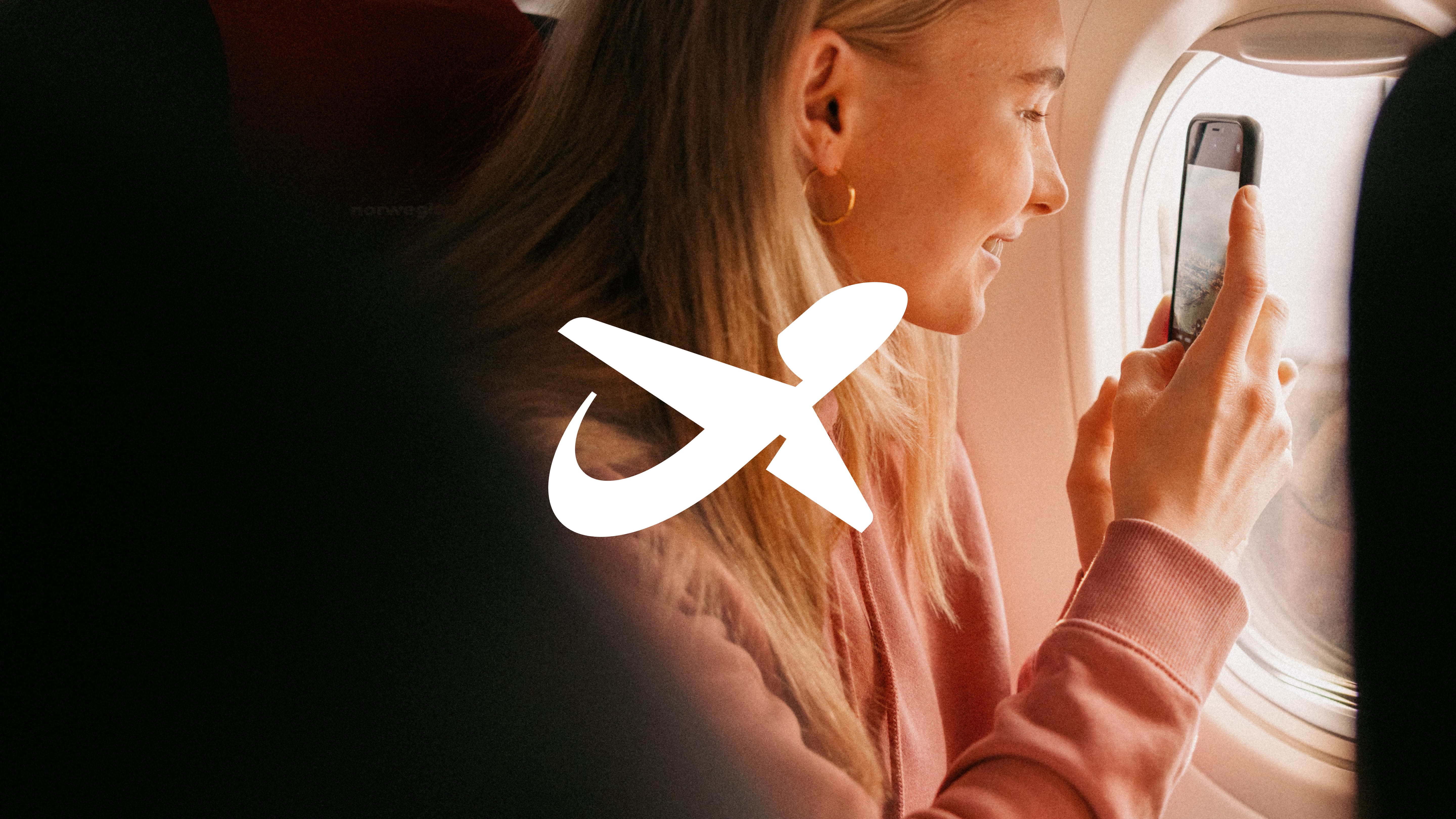
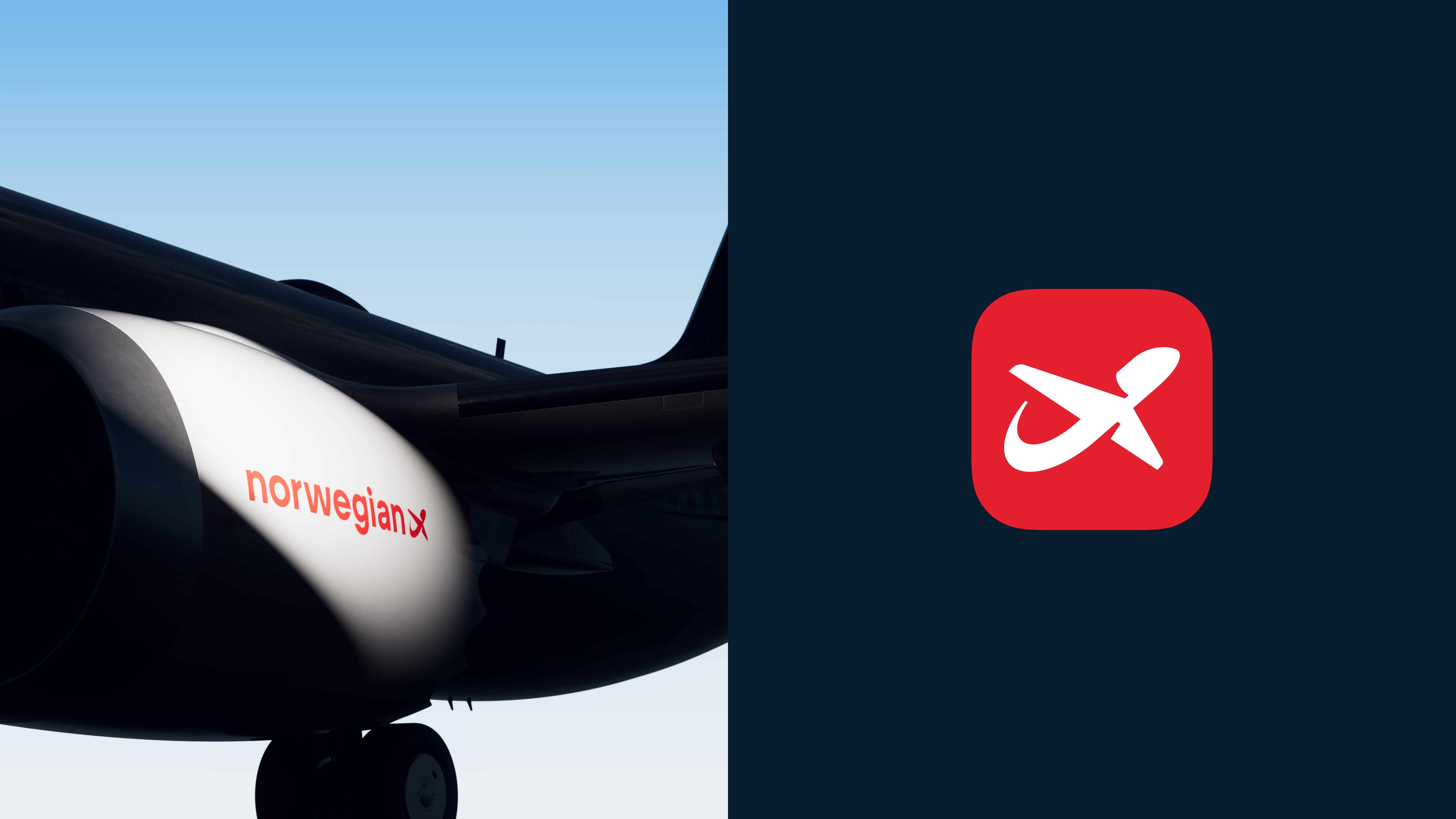
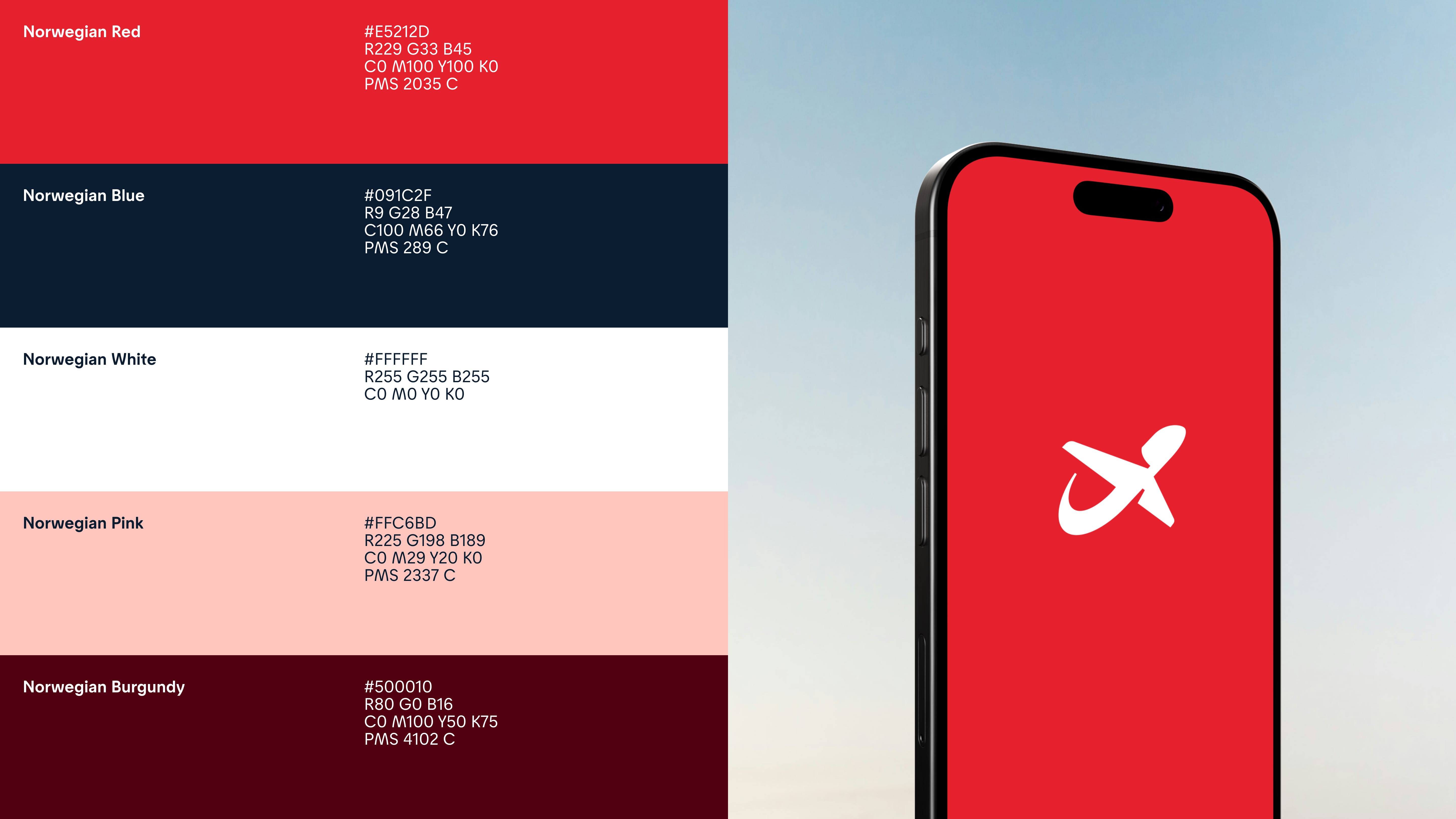
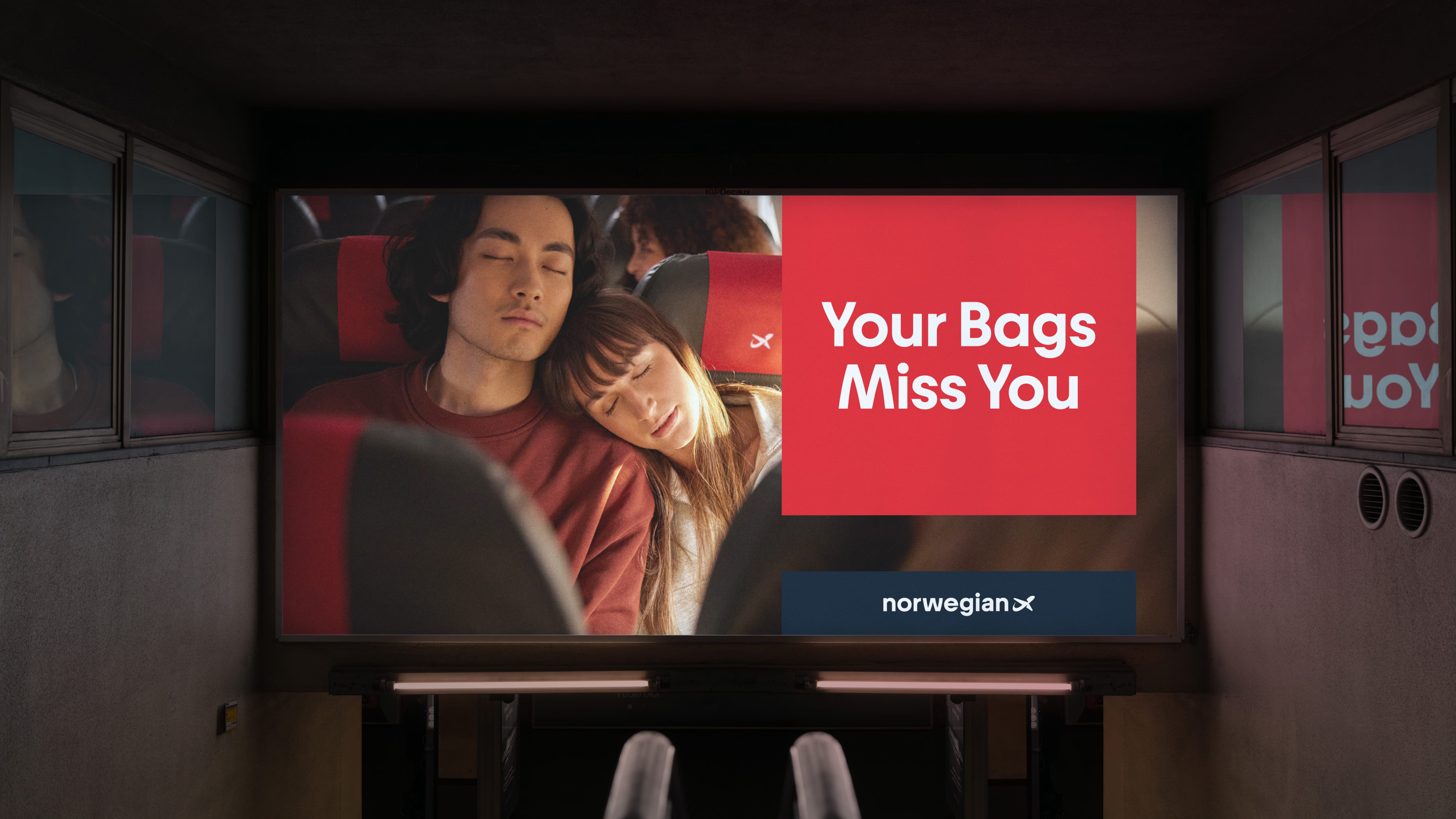
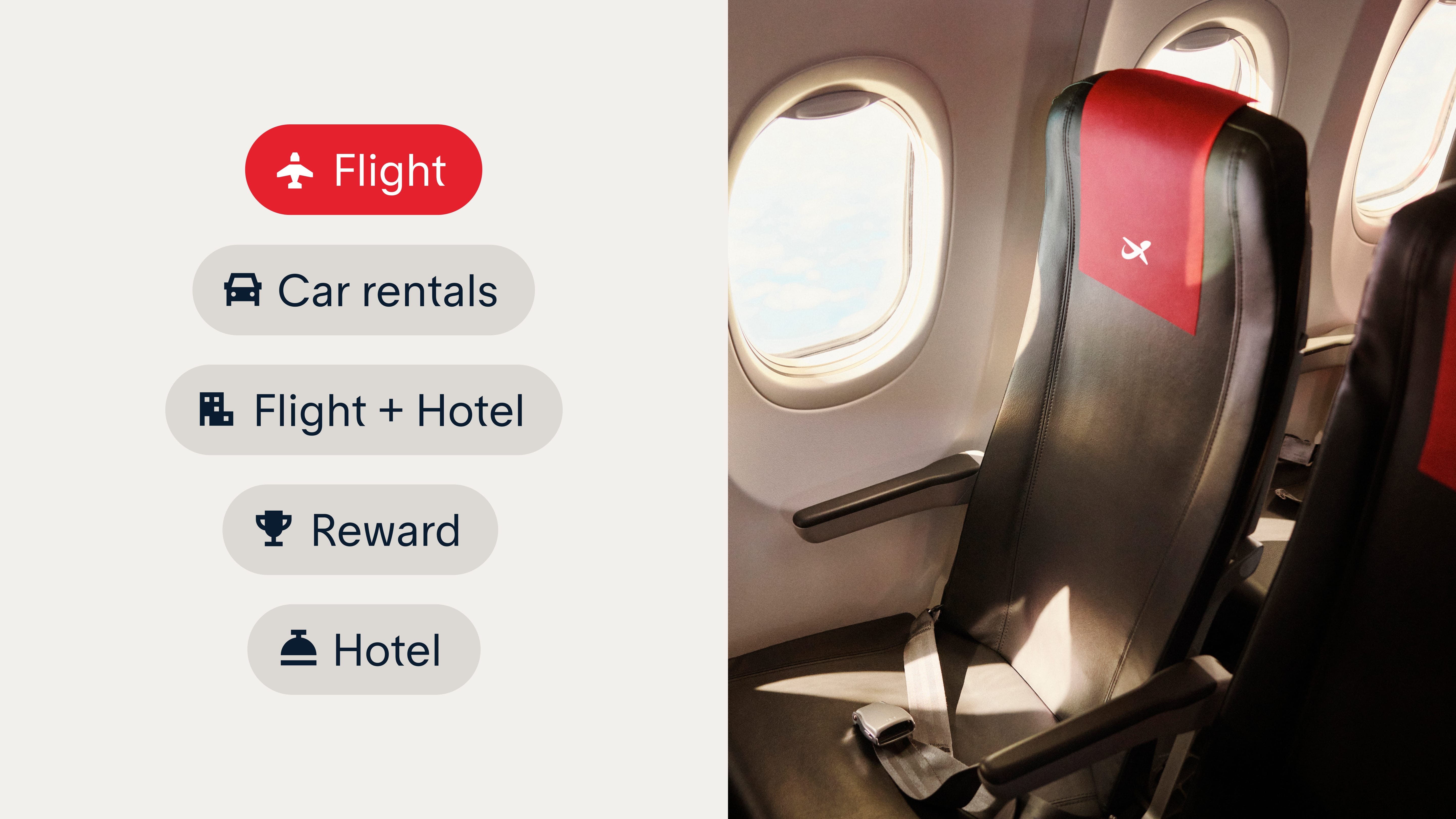
One of the great innovations is the introduction of a customized typography developed by Kanon Foundry, designed to reflect the clarity, simplicity, and warmth of the Norwegian visual language. This font, combined with a system of organic and expressive illustrations, reinforces the brand’s personality: down to earth rebel, a quiet rebellion that communicates closeness without losing professional rigor.
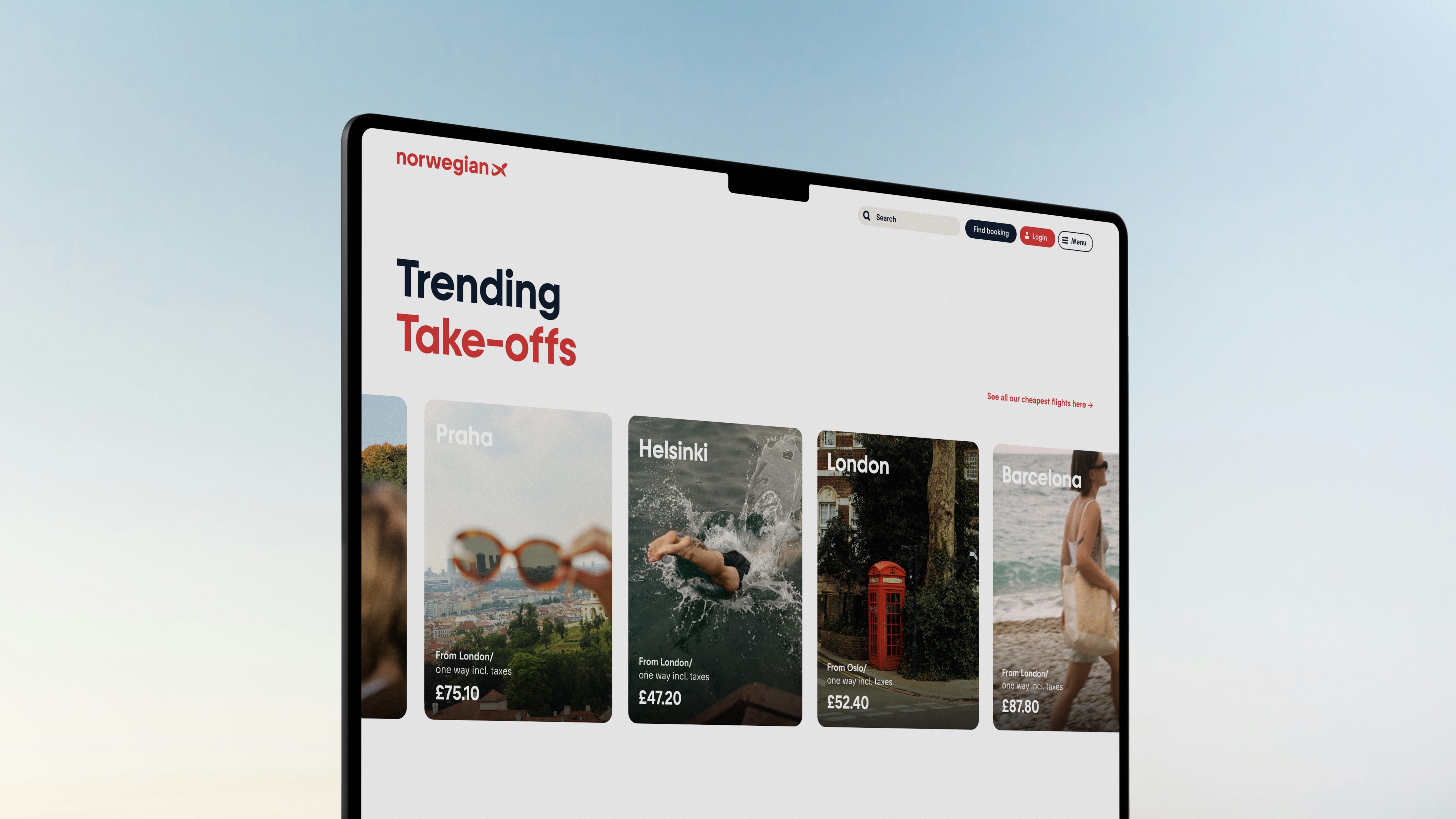
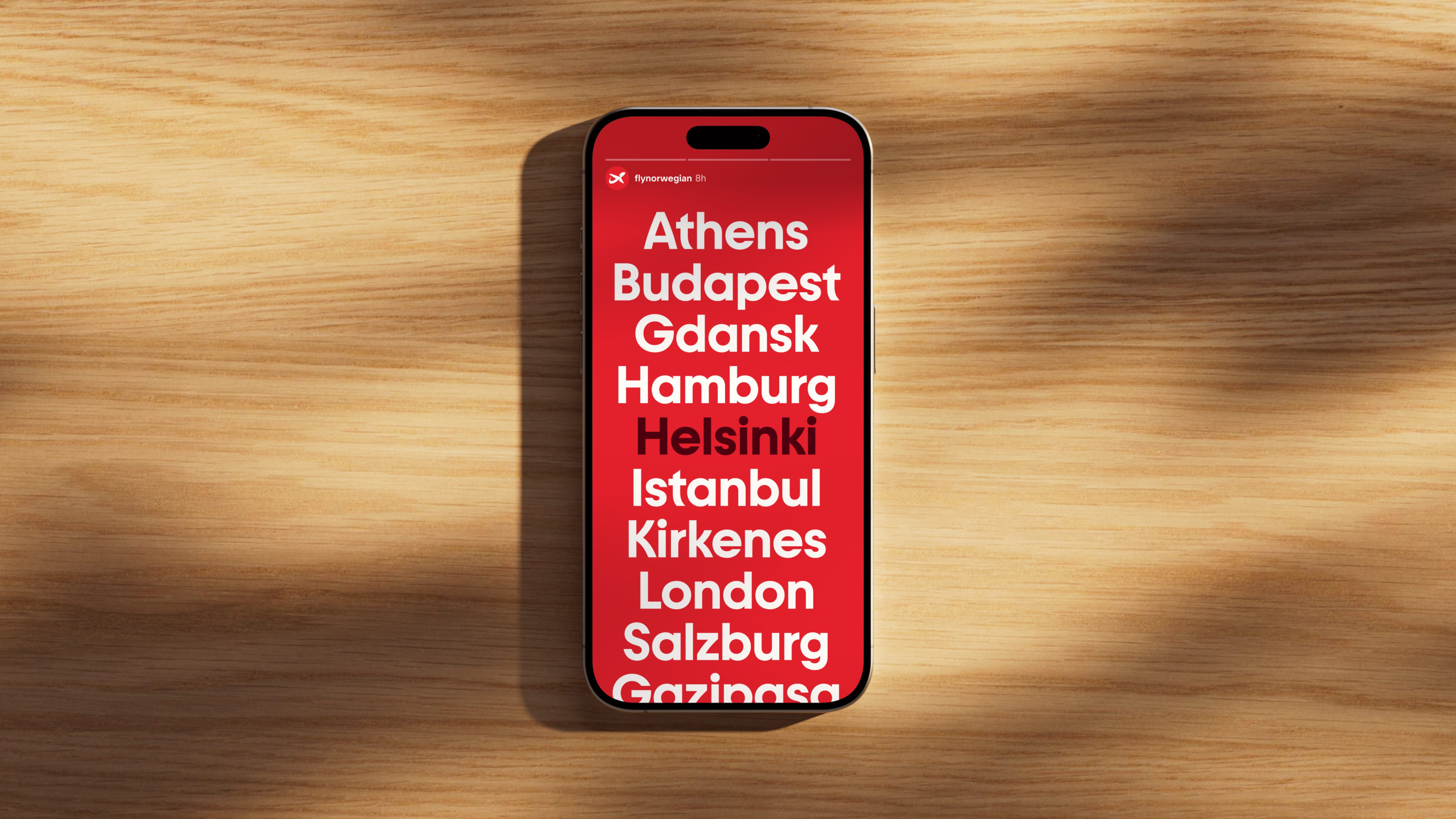
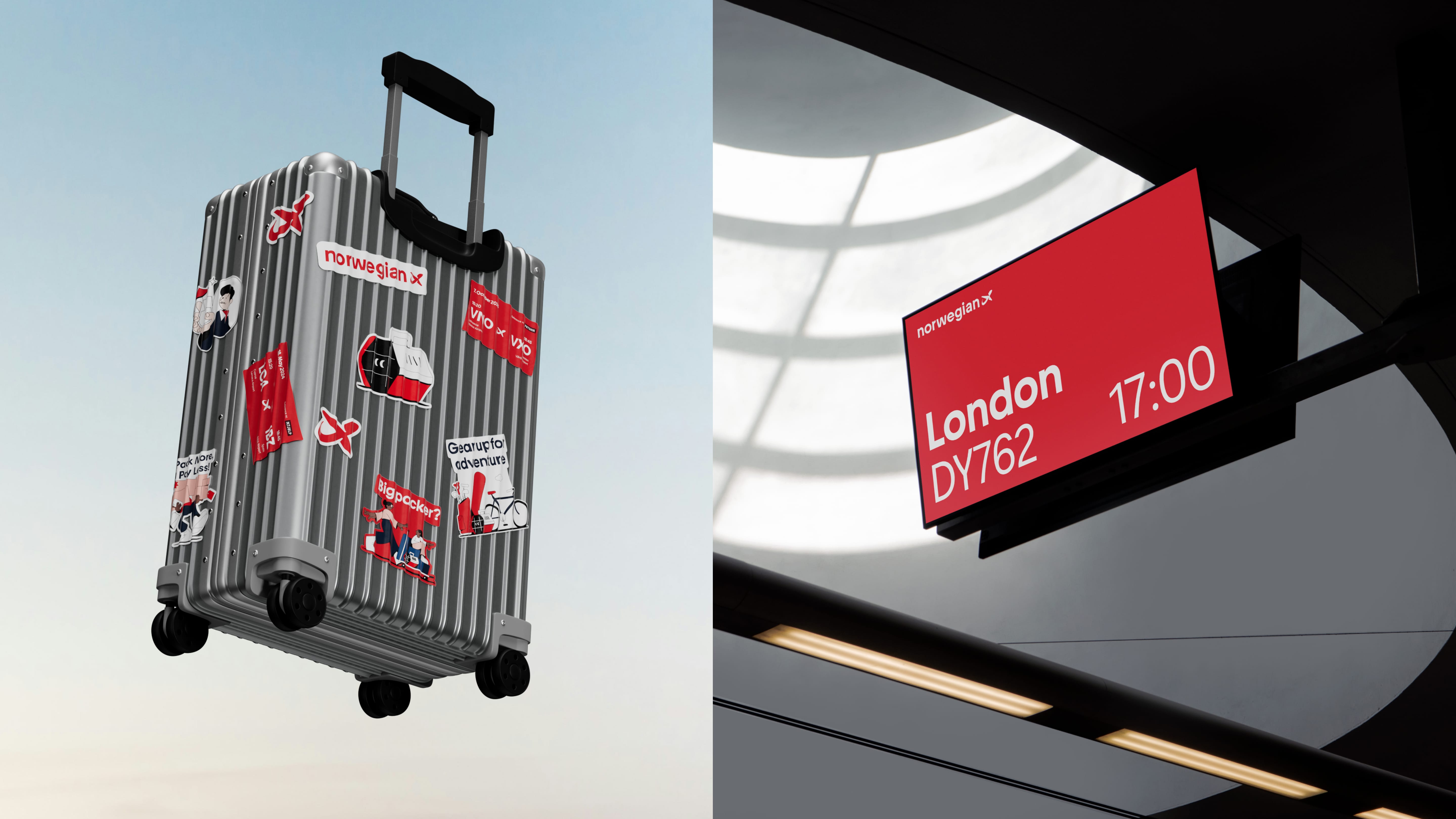
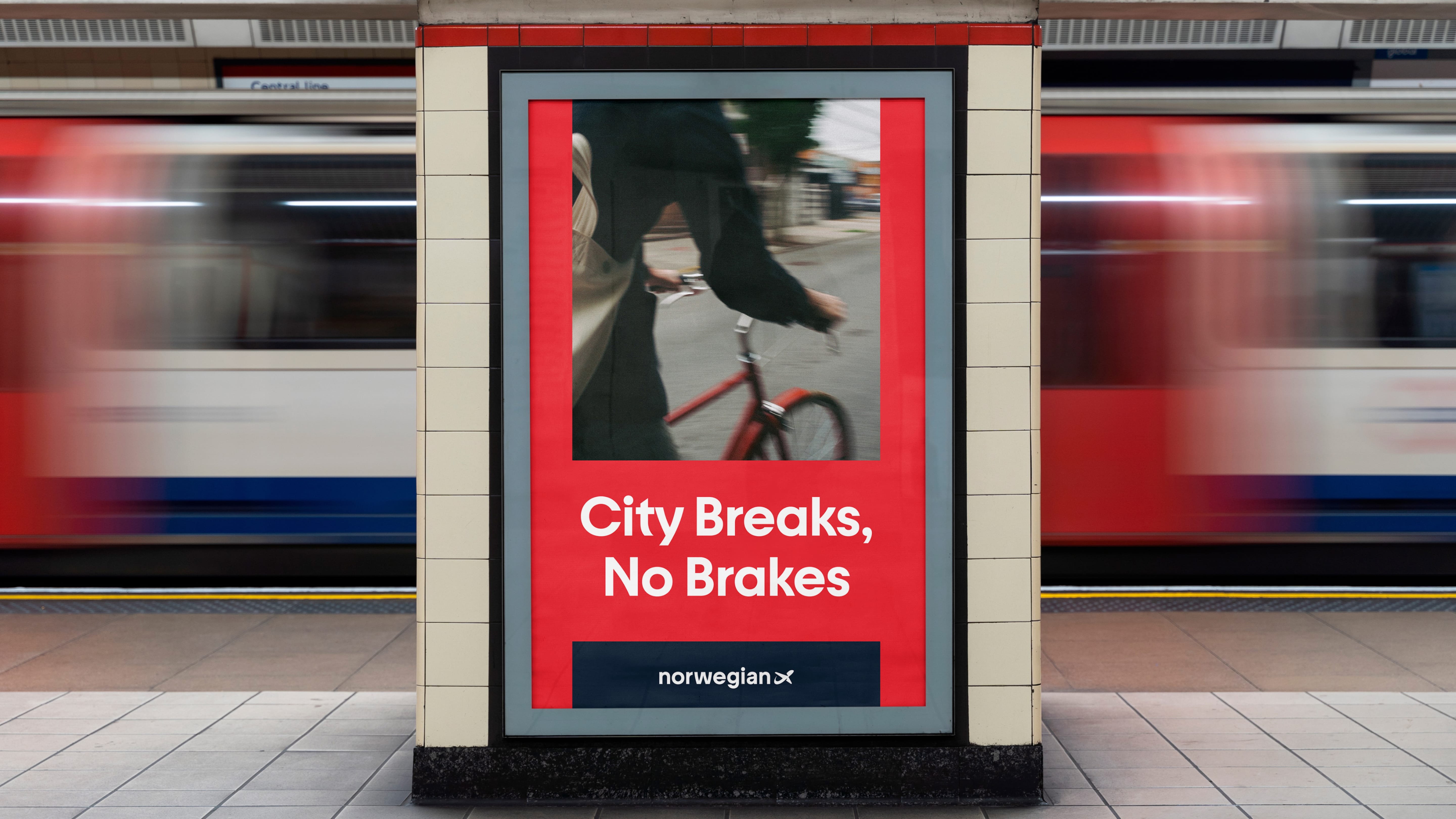
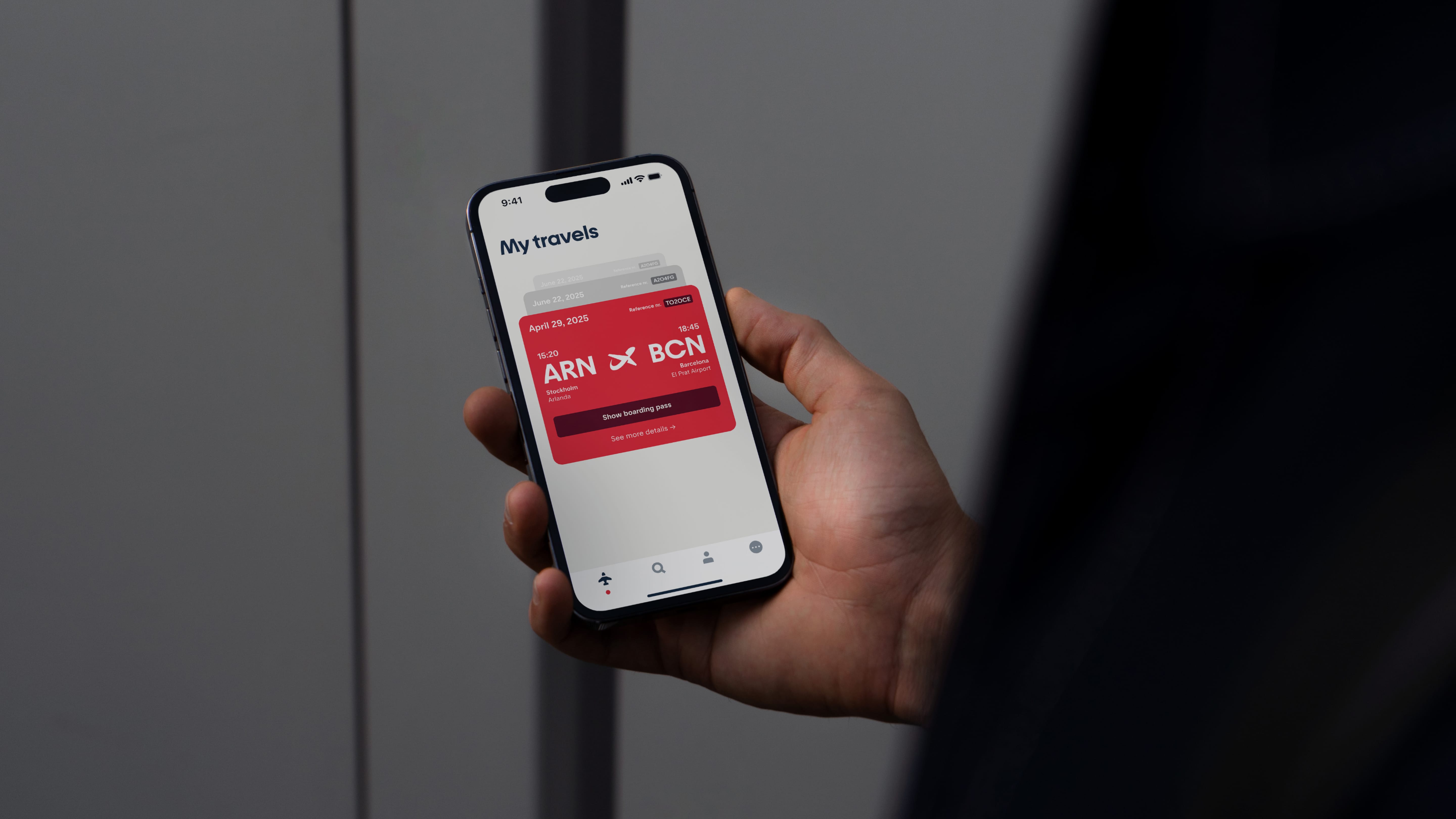
The visual system has been conceived as flexible and coherent, capable of adapting to multiple platforms—from airport signage to mobile applications—and coexisting with previous elements on aircraft fuselages. Every touchpoint maintains the same voice: accessible, modern, and conscious. In the words of the designers, “it’s not just about flying, but flying with purpose.”
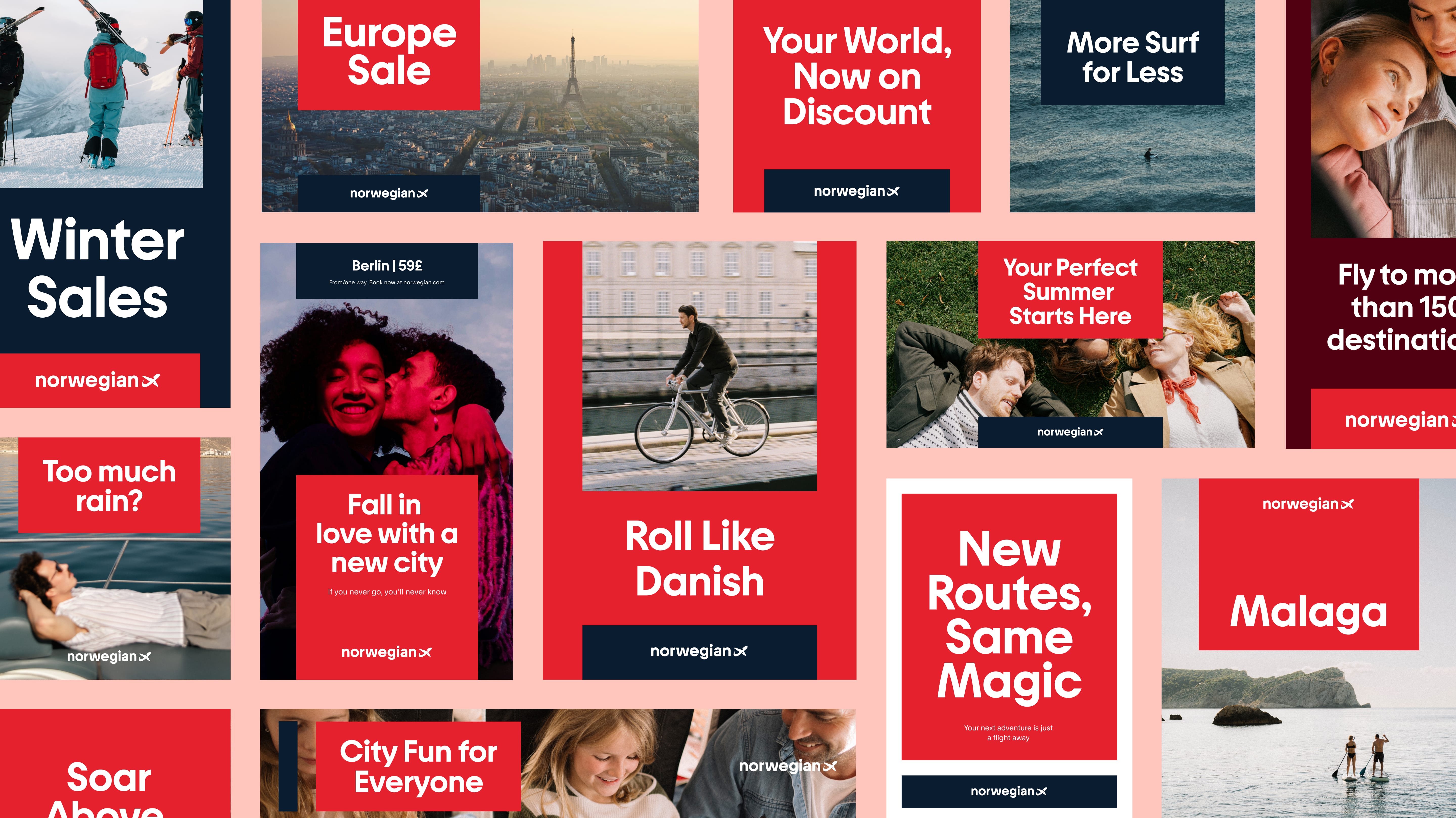
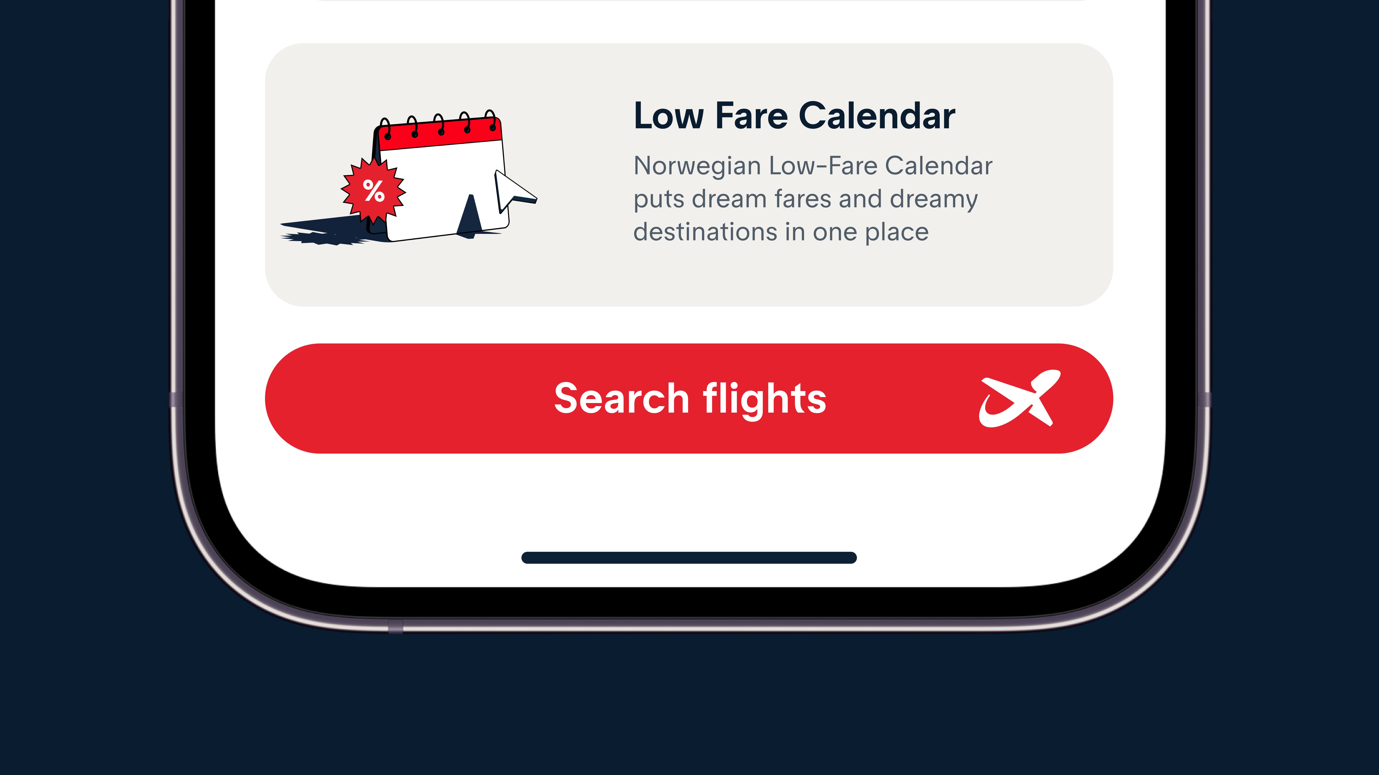
The jury highlighted how the redesign redefines the identity of a national airline without breaking with its legacy, balancing cultural heritage and international ambition. It is a lesson in how corporate branding can evolve towards empathy without losing consistency, achieving a brand that feels as contemporary as it is enduring. Norwegian thus ceases to be just another airline, becoming a symbol of modern Scandinavian design applied to the global brand experience.
https://awards.europeandesign.org/winner/261176
Binde. 100–10 — Alexey Murashko
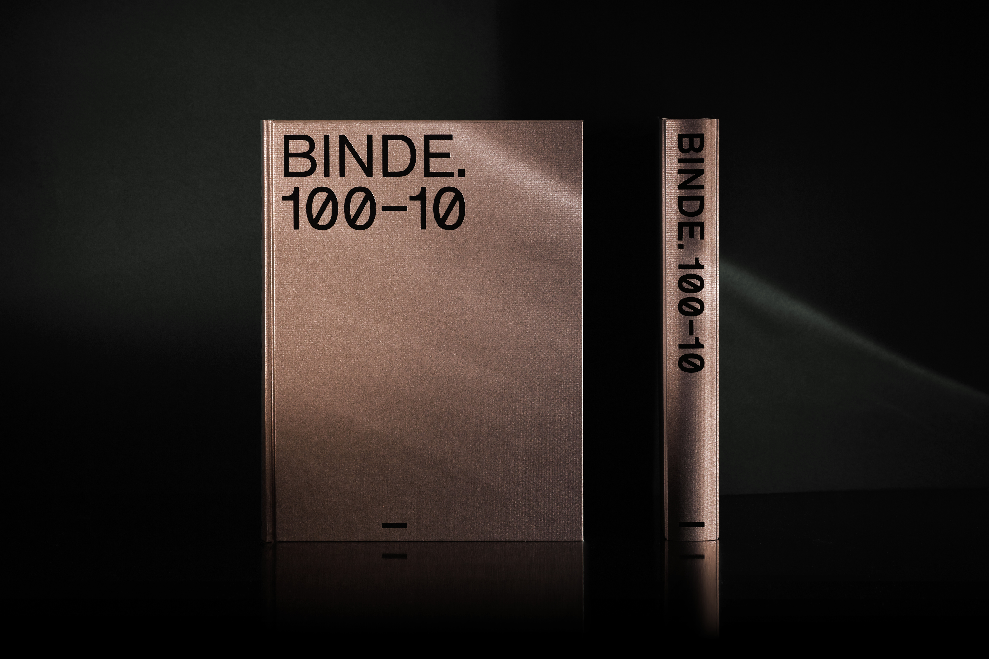
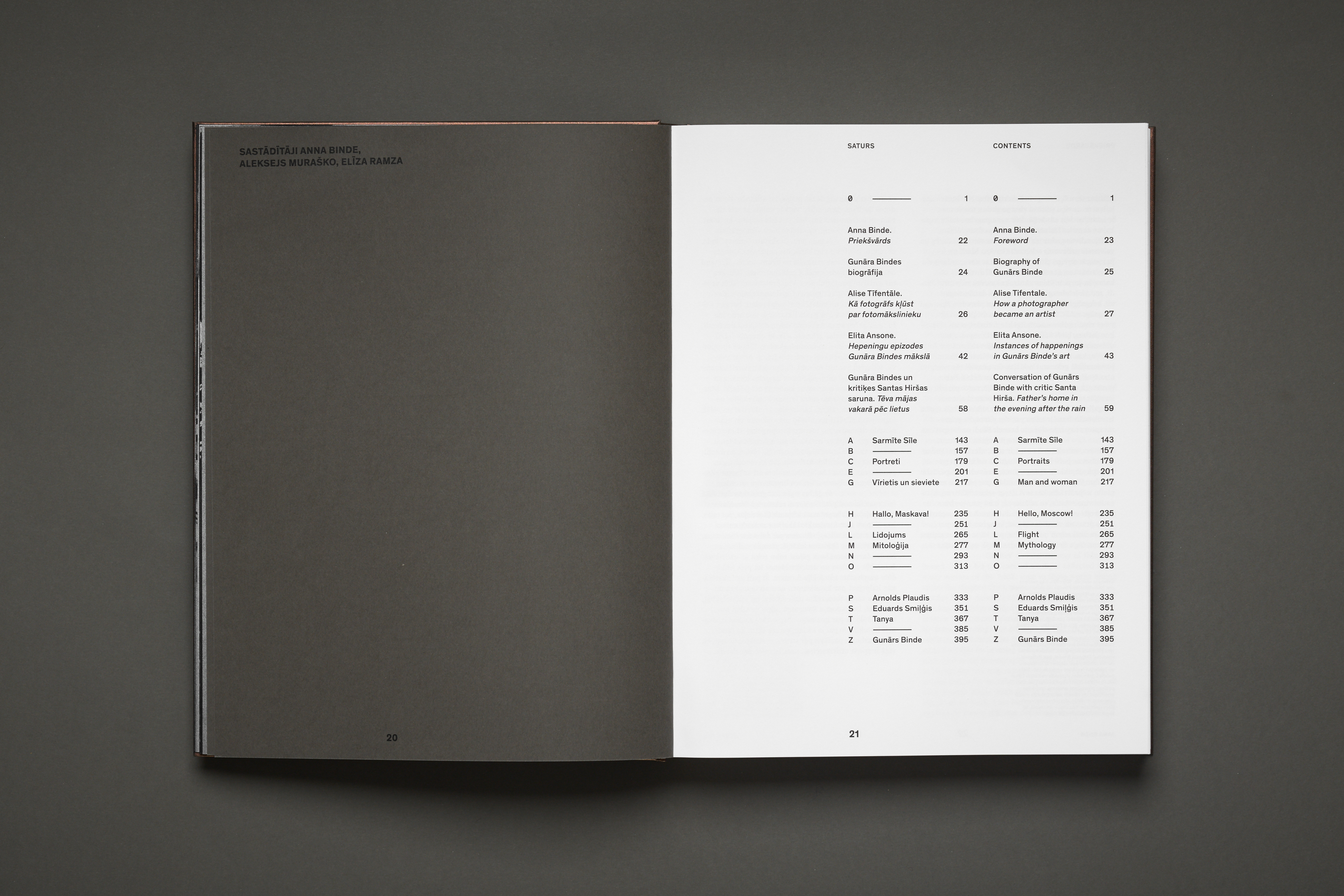
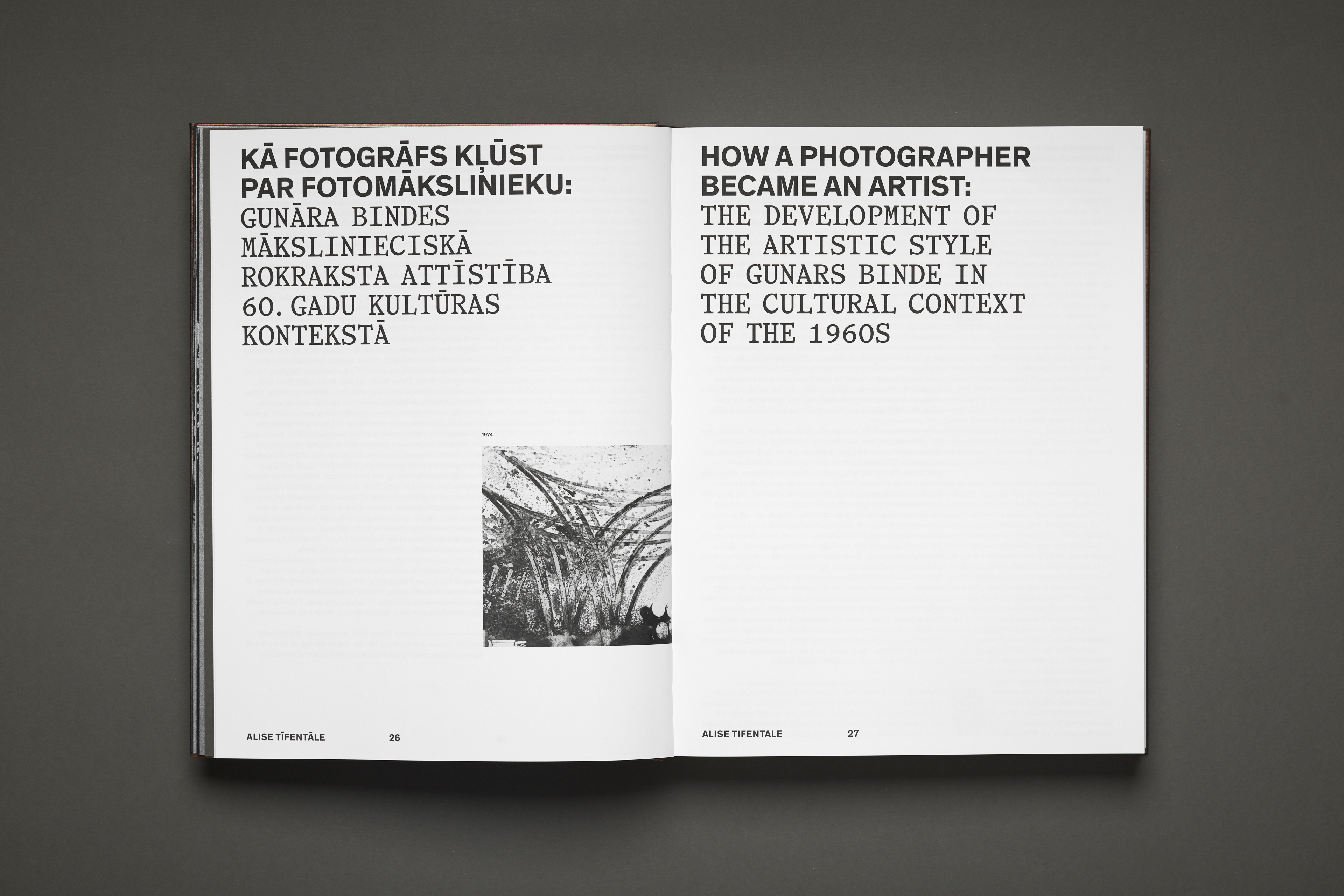 Winner of the Gold Award 2025 in the category Artistic Catalogue, the project “Binde. 100–10” by Alexey Murashko is a monumental editorial work that celebrates the career of Latvian photographer Gunārs Binde, one of the most influential names in 20th-century European photography. The publication, conceived as a living tribute, combines structure, materiality, and visual narrative to construct a multifaceted portrait: that of the artist, his time, and his vision.
The book was created to mark Binde’s 90th birthday and includes a vast selection of his photographs, critical essays, and unpublished interviews. Faced with an overwhelming amount of material, Murashko opted for a design solution that organizes the content into five sections, structured with clarity and physical rhythm. Each block is separated by gray signatures printed on heavier paper, making the transition from one section to another a tactile, almost cinematic gesture.
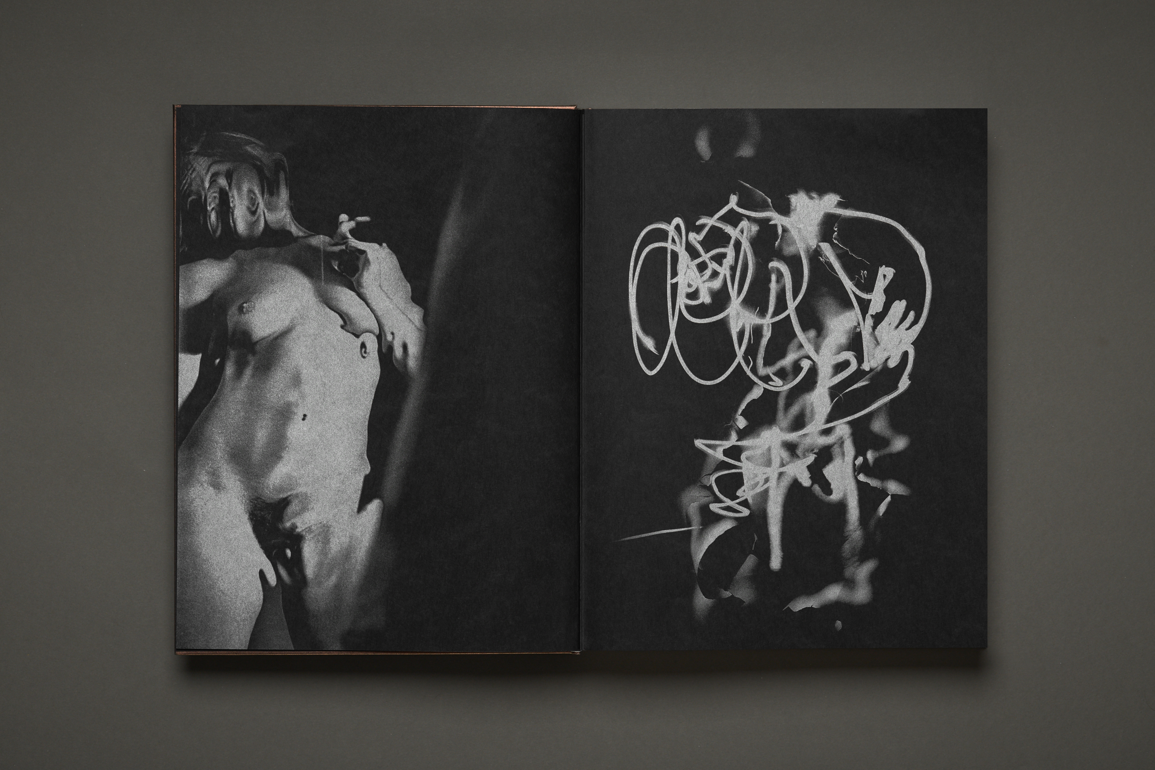
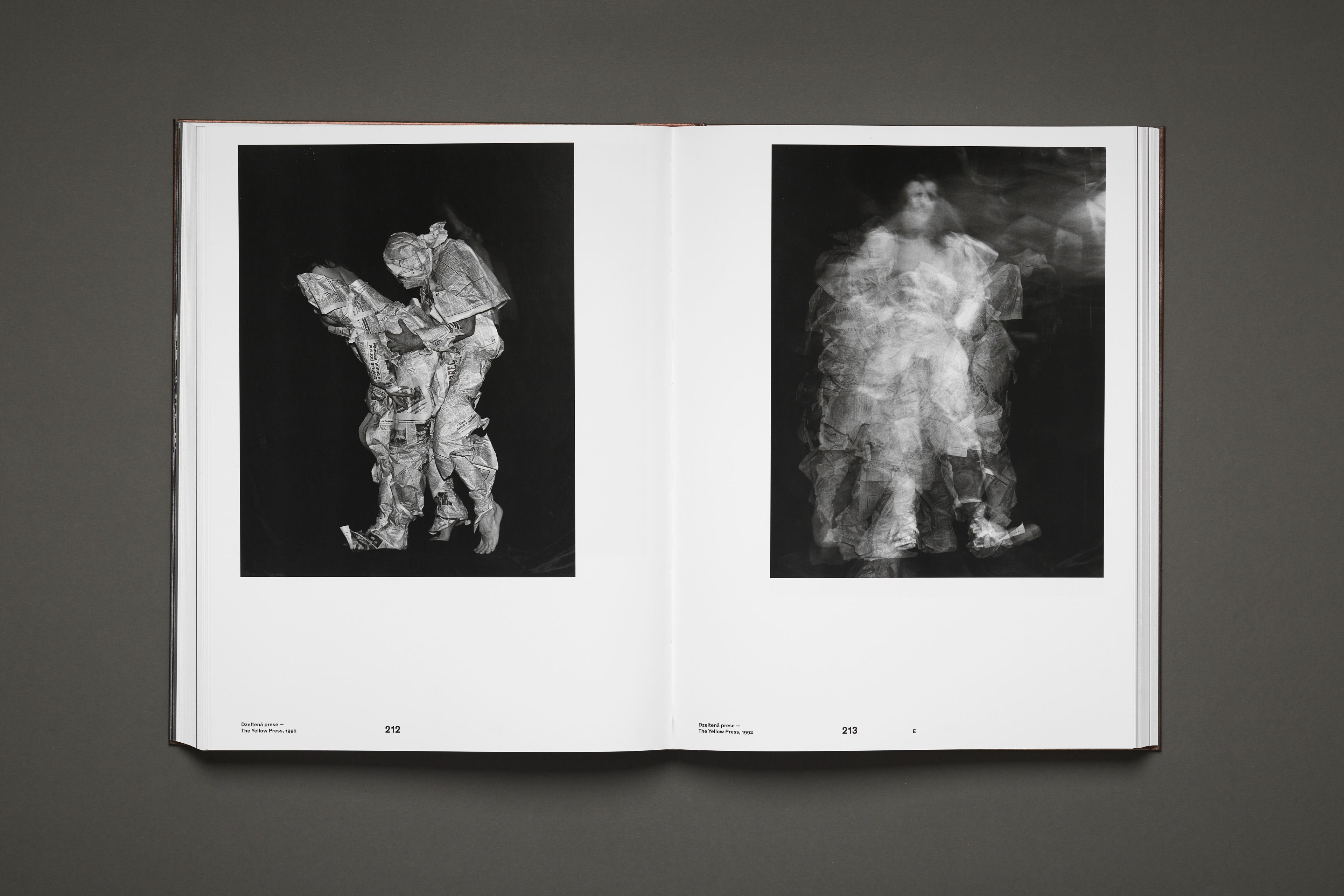
The work opens with a series of photographic experiments printed in silver on black paper, a poetic nod to the photosensitive substances that gave birth to analog photography. This decision is not only technical but conceptual: it places Binde’s work in dialogue with the 21st century, highlighting its relevance and its ability to reinvent itself over time. Many of these images had never been published before, adding an air of discovery to the volume.
The three main sections are constructed as a visual narrative in three acts: “The Known Binde”, dedicated to his famous portraits, nudes, and erotic photographs; “Myths and Moments”, a symbolic exploration of ideology, religion, and the tensions between power and nature; and “Inner Circle”, which gathers personal portraits, self-portraits, and intimate scenes that reveal the artist’s most human side. Each series is identified with Latin letters —an open structure suggesting the possibility of future editions and continuations of the archive.
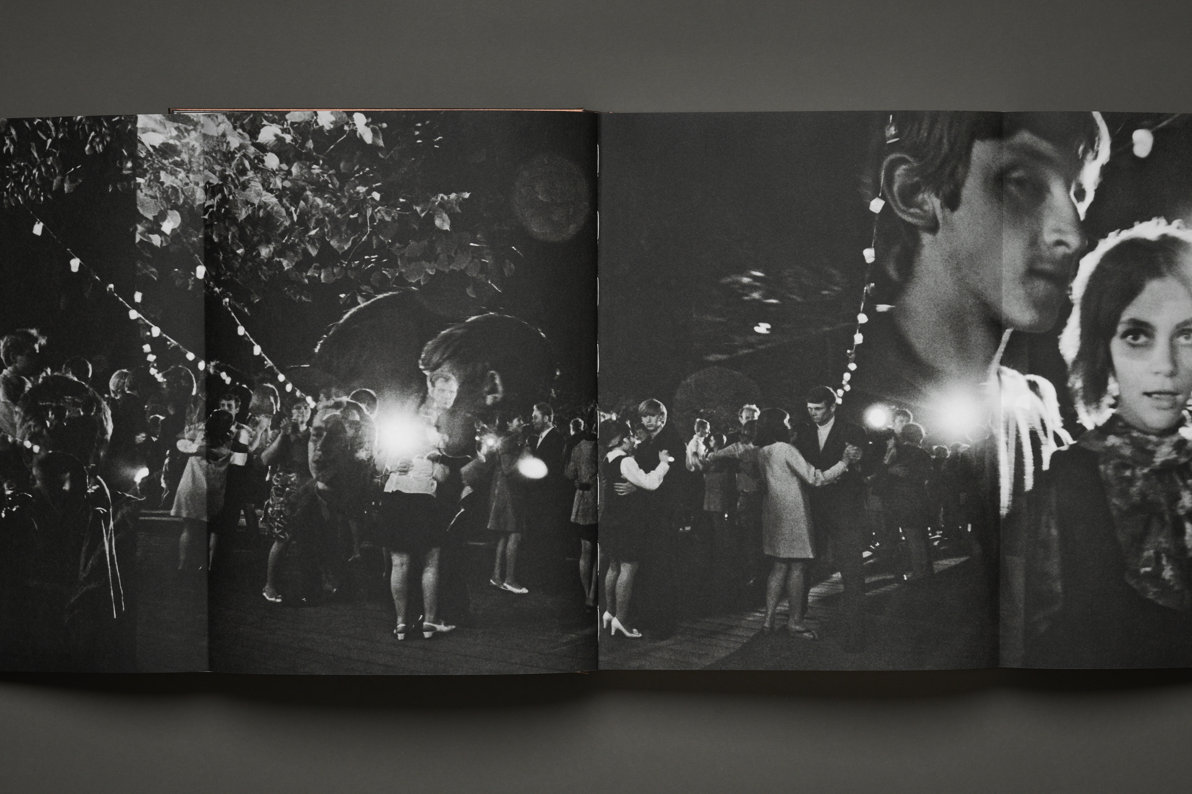
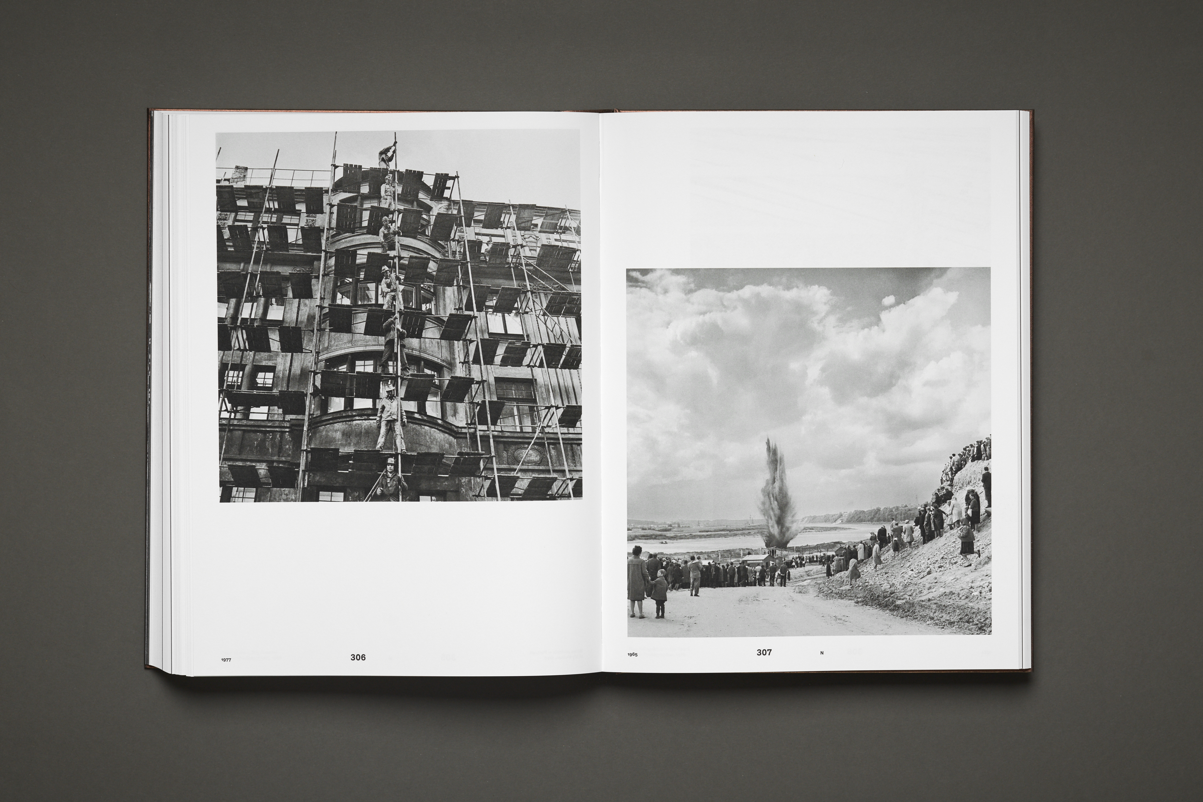
The editorial design combines technical rigor and material sensitivity. The textual and essay sections are printed on uncoated paper with double high-density black ink, enhancing readability and the tactile relationship with the image. In contrast, the photographic sections use four-color process on coated paper with glossy varnish, achieving an extreme contrast reminiscent of the silver photocopies so characteristic of Binde’s style. The entire volume was printed with stochastic screening, a technique that offers exceptional definition even in miniatures, without visible screen patterns.
The result is much more than a catalog: it is a printed sculpture that balances weight, proportion, and texture to pay homage to an artist whose work always oscillated between irony and sensuality. As the editorial team states, “Binde. 100–10 not only documents a career but reinterprets it from a contemporary perspective, transforming memory into living matter.”
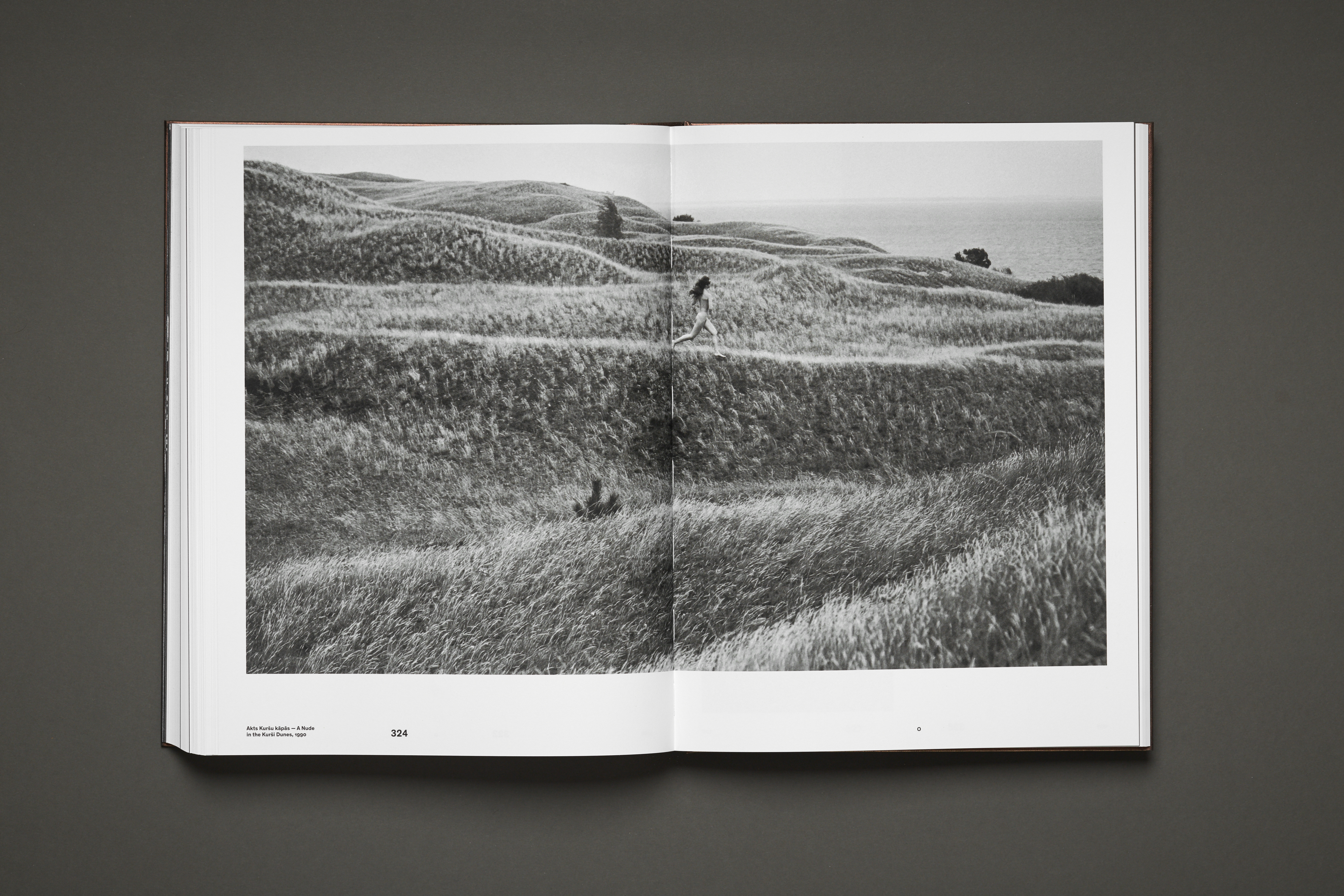
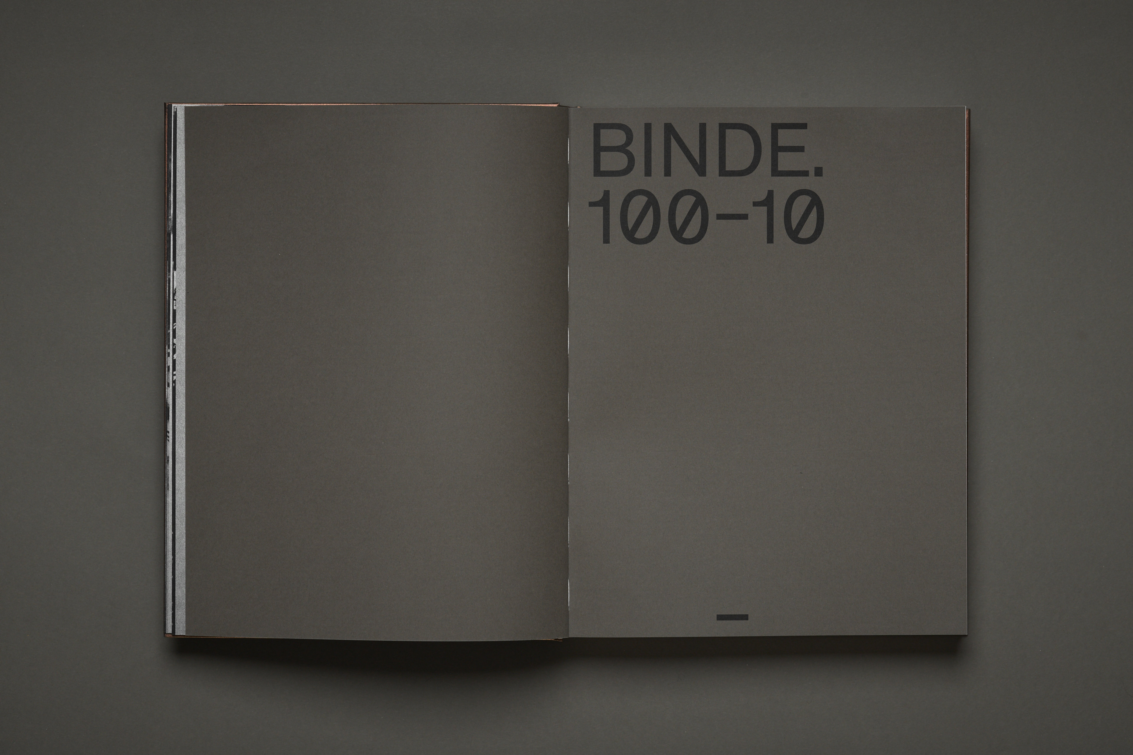
The jury praised its technical and conceptual mastery, highlighting how each design decision—from paper to typography—serves the photographic narrative. This project demonstrates that editorial design remains one of the most powerful languages for narrating art: a space where form, content, and time converse with the same precision as light in a darkroom.
https://awards.europeandesign.org/winner/261324
Google Sans Flex — Studio Dumbar/DEPT®
Winner of the Silver Award 2025 in the category Typographic Applications, the project “Google Sans Flex — Pushing the Boundaries” by Studio Dumbar/DEPT® represents one of the most exciting collaborations between design, technology, and contemporary typography. Commissioned by Google Design, the Dutch studio explored the expressive possibilities of Google Sans Flex, the tech giant’s new variable font, in a series of visual and auditory experiments that challenge the limits of graphic language.The project is developed under a central concept: “Action and Reaction”. Each interaction with the typography generates a unique response—a change in weight, color, movement, or even sound—that tests the font’s flexibility and its potential as a dynamic system. Far from being limited to a technical demonstration, Studio Dumbar’s work turns typography into a living organism, sensitive to context and the intention of the message.
The result is an immersive visual exploration that demonstrates how variable technology can transform digital identity. Through animations, modulations, and typographic transitions, the team created a constantly mutating language, where letters behave like matter in motion. Each piece of the project is a study on the relationship between form and response, where typography ceases to be static and becomes an interactive experience.
This experimentation also had a sound dimension: by associating visual changes with auditory stimuli, the studio generated a multisensory system that reinforces the idea of action and reaction. Typography, therefore, behaves like an interface, capable of communicating emotions and nuances more deeply. The jury highlighted precisely this ability to transcend the traditional function of the letter and explore new forms of visual narrative.
The work of Studio Dumbar/DEPT® synthesizes decades of research on typographic movement, digital identity, and graphic animation. Their interpretation of Google Sans Flex demonstrates that the typography of the future will not only be legible but also reactive, adaptable, and emotional. This vision aligns with Google Design’s philosophy, which seeks to expand the role of design as a bridge between communication and technology.
Beyond the typographic laboratory, the project poses an essential question for contemporary design: how can a font become an experience? The answer lies in this work, which not only pushes the boundaries of typographic design but also those of creative thinking. In their own words: “Flex is not just a typeface. It’s a conversation between what we say and how we show it.”
Before refreshing your brand identity
We analyse your current identity, website and communication materials to identify where design can improve perception, coherence and conversion.
Conclusion: design as the language of the future
If there is something that unites these ten projects, it is their ability to look beyond form. Each one, from its context and discipline, demonstrates that graphic design is not just an aesthetic matter but a way of thinking about the world. Whether it’s a social campaign that challenges perceptions, a visual identity that connects generations, or a typography that reacts to sound, design remains a tool to interpret, connect, and transform.
At a time when automation and artificial intelligence seem to occupy every space, these projects remind us that the essence of design remains human: empathy, intention, and the ability to tell stories with soul. Technology extends our hands, but it is sensitivity that gives meaning to the result.
The future of graphic design—the one we are already building—will be more hybrid, collaborative, and conscious. It will not matter so much to master a tool, but to understand how an idea can generate real value for people and communities. And in that quest, the role of the designer is consolidated as a mediator between thought and emotion, between data and beauty.
At Code Barcelona we continue to believe that good design not only communicates: it evolves the visual culture of an era. These projects are a testament to that. They are signals of where contemporary creativity is headed and how design, at its best, remains a form of tangible hope.
More graphic design and branding inspiration
Discover our selection of the best graphic designs of 2026, examples of architecture logos, hotel identity design, and creative packaging. To plan a complete identity system, see how much a brand book costs. Our branding and web design studio in Barcelona connects visual identity with digital experience.