ForestWave has something most corporate identities promise but few deliver: presence beyond the PDF. This brand doesn’t just look good on paper—it comes alive at trade shows, on deck, in the office, on work bags, and across digital screens.
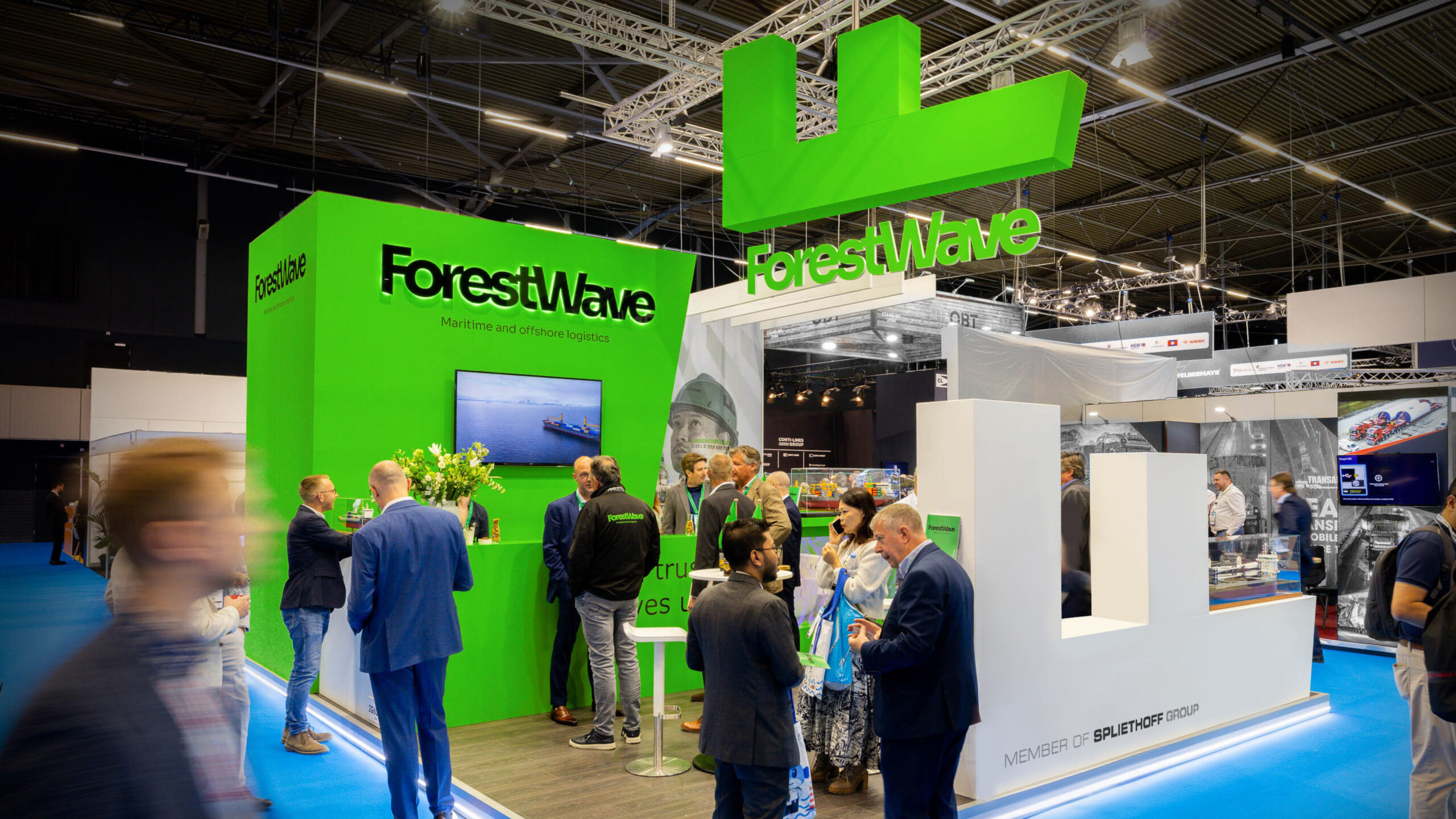
What’s remarkable isn’t just that a shipping company uses electric green—it’s how that green works: as a signal, a visual rhythm, a point of orientation, and a jolt of visual memory in an industry dominated by cautious blues and corporate greys.
The identity blends solid black, functional white, clean typography, and a direct composition. It doesn’t try to soften the maritime world or make it more approachable than it is. Instead, it faces it head-on, adding visual direction, contrast, and a more distinctive atmosphere.
This spotlight is about enjoying a B2B brand that understands a fundamental truth: coherence isn’t decoration. When an identity is applied thoughtfully across spaces, objects, fleet, and UX/UI, it elevates perceived value—no explanation needed.
A rebrand that goes beneath the surface
ForestWave operates in a world that rarely indulges in graphic excess: shipping, cargo, vessels, heavy industry. It’s a universe where brands often blur together, everything turning blue, grey, metallic, corporate, and cautious. Here, a bolder choice stands out: making color a code for recognition and letting the system breathe across real-world applications.
Green isn’t just a friendly accent—it’s the identity itself. It’s woven into the ship’s structure, printed materials, signage, interiors, work gear, and the digital experience. This measured repetition makes the brand memorable without creating visual noise.
The composition is also noteworthy: it doesn’t rely solely on clean branding pieces over neutral backgrounds. It alternates industrial scale, object detail, environmental photography, and everyday applications. This mix gives the case visual rhythm and avoids the feel of a static catalog. The brand looks like it’s working, not posing.
For B2B marketing leaders, the takeaway is clear: when an identity is applied consistently at every touchpoint, the company feels more organized, more solid, and easier to grasp. Not because there are more branded pieces, but because everything pushes in the same direction.
ForestWave — a shipping company with high-voltage visual presence
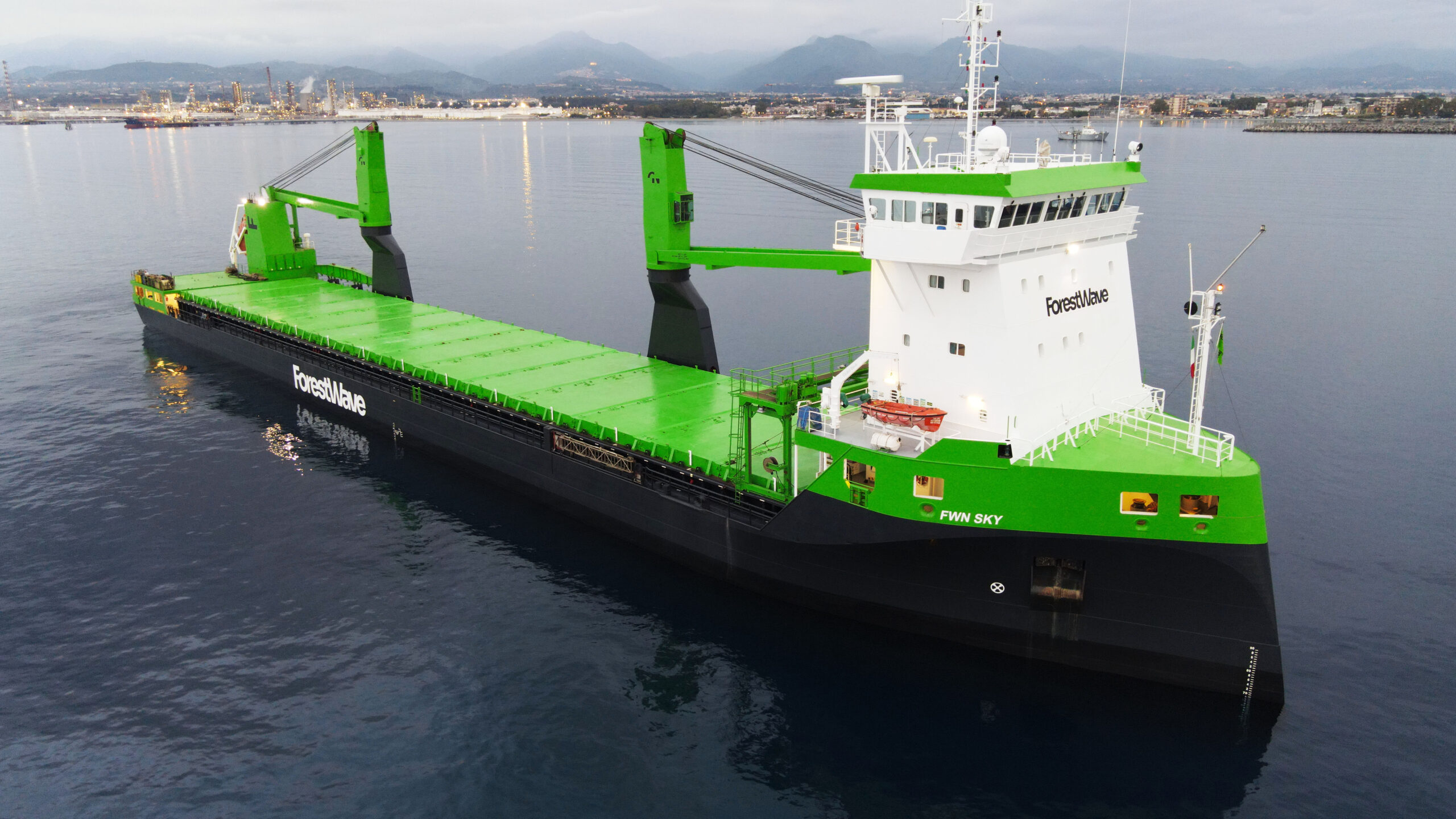
The ship itself is a visual statement: black below, white above, a fluorescent green streak cutting through the structure like a signature visible from afar. The identity isn’t just a logo on the side—it occupies volume, surface, and movement. For a shipping company, that makes perfect sense. The brand is never static; it sails, docks, passes other ships, appears in changing environments, and needs to be instantly recognizable.
The palette creates a powerful tension. Black adds weight, white cleanses, and green breaks the sector’s sobriety without making it childish. It’s expressive but not whimsical. Energetic yet disciplined. This combination creates a pragmatic, almost anti-ornamental atmosphere—ideal for a company that needs to project reliability without blending in.
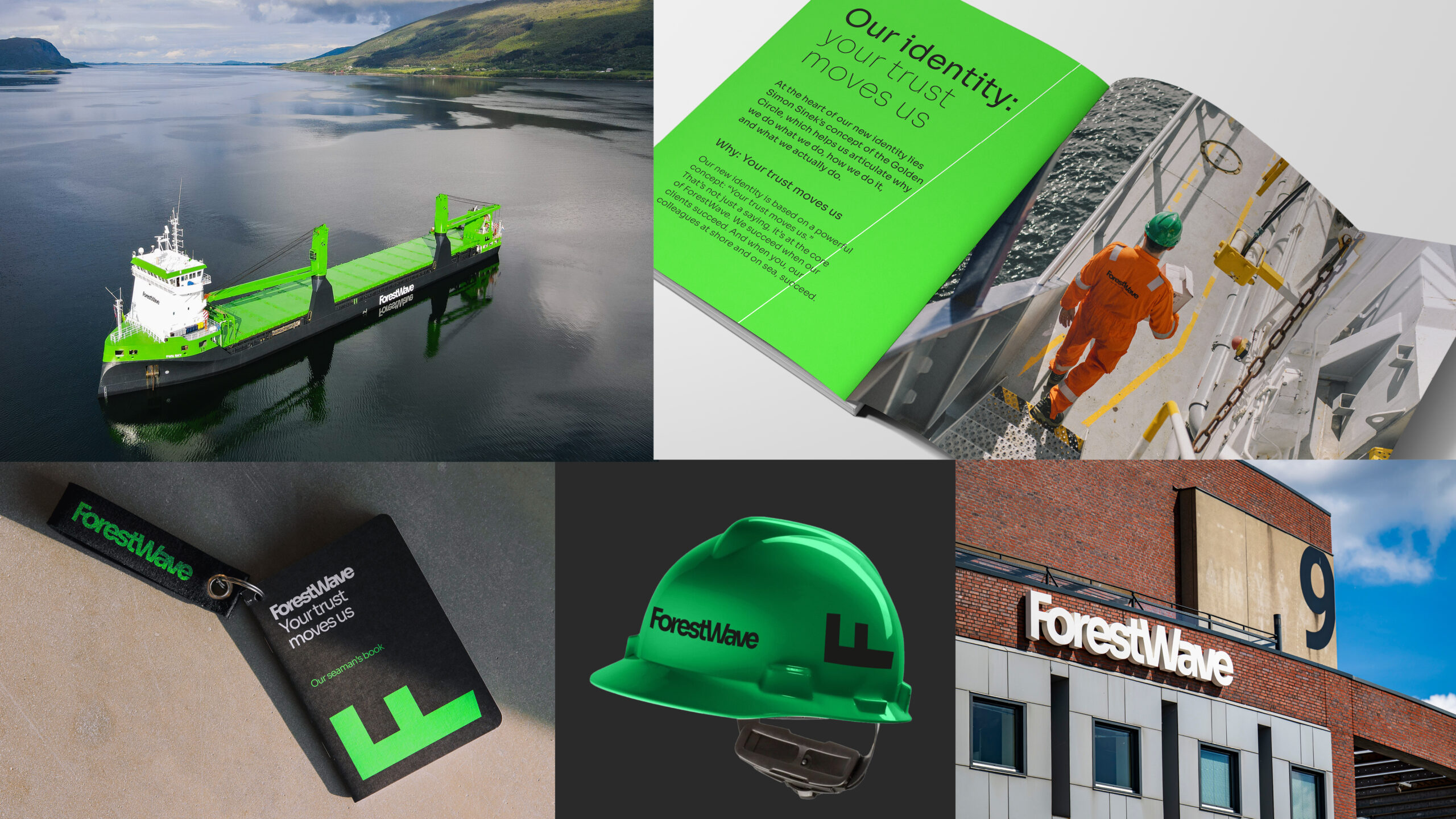
One of the strengths is how the brand is presented around people—not just machinery. Maritime sectors can quickly feel cold if everything is about tonnage, routes, or infrastructure. Here, the system makes room for the team, for human scale, and for a more relatable narrative without losing impact.
Typography reinforces this clarity: black, robust, free of unnecessary flourishes. It works on green, on white, and across a range of physical formats. In industrial branding, legibility isn’t just an aesthetic detail—it’s a functional necessity. A helmet, a bag, a façade, or an interface doesn’t get the same reading time as an editorial poster; the system needs to be immediate.
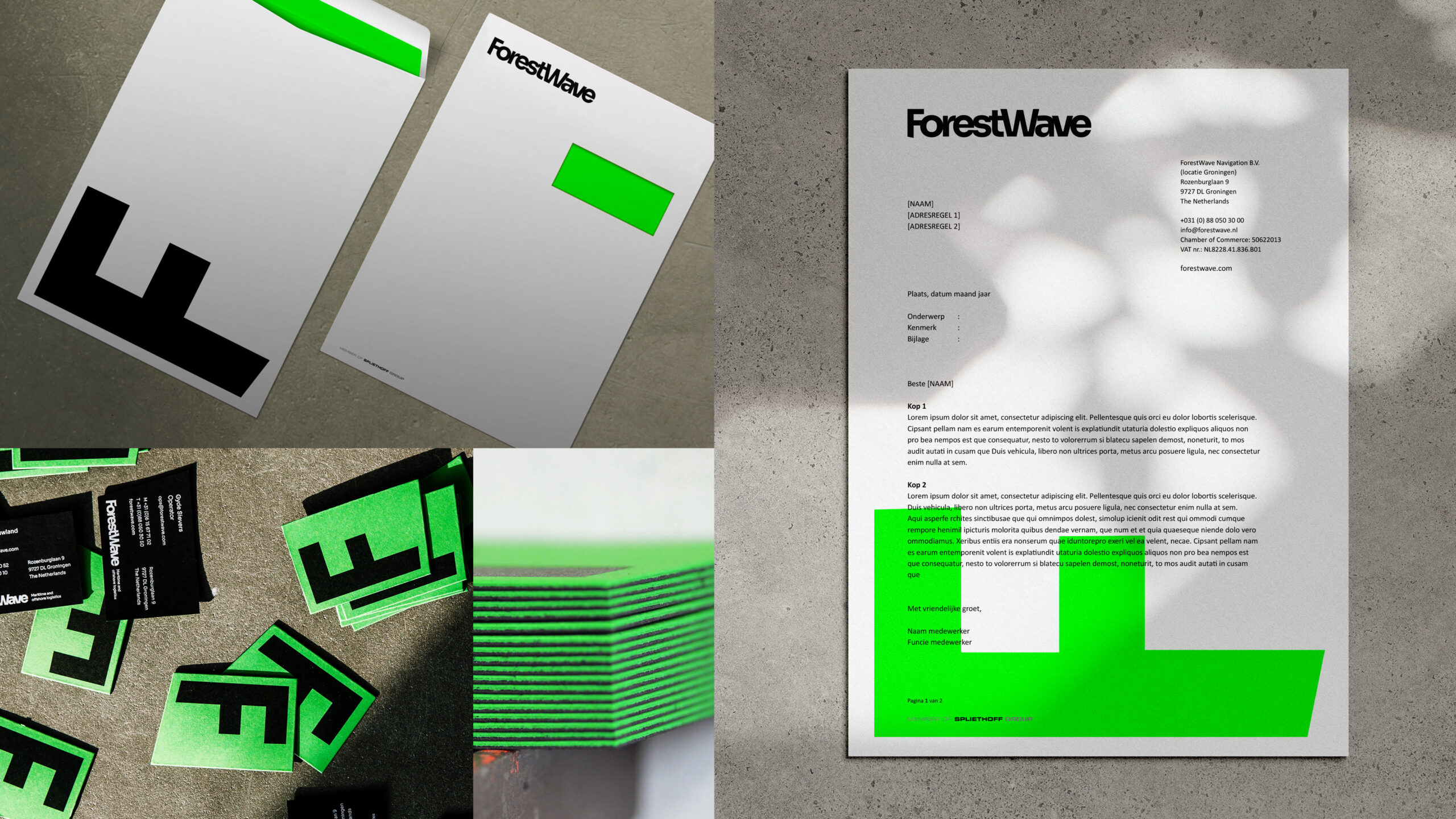
Color as a shortcut to recognition
ForestWave’s green works because it appears consistently, but not always with the same compositional weight. Sometimes it dominates the whole piece. Sometimes it’s a block, a stripe, or a secondary surface. Sometimes it becomes material—a bag, a helmet, a stand structure. This variety prevents fatigue and keeps recognition high.
Well-designed repetition doesn’t bore—it organizes. For brands with many applications, the visual system must act like infrastructure. Each piece should be distinct without breaking the identity. Here, the visual direction strikes the balance: rigid enough for recognition, flexible enough to adapt.
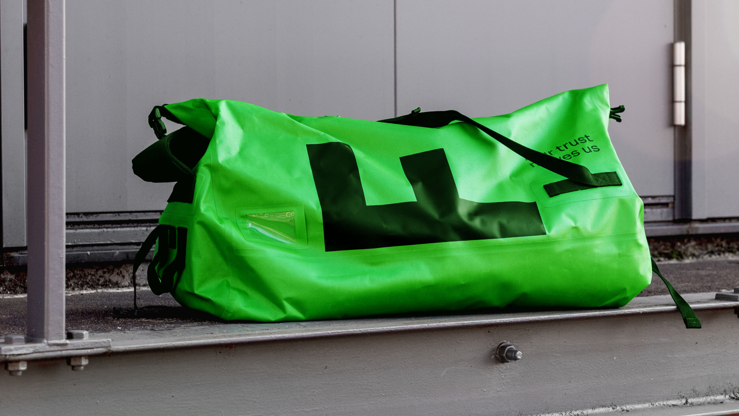
The green bag is a great example of identity applied without pretension. It doesn’t look like decorative merch; it feels like part of daily operations. That changes perception. When a brand naturally inhabits real objects, it stops feeling like an added layer and starts to feel like internal culture.
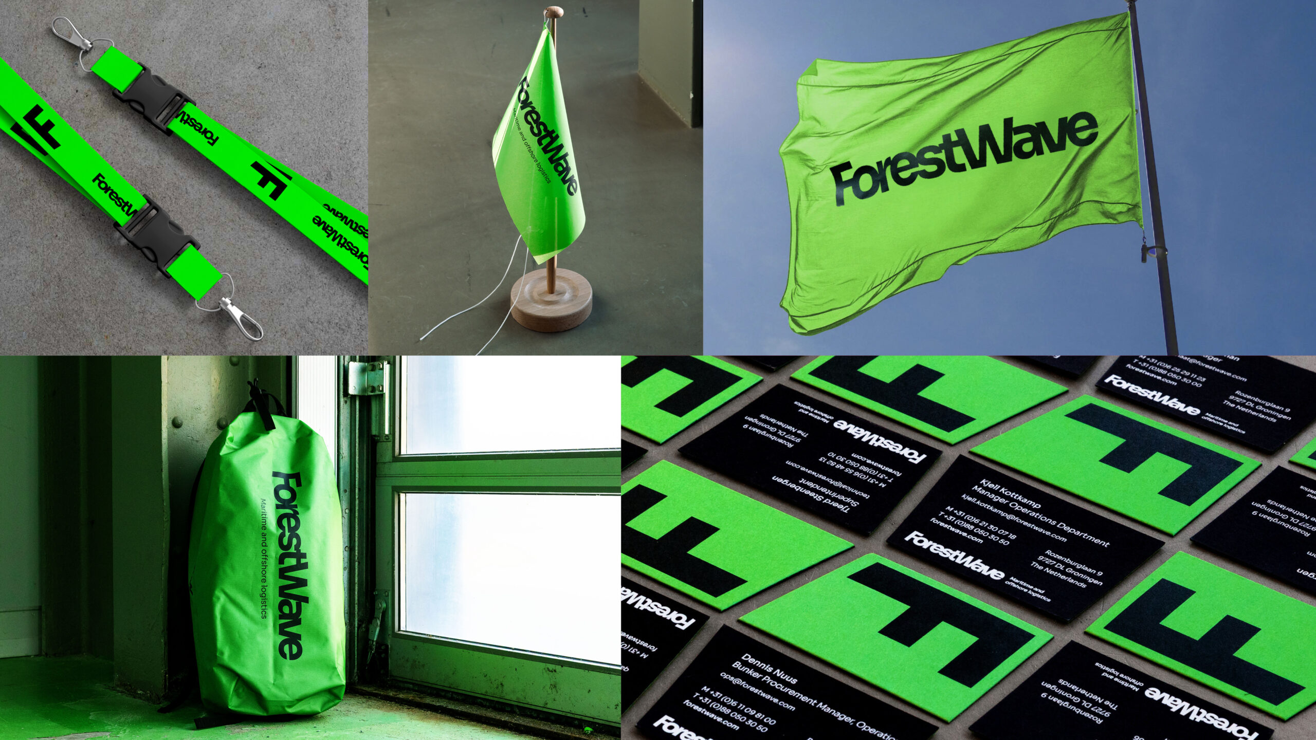
From object to space: an identity that fills the room
The leap to interiors and physical environments is where the project gets most interesting. Many corporate identities work on paper but lose character in offices, trade shows, or transitional spaces. ForestWave maintains presence because the system doesn’t rely on a single hero piece—it’s about color, scale, contrast, and rhythm.
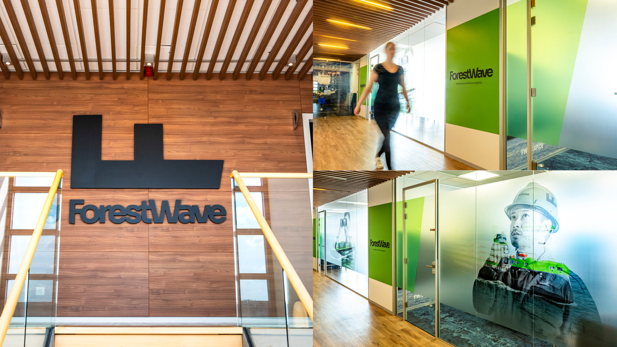
In the office, green takes on a spatial dimension. It’s no longer just ink or pixels: it filters, divides, guides, sets the mood. Environmental graphics add identity without turning the space into a showroom. There’s a sense of brand presence, but it never feels forced. That balance is tough: too much graphics is exhausting; too little, forgettable.

The trade show stand takes this logic further: visual competition, foot traffic, business conversations, noise. Here, an identity needs to be fast. ForestWave turns color into a beacon. It doesn’t compete with complexity, but with presence. In a B2B event, that clarity can be the difference between being remembered or fading into a sea of similar stands.
The screen as an extension, not a separate piece
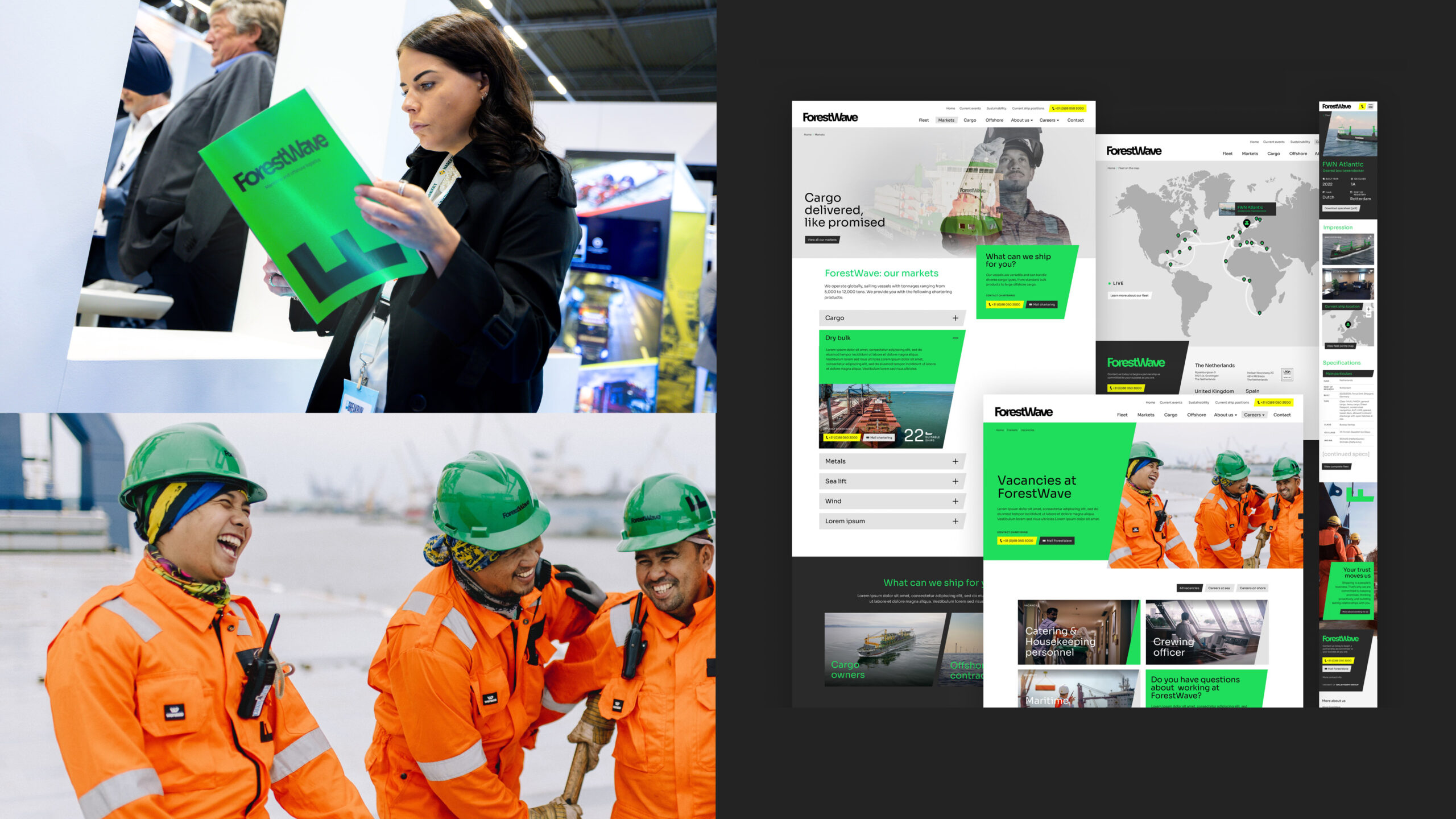
The digital side follows the same logic: high contrast, clear blocks, bold typography, and a UX/UI that prioritizes clarity over effects. There’s no disconnect between the physical world and the screen. The website and printed materials speak with the same voice—crucial when a client moves from a trade show to a sales presentation and then researches the company online.
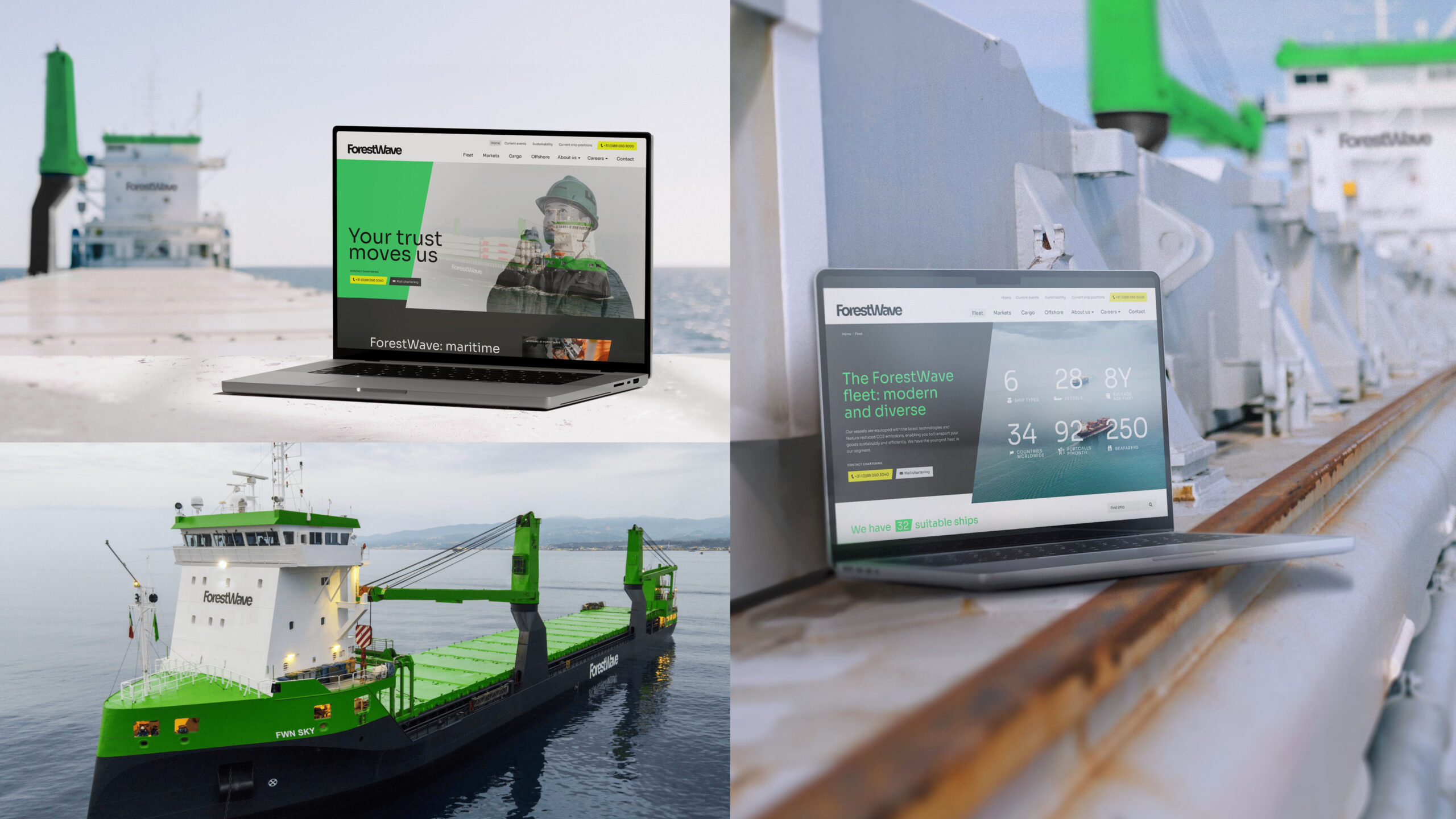
This continuity between brand, interface, and operations is one of the project’s most valuable lessons. The screen isn’t a parallel channel—it’s an extension of the system. For any company with complex sales, this builds trust: users don’t feel like each touchpoint belongs to a different department.
The B2B lesson: clarity, trust, and visual recall
ForestWave proves something often forgotten in industrial sectors: aesthetics sell—not by being flashy, but by reducing ambiguity, organizing a complex story, and making a company easier to recognize, explain, and remember.
A shipping company’s corporate identity doesn’t need to mimic lifestyle brands to be appealing. It can be tough, direct, functional—and still have a powerful visual direction. In fact, that’s much of the appeal: the project doesn’t soften the maritime context, it amplifies it with intent.
The big takeaway is simple: a strong brand doesn’t just live in the logo. It lives in how it occupies a ship, a card, a bag, a wall, a stand, and a screen. When all these pieces keep the same rhythm, perceived value rises—no extra explanation required.
And for a B2B brand, that’s gold: less noise, more recognition, more trust. ForestWave sticks in your mind because it doesn’t try to look “designed.” It simply acts like a brand with a true identity.