Web design is experiencing a new golden age. By 2026, the web has become a space where technology, art, and digital strategy converge to create experiences that are more human, immersive, and memorable than ever before. It’s no longer just about building fast or visually appealing sites, but about crafting cohesive digital ecosystems that communicate values, evoke emotion, and deliver real utility.
This article presents a curated selection of the 10 best web designs of 2025–2026: projects that stand out for their visual innovation, outstanding user experience, and brand storytelling. From experimental interaction labs to major tech platforms, each example proves that the future of web design lies not in fleeting trends, but in the integration of design, technology, and purpose.
Alongside celebrating global talent, this analysis also highlights a closer trend: the growing prominence of design studios in Europe, and especially in Barcelona, a city that has established itself as a hub of creativity and digital development. At Code Barcelona, we observe and analyze these references not just as aesthetic inspiration, but as models of strategic design that are shaping the direction of the industry.
Here are the ten websites that, in our view, define what best-in-class web design in 2026 means: intelligent, emotionally resonant, and meticulously crafted to make a lasting impression.
Looking for inspiration for your next website redesign?
If you are reviewing web design examples, you are probably thinking about what the next digital version of your brand should look and feel like. At Code Barcelona, we design custom websites for companies that need to communicate their value more clearly, stand out and build trust.
Heimdall Power — Web Design Analysis (Visual, UX, and Content)
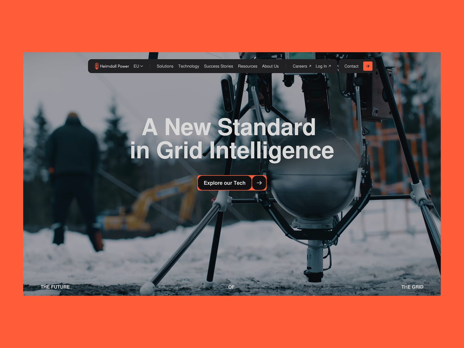
Context. Heimdall Power operates at the intersection of hardware, data, and the energy transition. Its website conveys this ambition at first glance: a restrained, tech-driven aesthetic and a leadership narrative (“The Power of Knowing”) that positions the brand as a benchmark in smart grid technology. This analysis focuses on three layers—visual and design, user experience, and content/narrative—to explain why it belongs among the “best web designs of 2026.”
1) Visual and Design
The art direction uses a high-contrast sans-serif typographic base (oversized headlines, generous line spacing for body text) and a palette that pairs dark backgrounds with warm accents (orange/amber) associated with energy, alertness, and capability. Color contrast establishes hierarchy and draws attention to headlines and calls to action (CTAs) without overwhelming the user. The layout employs wide-screen modules with ample breathing room; imagery—showcasing infrastructure, sensors, transmission lines—is sharp and consistent, reinforcing a sense of industrial precision.
The initial hero distills the value proposition and promise with visual economy: few words, high semantic weight, and a prominent primary CTA. As you scroll, themed blocks (Solutions, Technology, Cases/Resources) maintain a coherent visual rhythm: cards with functional iconography, informative headlines, and technical photography that avoids generic stock. Micro-animations (gentle reveals, hover state changes) are subtle and purposeful, adding life without distraction.
Targeted interactivity—such as “explorable” product/solution modules—enhances understanding: allowing users to rotate, zoom, or explore a component adds an educational dimension and elevates the design beyond a static mockup. The grid remains stable (wide central column, airy sides), ensuring consistency across pages. The result: a “trustworthy technology” aesthetic—restrained, precise, and contemporary, with a distinct identity compared to more generic B2B energy sites.
2) UX (User Experience)
The top navigation is clear and pared down to essentials (Solutions, Technology, Resources, Company), with persistent CTAs for demos or inquiries. The above the fold section communicates value before requiring a scroll, and discovery paths are well thought out: from “why” to “how” to “for whom.” Internal pages follow predictable patterns (headline → value props → supporting visuals → social proof/authority → CTA), reducing cognitive load.
For scan reading, hierarchy is excellent: informative headlines, short paragraphs, benefit lists, and quantified highlights. CTAs are clearly distinguishable (color, size, spacing) and appear at regular intervals without being intrusive. While the technical content is dense, the layout breathes—crucial for professional audiences seeking signal over noise.
The mobile experience preserves hierarchical order, with reflowed blocks and accessible CTAs. Still, due to the nature of technical visualizations, the full value shines on desktop. Accessibility benefits from strong contrast, appropriate font sizes, and clear focus; as an improvement, keyboard navigation and alternatives to animations for users with reduced motion preferences should be documented.
3) Content and Brand Narrative
The narrative connects technical purpose with mythology (Heimdall, the watchman who “sees all”): a powerful metaphor translated into messages of visibility, anticipation, and control. The tone is professional, direct, and measured; it avoids empty jargon and delivers substance with metrics (e.g., unlocked capacity, reduced incidents). Content is structured in layers: a clear elevator pitch on the homepage, benefits and use cases in “Solutions,” deeper technical detail in “Technology” and “Resources” (white papers, datasheets, news).
The value proposition is outcome-focused, not just attribute-based: “unlock capacity without building,” “mitigate outages with foresight,” “accelerate the transition.” This results-driven approach helps users envision real-world scenarios. Social proof (awards, partnerships, media presence) reinforces authority; adding more quantified case studies by vertical (cold climates/icing, summer congestion, cross-border interconnection) would further boost credibility.
The editorial system—short messages, supporting visuals, downloadable resources—aligns with sophisticated B2B marketing: thought leadership without grandiosity, focused on utility and evidence. For SEO, expanding the content hub (articles, DLR/AAR comparisons, decision matrices) would help capture informational searches and support sustained organic acquisition.
4) Why It Works as a “Best Web Design 2026”
Balance of form and function. Visual refinement serves clarity, not spectacle. Clear value framing. Complex technology is translated into tangible, actionable benefits. Purposeful interactivity. Micro-interactions and explorable modules aid understanding. Scalable architecture. The modular system enables growth in both depth and breadth without losing coherence. Trust signals. Technical authority and consistent narrative reinforce the perception of leadership.
5) Actionable Recommendations (Quick Wins)
• Role-based segmentation from the homepage (Utilities / TSO/DSO / Regulators / Investors / Press) for personalized content journeys.
• 60-second explainer layer (video/infographic) summarizing DLR/AAR and CAPEX/OPEX impact for non-technical audiences.
• Explicit accessibility patterns (skip links, animation controls, text alternatives) and visible WCAG guidelines in “About.”
• Editorial hub with comparisons, how-tos, glossary, and decision matrices to support informational SEO.
• Contextual micro-social proof (logos and stats) injected next to each key benefit to boost mid-funnel conversion.
• UX measurement: track scroll depth, CTA clicks, and datasheet reads to refine copy and hierarchy.
6) Conclusion
The Heimdall Power website exemplifies how a high-impact B2B tech company should present itself today: clear in its proposition, precise in its design, and rigorous in its content. Visually, it’s restrained yet distinctive; in UX, it’s predictably smooth (learnable, fluid, frictionless); in narrative, it’s outcome-driven and evidence-based. In a 2026 landscape defined by performance, accessibility, and applied intelligence, this site embodies a core idea: the best web design isn’t what dazzles most, but what best illuminates the user’s decision.
Note: This analysis focuses on the current experience of Heimdall Power’s corporate domain. For publication in “Best Web Designs of 2025–2026,” we recommend including a representative hero screenshot and a link to the homepage.
Damso — Web Design Analysis (Visual, UX, and Content)
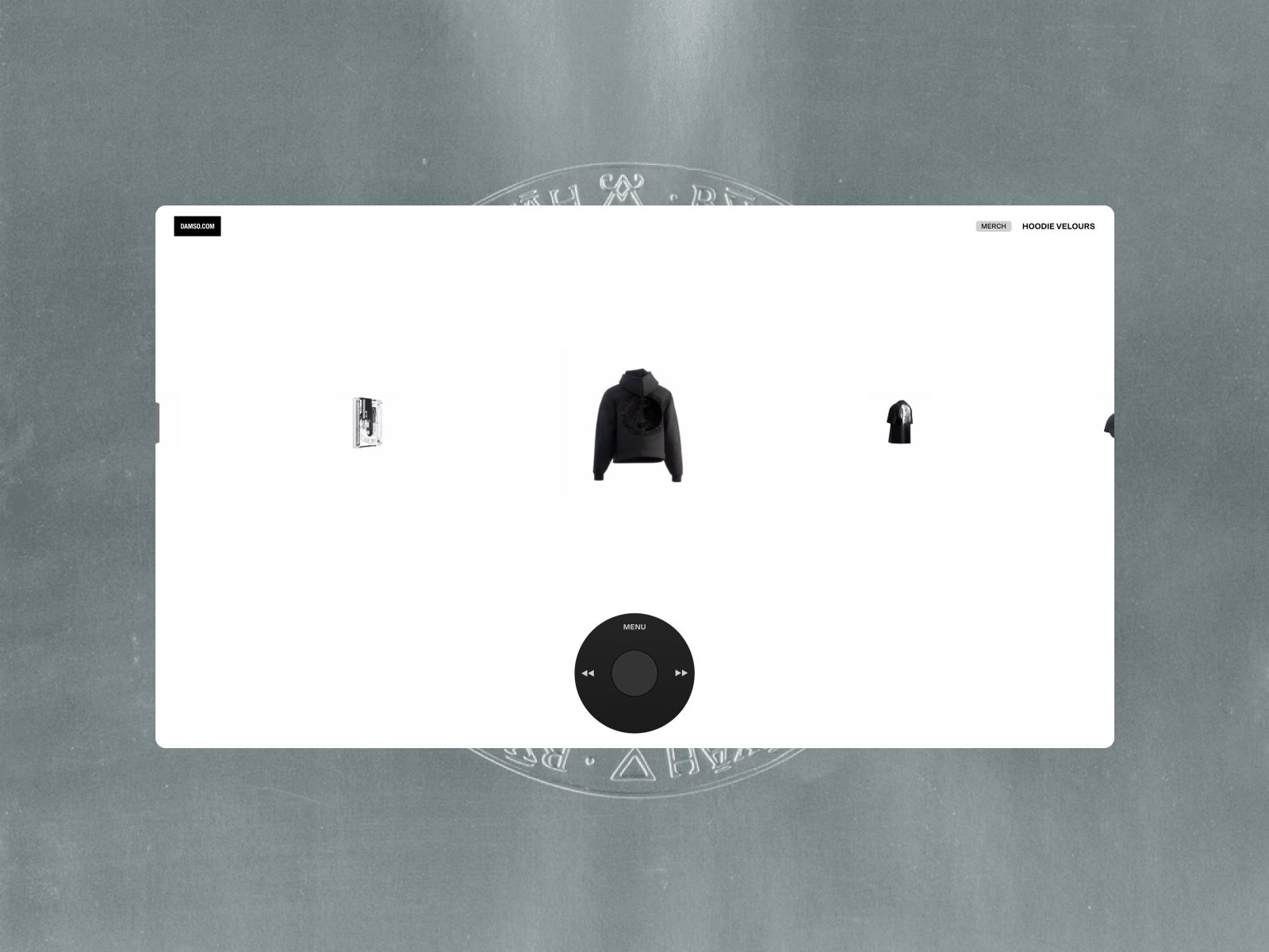
Context. The official Damso site is an immersive universe that puts artistic expression above conventional information. The homepage acts as a living canvas with minimal navigation (“World,” “Shop”) and a gallery of pieces/frames that reinforce the artist’s world: it’s a web-album, closer to a digital installation than a classic editorial portal. This approach places the project among the “best web designs of 2026” for its radical art direction and deliberately sensory UX.
1) Visual and Design
The visual identity breaks from the “musician’s website” archetype (headers, bio, discography) to immerse the user in a contemplative mode. The interface uses a grid structure with full-screen image mosaics; typography is kept to a minimum; color varies with each graphic piece—there’s no single brand color, but a “living palette” inherited from the content. This creates an anti-UI aesthetic (minimal signage, maximum atmosphere), typical of sites awarded for art direction.
The treatment of images and stills suggests a logic of “chapters” or “portals” (each visual block opens another level of Damso’s world). Verbal economy enhances iconic reading: the site is seen before it’s read. Micro-details—custom cursors, hover effects on cards, transitions between pieces—act as cinematic “micro-cuts” that give rhythm to scrolling, avoiding a flat catalog feel. The result: a website that is itself a piece of art direction.
2) UX (User Experience)
Navigation is intentionally austere: “World” channels exploration of the visual universe; “Shop” handles transactions (merch/editions). The compact menu reduces friction for users arriving from social media seeking a brand-first experience. The trade-off is discoverability: by hiding informational layers (bio, calendar) in favor of mood, the site favors fans and highly familiar visitors. It’s a choice that fits the artist-brand, but sacrifices “universal” usability for immersion.
The architecture encourages direct tapping on mosaics/tiles, and dwell time is driven by visual curiosity. Areas for improvement: persistent quick access to functional info (upcoming releases, latest news, streaming links) and explicit focus states for keyboard navigation (accessibility). Still, the gestures (hover/click) and minimalist layers create a UX in tune with the artistic vision.
3) Content and Brand Narrative
The content is deliberately non-literal. The site acts as an extension of Damso’s imagination: visual identity, codes, silences. The narrative emerges from the sequence of images and scarcity of copy. “World” suggests a manifesto: enter the artist’s world—without explanation. It’s a bet on visual storydoing over descriptive storytelling. In commerce, “Shop” adds a clear tactical layer without intruding on the creative experience; it balances art and brand.
For informational-intent SEO (non-brand searches), the site could be strengthened with indexable micro-pages (discography, press, collaborations) and structured data. However, as a brand-building piece for 2026, its strength lies in uniqueness: it delivers an uncompromising aesthetic stance.
4) Why It Works as a “Best Web Design 2026”
Total art direction (the UI serves the work, not the other way around), visual rhythm that invites wandering, coherence between image and sound (implied musical expectation), and interface minimalism as a statement. If the criteria are brand, character, and memorability, this site excels.
5) Actionable Recommendations
• Add an accessible layer (skip links, visible focus, animation controls).
• Create discreet SEO landing pages for bio/dates/albums without breaking the visual universe.
• Introduce a “press” mode (downloads, fact sheets, contact) accessible from the footer without affecting immersion.
• Track scroll depth and CTR on mosaics to refine content hierarchy.
Savor — Web Design Analysis (Visual, UX, and Content)
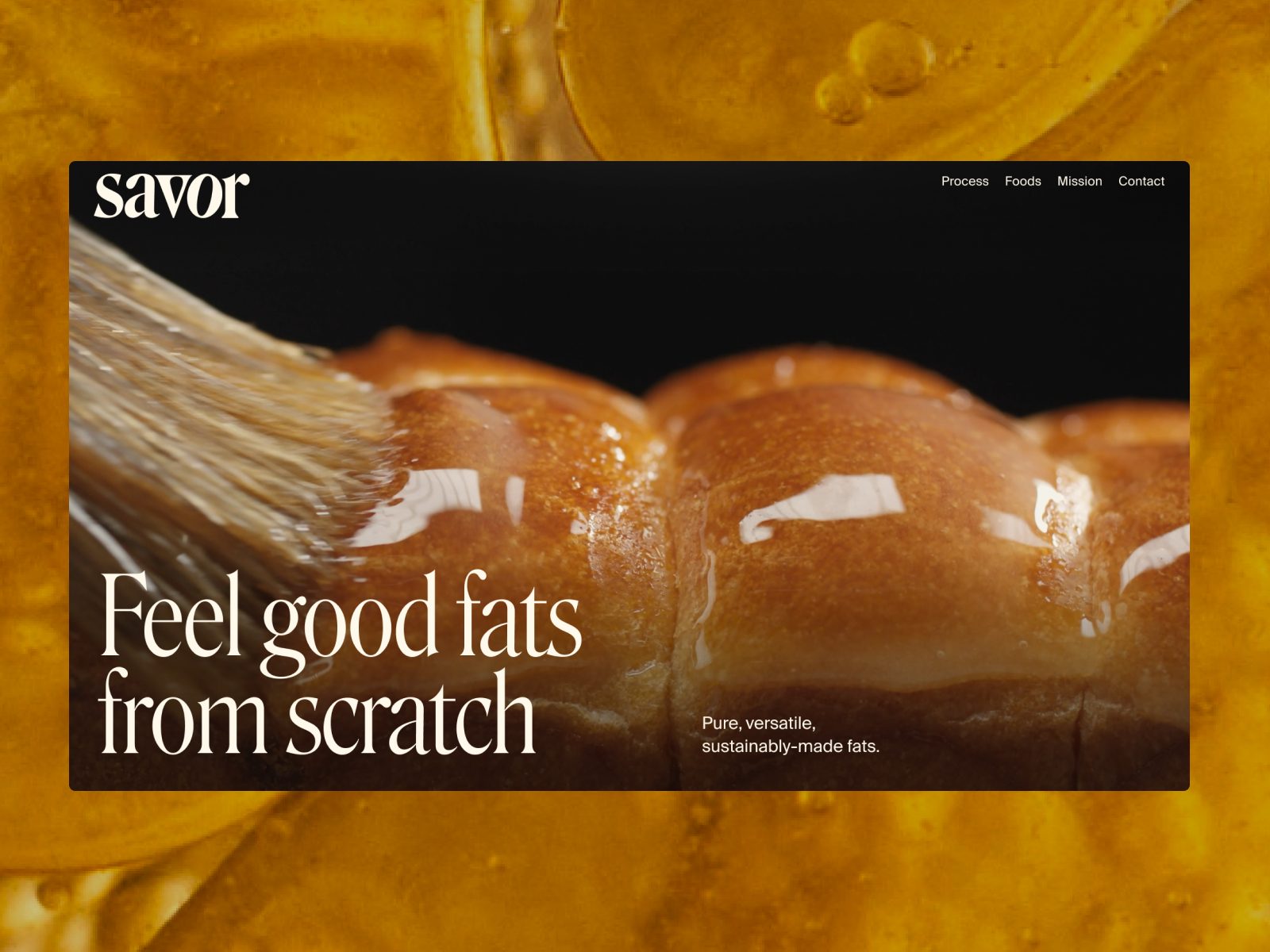
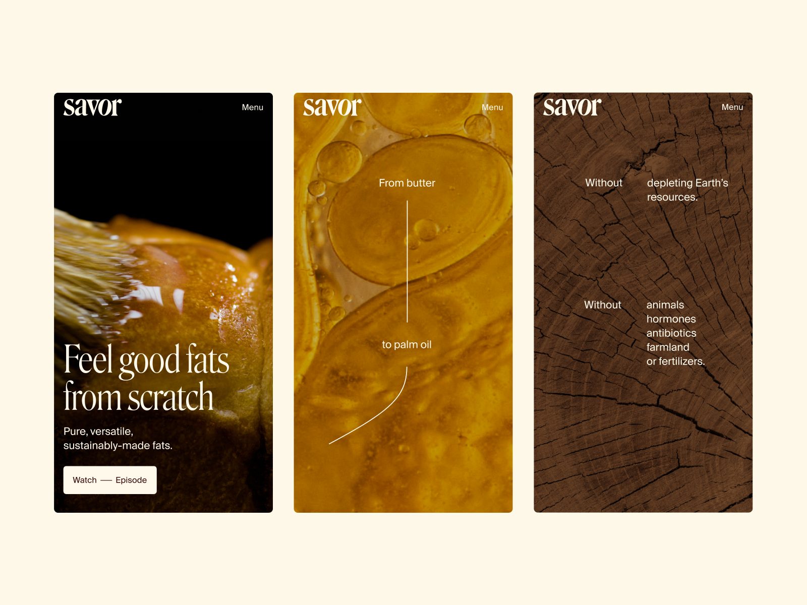
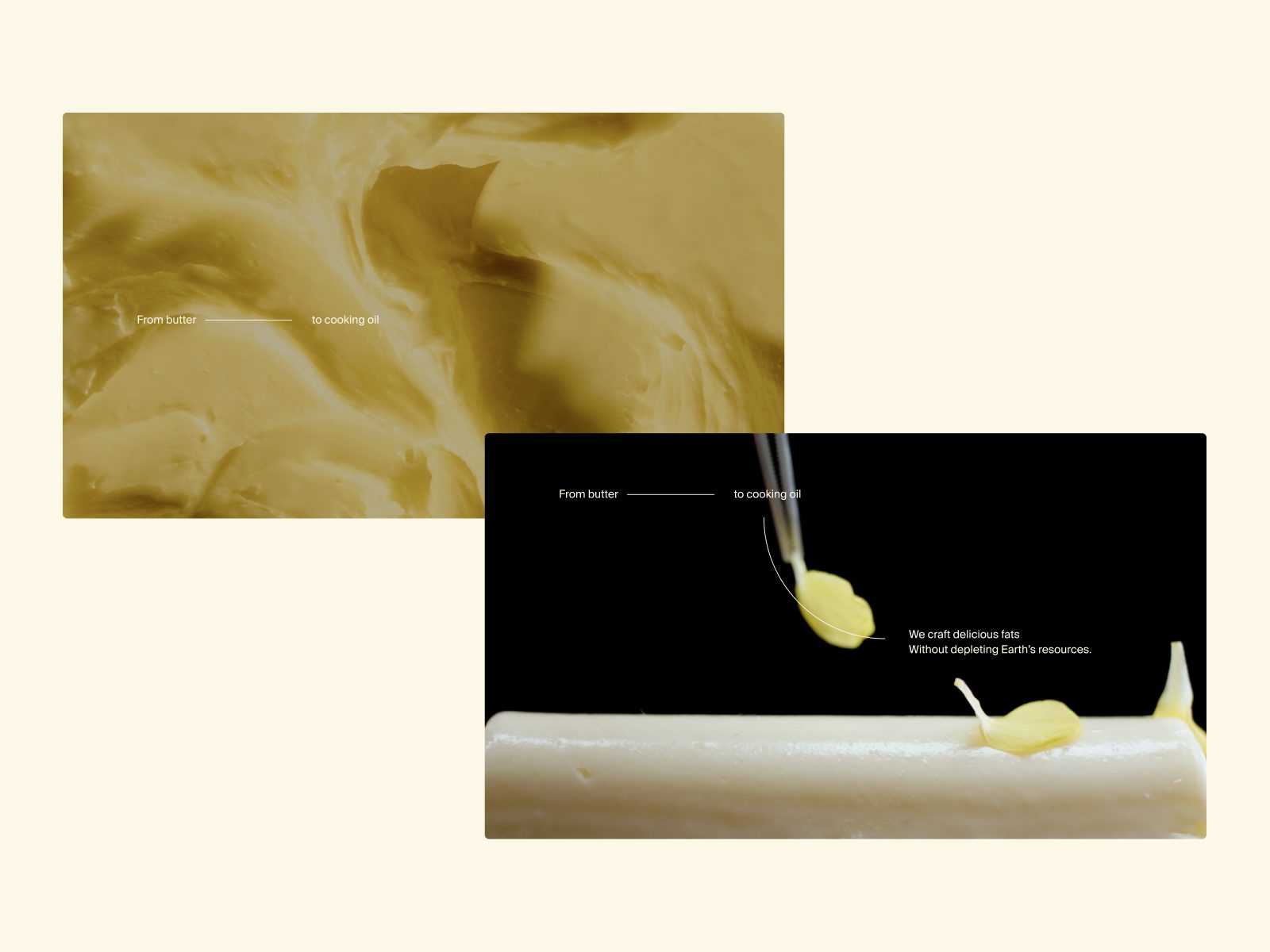
Context. Savor positions itself as a sustainable “fats” company (from butter to palm oil) producing without animals, antibiotics, or fertilizers, focused on “real fats, real flavor.” The site blends clean brand storytelling with editorial art direction and a clear navigation structure (Process, Foods, Mission, Journal). It’s a standout for 2026 due to its balance of food science, ethical narrative, and visual execution.
1) Visual and Design
The homepage opens with a positioning headline (“Pure, versatile, sustainably-made fats”) and an invitation to watch an episode—a sign of a video-first strategy. The hero uses contemporary sans typography and full-width, high-quality food/styling photography. The color palette features natural tones (creams, soft greens, ochres) that reinforce purity and origin, with minimal accents for CTAs. The result is a culinary-scientific look & feel: appetizing yet technical.
The layout uses wide modules, generous padding, and careful hierarchy of headlines and paragraphs for easy scanning. Blocks like “From butter to palm oil / We craft delicious fats without…” alternate text and image with enough whitespace to avoid overload. Semantic repetition (“more… more… more… room for wild things…”) adds a poetic cadence to scrolling.
2) UX (User Experience)
The top navigation (Process, Foods, Mission, Journal, Contact) is direct and predictable. CTAs such as “Our Process”, “Our Foods” and “Join now” appear with intention and without overuse. On mobile, the layout reflows while preserving legibility; image modules retain visual impact without compromising performance. The footer includes links to LinkedIn, Instagram and a Press Kit, which strengthens the relationship with media and partners.
The site prioritizes clarity over spectacle: a highly editorial web reading pattern (hero → benefits → visual evidence → press → newsletter). It is a UX designed to educate quickly, with strong “time to understanding”: users can understand what Savor does and why it matters within the first scroll, which is essential in food innovation.
3) Content and Brand Narrative
The message combines three core ideas: real flavor, sustainability and scale. The proposition “All our old favorites, just made a different way” summarizes the positioning: not giving up pleasure, but changing the method. The negative enumeration (“without animals, hormones, antibiotics, farmland or fertilizers”) condenses the ethical proof and aligns the brand with climate-conscious consumers.
The press section and the journal available from the navigation help build authority and informational SEO. The copy is clear and approachable, without excessive technical language. The voice avoids dogma and proposes a pragmatic future. To reinforce credibility, it would be useful to introduce verifiable data such as LCA, water and CO₂ savings, and links to scientific partners or papers.
4) Why It Works as a Best Web Design 2026
Because of its integrated coherence: every visual decision (photography, color, typography) supports the story of purity and progress; the UX reduces educational friction; and the content translates innovation into a tangible promise: real fats, real flavor. It also anticipates the 2026 wave of performance as design: lightweight pages, direct messaging and a modular architecture that can grow without losing identity.
5) Actionable Recommendations
• Add a 60–90 second “How it works” video or infographic to accelerate understanding on the first visit.
• Add quantitative evidence such as LCA data, impact metrics and certification links to reinforce trust.
• Publish use cases for culinary B2B, foodservice and retail, with sensory performance and cost metrics.
• Implement structured data such as FAQ and HowTo schema for informational SEO.
• Make accessibility options visible in the footer: contrast, keyboard reading and animation control.
6) Conclusion
Savor shows that the best web design for food innovation in 2026 is one that integrates pleasure and purpose: elegant visuals, frictionless UX and a narrative that turns science into desire. The website teaches without preaching, seduces without tricks and positions an emerging category with a clear, appetizing language: a benchmark for food-tech brands aiming to scale.
Madar Platform — Web Design Analysis (Visual, UX, and Content)
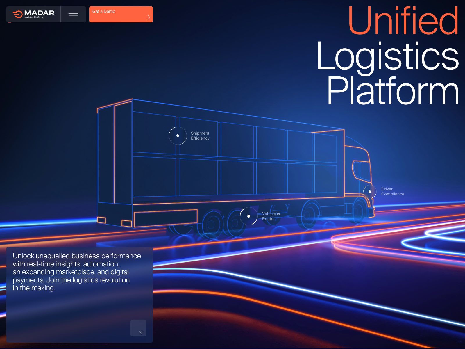
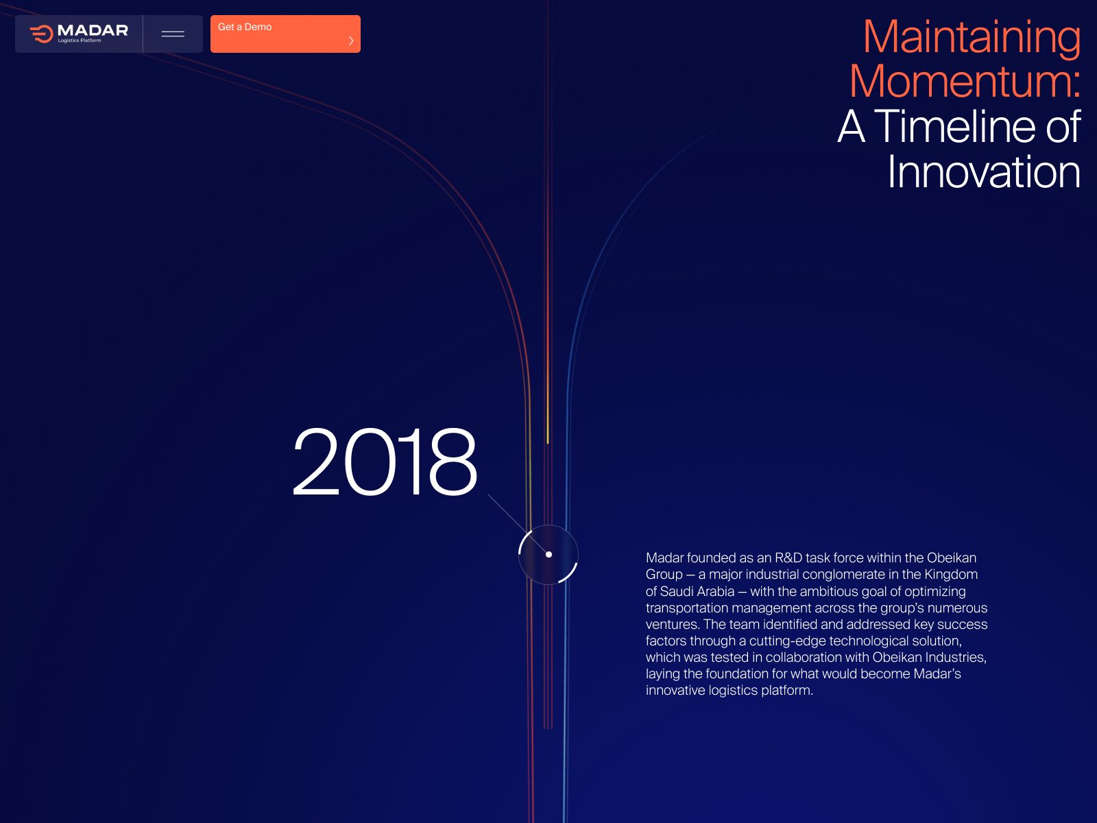
Context. Madar Platform is an Arab educational and innovation digital platform that brings together culture, technology and community. Its website is an example of how a digital product can retain an editorial soul without sacrificing functionality. It is a site where content becomes experience: refined visual storytelling, interfaces with local identity and a globally usable experience. This balance places it among the best web designs of 2026 for its ability to connect culture and technology fluidly.
1) Visual and Design
The first impression is elegant and calm: a neutral palette with earthy nuances and contemporary typography that alternates Arabic and Latin with typographic precision. The layouts use flexible modularity: wide blocks, breathable margins and a slow visual rhythm. The headers combine high-contrast typography with a fusion of modern sans and geometric Arabic calligraphy, creating an authentic visual identity that conveys the platform’s dual DNA: tradition and progress.
Smooth transitions and scroll effects add dynamism without distraction. Each module combines text, iconography and color as narrative guides. The use of microinteractions such as hover states, movement and activated gradients brings educational content to life and encourages exploration. Overall, the design communicates technological serenity: modernity with cultural respect.
2) UX (User Experience)
The navigation structure is intuitive and multi-level: Education, Community, Innovation, News and Resources. Each section maintains visual and semantic consistency. The mobile-first design adapts precisely to different screen widths, preserving proportions and hierarchies. On desktop, reading is organized in a three-column grid that optimizes scanning. On mobile, blocks stack without losing air or clarity.
The user journey relies on a progressive editorial UX: visitors quickly understand what Madar offers, education plus cultural innovation, and can then explore materials, courses or collaborations. CTAs are well placed and contrasted — visible but not aggressive — which supports fluid navigation. The bilingual interface, Arabic and English, preserves a natural reading experience without losing balance or legibility.
3) Content and Brand Narrative
The tone is educational and optimistic. Each content block communicates a purpose: empowering Arab youth through technology. The copy is written in short, active and accessible sentences. The narrative structure mixes practical information such as programs, workshops and communities with social-impact storytelling. The balance between technical and emotional language is exemplary: visitors feel they are looking at a movement, not just a platform.
The design supports this narrative with images of real people, urban environments and everyday technology, avoiding generic stock imagery. Each visual resource humanizes innovation. From an SEO perspective, the site uses clear semantic tags and a clean architecture, ideal for positioning terms related to Arab digital education and cultural technology platforms.
4) Why It Works as a Best Web Design 2026
Digital cultural identity. It integrates contemporary Arab aesthetics with international UI/UX standards.
Consistency and visual calm. The architecture breathes elegance without rigidity.
Accessibility. Contrast, hierarchy and fluid translation between languages create an inclusive experience.
Narrative purpose. Every interaction communicates a collective mission: connecting knowledge and culture.
Invisible technology. Animations and micro-details serve understanding, not spectacle.
5) Actionable Recommendations
• Add an impact cases section with project metrics and testimonials.
• Improve internal linking between articles to increase dwell time.
• Integrate a predictive search engine with filters by resource type.
• Create a Partners area with logos and links to sister initiatives.
• Include accessibility indicators for keyboard, screen reader and adaptable contrast.
6) Conclusion
Madar Platform is a lesson in purpose-driven web design: accessible, elegant and rooted in a strong cultural identity. Its success lies in transforming educational content into an aesthetic experience that educates and moves. In the category of best web design 2026, it represents the perfect bridge between technological innovation and living culture.
Terminal Industries — Web Design Analysis (Visual, UX, and Content)
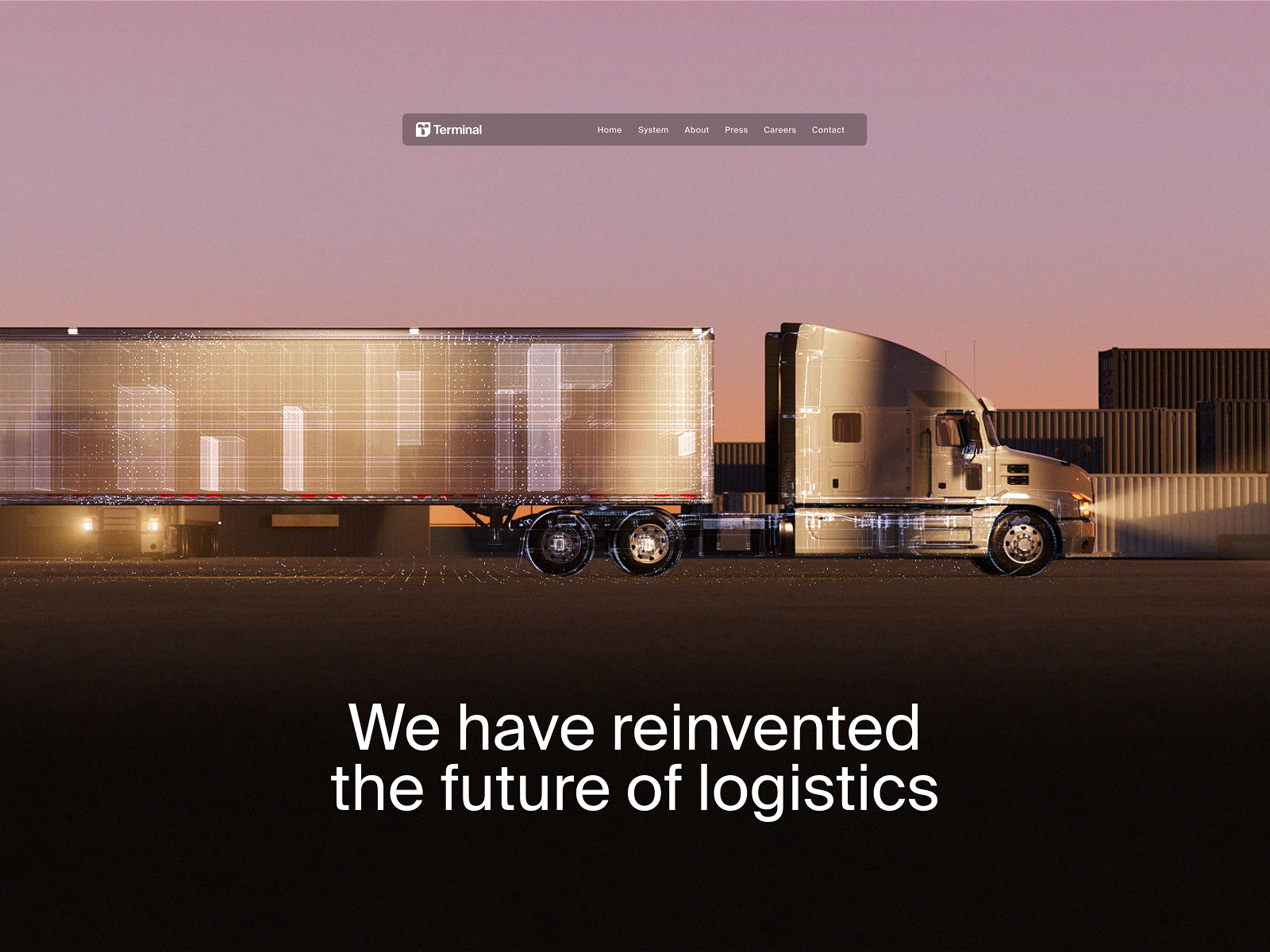
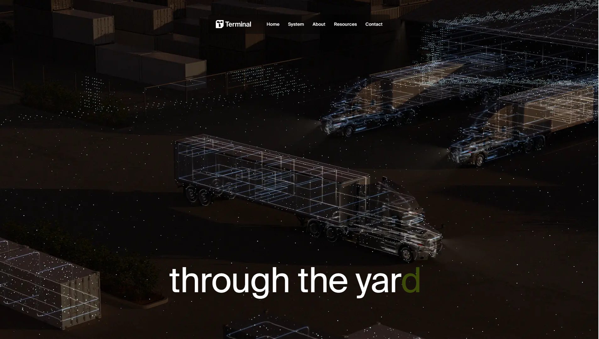
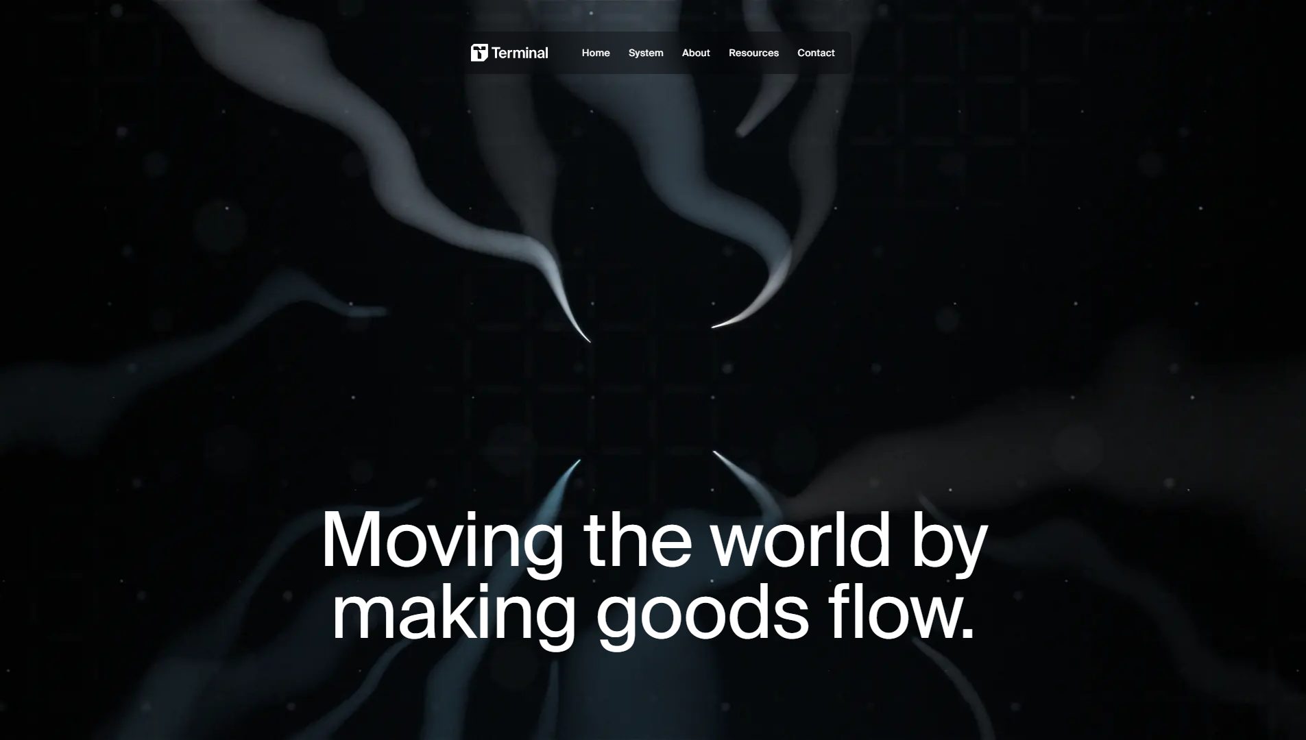
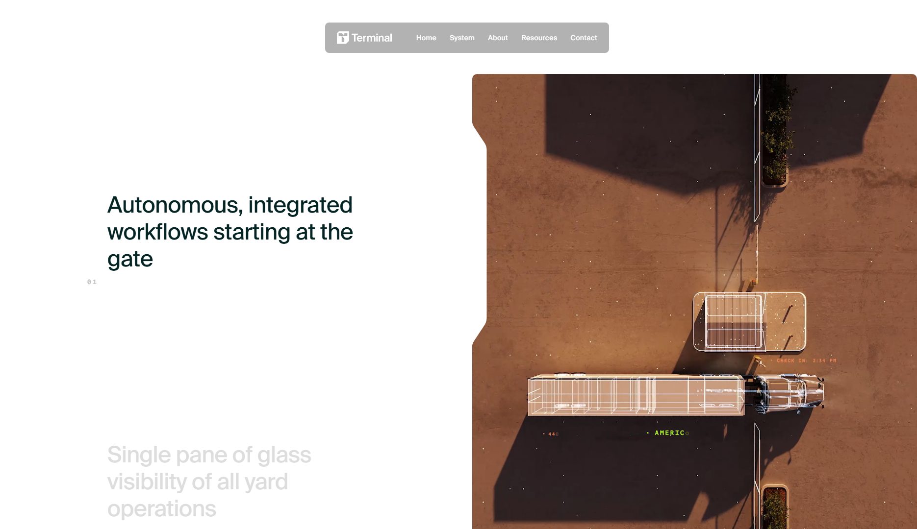
Context. Terminal Industries is an AI and industrial automation startup that redefines how technology is communicated visually. Its website is a radically contemporary design piece: science-fiction aesthetics, immersive transitions and a visual narrative focused on the power of AI applied to industry. This project embodies the principles of the best web design of 2026: visual precision, technological innovation and a narrative UX that feels more like a digital experience than a simple corporate site.
1) Visual and Design
The design is built on a dark, almost galactic background, with monospaced typography and vector animations that evoke cybernetic systems. The minimalist logo and line patterns recall an intelligent circuit, coherent with the idea of Terminal as an interface between human and machine. The art direction adopts a tech brutalist style — defined edges, condensed typography and asymmetric composition — that communicates energy and precision.
The use of video and 3D particles as background creates depth without sacrificing performance. The visual system is built around intense contrasts: white, black, cyan and magenta, reinforcing the idea of electric flow. Everything communicates speed and control. Instead of narrative illustrations, Terminal Industries uses simulated data visualization, allowing the graphic language itself to express intelligence.
2) UX (User Experience)
The UX combines clarity and drama. The top menu reduces options to the essentials: Products, Platform, Research and Contact, to minimize cognitive friction. The scroll is designed as a progressive journey: each section behaves like a visual chapter with automatic transitions. The user does not simply browse: they experience. Entry and exit animations function as narrative anchors that guide reading.
In terms of performance, the website shows impeccable engineering: reduced loading times, optimized animations and full device adaptability. On mobile, resizing preserves visual intensity through adaptive typography and intelligent reduction of interactive elements. The result is an immersive yet controlled experience where aesthetics do not compromise legibility or conversion.
3) Content and Brand Narrative
Terminal Industries structures its message around three pillars: automation, precision and vision. The tone is technical but not cold: it uses spatial metaphors and active verbs that suggest continuous progress. The copywriting balances authority and aspiration, combining scientific language with short, visually clean sentences.
The brand narrative feels more like visionary engineers than a traditional corporation. Each section translates complex concepts such as machine learning and robotic infrastructure into tangible benefits: efficiency, safety and autonomy. The case studies are presented with visual precision — data, metrics and screenshots — reinforcing credibility without relying on grandiloquent adjectives.
4) Why It Works as a Best Web Design 2026
Immersive art direction. It combines sci-fi aesthetics with functional structure and product logic.
Performative design. Animations are part of the message, not decoration.
Clean architecture. Hierarchical information, predictable flows and clear conversion paths.
Technical performance. Fast loading, optimized animations and fluid transitions.
Brand coherence. Every visual element expresses industrial identity and technological precision.
5) Actionable Recommendations
• Add an Insights or technical blog section to attract organic traffic and reinforce authority.
• Add B2B testimonials or impact figures in product sections.
• Include an optional high-contrast or light mode for accessibility.
• Offer a reduced version without animations for markets with limited connectivity.
• Add more human elements such as faces, team and culture to balance technical coldness.
6) Conclusion
Terminal Industries is a visual and technical reference for the new digital paradigm of 2026: websites that are interactive experiences, not showcases. Its fusion of visual narrative, technological precision and fluid experience defines what we mean by next-generation web design. A clear model for design agencies that want to create projects with visual and conceptual impact in technology sectors.
From inspiration to a real project
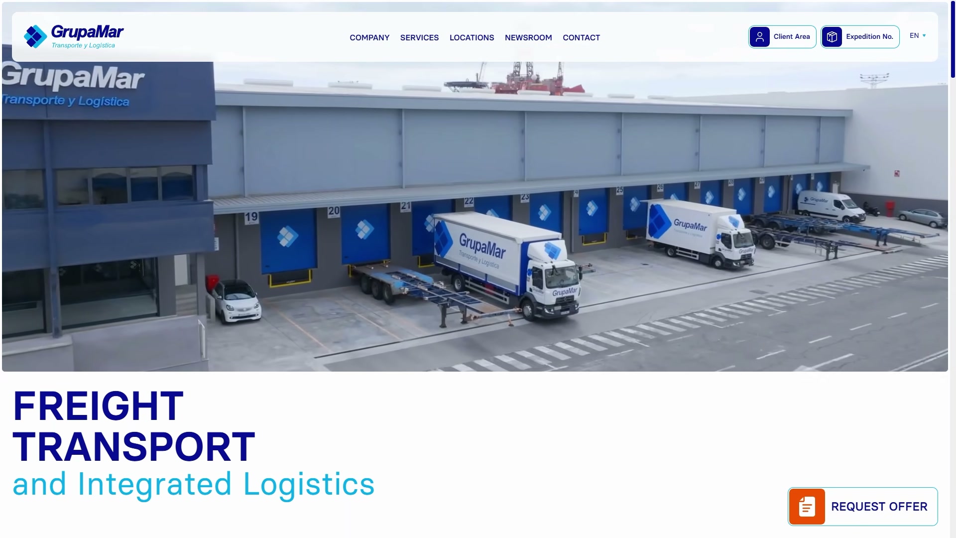
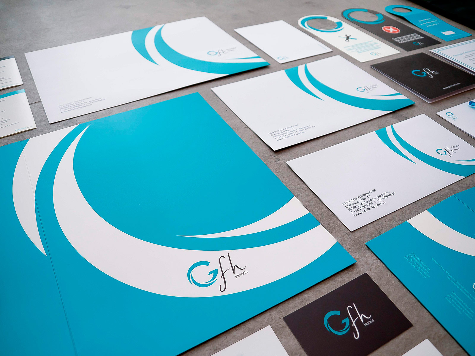
If you are collecting references for a corporate website redesign, the next step is to see how that level of criteria can be applied to real companies. These Code Barcelona projects show how design, brand and development can work together.
Smooothy — Web Design Analysis (Visual, UX, and Content)
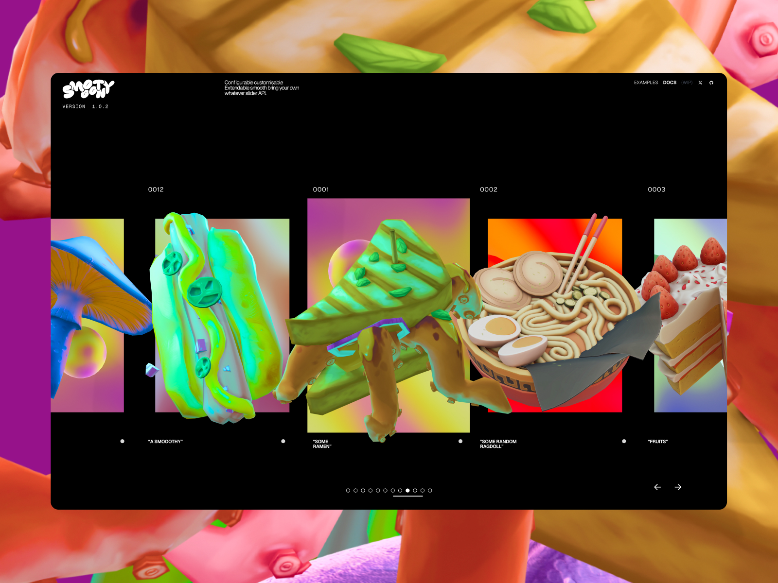
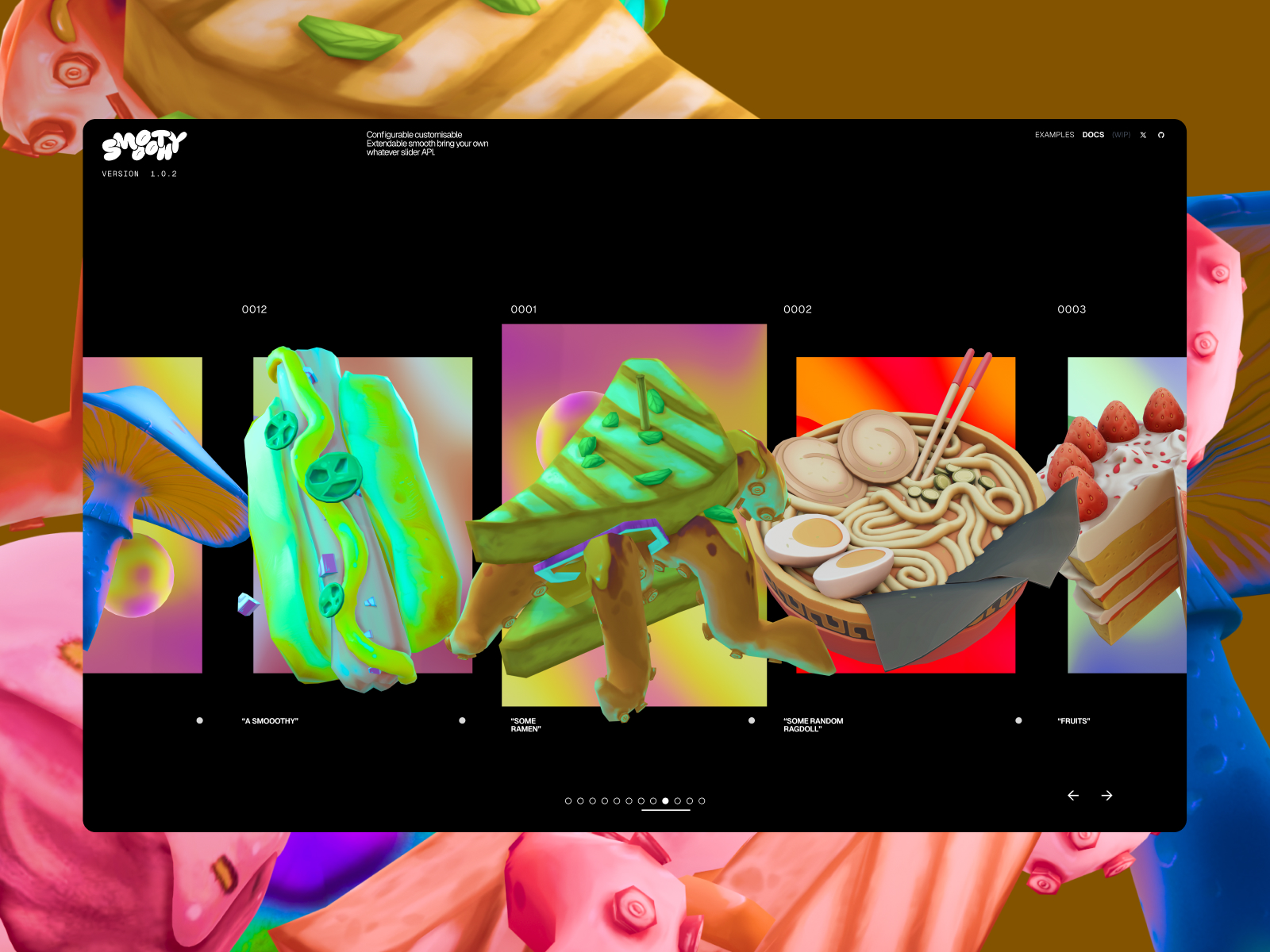
Context. Smooothy is an experimental personal project in interactive design created by designer Federico Ognibene, built around softness, speed and precision in digital navigation. It is not a commercial website, but a web art-direction piece and a laboratory for microinteractions and fluid animation. Because of its technical quality and visual coherence, it has become a 2026 reference for UX motion and digital narrative.
1) Visual and Design
The strongest feature is the continuous animation that accompanies every transition, living up to the project name: everything is smooth. The monochromatic palette with pastel accents such as mint green, violet and beige creates a sense of calm and control. The design is fully fullscreen, with no sidebars or conventional divisions; content floats in digital space. Geometric sans typography with wide spacing reinforces the idea of minimalist order and typographic precision.
Digital lights and shadows, depth effects, subtle parallax and dynamic reflections create an almost tactile atmosphere. Unlike websites that rely on heavy 3D, the animations here are vectorized and optimized for performance. Every screen change feels like a liquid flow, reinforcing the conceptual identity of the site. Smooothy shows how animation can be functional design, not mere ornament.
2) UX (User Experience)
The journey is linear and intentional: users move through modules that transform smoothly into one another. There are no abrupt clicks or reloads; everything relies on scroll and gesture. This creates an immersive experience closer to an interactive app or a future interface demo. Microtransitions such as hover, opacity changes and typographic deformation help users understand where they are in the flow.
In accessibility terms, Smooothy is an experimental interface, so some elements such as contrast, text size and keyboard navigation do not follow standard WCAG patterns. However, because it is a visual exploration piece, its value lies precisely in pushing the limits of what is possible. On mobile, the design is reinterpreted with simplified vertical transitions while maintaining constant fluidity.
3) Content and Brand Narrative
The textual content is minimal and conceptual. There are few words, but each one reinforces the idea of fluidity: motion as identity, code as design. It is a demonstration of branding through interaction. There is no verbal storytelling, but rather visual and sensory storytelling: users understand the message by feeling it, not reading it.
In a professional context, it works as an evolving portfolio that demonstrates mastery of WebGL, GSAP and animated typography. It also aligns with the 2026 trend of kinetic interfaces, where the way a site moves expresses as much as its content.
4) Why It Works as a Best Web Design 2026
Technical mastery. GSAP and WebGL animations are perfectly optimized.
Conceptual innovation. Movement becomes a visual language.
Emotional design. It communicates calm, elegance and control through the physics of scroll.
Absolute consistency. Every formal decision reinforces one idea: fluidity.
UI/UX influence. It has become a reference in motion design and digital prototyping circles.
5) Actionable Recommendations
• Implement animation controls or a reduced-motion mode for accessibility.
• Add a behind-the-scenes panel to explain technical processes and enrich SEO.
• Create a light version focused on education or UX motion training.
• Include a visible form or professional contact route to capture creative leads.
• Add dark/light mode with automatic color scheme adaptation.
6) Conclusion
Smooothy is a manifesto for web design in 2026: fluid animation, clean structure and contained emotion. It does not try to sell; it tries to demonstrate. Its success lies in inspiring designers to integrate movement and meaning into a digital interface. It proves that the future of web design is not about adding more, but about making every pixel move with purpose.
Symphony of Vines — Web Design Analysis (Visual, UX, and Content)
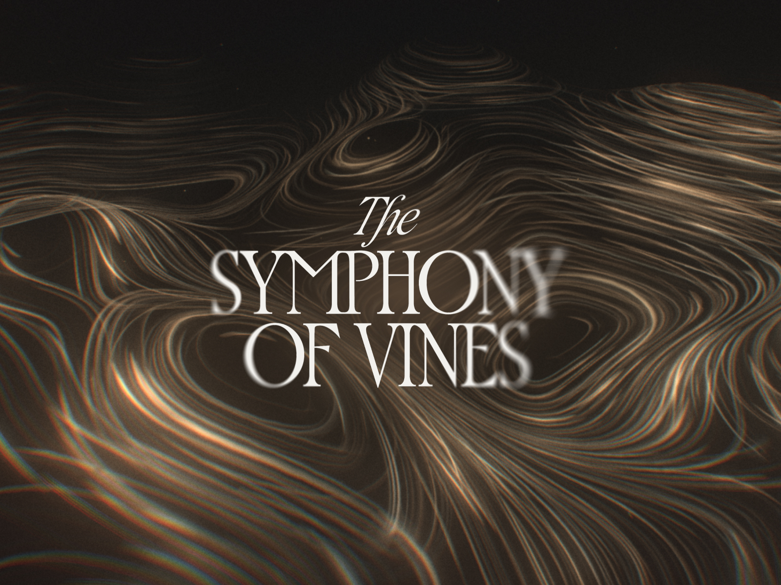
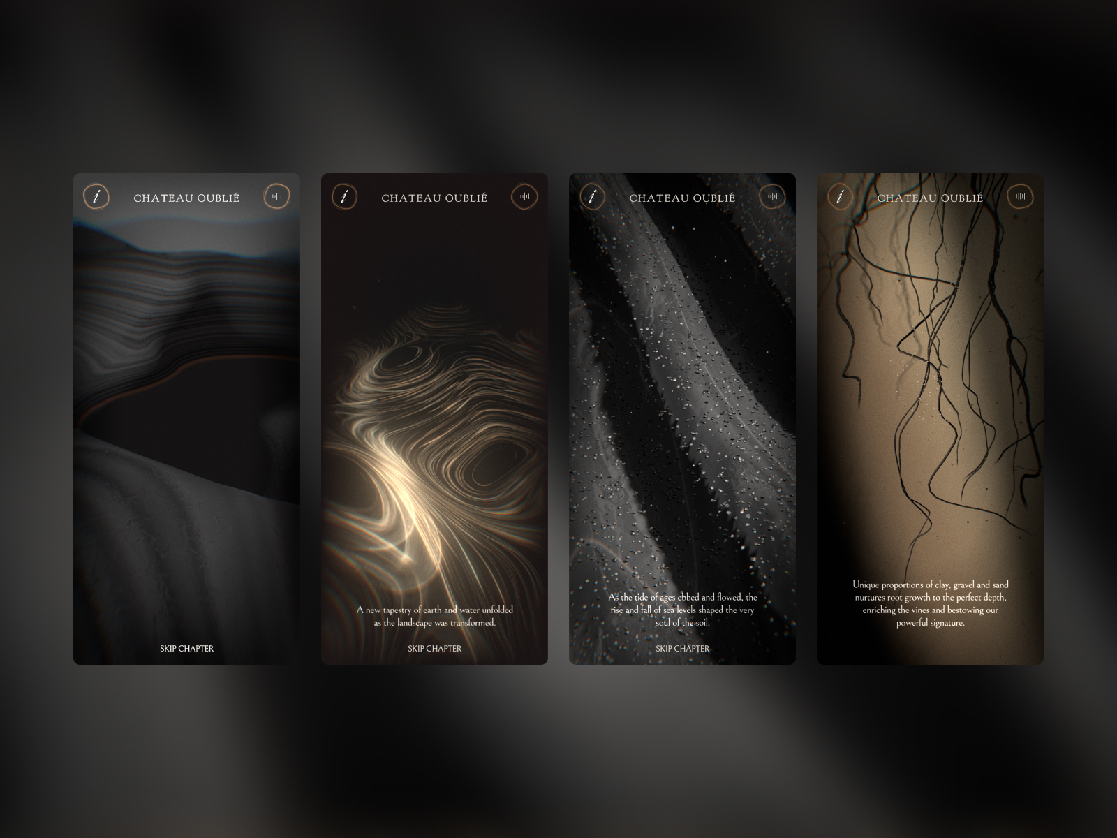
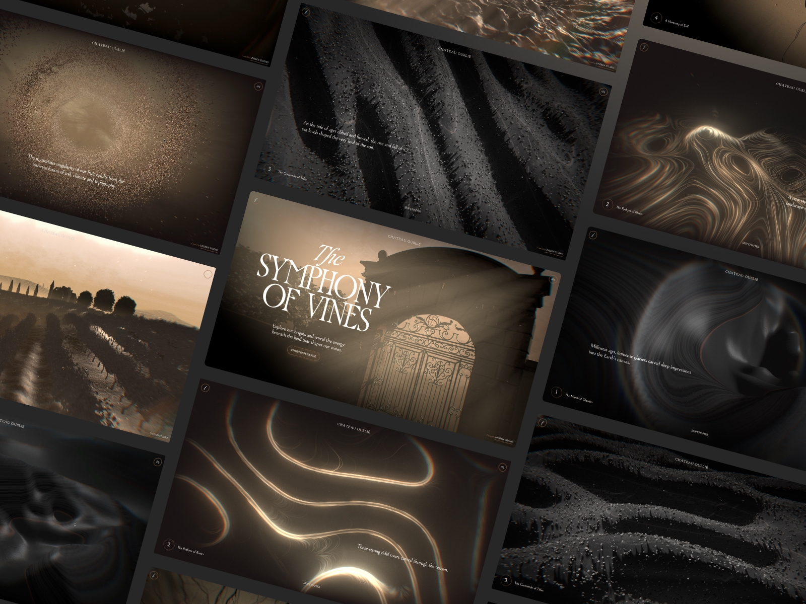
Context. Symphony of Vines is an interactive sensory storytelling project created by Unseen Studio, exploring the relationship between wine, music and nature. The website transforms brand narrative into an immersive audiovisual experience where users can “hear” wine through soundscapes and generative visuals. This fusion of art, technology and emotion makes Symphony of Vines a key reference for experiential web design in 2026.
1) Visual and Design
The design is built around a universe of color, sound and movement. Black backgrounds and organic gradients evoke wine textures; reactive particles and waves that respond to music create a living environment. Each scene behaves like a musical movement. Elegant serif typography is combined with geometric sans type to balance heritage and modernity. The result is a harmonious visual composition, with digital cinematography that imitates the natural rhythm of the vineyard.
Fluid animations generate a sense of total immersion. The integration of HD video, 3D and reactive audio is executed with outstanding technical precision: progressive loading, no perceptible cuts. The site maintains a premium aesthetic — luxury without ostentation — coherent with the wine industry. Each page is a multisensory chapter where design and technology work in unison.
2) UX (User Experience)
Navigation is non-linear and exploratory. Instead of a classic menu, the user is guided by interactive areas and visual signals such as cursor movement and discreet icons. Each click reveals a new sonic or visual layer. It is intuitive for creative users, although more challenging for conventional users. The architecture is deliberately cinematic: intro → exploration → discovery → resonance.
The balance between control and surprise is carefully measured. Users feel that they are participating in the work, generating emotional connection with the brand. The mobile version simplifies the experience without losing its essence: finger movements replace the cursor and reactive effects adapt to touch. Despite the graphic load, performance remains solid thanks to WebGL optimization and intelligent preloading.
3) Content and Brand Narrative
The narrative connects art, wine and nature. Each chapter represents a stage of the winemaking process: earth, sun, fermentation and tasting, transformed into audiovisual language. The text is short and poetic; titles evoke classical music such as Prelude, Harmony and Resonance. The brand communicates through emotion and sensation, not technical explanation. It is an emotional brand that is experienced rather than described.
Storytelling is reinforced with spatial audio that reacts to user movement, creating a sense of presence. From an SEO perspective, the project does not aim for massive organic traffic, but it can inspire interactive branded content strategies: experiences that are shared more than searched.
4) Why It Works as a Best Web Design 2026
Multisensory design. Flawless fusion of sound, movement and visuals.
Emotional narrative. Every interaction tells a story without words.
Technical innovation. WebGL, reactive audio and non-linear navigation.
Immersive identity. The brand is perceived as an artistic experience.
Premium quality. Design communicates luxury, origin and craftsmanship.
5) Actionable Recommendations
• Add a low-power mode for slow connections or older mobile devices.
• Add descriptive sound captions for auditory accessibility.
• Create an institutional version that explains the project behind the scenes: vineyards, artists and creative process.
• Publish a technical making-of and team interviews to increase SEO visibility.
• Implement interaction metrics such as average time and click points to measure engagement.
6) Conclusion
Symphony of Vines shows that web design in 2026 is no longer limited to screens — it becomes experience. It connects art, sound and nature to deliver a digital piece that redefines sensory marketing. Its value is not only in what it shows, but in how it makes users feel. A benchmark for creative studios seeking to move beyond traditional design and explore the web as an emotional space.
8bit.ai — Web Design Analysis (Visual, UX, and Content)
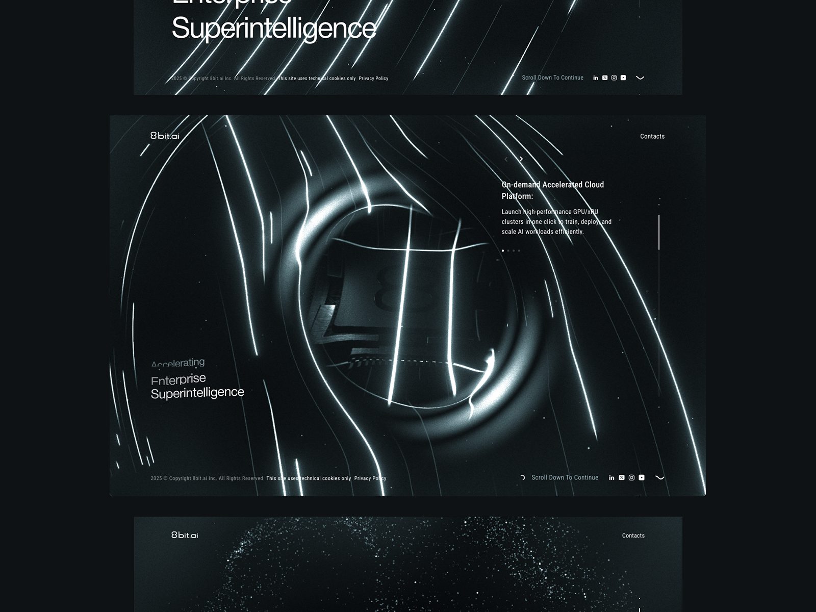
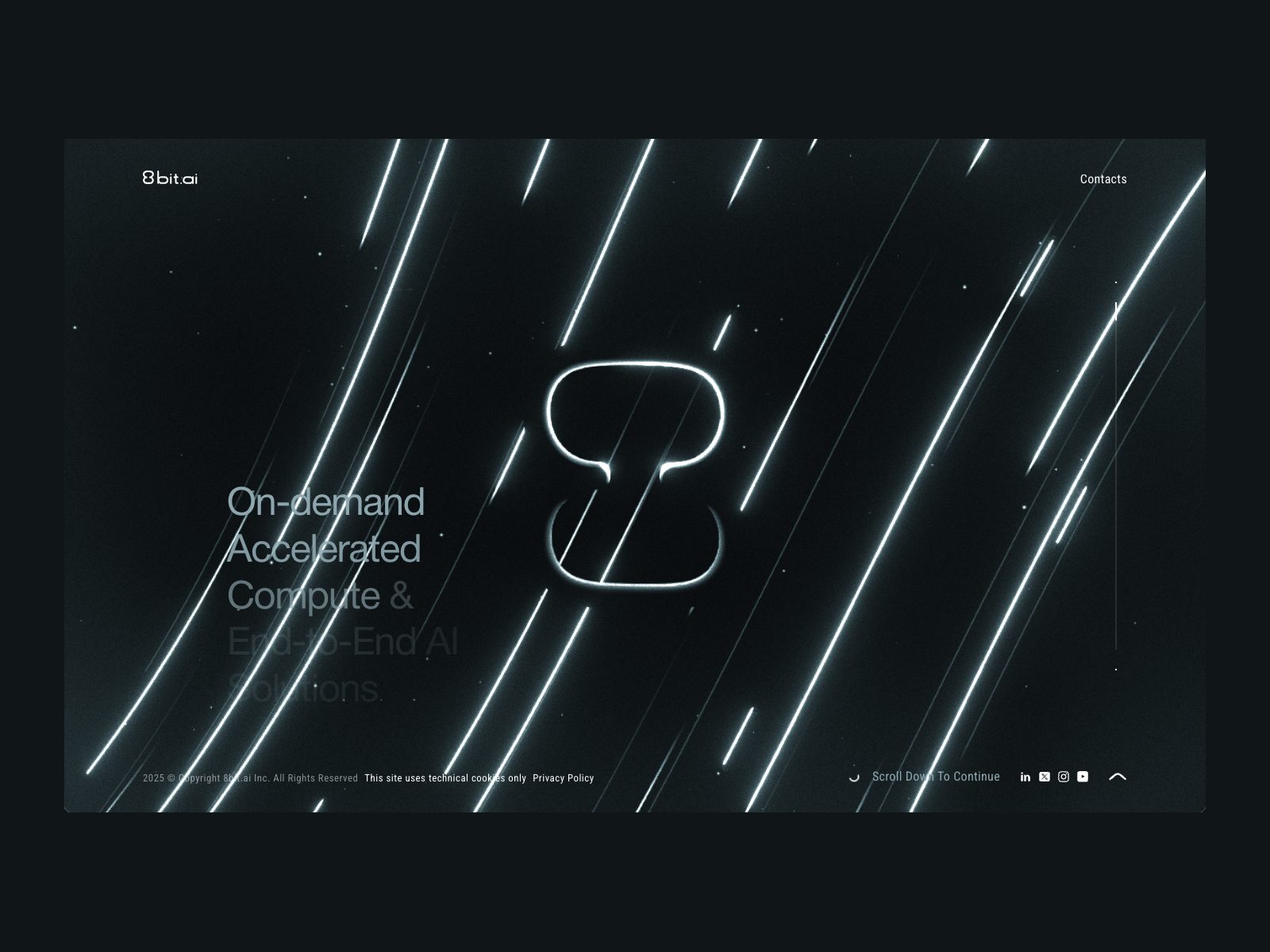
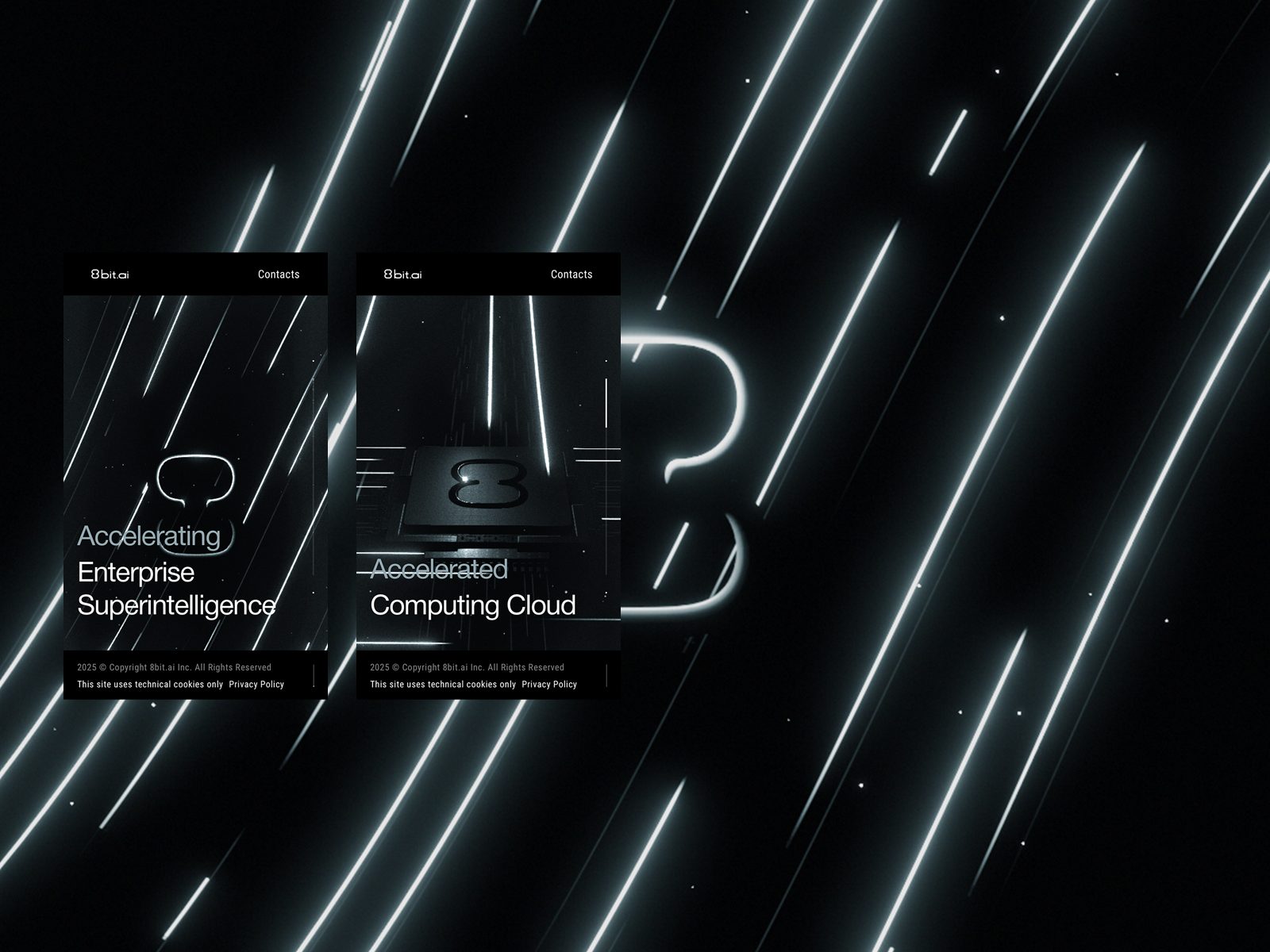
Context. 8bit.ai is a platform that combines artificial intelligence and retro digital culture to offer an interactive universe of visual creativity. Its website is a tribute to 1980s pixel art reinterpreted with generative AI tools and a navigation system that mixes game, experience and technology branding. In the global conversation around best web design 2026, this site shows how to merge nostalgia, interactivity and technical avant-garde without losing message clarity.
1) Visual and Design
The design is a delightful collision between the retro and the futuristic. From the first glance, users enter an interface that recalls classic video games, but with smooth animations, dynamic lighting and modern depth. The dark background highlights a vibrant palette of cyan, magenta, acid green and purple: a controlled neon palette that balances energy and legibility. Monospaced typography reinforces the digital look without becoming caricature.
Pixel microanimations, animated gradients and buttons that blink on hover create a continuous interactive rhythm. Visual components such as bars, borders and modular panels are carefully designed to simulate old-system interfaces while being optimized with modern scroll and transitions. The art direction balances humor, design and technology.
2) UX (User Experience)
The user experience is as immersive as it is intuitive. 8bit.ai adopts a gamified navigation structure: each section such as Create, Explore, Train and About is presented as a level in a video game. Users progress by unlocking visual content and examples of AI applied to art. The interaction curve is designed to create curiosity: first the aesthetic, then the functionality. This pattern sustains attention longer than a standard informational website.
The responsive design is very well resolved: on small screens, menus become circular icons and lighting effects are simplified without losing identity. Technically, it stands out for graphic resource optimization, achieving low load times despite a high level of animation. Every interaction feels smooth, direct and fun.
3) Content and Brand Narrative
The tone of voice is provocative and playful: “Let’s make AI fun again”. It moves away from corporate discourse and adopts a narrative that humanizes technology. The content explains AI features accessibly, through interactive visual examples and generative demos. Every word invites the user to experiment, not just read. The narrative structure works like a gamified tutorial: you discover the product while playing with it.
Video game metaphors such as missions, achievements and bonus levels reinforce the idea of continuous exploration. In SEO, the site uses powerful vocabulary around emerging searches: creative AI, generative art, retrofuturist design and interactive websites.
4) Why It Works as a Best Web Design 2026
Coherent and memorable aesthetics. It connects visual nostalgia with generative AI.
Gamification as UX. It turns navigation into an interactive experience.
Advanced technical design. Optimized WebGL and 3D microinteractions.
Accessible narrative. It translates AI into visual and emotional language.
Natural engagement. The playful approach creates connection without needing incentives.
5) Actionable Recommendations
• Add a technical blog with use cases to reinforce authority.
• Add visible AI impact metrics such as generated images and active users.
• Include dark and light theme options to expand accessibility.
• Improve interactive audio performance for mobile devices.
• Create an educational version for art and design schools.
6) Conclusion
8bit.ai is a gem of web design in 2026: fun, intelligent and technically impeccable. It does not simply present a product; it invites users to live it. It proves that digital creativity does not need to be serious to be revolutionary. A clear reference for designers who want to break molds between play, aesthetics and technology.
Vooban — Web Design Analysis (Visual, UX, and Content)
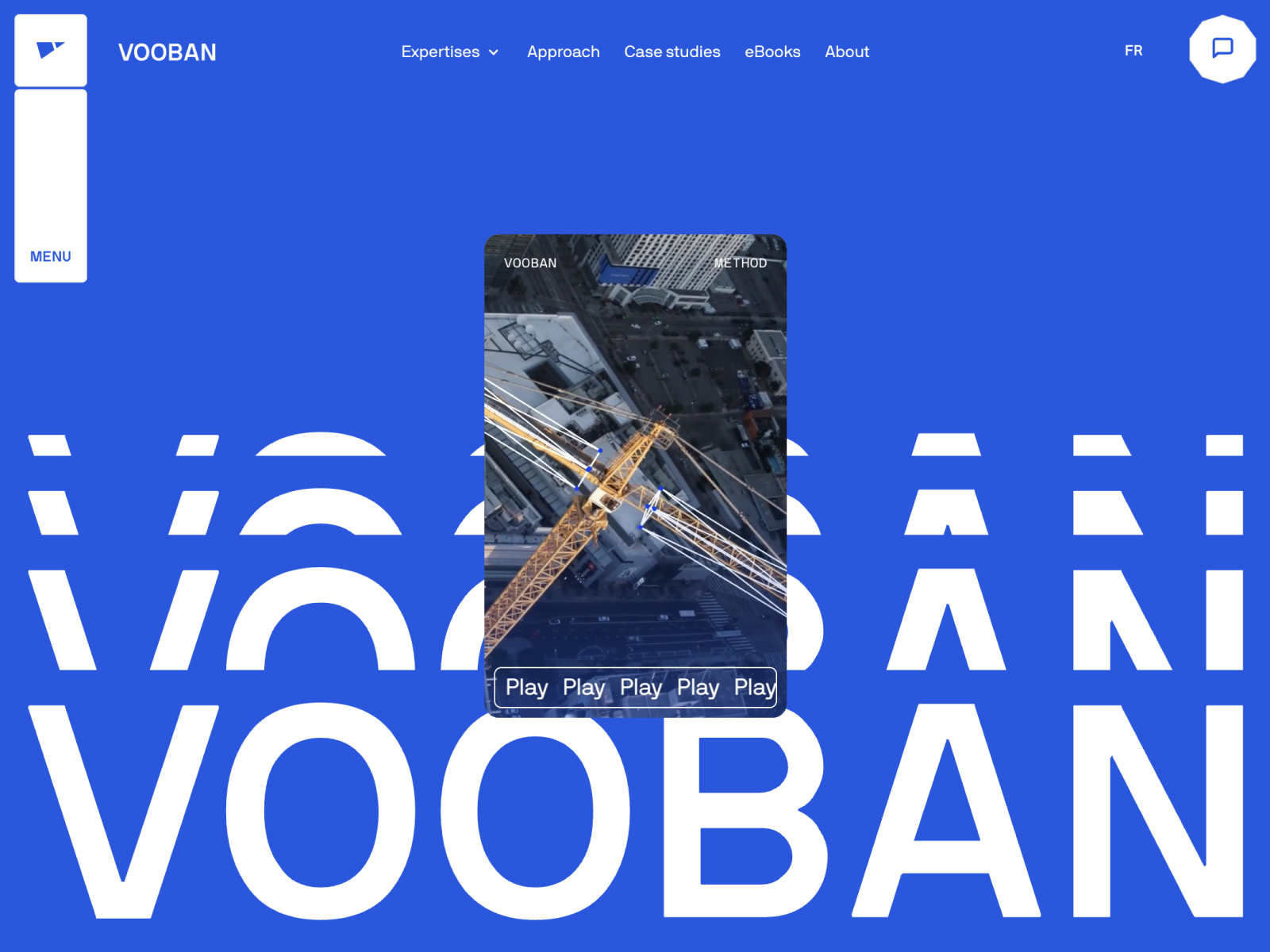
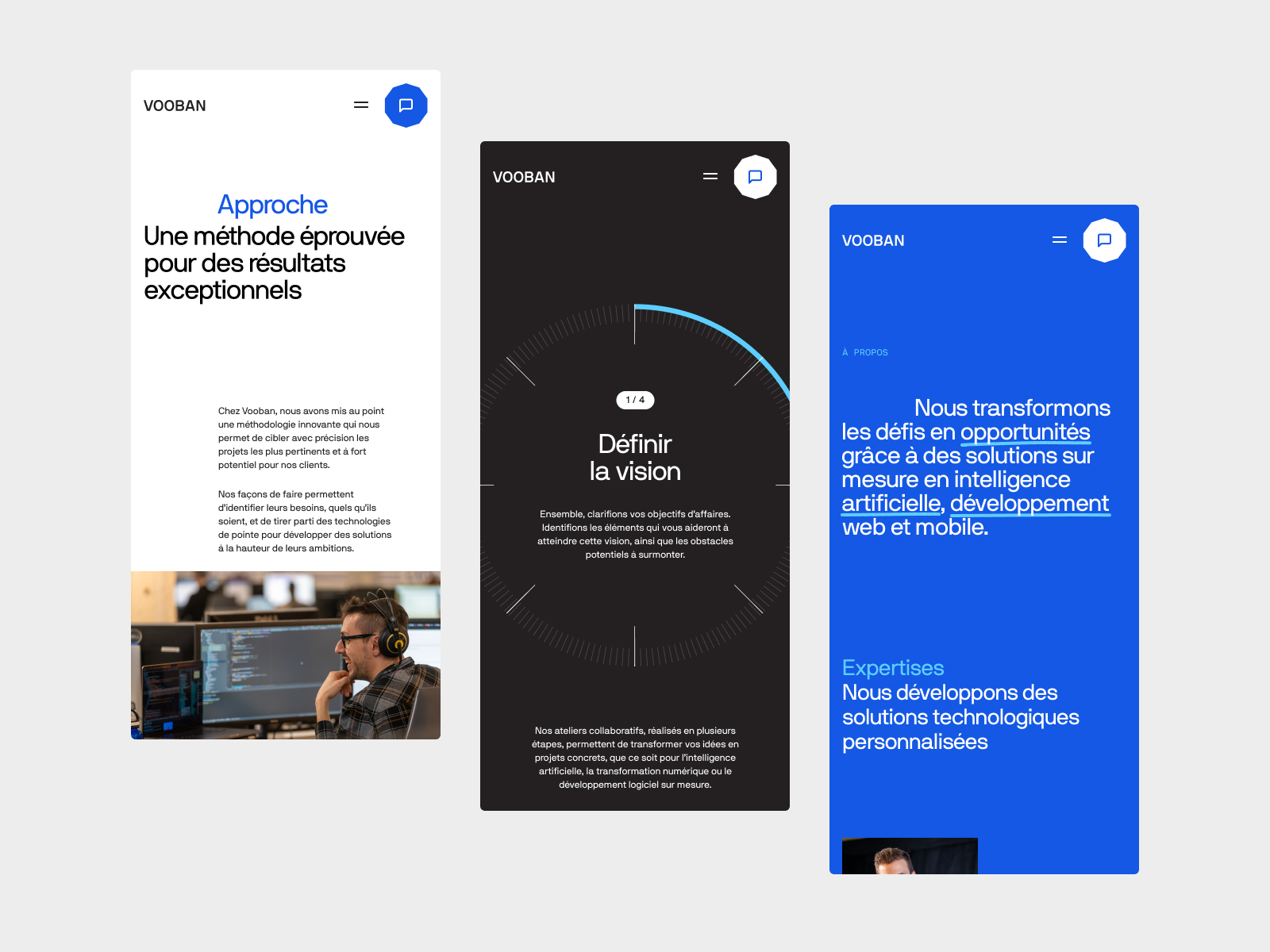
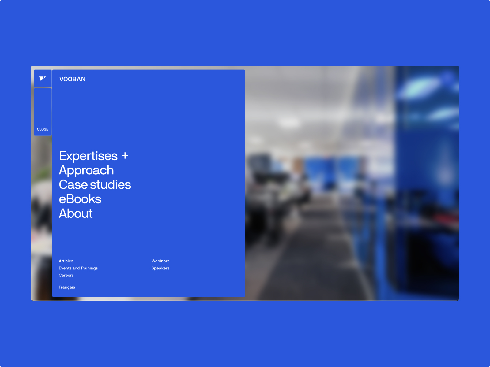
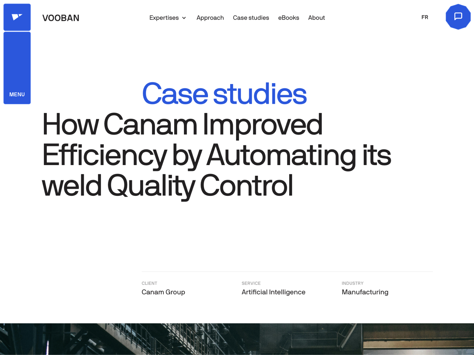
Context. Vooban is a Canadian technology agency specializing in artificial intelligence applied to industry and sustainability. Its website is a masterful example of how to combine corporate clarity with a strong visual identity. Within the ranking of best web design 2026, Vooban stands out for its balance: it communicates innovation without artifice, trust without rigidity and technology without coldness. It is a website that conveys seriousness, talent and future vision.
1) Visual and Design
Vooban’s design is a case of pragmatic elegance. It relies on a palette of dark tones with lime green and electric blue accents, communicating technological energy. The use of condensed display typography for headlines and rounded sans type for body text creates visual rhythm without losing legibility. Content blocks are perfectly aligned in an adaptive grid, with generous spacing and precise use of color as hierarchy.
The main hero presents a subtle background video, with particles that simulate moving data, while bright white text stands out against matte black. This contrast communicates control, innovation and seriousness. Transitions are soft, with vertical movement and controlled fade effects. The design shows how restraint can be powerful when combined with visual precision and narrative coherence.
2) UX (User Experience)
The user journey is built with impeccable logic: what we do, our projects, why AI, contact. Everything is where it should be, clear and without unnecessary layers. Load time is fast, navigation is fluid and the information architecture is perfectly hierarchical. On mobile, the menu becomes a drawer-style system with discreet animations, preserving coherence between desktop and smartphone.
The site integrates narrative scroll in key sections, allowing text to synchronize with vector animations. This not only improves understanding but also creates a sense of fluidity and modernity. The UX writing is concise, with clear action buttons and a tone that inspires collaboration.
3) Content and Brand Narrative
Vooban’s discourse combines technical authority and humanity. It focuses on showing how AI can generate positive impact for the planet and for business. Instead of cold corporate language, it uses a close, outcome-oriented tone: transforming data into sustainable decisions. Project sections are carefully written with concrete data and dynamic graphics, reinforcing transparency and credibility.
Emotionally, the brand positions itself as AI with purpose. It does not sell technology, but human solutions enhanced by technology. Every word reinforces that promise. From an SEO point of view, Vooban uses high-value keywords around applied artificial intelligence, sustainable automation and technology consulting, supporting strong international visibility.
4) Why It Works as a Best Web Design 2026
Structural clarity. The architecture guides without confusing.
Emotional corporate design. It balances technical precision and visual empathy.
Human focus. Values and social impact take center stage.
Useful interactivity. Animations improve understanding.
SEO and narrative consistency. Every text is designed to position and persuade.
5) Actionable Recommendations
• Add a downloadable resources section such as whitepapers and case studies.
• Add subtitles or multilingual versions for international expansion.
• Strengthen the team section with interactive microprofiles.
• Include visible sustainability indicators such as reduced emissions and energy savings.
• Add a technical blog to reinforce authority and increase organic traffic.
6) Conclusion
Vooban is a perfect example of how corporate web design can evolve toward emotion without losing credibility. It combines technical precision, clear narrative and restrained design with impeccable execution. It represents the maturity of web design in 2026: when aesthetics stop being decorative and become a visual strategy of trust. An ideal reference for web design studios in Barcelona aiming to create high-impact international B2B projects.
Top Tier Relats — Web Design Analysis (Visual, UX, and Content)
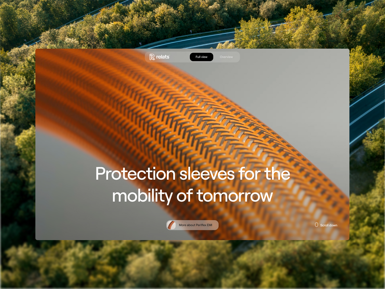
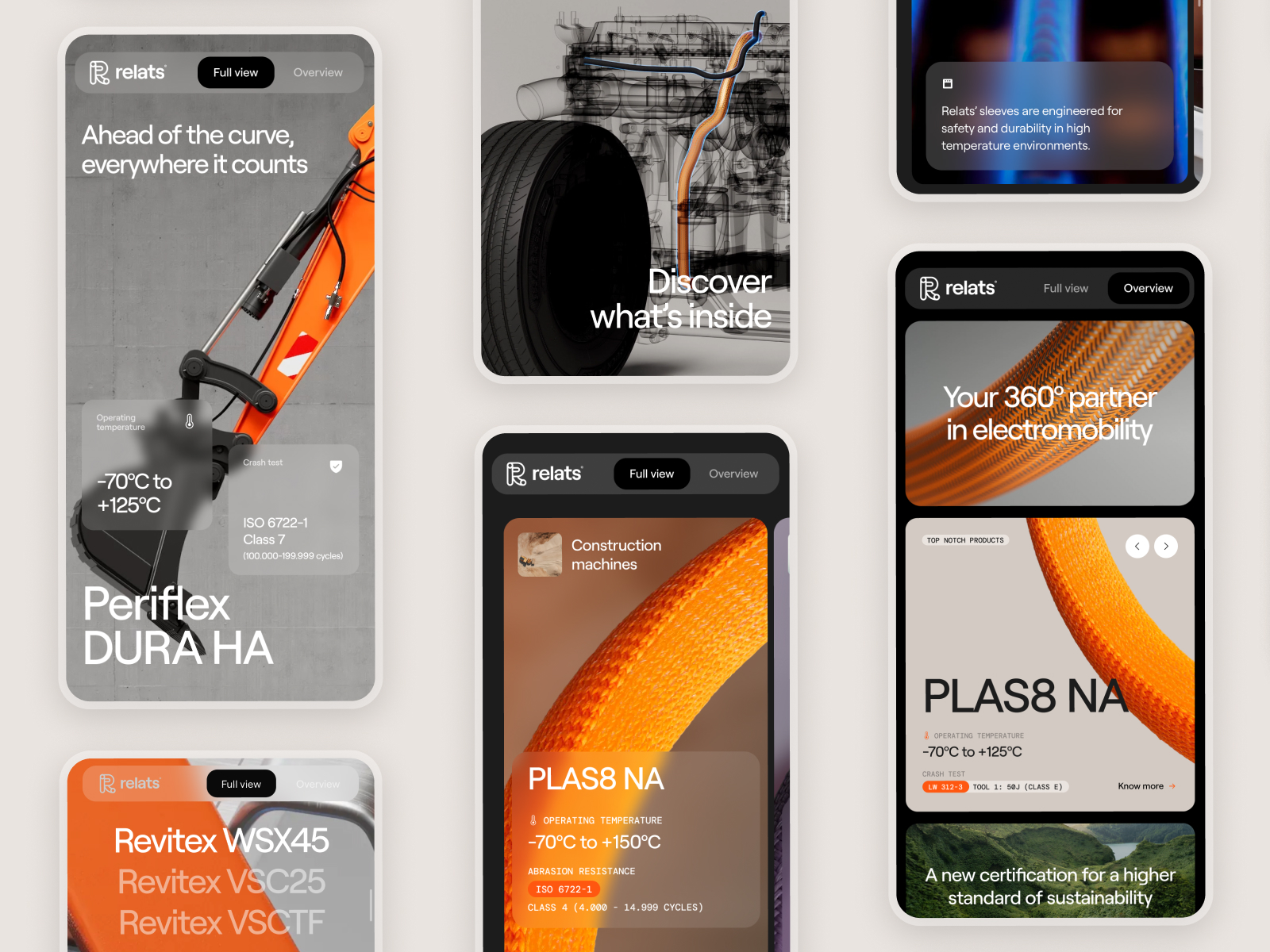
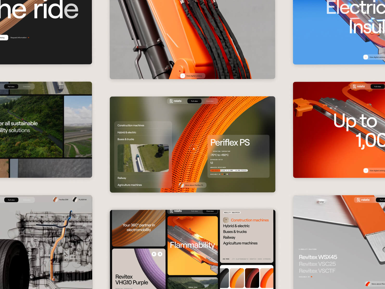
Context. Top Tier is a division of the industrial group Relats, dedicated to advanced insulation, thermal protection and high-performance material solutions. Its new website — toptier.relats.com — stands out as one of the best corporate websites of 2026 thanks to its impeccable balance between design, technology and industrial narrative. It shows how a B2B brand can be visually powerful, modern and approachable without losing technical rigor.
1) Visual and Design
The art direction of Top Tier Relats combines industrial minimalism with digital sophistication. The aesthetic is based on neutral tones — white, gray, black — with warm orange accents, the corporate color of Relats, bringing energy and visual coherence. Modern sans-serif typography reinforces the feeling of precise engineering. Each module is built with mathematical symmetry: exact margins, controlled visual rhythm and impeccable typographic hierarchy.
The design communicates solidity and transparency. Product blocks are combined with technical imagery and light 3D renders, creating the appearance of a technology laboratory. Transition animations — subtle movements and fades — keep the experience fluid, reinforcing the perception of a modern technology brand. The message is clear: high-level technology designed for humans.
2) UX (User Experience)
The UX of Top Tier Relats is an example of informational clarity. Main navigation is divided into well-defined sections: Products, Solutions, Technology, Sectors and Contact. Each opens into a structured tree that allows access to detail without losing context. The calls to action are discreet but effective, inviting users to discover more, see specifications or request technical information.
The architecture is designed for technical audiences such as engineers and industrial buyers, but with a friendly and contemporary interface. On mobile, the accordion-style navigation system simplifies access to technical sheets without overloading the screen. Interactive elements such as tables, image sliders and internal links behave smoothly, reinforcing the perception of a technological and modern brand.
3) Content and Brand Narrative
The content combines technical precision with a clear and elegant narrative. The brand voice is professional, rigorous and positive. There are no empty phrases, but data and results: certified materials, sustainable innovation, global presence. Each text is built on controlled technical language, yet understandable for a general audience. This balance makes the brand feel expert but approachable — a rare combination in the industrial sector.
Visual storytelling reinforces the message: videos and photographs present the material in action, in real environments such as aeronautics, automotive and renewable energy. The brand does not simply sell a product, but a vision of responsible engineering. From an SEO perspective, the structure uses headings and meta descriptions effectively, aimed at terms such as advanced thermal solutions, industrial technical insulation and high-performance materials.
4) Why It Works as a Best Web Design 2026
Clean and professional design. No artifice: only clarity, balance and elegance.
Functional UX. The structure guides naturally, prioritizing efficiency and understanding.
Industrial narrative with soul. It communicates technology with humanity.
Contemporary aesthetic. The design feels premium without being pretentious.
Technical optimization. Lightweight, fast and perfectly responsive.
5) Actionable Recommendations
• Add an innovation or R&D section with projects in development.
• Add a People & Culture area to humanize the industrial brand.
• Integrate client testimonials or success cases with verifiable figures.
• Explore additional language versions with localized SEO: DE, FR and ES.
• Create an interactive microsite explaining manufacturing processes.
6) Conclusion
Top Tier Relats represents the ideal model for industrial web design in 2026: visually impeccable, technically solid and with a human brand discourse. It understands that innovation is not communicated with data alone, but also with aesthetic clarity. Its execution makes it a reference not only within the technical sector, but also within European corporate design. A strong example of how industrial brands can reach the visual level of leading international creative studios.
If you are collecting references for a redesign, it may also help to review our web design trends for 2026, a selection of best web designs of 2025 and sector-specific examples such as architecture websites, technology web design or web design for pharmaceutical laboratories. From our web design studio in Barcelona, we approach these projects with strategy, design and custom development.
Turn inspiration into a project
We can help you define the visual direction, content architecture and development of a website designed to generate trust with clients, partners and talent.
General Conclusion — The Best Web Designs of 2025–2026
After analyzing the ten selected projects, it is clear that web design in 2026 is defined by three essential principles: intelligence, emotion and accessibility. The strongest websites are no longer just digital showcases, but coherent experiences where every pixel has a purpose. From the sensory worlds of Symphony of Vines to the corporate precision of Vooban or the impeccable industrial design of Top Tier Relats, they all share one common thread: the fusion of technology and humanity.
The future of web design lies in creating systems that communicate without friction: clean, agile, inclusive and emotionally intelligent experiences. Leading studios — both international and local — understand that the web is not only visual design, but narrative strategy, behavior and brand perception.
In this context, Barcelona consolidates its position as one of the creative capitals of the world. From here, studios like Code Barcelona work with that vision: projects that balance aesthetics, performance and content. Because good web design is not only seen: it is felt, understood and remembered.
The year 2026 will mark a new stage: the maturity of web design as an integral discipline. An era where speed, digital sustainability and visual empathy will become the true indicators of quality. In that scenario, the best web design studios in Barcelona will continue to play a central role in global evolution.
In summary: the best web designs of 2025–2026 stand out not only for their aesthetics, but for their ability to connect ideas, people and technology. Each one, in its own way, proves that the future of digital design lies in thinking with soul and creating with purpose.
Related web design resources
Continue exploring our guides to the best web designs of 2026, outstanding web designs from 2025, and the main web design trends for 2026. For projects focused on conversion, see how much a landing page costs. Our web design studio in Barcelona applies these principles to custom digital projects.
Practical application: turn these references into a real project through our custom web design and development and website speed audit and WPO services.
Great design still depends on a stable technical foundation. When a WordPress site is broken, hacked or critically slow, WP Repair provides specialist diagnosis and one-off repair.
Best Web Designs of 2026. Los puntos clave.
What defines good web design in 2026?
Good web design in 2026 combines visual identity, speed, accessibility, brand storytelling and a clear user experience. It is not only about creating an attractive website, but about building a coherent digital presence that explains the value proposition and helps users take the next step.
What do the best websites today have in common?
The best websites today usually share strong art direction, content that is easy to scan, useful microinteractions, solid technical performance and a clear connection between design and strategy. Every visual element has a purpose: to guide, explain, engage or convert.
Which web design trends stand out in 2026?
In 2026, key trends include more immersive interfaces, expressive typography, modular visual systems, subtle animation, accessible design and the integration of technology without losing clarity. Corporate websites with storytelling, useful content and a distinctive visual language are also becoming more important.
How should you choose references for a corporate website redesign?
References should be chosen for their intention, not only for their aesthetics. It is useful to analyse what each website communicates, how it organises information, what visual rhythm it uses, how it presents products or services and what kind of trust it builds. The goal is not to copy a reference, but to translate it into the brand, sector and objectives of each company.
What is the difference between a beautiful website and a strategic website?
A beautiful website can create a strong first impression, but a strategic website communicates the company’s value more clearly, structures messages, improves navigation and guides users towards a specific action. Visual design matters, but it should work together with content, UX, positioning and conversion.
When should a website be redesigned?
A website should be redesigned when it no longer represents the brand properly, fails to explain services clearly, generates few enquiries, loads slowly, does not work well on mobile or is no longer aligned with the company’s evolution. A redesign is also useful after a change in positioning, visual identity or commercial strategy.
What should a B2B corporate website include in 2026?
A B2B corporate website should clearly explain what the company does, who it works for, what problems it solves and why it is trustworthy. It also needs real case studies, well-structured messaging, simple forms, strong performance, accessible technical content and a visual identity aligned with the company’s level.