An automotive landing page shouldn’t just showcase a machine—it should set the stage. It should create a scene, bringing the product into focus with space, visual tension, and that spark of desire that turns a quick visit into a lingering look.
In automotive web design, perceived value starts long before the spec sheet. It begins with composition, color, product scale, typography that stays out of the way, and motion that adds rhythm without becoming empty spectacle. When the product feels carefully presented, the brand earns trust before asking for anything.
Radian is a standout example because it gets this distinction. The bike takes center stage, the interface supports, and the visual direction creates a launch atmosphere—not just a catalog. There’s UX/UI, commercial intent, and visual rhythm, but everything is woven seamlessly into the experience: configuring, exploring, or reserving feels like a natural extension of desire.
Radian — product up front, brand in the background
The first bold move is compositional: the bike appears head-on, large, clean, almost unavoidable. There’s no battle between headlines, modules, banners, or scattered promises. The design understands that, on an automotive landing, the object must lead. The interface doesn’t disappear, but it knows its place: minimal navigation, a clear call to action, and branding that frames without overshadowing the product.
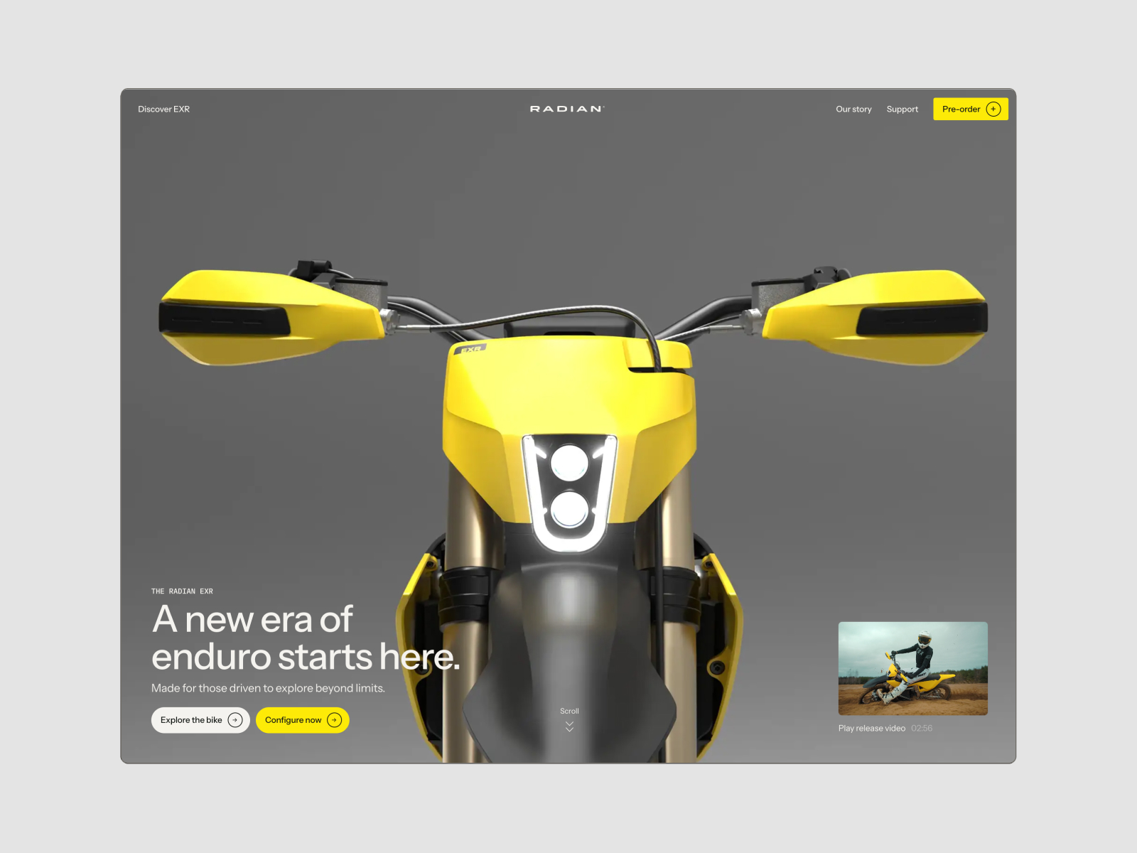
The yellow of the bike isn’t just eye-catching—it’s an anchor. Against the gray background, the product stands out and stays memorable. That contrast builds identity without the need for an overloaded graphic system. Visual memory is created through precision: a recognizable product, a background that doesn’t compete, and a button that echoes the same chromatic energy.
Typography reinforces the premium feel. It doesn’t steal the spotlight, but ensures clarity. The logo at the top, minimal links, and CTAs organize the experience with a calm confidence: you know where you are, what you can do, and what’s at the heart of the scene.
What’s interesting is that the aesthetics aren’t just decoration. Commercial intent is present from the first block: explore, configure, reserve. The design doesn’t kill desire with cheap urgency, but it doesn’t leave you hanging either. That’s a valuable lesson for any brand with pre-sales, launches, or high-ticket products: perceived value rises when commercial action feels like a natural part of the experience—not an afterthought.
A hero section with rhythm, not noise
The hero section achieves something rare: it’s bold without shouting. The bike commands the center, buttons are right where they should be, and the scroll introduces a sense of journey. It’s not animation for animation’s sake—it’s about giving the first screen a pulse.
For an automotive brand, this kind of introduction changes how the product is perceived. It’s not just another item in a catalog—it’s the star of the show. And that directly impacts perceived value: the more intentional the setting, the more cared-for the product feels.
Radian — motion, scroll, and hotspots that invite exploration
Motion is where the landing starts to feel less static and more immersive. The key is that movement doesn’t obscure information—it paces it. The page doesn’t bombard you with arguments; it draws you in layer by layer, with a cadence more like a product launch than a conventional sales page.
Typography that sets the scene
A single, well-timed word can do more for identity than three paragraphs of explanation. Here, typography acts as art direction: it appears with drama, adds visual texture, and signals a shift in the experience’s rhythm.
This technique works when used sparingly. A strong reveal can heighten emotion, energy, and personality; too many reveals turn navigation into a waiting game. The difference is in the curation. In Radian, motion adds atmosphere and helps the brand feel innovative without becoming cold.
Hotspots for exploration without overload
Hotspots are one of those details that, when used well, add depth to an automotive landing without overwhelming it with text. They let you highlight features, specs, or design choices right when the user is focused on the product. Information appears in context, not as a separate block.
This improves UX/UI in a simple way: it reduces friction. Users don’t have to leave the scene to understand it. They can explore, discover, and connect form with function. For technical or aspirational products, this light interaction helps maintain attention and trust without turning the page into an endless spec sheet.
A configurator with commercial intent
The configurator grounds the desire. After the visual impact, it’s time to choose, compare, move forward. In automotive ecommerce or reservation flows, this step is delicate: if it feels too transactional, it breaks the mood; if it’s too editorial, it doesn’t convert.
Here, the experience keeps the product in view and supports the decision with clear options. That mix is powerful for brands selling something more complex than an impulse buy. Users need to feel excitement, yes—but also control. Conversion isn’t just about impact; it’s about a well-ordered sequence.
Radian — a benchmark for automotive web design
What’s most interesting about Radian isn’t any single visual detail—it’s the sum: focused composition, memorable color, understated typography, rhythmic motion, and interaction that turns the product into a journey. Everything is designed so the bike stands out without sacrificing clarity.
This is a strong reference for marketing teams working with aspirational products, launches, pre-sales, or lead generation. Not because every brand should use a giant bike on a neutral background, but because the logic is widely applicable: less noise, more focus; fewer scattered arguments, more directed desire.
When an interface feels tailor-made for the object it presents, perceived value rises. Users don’t feel like they’re browsing a template filled with renders—they experience something built around an identity. In automotive, luxury, tech, or high-interest industrial products, that difference matters.
There’s also a valuable takeaway for campaigns, product pages, reservation flows, and digital branding: you don’t need to say everything on the first screen. What matters is deciding what should stick—a silhouette, a color, a word, an interaction, a well-placed call to action. That’s where conversion begins, long before the form.
Radian leaves a clear impression: a landing page can sell without being heavy-handed. It can be visual, precise, and commercial all at once. It can have atmosphere without losing direction. And it can turn an automotive product into something much harder to ignore—a piece with presence, visual rhythm, and its own identity.