This post is dedicated to a new web project we completed in March—a web design and web development project for Álvaro Vargas.
In a storytelling format, I’ll walk you through the entire design and development process for this brand-new website.
A few weeks ago, Álvaro Vargas reached out to us. Initially, he was looking for information about designing a cookbook that he plans to publish in the future.
Who is Álvaro Vargas?
Álvaro Vargas is a highly active nutritionist who creates daily content about nutrition and health for social media. With a deep understanding of media and how it works, he places great importance on social platforms and knows how to leverage them to boost his visibility.
He’s active on Facebook and Instagram, hosts podcasts, and runs a YouTube channel—on all of them, he consistently produces high-quality content for those interested in nutrition and wellness. He regularly shares photos of his dishes, films recipes for YouTube, and writes blog posts on his personal website. He’s also published a couple of books on the same topics.
Now, taking his career a step further, Álvaro has come up with the brilliant idea of sharing his knowledge in person. To start, he’ll be offering a couple of courses in Barcelona and Madrid.
After agreeing to design the interior of his cookbook, we continued discussing his projects, and he entrusted us with an exciting new assignment.
To support his new venture of in-person courses, he needed a website where people could sign up.
Let’s get to work!
With this brief, we got started in the studio. After several conversations to nail down the project details, we had a clear sense of Álvaro’s style—something fresh, intuitive, direct, and reflective of his personality and professional goals.
So, we began working on the visual concept we would present to Álvaro.
This has been one of the most refreshing projects we’ve tackled recently—a cutting-edge assignment with no design constraints, as Álvaro is very open-minded and trusted our professional judgment from the start. We paid close attention to detail, and we loved the result. Admittedly, at first, we wondered if Álvaro would be bold enough to let us take the reins, but he immediately understood and embraced the vision we had for his website.
For the graphic design of the website, we reviewed his social media, books, and blog to perfectly capture the design style that would suit him best.
The technical highlights of this project were the website’s animations, color palette, and information layout.
What goals did we need to achieve?
Our aim was to create a one-page website—dynamic, intuitive, straightforward, and highly engaging.
Users should be able to quickly browse the site and find all the information they need to decide if they’re interested in the course and how to sign up.
The timeline was tight, as Álvaro wanted the website ready by early April.
To meet this deadline, we focused on the following key areas:
- The color palette
- Information layout
- Animations
- Menu
- Communicating Álvaro’s vision and mission
- Payment gateway
- Personalized gifts for Álvaro

1. The color palette
We chose a high-contrast color mix that gives the design a bold visual impact—perfect for a one-page website. This approach draws users in and keeps their attention on the screen until they’ve reached the end, absorbing all the information almost effortlessly.
2. Information layout
We also paid special attention to how information is organized. Just like with the colors, the layout guides the eye from section to section, keeping users engaged and preventing boredom or drop-off.

3. Animations
The website features several effects that capture users’ attention and add the dynamic feel essential to the project’s goals.
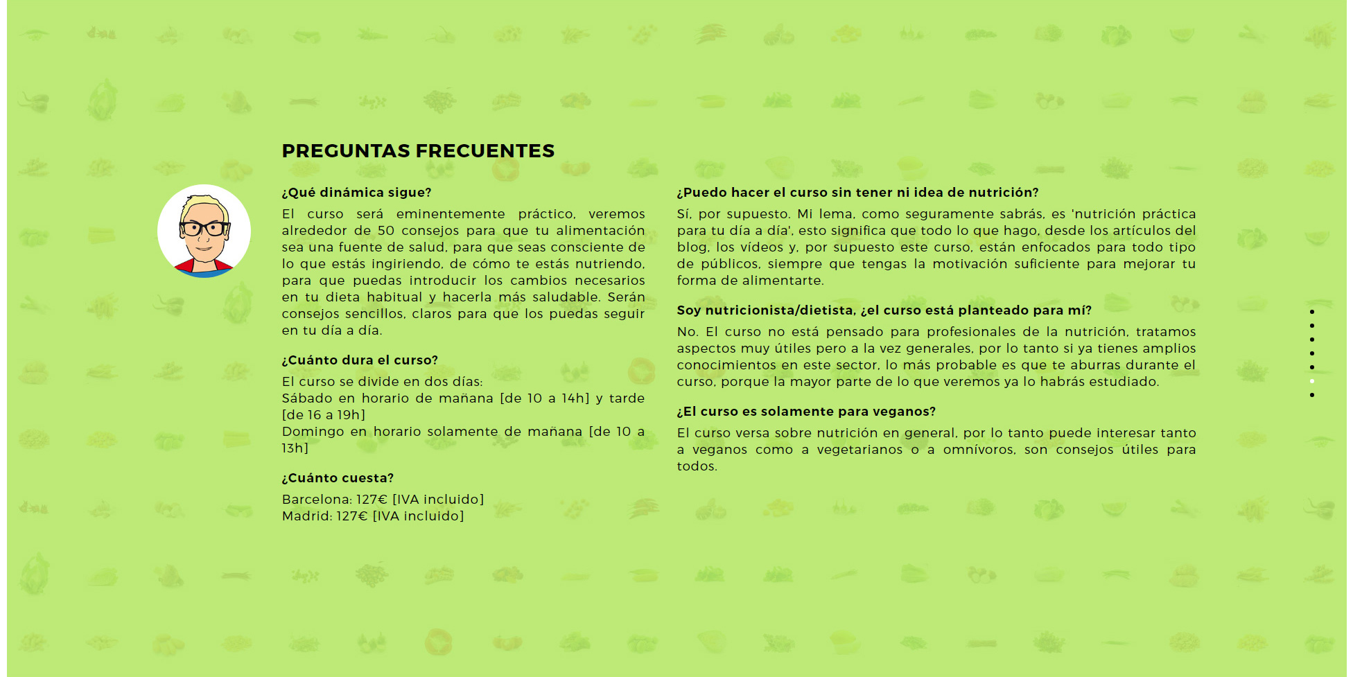
For example, in the “Frequently Asked Questions” section, we created playful animations: Álvaro’s eyes follow your cursor, and when you hover over one of the food items in the background, it magically—or programmatically—disappears!
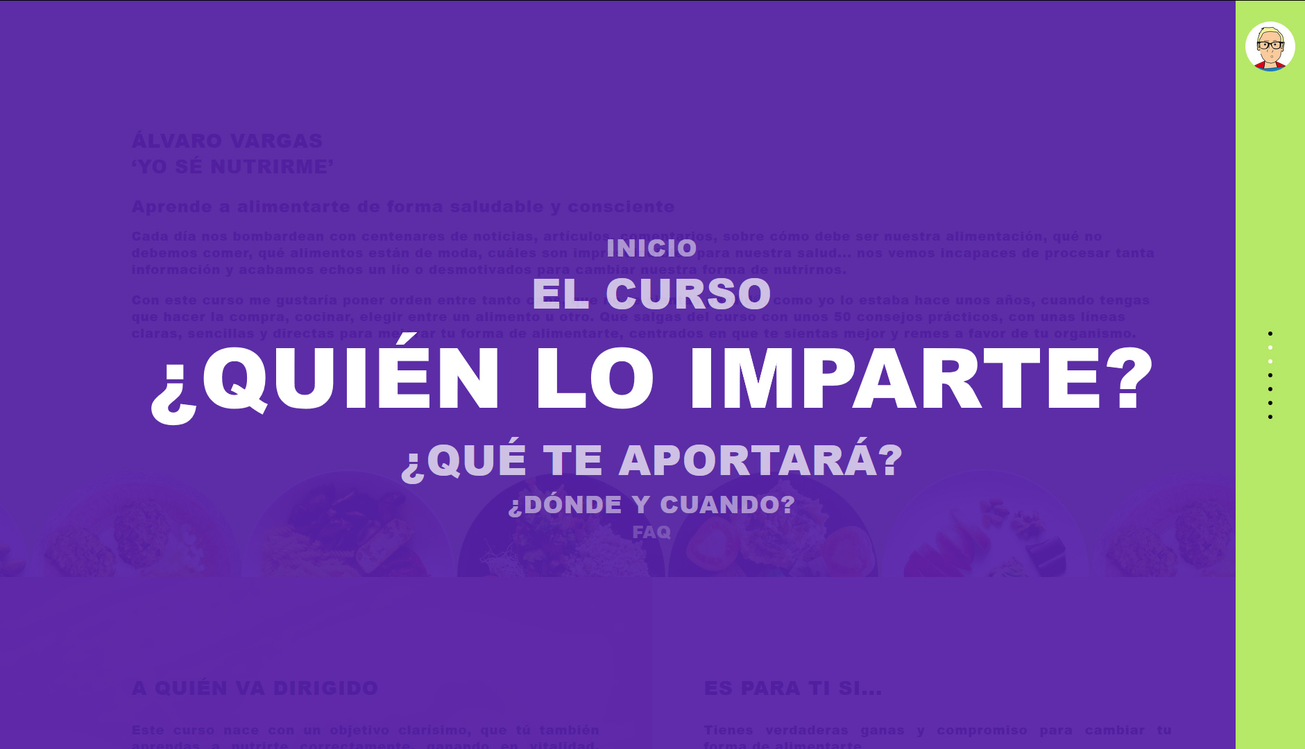
4. The menu
The website features a unique, horizontally positioned menu that lets users jump to any section at any time. The menu also features smooth transitions with a sense of depth, making navigation a pleasure.
5. Communicating Álvaro Vargas’s vision and mission
Thanks to the previous elements and the content Álvaro provided, his vision and mission came through loud and clear.
Once the graphic design for the website was approved and Álvaro gave us the green light, we got to work on the site’s development.

6. Payment gateway
Since this was a website with a payment gateway, ensuring robust security was crucial. We thoroughly tested the system and walked Álvaro through how the payment process works, making sure everything was clear and seamless.

Within just a few weeks, the website was fully designed and developed. Everything was ready for launch—and launch we did.
7. Personalized gifts for the client 😉
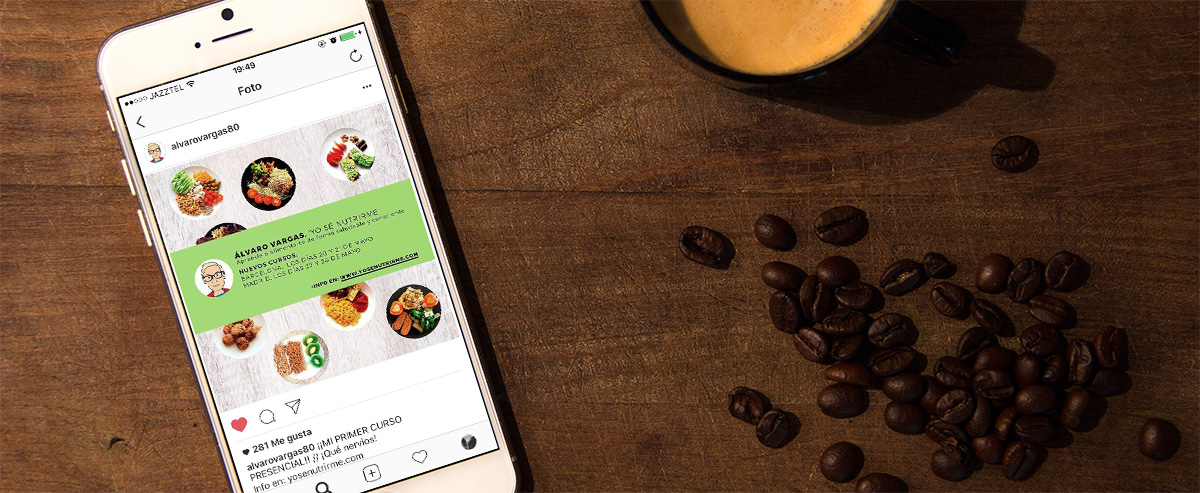
As a special touch, we created custom cover images for Álvaro to share his course links on Instagram and Facebook, helping him get the most out of his new site.
We know that from day one, Álvaro had people interested in signing up—some didn’t hesitate for a second to reserve their spot.
The teams at JordiEnsenyatDisseny and CodeWebBarcelona wish him the very best with this new project and hope he fills every seat in the house.
Recognition
So far, our work has already been featured on several websites showcasing inspiring web design projects, such as:
http://www.csswinner.com/details/yo-s-nutrirme/11414
http://www.designnominees.com/sites/yo-s-nutrirme
https://onepagelove.com/yo-se-nutrirme
http://www.bestcss.in/user/detail/Yosenutrirme-5193
The project live
If you’re curious and want to see the project in action, just follow the link to his website: www.yosenutrirme.com