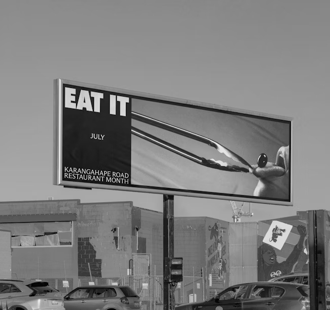
Motion Sickness celebrates the provocation, sexuality, and cultural identity of Karangahape Road in a campaign that turns desire into visual language
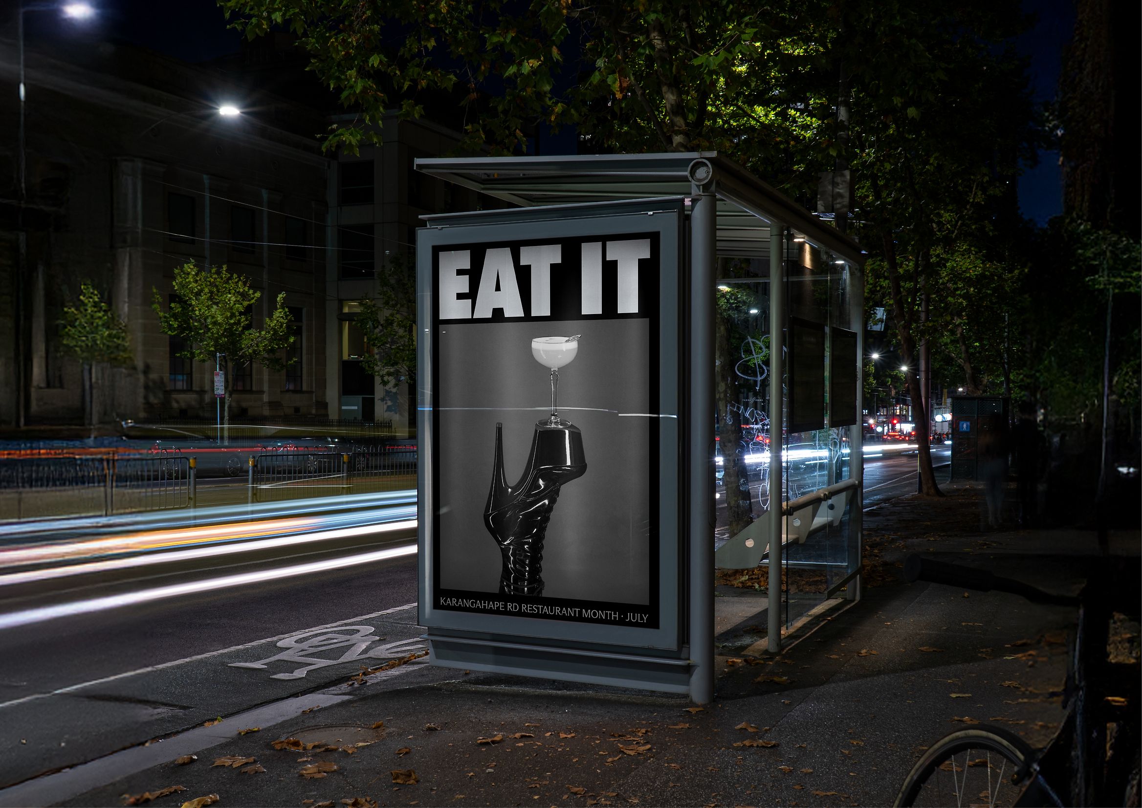
Every week at Code Barcelona, we look for a project that stands out not just for its beauty, but for its attitude. EAT IT is exactly that: a visual explosion that pushes the boundaries of food communication—an ode to identity and transgression. Created by New Zealand studio Motion Sickness for the Karangahape Road Business Association, this project proves that graphic design can be as provocative as it is poetic.
Winner of the Best Design Award 2025 in the Design Communication category, EAT IT doesn’t just invite you to eat. It seduces, challenges, and wraps you in a visual narrative charged with desire, irony, and neighborhood pride. It’s not a piece to be explained—it’s meant to be experienced.
Context: Karangahape Road, a kilometer of culture and freedom
To understand EAT IT, you have to understand Karangahape Road—better known as K-Rd—the most vibrant, irreverent, and diverse neighborhood in Auckland. Since the 1970s, it’s been the epicenter of queer movements, underground art, nightlife, and alternative cuisine. Its spirit isn’t about trends; it’s about living unapologetically.
The challenge was huge: create a campaign that captured this essence without turning it into a cliché. As the studio put it, “The time had come for Karangahape Road’s take on ‘restaurant month’. So we created EAT IT — an ode to the road’s provocative attitude, powerful sexuality and one-of-a-kind gastronomical offering.”
Creative concept: eating as pleasure and provocation
The idea behind EAT IT is as simple as it is brilliant. Eating isn’t just a necessity—it’s sensual, instinctive, and emotional. And on K-Rd, where food, clubs, art, and performance collide, that connection is inevitable.
The concept revolves around three pillars:
- Provocative attitude: a bold invitation to indulge without shame.
- Fetish-inspired aesthetic: BDSM as a visual metaphor for desire, control, and freedom.
- Local pride: using the neighborhood’s culture as creative raw material.

The result is a brand campaign that blends eroticism, irony, and visual sophistication to celebrate what K-Rd truly is: a community unafraid to be seen for what it is.
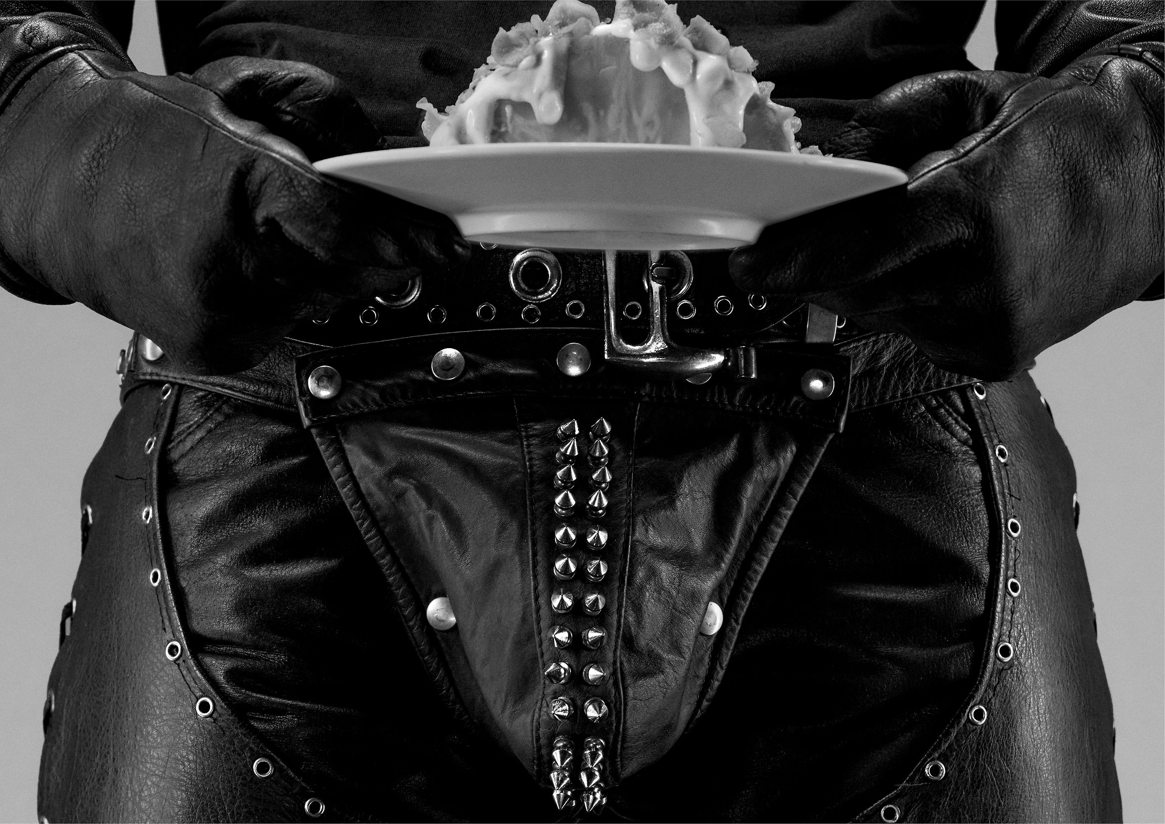
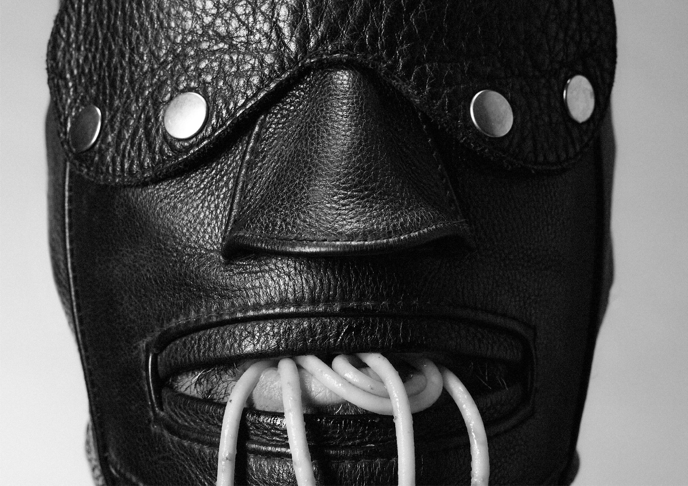
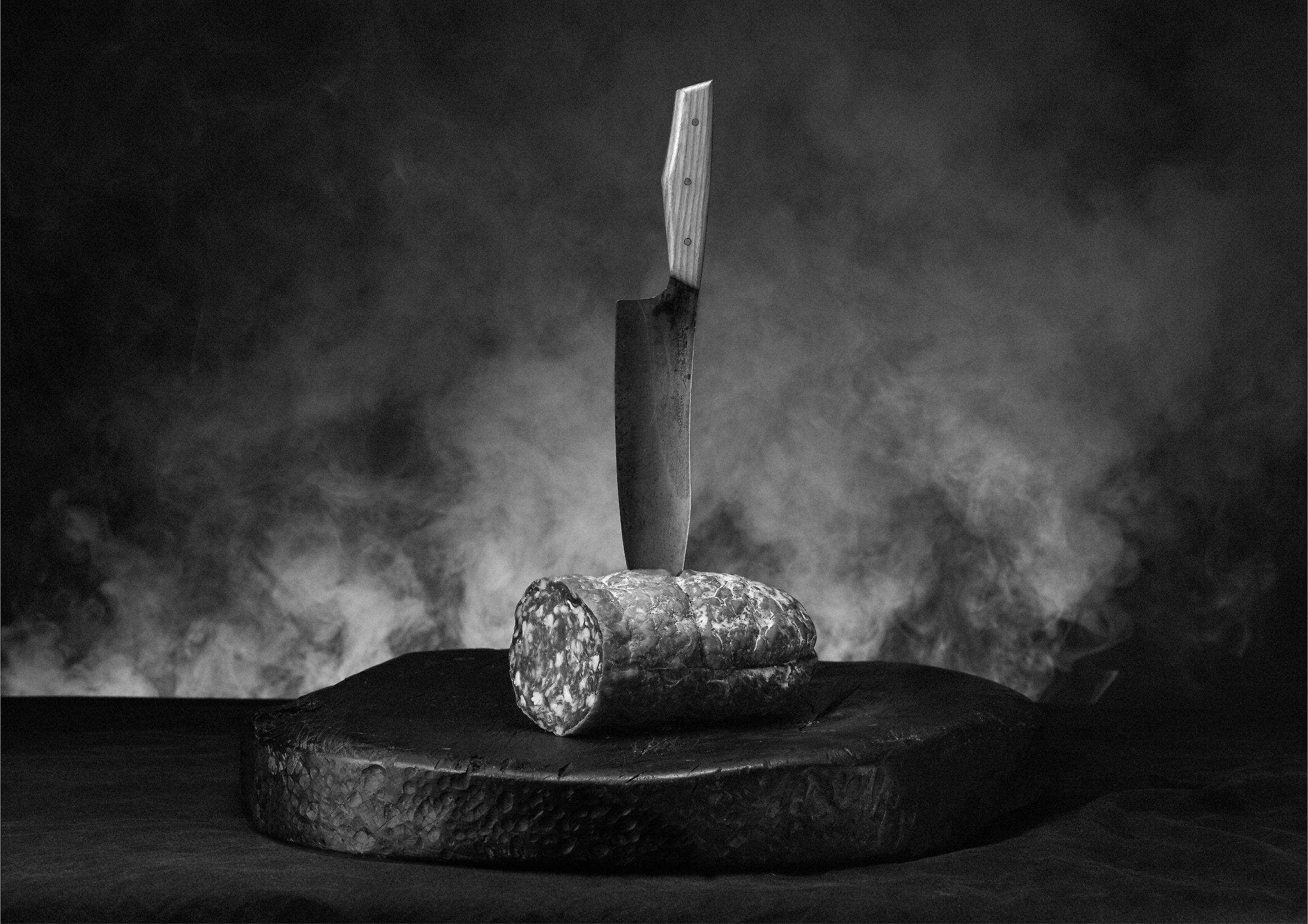
Art direction: leather, metal, and desire
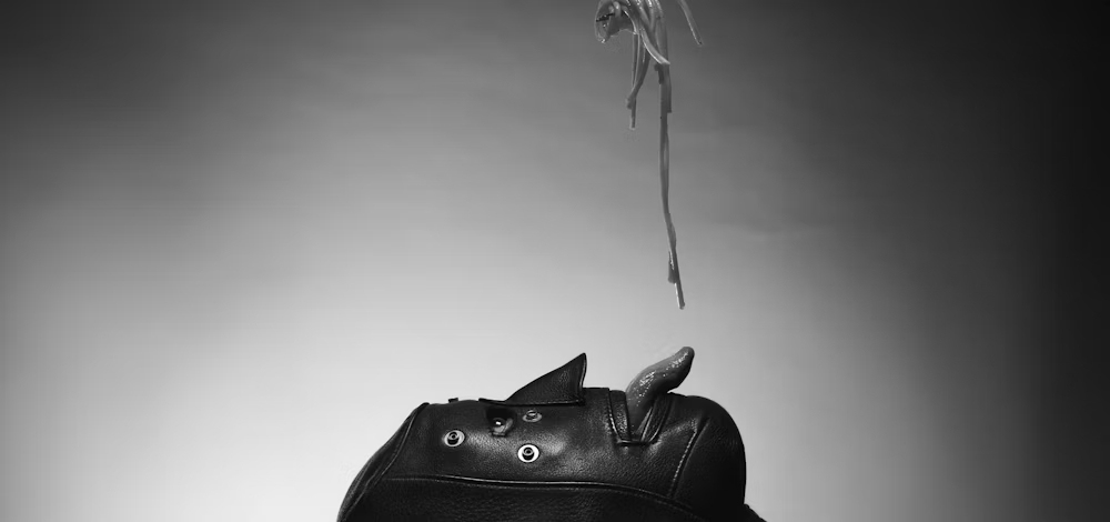
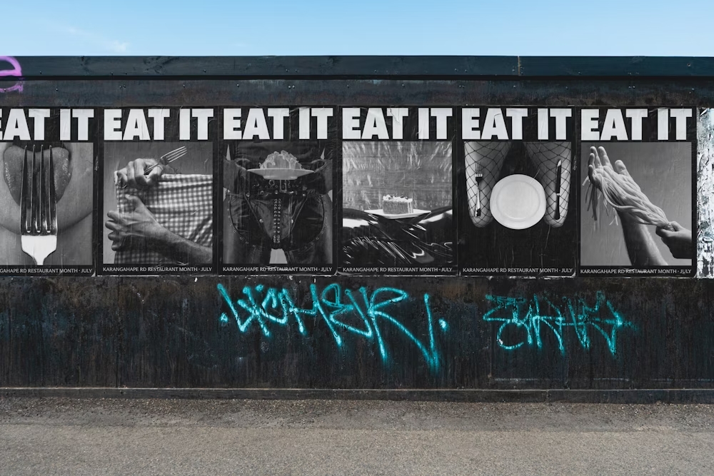
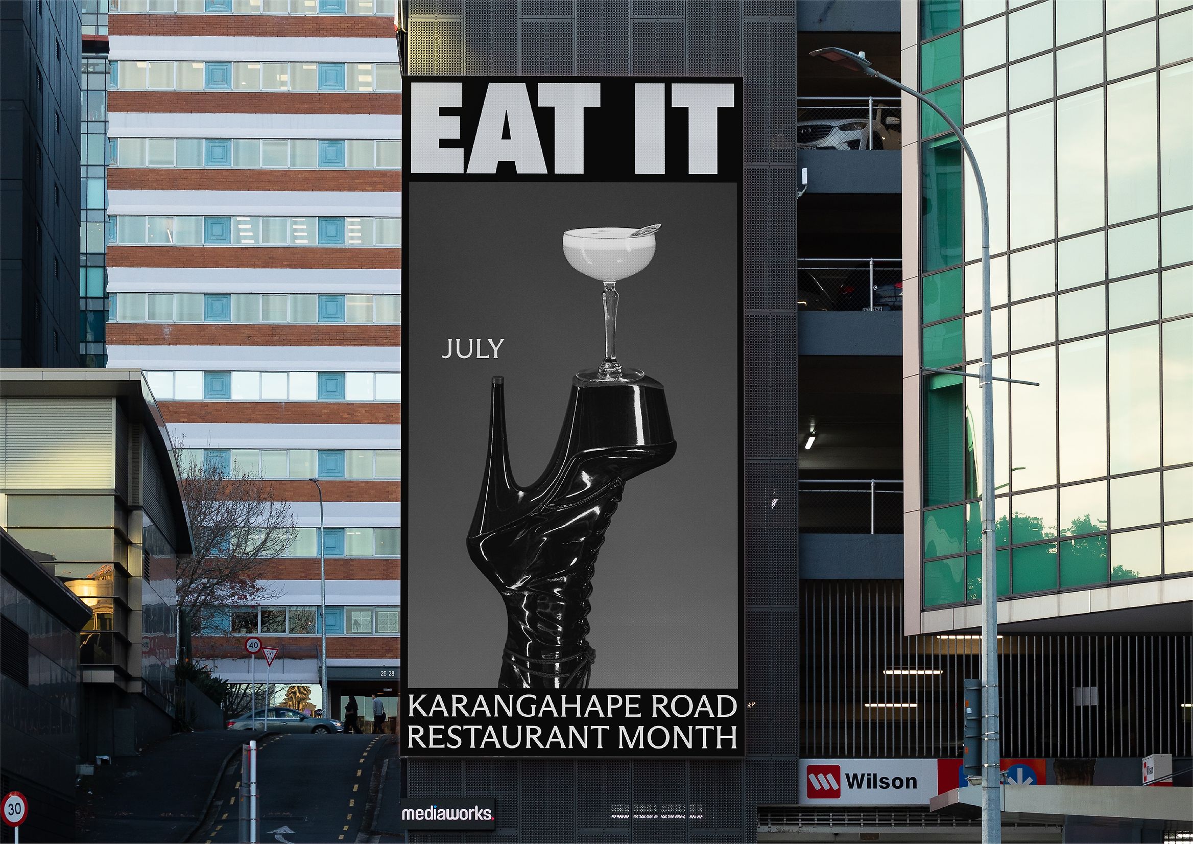
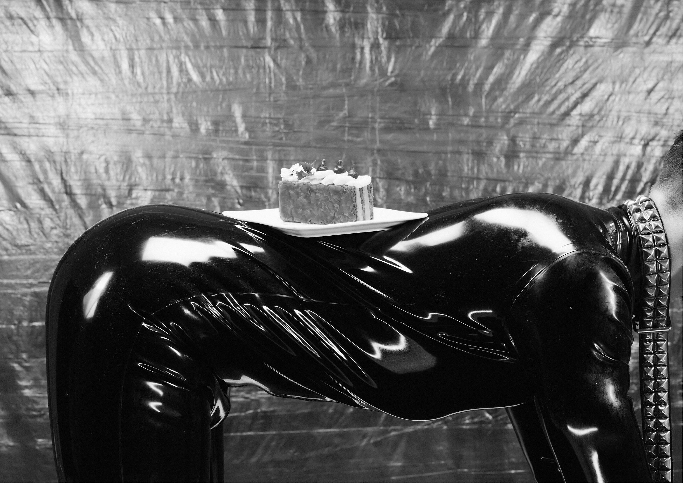
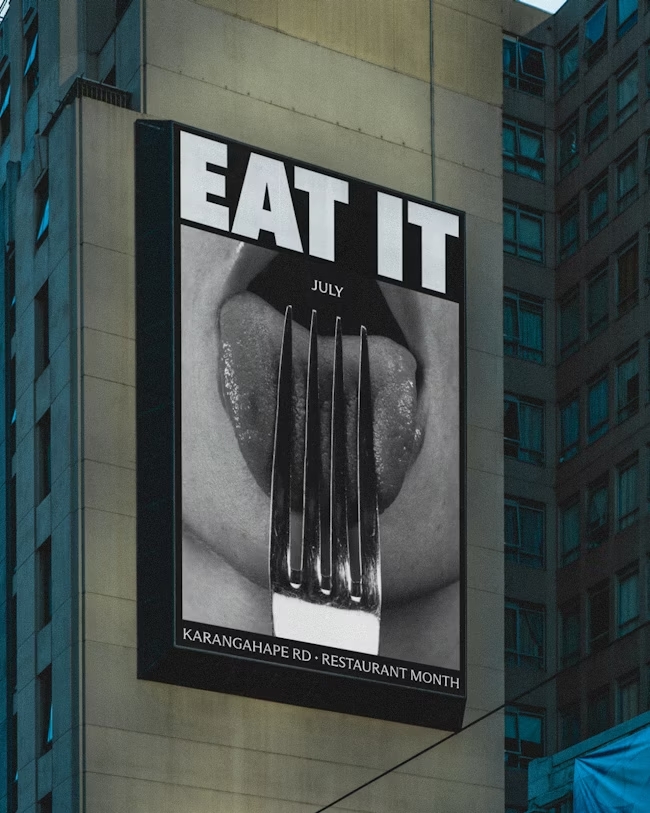
The visual universe of EAT IT is built on materiality: black leather, polished steel, chains, stilettos, and gleaming surfaces that evoke the world of fetish and BDSM aesthetics. Yet, far from being excessive or vulgar, the treatment is visually restrained and deeply elegant.
The creative team, led by Sam Stuchbury (Creative Director) and Hamish Steptoe (Art Director), with Freddy Riddiford on copywriting, achieves a perfect synthesis of sensuality and design. Every photo is a metaphor for pleasure: food, bodies, and objects merge in a visual narrative that appeals more to touch than sight.
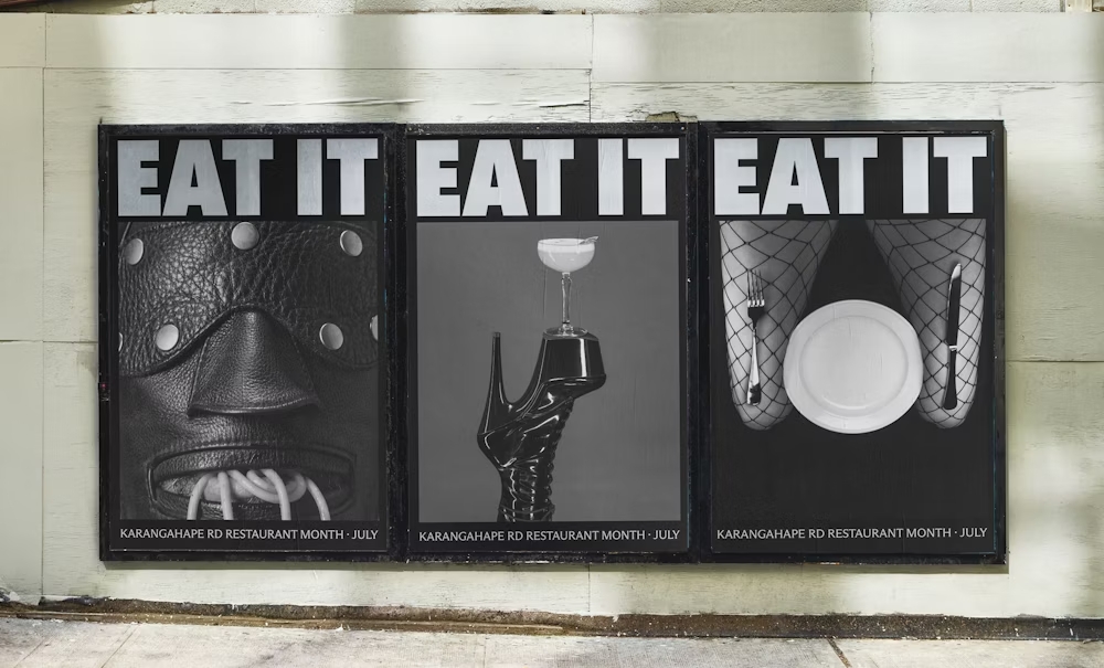
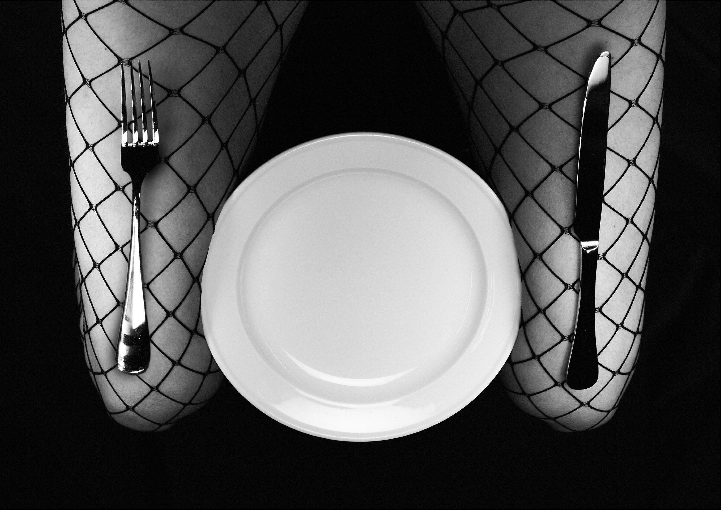
The images, shot in a cinematic style, are dense, glossy, and deliberately dark. Black dominates the composition, while color emerges in metallic reflections, wet textures, and highlights. There’s no literalism—only suggestion.
As the team says: “Suggestive and richly stylised imagery takes us on a journey deep into the world of BDSM and kink, which for decades has thrived along Karangahape.” That line perfectly sums up the project’s sensibility: visually powerful, culturally aware.
Typography and tone: the voice of desire
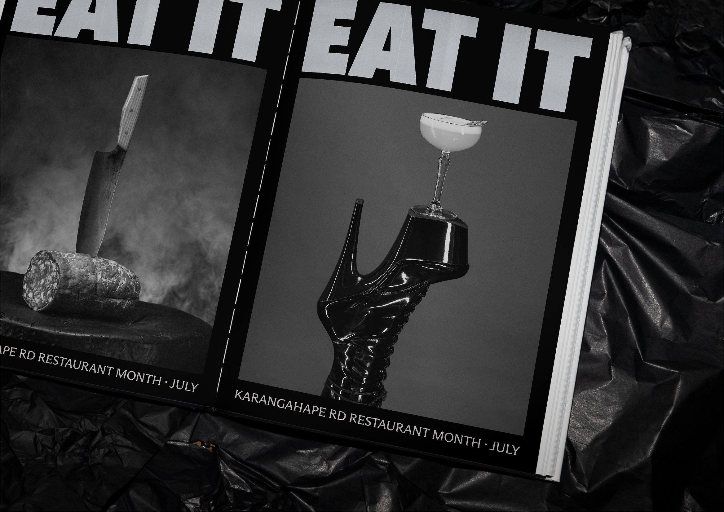
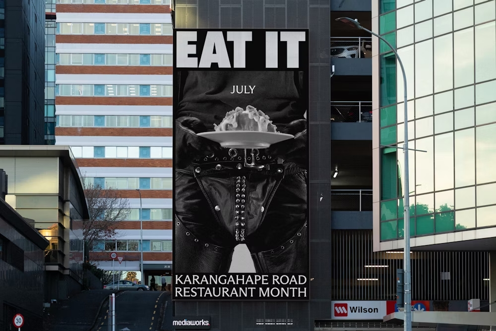
The “EAT IT” text dominates the space like a command. Bold, sans serif, compact. Its impact is intentional—no embellishments, just strength. In a world of diluted messages, this campaign chooses brutal clarity.
White on dark not only ensures visual contrast, but also reinforces the aesthetic of power at the heart of the concept. Every word feels forged in steel. No rhetoric—just action. The message doesn’t ask; it commands.
This direct tone carries through to the supporting copy—short, sharp, with the punch of a tagline. “Succumb to Karangahape Road.” The campaign turns a phrase into a mantra, an invitation into a dare.
Photography and materials: where gourmet meets erotic
One of the project’s greatest strengths is its sensory fusion: the visual codes of food design intertwine with those of eroticism. A dripping strawberry becomes a symbol of desire; a glass of wine, a metaphor for surrender. Textures take center stage—silk, skin, metal, liquid.
Objects—chains, heels, straps—are woven into the food in subtle, symbolic ways. There’s no visual shock—just balance. Every detail is meticulously calculated to maintain the tension between pleasure and elegance.
Design as cultural activism
Beyond its aesthetics, EAT IT is an act of cultural representation. It doesn’t try to “sanitize” Karangahape Road’s image, but to amplify it. It doesn’t turn its queer, provocative identity into a product, but into visual pride.
In this sense, the campaign is a form of social design: it’s not about pleasing, but about reflecting. The choice of BDSM as a visual metaphor is rooted in a long history of resistance and sexual freedom within New Zealand’s community.
EAT IT doesn’t sell food—it sells a way of living and desiring. This is graphic design at its purest: visual communication with ideological and emotional substance.
Reception and reviews
The Designers Institute of New Zealand judges described it as:
“An outrageously provocative invitation to K-Rd. So simple. So direct. Undeniably K-Rd in its attitude.”
A verdict that perfectly captures the project’s essence: provocation with purpose.
Here, provocation is never gratuitous. Eroticism isn’t an accessory—it’s the most honest language for a place where sensuality and diversity have always been at the heart of its identity.
The campaign was widely discussed in the media and on social networks for its boldness and elegance, becoming a benchmark for contemporary urban communication. Above all, it’s an example of how the aesthetics of pleasure can also be a tool for inclusion.
A lesson in identity and visual coherence
What makes EAT IT truly great isn’t just its flawless art direction, but its absolute coherence. Every visual element, every texture, every word serves a single idea: pleasure needs no justification.
That narrative coherence is what transforms a simple campaign into a work of cultural identity. Design stops being a vehicle and becomes the protagonist—capable of moving, challenging, and representing.
Conclusion: design that dares to be hungry
EAT IT isn’t just a celebration of food—it’s a celebration of desire. Graphic design becomes visual poetry, a political gesture, a declaration of aesthetic independence. In an industry saturated with safe, predictable branding, Motion Sickness reminds us that design can be both subversive and sophisticated.
That’s why, at Code Barcelona, we’ve chosen it as our featured graphic design of the week: because it reminds us that design isn’t just communication—it’s a way of feeling.
And because sometimes, the bravest thing a brand can do is look to its neighborhood, its history, and its desires—and dare to say, without fear: EAT IT.


