The latest edition of our monthly roundup, Best Web Designs of the Month… for May, is here! In this article, we’ll take the pulse of the current web design and development scene—don’t miss it.
It’s time to take a break and get inspired by our hypnotic selection of the best web designs from May 2019.
Inspiration: Best Web Designs of May 2019
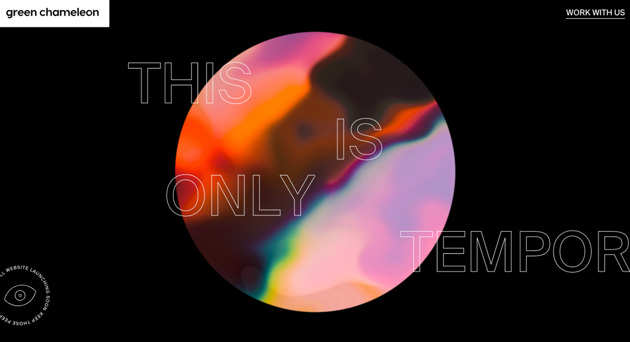
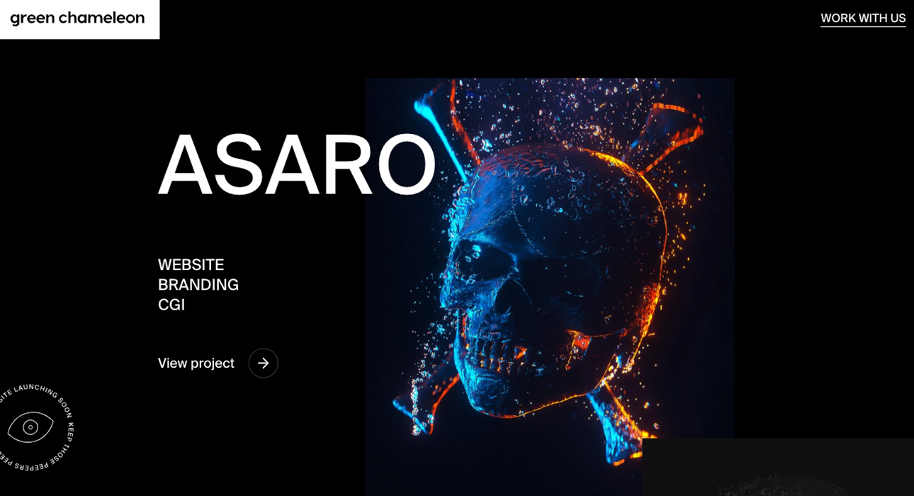
Craftedbygc
Marketing agency Green Chameleon has surprised us with a website dedicated to keeping the spirit of web design alive while their full site is under construction.
Right from the start, we found the “meanwhile” concept both clever and refreshing—a rarely seen approach that works brilliantly.
What stands out most is the use of bold, advertising-style typography. Project images are displayed in color against a black background, giving the site a sophisticated edge.
Overall, the design is minimalist with a journal-like feel—large, direct messaging and minimal text.
There’s not much to say about the development, as it doesn’t seem overly complex, but it’s executed just as well as you’d expect. Transitions and hover effects are smooth, giving the site just the right amount of dynamic flair.
Navigation is based on vertical scrolling, which is more than enough for a site of this type.
Lean back in your studio chair—with just a couple of minutes and a single finger, you’ll have plenty of time to explore Green Chameleon’s work. A winning approach.
Check out their website at:
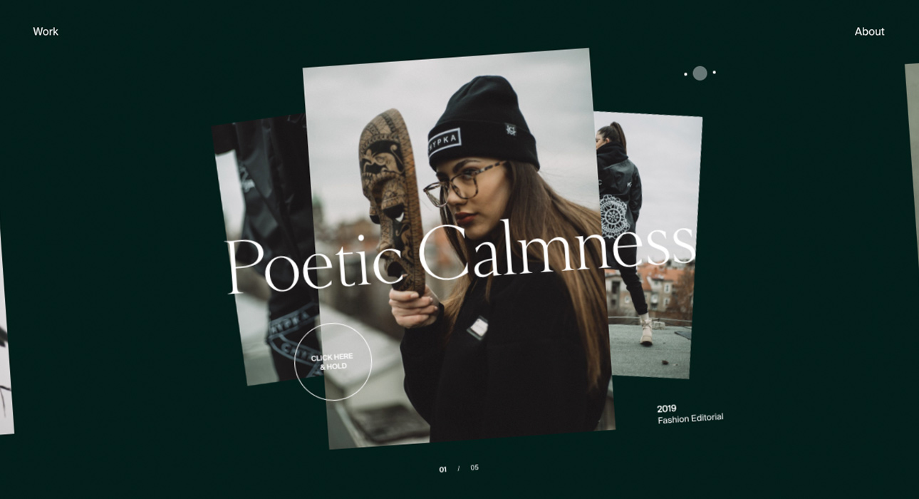
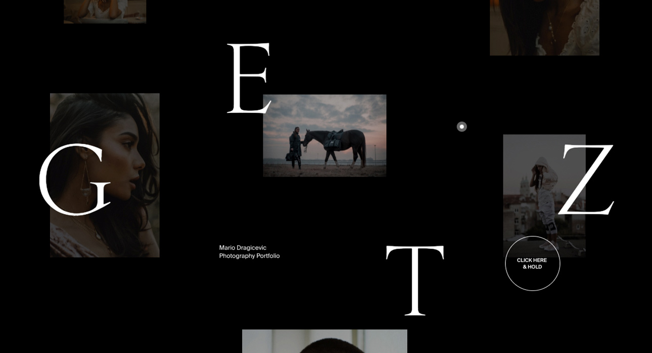
Getz
This website is the personal project of portrait photographer and videographer Mario Dragicevic.
Designed as a portfolio to showcase Mario Dragicevic’s photographic talent, it makes our list for bringing a touch of innovation to the online portfolio space.
The site stands out for its bold, unconventional color palette—saturated tones, pastels, black, green… all topped with a subtle Instagram-style filter and clear, oversized messaging.
Transitions are expertly programmed, with seamless execution and no visible loading jumps—everything flows smoothly.
Project navigation is spot-on, using vertical scrolling that moves content horizontally, and a gamer-inspired click-to-load feature to view project details.
Project pages are also minimalist and personal, presenting images in various layouts and formats, as if ready for magazine publication.
Check out their website at:
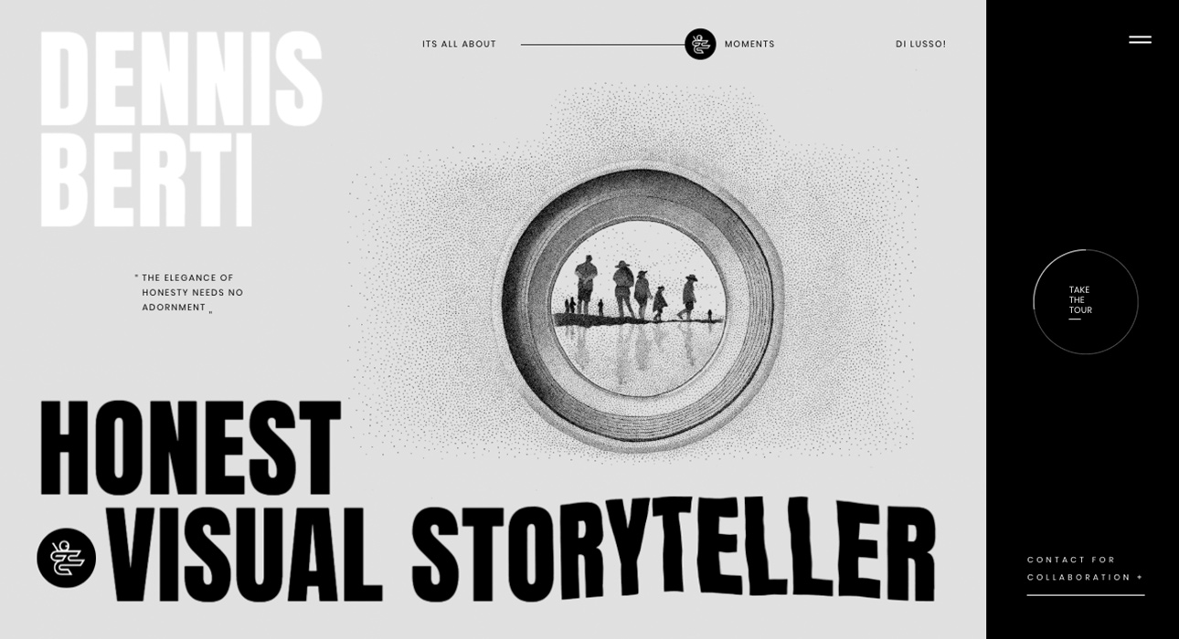
Dennis Berti
Continuing with the photography theme, this gem also makes our list of May’s best web designs.
The site is dedicated to showcasing Dennis Berti’s photography—a highly personal project that reflects his unique style.
The main feature here is the 2019 web design trend of using oversized, headline-style typography to introduce content.
The first win is the choice of a strong, basic sans-serif font that delivers the message instantly.
Beyond that, the overall design is understated and minimalist, highlighting the importance of his photography—and it absolutely succeeds.
Section-based navigation might be the site’s only weak point, requiring users to browse through different categories. However, this likely reflects the author’s desire to keep work groups distinct.
Check out their website at:
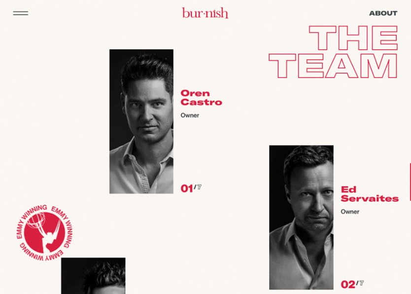
Burnish Creative
The video post-production team at Burnish Creative presents their new website—a project that, as you might guess, is fresh and highly visual.
Perhaps the most notable feature is the hamburger menu, which only appears on click, ensuring that first-time visitors are immediately immersed in the studio’s impressive portfolio.
It’s another example of a portfolio site with its own personality, offering a unique way to experience the studio’s work.
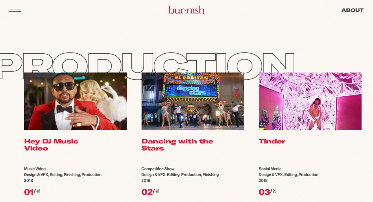
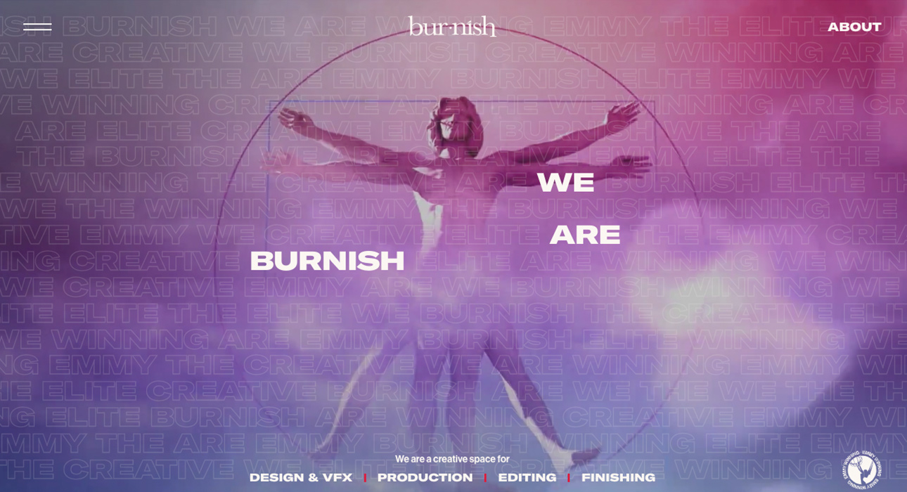
Check out their website at:
DEMO – Design in Motion Festival
This one’s my personal favorite—and it’s no wonder, since a motion design festival’s website could never be ordinary.
That’s exactly what they’ve achieved: a dynamic, fresh, eye-catching, and tech-forward design.
Everything is amplified by massive typography, bold text, and striking motion and transitions that energize the site without overwhelming it.
But a word of warning: if you’re not a fan of heavy animation, this might not be the project for you. Judge for yourself.
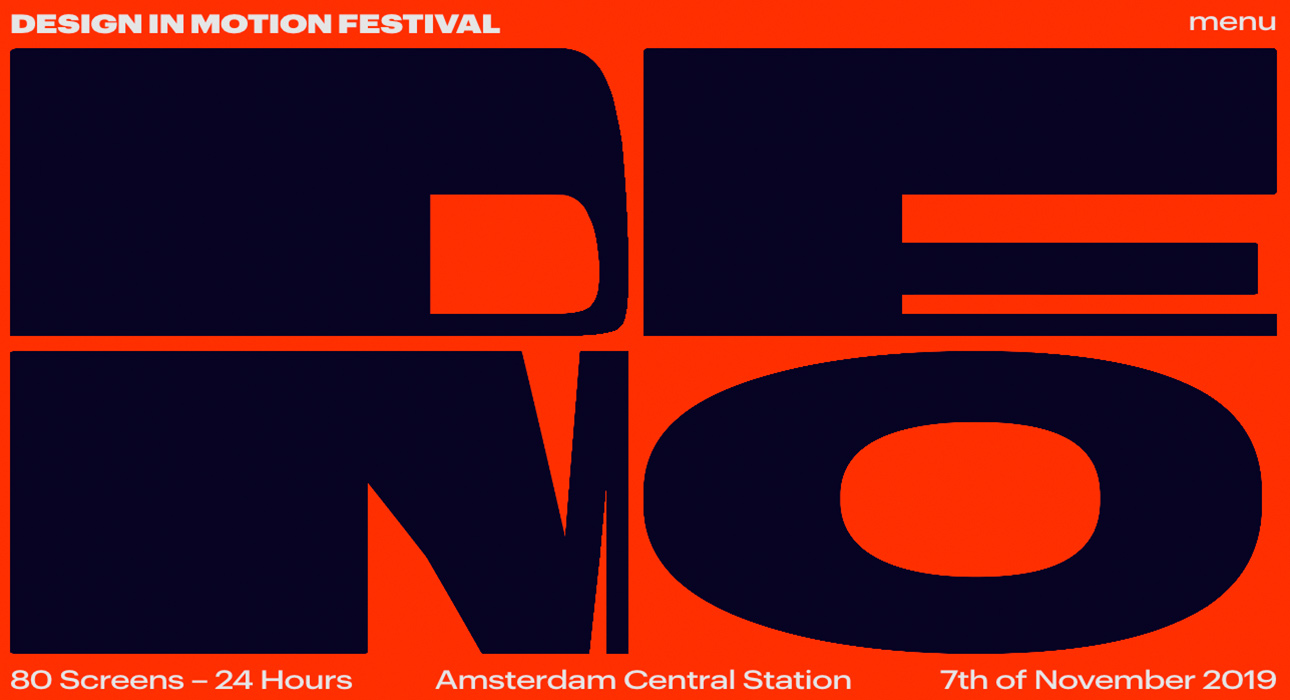
Check out their website at:
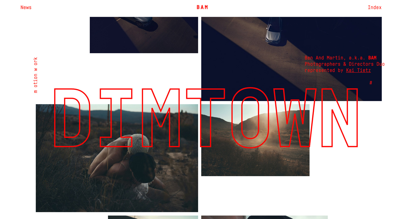
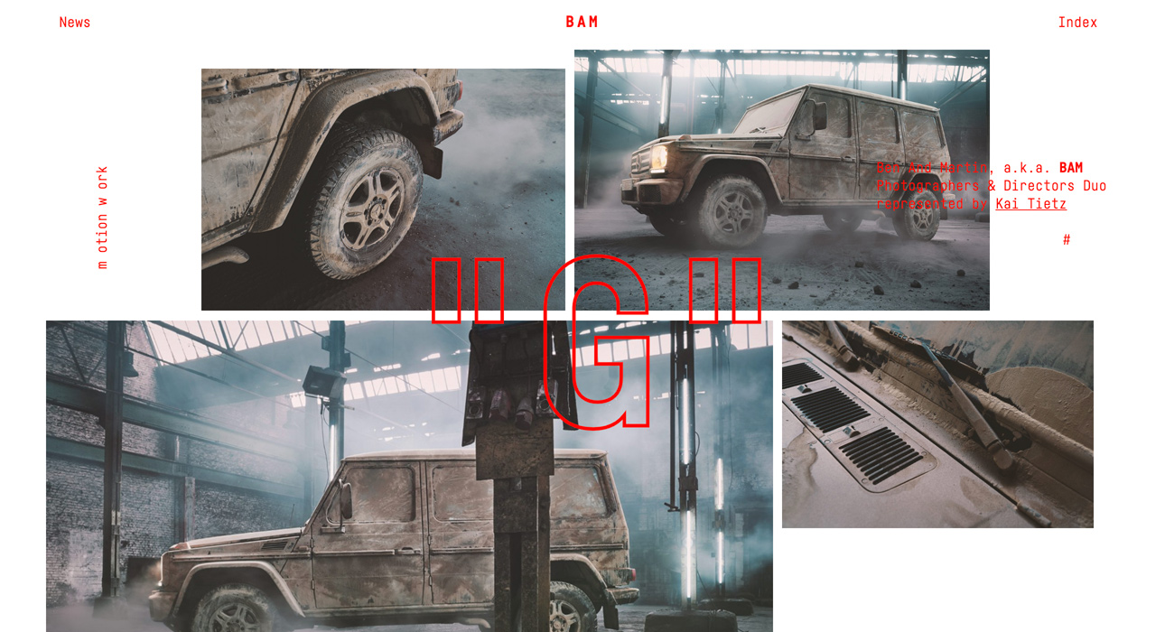
BAM – Photographers & Directors
It may seem like this month is dedicated to photographers and creative directors, but it’s just a coincidence.
BAM is a portfolio for advertising photographers Ben & Martin—hence the name.
With a highly personal, minimalist, and poetic style, the site guides you through their entire body of work.
Striking visuals are the sole focus here, and the design does everything needed to spotlight the work of these two visual creatives.
Special mention goes to the menu—enough said.
Check out their website at:
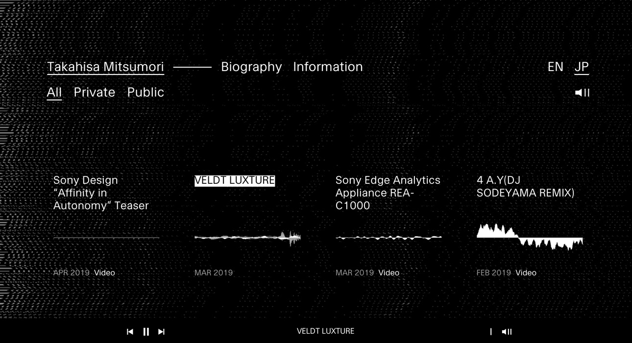
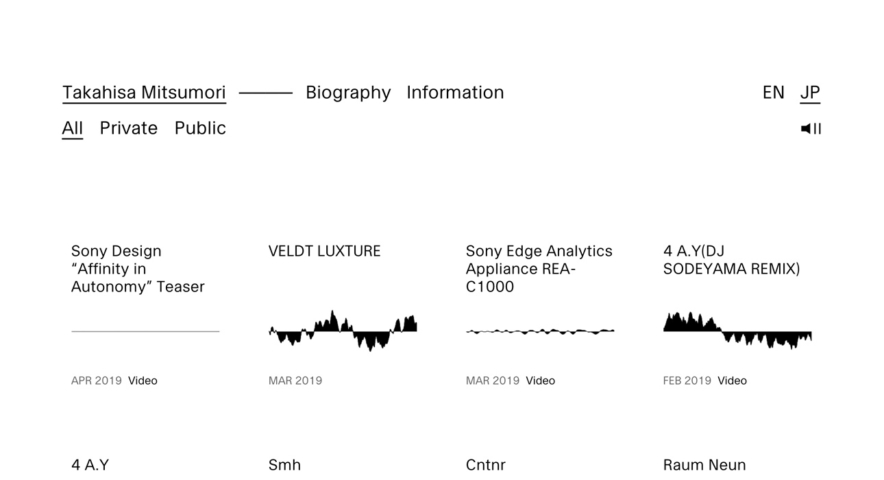
Takahisa Mitsumori
Finally, we wrap up our tour of May’s best web designs with a project dedicated to Mergrim—a Berlin-based visual artist with a name straight out of a Kurosawa samurai film.
The site is designed to showcase Takahisa Mitsumori’s audiovisual production work, opting for a stripped-back look that harks back to the early days of computing.
The aesthetic is minimalist, with almost no images throughout the site—instead, audio takes center stage.
Presented as an audio portfolio, it’s a bold move by the site’s creator to focus solely on the essence of Takahisa’s work.
A masterstroke that shows zero insecurity and no bowing to current visual conventions.
Check out their website at:
Conclusions
We’ve shared our picks for the best web designs this month, and once again, our predictions about web and graphic design trends are spot on: app-like layouts, oversized typography that dominates the screen and becomes part of the message—not just visually, but as a design element in its own right. Usability and user experience are at the service of technology, resulting in dynamic and visually compelling sites.
Most of these references are sites where the average user needs less than a minute to understand where they are and what’s on offer—brilliant!
See you in about 30 days.


