Another year, another roundup. We’re back with our annual review and analysis of the best web designs out there. This year is bigger than ever—not only have we found some truly outstanding sites, but we’ve expanded our list to a whopping 20 websites. Get ready for the very best in web design from 2019–2020!
[superfeatured]7076[/superfeatured]
If you’re new here and found us through Google, don’t miss out—subscribe to our mailing list for the latest updates in design and exclusive courses: Subscribe now
Here’s what we look for when selecting websites for our annual list:
- Originality or a fresh perspective
- Alignment with the latest trends in graphic and web design
- Use of cutting-edge technologies
- Visual impact (the kind that makes you say “wow!”)
In short: we want sites that truly impress us.
WOW! Our new post on the best web designs of 2020–2021 is out now!
As we mentioned, this year’s selection is packed. We’ve included 20 in-depth reviews, each with extra screenshots. Please note: the order is not a ranking—this is simply a curated collection of the year’s standout web design.
Let’s get started, shall we?
Previous Editions
- Best web designs 2018–2019 (39,400 visits)
- Best web designs 2017–2018 (65,000 visits)
- Best web designs 2016–2017 (37,000 visits)
Best Web Designs of 2019–2020
Active Theory
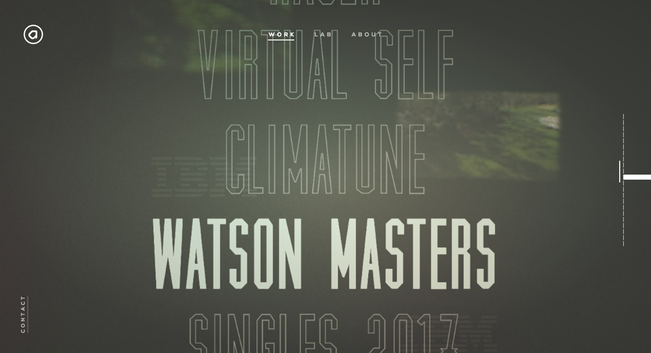
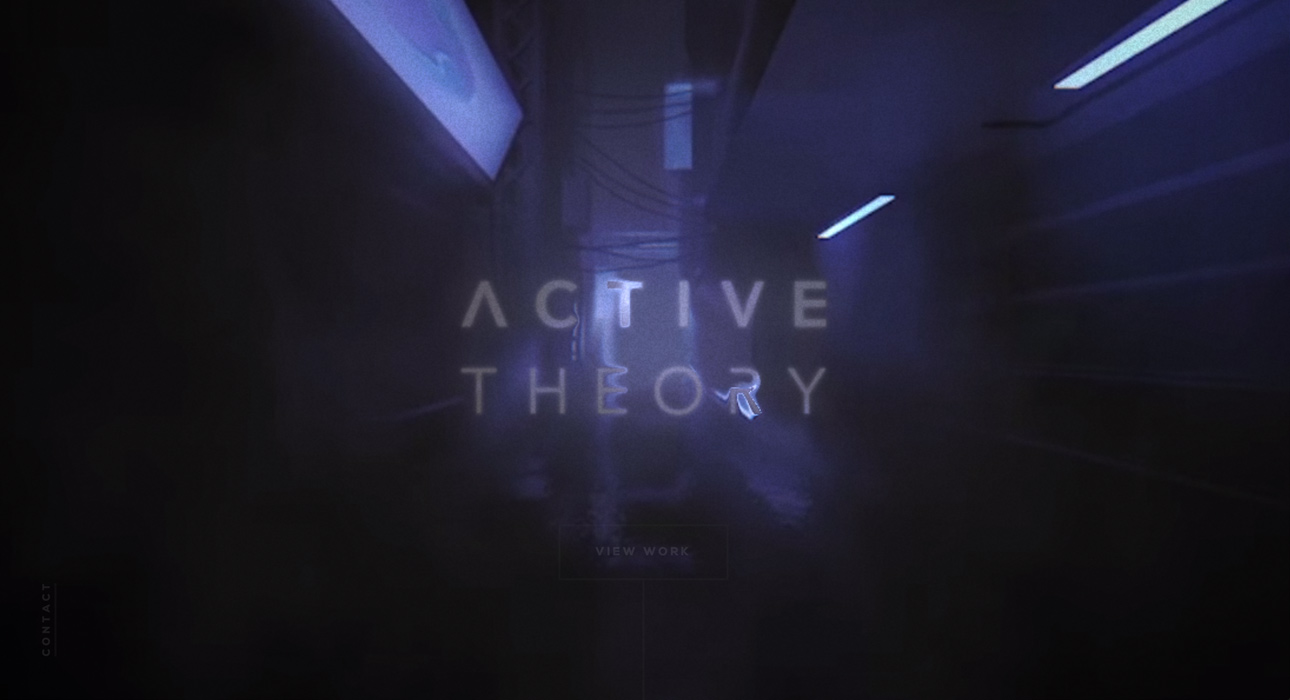
First up is the website for Active Theory—a benchmark in high-end web design and development technology.
This site showcases the studio’s own work, and they’ve gone all out to demonstrate their capabilities and impress potential clients.
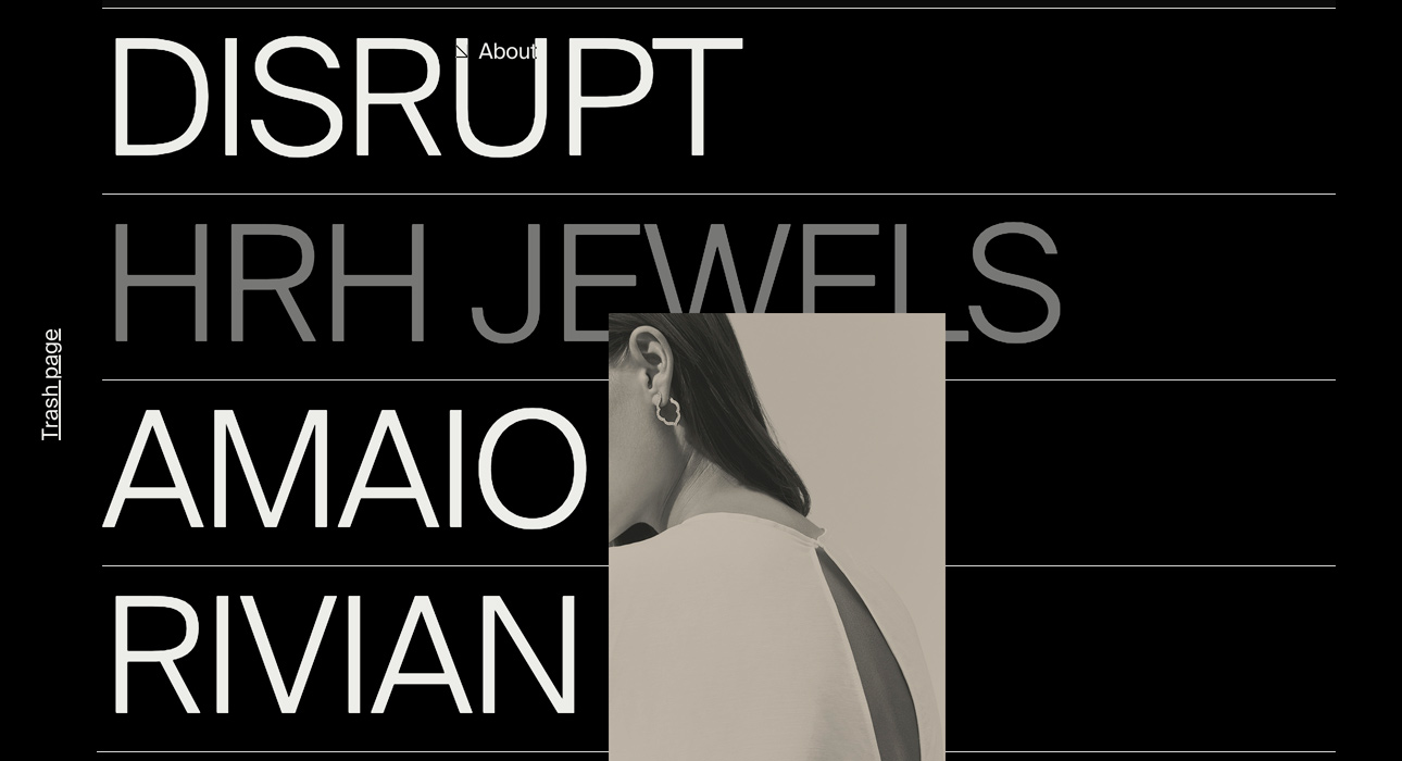
What stands out is the use of oversized typography, giving the site a look that’s clearly crafted by true web design professionals. It’s obvious they’re on top of both web and graphic design trends.
The overall aesthetic is inspired by a futuristic dystopia, reminiscent of Blade Runner.
Navigation is simple, with a menu on the right side that lets you move through sections effortlessly.
The landing animation on the homepage is also a highlight.
Another cool feature: the cursor creates a water-like ripple effect as you move it across the screen, perfectly complementing the site’s design.
Boë Gin
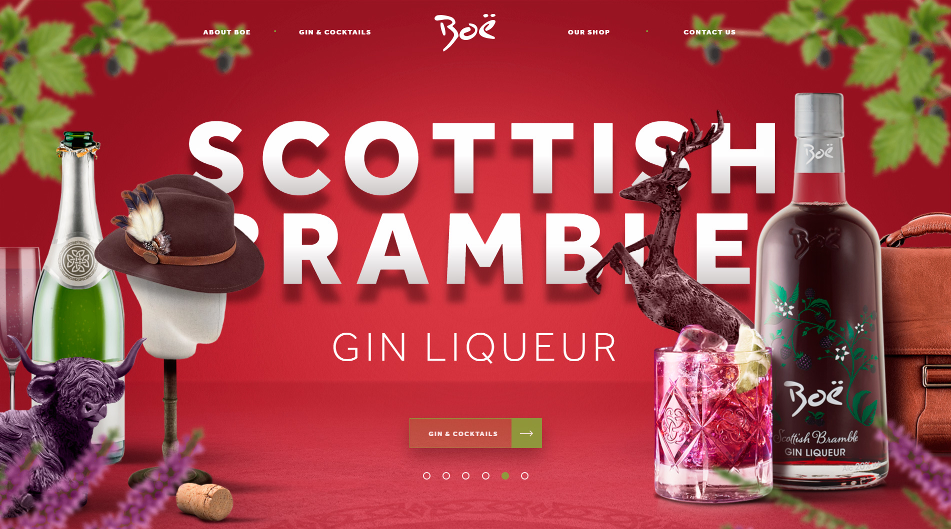
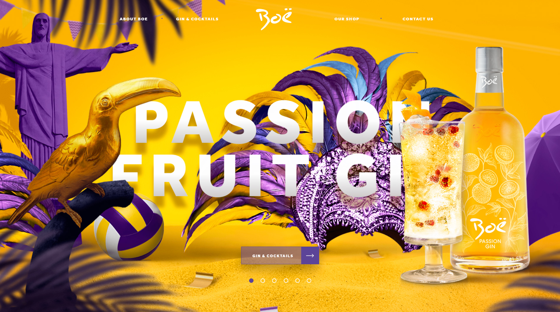
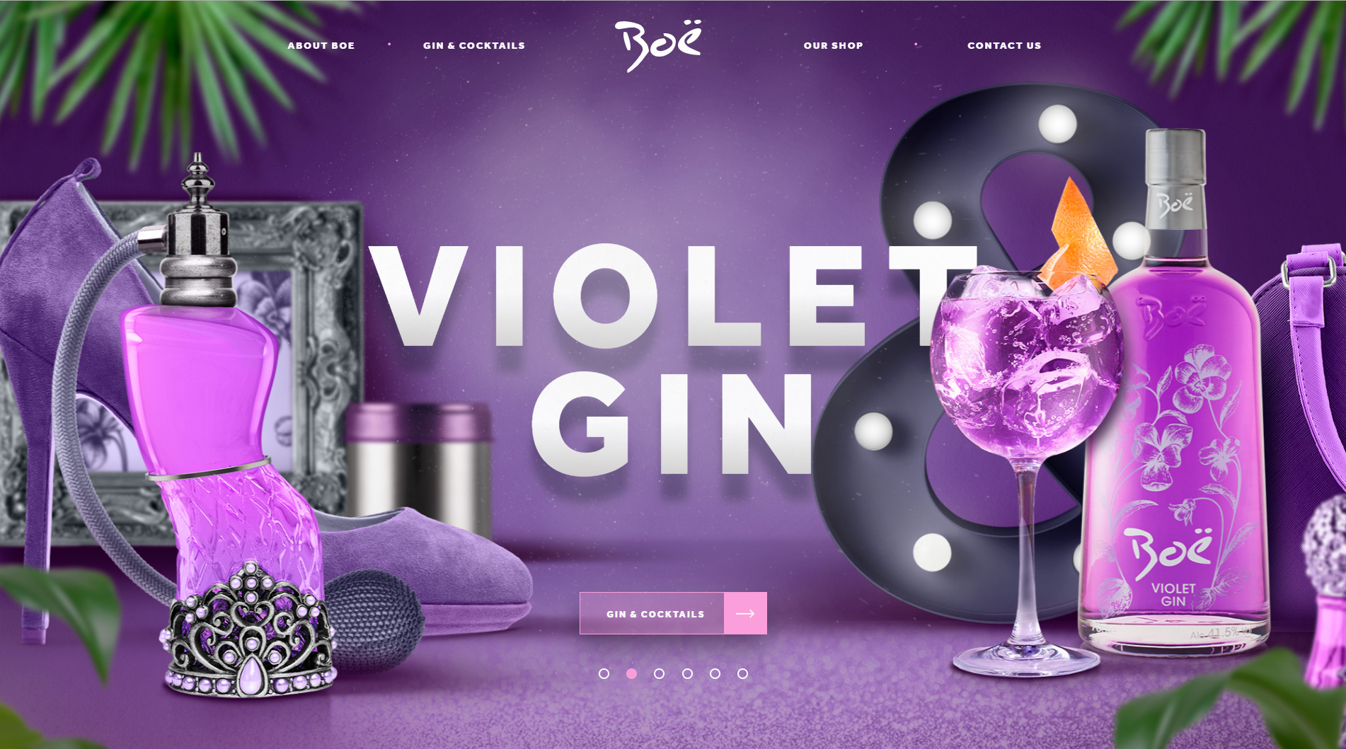
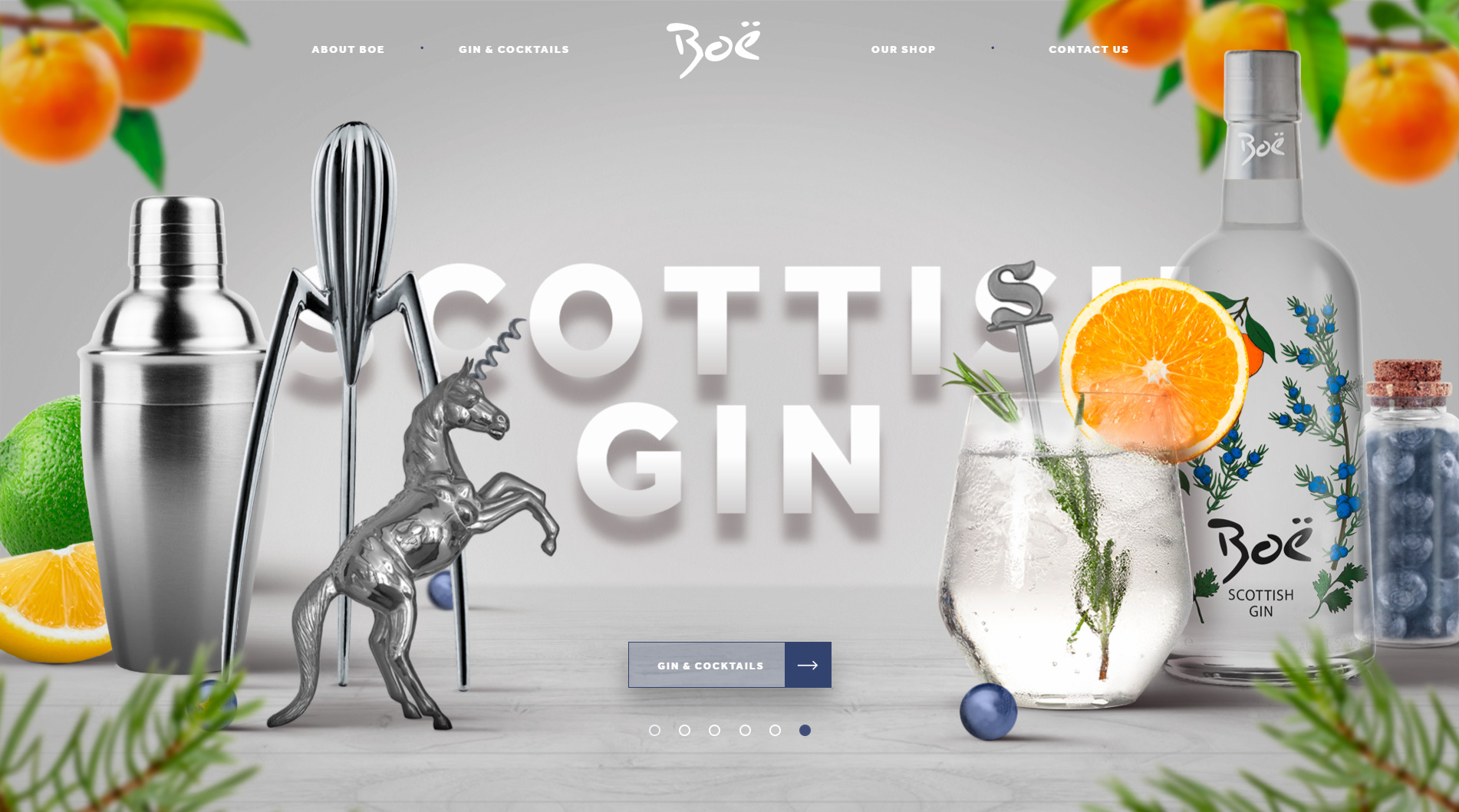
Next up: Boë Gin, a site by UK-based Tayburn for the gin brand.
Boë Gin wanted to stand out from the crowd and break away from the typical gin market.
Known for its vibrant colors and bold combinations, the brand’s personality shines through in the web design.
We chose this site for its fearless and unapologetic use of color and form, earning it a spot among the best web designs of 2019–2020.
The site also features a strong, contemporary typeface with real presence.
From the start, you get a sense of an Indian-inspired, Asian-influenced aesthetic, with cultural elements woven throughout.
ddd
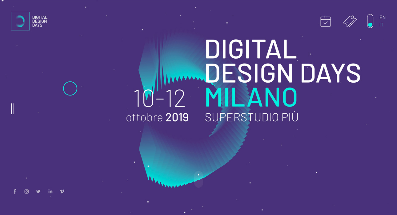
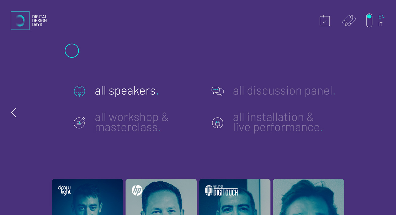
The third entry is a website for a digital design event in Milan.
The color palette, effects, and transitions are all incredibly engaging.
Navigation is based on vertical scrolling, letting you explore each section and marvel at the digital design resources used to create this technological wonder.
I encourage you to check it out for yourself and see why it’s one of the top web designs of 2019–2020.
Digital conference
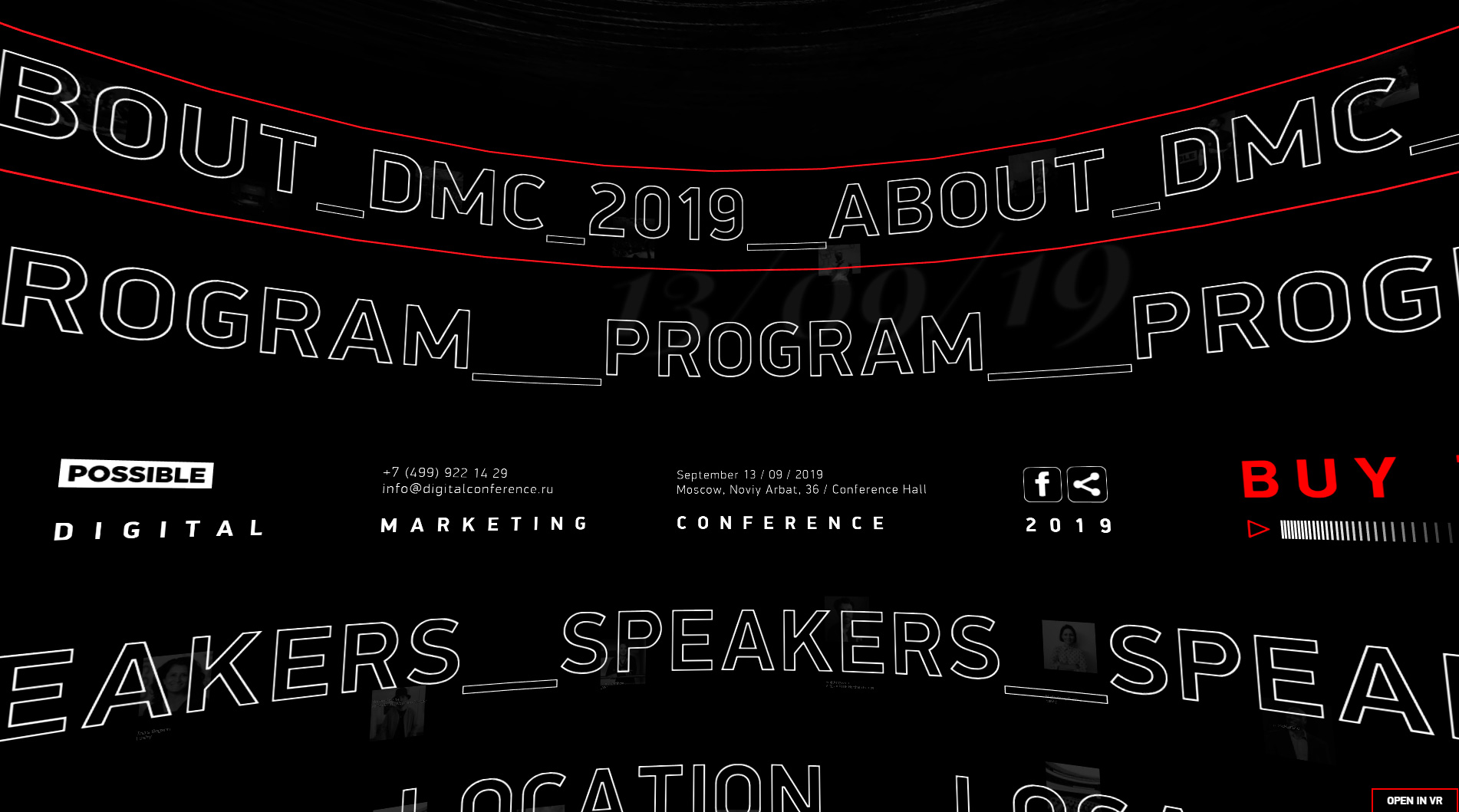
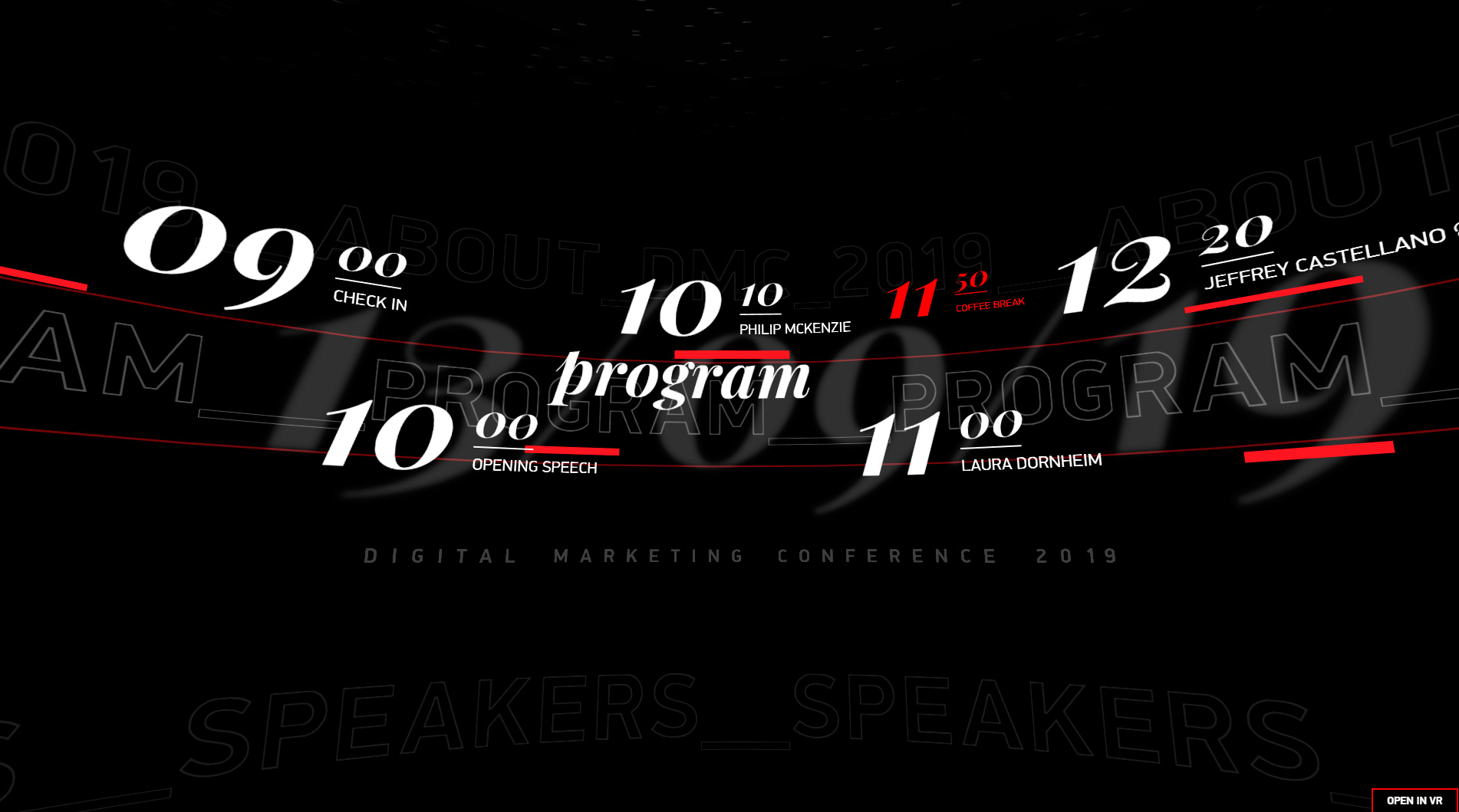
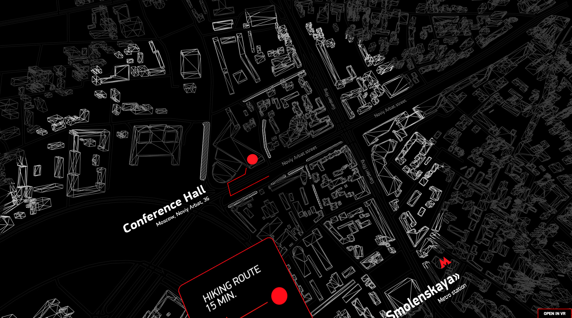

Fourth on our list is a true gem of design and innovation. The level of creativity here is so high, I hardly know where to begin.
This website has swept up numerous annual awards and appeared on countless lists celebrating the best in web design and development. We’ve even featured it in a couple of our own blog posts.
At this point, the best thing you can do is click through and see for yourself why it’s made so many top lists.
Highlights:
- Massive, eye-catching typography
- A menu designed with a truly avant-garde approach
- Unique ways of presenting information on screen
- User experience paired with site efficiency
These are just a few reasons why this site is a personal favorite and a standout in our annual roundup.
Gruev
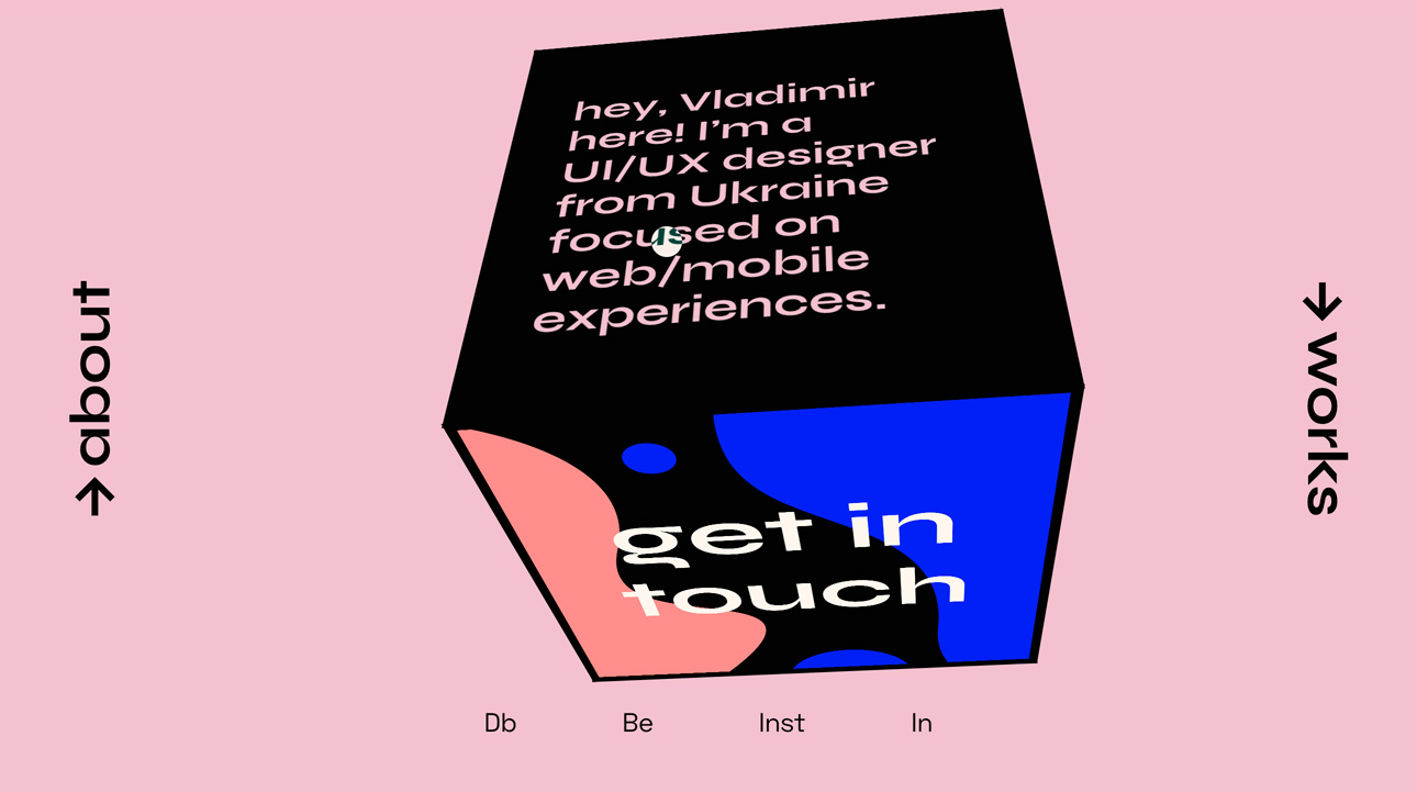
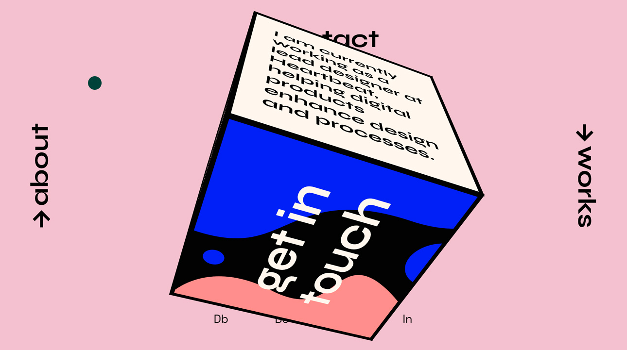
Next up is a site that stands out for its creative approach to usability and navigation.
This is the portfolio of Vladimir Gruev, a digital designer and web developer. As a showcase, he’s built a spectacular site with a fresh take on usability, demonstrating exactly what he’s capable of.
The menu is split into four sections, strategically placed at the cardinal points: North, South, East, and West.
In the center, you’ll find a quick summary of what each section contains when you hover or click.
But the real surprise comes when you click into any menu section—inside, you’ll see just how much creativity has gone into this digital masterpiece.
Don’t miss the chance to explore this site and see the clever use of technology and design for yourself.
Granyon Party
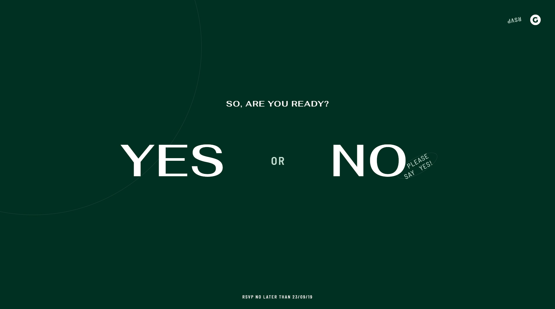
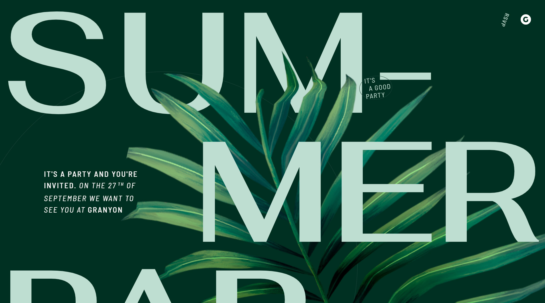
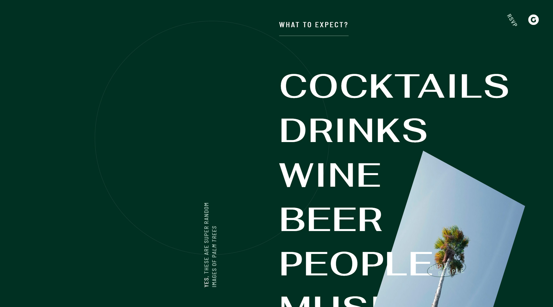
This site features some of the top web design trends that are set to dominate 2020.
Oversized typography is integrated as a core design element, becoming key to user communication.
If you browse the site, you’ll notice every detail has been carefully considered.
The color palette is also noteworthy—a lush, jungle green paired with a subtle, greenish white.
Navigation is classic vertical scroll, so a quick spin of your mouse wheel lets you view all the content easily and intuitively.
Kik
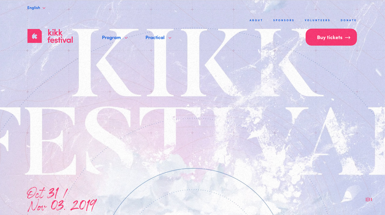
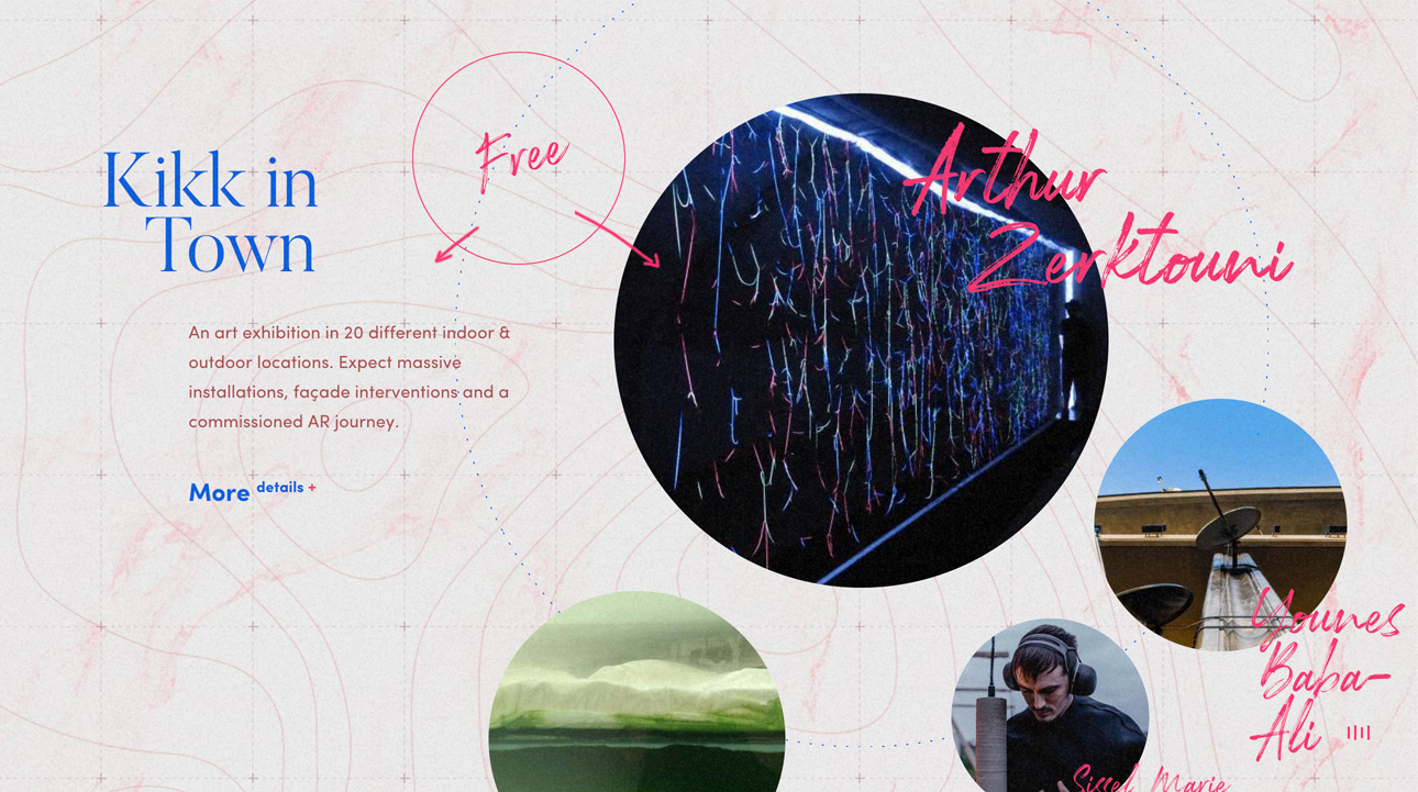
This site is dedicated to an international festival of digital creation and culture, with a strong focus on the intersection of art and the economic impact of new technologies.
Naturally, web design plays a central role in this project.
Browsing the site feels like flipping through a traveler’s notebook—content pops up here and there in seemingly random order. At first, it feels chaotic, but a closer look reveals that everything is thoughtfully placed.
Ninja Guru
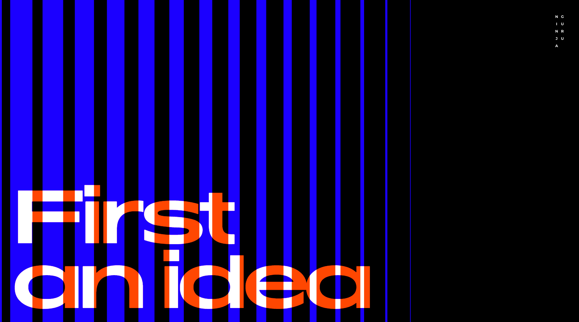
Now for another of our favorites—this one’s a real treat.
This website belongs to a creative collective specializing in interactive art. The group collaborates with artists, interactive designers, programmers, engineers, sculptors, and creators of all kinds.
The design is spectacular: bold typography, distorted images, and short gif-style videos make for a visually striking, cutting-edge, and truly innovative experience.
This site incorporates several web trends that will shape design in 2020.
Navigation, as with most sites here, is based on vertical scrolling, letting users move through all sections seamlessly.
Each section is clickable, leading to deeper content. Don’t hesitate to explore and click everywhere you can—you won’t be disappointed.
WOW! Our new post on the best web designs of 2020–2021 is out now!
Flavinsky
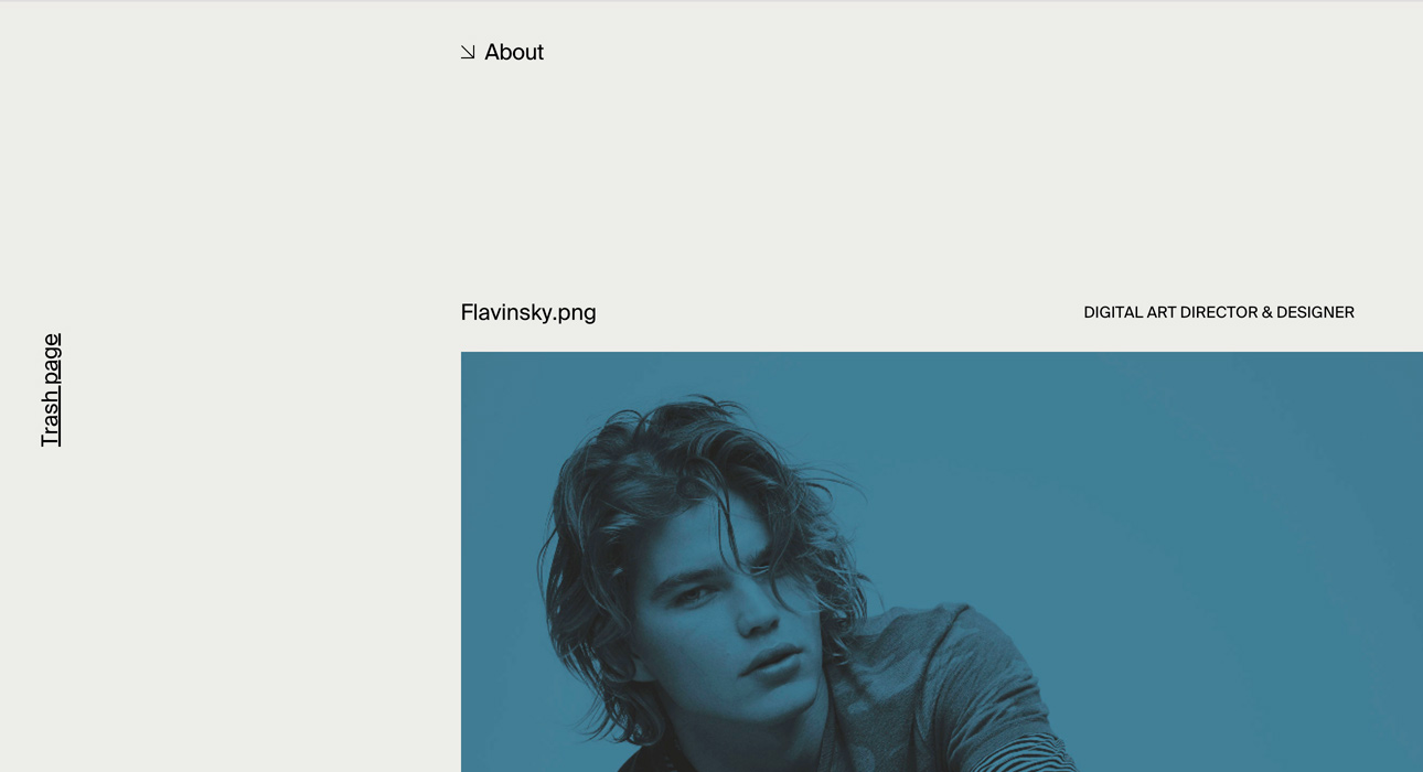
What really caught our attention about this site is how it divides information into irregular blocks.
If you browse the homepage, you’ll do so by scrolling vertically.
At first glance, it might not seem special, but spend a little time exploring and you’ll see everything is arranged with exquisite care.
As with other sites on this list, typography plays a major role, reflecting upcoming trends in both web and graphic design.
The mouse pointer is custom-designed, adding to the site’s creative flair and serving as a visual guide to what you’ll find when you click on different elements.
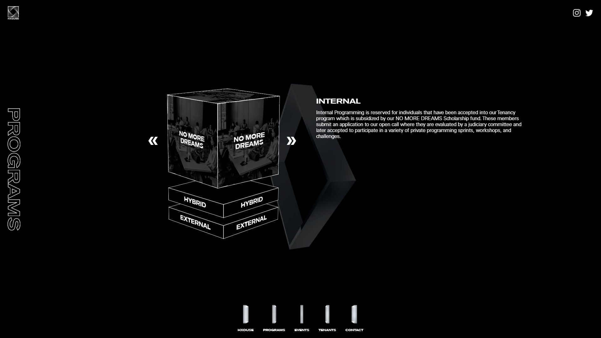
Hxouse