We’re nearing the end of May, and it’s the perfect time to share a stunning showcase of the best architecture logos.
In this curated selection of 20 top architecture logos, you’ll discover some of the most outstanding examples of logo design and branding in the world of architecture.
Are you an architect or run an architecture studio? We have extensive experience creating logos and brand identities for this sector. Click here for a free consultation on how to elevate your image. We’ll review your brand and provide a tailored action plan to enhance it.
So, without further ado, let’s dive in:
The best architecture logos.
1. Bolgeblikk
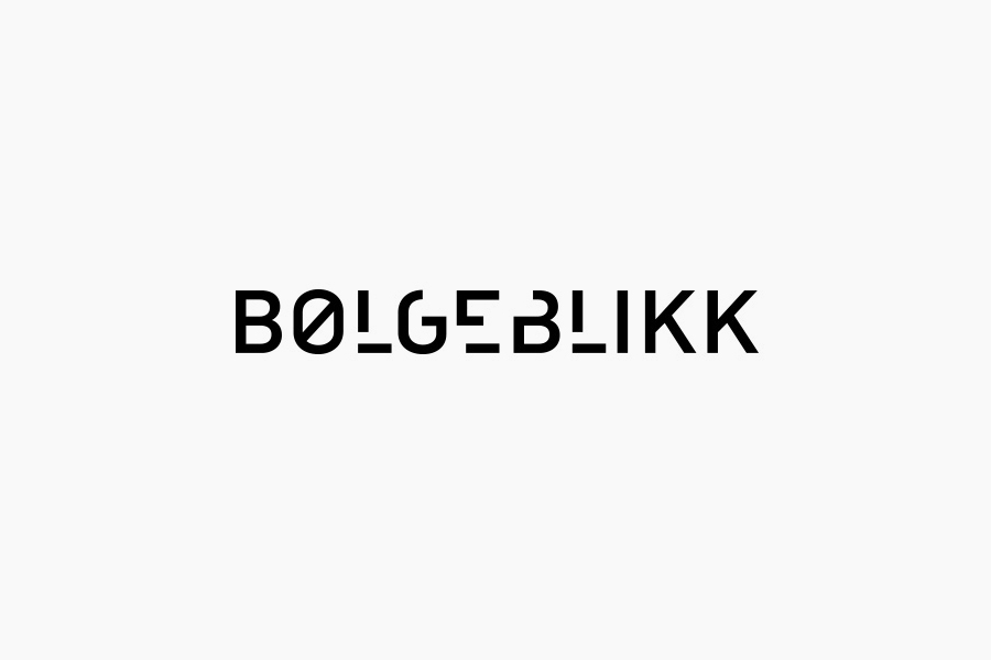
With an ultra-minimalist design, the Bolgeblikk logo perfectly captures a creative concept and makes it accessible to everyone.
The Norwegian architects at Bolgeblikk focus primarily on public works.
The minimalist design is enhanced by a monochrome palette—white on black—evoking a 2D site plan, street, plot, or sector from a top-down view.
This minimalist approach is a fantastic example and well-deserving of its place among the best architecture logos.
2. Síol
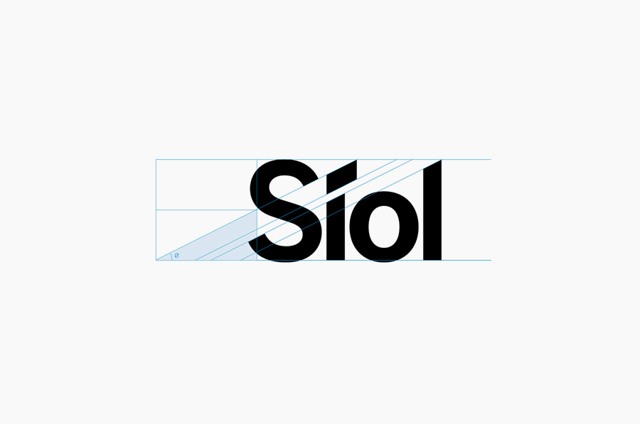
The logo design for Síol is another great example of how a conceptual logo can be created without unnecessary clutter.
The story behind the name is also worth mentioning—Síol is Gaelic for “seed,” which is why the accent on the “í” is used to represent a seed sprouting.
3. Nicholas Architects
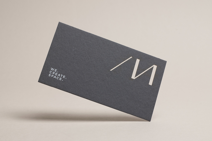
I have to admit, this is one of my personal favorites among the best architecture logos.
I love how negative space is used to create form.
With just four lines, they’ve managed to craft a fantastic logo. The incomplete “AN” is cleverly finished by the negative space, resulting in a stylized /N.
4. Grove-Raines Architects
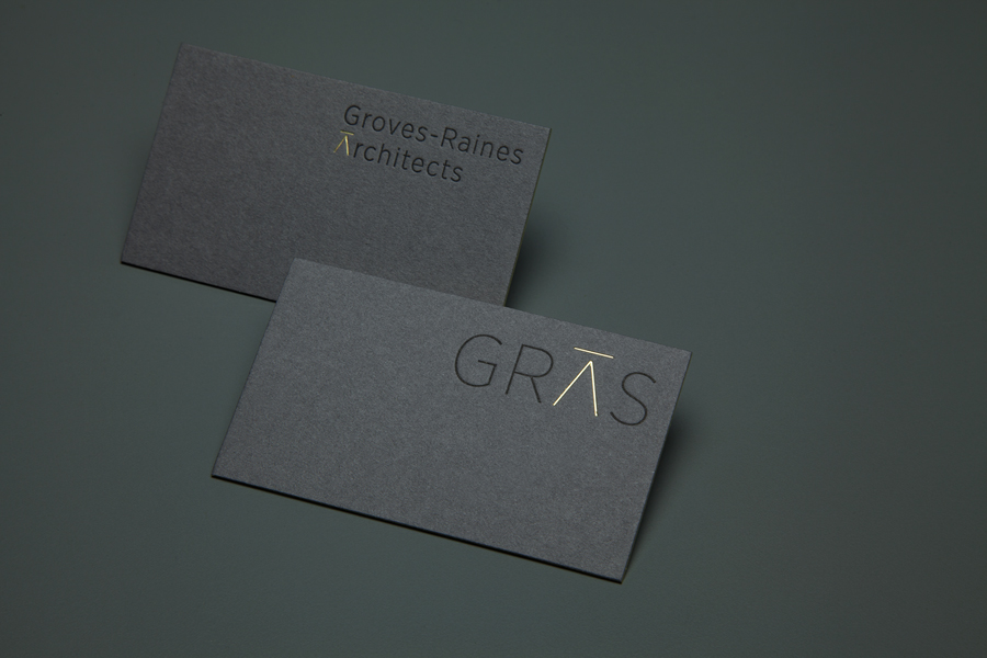
Next up is the Grove-Raines logo—an exquisite, creative, and straightforward design.
The logo is built from the initials GRAS: G (Grove), R (Raines), A (Architect), S (Architects).
It’s a standout example and fully deserves its place among the best logo designs for architecture.
5. Poseidon
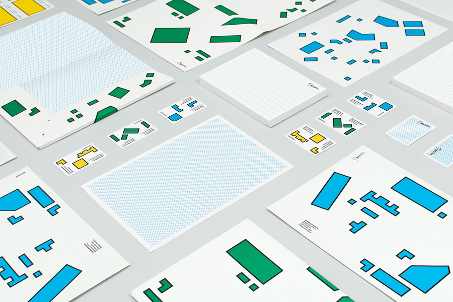
Poseidon’s architecture group is one of the boldest choices on this list—and you’ll soon see why.
They embrace geometric shapes that mimic floor plans and rooms, paired with colors that are anything but ordinary.
6. Biber-Architects
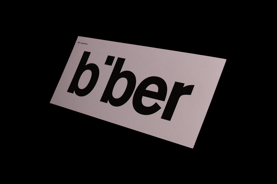
A logo that’s minimalist, simple, and elegant—without being flashy, it does its job perfectly.
It’s the foundation of a brand that can stand the test of time: easy to recognize, easy to remember.
7. Nine Smith St.
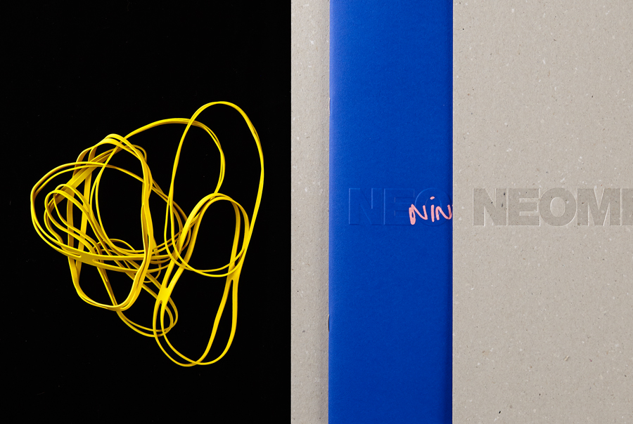
This next logo is another design outlier—Nine Smith St. breaks away from traditional architecture logos with a street-inspired, avant-garde, urban, and underground feel.
See for yourself why it’s included among the best architecture logos.
8. Ascui and Co.
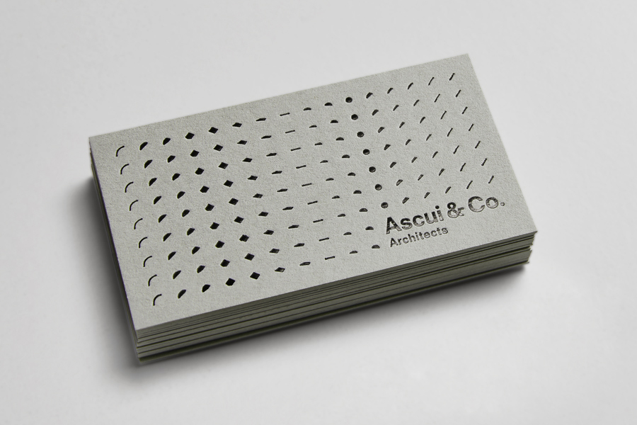
The logo for Ascui and Co is a perfect fit for this list of best architecture logos.
A design that beautifully blends classic and contemporary elements.
They’ve also made a bold choice with color, moving away from the usual black-and-white or two-tone schemes.
Are you an architect or run an architecture studio? We have extensive experience creating logos and brand identities for this sector. Click here for a free consultation on how to elevate your image. We’ll review your brand and provide a tailored action plan to enhance it.
9. Higgins Architects
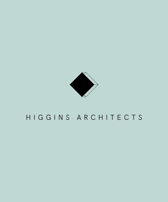
With a distinctly classic design, the Higgins Architects logo exudes elegance from every angle—the four sides of the black-and-white square logo are the purest geometric expression of a building or space.
The typography also reinforces this concept: classic, but not overdone.
A perfect architecture logo.
10.MOAA Architects
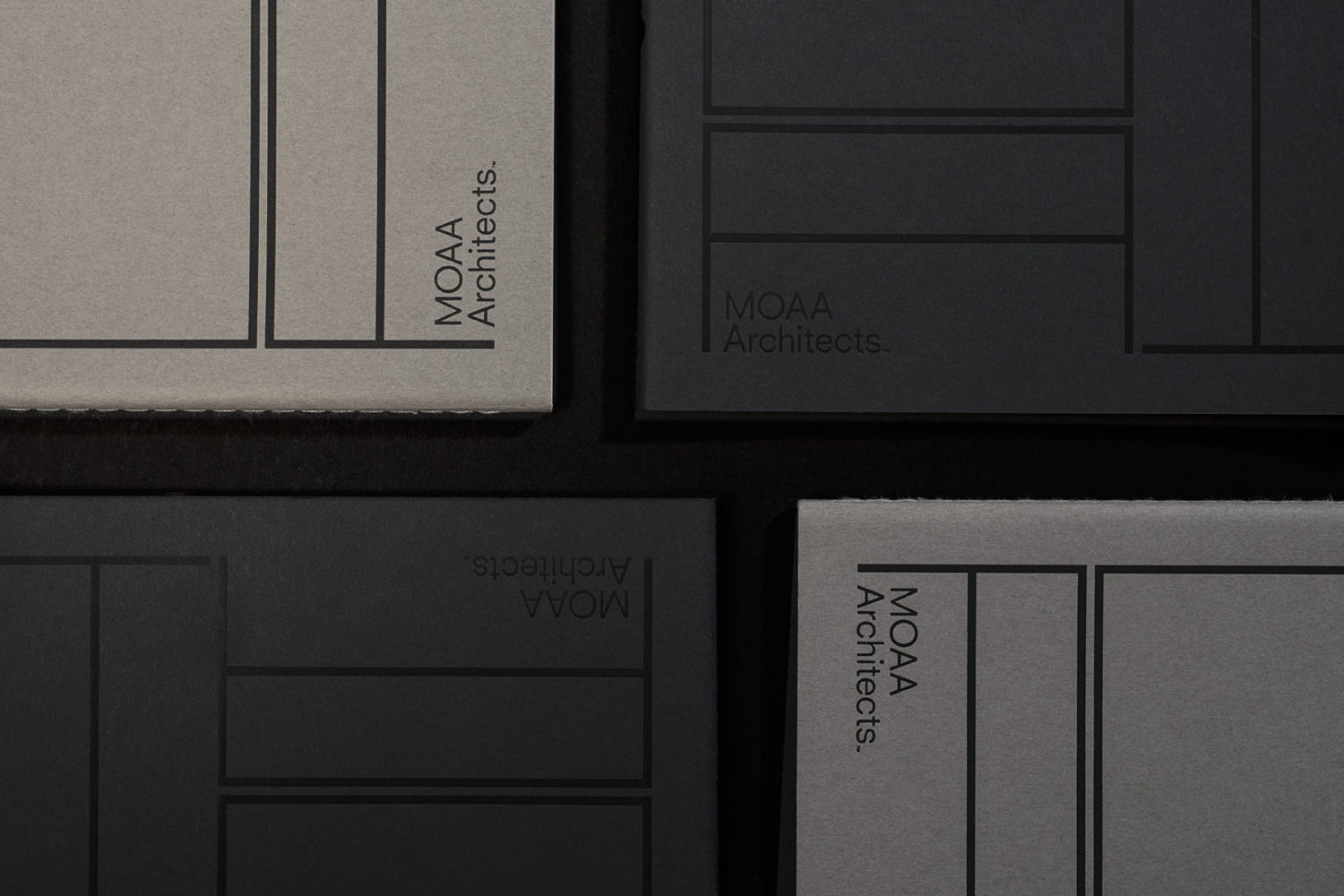
Another one of my favorite logos is that of MOAA Architects.
Discover more design and web development projects at Code Barcelona.
A minimalist design, simple and incredibly effective.
The lines create spaces and the spaces are interpreted as letters, the letters form spaces… and so on, however one wishes to interpret it.
In any case, the result is a very elegant logo design, with the minimum to achieve the maximum.
The MOAA logo deserves to be among these best architecture logos.
11.Klöpfer Holzhandel
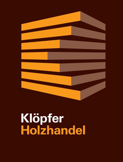
This logo is a display of graphic design.
Colors, shapes, layout, all perfectly combined to achieve a three-dimensional and geometric visual effect that will blow our minds.
A clear example to include in this list of the best architecture logos.
12.GMG Architects
This logo also seemed deserving to us to be among these fantastic architecture logos.
GMG is an architecture firm with a clear focus on healthy homes and the environment, as their logo conveys.
13.Andreas Martin Löf Arkitekter
Andreas Martin’s logo is also one of my favorites.
A succession of lines, black on white, that end up forming the initials of the company’s name.
The logo design is minimalist in form and profound in content.
14.Gravity Architecture
In fourteenth place, we have the Gravity logo, another logo that plays with three-dimensional geometry simulating the company’s initial.
In the typographic section, a very linear model without embellishments has been chosen.
Undoubtedly, the best part of this logo is the three-dimensional geometry, and that is why it is among the best architecture logos.
15.Wogarch
This is another wonderful opportunity to be commissioned for a logo design for an architecture firm.
Color, dimension, and geometry, all well combined, and the result is exceptional.
A good logo to include in this list of the best architecture logos of today.
16.Hungarian Association of Landscape Architecture
As its name clearly indicates, this architecture logo falls within the realm of landscape design.
Architects who specialize in designing outdoor spaces, gardens, etc…
A succession of shapes that mimic the topographic lines of a map.
Additionally, the typography chosen perfectly supports the company’s philosophy, elegant and classic.
17.S-AR
This logo is among those selected for its simplicity.
A good way to create a brand to remember and to endure over time.
Are you an architect or do you run an architecture firm? We have already worked for this sector creating logos and corporate identities. Click and we will advise you on how to improve your image. We will analyze your corporate identity and present you with an action plan to improve it.
18.Kristin Jarmund
This logo is a bold choice by the architecture firm Kristin Jarmund.
They haven’t held back here, using bold colors with straight lines to create the greatest possible impact.
19.Oriental
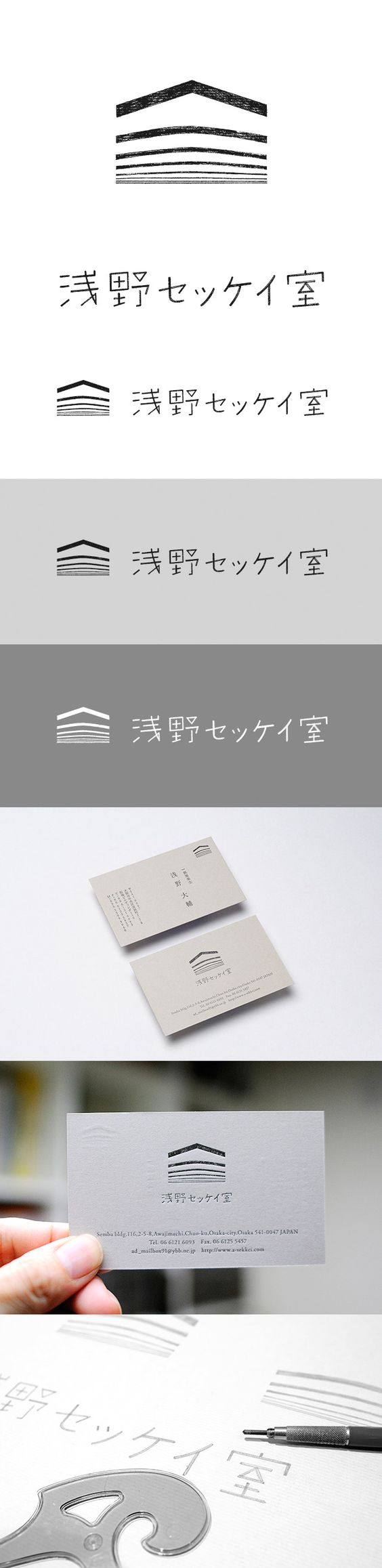
This logo with an unpronounceable name has stolen my heart.
Minimalist, oriental, zen, the design of this logo shows us how a line ends up creating a home.
Its black and white palette directs us straight to the meaning in its pure form, without chromatic distractions.
20.PlusUrbia
Finally, I will say goodbye with a logo of our own creation, this one was conceived and born in our graphic design studio.
Shapes and space – geometry and dimension – emptiness and meaning
What do you think? Is it worthy of being among the best architecture logos?
Are you an architect or do you run an architecture studio? We have already worked for this sector creating logos and corporate identities. Click and we will advise you on how to improve your image. We will analyze your corporate identity and present you with an action plan to enhance it.
More resources for architecture brands
Compare more references in our selection of the best architecture websites, our guide to websites for architects, and our review of architecture logo design. You can also explore the web design trends shaping 2026. From our web design agency in Barcelona, we create digital systems for architecture and design-led companies.
Related services: Branding and Logo Design and Brandbook.