Once again, our design studio highlights a corporate identity project that caught our attention for several reasons.
Let’s take a closer look at all the details of this award-winning branding project.
Wave Corporate Identity and Branding
by Shawn Goh Graphic Design Lab.
Project Background
With the main goal of developing the corporate identity for a new potato chips brand, Shawn Goh Graphic Design Lab. presented this project, aiming to break away from the conventional image typically associated with bagged potato chips.
This type of product is often linked to unhealthy eating, so the challenge was to create a corporate identity that would highlight the product’s positive values.
These are not fried chips, but high-quality, nutritious, and healthy snacks made from the finest ingredients.
The Graphic Project
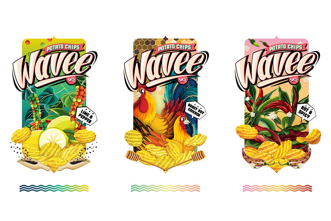
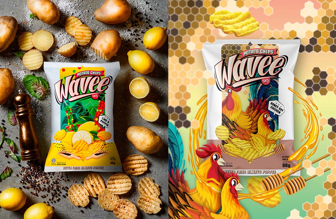
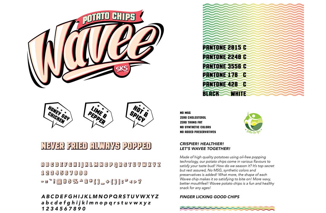
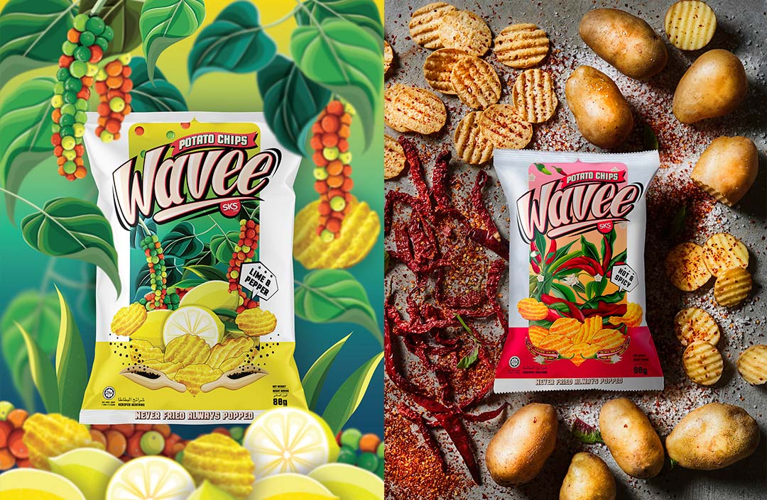
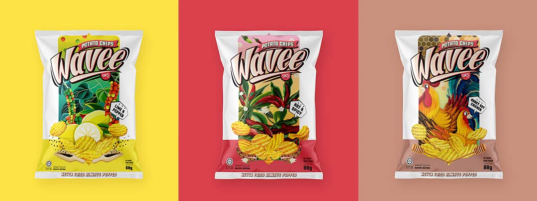
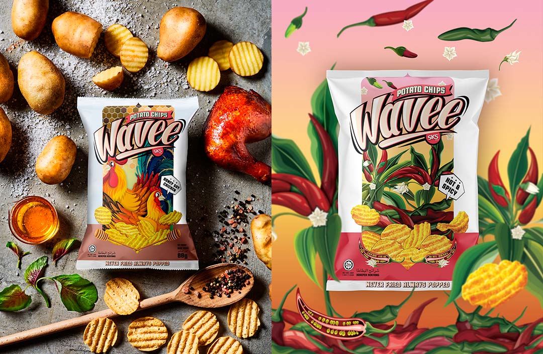
Here we have the corporate identity design for the packaging of bagged potato chips.
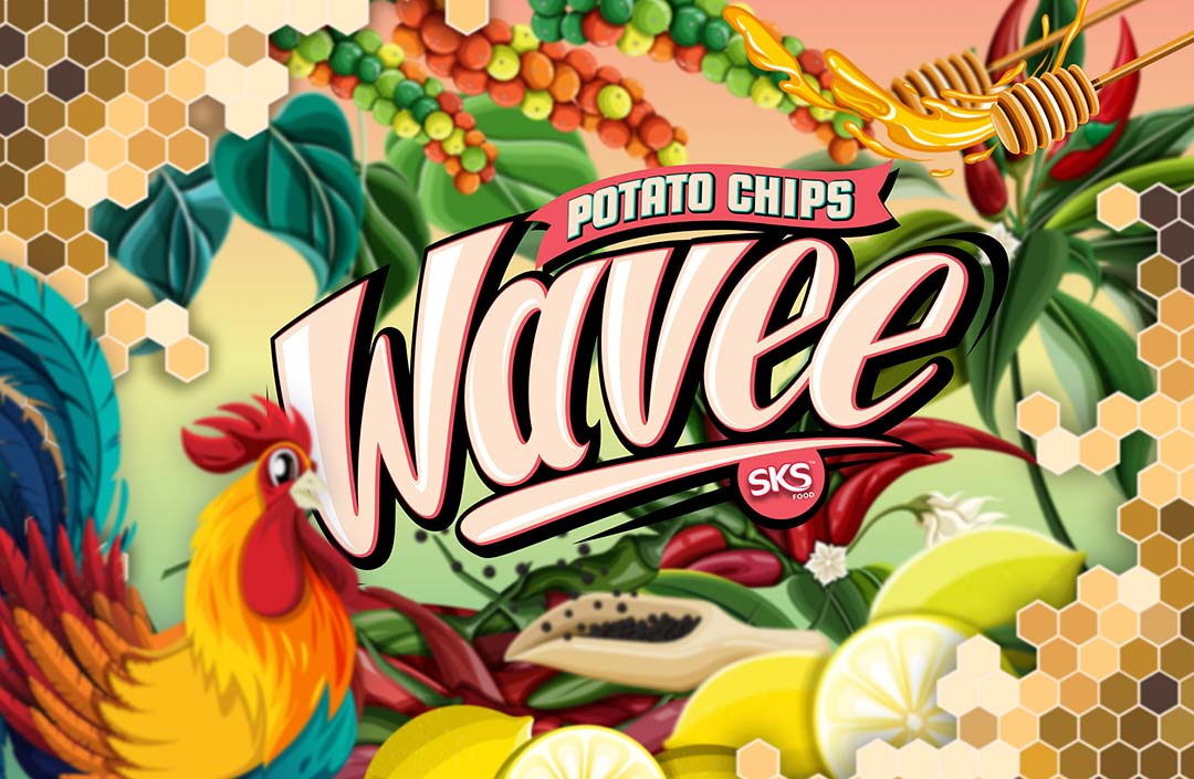
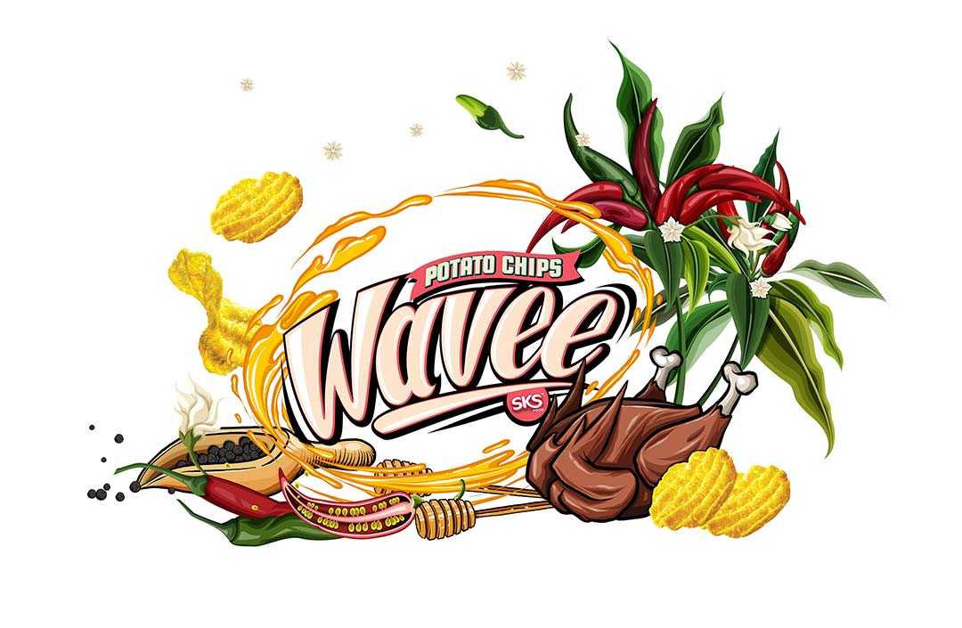
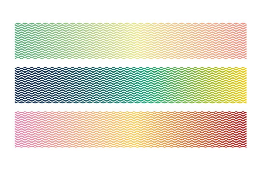
Vibrant illustrations were used for the packaging and to showcase the product’s features. Each flavor line is distinguished by different colors, illustrations, backgrounds, and themes.
To ensure visual consistency throughout the project, white was used as a base color along with a unified illustration style.
All illustrations are original, hand-drawn creations by the designer, crafted specifically to appeal to the target audience—consumers who value quality, originality, and well-crafted products.
These elements, used thoughtfully by the creators, give the branding project a sense of unity and coherence within the corporate identity.
Who is behind the project?
The branding for Wave was created by Shawn Goh Graphic Design Lab, a graphic design studio based in Kuala Lumpur, Malaysia.
We’re increasingly seeing graphic design studios from Asia and Indonesia delivering highly creative and quality projects.
Their unique and distinctly different approach to projects makes this a particularly rich and original niche.
Awards and Recognition
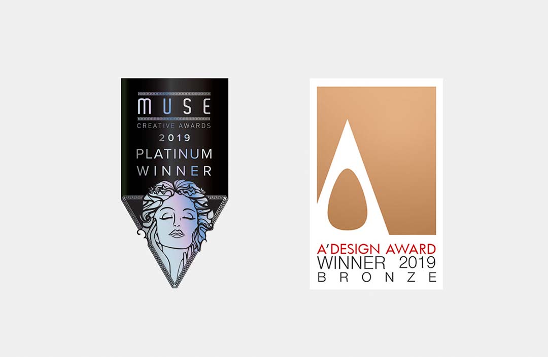
This project received the Muse Creative Awards in the corporate identity category.
It was honored with the Platinum Muse Award.
Our Take
Personally, I believe this project is a well-deserved winner. Titles aside, it features a fresh and vibrant design that perfectly supports the project’s original objectives.
The color palette and illustrated elements are spot-on—nothing feels forced, yet the outcome is excellent.
Often, these two principles go hand in hand. Not every great project is a wild creative experiment; here we have a perfect example of a design tailored to meet specific, pre-defined goals.
Design serves the objectives.
Further Reading
Here are some links where you can explore the project in more detail.


