Tella Thera has the kind of presence that doesn’t ask permission. An olive oil bottle transformed into a ceramic object—almost ritualistic—where form is as important as content. There’s no shouting “premium” here: luxury takes a different route—slower, more tactile, quietly confident.
The magic lies in the staging. Deep black, matte white, soft shadows, minimal typography, and a composition that leaves plenty of space for the material to speak. This project avoids Mediterranean clichés and obvious gourmet codes, building its own atmosphere—part gallery, part beautifully set table, part signature piece.
Let’s look at it as a visual reference: packaging, identity, visual memory, and a touch of editorial UX/UI when relevant. No over-explaining. Just enjoying how a finely tuned visual direction can elevate perceived value with very few elements.
A small object, a big presence
Here, packaging isn’t treated as a mere container. It’s presented as an object with cultural, tactile, and emotional weight. That choice changes the perception from the very first touch: this isn’t just “a bottle,” but a piece meant for ritual.
The composition plays with a refined tension between darkness and substance. The black background isn’t gratuitously dramatic; it acts as an empty gallery, allowing the ceramic to take center stage without competition. That negative space makes the form feel sharper, slower, more valuable.
There’s also a strong lesson in visual direction for any brand: if you want to elevate perceived value, don’t reveal everything at once. Reduce stimuli. Guide the gaze. Let the product have a recognizable silhouette. Visual memory is often born from a simple decision, repeated with intent.
Tella Thera — ceramics with an editorial pulse
Tella Thera is a hybrid—part packaging, part identity, part story of hospitality. The bottle is rooted in the world of olive oil, but sidesteps the obvious Mediterranean codes. No bright greens, sunlit fields, or visual folklore. Instead: clay, matte white, shadow, and pause.
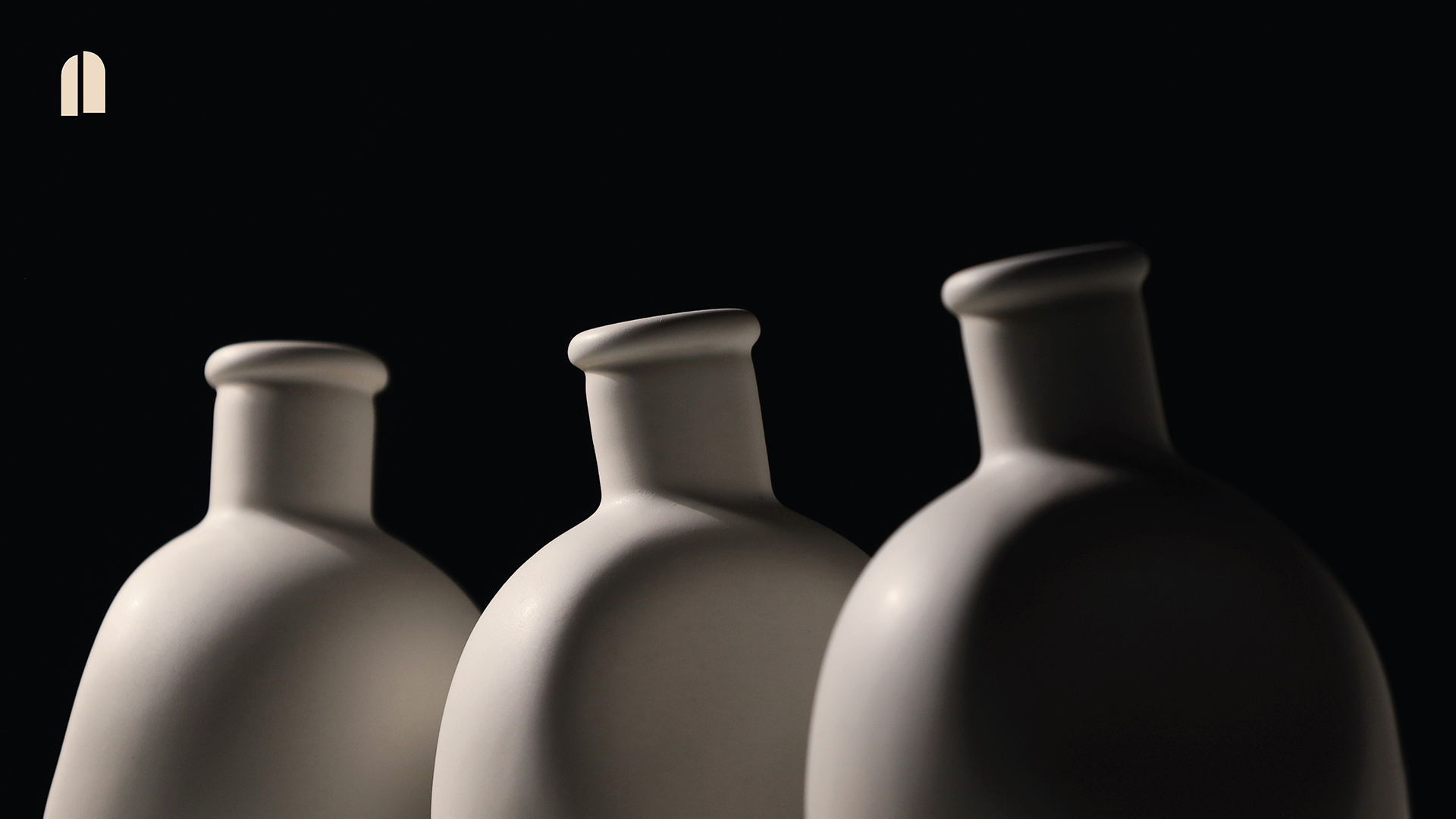
The first impression is intensely physical. The rounded shape, matte surface, and subtle irregularities make the object feel made to be touched, not just seen. That sensation matters: in premium packaging, the promise begins before anything is opened. Texture, imagined weight, and the grip of the hand already communicate care.
The use of white on black creates a quiet sense of luxury. No shop-window shine or easy aspirational color. The mood is closer to a gallery piece: minimal information, precise focus, controlled shadow. This restraint helps the brand feel self-assured. When design doesn’t need to overdecorate, the product gains authority.
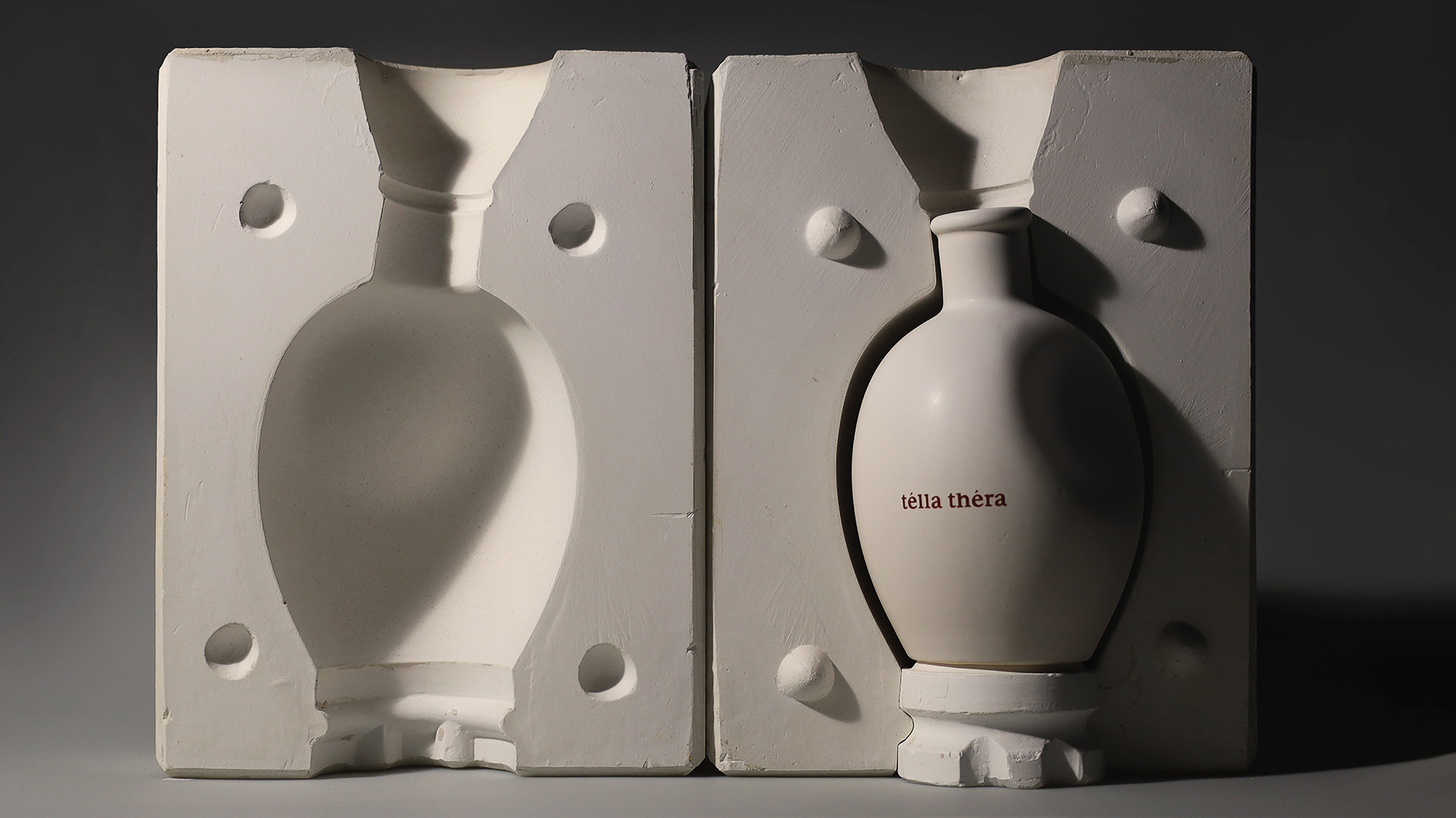
Introducing the mold adds a powerful layer. Many brands show only the final result and forget the journey. Here, the process is also art-directed: the pre-fired piece, the imprint, the engraved word, the form still in progress. This sequence builds credibility by suggesting craft, trial, material, and intent.
For a brand, showing process doesn’t mean revealing unfiltered backstage. It means selecting moments that help convey value. A well-shot mold can sell more than three paragraphs about craftsmanship. It narrows the gap between concept and execution, building trust.
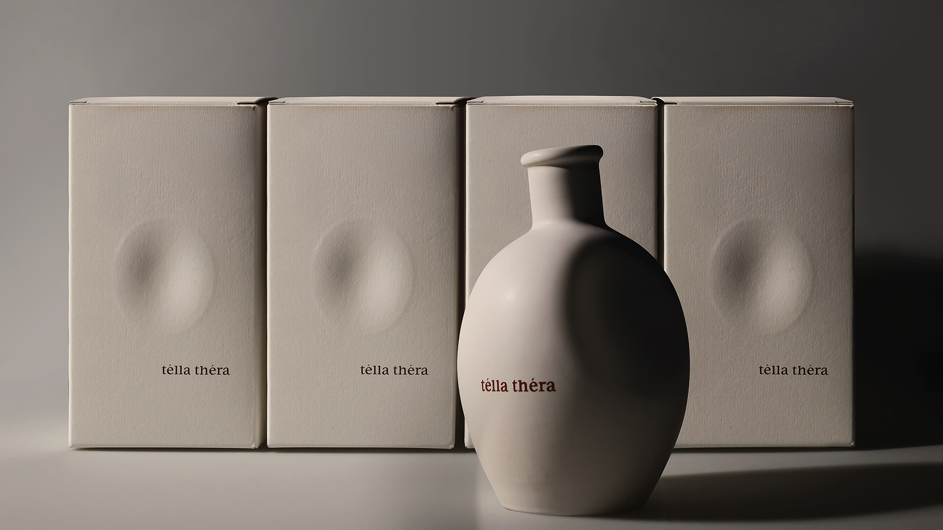
When the outer packaging appears, the identity expands without becoming heavy. The boxes maintain the same calm palette, letting the bottle act as the focal point. There’s a system, but no rigidity. The composition signals that everything belongs to the same universe: product, packaging, unboxing experience, and lasting memory.
This kind of coherence has a direct impact on perceived value. A premium product isn’t justified by the object alone; it’s justified by the continuity of every touchpoint. Box, message, material, and photography must speak the same language. When that continuity exists, the price feels less arbitrary.

The typographic layer is discreet but not secondary. The message is framed in a clean, almost ceremonial composition. The phrase doesn’t try to explain the entire brand; it complements the sensation. It speaks of nourishment, body, and soul, but does so within a restrained visual structure. The text doesn’t intrude—it breathes.
This is especially relevant for editorial web design and premium brand UX/UI. Not all content needs to fight for attention. Sometimes copy gains strength when given space, visual rhythm, and calm hierarchy. Interaction can be minimal and still memorable if the sequence is well choreographed.
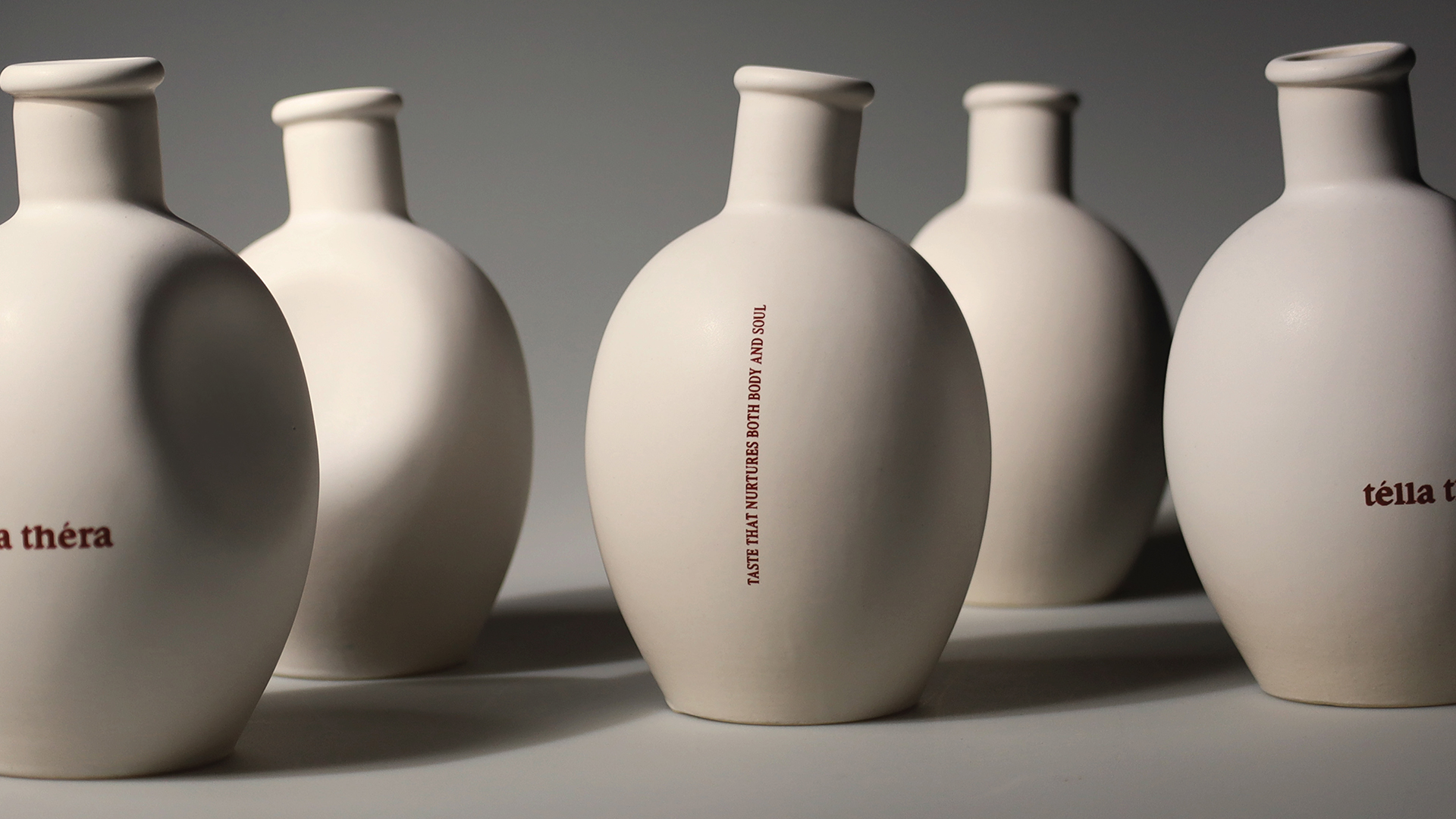
The full product line confirms this isn’t a one-off piece. The repetition of form, subtle shifts in position, and vertical branding presence build identity without covering every surface. There’s a clear elegance in letting form be the main recognizable element.
Color also reinforces visual memory. Warm neutrals, ceramic white, and reddish accents create a palette with a human touch. This isn’t cold minimalism. It’s grounded—earth, oil, tactility, hospitality. That blend of calm and substance keeps the project from feeling overly polished.
Digitally, the sequence works beautifully in vertical format. Large pieces in column create an immersive experience: first impact, then process, then system, message, and product family. That order has an editorial rhythm. It doesn’t force instant understanding; it lets the brand build in layers.
What makes this piece memorable
Tella Thera sticks in your mind because it doesn’t try to seem big through sheer volume. It sells touch, pause, and coherence. Its strength comes from very deliberate choices: an organic silhouette, a restrained palette, atmospheric photography, understated typography, and a sequence that turns packaging into narrative.
The lesson for brands with physical products is clear: the object shouldn’t live apart from its visual story. If the packaging, photography, claim, and presentation system feel like they come from different worlds, perceived value breaks down. When everything shares intent, the product gains credibility before it’s even tried.
There’s also a highly relevant idea for premium websites, portfolios, and ecommerce: show less, but organize it better. A scroll with large images, generous spacing, and process moments can build more trust than a page full of commercial arguments. Conversion doesn’t always start at the button; often, it starts with a sense of care.
This reference is a reminder: visual direction isn’t decoration. It’s positioning. When a brand knows how to control composition, color, typography, materiality, and atmosphere, it doesn’t just look better—it feels more serious, more desirable, and harder to replace.
And for any project with premium ambitions, that’s worth far more than just a “nice” aesthetic. That’s visual memory.