Curious to see how pharmaceutical companies present themselves through their logos?
You’re in the right place. We’ve taken the time to gather a wide selection of pharmaceutical laboratory logos and put together a series of articles where we showcase and analyze them in depth.
We found nearly a hundred logos, but not all of them made the cut for these articles. For now, here are 10 pharmaceutical logo examples to help us determine whether this sector has a strong approach to logo design.
PFIZER
The Pfizer pharmaceutical logo
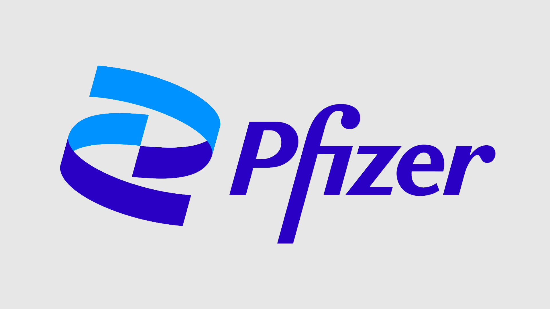
Pfizer has leveraged the global spotlight it received for developing one of the COVID-19 vaccines to launch a new corporate identity, which naturally includes a refreshed logo.
The new logo features two shades of blue, symbolizing scientific research and innovation. It also incorporates two upward-spiraling helices, representing DNA.
To complete the look, a bold, confident typeface was chosen to convey trust.
MODERNA
An old-school logo design for Moderna
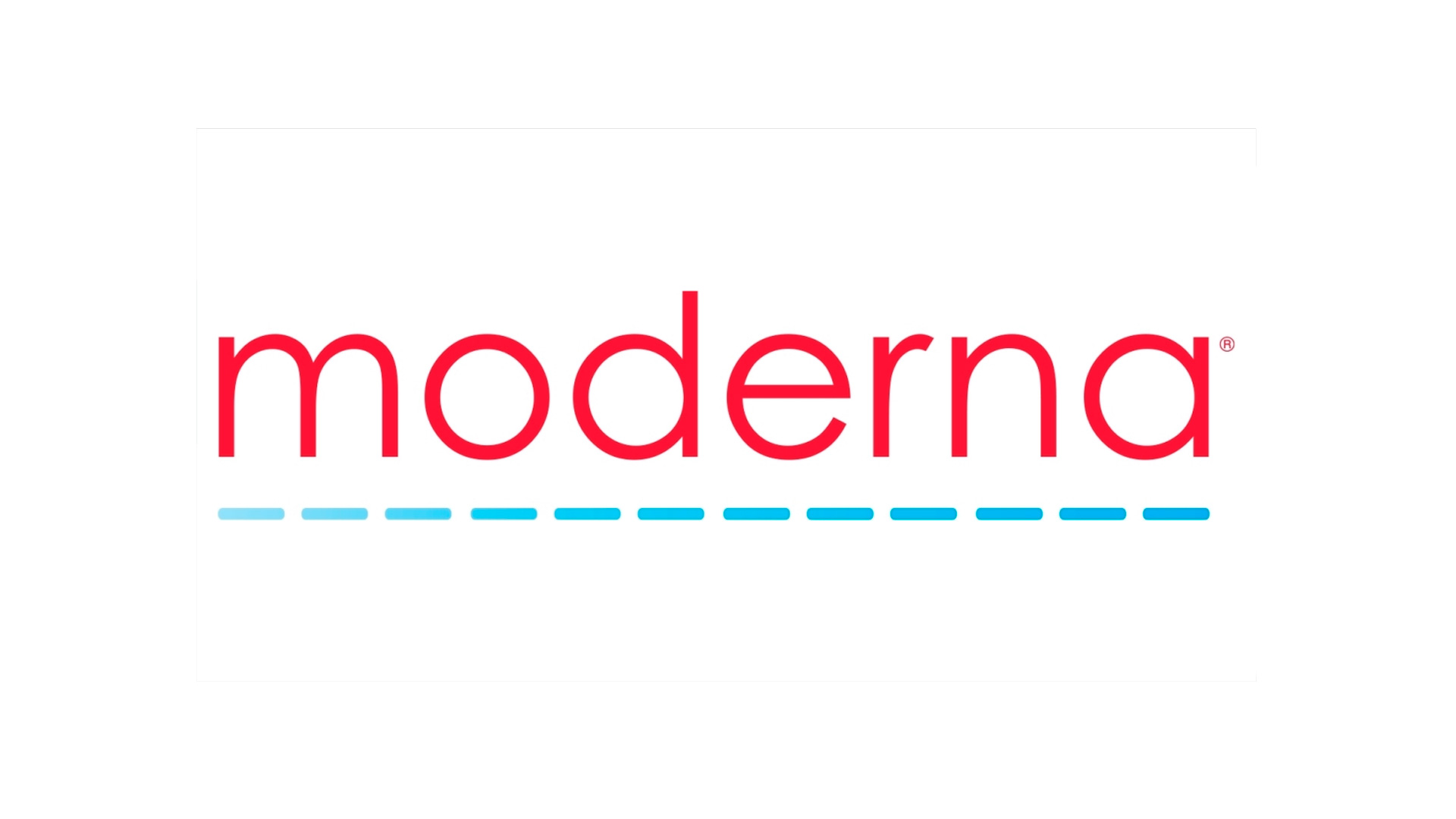
Moderna’s logo is a study in contrasts.
Despite being a relatively young company, founded in 2010 (which likely inspired its name), the logo itself is quite basic, lacking in appeal and modernity.
The lower lines are meant to represent the company’s journey, while the typography attempts to reinforce the brand name.
INCYTE
Logo design for the pharmaceutical company Incyte
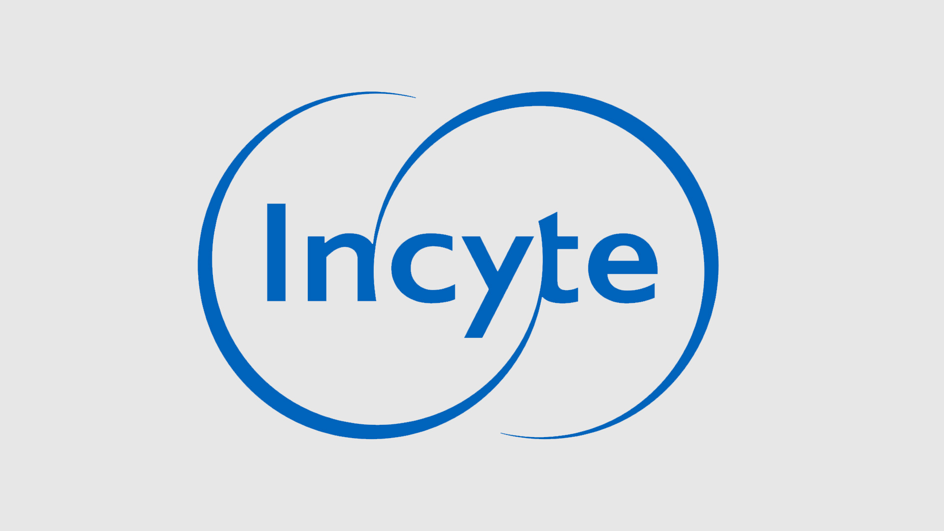
The third logo on our list is from Incyte.
Once again, we see a blue-themed design, a color closely associated with science and research.
The logo features two incomplete circles joined at the center, symbolizing unity, strength, and protection.
ROCHE
A classic logo design for this traditional pharmaceutical company
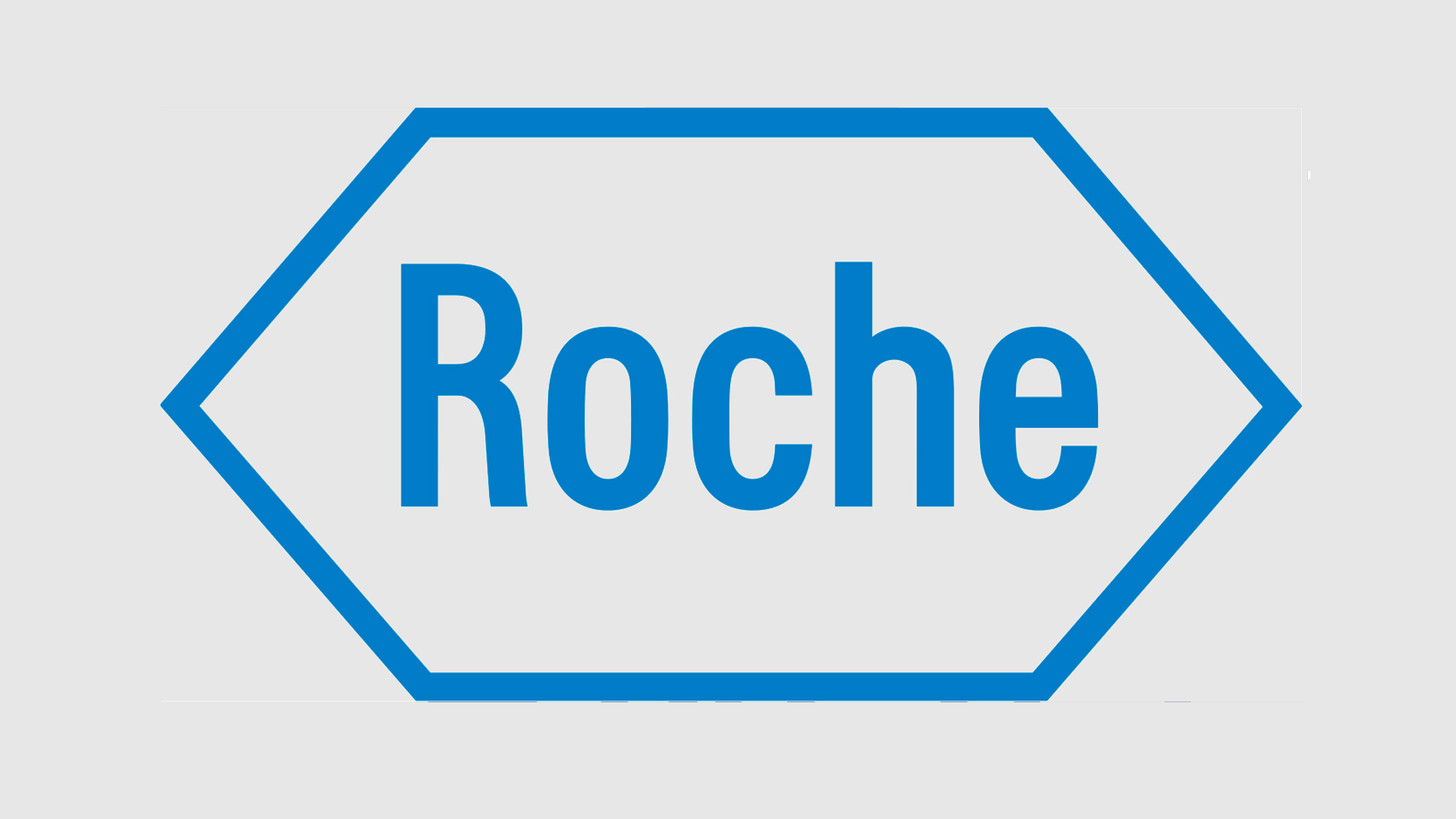
Roche’s logo has accompanied the company for over 50 years. Its signature blue, a staple among leading industry players, frames the brand name inside a hexagon, creating a distinctive and memorable identity.
The hexagon is a personal symbol of balance, harmony, and the universe.
The soft sans-serif typeface is designed to convey gentleness and security.
RATIOPHARM
A very understated logo design for Ratiopharm
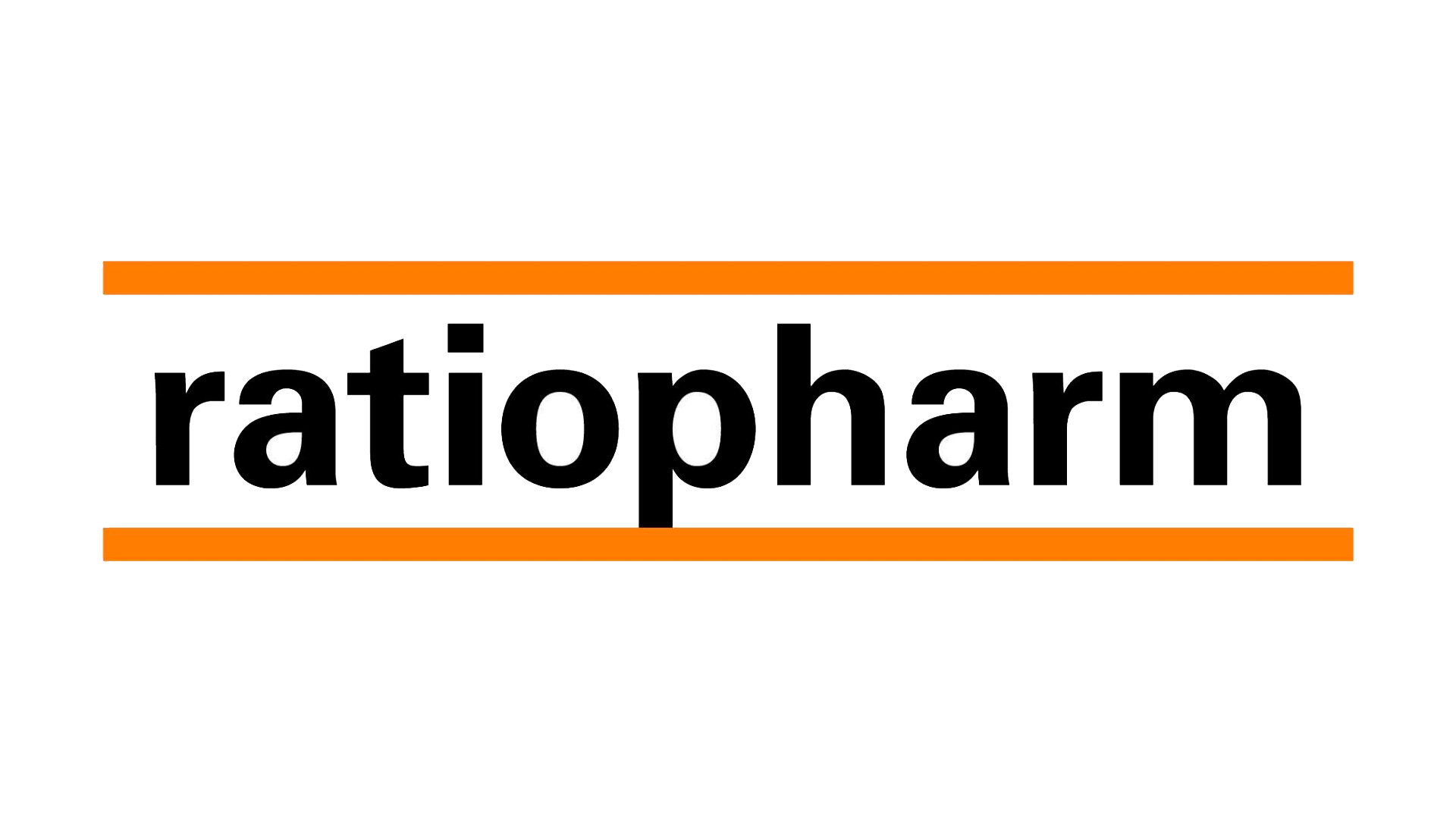
Ratiopharm is a leader in the production and distribution of generic pharmaceuticals.
The logo features the company name framed by two horizontal orange lines.
Orange here stands for effort, and in the context of medicine, it signals a focus on accessibility for the general public.
This logo can be interpreted as follows:
Ratiopharm is a generic drug manufacturer whose main goal isn’t to maximize profit, but to ensure everyone has access to medicine, regardless of their financial means.
ABBVIE
Sleek lines and a modern concept in the Abbvie logo
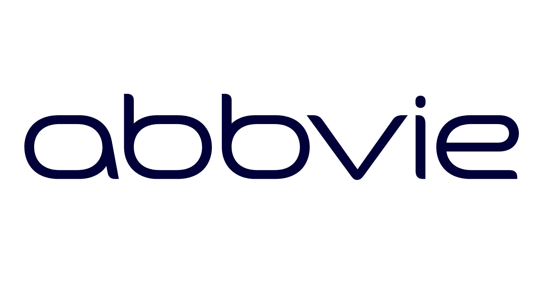
The Abbvie logo is a blend of two concepts: “abb” comes from its parent company, Abbott, while “vie” reflects the company’s ongoing commitment to research and improving lives.
The logo uses a very soft, thin blue typeface—choices intended to convey trust and expertise.
GSK
A bold logo for GSK
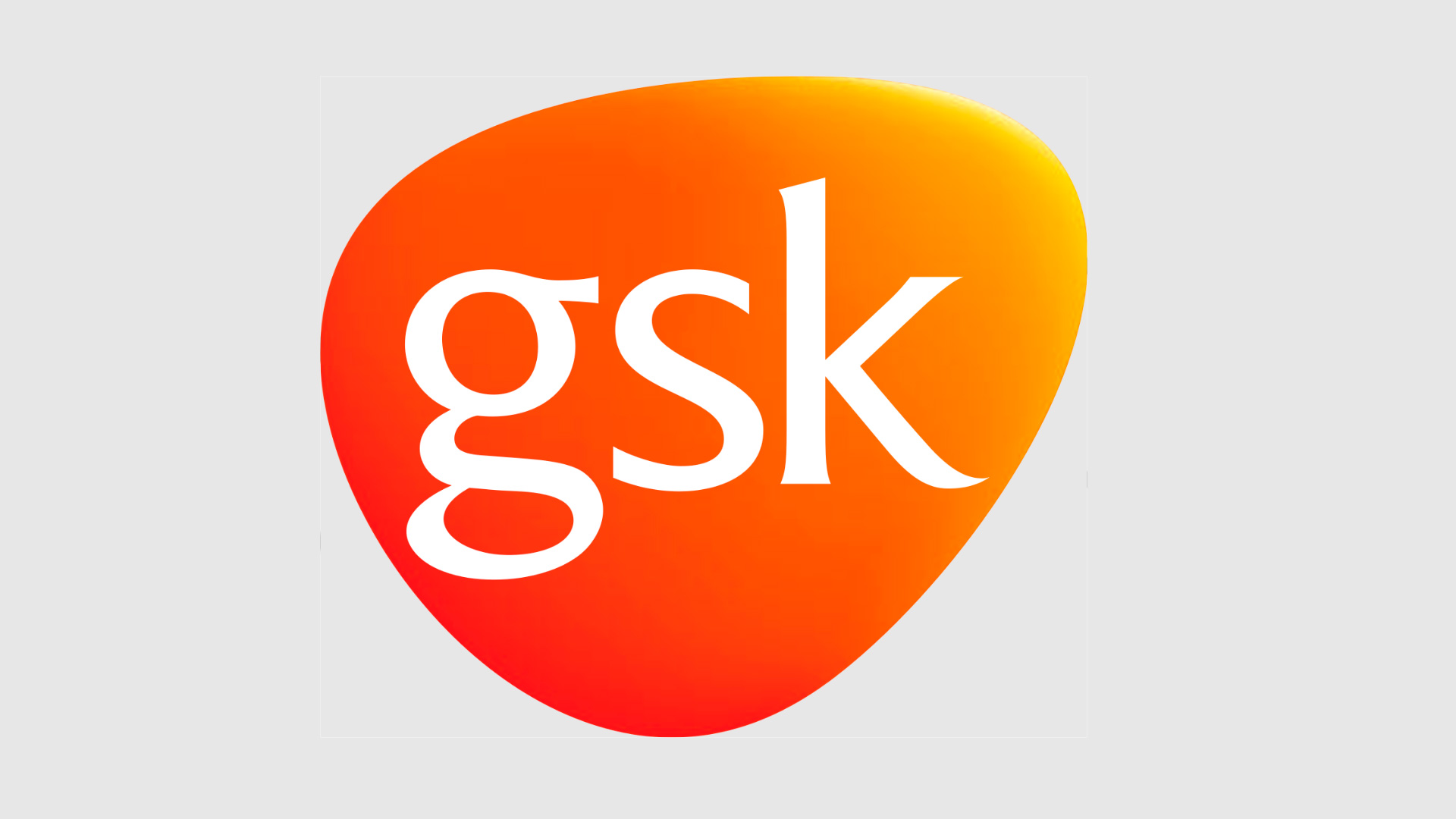
The British pharmaceutical company GlaxoSmithKline features its initials, GSK, inside a shape with a gradient from orange to yellow.
The form is reminiscent of a real heart, and the colors are meant to express the company’s drive for excellence and its commitment to delivering high-quality products to the public.
LABCORP
Logo design for Labcorp
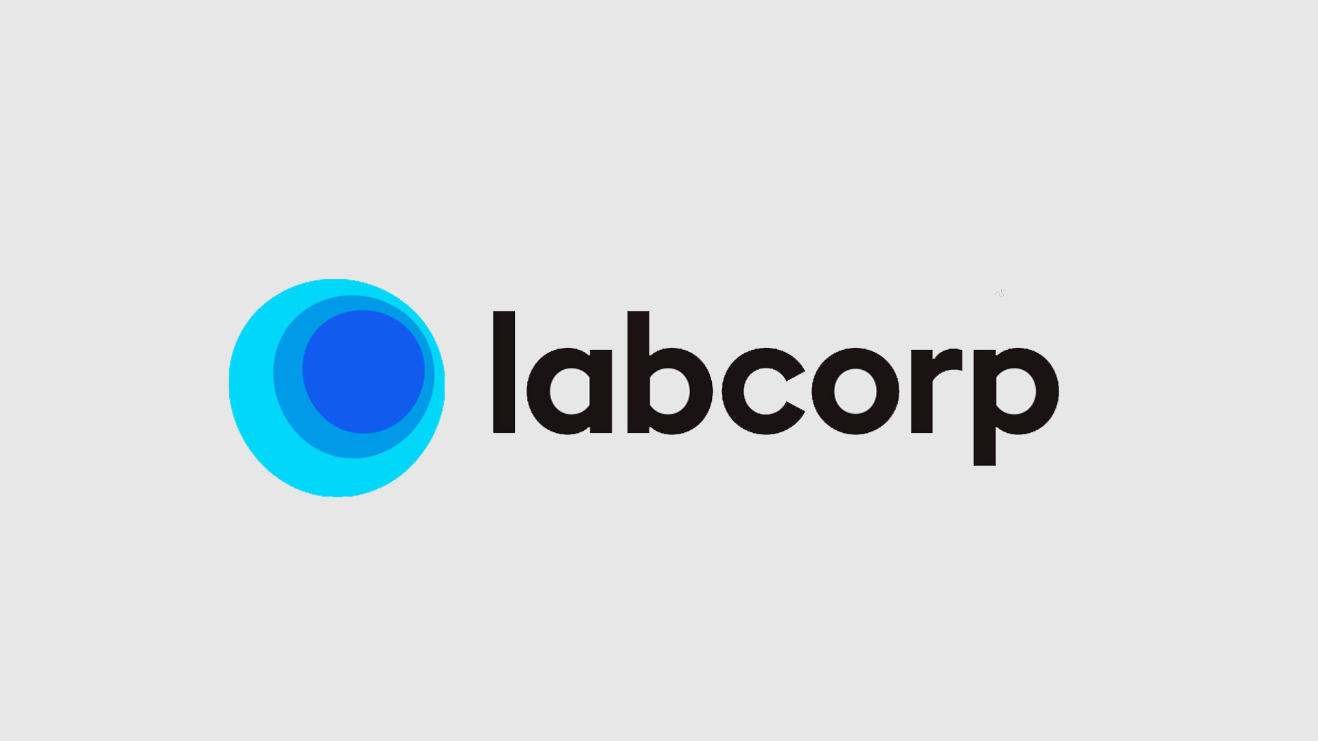
Labcorp is another company that has recently updated its logo—and it’s definitely a step up.
Looking at last year’s logo, Labcorp projected a very traditional corporate image, somewhat out of step with the times.
Today, Labcorp has embraced a softer, more modern, and dynamic visual identity.
GRÜNENTHAL
Logo design for Grünenthal
Grünenthal’s logo, shown here in black and white, actually comes in different colors depending on the department.
It’s a strong, bold logo that conveys trust.
GENMAB
Logo design for Genmab
Genmab’s logo represents a company specializing in the development of therapies for cancer treatment.
Unlike the usual blues, this design uses different colors and a graphic that reflects its mission.
Personally, I think the logo could use some work—a redesign wouldn’t hurt.
BOEHRINGER INGELHEIM
Logo design for Boehringer Ingelheim
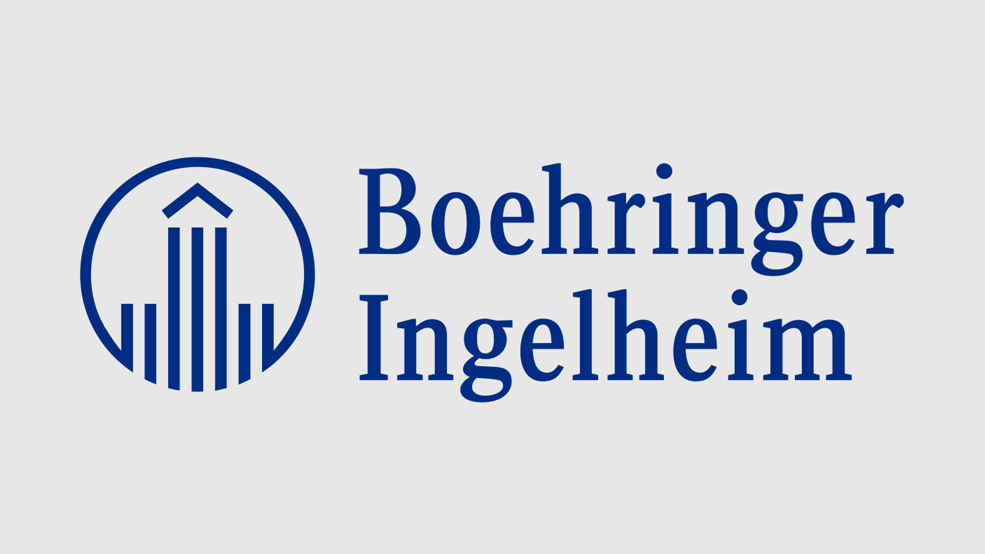
We wrap up our tour of pharmaceutical logos with Boehringer Ingelheim.
This logo is particularly interesting, as the company has a history spanning over a century.
The design is a stylized representation of the central section of Charlemagne’s imperial palace, who resided in Ingelheim after being crowned emperor.
Founded in 1885 by Dr. Albert Boehringer, the company’s heritage speaks for itself.
Conclusions
That’s it for the first ten pharmaceutical logos in this series. So far, we’ve seen a wide variety—most of them well-executed and with clear, defined concepts.


