How to Turn Rain Into an Emotional Brand Experience in a Sun-Soaked City
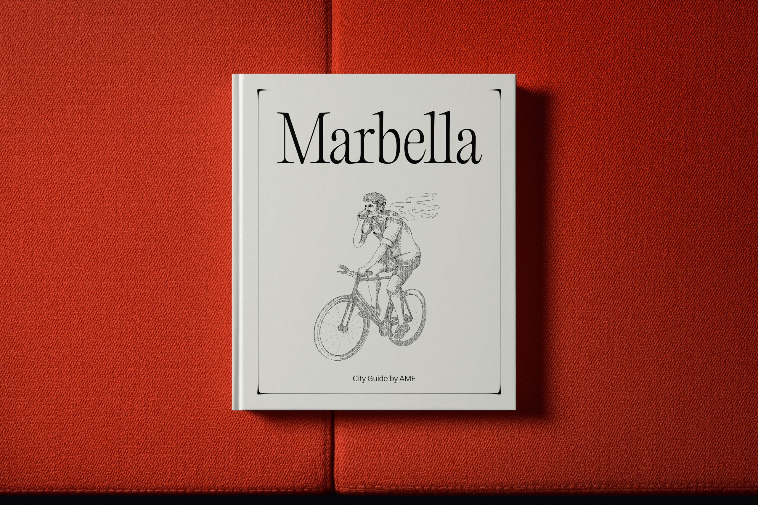
Each week, we explore international projects that prove contemporary branding is no longer just about aesthetics—it’s a powerful tool for crafting atmospheres, emotions, and unforgettable experiences. This time, we travel to Marbella to discover one of the year’s most sophisticated and conceptually robust visual identity projects: AME, a specialty coffee shop created by Sons & Daughters ID, internationally recognized with a Silver Award 2025 and winner of the ADC Europe Awards 2024 in the Illustration category, thanks to a visual system that is deeply editorial, emotive, and atmospheric.
At first glance, AME might seem like just another premium player in the contemporary coffee scene. But spend a few seconds with its visual system, and it’s clear there’s something far more intriguing at play. The brand isn’t built around coffee as a product, but around a feeling: rain.
And that’s precisely where the project’s conceptual strength lies.
In a city famed for its warm climate, clear skies, and endless Mediterranean summers, AME builds its identity around what’s rarely seen: rain—as an emotional refuge, a sensory pause, and a spark for creativity.
The result is a branding system that is elegant, quiet, and deeply cinematic, transforming a weather phenomenon into a complete visual language.
Marbella as a Starting Point: The Emotional Value of What’s Missing
One of the project’s greatest strategic insights is recognizing that the most memorable brands don’t always emerge from what’s obvious. Often, they succeed by creating tension, contrast, or longing.
Marbella stands for:
- sun,
- warmth,
- brightness,
- Mediterranean energy,
- an outdoor lifestyle.
AME chooses to position itself on the opposite end of the spectrum.
The brand draws inspiration from rain—not as a symbol of melancholy or sadness, but as an emblem of:
- calm,
- introspection,
- refuge,
- pause,
- contemplation,
- ritual.
The name “AME” itself introduces this emotional and sonic duality linked to water, while the entire identity revolves around an implicit question:
What would rain feel like in a city that almost never experiences it?
This conceptual contradiction is incredibly powerful from a branding perspective, creating instant differentiation.
While many specialty coffee shops compete using the same visual codes:
- industrial aesthetics,
- Nordic minimalism,
- earthy tones,
- artisanal language,
- hipster design.
AME creates a completely different visual universe.
It doesn’t just sell coffee. It sells atmosphere.
A Visual Identity Built on Sensation, Not Product
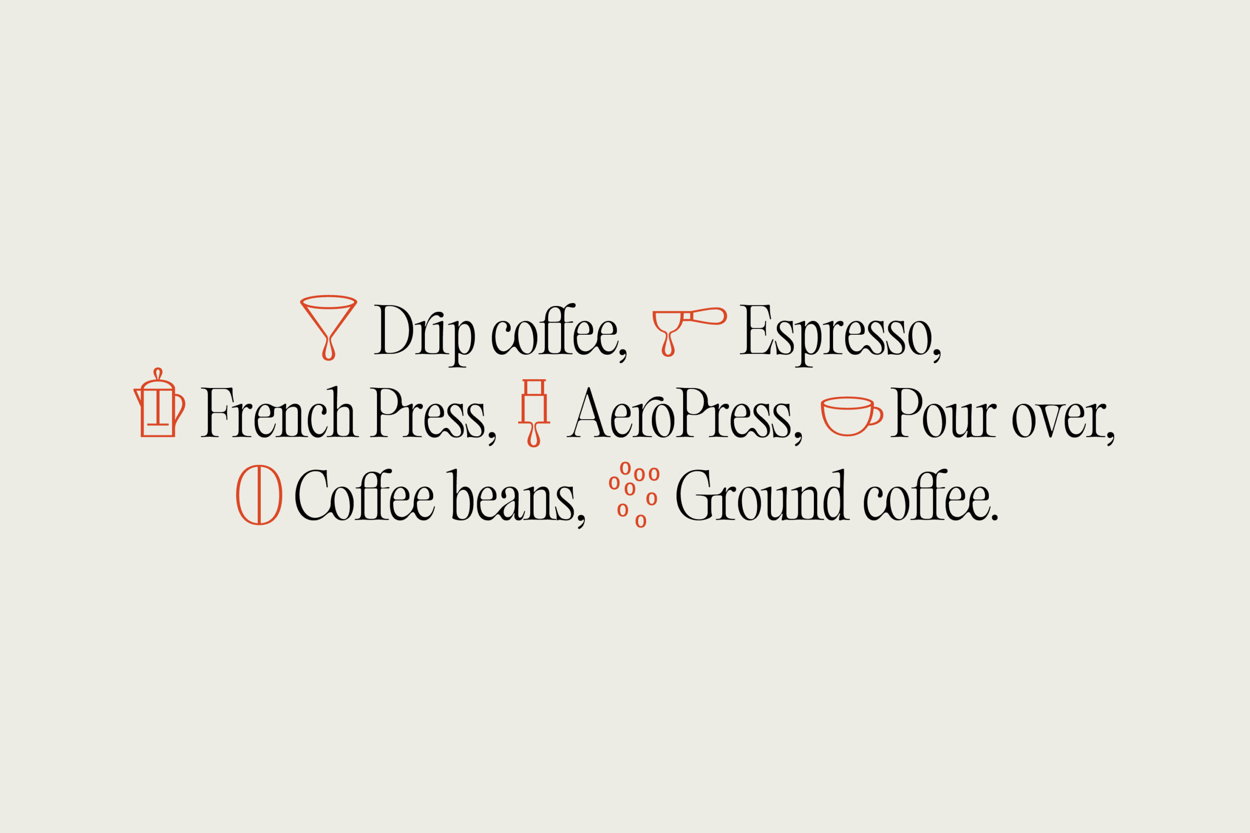
One of the most compelling aspects of Sons & Daughters ID’s work is its conscious avoidance of the coffee sector’s usual visual tropes.
You won’t find:
- coffee beans,
- botanical illustrations,
- direct references to roasting,
- classic café vintage aesthetics,
- overly artisanal codes.
Instead, the entire visual system is built around a sensory experience tied to rain.
The identity evokes:
- visual humidity,
- silence,
- a slower pace,
- soft shadows,
- shelter,
- inner warmth.
This is achieved through an exceptionally cohesive art direction, where every element works toward the same emotional goal.
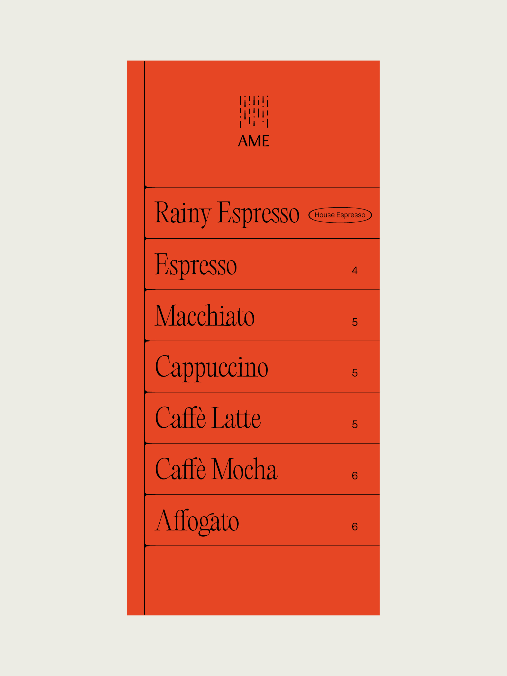
Color as an Emotional Tool: The Power of Vermilion
Perhaps the project’s most brilliant visual decision is its color palette.
When a brand uses rain as its central concept, you’d expect:
- blues,
- grays,
- cool tones,
- melancholic palettes.
AME does the exact opposite.
Its visual system features a striking vermilion—an orange-red hue—that serves as an emotional counterpoint to rain.
This color doesn’t represent water. It represents the refuge from it.
Visually, it conveys:
- warmth,
- shelter,
- interiority,
- freshly brewed coffee,
- Mediterranean light filtering into enclosed spaces.
The combination of:
- neutral gray backgrounds,
- editorial black,
- linear illustrations,
- vermilion accents,
creates an aesthetic that is both sophisticated and instantly recognizable.
Moreover, this color positions the brand firmly in the premium contemporary space, without falling into the usual luxury coffee clichés.
Editorial Typography and a Contemplative Visual Rhythm
Typography is another cornerstone of this project.
AME uses an elegant, flowing serif that feels more at home in contemporary editorial design than in traditional food and beverage branding.
The typography conveys:
- slowness,
- sophistication,
- sensitivity,
- contemplation,
- ritual.
Soft ligatures and organic shapes create an almost liquid feel, subtly reinforcing the rain concept without resorting to literal representation.
It’s a smart choice, avoiding obvious symbolism and building a much more mature identity.
The typography doesn’t shout for attention. It breathes.
And that visual breathing is central to the project’s concept.
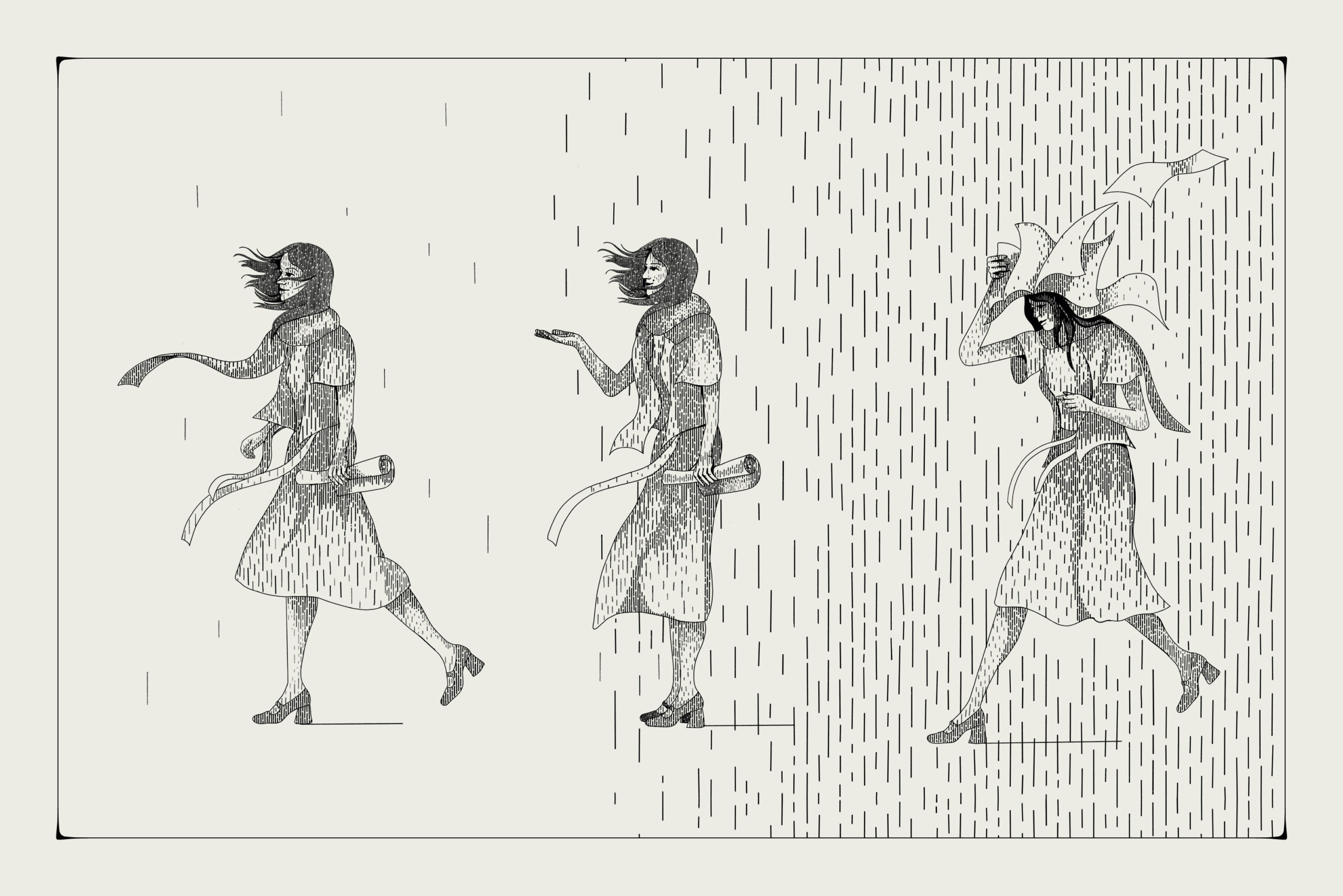
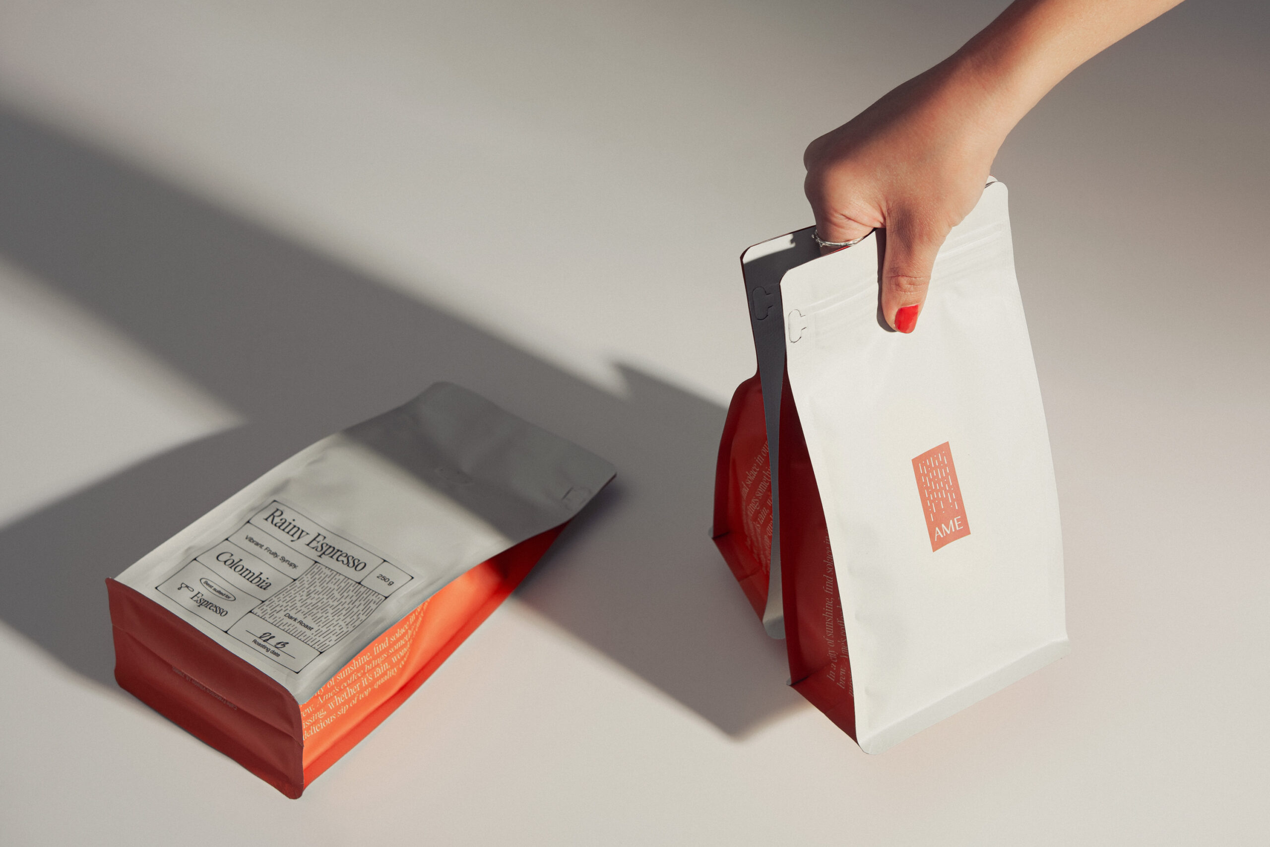
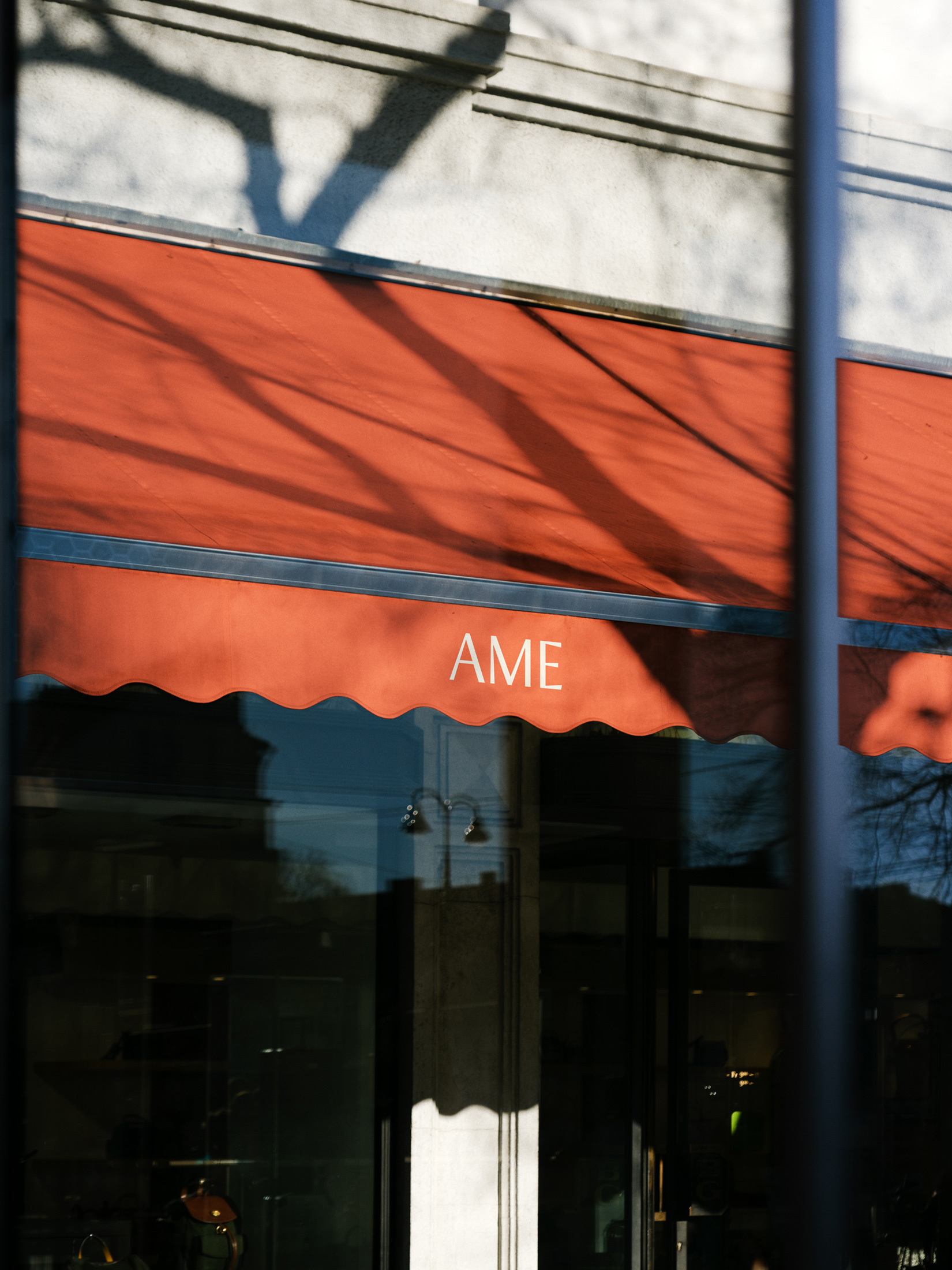
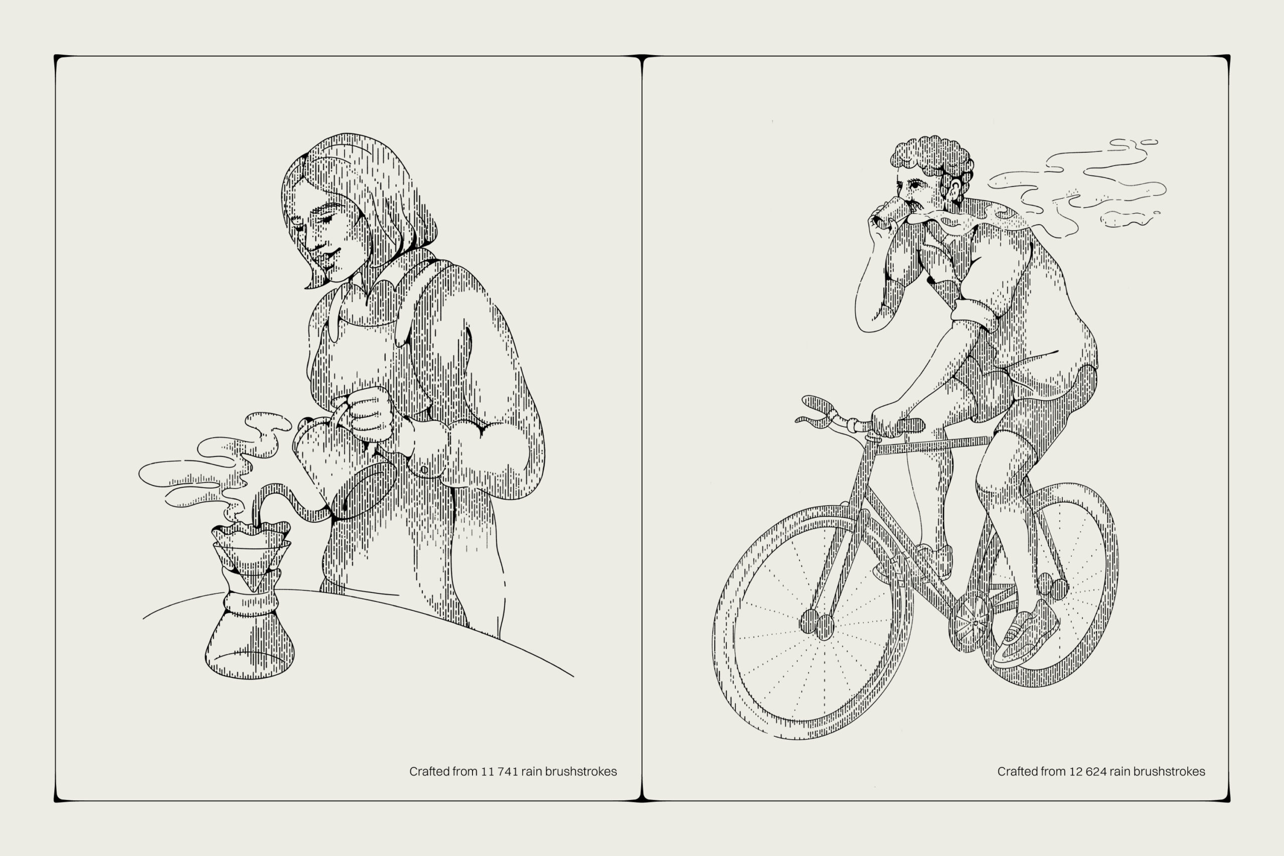
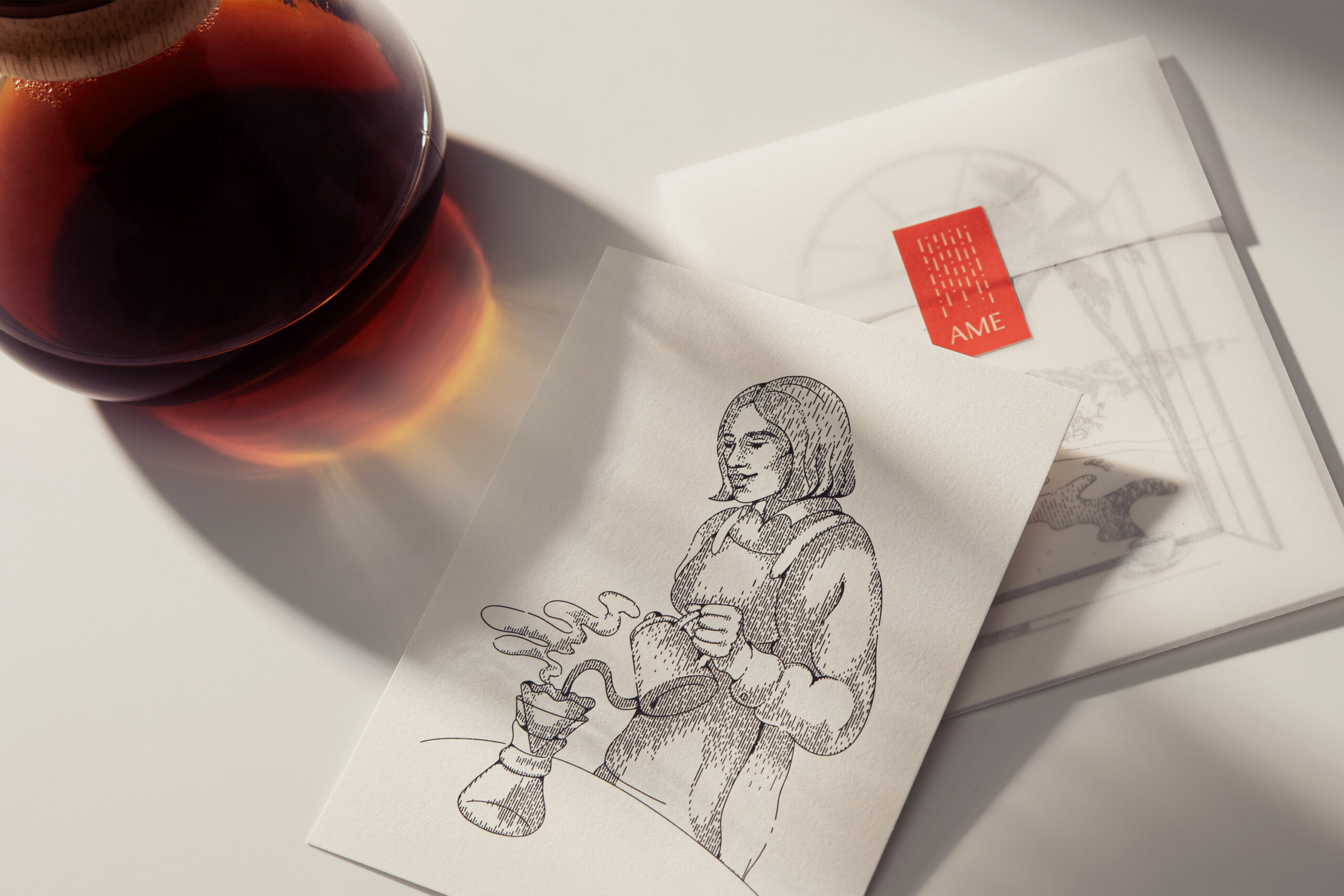
Illustration as an Atmospheric Language
If there’s one element that elevates this branding to an exceptional level, it’s the illustration.
Here’s where things get especially interesting: the illustrations aren’t just decorative.
They serve as a conceptual system.
Each image is built from thousands of tiny vertical strokes, evoking raindrops or atmospheric brushwork.
The studio refers to these as:
“rain brushstrokes.”
This transforms the weather concept into a visual language.
The scenes depict characters:
- walking in the rain,
- seeking shelter,
- serving coffee,
- moving slowly,
- inhabiting intimate spaces.
But what matters isn’t the literal narrative—it’s the emotional texture they create.
The illustrations achieve something rare: making the identity feel moist, quiet, and contemplative, without relying on obvious visual effects.
This is sensory branding, built through art direction.
International Recognition: ADC Europe Awards 2024
The project’s conceptual and visual strength did not go unnoticed in the global creative industry. AME was also honored at the ADC Europe Awards 2024, winning in the Illustration category for its sophisticated graphic system developed by Sons & Daughters ID.
This recognition is especially significant, as it validates one of the project’s most distinctive aspects: its ability to turn an abstract concept—rain—into a coherent, recognizable, and emotionally charged illustrative language.
Far from being mere decoration, the illustrations build atmosphere, rhythm, and visual narrative. Each composition is made up of thousands of tiny strokes inspired by raindrops, creating contemplative scenes that convey calm, intimacy, and slowness.
That’s the true genius of the system: the illustrations aren’t just an accompaniment to the branding—they’re an essential part of the brand experience.
In a landscape crowded with generic visual identities in hospitality and specialty coffee, AME shows how contemporary illustration can be a strategic tool for differentiation, personality, and visual memory.
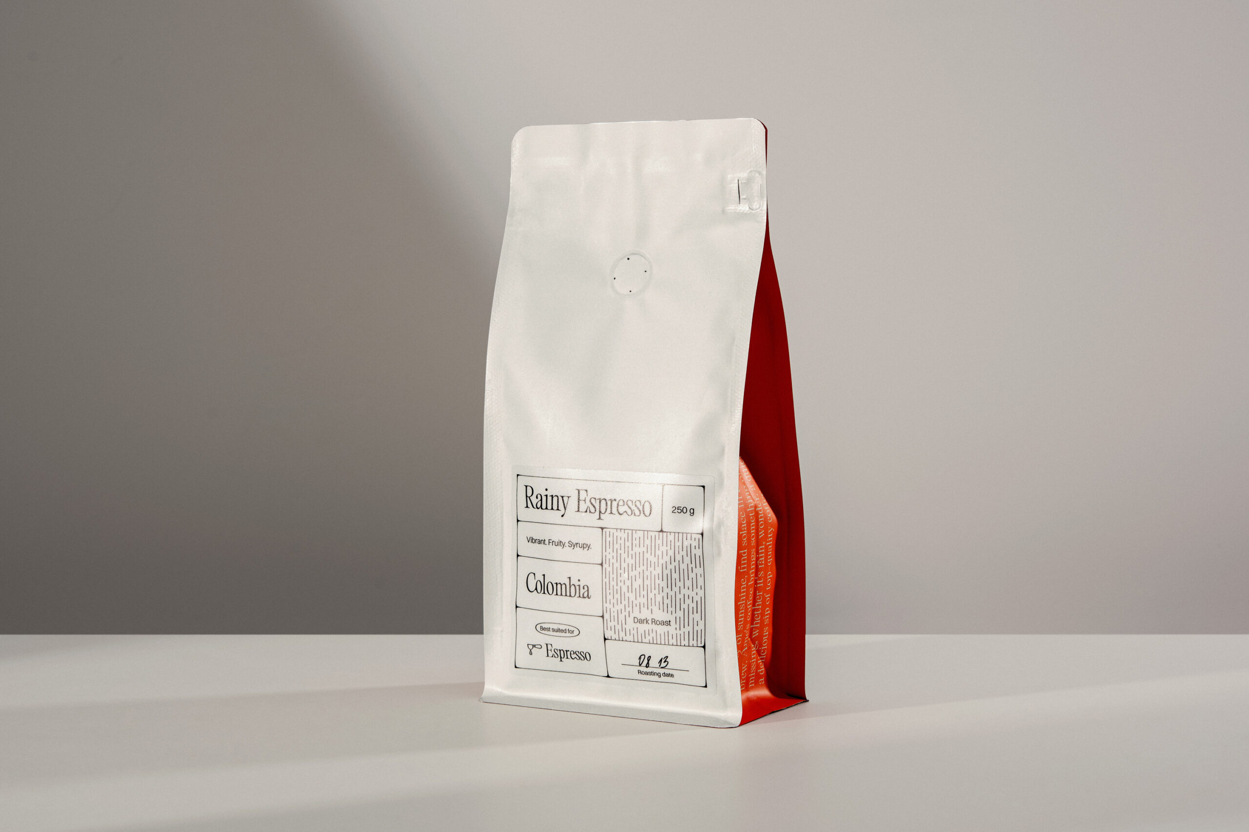
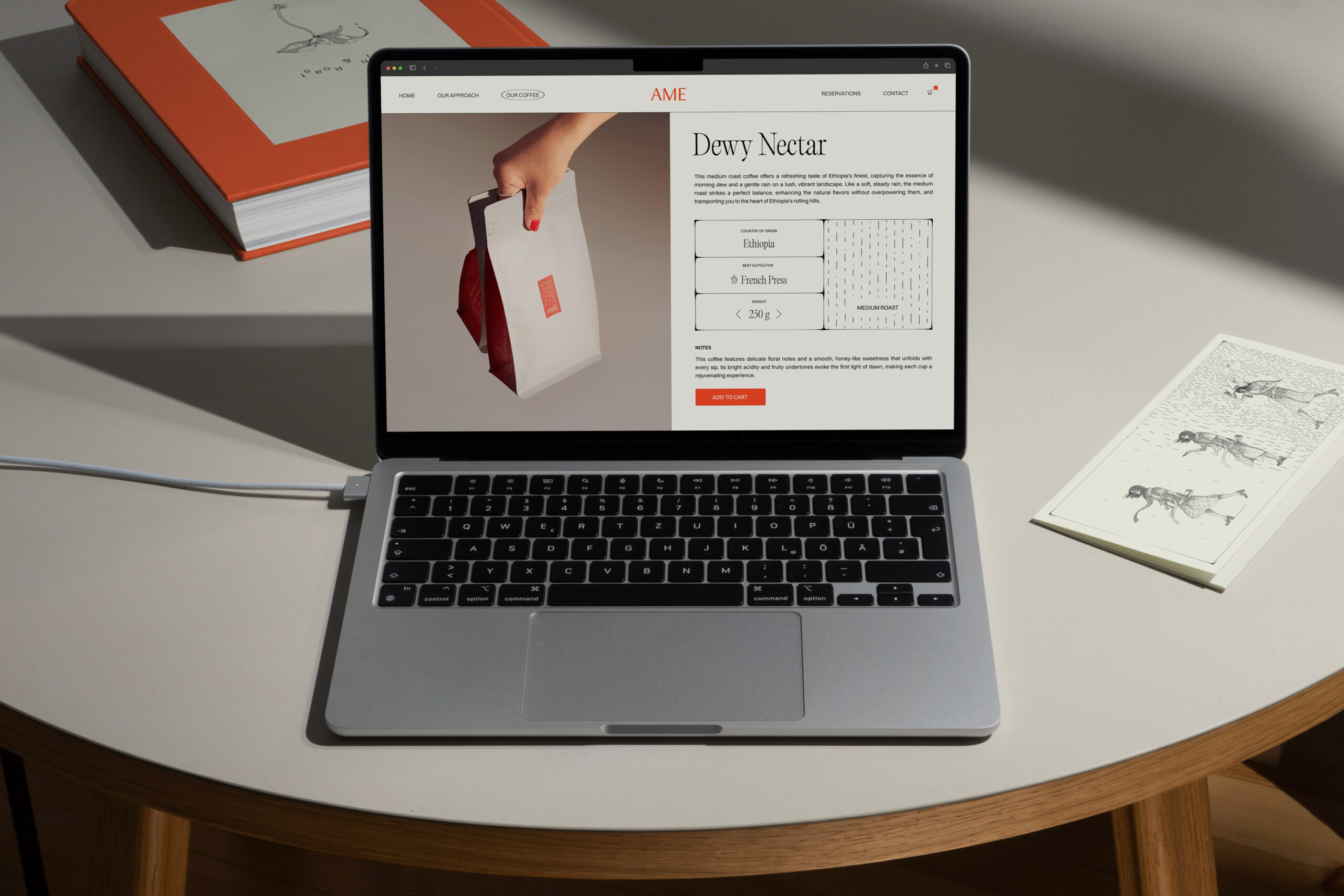
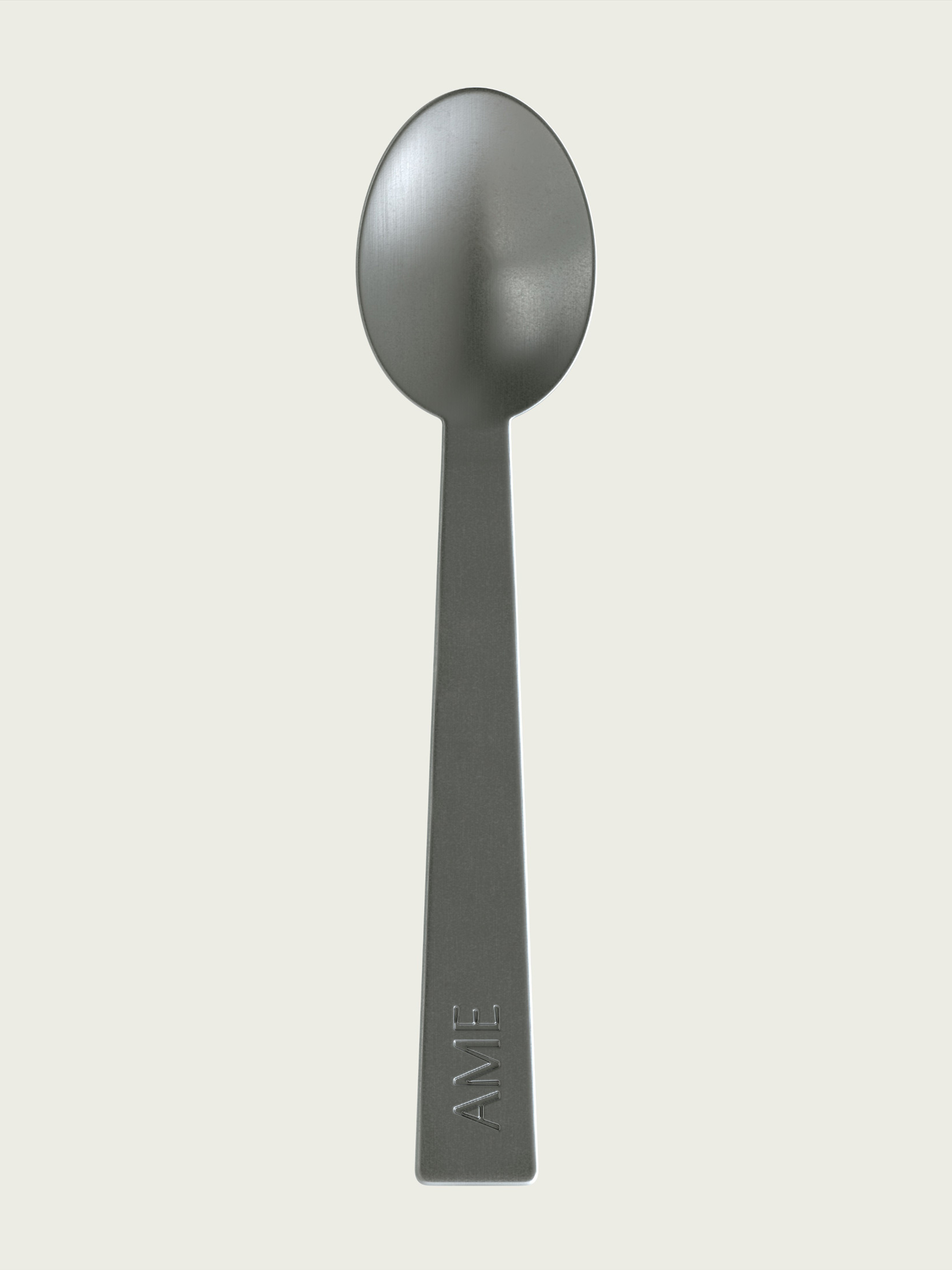
Premium Packaging with Editorial Logic
The packaging deserves special mention for its remarkable sophistication.
Instead of designing visually aggressive coffee bags overloaded with information, AME opts for an extremely clean structure, making the product feel almost like an editorial piece.
The labels evoke:
- tasting cards,
- book pages,
- typographic documents,
- artisanal records.
The coffee’s technical details are organized with a calm, elegant visual logic:
- origin,
- method,
- roast level,
- sensory profile,
- weight.
Everything is integrated into a restrained modular composition that reinforces the premium feel.
Additionally, the use of red on the sides of the packaging adds emotional contrast and makes the product stand out—both on retail shelves and in digital photography.
Atmospheric Branding: When a Brand Creates Climate
One of the most insightful ways to analyze this project is through the lens of:
atmospheric branding.
Many visual identities build recognition. Very few succeed in creating an emotional climate.
AME belongs to the latter.
The entire visual system is designed to evoke a specific feeling:
- slowing down,
- observing,
- pausing,
- breathing,
- being present.
The art direction employs:
- long shadows,
- side lighting,
- quiet compositions,
- ample negative space,
- warm photography,
- soft textures.
This brings the project much closer to the world of editorial and cinematic design than to traditional commercial branding.
At times, the images resemble frames from contemporary European cinema.
And that’s precisely why the brand feels culturally sophisticated.
Rain as a Metaphor for Pause and Creativity
Beyond aesthetics, the project works because rain carries immense psychological and emotional weight.
Rain is often associated with:
- introspection,
- creativity,
- refuge,
- reading,
- unhurried conversation,
- everyday rituals.
AME draws on all these associations to create a brand experience that goes far deeper than a typical specialty coffee shop.
Coffee becomes more than just a beverage. It transforms into:
- a temporary refuge,
- a mental space,
- a contemplative experience,
- an intimate moment amid daily chaos.
This aligns perfectly with current trends in experiential and emotional branding, where the most relevant brands no longer sell products—they sell emotional states.
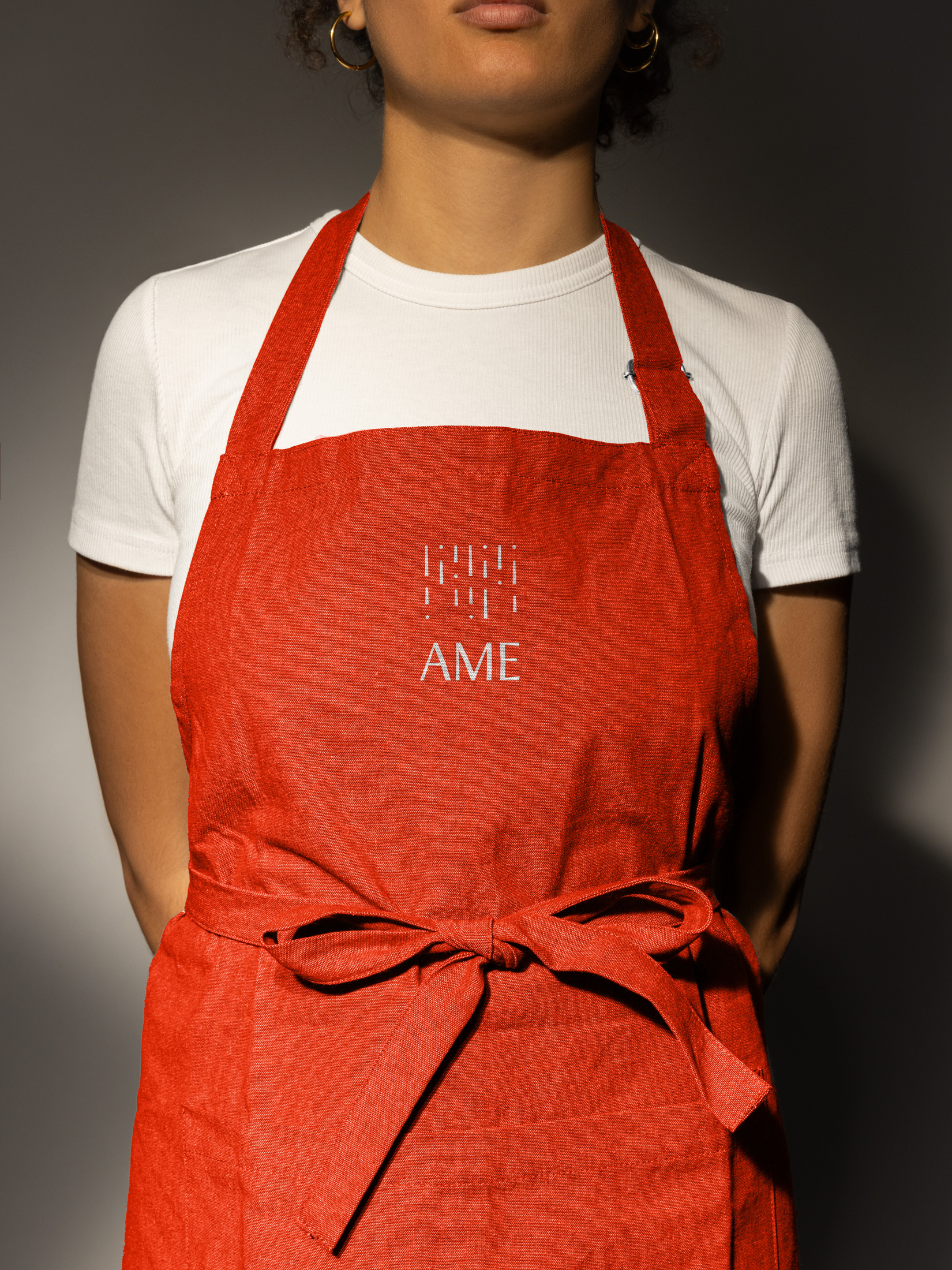
A Cohesive Visual System Across Digital, Space, and Merchandising
Another standout aspect of the project is the consistency of its visual system across all touchpoints.
The identity works seamlessly in:
- packaging,
- social media,
- photography,
- editorial,
- signage,
- physical space,
- merchandise,
- web design.
And most importantly, it always maintains the same emotional atmosphere.
Many projects lose their impact when moving from conceptual mockup to real-world implementation.
AME does not.
The branding retains:
- elegance,
- visual quiet,
- a measured rhythm,
- editorial sophistication.
This demonstrates an exceptionally controlled creative direction from the outset.
Contemporary Design Without Chasing Fleeting Trends
A major issue in today’s food and beverage branding is that many projects age quickly because they rely too heavily on short-lived visual trends.
AME completely sidesteps this pitfall.
It doesn’t try to be:
- trendy,
- viral,
- maximalist,
- experimental,
- overly digital.
Instead, it builds a far more timeless system based on:
- composition,
- typography,
- visual narrative,
- atmosphere,
- emotion.
This gives it remarkable staying power.
And it’s likely one of the reasons the project resonates so well internationally.
Coffee as a Cultural Experience, Not Just a Culinary One
AME also signals a significant shift in contemporary hospitality branding.
Today’s specialty coffee shops no longer compete solely on:
- product quality,
- coffee origin,
- brewing methods.
They compete by building:
- cultural identity,
- aesthetic experience,
- community,
- emotional sensitivity.
In this context, AME positions itself closer to:
- an editorial publication,
- a contemporary gallery,
- a space for contemplation,
than to a traditional coffee shop.
And that dramatically elevates the brand’s perception.
A Project That Truly Understands Contemporary Emotional Branding
What’s most compelling about AME is that it doesn’t try to impress with visual


