The Power of Emotional Branding in the Age of Purposeful Design
Some brands aren’t just designed—they’re felt. They don’t simply aim to be remembered, but to be embraced. Mamushka Bakery & Afternoon Tea, created by A.S. Strategy, Branding & Communication under the direction of Antonia Skaraki, is one of those rare brands where design becomes an emotional language. It’s a branding exercise that blends sophistication, tenderness, and cultural symbolism into a single experience.
The project, honored as Gold Winner in Branding, Character Design, and Packaging Design at the Indigo Design Awards 2025 and named Graphic Design of the Year, proves that contemporary branding is not just about aesthetics—it’s about storytelling that forges deep emotional connections.
A Symbol of Care and Heritage
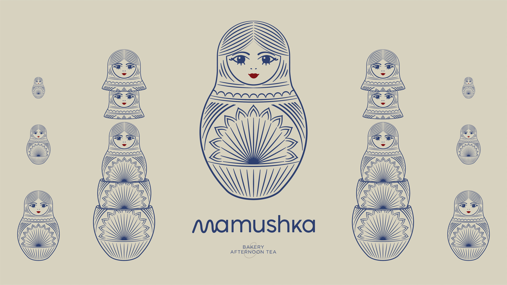
At the heart of this brand is Mamushka, “the little mother.” Inspired by the iconic Russian Matryoshka doll—a symbol of family, warmth, and continuity—Mamushka embodies layers of history, love, and tradition. Each nested doll represents generations protecting one another, flavors passed down, memories cherished.
The name is no accident. In Russian, “mamushka” is an affectionate diminutive, evoking closeness and protection. For a bakery and tea room in Bahrain, this figure becomes the perfect metaphor: hospitality, shared moments, the gentle pleasure of conversation over tea. The branding isn’t about impressing—it’s about embracing.
As the A.S. Strategy team explains, the goal was to build an identity that speaks not of product, but of feeling. The design needed to convey the idea of a “refuge”: a place where flavors evoke memories and the aesthetic invites calm.
The Power of a Timeless Visual Identity
Mamushka’s visual language is a study in balance. It achieves luxury without pretension, warmth without sacrificing sophistication. The color palette is anchored in beige and indigo blue, with a touch of red on the character’s lips. This seemingly simple combination is deeply intentional: beige brings serenity and approachability; indigo suggests introspection and depth; red adds energy and humanity.
The typography is rounded, friendly, and subtly geometric. It doesn’t seek to stand out, but to accompany. Its soft shapes and generous proportions evoke hospitality and closeness. Each letter carries a gentle rhythm, like a quiet conversation over afternoon tea.
The graphic system revolves around one principle: the elegance of the everyday. Rather than relying on flashy effects or harsh contrasts, the design breathes balance. Shapes repeat in layers, echoing the Matryoshka, creating a sense of symbolic depth that goes beyond a simple logo.
Designing with Soul: Illustration as Identity
Mamushka’s face is more than a visual icon—it’s the embodiment of the brand’s spirit. Her expression is serene, maternal, almost mystical. She’s not a caricature or a decorative element, but a quiet presence. In a market crowded with brands that shout, Mamushka whispers.
The illustration’s lines blend precision with warmth. Soft, rounded strokes avoid rigidity. The red lips are an emotional accent, breaking the neutral palette and adding a touch of humanity. It’s a subtle detail, but symbolically powerful: the color of life, affection, and care.
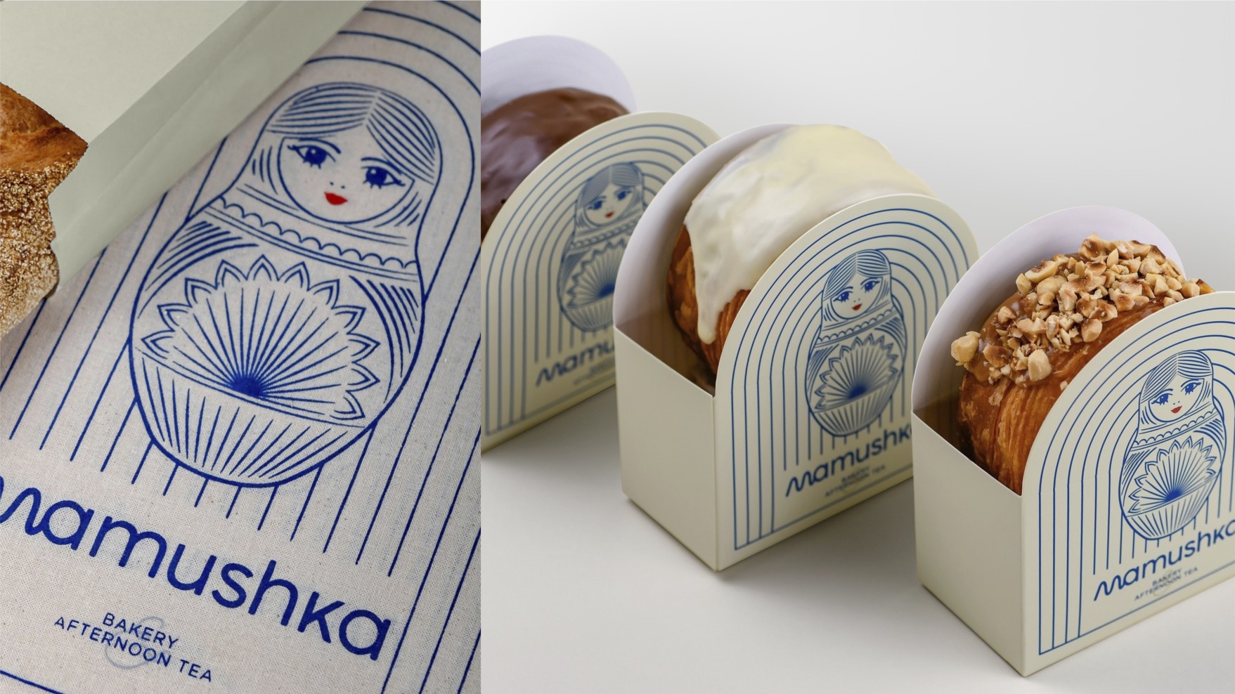
This figure appears across various touchpoints—packaging, stationery, signage—adapting flexibly while retaining its essence. It’s a clear example of how a well-crafted character can become the narrative thread of an entire visual story.
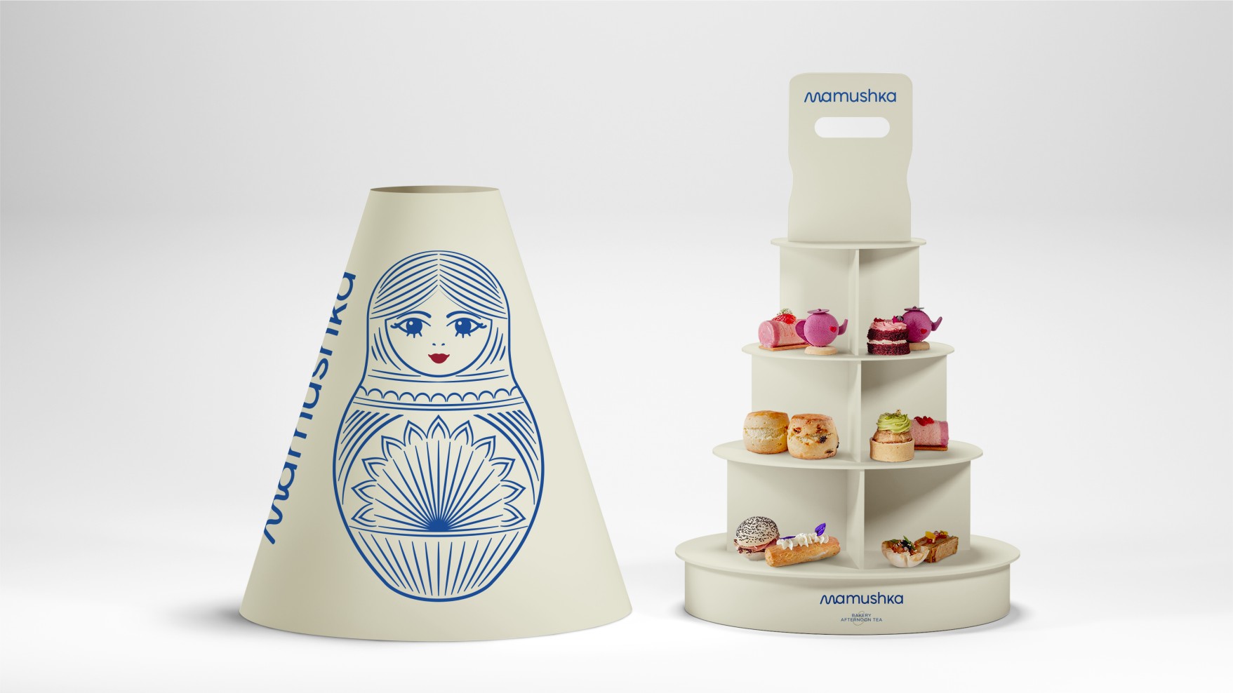
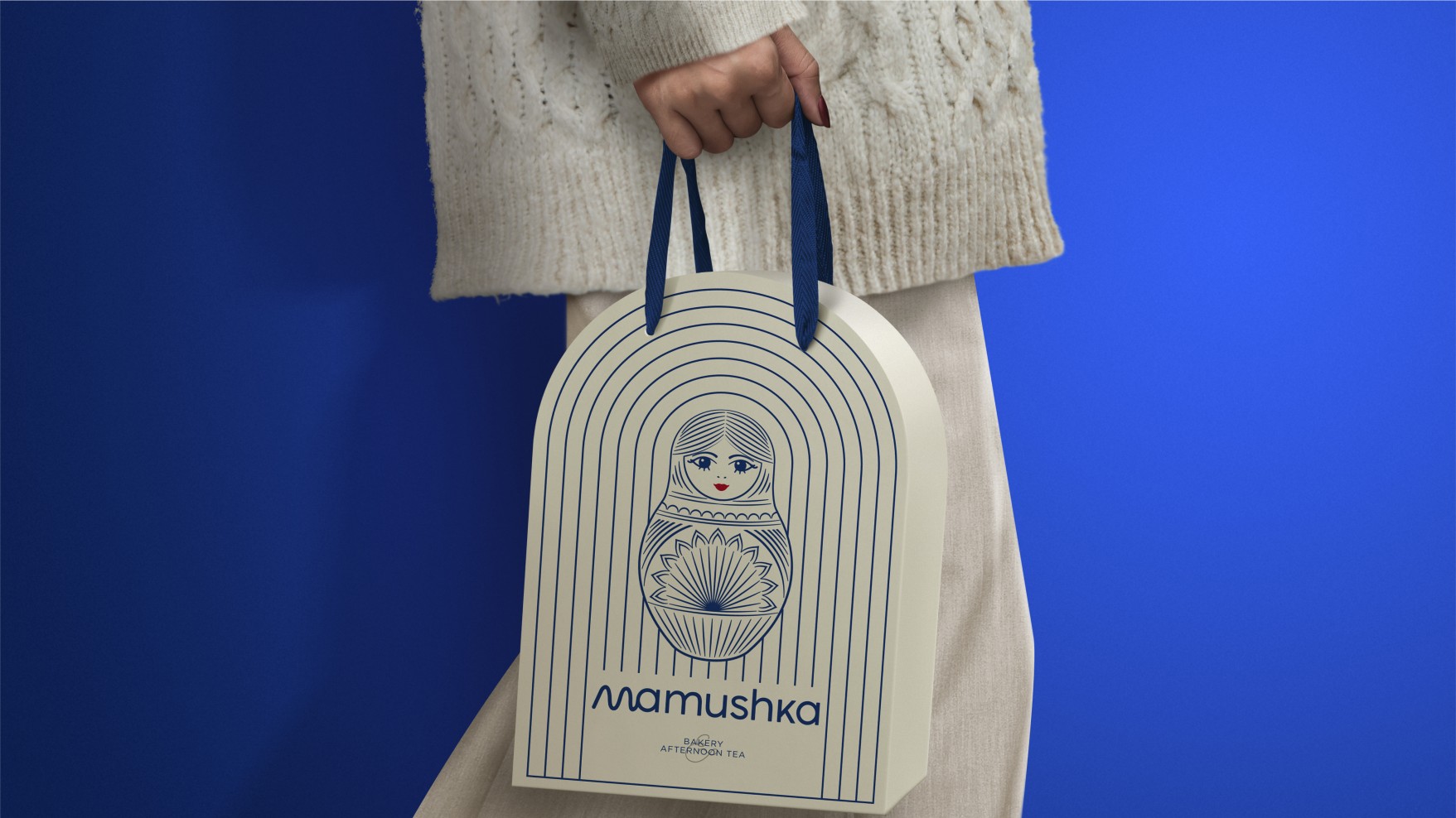
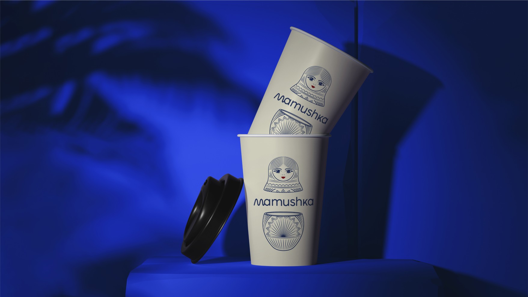
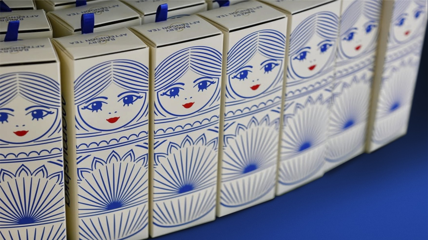
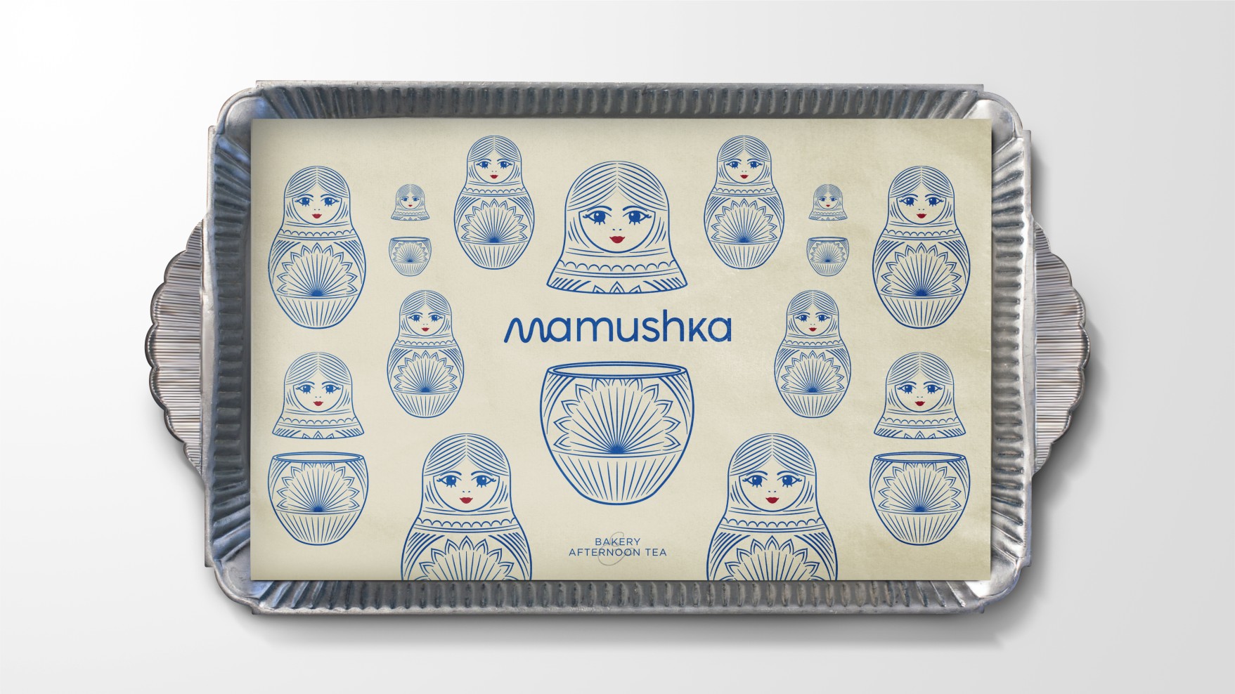
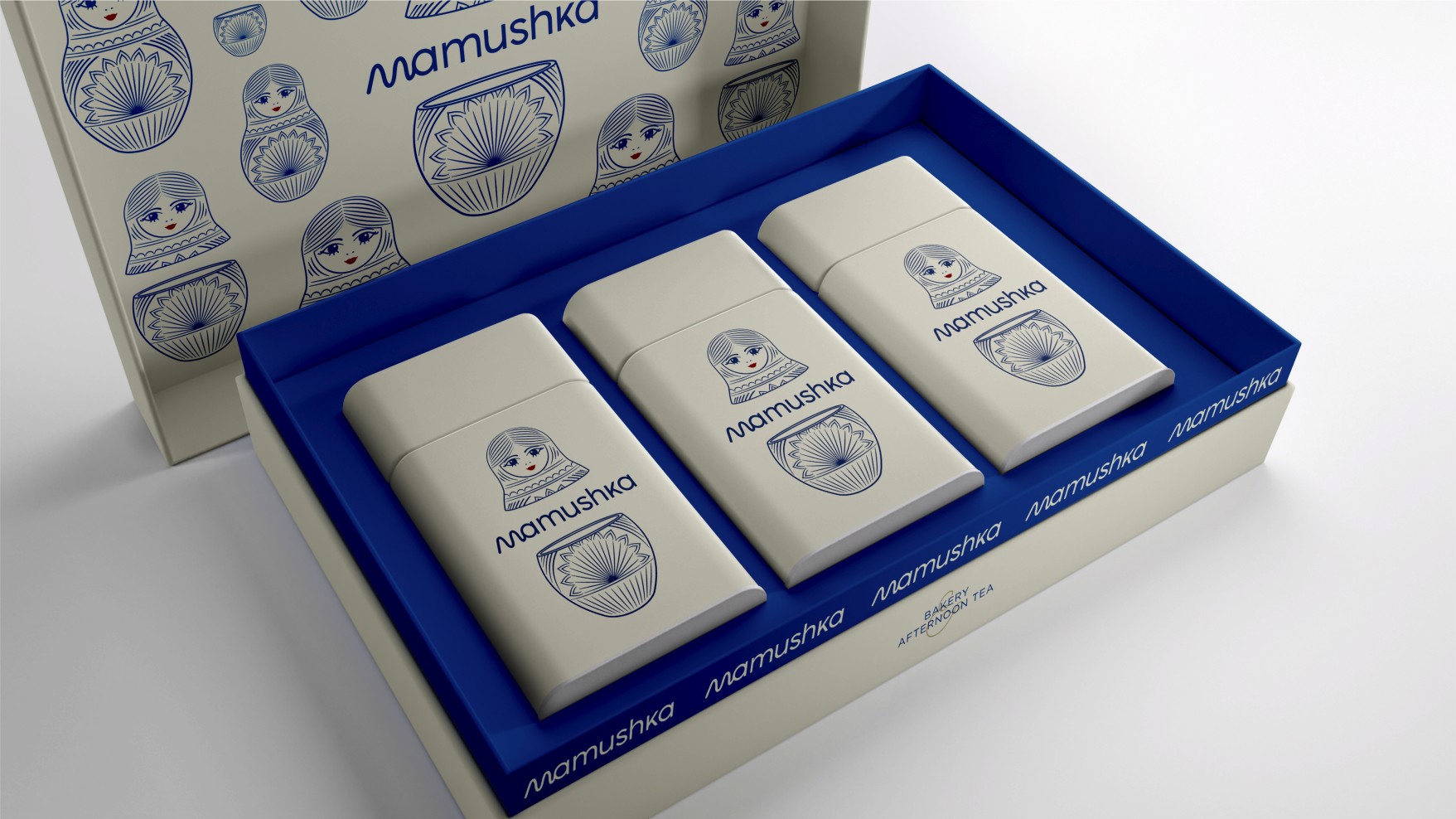
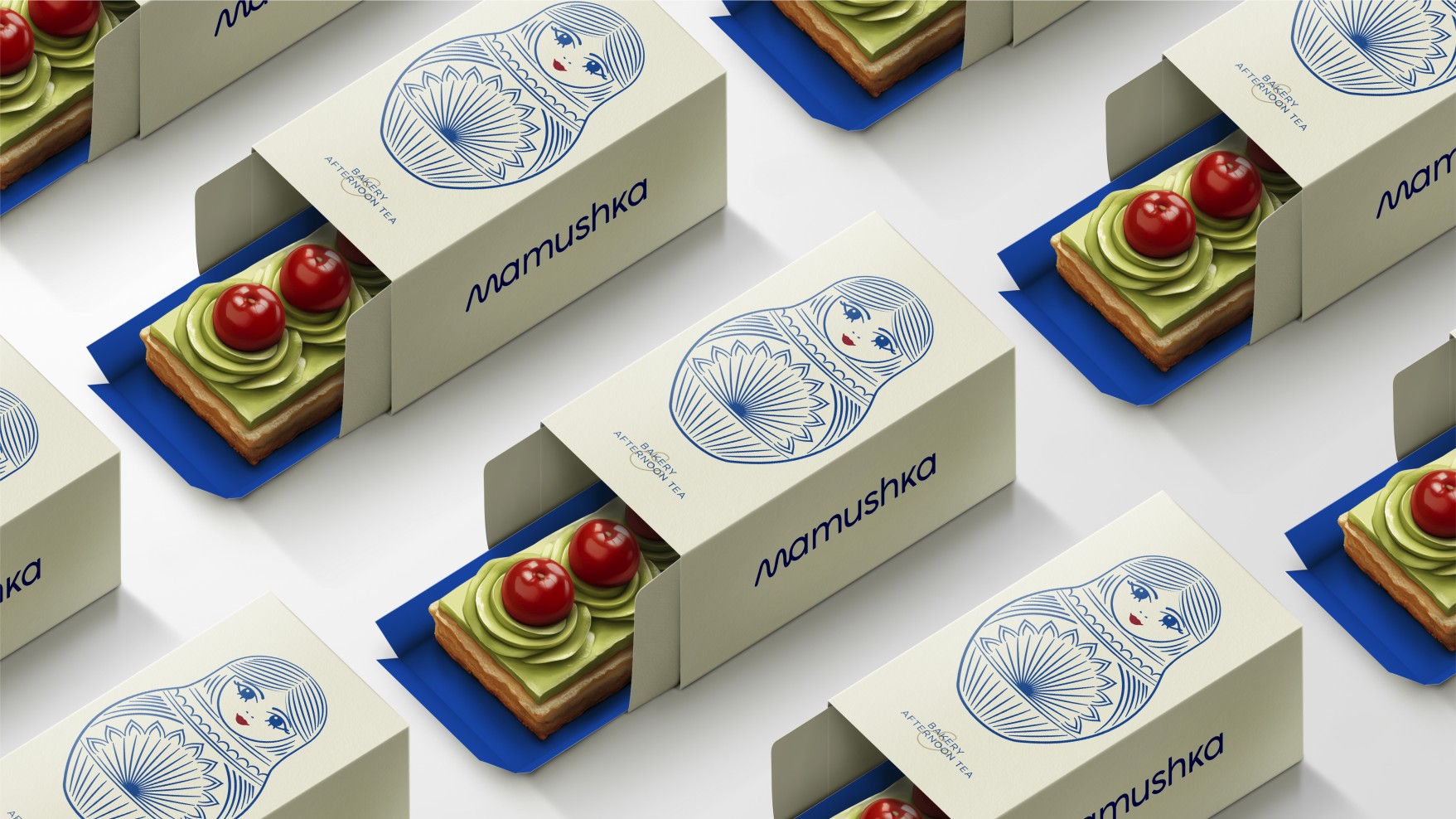
Packaging: Experience as Ritual
The packaging for Mamushka Bakery & Afternoon Tea is more than a wrapper—it’s an extension of the sensory experience. Every box, bag, or case is designed to evoke a specific emotion: pleasure, calm, nostalgia. Attention to detail is paramount. Materials convey quality without ostentation. Textures are soft, the touch is warm, proportions are harmonious.
Patterns and textures shift subtly depending on the product, but always maintain aesthetic consistency. Curved lines, inspired by the contours of the Mamushka doll, repeat in ribbons, embossing, and finishes. The color palette—beige, blue, red—adapts to each application while preserving overall harmony.
The result is a design system that’s versatile, distinctive, and deeply human. Each package feels like a small handcrafted treasure, something given with care. As Skaraki puts it, the aim was “to design a brand you could feel with your eyes closed.”
Branding for the Senses and the Heart
This project goes beyond visual identity, venturing into the realm of emotional branding. Mamushka doesn’t target a market segment; it speaks to a state of mind. The experience is almost ritualistic: opening a box, pouring a cup, pausing time. Everything communicates care, tenderness, and aesthetic pleasure.
This approach reflects a clear trend in contemporary design: brands that engage the senses build stronger, lasting bonds. In a world where communication is ever faster, Mamushka invites the opposite: a pause. To savor the silence between sips, and to see design as part of everyday life.
A Voice That Feels Close
The brand’s verbal communication is built on the same philosophy as its visual identity: warmth and courtesy. The tone is gentle, almost maternal. There are no grand slogans or lofty promises—just phrases that invite you to slow down and enjoy. The brand doesn’t talk about itself; it talks with you.
Naming and messaging strategies favor emotional language over commercial. Words are soft, structures simple. “Mamushka” doesn’t impose—it accompanies. This harmony between voice and visuals turns every touchpoint into an extension of the same spirit.
Elegance as Strategy
In a market where visual overload is the norm, choosing subtlety is a bold strategy. Mamushka’s elegance lies not in ostentation, but in precision. Every element—color, typography, form—serves a specific emotional purpose. Nothing is superfluous, nothing shouts.
The result is a brand that feels authentic, sophisticated, and culturally relevant. In Bahrain, where tradition and modernity intertwine, Mamushka strikes a balance between both worlds. Cosmopolitan yet warm; contemporary yet soulful.
International Recognition
The project’s impact has crossed borders. In 2025, Mamushka Bakery & Afternoon Tea was named Graphic Design of the Year by the Indigo Design Awards, and also took home Gold in Branding, Gold in Character Design, and Gold in Packaging Design. Additional accolades came from the Muse Awards, DNA Paris Design Awards, and Indie Awards.
These honors celebrate not only the project’s aesthetic quality, but its conceptual coherence. As the Indigo jury noted, “it’s an example of how simplicity, culture, and emotion can coexist in a perfectly articulated brand.”
Antonia Skaraki: Design with Purpose
The founder of A.S. Strategy, Branding & Communication, Antonia Skaraki, has built a career on the belief that design is a form of cultural strategy. Her projects are defined by a visual narrative that combines conceptual rigor with human sensitivity. With Mamushka, this vision reaches its purest expression.
Skaraki champions a branding philosophy rooted not in product, but in emotion. Her work creates brands that tell stories, invite reflection, and foster emotional bonds. Mamushka is a perfect example of this approach: branding that doesn’t shout its identity, but whispers it with elegance.
Lessons for Contemporary Design
The success of Mamushka Bakery & Afternoon Tea offers several key lessons for design and branding practice:
- Design is storytelling. Visual identity is not an end in itself, but a means to convey emotion and purpose.
- Luxury lies in subtlety. Discreet, consistent details communicate more sophistication than excessive flourishes.
- Sensory branding builds connection. When a brand engages the senses, it leaves a lasting impression.
- Tone matters as much as form. Consistency between verbal and visual language strengthens brand credibility.
- Emotional design transcends cultures. Brands with soul know no borders.
Conclusion: When Design Becomes Hospitality
Mamushka Bakery & Afternoon Tea is more than a branding success story—it’s a statement about what design can be: an act of hospitality. Every detail, from typography to color, expresses care. Every visual element is an invitation to pause, enjoy, and reconnect with what matters.
In an age dominated by speed and fleeting communication, projects like Mamushka remind us that the true power of design lies not in what it shows, but in what it makes us feel. The most valuable branding doesn’t just decorate a brand—it gives it soul.


