A website doesn’t fail because users read too little; it fails when they have to interpret too much
Many B2B websites don’t lose opportunities due to a lack of content. They lose them because they force users to do too much mental work: figuring out what the company offers, distinguishing what matters from what doesn’t, piecing together the value proposition, and deciding on the next step without a clear path.
That effort comes at a commercial cost. If someone lands on your site and has to read three sections to understand what should be clear in one, trust drops. When every message seems equally important, decisions get delayed. When navigation mirrors the company’s internal structure instead of the customer’s buying journey, user experience turns into friction.
Content architecture isn’t just about visual order or a decorative phase of web design. It’s a strategic decision: it defines what the user understands first, which questions get answered next, and what signals they need to move forward confidently. A clear website doesn’t oversimplify your business—it makes it readable.
For marketing teams, this changes the conversation. The issue isn’t whether the site has too much copy, too many pages, or too many services. The issue is whether all that content helps users decide, or just tests their patience. That difference impacts conversion, perceived value, and the quality of your leads.
The problem isn’t how much content you have—it’s the mental load you create
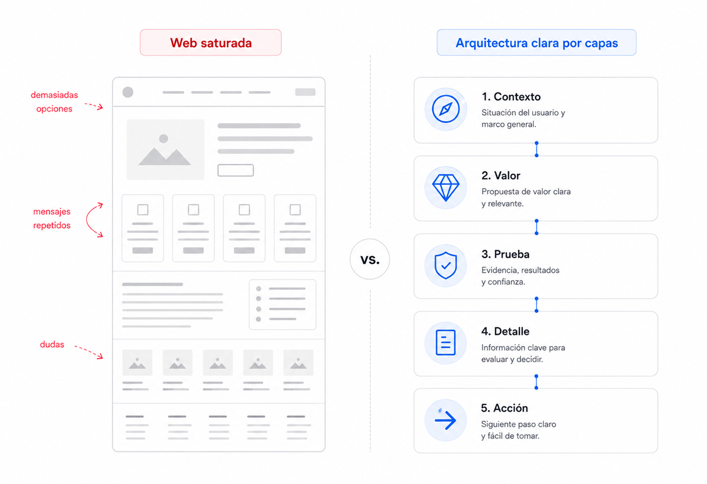
There’s a risky assumption in many redesigns: that a clearer website means less content. Not necessarily. A site can be brief and confusing, or extensive yet easy to navigate. The key isn’t volume—it’s the cognitive load placed on users at every step.
Cognitive load builds up when users have too many unanswered questions at once. What does this company actually do? Is this for me? How is this solution different? Where’s the proof? What should I do next? If the site doesn’t answer these in a clear sequence, users start solving the puzzle themselves.
That puzzle drains attention—and attention is a limited resource, especially in B2B, where decisions are already weighed down by internal pressure, comparisons, budgets, risk, and the need to justify choices. A website that adds complexity isn’t informing better—it’s increasing friction.
Friction doesn’t always mean users leave immediately. Sometimes it shows up as long visits with no conversion, lots of page views but no inquiries, forms started but never submitted, leads who arrive confused, or sales meetings where the team has to start from scratch because the website failed to clarify the basics.
That’s why content architecture should be seen as a guidance system. Its job isn’t to fill pages, but to reduce interpretation. It helps decide what to show first, what to group together, what to save for later, and what to cut because it doesn’t move the user forward.
A company can have a strong offering and still communicate it weakly if users are forced to connect scattered pieces. At that point, the problem isn’t visual design—it’s commercial clarity. And commercial clarity directly impacts trust.
When users quickly understand what you do, who it’s for, your approach, and what step they can take, they feel in control. When they have to figure it out, they sense risk. Whether it’s a corporate site, an ecommerce, or a private platform, that difference means fewer doubts, less drop-off, and better decisions.
Content architecture: the map that makes your business visible
Content architecture isn’t just the menu. The menu is only one visible expression. The real architecture is in the relationships between pages, sections, hierarchies, messages, calls to action, internal links, and decision points.
A strong structure determines what users need to know before they trust you, and what they need to see before they act. It doesn’t organize information for internal convenience, but for logical progression. This may seem minor, but it completely changes how a website performs.
Many companies build their sites from the inside out: about us, what we do, departments, services, methodology, team, contact. That structure might make sense internally, but it rarely matches the buyer’s mindset. Users aren’t looking for your org chart—they’re looking for answers to specific needs.
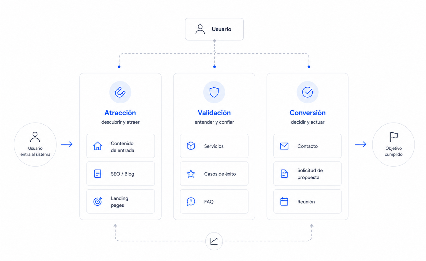
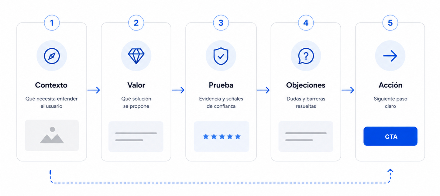
A serious content architecture organizes those questions. First, it helps users recognize the problem or opportunity. Next, it explains your value proposition. Then it provides proof, context, expertise, and reasons to trust. Finally, it enables an action that matches the user’s level of intent.
This doesn’t mean turning every page into a hard sales funnel. It means preventing users from wandering without direction. When the structure works, people don’t feel like they’re jumping between sections—they feel like they’re making progress. Each section answers a question, confirms an expectation, or adds depth.
In B2B, this progression is critical. A marketing director doesn’t decide based on looks alone. They need to understand positioning, reach, differentiation, technical capability, case studies, process, risks, and fit. If all that information is mixed together, with generic headlines and repeated messages, the site can seem less specialized than the company actually is.
Architecture also separates functions. Not all content should attract. Not all should persuade. Not all should convert. Some pieces drive organic traffic, others validate authority, others address objections, and others prompt an inquiry. When these functions blur, the site gets heavy—trying to do everything everywhere.
A smarter structure distributes the load. The homepage doesn’t need to contain the entire company. A service page doesn’t need to answer every technical question. A case study doesn’t need to repeat the general pitch. Each piece should have a clear role within the system.
Signs your website is making users think too much
A site with high cognitive load usually gives itself away quickly. It doesn’t always look messy. In fact, many have solid UX/UI design on the surface: good typography, well-managed spacing, clean images, and consistent aesthetics. The problem appears when users try to understand and decide.
Too many options at the same level
When everything seems equally important, nothing guides the user. Menus with too many items, sections with the same visual weight, multiple competing calls to action, or cards that mix services, benefits, and corporate messages without hierarchy force users to prioritize on their own.
Priority shouldn’t depend on the visitor’s effort. The site should clearly guide the way: what to look at first, what to compare next, and what action makes sense at each stage.
Headlines that sound good but say nothing
Abstract headlines are a huge source of friction. Broad, aspirational, or overly internal phrases force users to read the paragraph below to figure out what’s actually being offered. This breaks a basic rule of clarity: users should be able to scan a page and grasp the value structure without reading everything.
A good headline isn’t just decorative. It classifies, guides, and reduces uncertainty. On a conversion-focused site, every heading should help users know where they are and why that section matters.
Sections that repeat without adding value
Repetition can reinforce a key idea, but it can also become noise. Many sites repeat variations of the same promise: quality, experience, proximity, innovation, commitment. If every section circles back to the same point without adding proof, context, or a decision, perceived value drops.
Users don’t need to hear ten times that your company is good. They need to understand why they should believe it. That’s where case studies, metrics, processes, comparisons, guarantees, specialization, and concrete signals of expertise come in.
Navigation designed to describe, not to help
Navigation can be tidy and still not useful. If labels reflect internal categories, ambiguous names, or groupings only the company understands, users have to hunt for answers. That exploration drains energy and erodes their sense of control.
Effective navigation anticipates intent. It helps different user types quickly find what they need: solutions, industries, case studies, resources, pricing, contact, support, or documentation. The structure shouldn’t show off everything the company does—it should help each user find what’s relevant to them.
Calls to action without enough context
A call to action placed too early can create resistance. Not because the button is poorly designed, but because it asks for a decision before trust has been built. In B2B, “contact us” is rarely the first impulse if the fit, differentiation, or level of expertise isn’t clear yet.
Conversion improves when the call to action appears at the right time, with the right context. Sometimes the next step isn’t to request a meeting, but to view a case study, download a guide, compare approaches, or understand the process. Content architecture should respect the gradual maturity of the decision.
How to reduce friction without stripping your site of content
Reducing mental load doesn’t mean cutting your site down to nothing. That’s a common mistake: confusing clarity with oversimplification. A B2B company needs to explain nuance, process, scope, guarantees, expertise, and context. The key is where each element appears and what role it plays.
Effective content architecture works in layers. The first layer should quickly convey the offer: what you do, for whom, what problem you solve, and why it matters. The second should build trust: case studies, methodology, team, certifications, data, comparisons, or proof of experience. The third should allow users to dig deeper: documentation, FAQs, technical details, resources, or pages tailored to specific sectors, services, or needs.
Order changes perception. If a site starts with internal details before explaining value, it asks for too much patience. If it shows proof before the user understands what’s being proven, it wastes authority. If it presents a form before addressing basic doubts, it forces premature conversion.
A more effective sequence usually follows a simple logic: context, value, proof, and action. First, frame the need. Then, explain the solution. Next, show why your company can deliver. Finally, offer a next step that matches the trust you’ve built.
Modularity helps a lot. Instead of endless pages where every message competes, design sections with a specific purpose. One section can guide. Another can compare. Another can validate. Another can address an objection. Another can prompt action. When each module has a clear role, the page stops feeling like a jumble and starts acting like a guided conversation.
Repetition should also be reviewed. Repeating a strategic idea can be useful if each instance adds a new layer: definition, proof, application, result. But repeating the same promise in different words just takes up mental space. Users quickly spot when a site repeats itself because it has a point, and when it repeats because it doesn’t know how to move forward.
In UX/UI design, reducing friction means confidently establishing visual hierarchy. Not everything can have the same weight. Headlines should clarify, subheadings should guide, buttons should match a specific intent, and internal links should open useful paths—not interrupt reading with decorative options.
Clarity also depends on status signals. In ecommerce, users need to know if a product is available, if a size is selected, if the cart is updated, or how close they are to free shipping. On a corporate site, they need to know where they are, what page they’re on, how it relates to other sections, and what the logical next step is. Operational uncertainty quickly turns into distrust.
Content architecture drives sales by building trust
A clear website isn’t just easier to understand—it’s easier to believe. Trust doesn’t come from a brand claiming expertise, approachability, or uniqueness. It comes when users perceive order, control, and sound judgment in how you explain things.
When the structure is well thought out, the company appears more capable—not because of aesthetics, but because it shows an understanding of how customers think. It anticipates questions, organizes information, avoids detours, presents proof at the right moment, and doesn’t force users to chase meaning across scattered sections.
Perceived value rises as effort drops. If a complex solution is explained clearly, users associate that clarity with mastery. If it’s presented with noise, ambiguity, or message overload, users may assume the company itself lacks focus.
This has a direct commercial impact. A site with strong content architecture filters better. It attracts users who understand the fit sooner, reduces unqualified inquiries, and sets up sales conversations more effectively. The sales team doesn’t have to start from scratch—they continue a story the website has already begun.
It also boosts SEO. Well-structured content makes it easier for each page to have a clear intent, for topics to be logically grouped, for internal links to reinforce relationships, and for technical SEO to have a solid foundation. Google doesn’t need a bloated site—it needs one that’s readable, consistent, and well connected.
With custom WordPress builds, this is especially important. A tailored CMS with well-defined fields, clear content types, and reusable components helps maintain architecture without relying on page-by-page improvisation. Clarity shouldn’t be a one-off redesign effort—it should be a system capability.
The best architecture isn’t the star of the show. It makes your business understandable faster. It helps users move forward with less resistance. It makes your brand feel more confident, more specific, and easier to choose.
What marketing teams should review before a redesign
Before discussing aesthetics, check if your current site is helping users make decisions. Many redesigns start with visual references when the real issue is structure: pages that don’t address user intent, poorly grouped services, generic messaging, weak conversion paths, or valuable content hidden in secondary places.
The first review should be brutally simple: is the value proposition clear within the first few seconds? If the answer requires too much internal explanation, the site is shifting work onto the user that architecture should solve.
The second review is navigation. Is it organized around how customers buy, or how the company is structured? This distinction explains many conversion problems. Users aren’t looking for departments—they want solutions, trust signals, proof, and next steps.
The third review is for key pages. Homepage, services, case studies, ecommerce, contact, or main landing pages should each have a clear commercial function. If a page mixes too many ideas, repeats messages, or doesn’t lead to a concrete action, it’s probably increasing cognitive load—even if it looks fine visually.
The fourth review is about separating content types. There’s content for attracting, content for validating, and content for converting. Mixing them without hierarchy creates dense, ineffective pages. Separating them enables cleaner journeys: discover, understand, trust, explore, and act.
The fifth review is spotting what’s missing and what’s unnecessary. Redundant sections, broad claims, and wordy areas that say little are common excesses. What’s often missing: comparisons, decision criteria, real FAQs, clear processes, concrete proof, and signs of specialization.
A serious redesign doesn’t start by asking what the site should look like. It starts by asking what mental load it’s imposing, what decisions it’s not supporting, and what part of the company’s value remains invisible due to lack of structure.
Conclusion: A clear website doesn’t say less—it makes you think less
Content architecture is a business decision. It defines how your company is understood, how its value is perceived, and how much effort users need to move forward. When that architecture fails, the site may still look fine—but it loses commercial effectiveness.
A cluttered site doesn’t always have too much content. More often, it has too many unresolved decisions: unclear priorities, repeated messages, weak paths, premature calls to action, and fuzzy hierarchies. Users don’t leave because they’re not interested—they leave because understanding your business takes more energy than it should.
Clarity isn’t about saying less. It’s about organizing well. Show first what helps users understand, then what builds trust, and finally what enables action. That sequence reduces friction, improves user experience, and increases the sense of control.
For marketing teams, reviewing content architecture is a direct way to boost conversion without resorting to cosmetic changes. Before adding more campaigns, more sections, or more messages, make sure your current site is doing the essentials: explaining better, guiding better, and helping users decide with less resistance.