There are industries where digital design tends to show up with a hard hat and little visual ambition. Construction, manufacturing, engineering: all data, promises of control, and interfaces that feel like technical catalogs. That’s why Enerblock stands out. It doesn’t try to soften the industrial edge or disguise it with generic visuals; instead, it transforms it into a precise, dark, modular, and highly distinctive atmosphere.
The secret is in the balance. This isn’t design for design’s sake—it’s about presence. Coral accents inject energy, dark backgrounds add depth, oversized typography brings order, and the layout breathes system. In construction web design, that mix is gold: it makes a complex proposition feel clearer, more serious, and more valuable—even before you get into the details.
Enerblock — industrial construction with editorial flair
Enerblock’s visual identity is full of character: technical, restrained, and aspirational. The brand doesn’t present itself as a company that “does things,” but as a system. That shift is felt from the very first moment. The grid, the lines, the monogram, the content blocks, and the color contrast all build a sense of method. Everything seems to have a reason, a place, and a scale.
The use of black and dark tones avoids the empty “premium” cliché. Here, it works because it connects with machinery, precision, structure, and control. On this foundation, coral acts as a powerful visual cue: it highlights key areas, warms up the interface, and keeps the overall feel from becoming too cold. It’s a color with visual memory. It doesn’t just decorate; it directs.
The typography has the punch a B2B brand needs to convey trust. Big headlines, no ambiguity, short statements, and a clear hierarchy. There’s no interface noise competing with the main idea. The composition leads. And when the composition leads, the brand feels more confident.
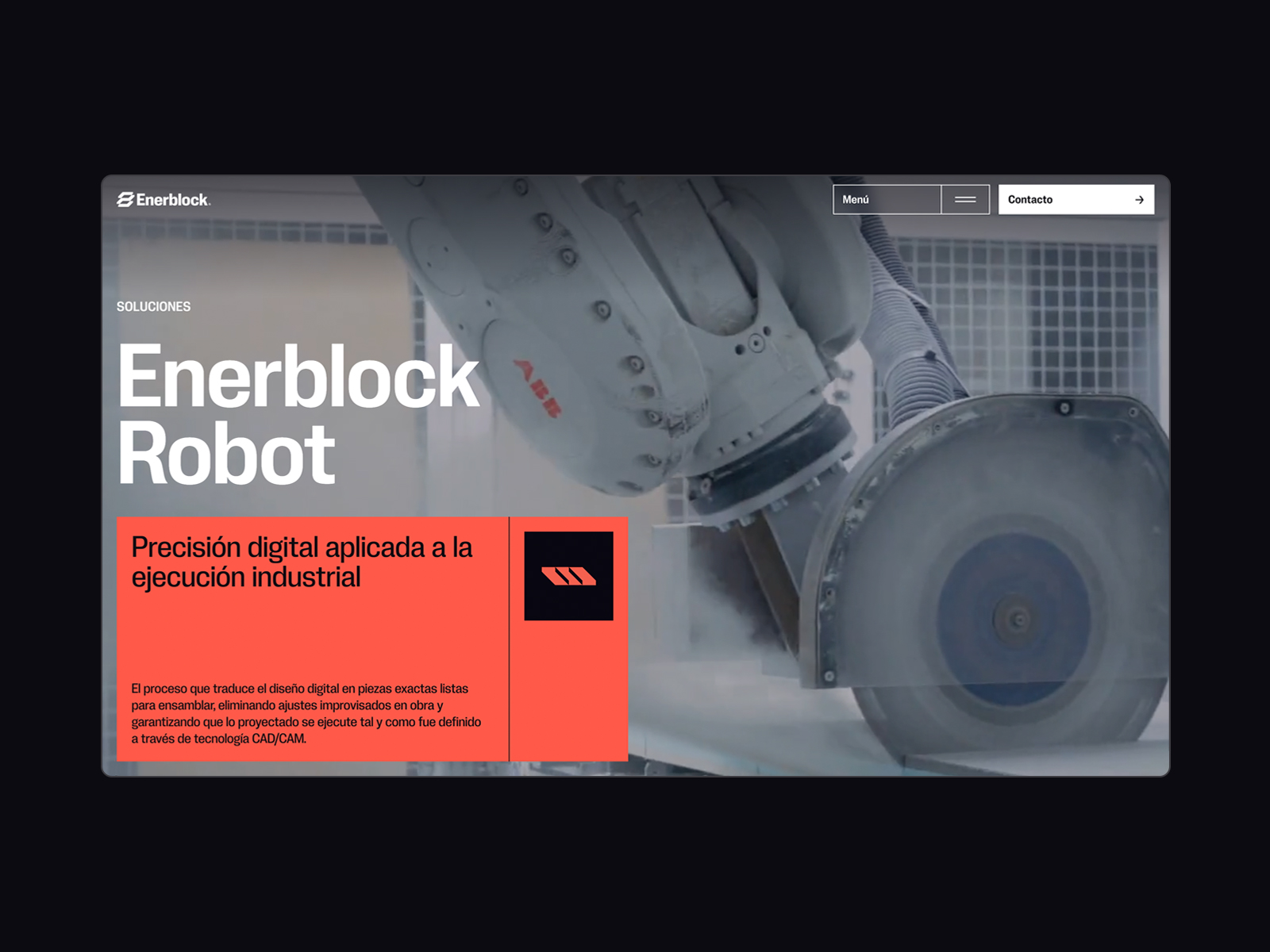
The Enerblock Robot section brings the promise down to earth. Machinery, a dark setting, and a coral block create a direct scene: here, there’s technology, process, and real capability. For an industrial brand, this is crucial. Product videos or images aren’t just filler—they bridge the gap between what’s promised and what the client expects to receive.
There’s also a refined UX/UI approach: navigation doesn’t try to explain everything at once. Menu, contact, clear sections, and an architecture that lets the proposition breathe. In complex B2B projects, that clarity is worth more than a cluttered interface. If users quickly understand where they are and what they can explore, the experience is already working in favor of conversion.
Brand interaction in the hero
The hero’s motion has a virtue: it doesn’t need to shout. Interacting with the symbol adds a layer of digital tactility, almost like visual engineering. It’s a subtle gesture, but it changes the brand’s feel. The identity stops being just a logo on a screen and becomes a living part of the system.
This kind of movement works especially well when a brand wants to project control. It’s not animation for entertainment; it’s animation to reinforce precision. And that difference is tangible. Users don’t feel like they’re being shown a trick—they feel like they’re entering an environment designed with intent.
Enerblock — understated motion to convey solidity
Motion in Enerblock follows a clear visual direction: it guides the reading, adds depth, and turns the industrial system into a narrative. No excessive layers, no gratuitous transitions, no animations that overshadow the content. Motion acts as an atmospheric tool.
For an industrialized construction brand, this makes perfect sense. Clients aren’t looking for fireworks; they want reliability, traceability, technical capability, and the sense that everything is under control. When motion is restrained and well-integrated, perceived value rises. The brand feels more mature, more polished, and better prepared for large-scale projects.
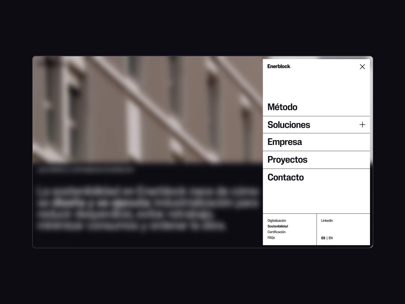
The overlay menu is a small piece of art direction. Softened background, clear panel, vertical navigation, and an immediate sense of order. The interaction isn’t an interruption, but a clean state change. It’s a simple decision, but it adds a lot to the overall perception: the interface feels considered, even in its most functional moments.
The menu structure also reveals the brand’s ambition. Solutions, company, projects, sustainability, certification, FAQs. This isn’t a one-note showcase site—it’s a content ecosystem. When done right, this kind of architecture lets marketing, sales, and trust work together without turning navigation into an endless list.
System-driven scroll narrative
The sticky effect fits Enerblock’s narrative perfectly, turning explanations into sequences. Linear shapes, bold typography, and a dark background create a kind of editorialized technical blueprint. It’s not just about reading—it’s about feeling the system unfold logically.
This type of visual storytelling is especially useful for products or services that are hard to sum up in a single sentence. Instead of piling on text, the design distributes information in a visual rhythm. The eye moves forward, the concept settles in, and the brand gains authority without becoming heavy-handed.
Team, human scale, and trust
The team section brings something essential to such a technical identity: people. The grid keeps the editorial tone and avoids the soulless corporate block. There’s order, names, roles, and a visual sense of structure. For a B2B brand, showing the team isn’t just about approachability; it’s also a way to demonstrate capability.
When a company sells complex processes, trust isn’t built on promises alone. It’s also built on faces, clear hierarchies, and a sense of internal organization. Here, the composition ensures that the human element doesn’t break the visual system—it completes it.
Brand close with graphic weight
The footer keeps the same energy: bold branding, confident composition, and a three-dimensional element that reinforces visual memory. It’s a good reminder of something many websites forget: the ending also sells. The close shouldn’t be a dumping ground for links—it’s a final chance to reinforce identity and make the next step easy.
In Enerblock, that close has systemic presence. It doesn’t fizzle out. It keeps color, scale, intent, and contact. That continuity is what makes the experience feel designed end-to-end, not cobbled together from disconnected blocks.
What Enerblock teaches about B2B web design
The most interesting lesson from Enerblock is that an industrial brand doesn’t have to look gray to be taken seriously. It can have a strong visual direction, a distinctive atmosphere, and motion elements without losing clarity. In fact, when everything is well balanced, the opposite happens: aesthetics help clarify the proposition and elevate perceived value.
There’s also a valuable takeaway for any B2B project: complexity isn’t solved by explaining everything at once. It’s solved with hierarchy, visual rhythm, and a narrative that lets users move forward. Color to focus. Typography to position. Composition to organize. Interaction to convey precision. Content to build trust.
Enerblock works because its identity, its streamlined UX/UI, and its presentation all speak the same language. Everything points to control, system, industrialization, and a future built methodically. That coherence is what turns a construction website into a brand experience with real character.
And maybe that’s the most compelling invitation: to look at any B2B website and ask whether it communicates the clarity, precision, and confidence the company needs to sell. Not from an obsession with spectacle, but from something harder: building a digital presence that’s truly memorable.