At Code Barcelona, we’re passionate about high-quality web design, and this year we’ve been inspired by true digital masterpieces. In this article, we showcase the 20 best web designs of 2025—a curated selection that stands out for its creativity, functionality, and trendsetting impact in the digital world. From minimalist interfaces to immersive experiences, these websites are redefining how we interact online. Read on to discover why 2025 is shaping up to be a revolutionary year for web design!
Best Web Designs 2025
Shupatto Bags Brand Site: Designed to Fold with a Snap
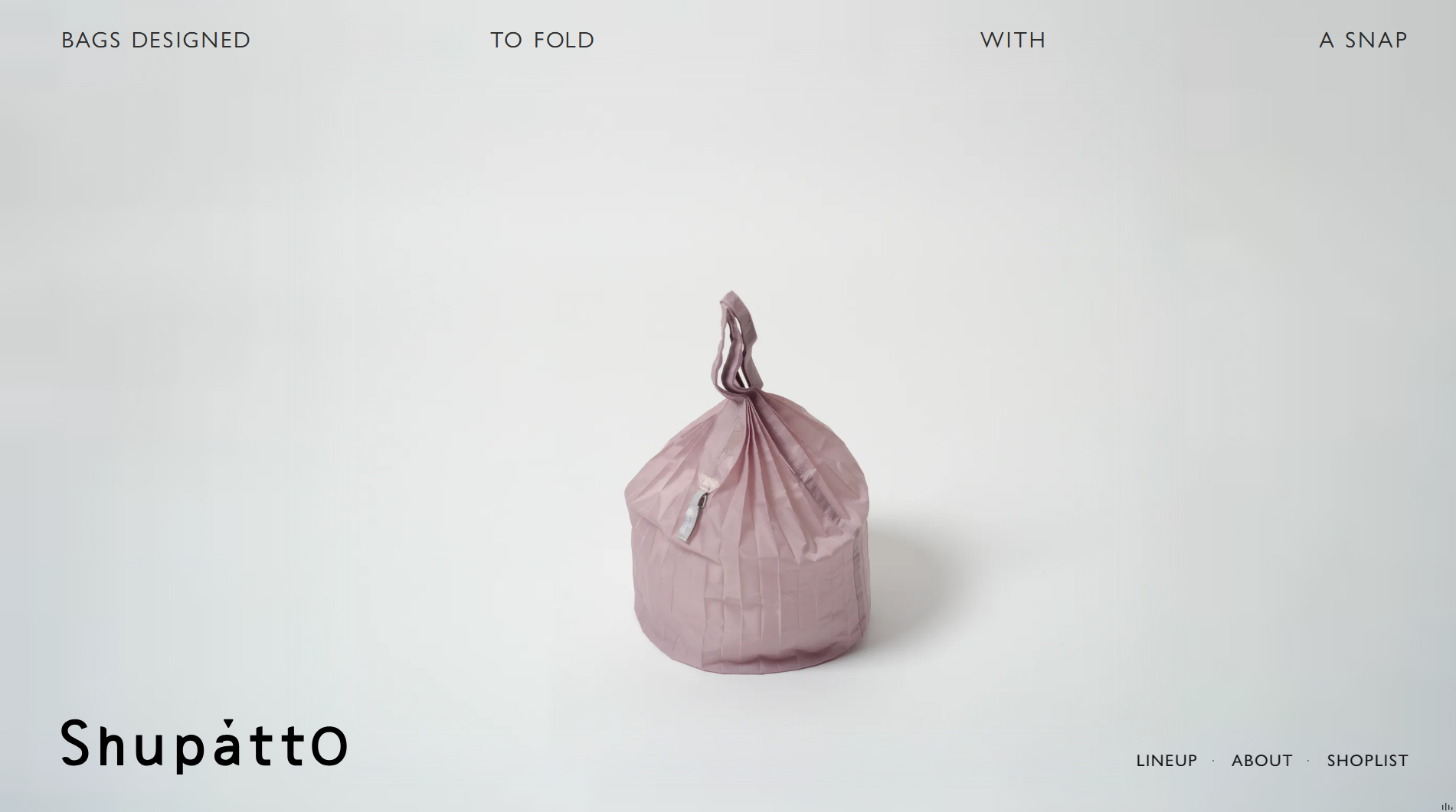
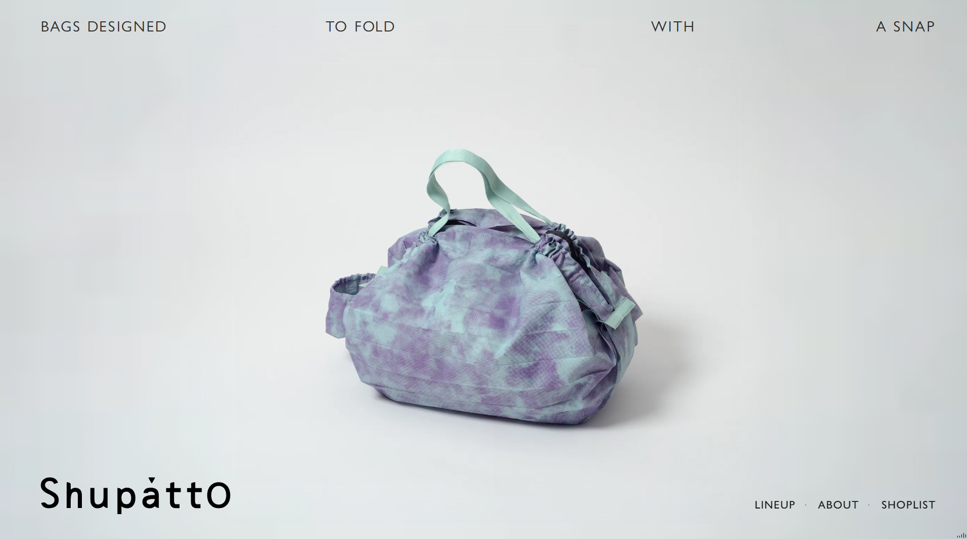
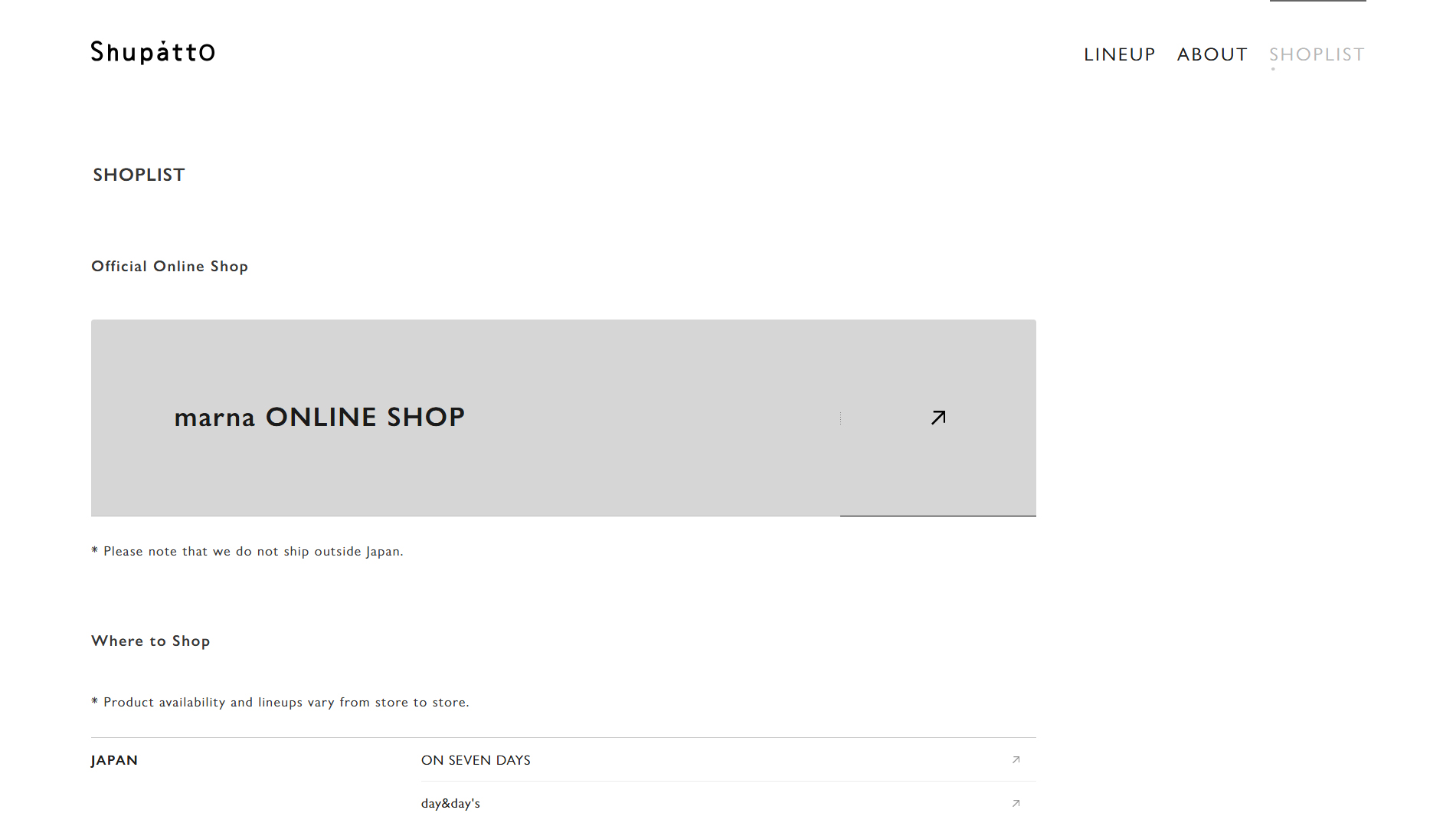
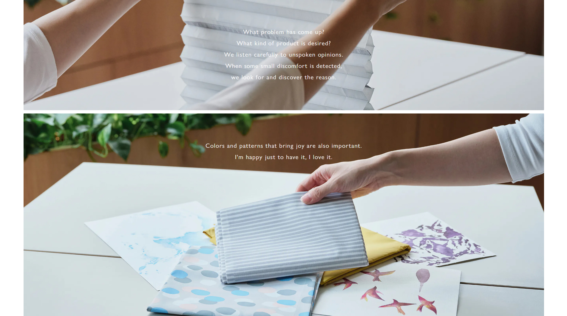
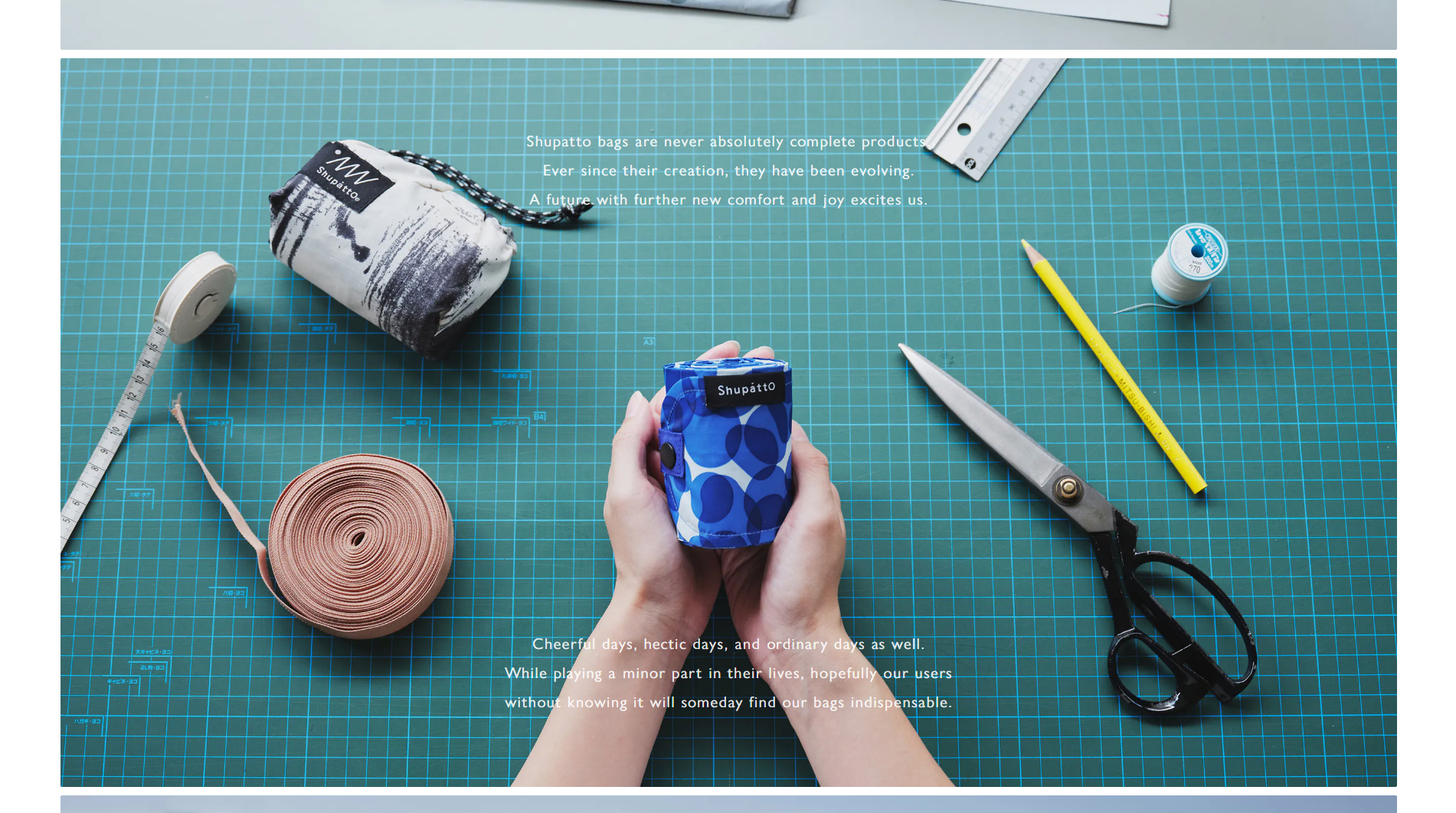
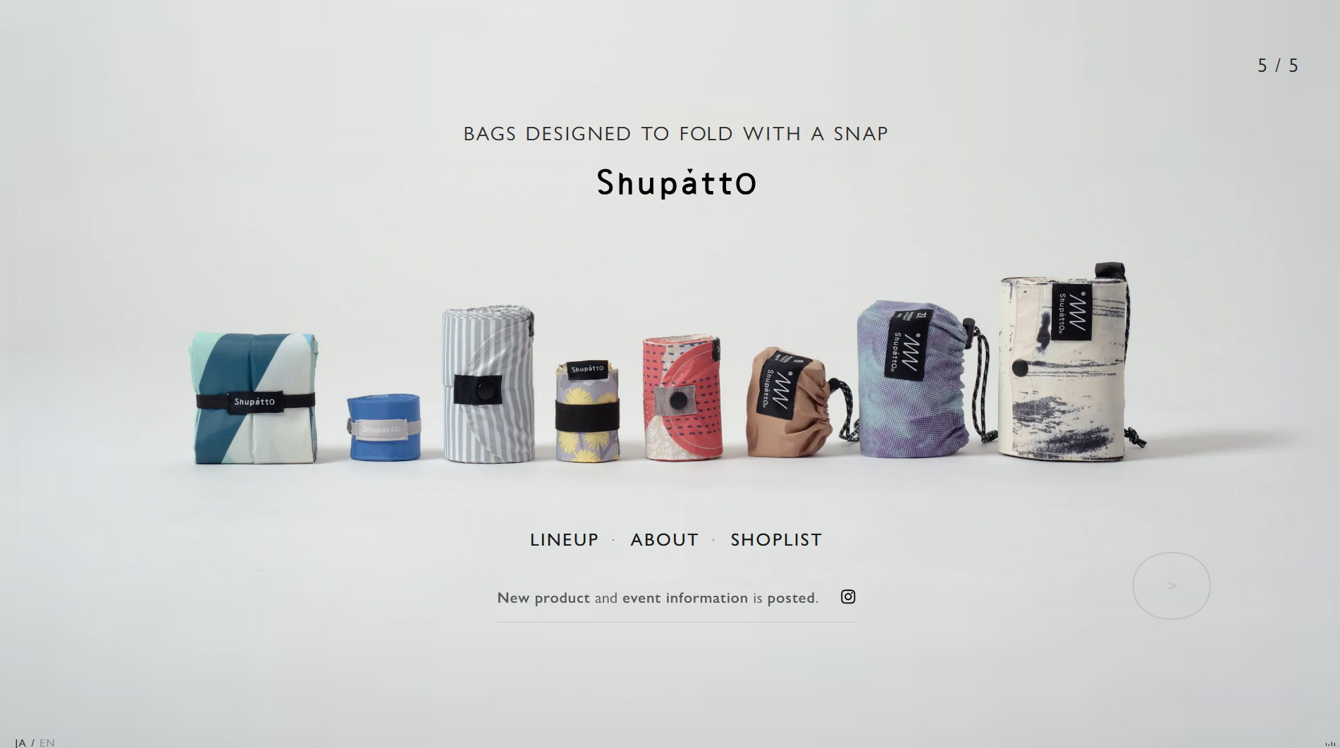
The Shupatto Bags Brand Site is a prime example of how web design can communicate both the functionality and spirit of a product through digital experience. Shupatto, a brand known for its foldable bags, partnered with mount inc. to create a visually striking platform that mirrors the unique design of its products.
Discover how we approach professional web design at Code Barcelona, a leading agency in Barcelona.
The site uses animated graphics to demonstrate how the bags fold effortlessly in a single motion, reinforcing the product’s core values: convenience and simplicity. This visual approach allows users to digitally experience just how practical and efficient Shupatto’s folding system is.
The design is minimalist and clean, with soft colors that evoke calm and ensure the product remains center stage. Smooth transitions between sections make navigation seamless, inviting users to explore both the bags’ features and the various collections on display.
Typography is modern and straightforward, ensuring clear, distraction-free reading. Smart use of product photography in action, paired with concise descriptions in each section, delivers an engaging and highly informative visual experience.
In short, the mount inc. team has masterfully combined flawless visual design with Shupatto’s product functionality, resulting in one of the year’s most memorable web experiences.
Visit site: Shupatto Bags
AIM — AI Modernism of Kharkiv
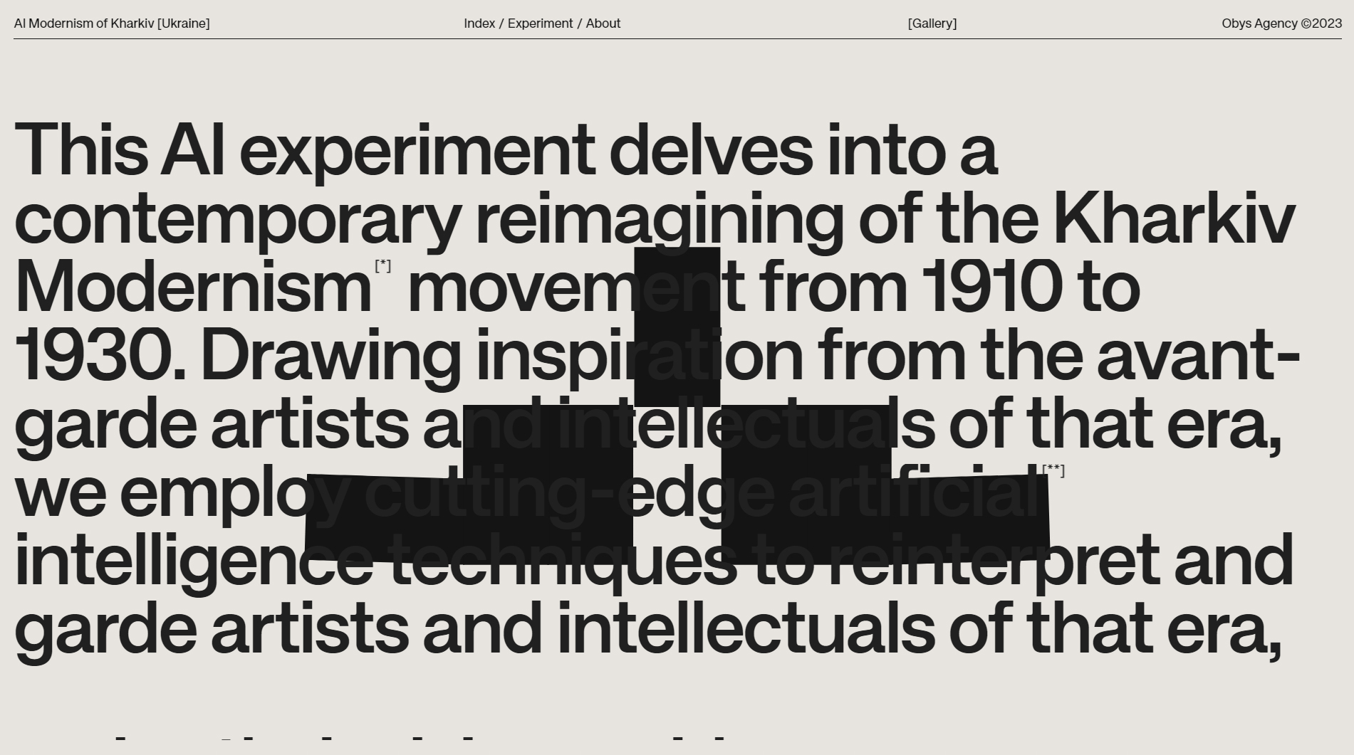
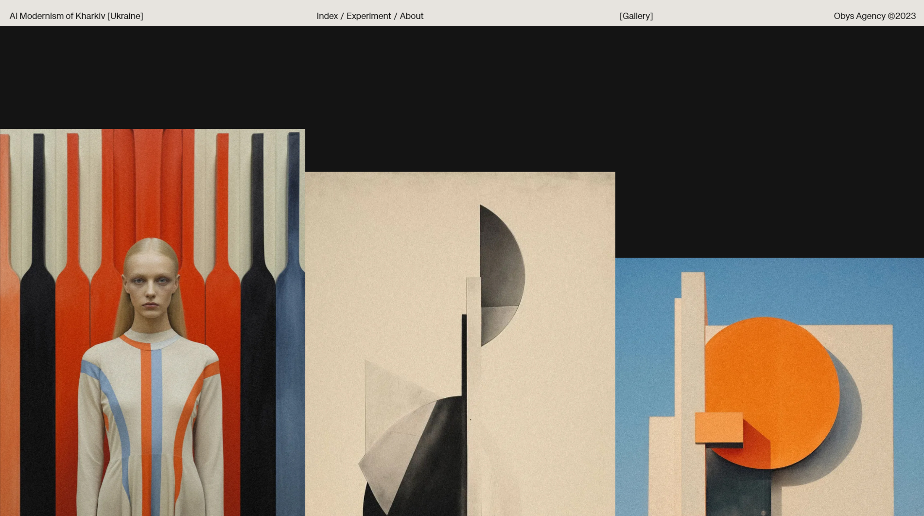
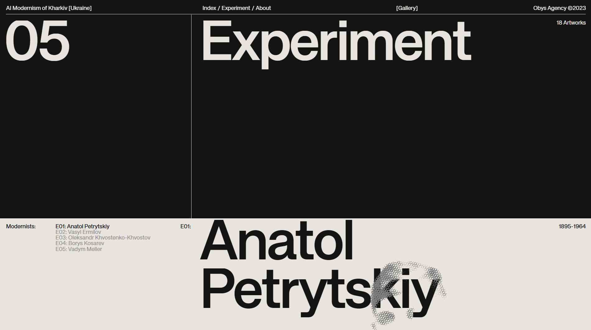
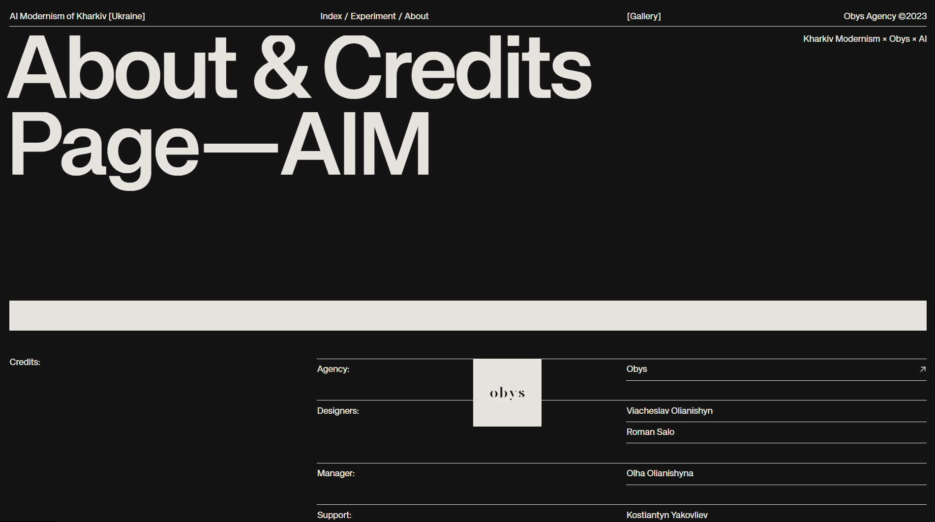
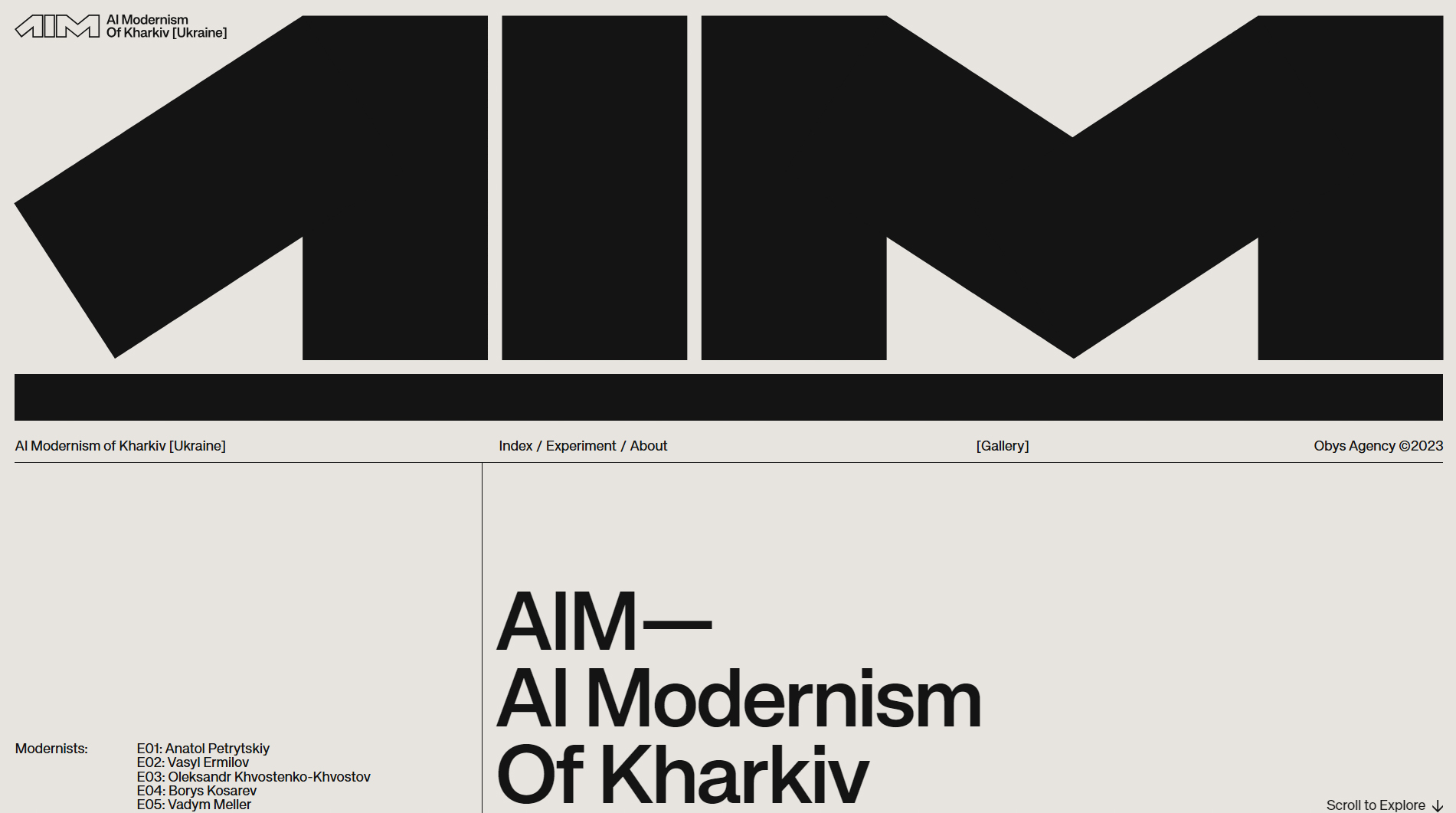
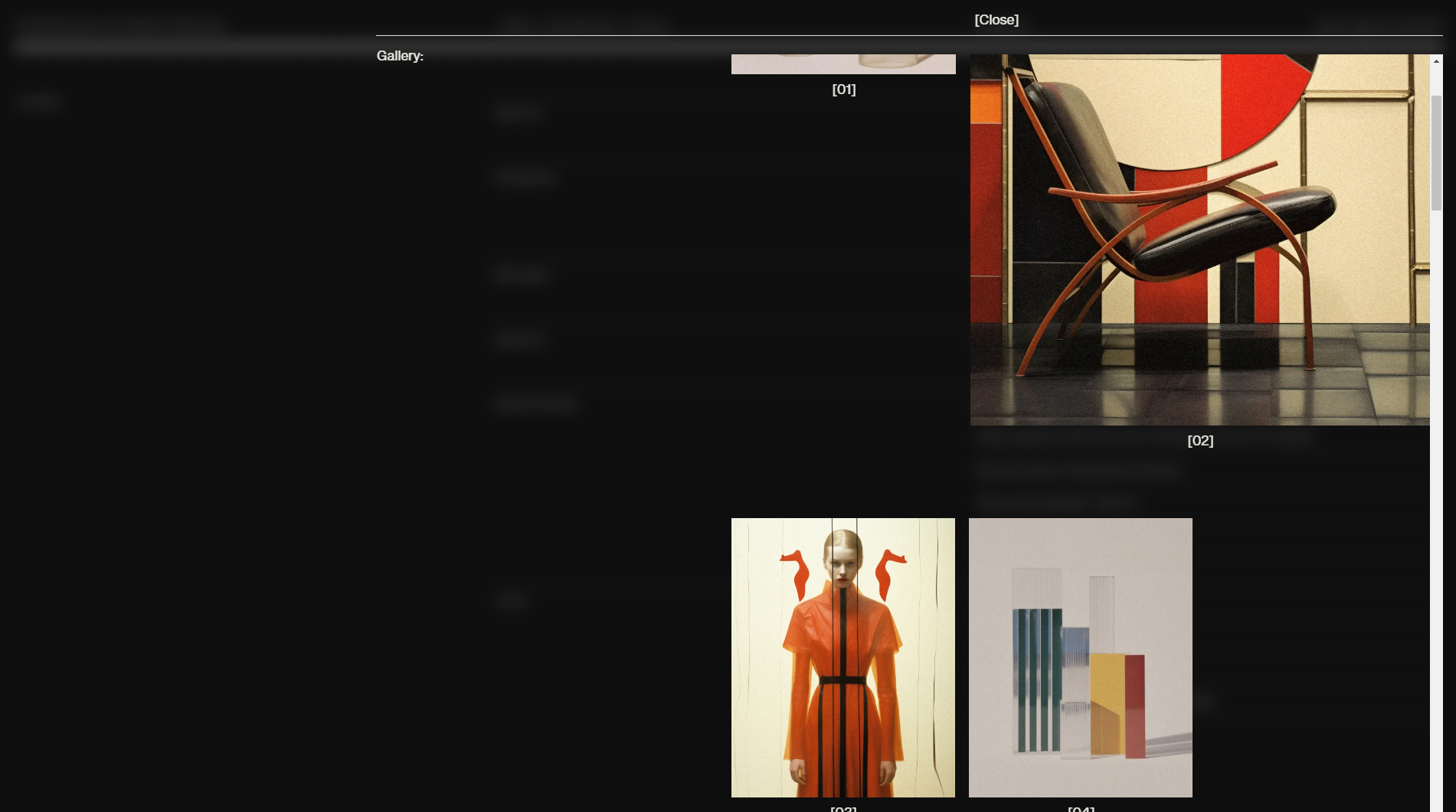
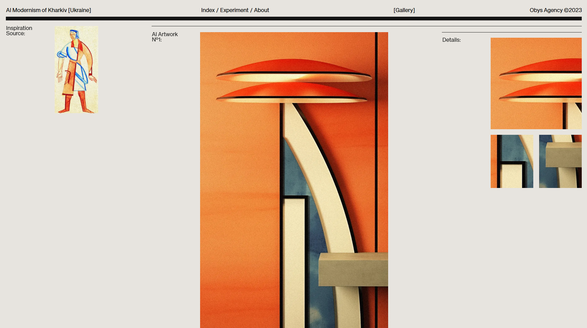
The AIM — AI Modernism of Kharkiv website is a visual tribute to the architectural modernism of Kharkiv, Ukraine, powered by artificial intelligence. Created by Obys Agency in collaboration with Viacheslav Olianishyn, the design captures the essence of the modernist movement while leveraging cutting-edge technology for a truly unique digital experience.
The site features a restrained, minimalist color palette—grays and blacks that highlight the elegance of modernism and the geometric precision of Kharkiv’s buildings. Subtle animations and smooth transitions invite users to explore architectural details with an almost artistic lens, while AI generates complex real-time visualizations that reinterpret the buildings.
Navigation is fluid and adapts seamlessly to both mobile and desktop, reflecting a strong focus on responsive design. Text is concise yet informative, allowing the visual content to take center stage. High-resolution images of Kharkiv’s architecture, combined with AI-generated graphics, create a perfect fusion of art and technology.
Bold, modern typography adds to the site’s sense of elegance and professionalism, complementing the architectural style. Each section is carefully structured to guide users through an immersive journey into Kharkiv’s modernism, delivering a visual experience that impresses with both creativity and sophistication.
In summary, Obys Agency and Viacheslav Olianishyn have achieved a seamless blend of architecture, art, and technology, making AIM one of the year’s most innovative and artistic web designs.
Visit site: AIM — AI Modernism of Kharkiv
Intrepid
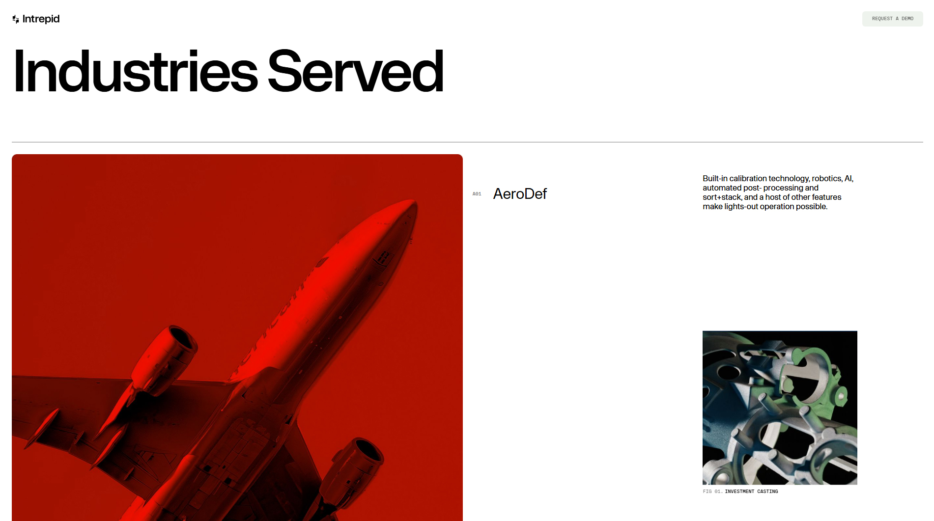
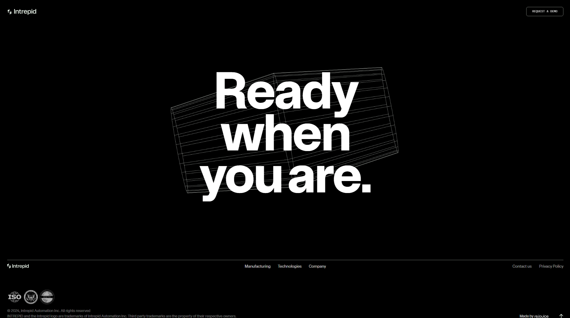
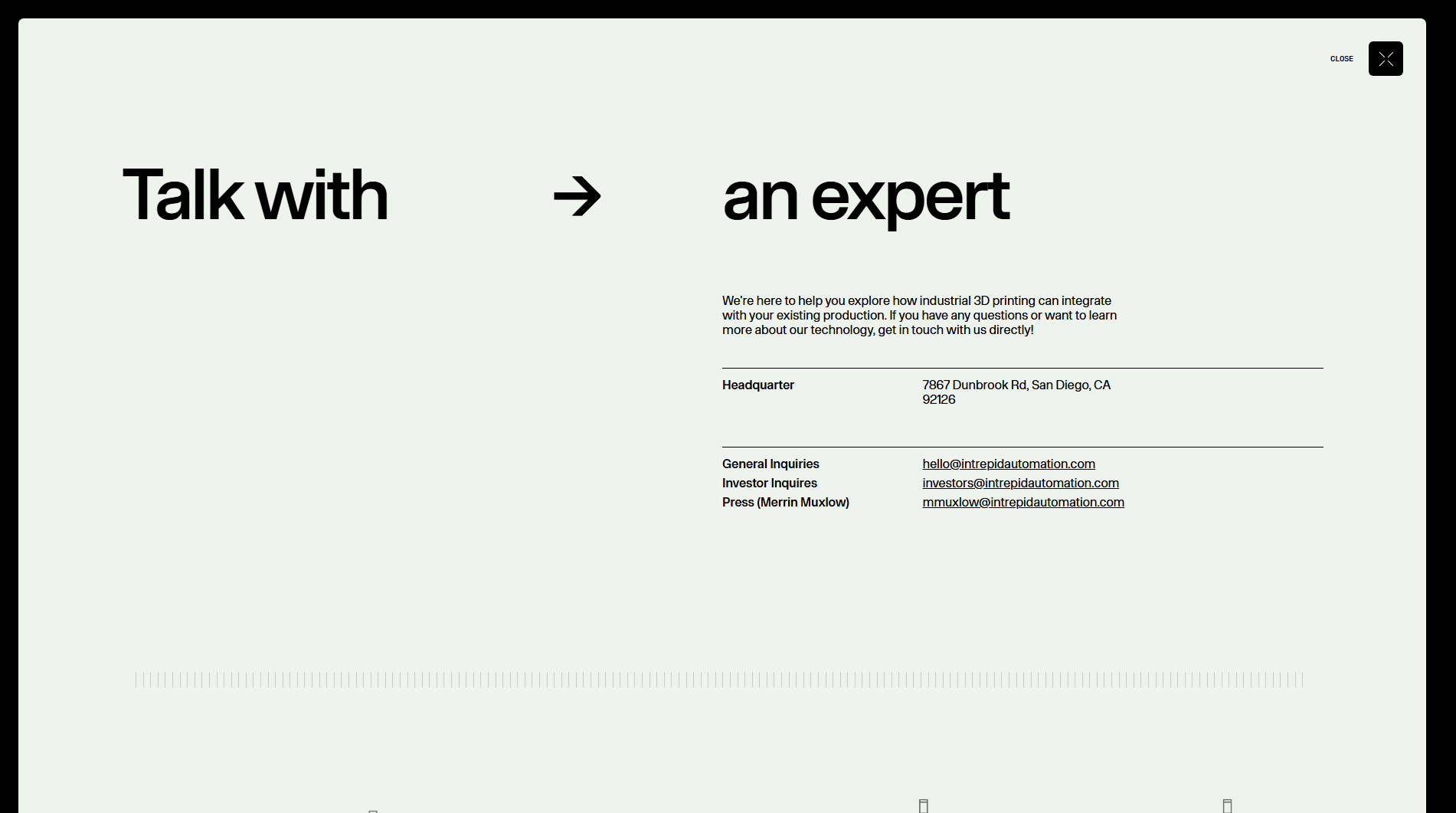
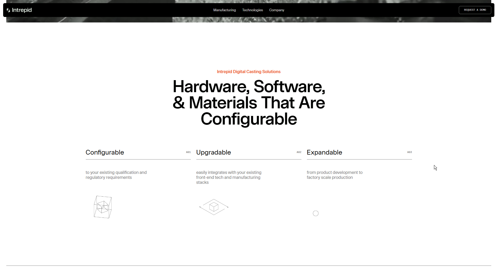
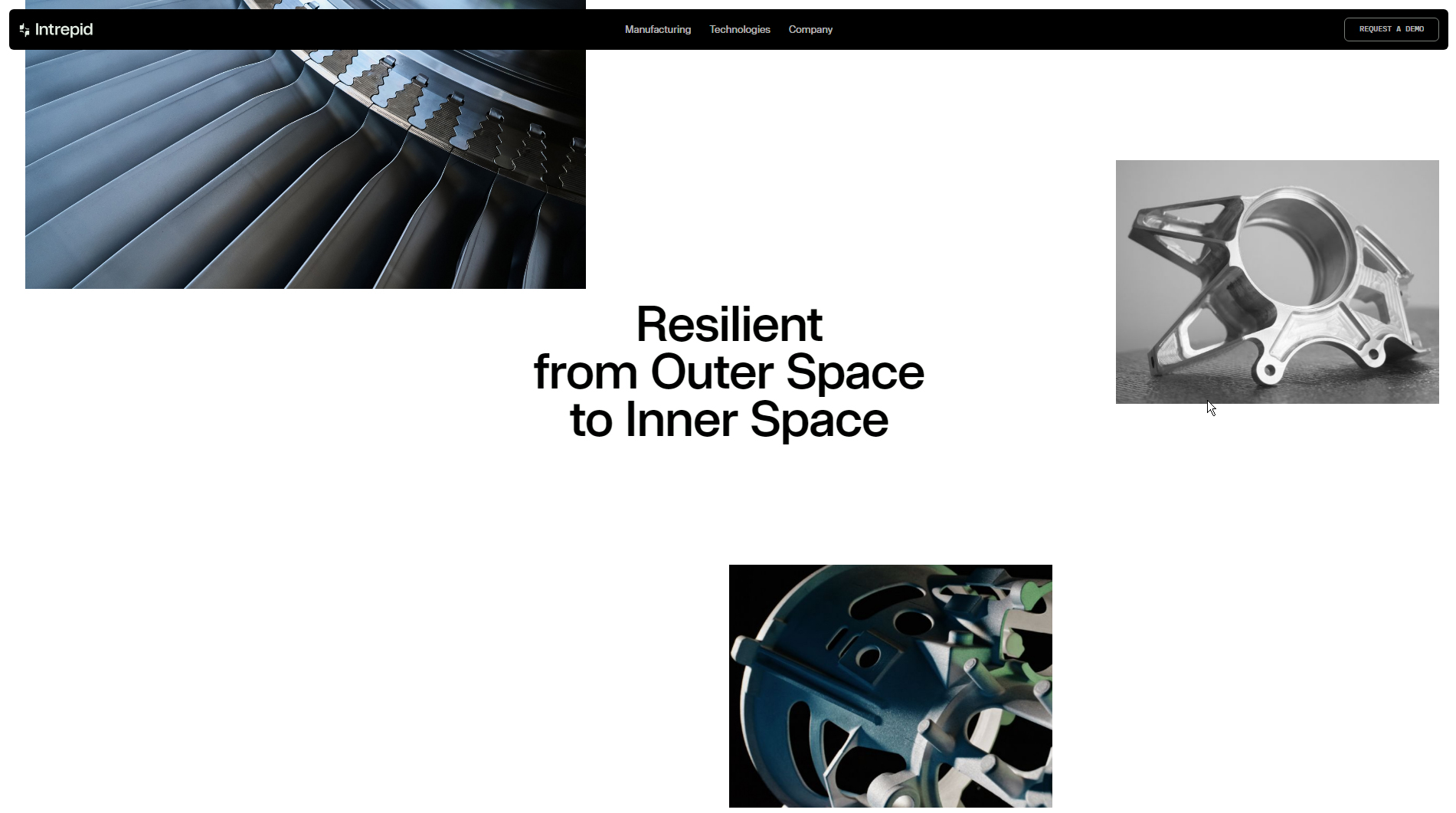
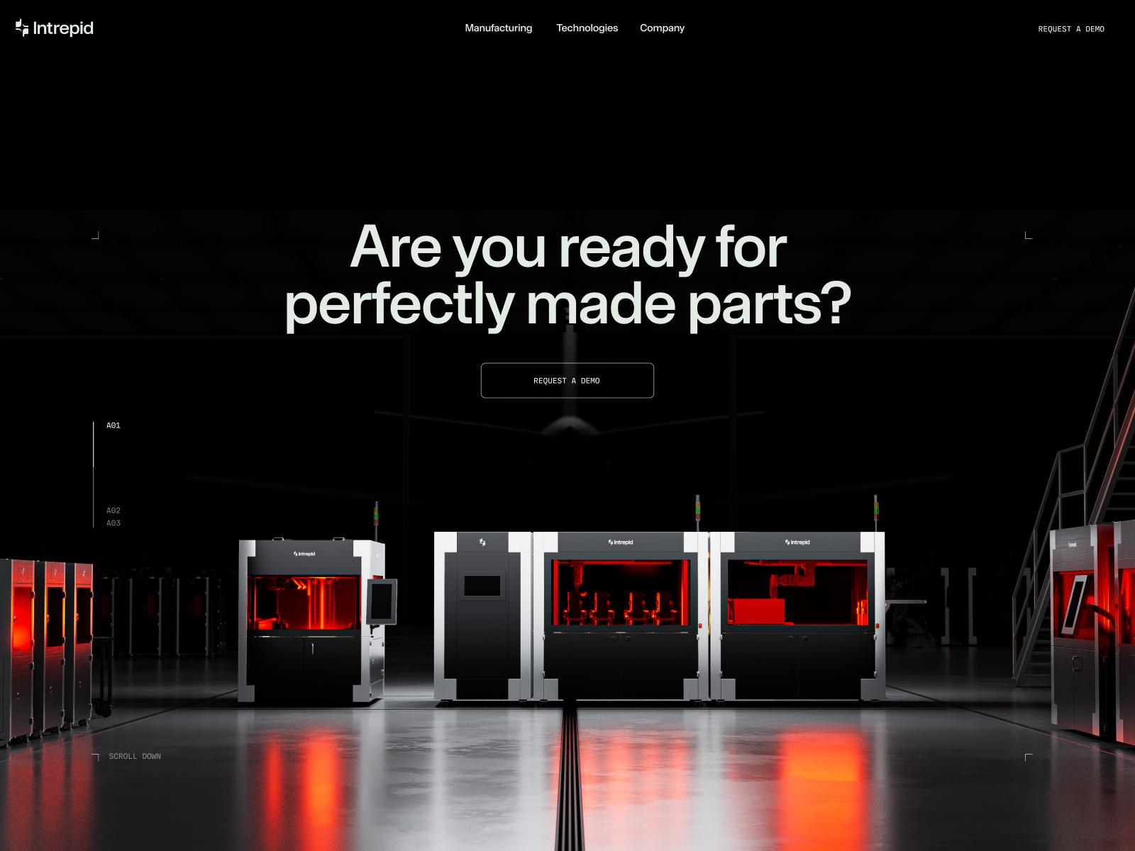
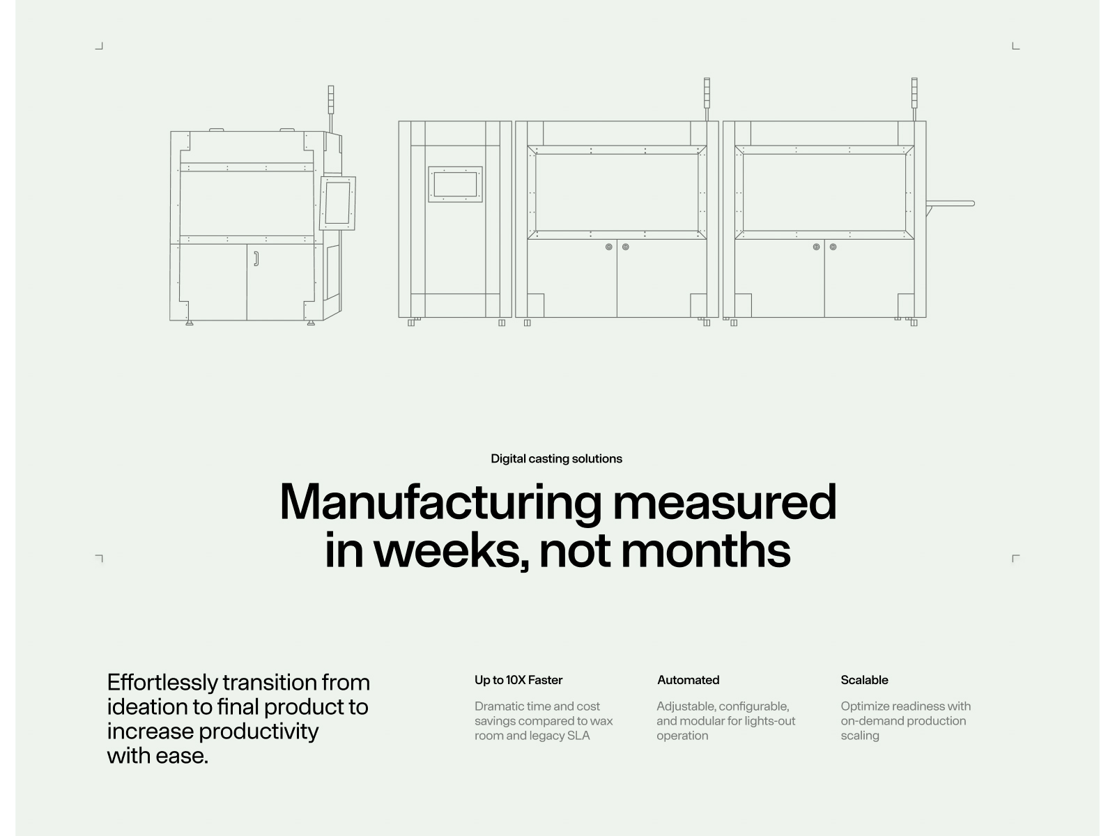
The Intrepid website, developed by REJOUICE®, is a dynamic platform offering innovative software, hardware, and process solutions to optimize manufacturing costs and timelines. With a focus on accelerating operational readiness, this site stands out for its vibrant, functional design that embodies the company’s mission.
The site’s typography—__onsite_2032f6, __onsite_Fallback_2032f6, __mdio_e79ec6, and __mdio_Fallback_e79ec6—brings a contemporary, professional feel. These fonts were carefully chosen for readability and visual appeal, reinforcing the brand’s identity while effectively communicating its message.
The design is energetic and colorful, immediately capturing user attention. A bold color palette reinforces Intrepid’s innovative, daring personality in the tech sector.
Animations add interactivity and enrich the user experience. Motion effects are not only visually engaging but also intuitively guide visitors through the content, making navigation more immersive and enjoyable.
The fully responsive design ensures seamless adaptation across devices, from desktop to mobile—crucial for reaching a broad audience and ensuring product and service information is always accessible.
3D elements add an extra dimension, highlighting the brand’s innovative edge. These visuals not only impress but also help illustrate Intrepid’s solutions, making their value proposition easier to grasp.
In summary, the Intrepid website is a standout example of how well-executed web design can convey innovation and efficiency in the tech sector. With effective typography, dynamic animations, and a user-focused approach, REJOUICE® has created a platform that’s both visually appealing and highly functional—truly representative of Intrepid’s mission.
Visit site: Intrepid
Fitonist
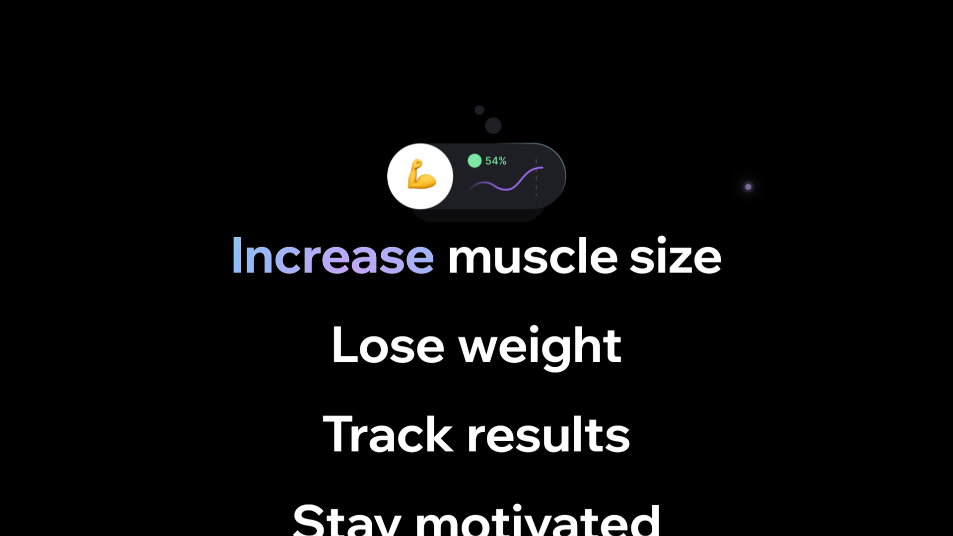
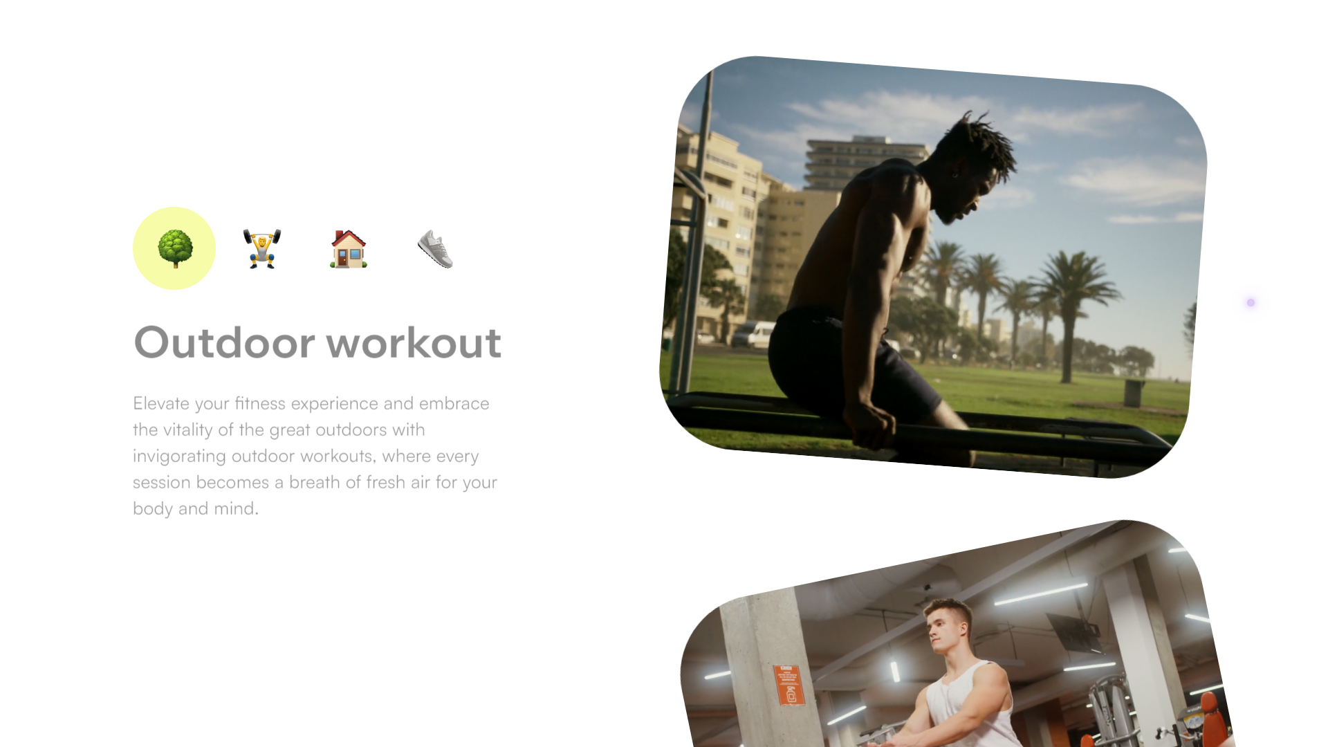
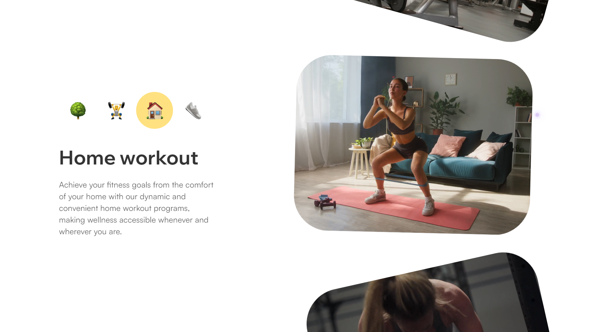
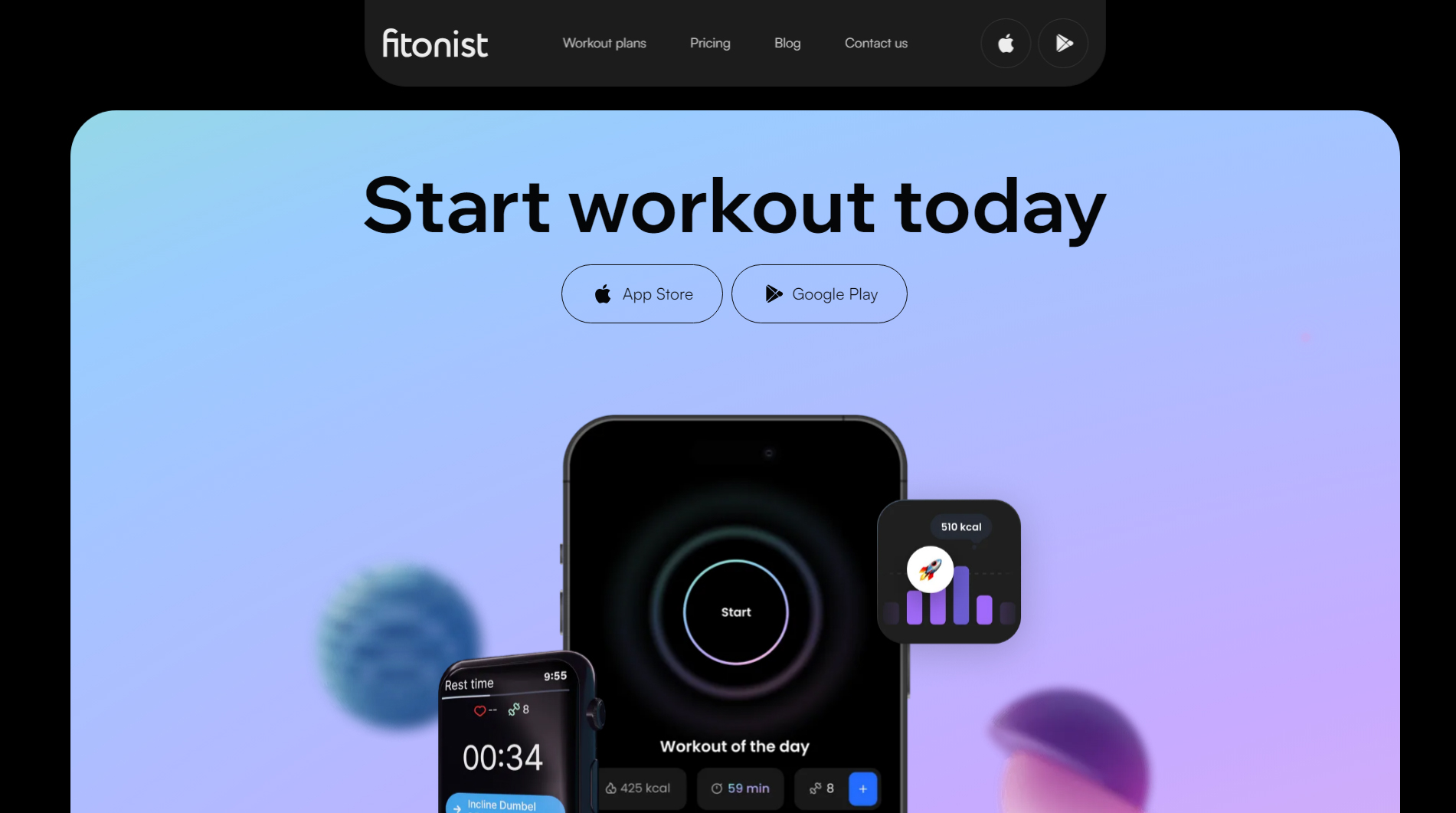
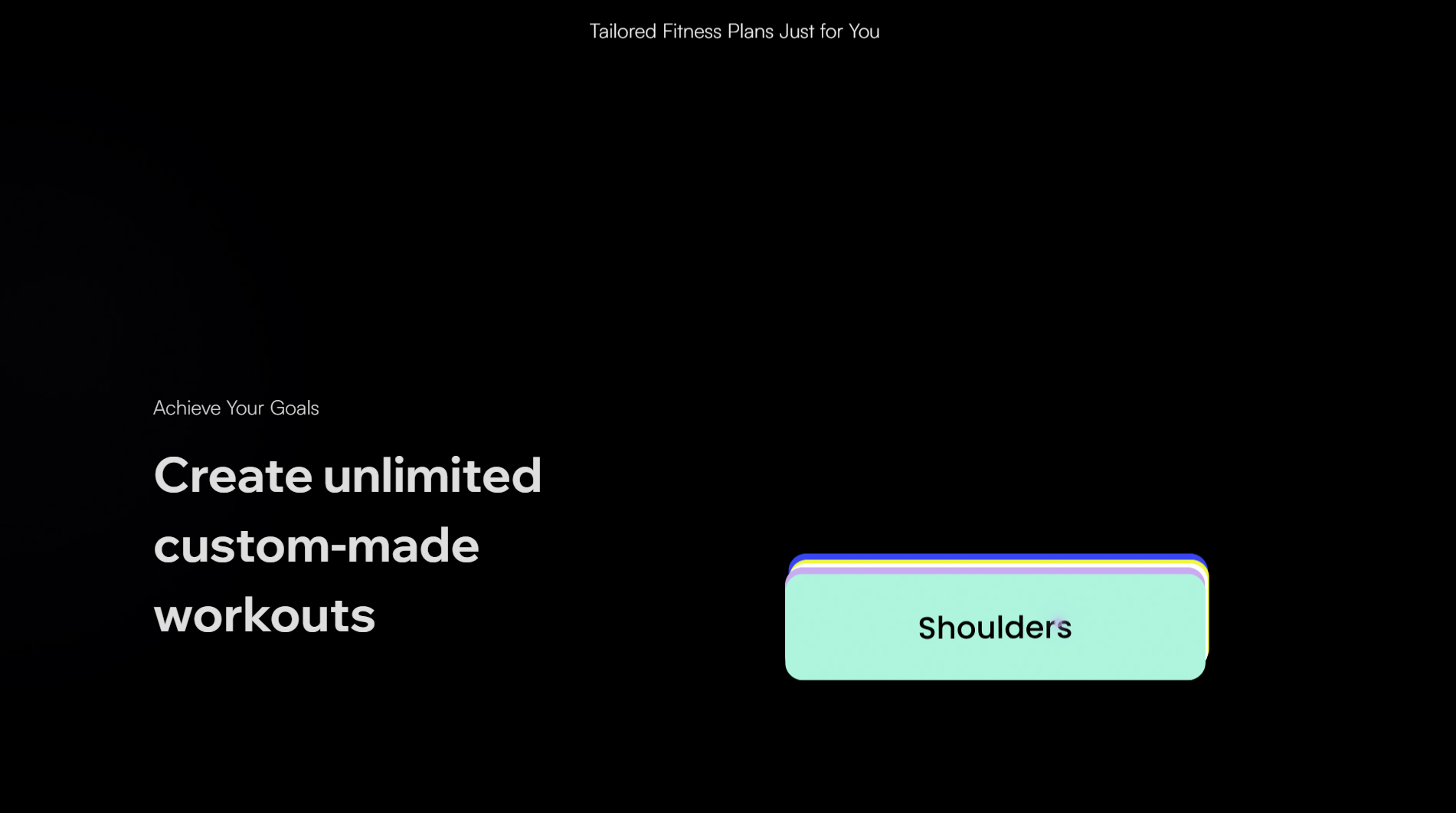
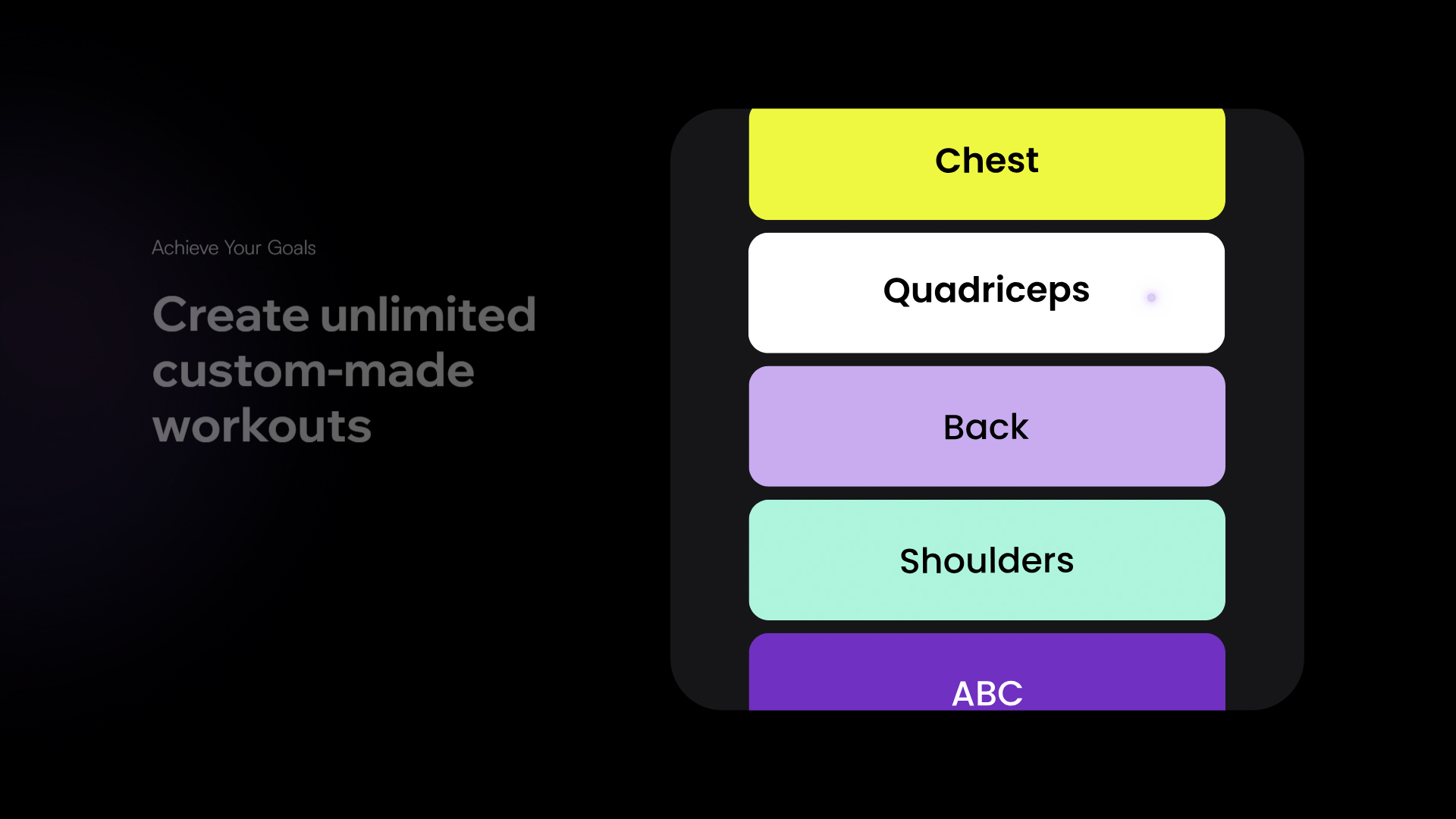
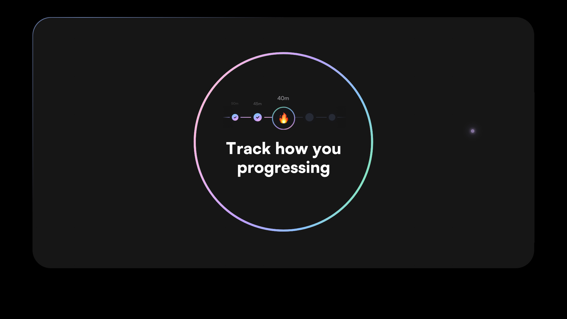
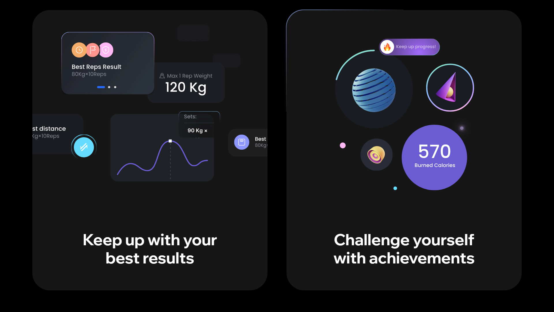
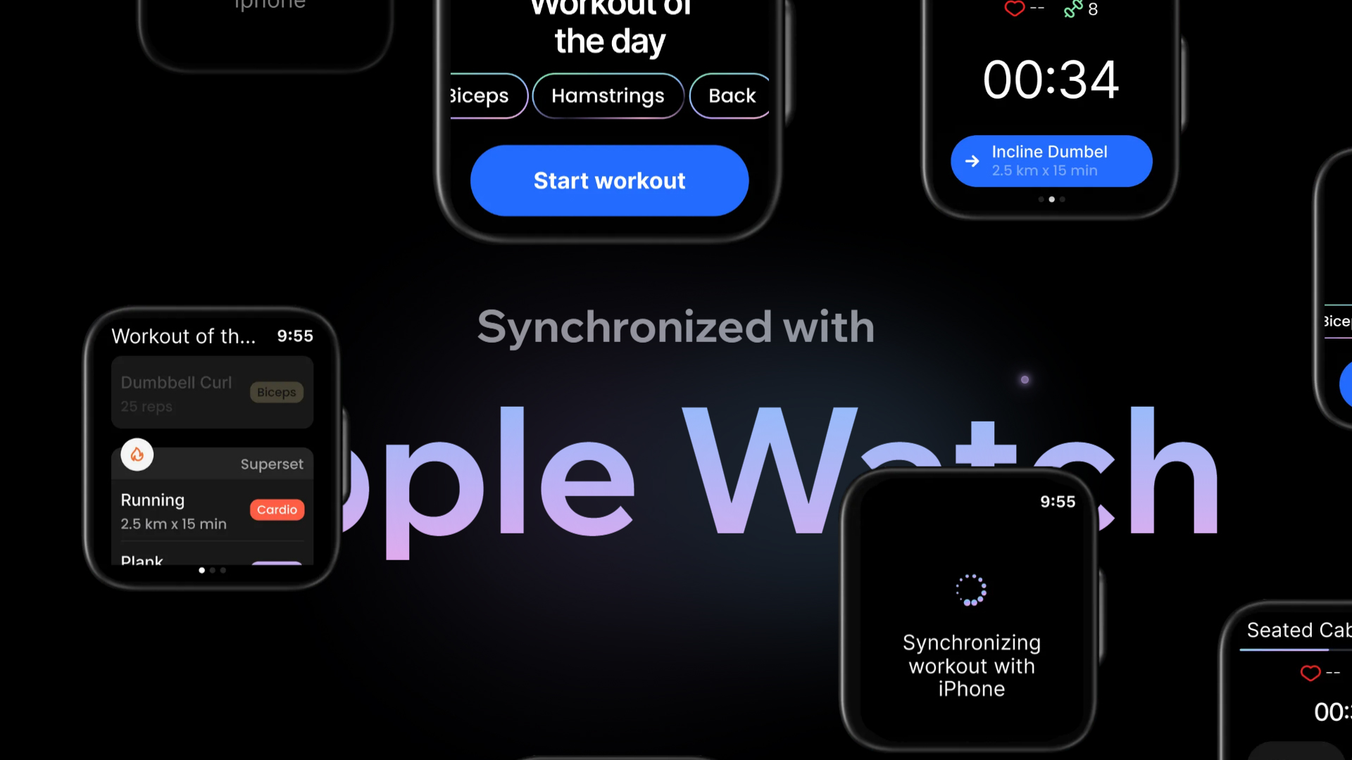
The Fitonist website, created by Outcrowd, is dedicated to promoting an innovative AI-powered mobile app designed to empower gym enthusiasts of all levels and deliver the ultimate workout experience.
The chosen font, Satoshi, is modern and versatile, adapting seamlessly to different sections while maintaining optimal readability. This typographic choice reinforces Fitonist’s contemporary, dynamic image, appealing to users seeking effective solutions for gym performance.
The color palette—HEX #000000 and HEX #C8ACF0—creates a striking, elegant contrast. Black provides a solid, sophisticated foundation, while lavender adds freshness and modernity. This combination is not only visually impactful but also reflects the app’s innovative spirit.
Animated elements make navigation more interactive and engaging. These animations enhance the site’s aesthetics and help guide users through the experience, ensuring they intuitively find the information they need.
Dynamic scrolling enables smooth content exploration, keeping users engaged and making it easy to understand the app’s features and benefits. Microinteractions throughout the site add another layer of interactivity, elevating the overall user experience and keeping visitors engaged.
A focus on interaction design and UI results in a user-friendly platform that encourages visitors to sign up and explore the app’s features—crucial for converting interest into action.
In summary, the Fitonist website is an excellent example of how thoughtful web design can propel an emerging health and fitness brand. With effective typography, an appealing color palette, and interactive animations, Outcrowd has crafted a digital experience that’s both visually compelling and perfectly aligned with the goals of gym enthusiasts.
Visit site: Fitonist
Space Trash Signs
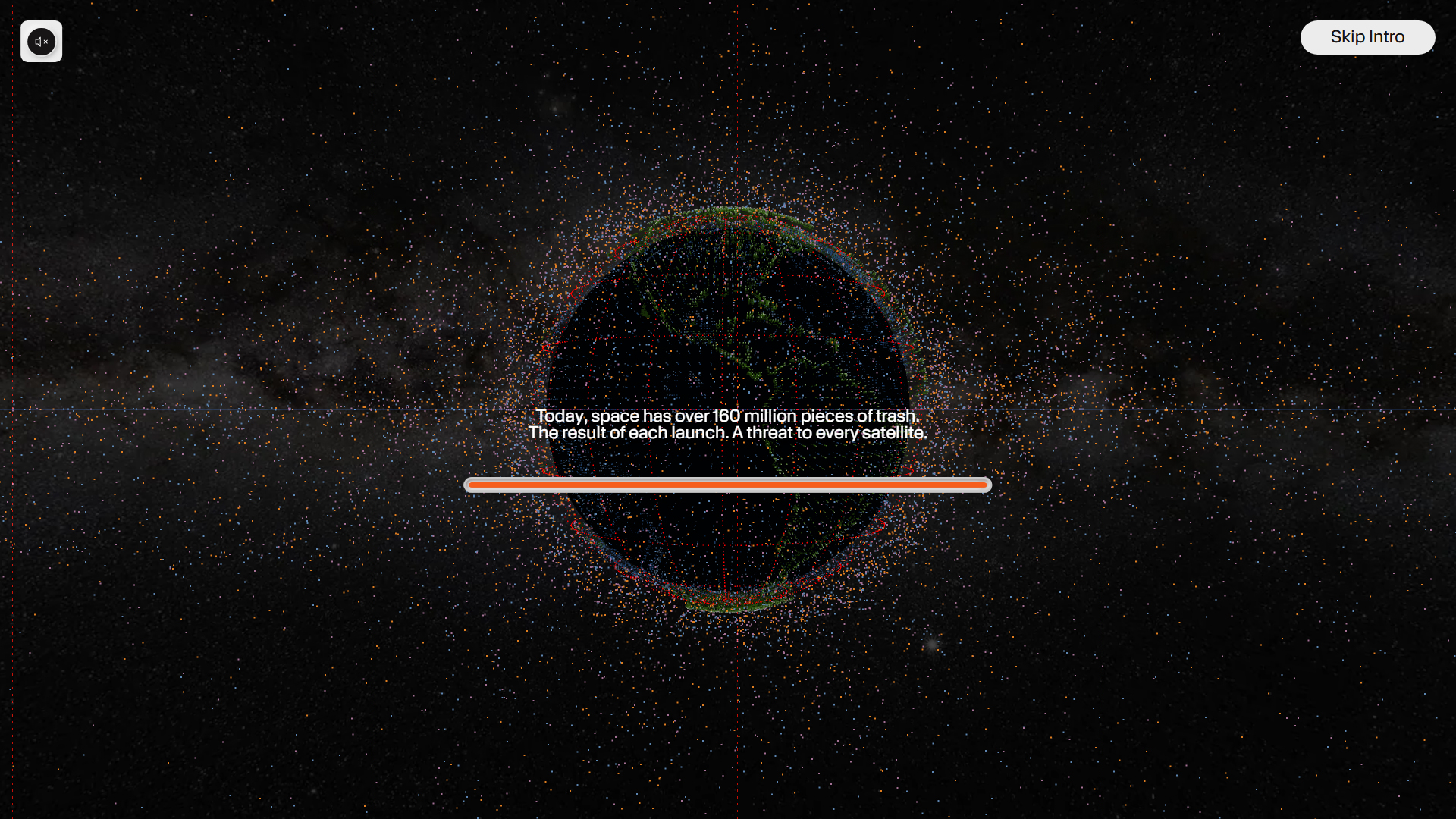
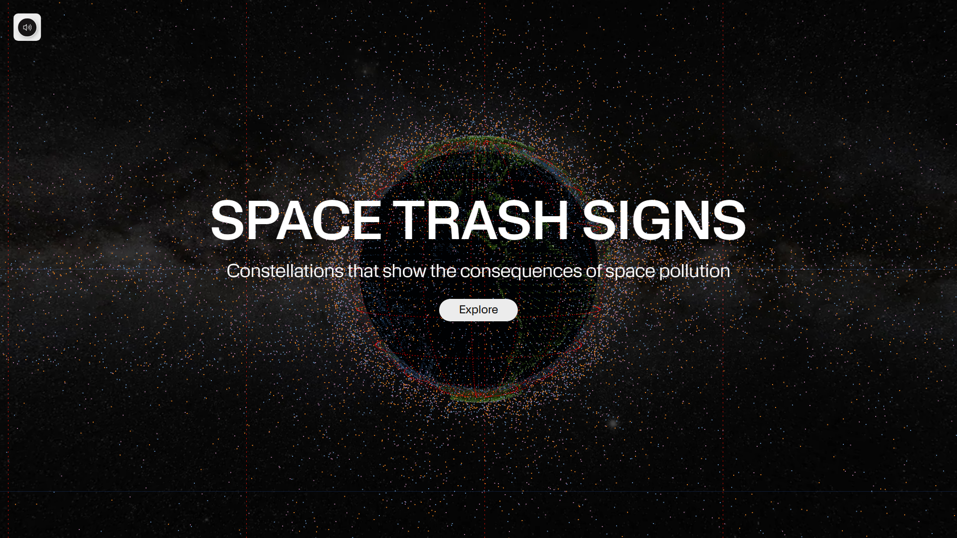
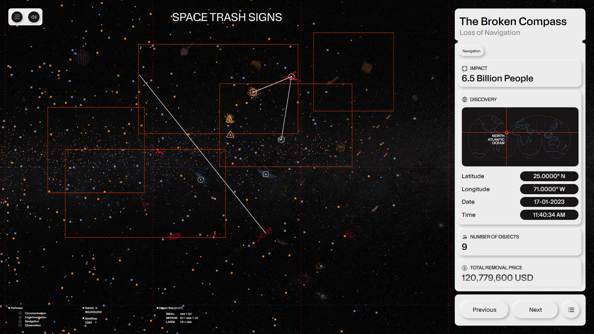
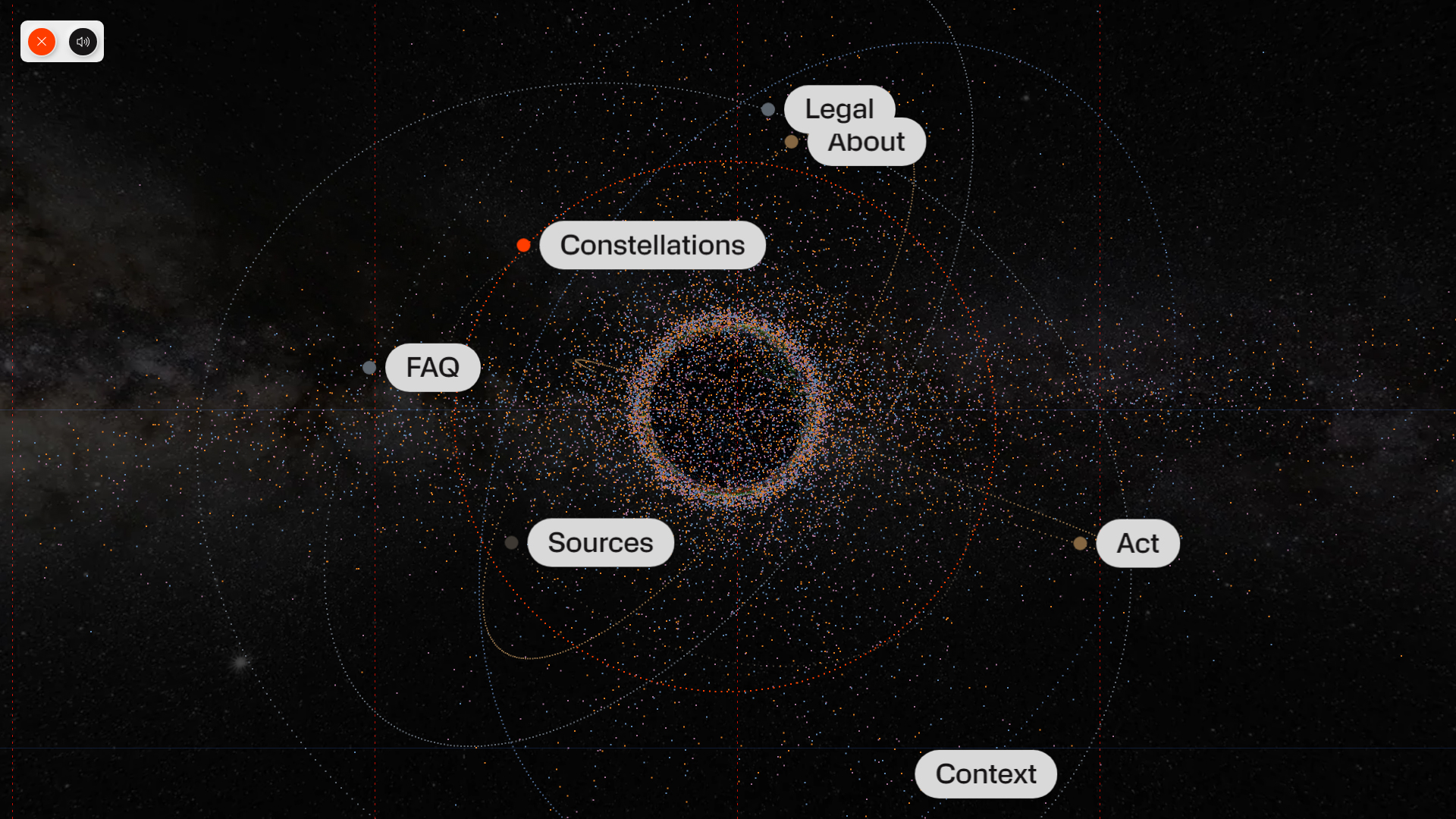
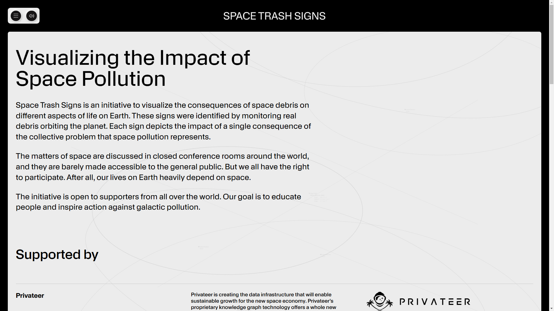
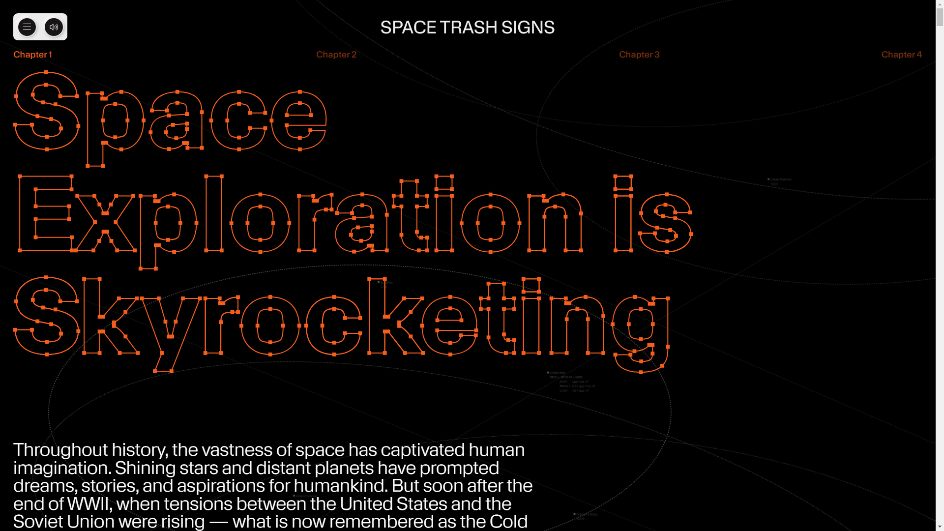
The website Space Trash Signs, created by Owls Department and Moby Digg, is an innovative 3D project that visualizes the consequences of space pollution through constellations formed by space debris. This design not only educates about a critical issue but also offers an interactive and immersive experience that invites visitors to reflect on the impact of human activity in space.
The typography used, KMR Apparat, brings a modern and experimental style that complements the nature of the project. This typographic choice aligns with the futuristic theme of the site, ensuring that the content is both attractive and readable.
The site’s color palette, which includes HEX #000000 and HEX #ffffff, creates a strong contrast that emphasizes the simplicity and clarity of the design. The use of black as a background provides a dark and deep context, highlighting the visual elements and constellations of space debris, while white is used for text and interactive elements, ensuring easy reading and navigation.
The site’s design is experimental, incorporating animation and transitions that enrich the user experience. These animated elements are not only visually striking but also help guide visitors through the project’s narrative, making the exploration of space pollution dynamic and engaging.
The inclusion of data visualization and 3D elements allows for a clear and effective representation of the space junk issue, facilitating a deeper understanding of the consequences of this form of pollution. Additionally, the use of gestures and interaction adds a level of immersion, allowing users to interact directly with the content and explore the constellations of space debris.
In summary, the Space Trash Signs website is an excellent example of how web design can combine creativity and environmental awareness. With its innovative use of typography, a contrasting color palette, and a captivating interactive experience, Owls Department and Moby Digg have created a platform that is not only informative but also impactful and reflective on a globally relevant topic.
Visit site: Space Trash Signs
NeoCultural Couture
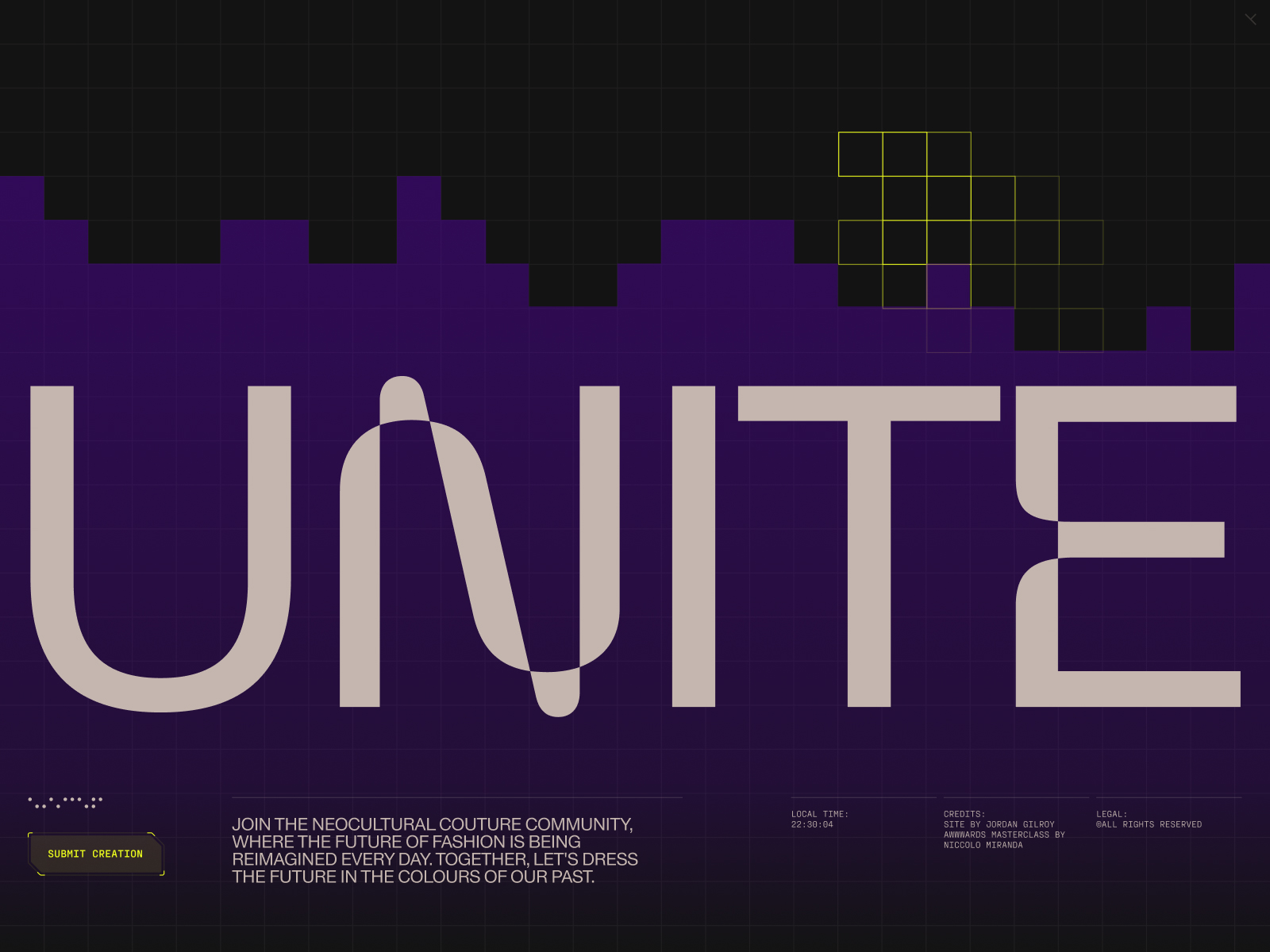
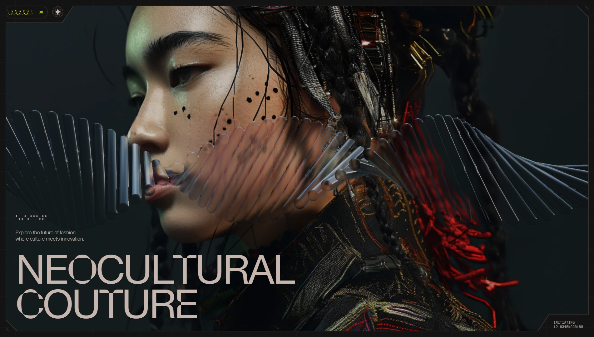
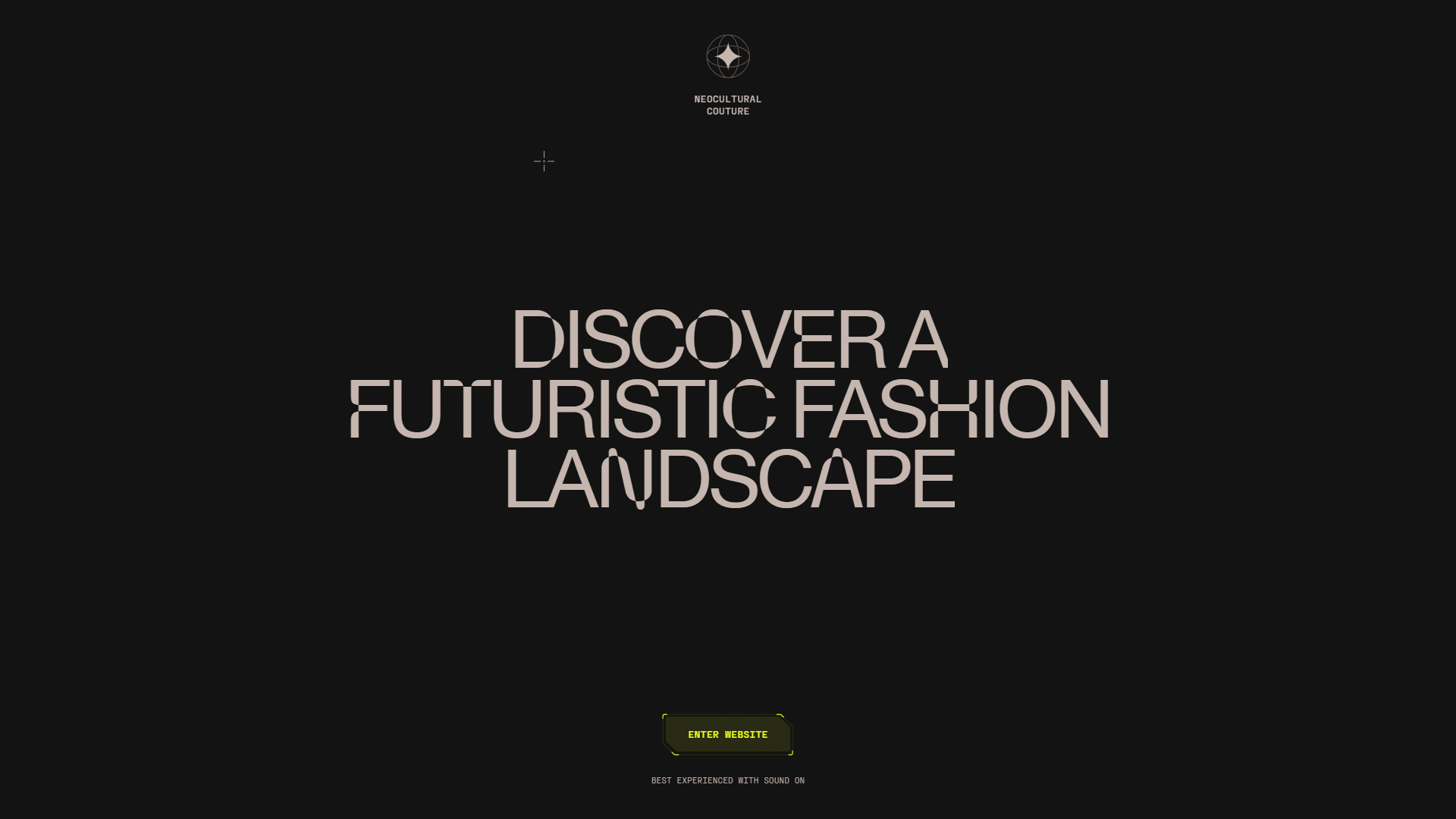
The website NeoCultural Couture, created by Jordan Gilroy and Kin, is an innovative platform that explores collections inspired by artificial intelligence, merging cultural heritage with futuristic design. This site offers a unique exploration of time, tradition, and tomorrow, inviting visitors to immerse themselves in a world where fashion and technology intertwine.
The typography used on the site includes Suisseintl, Parabole Text, Parabole Display, and PP, creating a typographic hierarchy that is both visually appealing and functional. These fonts bring a contemporary and elegant air, perfectly fitting the theme of fashion and innovation, ensuring that the content is easily readable.
The site’s color palette, which includes HEX #131313 and HEX #C5B6AF, establishes a sophisticated and modern contrast. The deep black provides an elegant and timeless base, while the soft beige tone adds warmth and a sense of connection to cultural heritage. This color combination is not only aesthetically pleasing but also reinforces the concept of fusion between the old and the new.
The site’s design is experimental, using fluid transitions that enhance the user experience when navigating through different sections. These smooth transitions not only make navigation more enjoyable but also provide a sense of continuity to the exploration of the content.
The site’s gallery presents the collections in a visually striking way, allowing visitors to appreciate the details and craftsmanship behind each piece. The interaction design is carefully thought out, allowing users to explore and discover additional information about each collection and its cultural inspiration.
Even the 404 error pages have been designed with attention to detail, reflecting the overall aesthetic of the site and ensuring that the user experience is smooth at all times.
In summary, the NeoCultural Couture website is an outstanding example of how web design can creatively and effectively integrate fashion and technology. With its sophisticated use of typography, harmonious color palette, and immersive user experience, Jordan Gilroy and Kin have created a platform that not only celebrates cultural heritage but also embraces the future of design.
Visit site: NeoCultural Couture
REFIRE
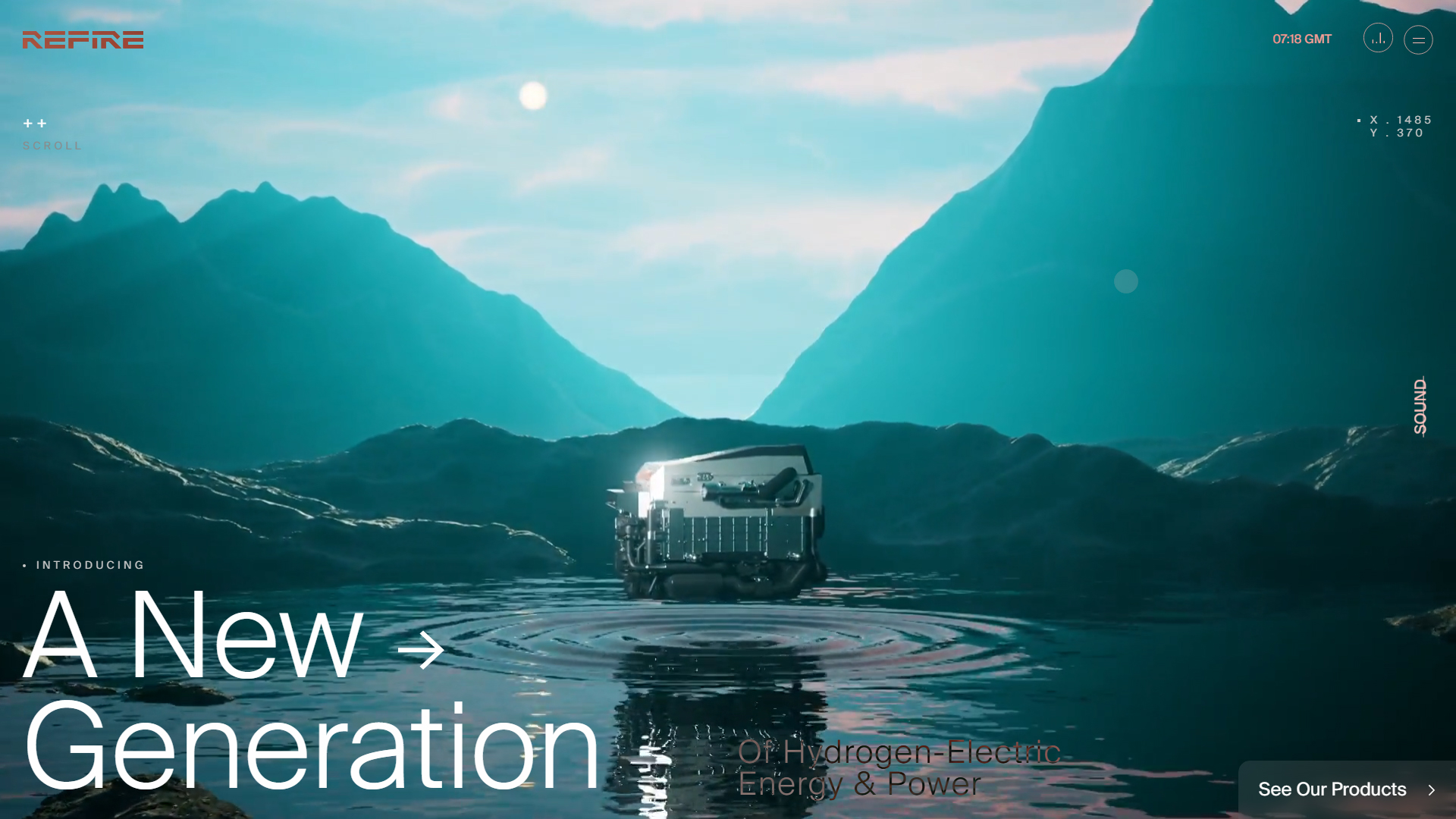
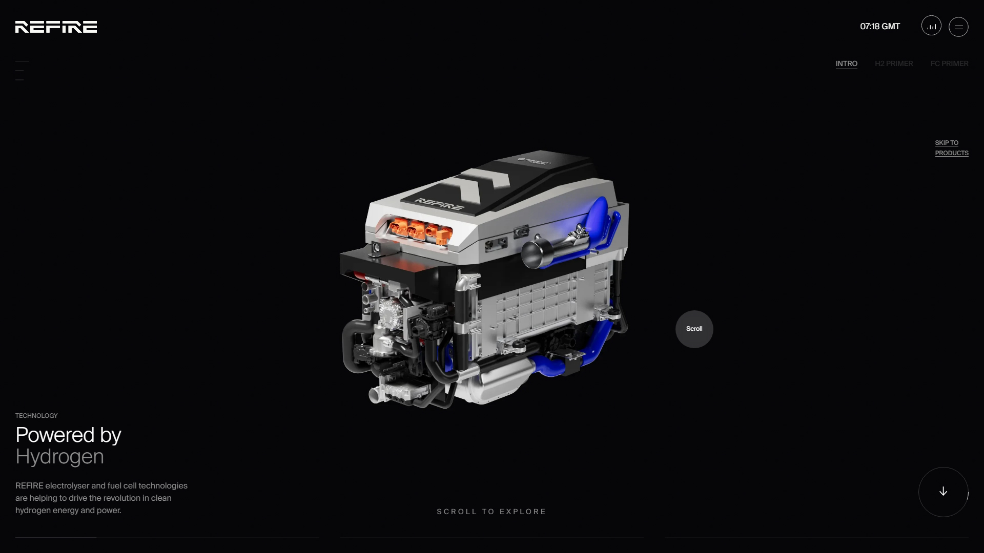
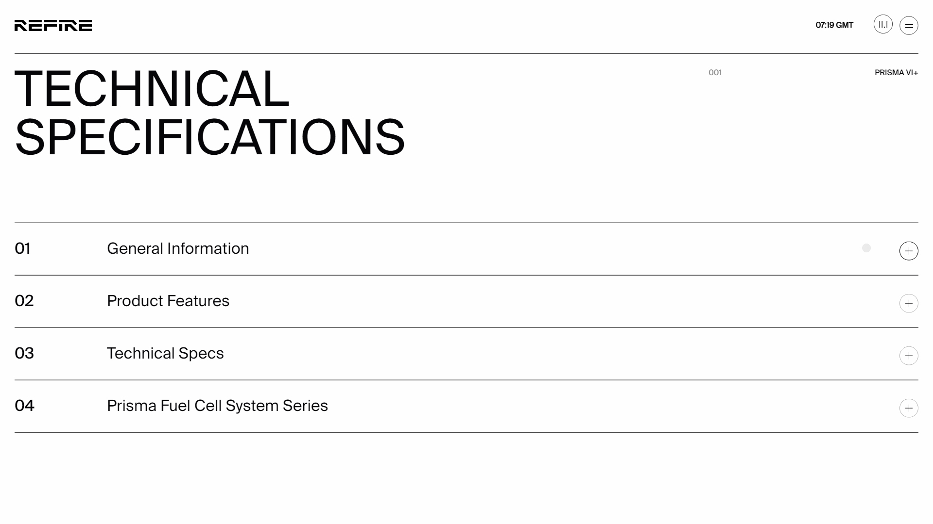
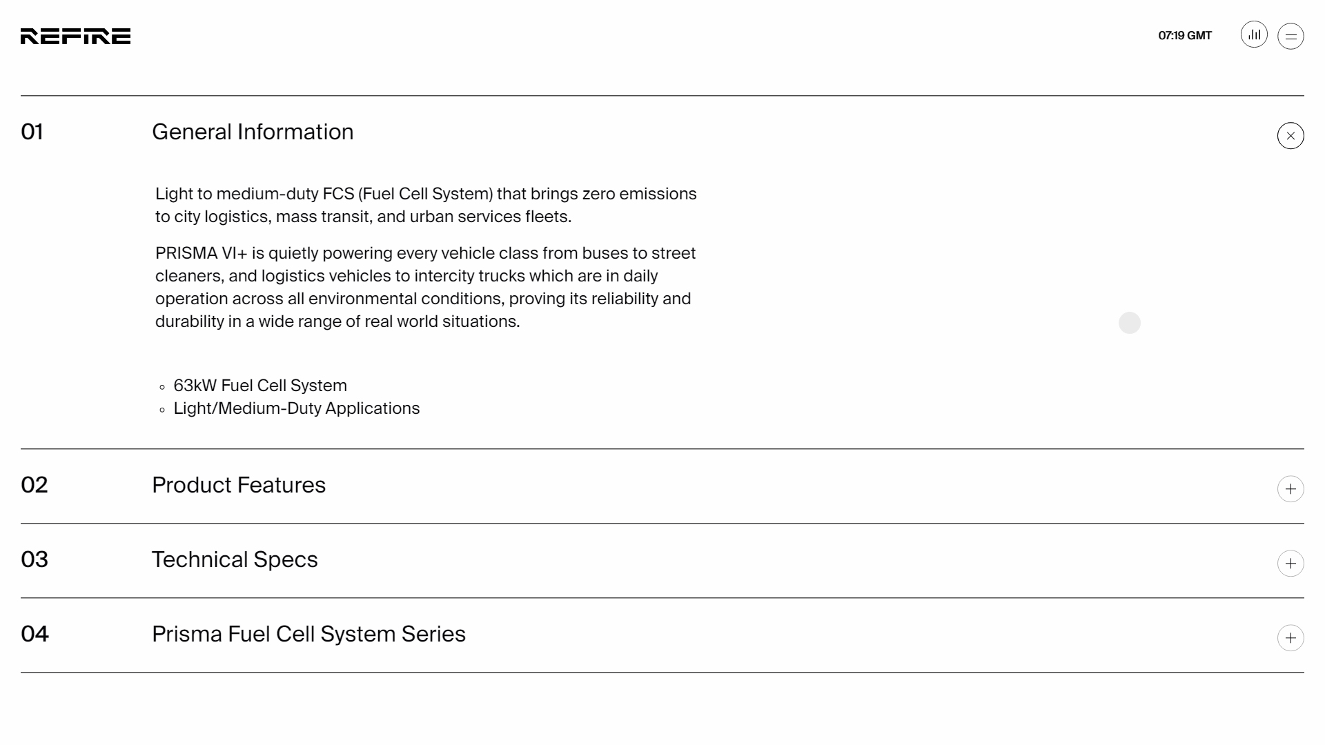
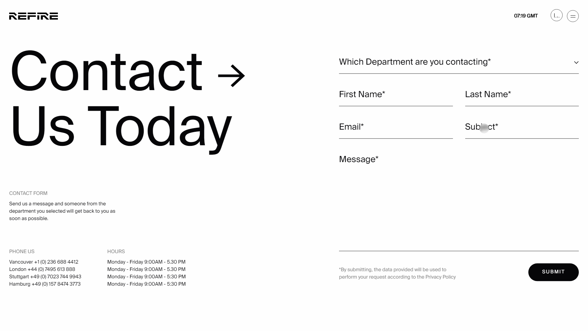
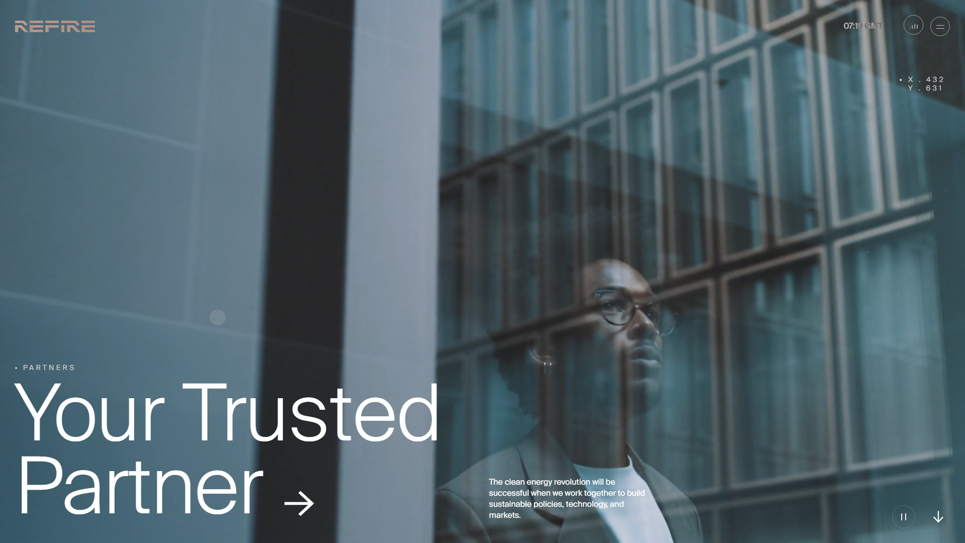
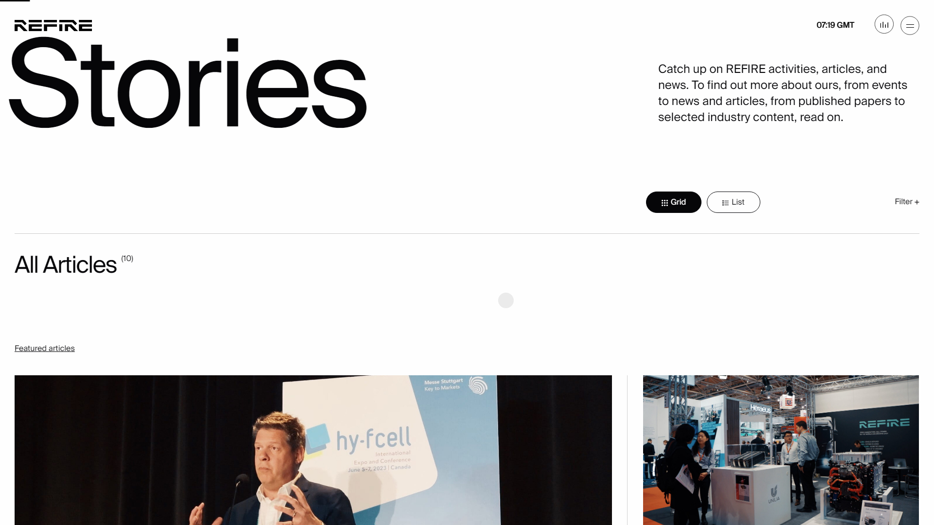
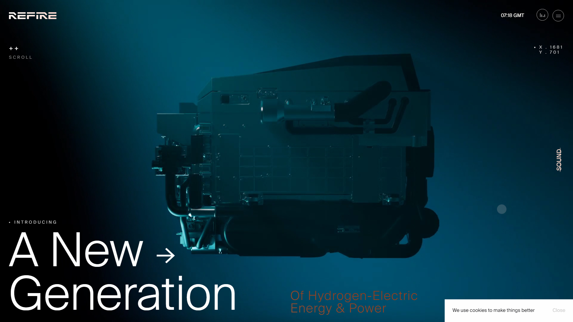
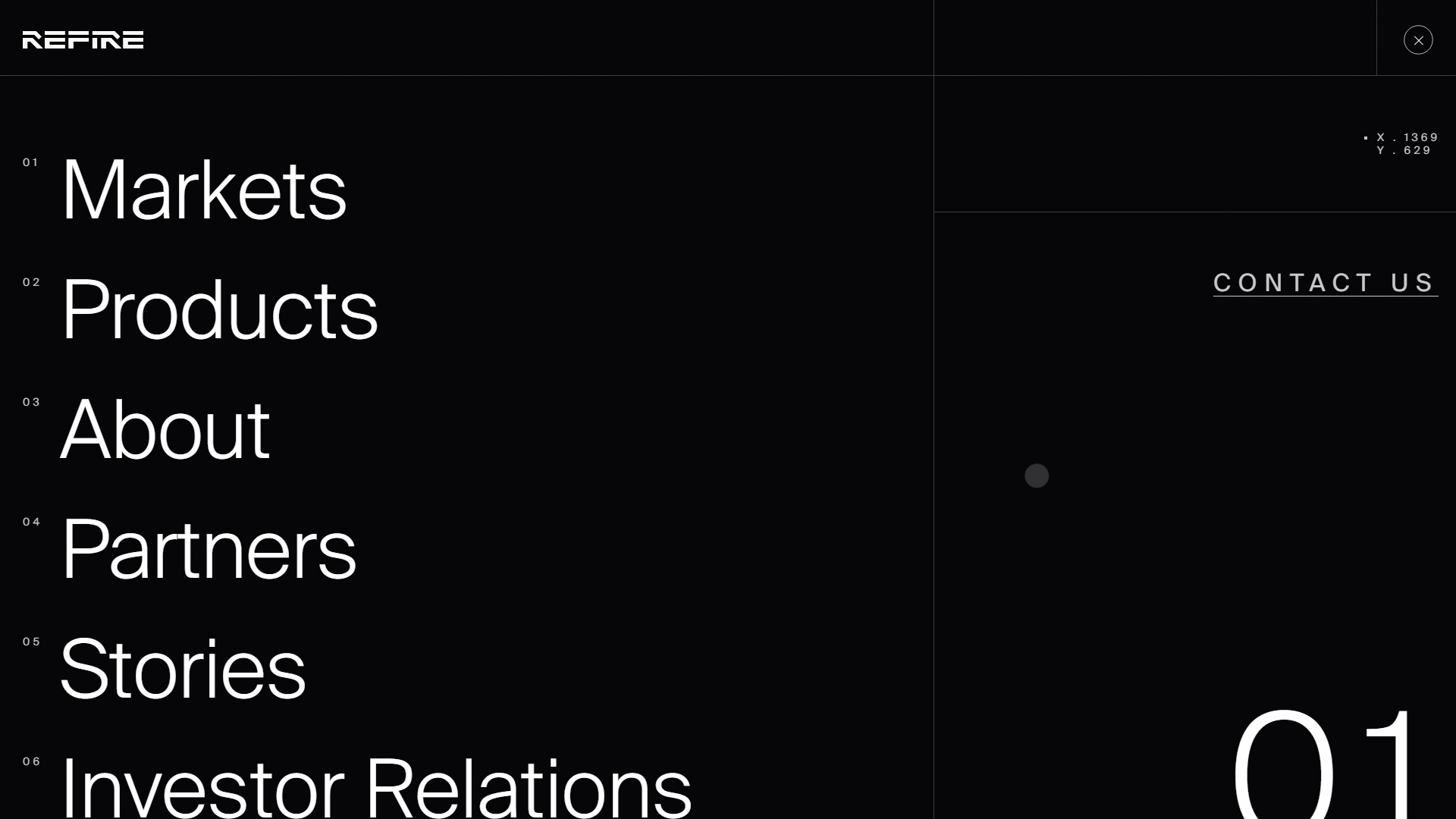
The REFIRE website, developed by CUSP and SALT AND PEPPER , represents an innovative generation of hydrogen-electric power and energy. This site not only communicates REFIRE’s vision for the future of energy but also offers an interactive and visually appealing experience that captures visitors’ attention.
The typography used on the site is Suisse, a modern choice that provides clarity and elegance. This font is not only highly legible but also reinforces REFIRE’s professional and technological image, perfectly aligning with its focus on innovation in the energy sector.
The site’s color palette, which includes HEX #060508 and HEX #FEFEFE, creates a striking contrast. The deep black establishes a solid and sophisticated background, while the bright white adds brightness and clarity, allowing key content elements to stand out. This color combination also contributes to a sense of modernity and seriousness, suitable for a brand at the forefront of energy technology.
The site’s design includes scrolling and 360-degree elements, allowing users to explore REFIRE’s technology in a dynamic and immersive way. This interactivity not only enhances the user experience but also allows for a better understanding of the products and services the company offers.
Additionally, the integration of photo and video in the design provides a clear and effective visual representation of REFIRE’s value proposition, making technical information more accessible and appealing to visitors.
In summary, the REFIRE website is an excellent example of how well-executed web design can effectively communicate an innovative vision in the energy sector. With its intelligent use of typography, a contrasting color palette, and an interactive experience, CUSP and SALT AND PEPPER have created a platform that is not only informative but also inspiring for those interested in the future of energy.
Visit site: REFIRE
CPF Freiburg — Chemicals and Pharmaceuticals
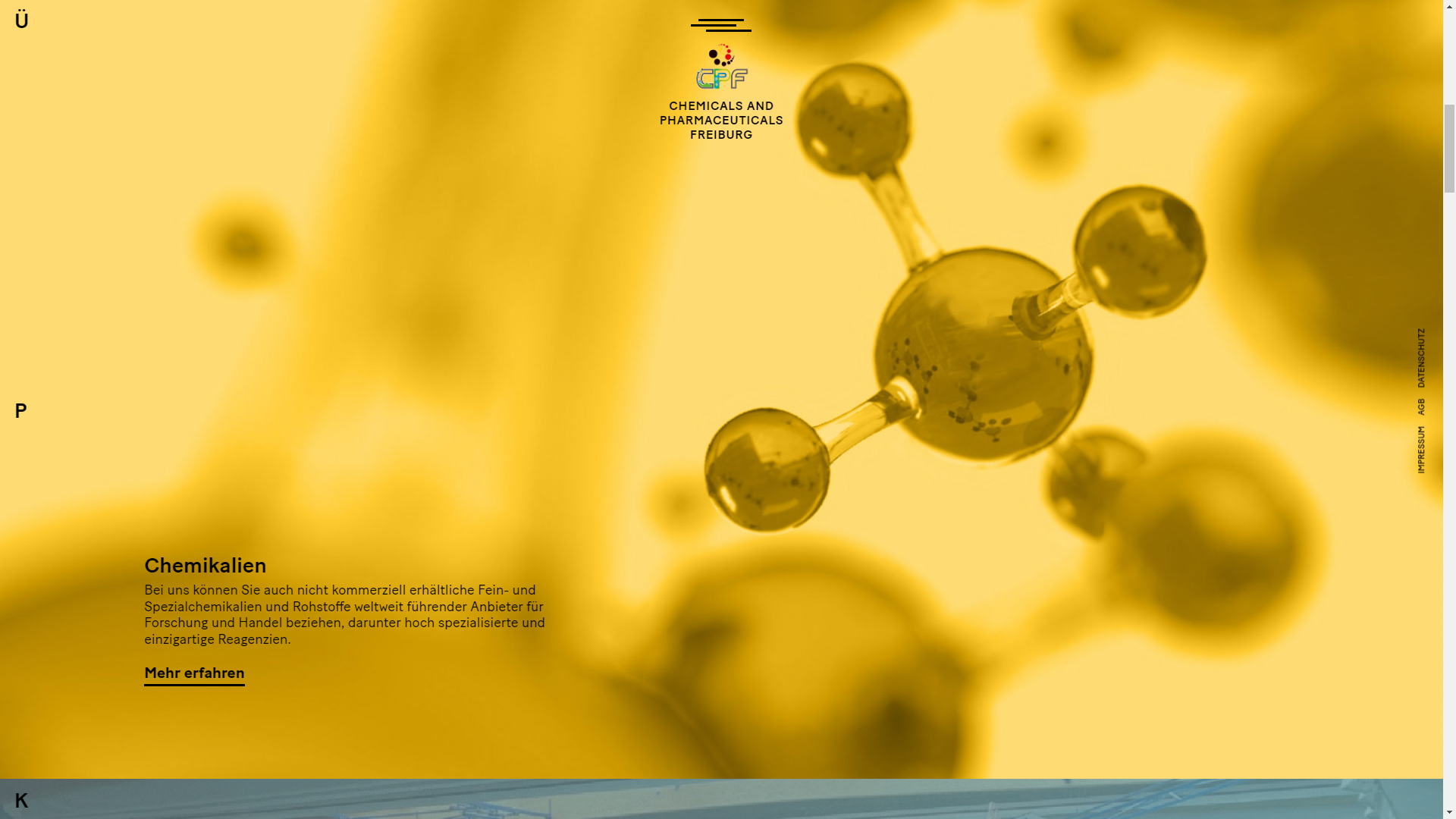
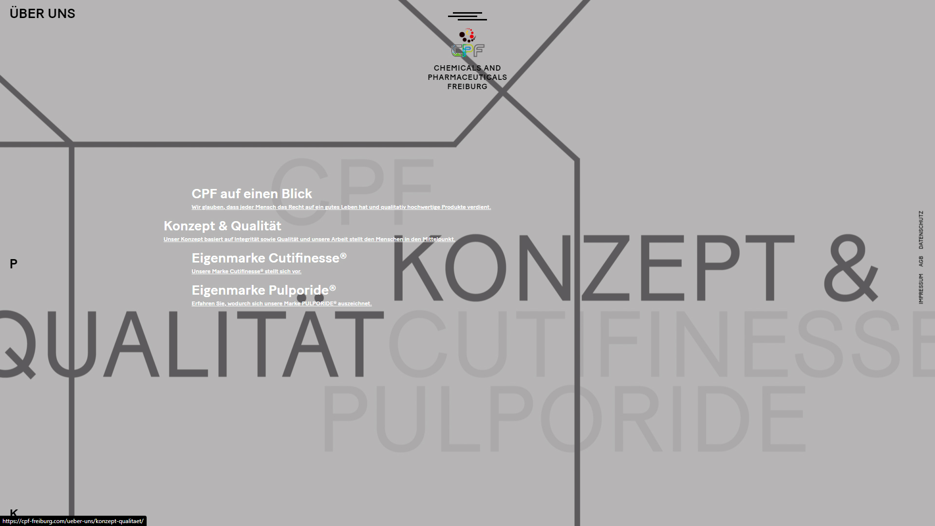
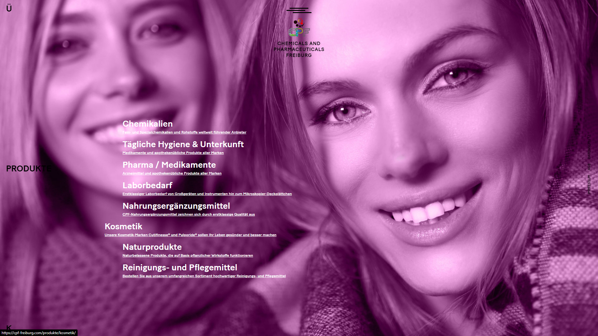
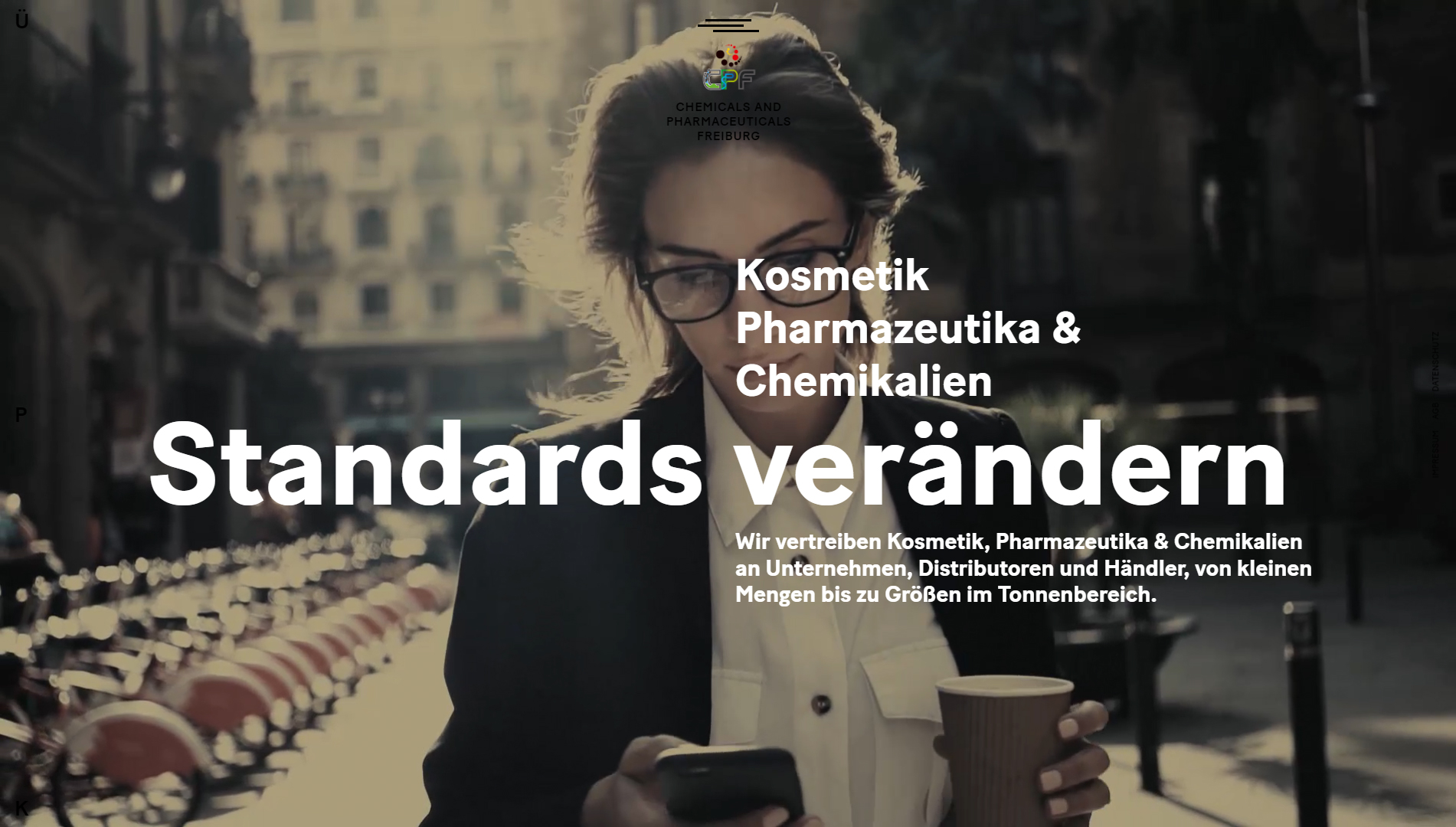
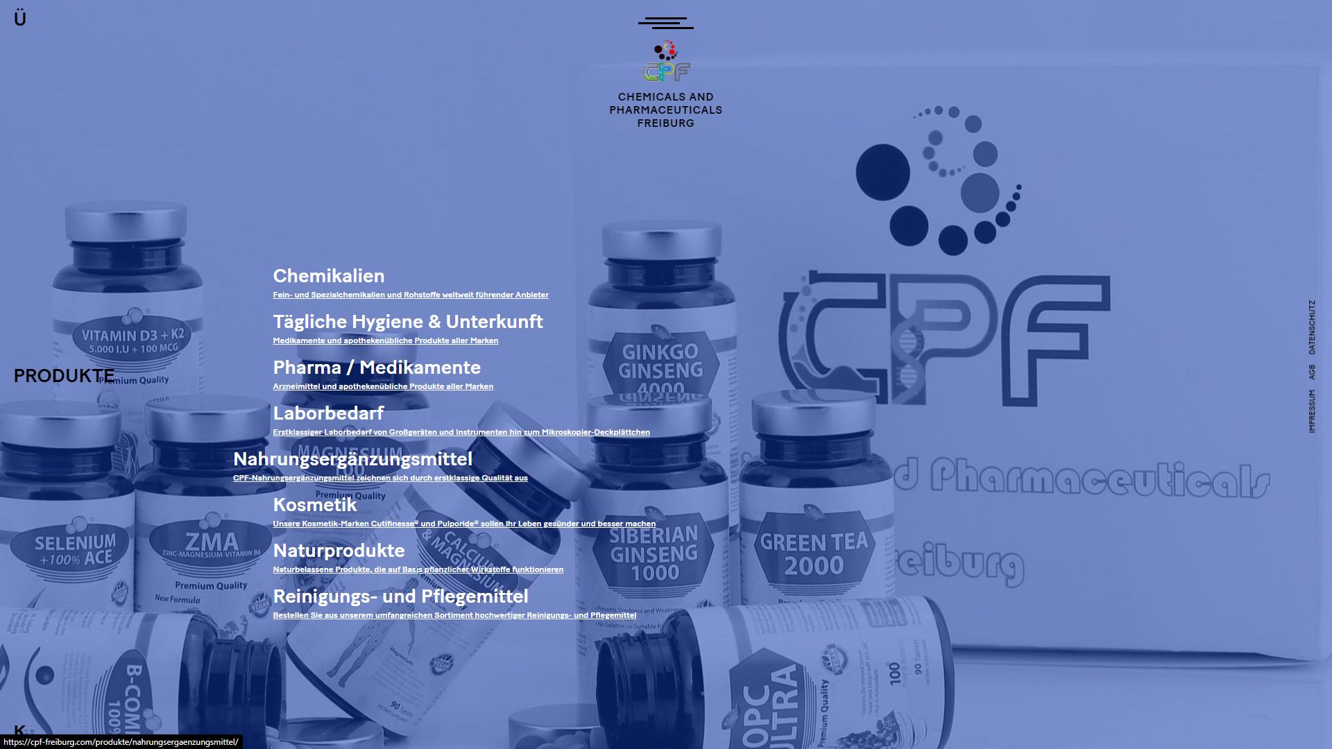
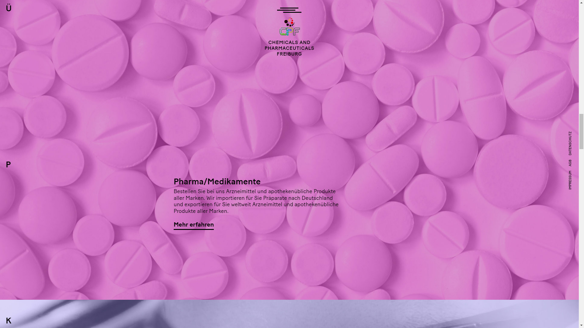
The corporate website of CPF Freiburg, designed by Manuel Kreuzer, is a masterpiece of contemporary design, combining modern typography, precise animations, and a dynamic visual experience for a company in the chemicals and pharmaceuticals industry. This site reflects the seriousness and innovation of the brand while using advanced technological tools to offer an intuitive and smooth web experience.
The site’s design is characterized by a clean and professional aesthetic, with clear navigation that facilitates access to essential information about CPF’s products and services. Visually, the subtle animations stand out, adding dynamism without distracting the user. The use of parallax design contributes to the sense of depth and fluidity as the user scrolls through the different sections.
Contemporary typography is one of the central elements of the design, achieving a perfect combination of elegance and readability. This typographic choice, along with the responsive design, ensures that the site functions optimally on both desktop and mobile devices, providing a consistent experience across all platforms.
The site is built using WordPress and modern technologies like HTML5, ensuring a solid code structure and flexible design. Additionally, the visual effects and interactive filters allow users to explore the different areas more attractively, enhancing the user experience and facilitating the exploration of products and services.
In summary, CPF Freiburg stands out as an exceptional example of corporate web design in the chemical and pharmaceutical sector. Manuel Kreuzer has successfully integrated animations, modern typography, and advanced technology into a web platform that is functional, attractive, and aligned with the needs of a high-profile company.
Visit site: CPF Freiburg
GOA Architecture
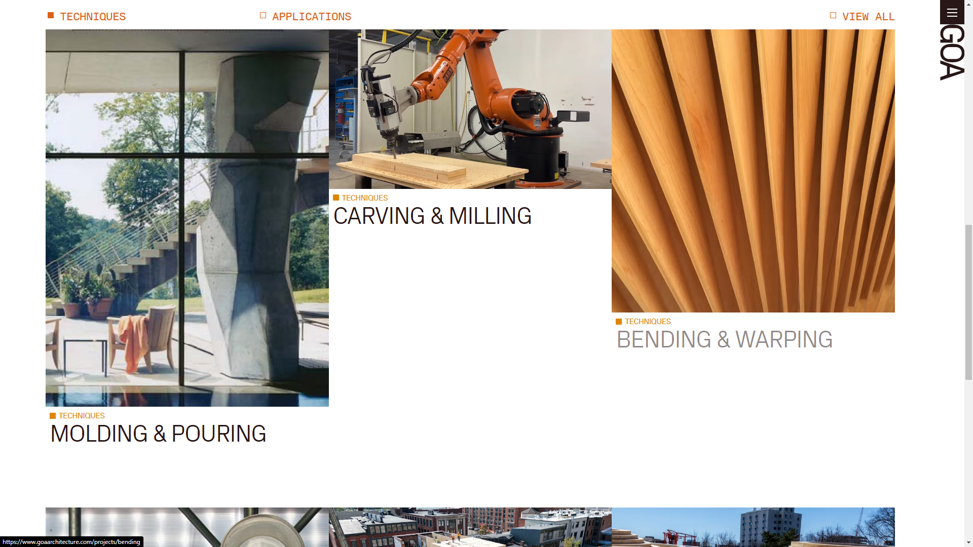
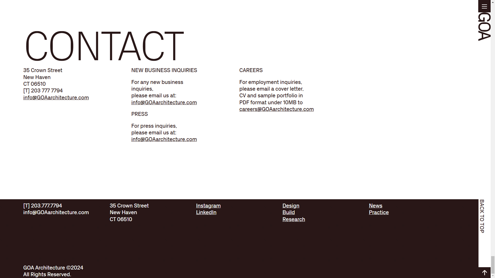
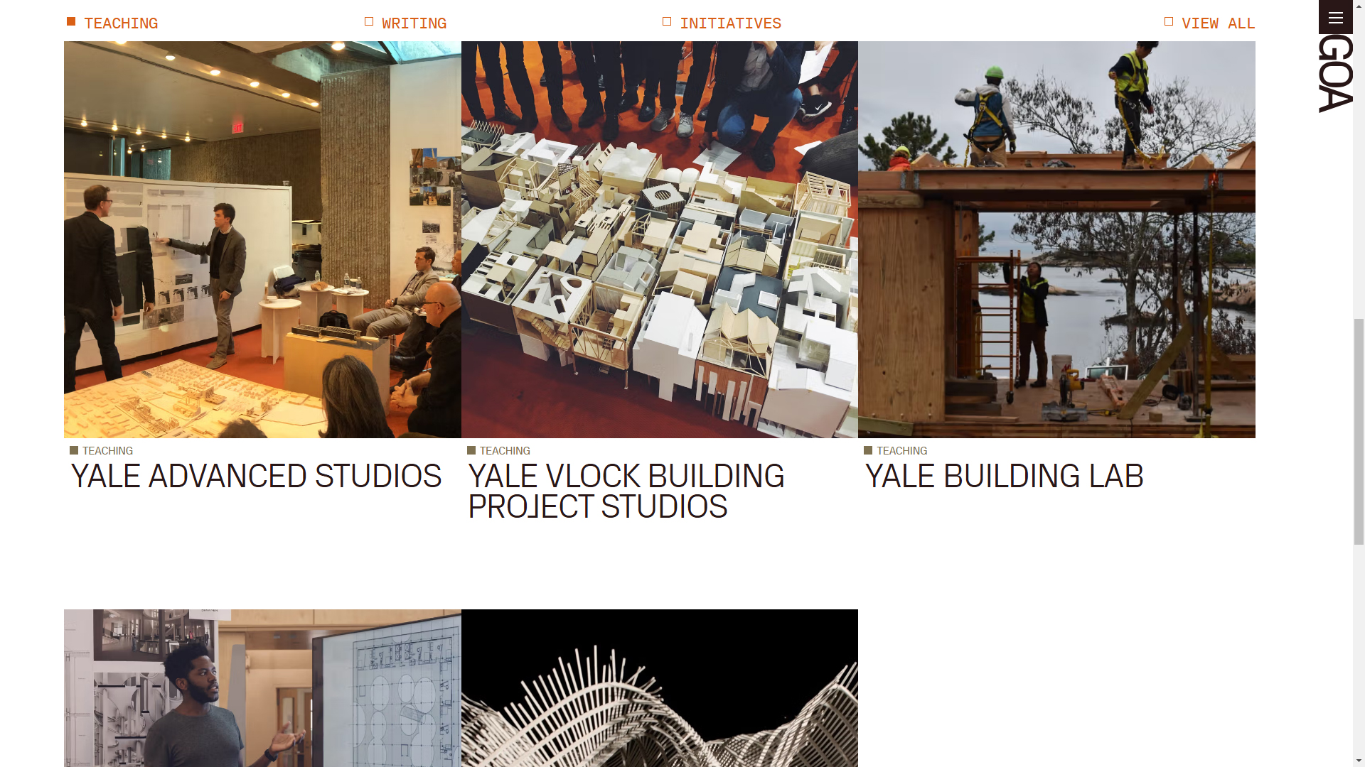
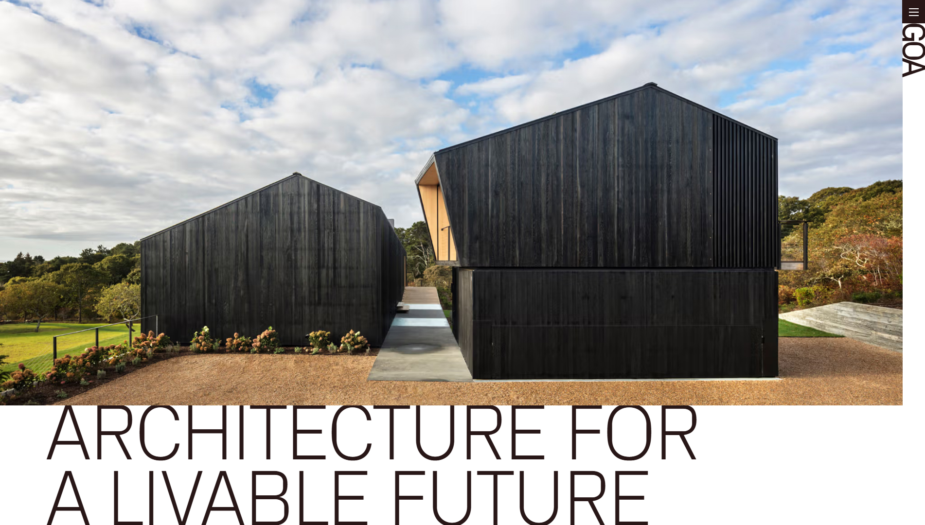
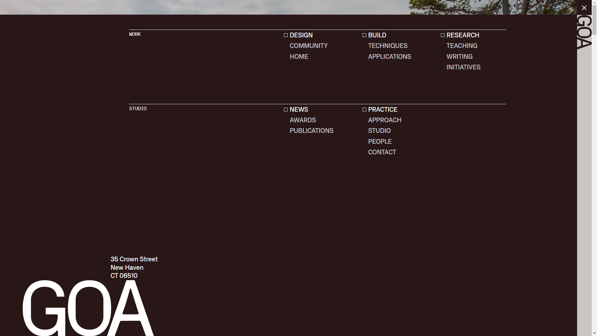
The GOA Architecture website, designed by Gone Fishing Studio, stands out for its bold and modern approach, merging architecture with innovative web design. This architecture firm, located in New Haven, specializes in the intersection of architectural design, building science, and ecological research, and their website perfectly reflects these values.
The use of a contrasting color palette with a dark background HEX #281717 and pure white details HEX #fff creates a sophisticated atmosphere that highlights the visual and typographic content. The typographic choice with PX Grotesk and PX Grotesk Mono provides a contemporary and technical feel, aligned with the firm’s avant-garde and rigorous approach to their architectural projects. This typography, with its clean and modern look, helps guide the user’s attention to the key elements of the site.
The site’s design employs large background images that visually dominate each section, creating a complete immersion in the firm’s architectural projects. Additionally, the horizontal content layout is unusual but effective, reinforcing the creative and unique identity of GOA Architecture. This structure invites the user to navigate laterally through a minimalist horizontal menu, organizing the information in an unconventional yet clear manner.
The subtle microinteractions add dynamism to the user experience, making navigation smooth and engaging. Each small animation and transition between sections is designed to enhance interaction without distraction, contributing to a carefully planned interactive experience.
The site is designed to be responsive, ensuring that both high-quality images and horizontal navigation work seamlessly on any device, from mobile phones to desktop screens. The details of architecture, combined with advanced web technology, demonstrate GOA‘s detailed approach to innovation in both design and usability.
In summary, the GOA Architecture site, created by Gone Fishing Studio, is an outstanding example of how web design can effectively combine architecture, graphic design, and unconventional navigation. This page, with its creative use of typography and a horizontal structure, offers a unique and memorable experience, in line with the firm’s avant-garde vision.
Visit site: GOA Architecture
Pharmacor
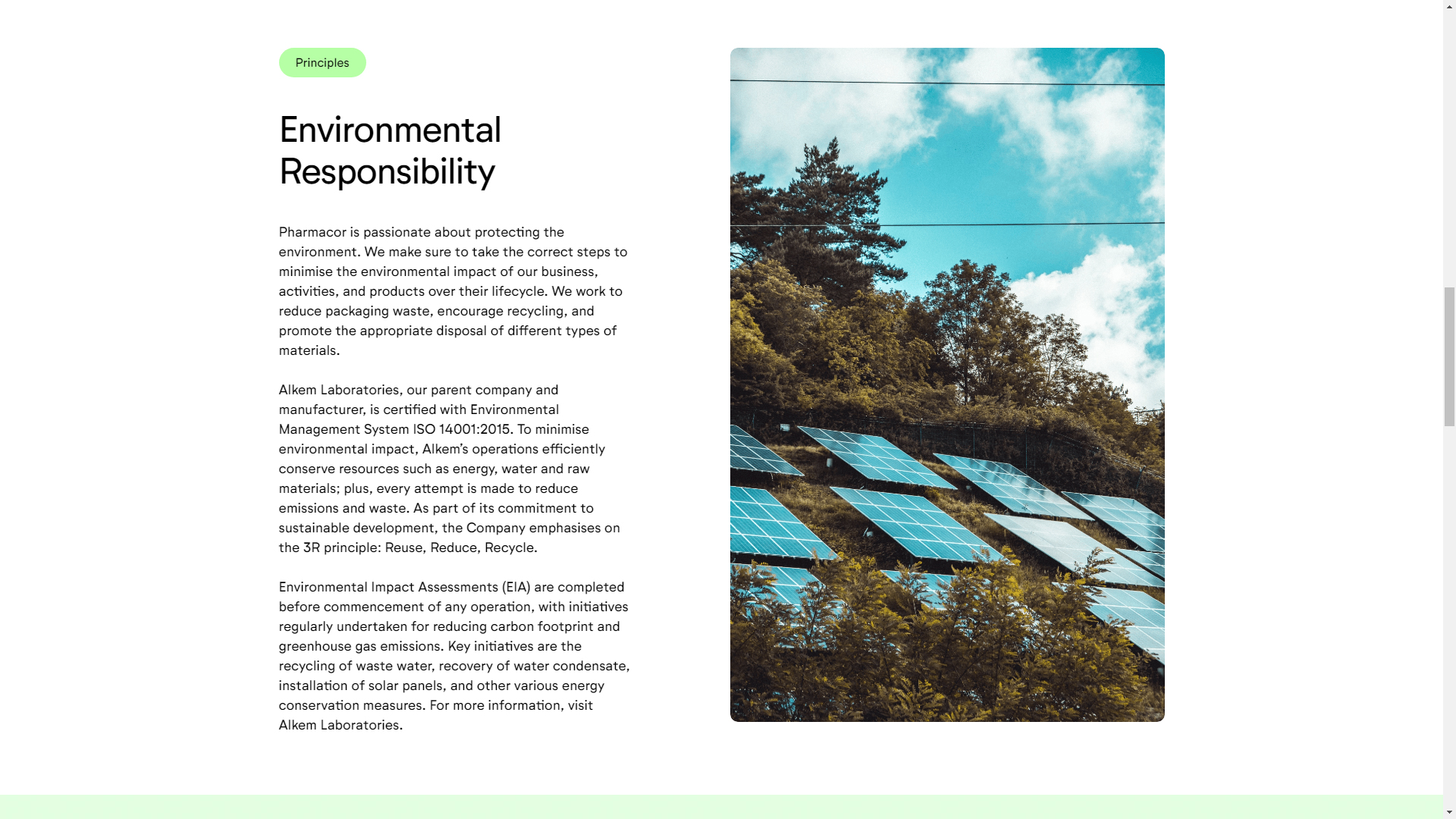
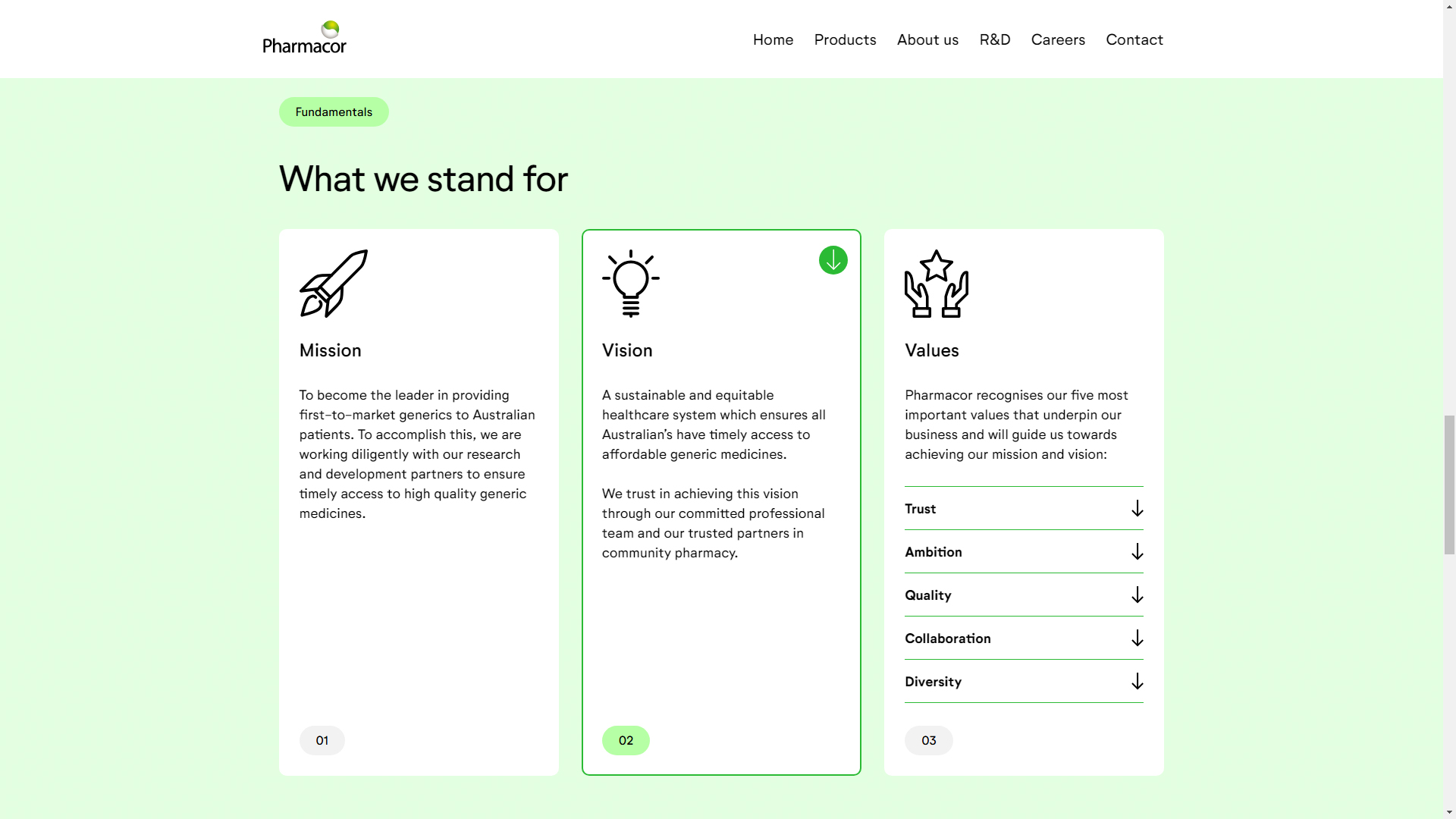
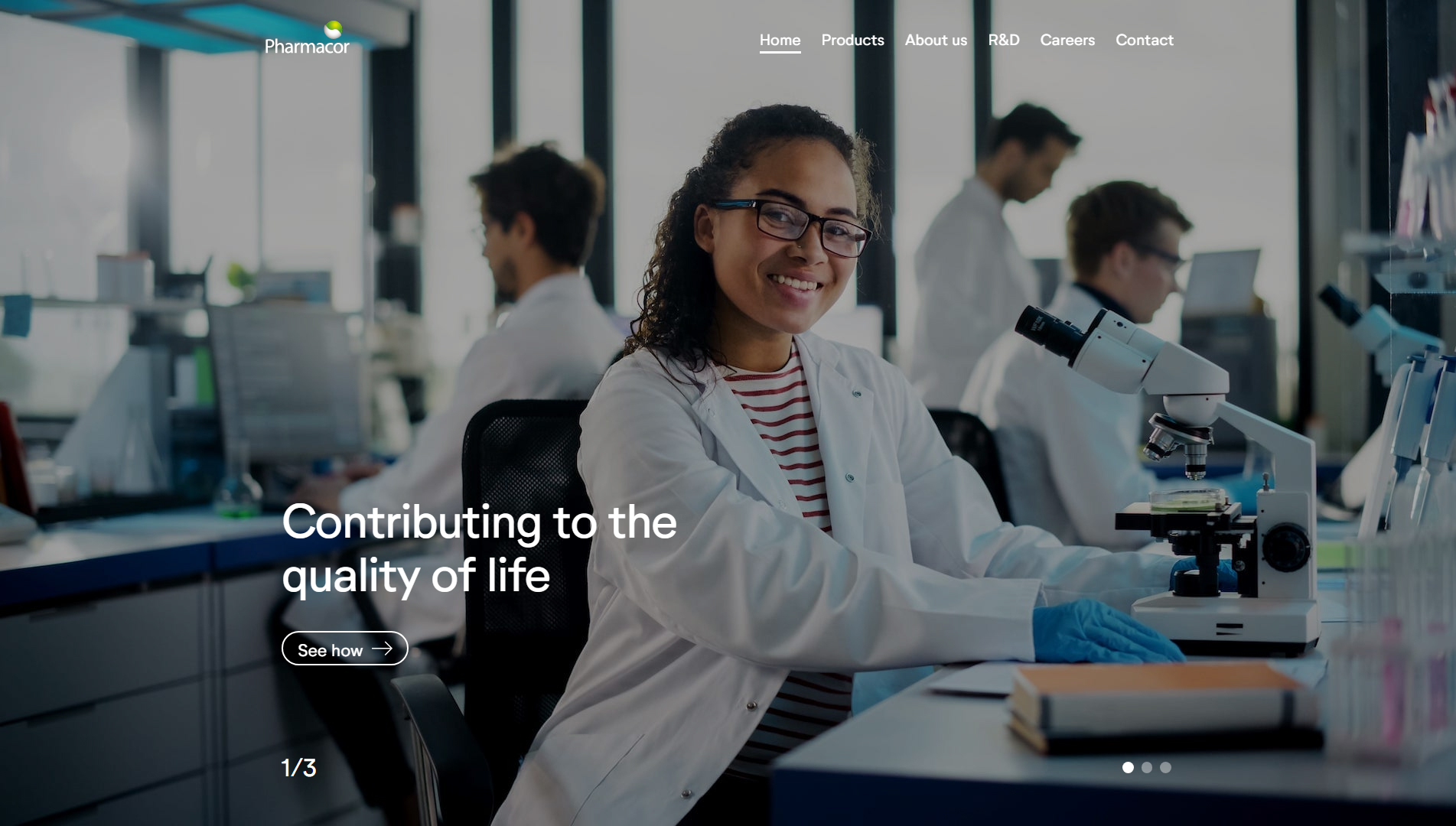
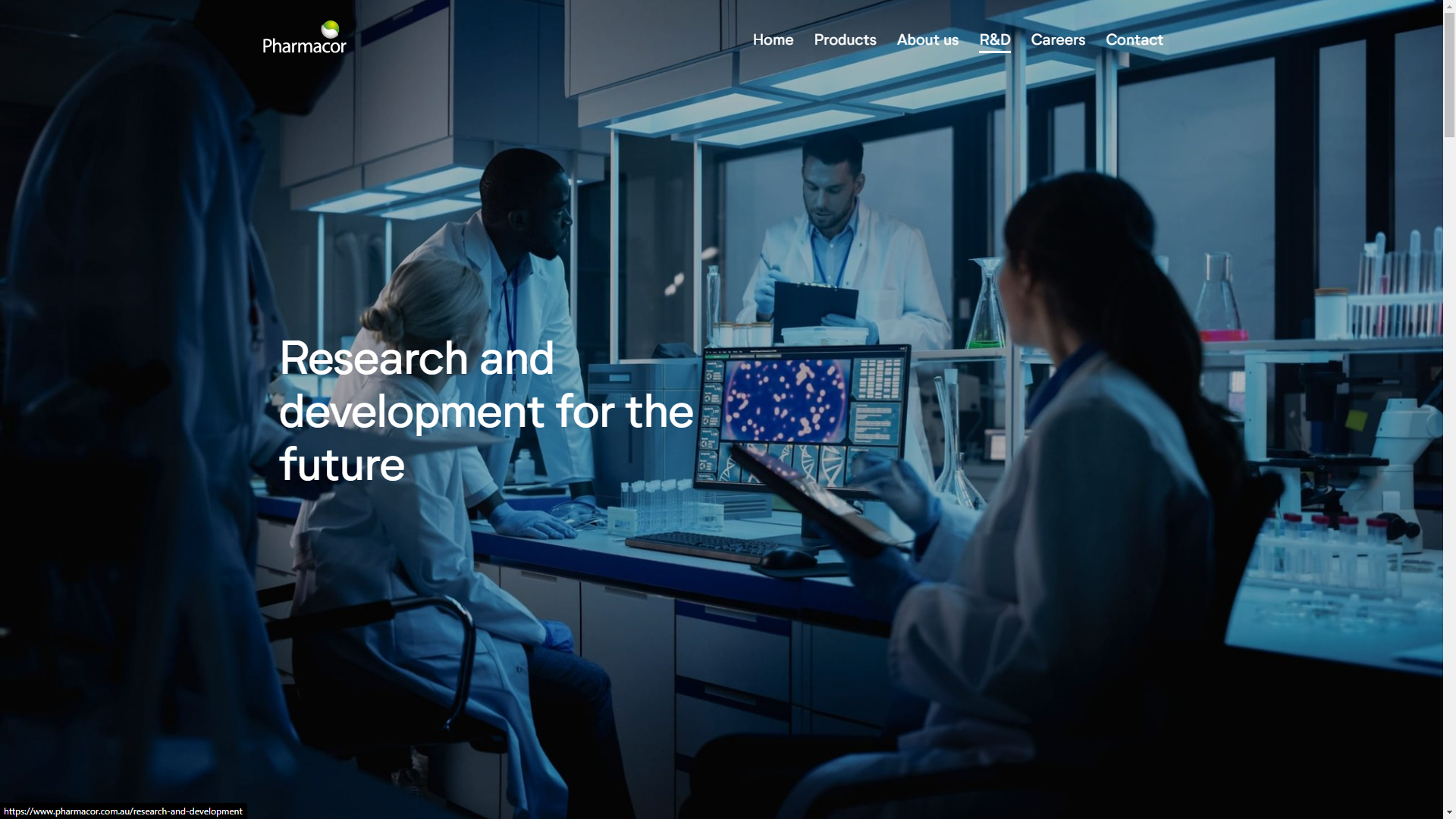
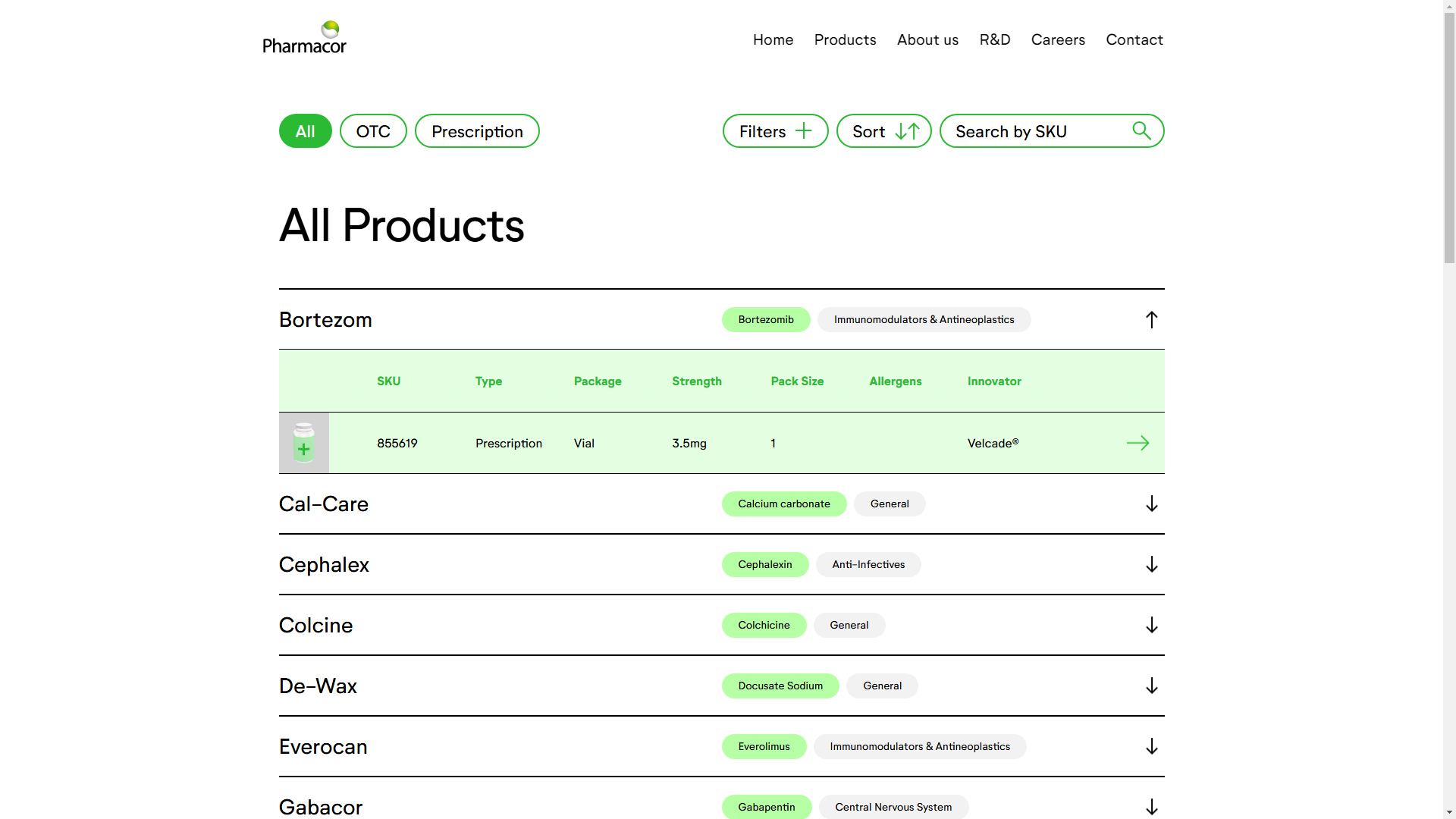
The Pharmacor website, designed by Studio-Storm, stands out as an exceptional example of custom web design, specifically tailored to the needs of a pharmaceutical company. This site not only serves as an informative platform but also acts as a product catalog aimed at doctors and the general public, combining functionality with a modern and professional aesthetic.
The typography used, Neutrifstudio, is notable for its clarity and modernity, which facilitates reading and ensures that the information presented is accessible and understandable. This typographic choice is perfectly complemented by a clean design that prioritizes usability and user experience, allowing visitors to effortlessly navigate through the wide range of products offered.
The site’s design is responsive, ensuring it adapts perfectly to any device, from desktop computers to mobile phones. This is crucial in the pharmaceutical sector, where users may seek information at any time and place. The e-commerce features allow for a seamless shopping experience, making navigation and product selection intuitive.
One of the most notable aspects of the site is its focus on graphic design, where custom icons and visual elements help guide the user through the content effectively. The microinteractions are enabled on the site, adding a level of interactivity that enhances the overall user experience, making navigation more engaging and memorable.
The combination of interactive web technology and a carefully considered UI design makes Pharmacor not only visually appealing but also highly functional. Every detail, from content layout to subtle animations, has been designed to maximize efficiency and user satisfaction.
In summary, the Pharmacor website, created by Studio-Storm, is a masterpiece of custom design that addresses the specific needs of a pharmaceutical company. With its innovative use of typography, graphic design, and interactive technologies, it stands out as one of the most remarkable web designs of the year.
Visit site: Pharmacor
Breaking
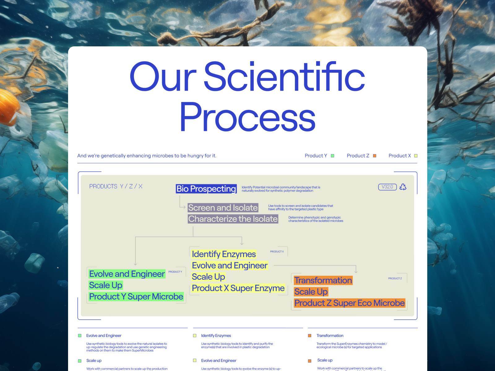
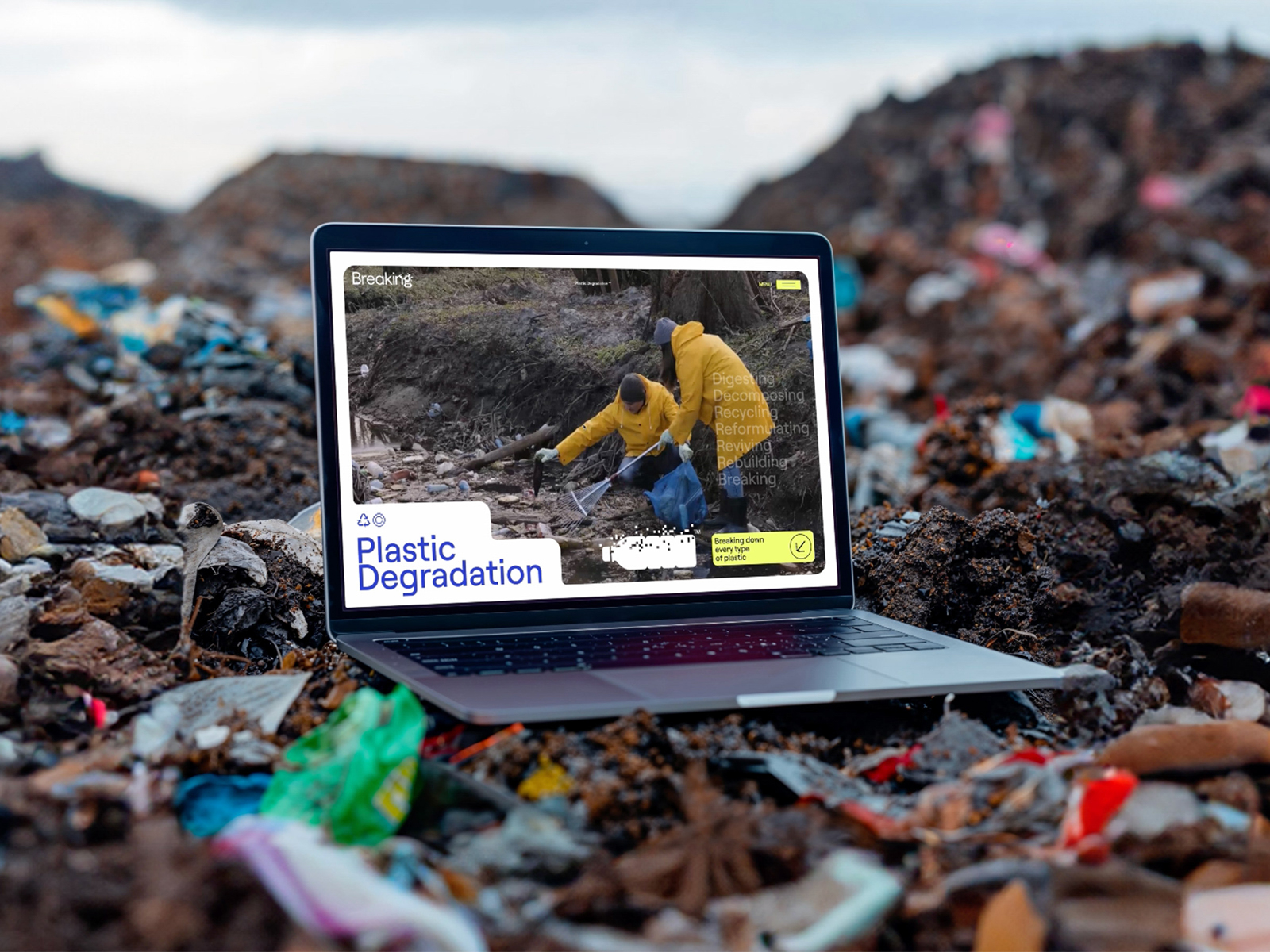
The website Breaking, created by Maven Creative in collaboration with The Limbo Society, is a captivating web experience that addresses one of the most pressing issues of our time: plastic degradation. This design is not only informative but also crafted to engage users and highlight the innovative scientific discoveries of the team behind the research.
With a focus on social responsibility, the site presents a powerful visual narrative that uses striking animations and well-designed graphics to communicate the seriousness of plastic-related issues in our world. The chosen typography is modern and dynamic, contributing to the clarity of the message while maintaining the visitor’s visual interest.
The design is fully responsive, ensuring that users can access the information on any device, from mobile phones to desktop screens. This adaptability is essential to reach a broader audience and raise awareness about plastic issues and the science of its degradation.
One of the site’s highlights is its use of data visualization. Through interactive charts and effective visual representations, the site allows users to better understand the complex data related to plastic research. The microinteractions add an additional level of interactivity, making navigation intuitive and engaging, and encouraging users to explore more about the topic.
The approach of Maven Creative and The Limbo Society in combining graphic design and technology translates into a web experience that not only educates but also motivates visitors to reflect on their relationship with plastic and the environment. Every element of the site is carefully designed to maximize the impact and accessibility of the information presented.
In summary, the Breaking website is an outstanding example of how web design can be used to address important social issues. With its focus on the science of plastic degradation and its visual appeal, Maven Creative and The Limbo Society have created a platform that informs, inspires, and connects with its audience.
Visit site: Breaking
Post Familiar Wine
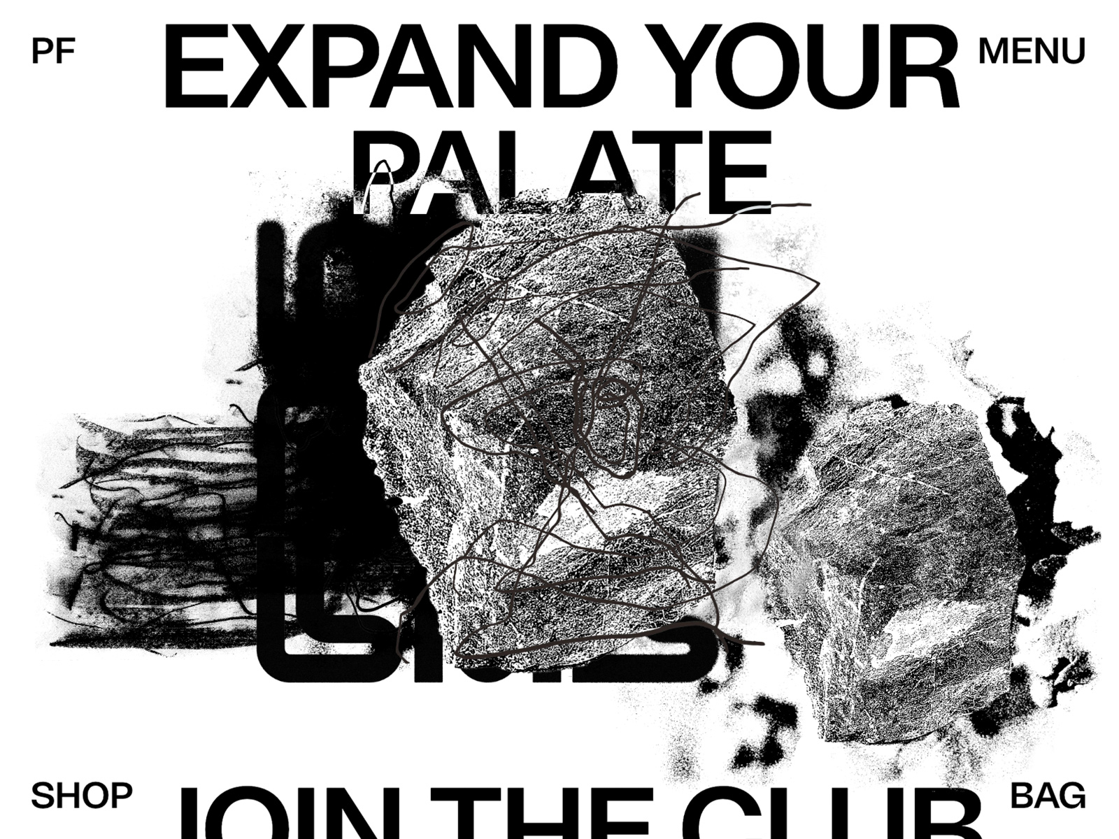
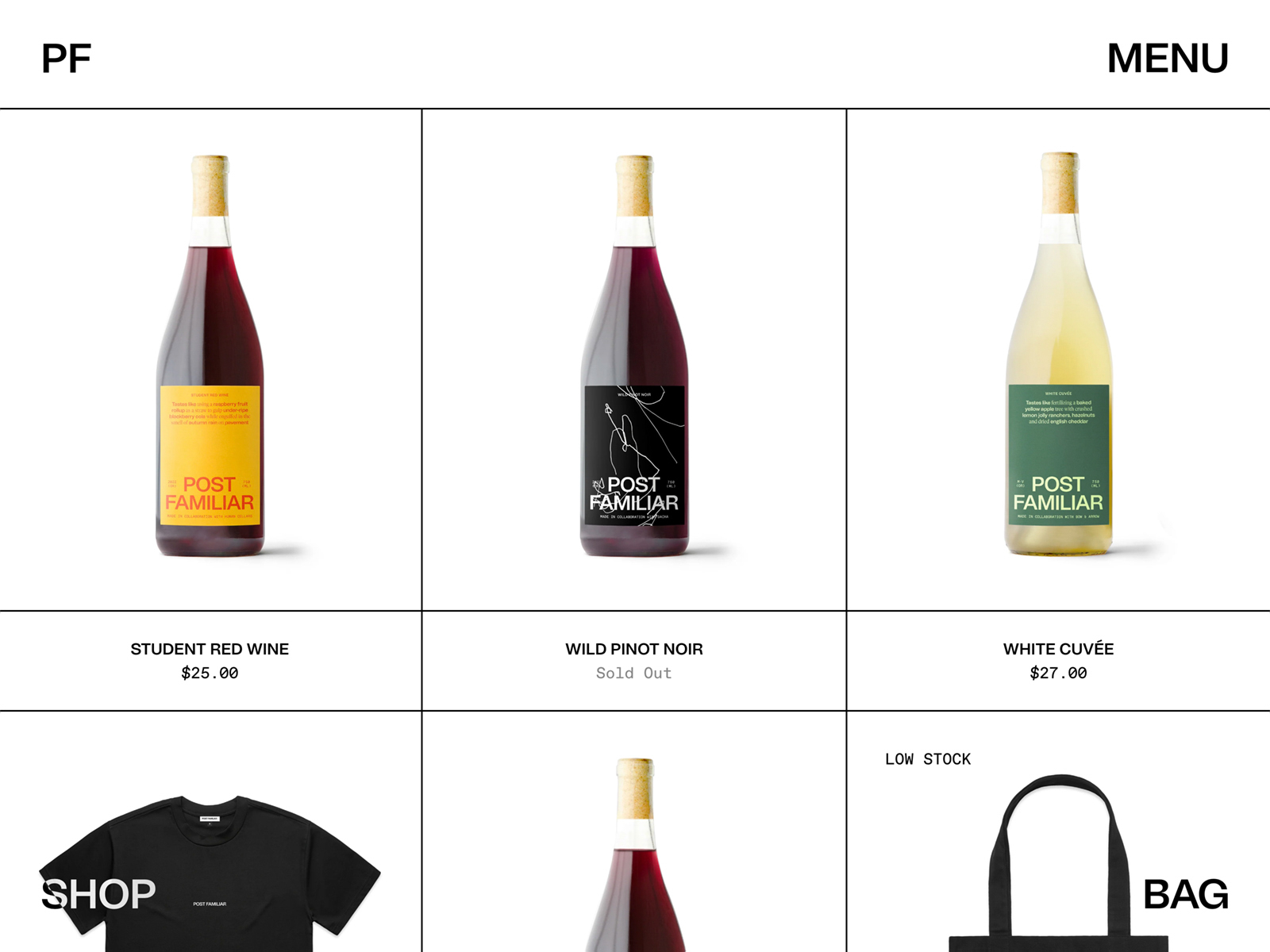
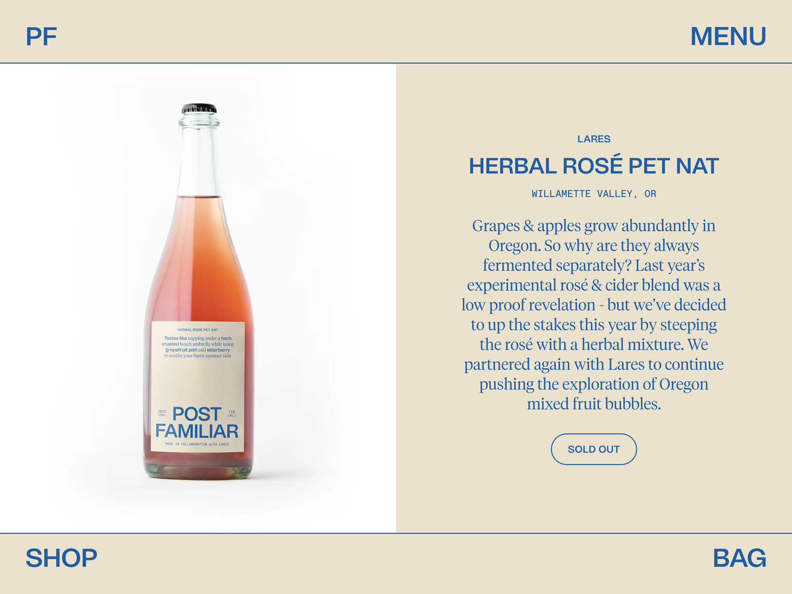
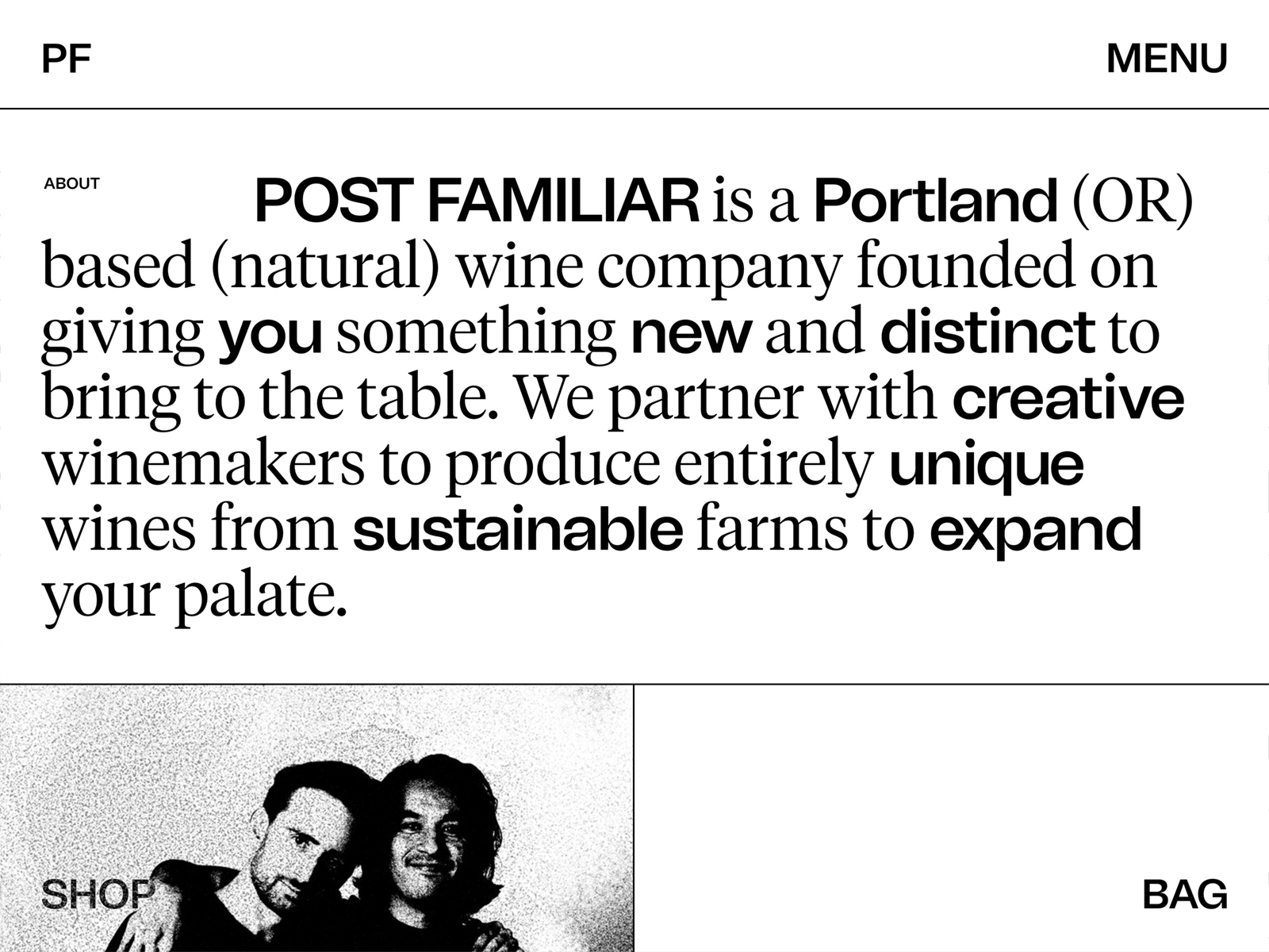
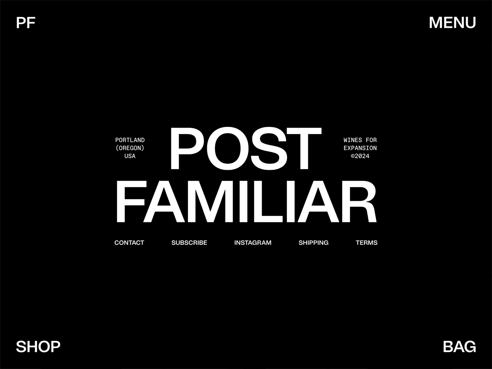
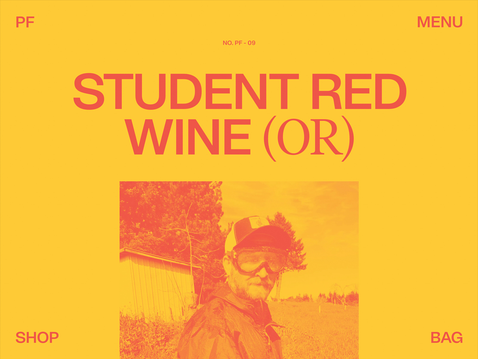
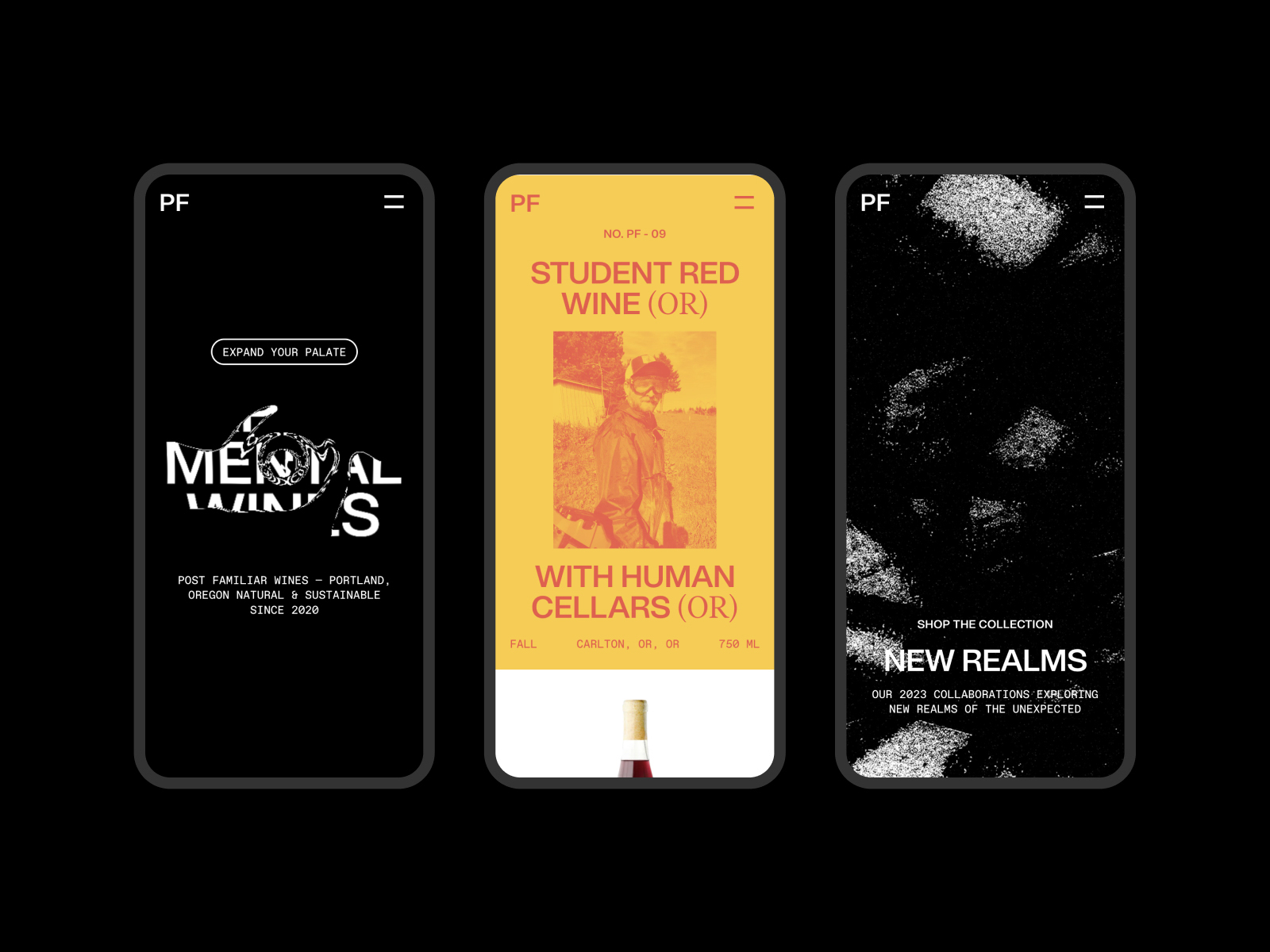
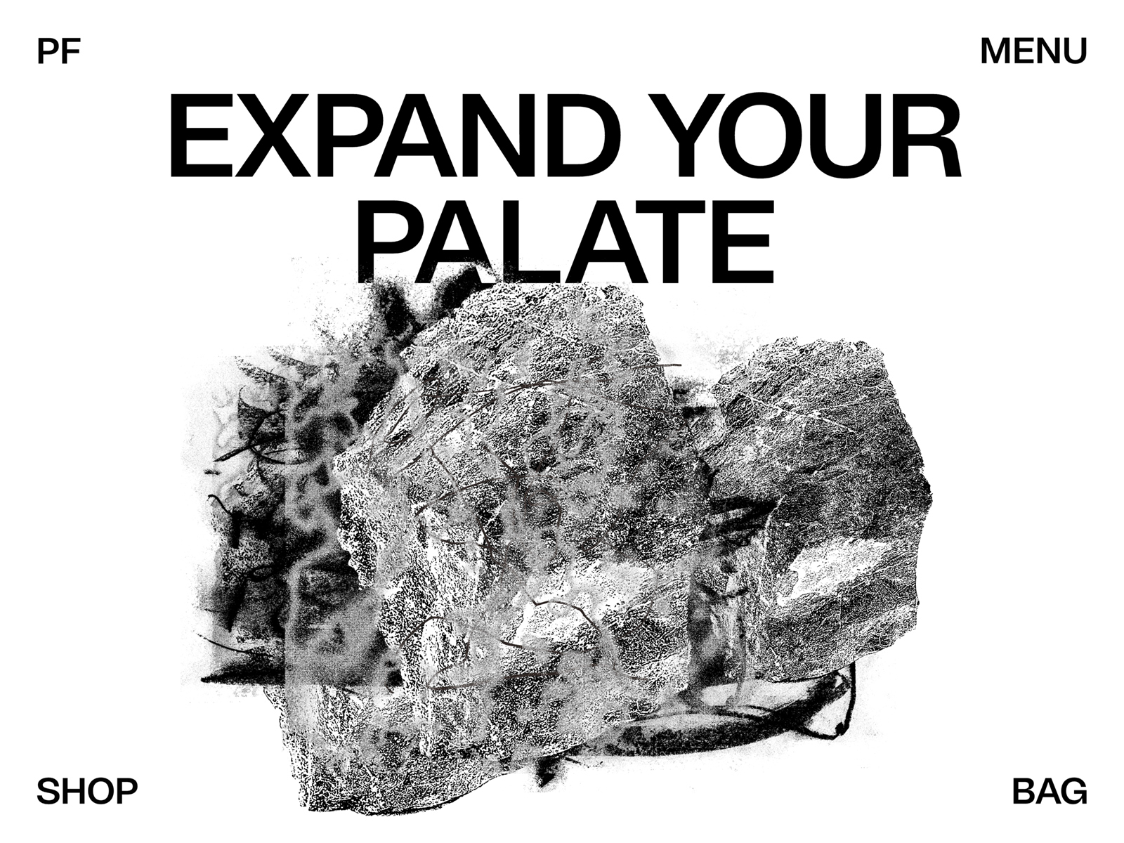
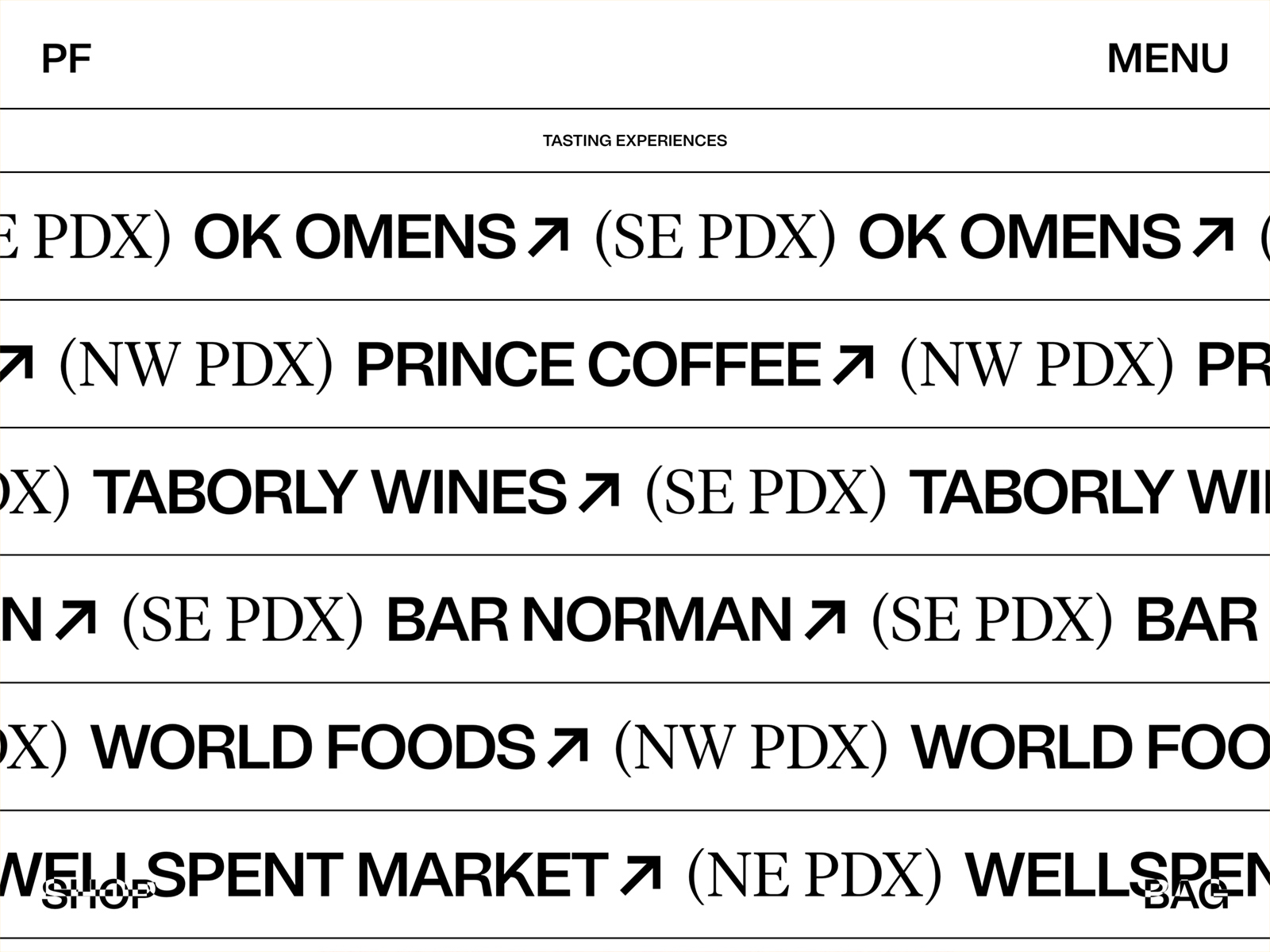
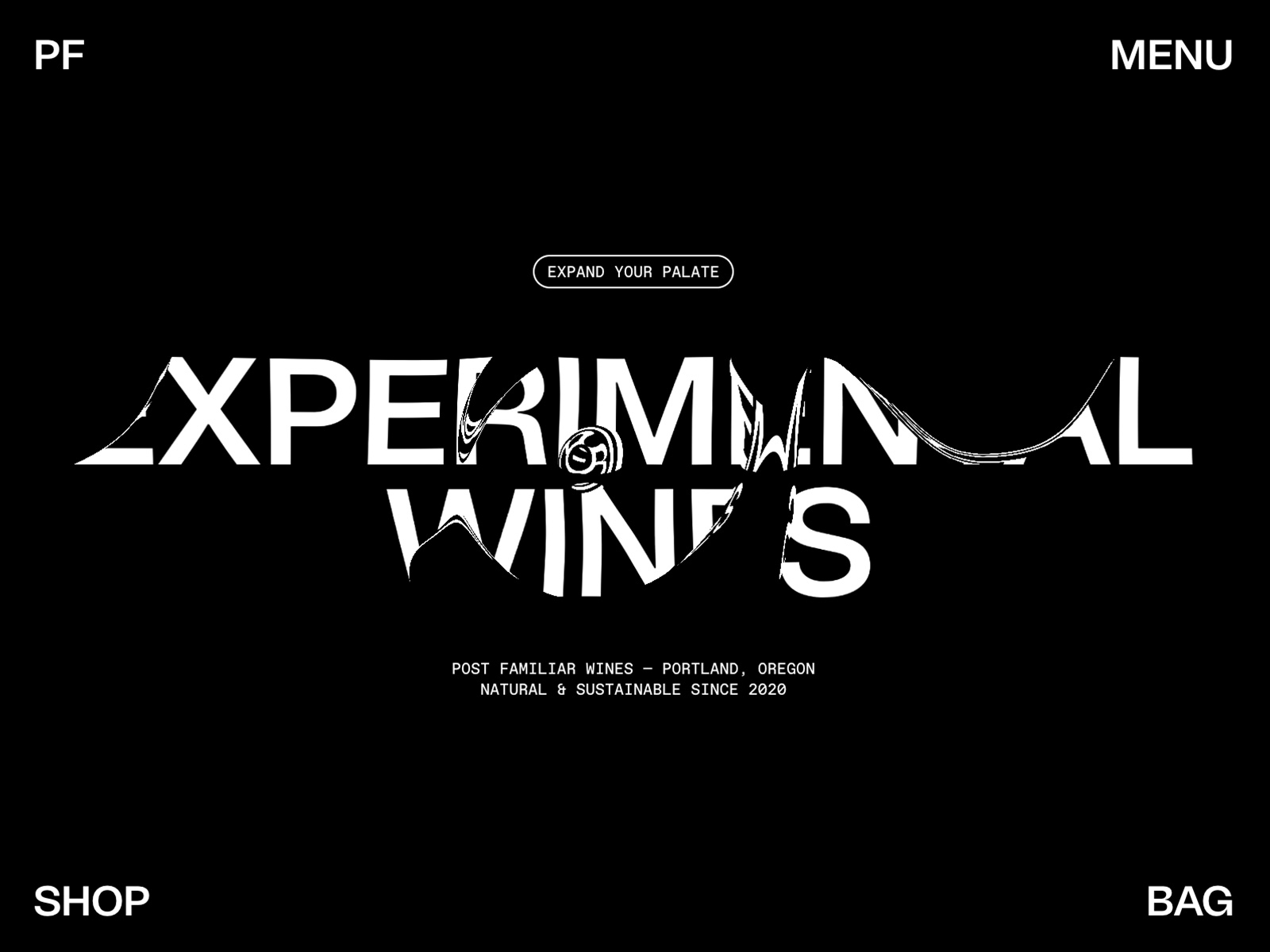
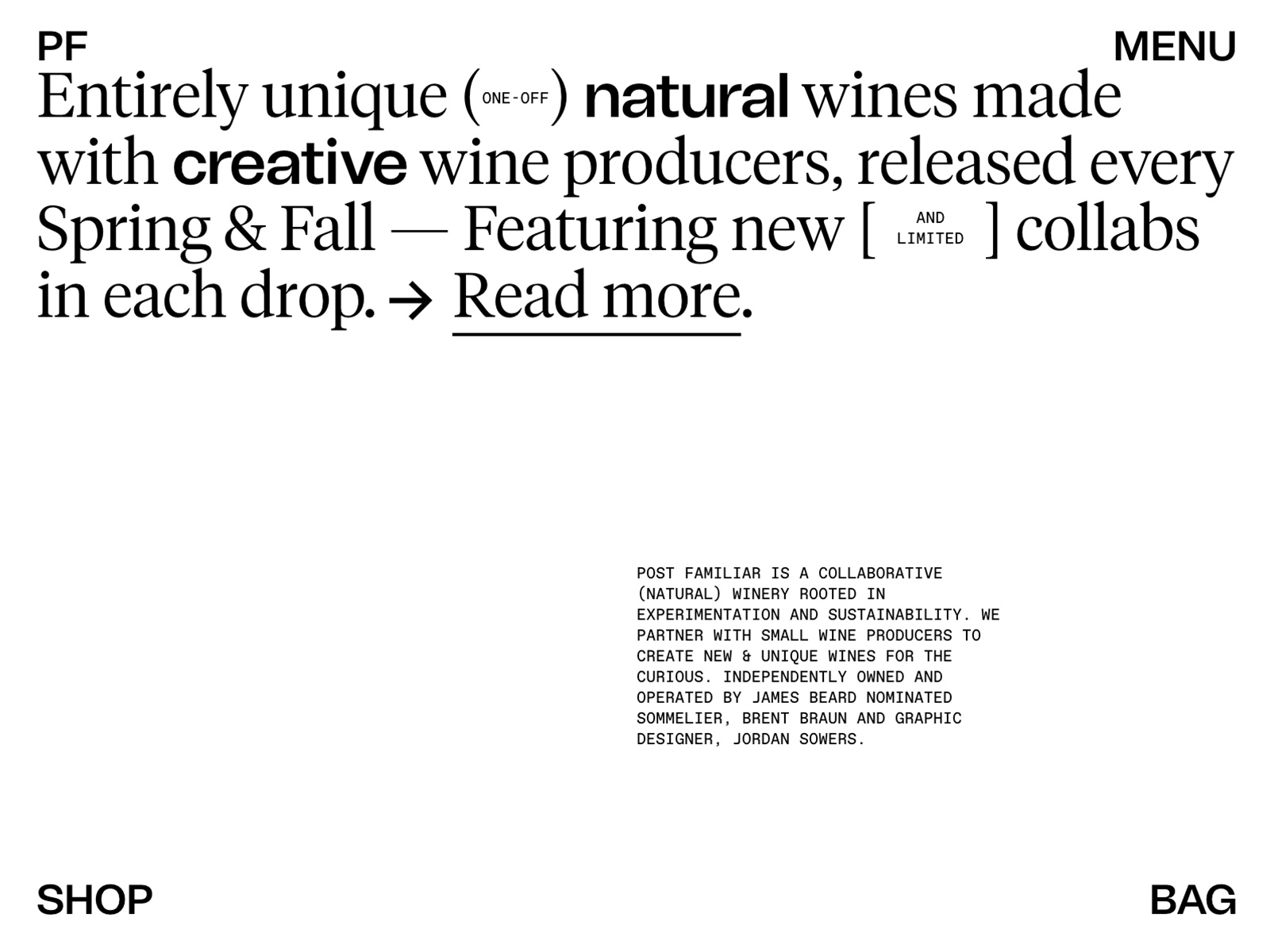
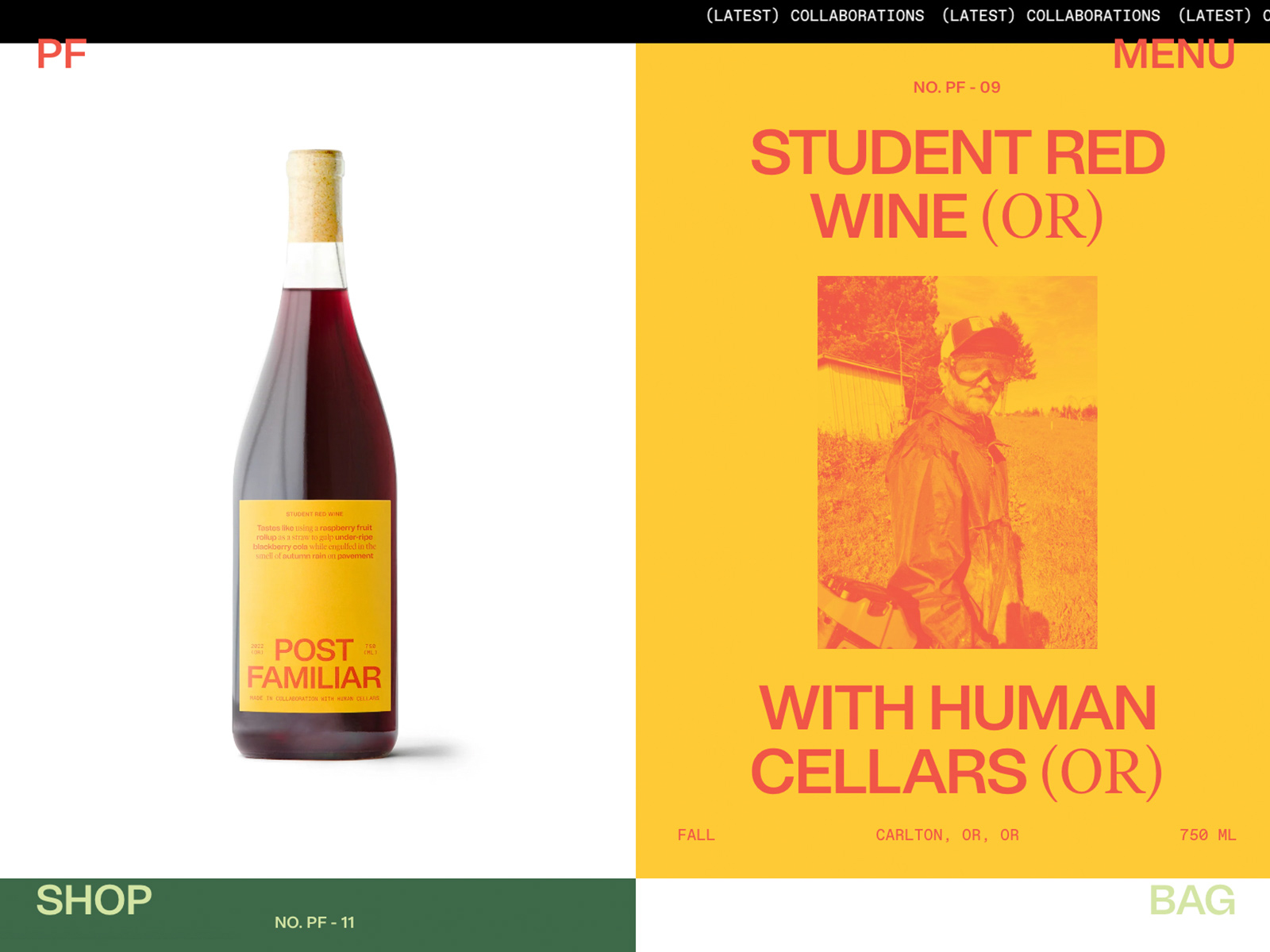
The website Post Familiar Wine, created by Jordan Sowers, presents itself as a vibrant and attractive platform for a collaborative winery focused on experimentation and sustainability in wine production. This site is a clear reflection of its philosophy, showcasing an innovative approach to creating unique wines in collaboration with small producers.
The site’s color palette, which uses HEX #000 and HEX #fff, offers an elegant and modern contrast that emphasizes the information presented. This minimalist approach allows the content to shine, highlighting both the products and the essence of the brand. The combination of black and white colors highlights the purity and sophistication of the wines, creating an attractive and easy-to-navigate visual environment.
The selected typography includes Tomato-Grotesk, Tiempos, and Favorit, which combine to create a perfect balance between modernity and readability. This typographic choice is not only aesthetically pleasing but also reflects the authenticity and artisanal focus of the winery, allowing the brand to tell its story effectively.
The site’s design is flat, which contributes to a clean and contemporary appearance. This visual style is complemented by subtle filter effects that enhance the user experience, making navigation intuitive and enjoyable. The interactive elements are designed to guide the user smoothly through the wine catalog and the brand’s story.
The site also integrates e-commerce features, allowing visitors to explore and purchase wines easily and efficiently. The navigation structure is clear, facilitating access to information about each wine and its production process.
In summary, the Post Familiar Wine website is an outstanding example of how well-thought-out web design can reflect the values of a modern and sustainable winery. Through its effective use of typography, color palette, and focus on user experience, Jordan Sowers has created a platform that is not only visually appealing but also informative and accessible.
Visit site: Post Familiar Wine
IDT Australia
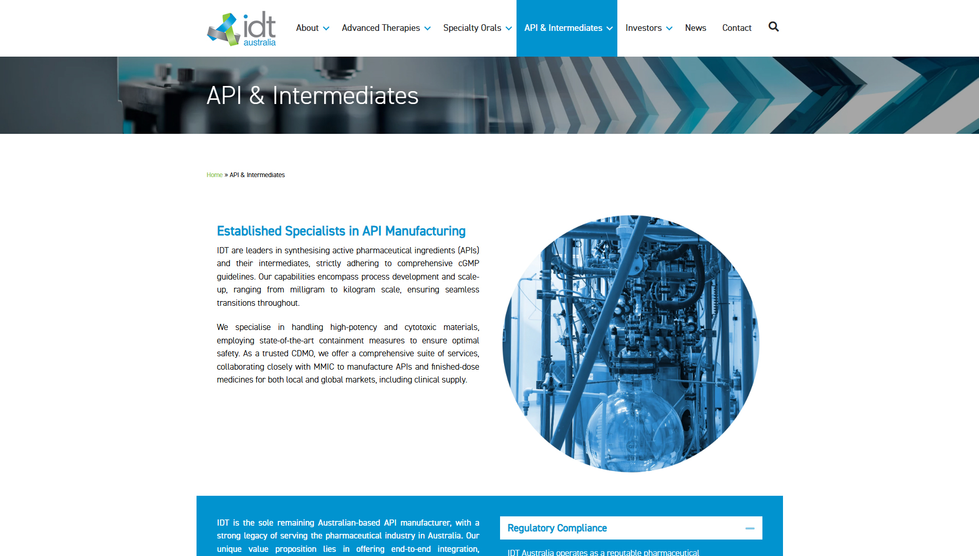
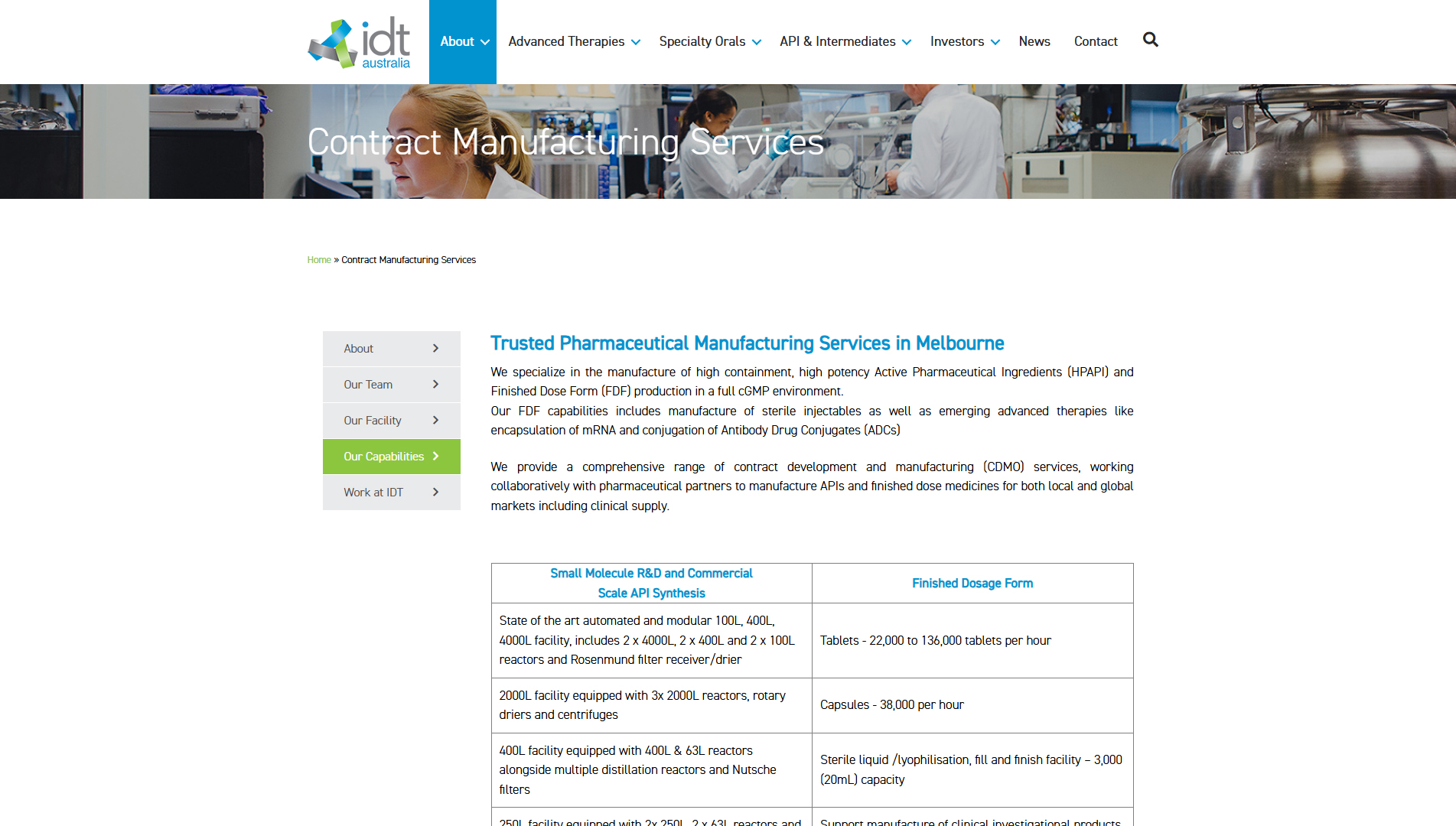
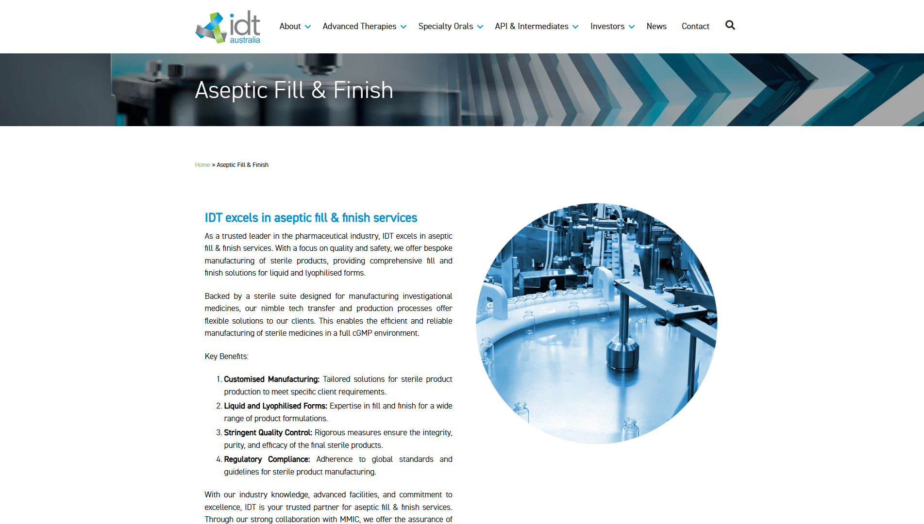
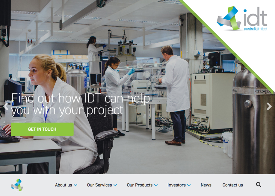
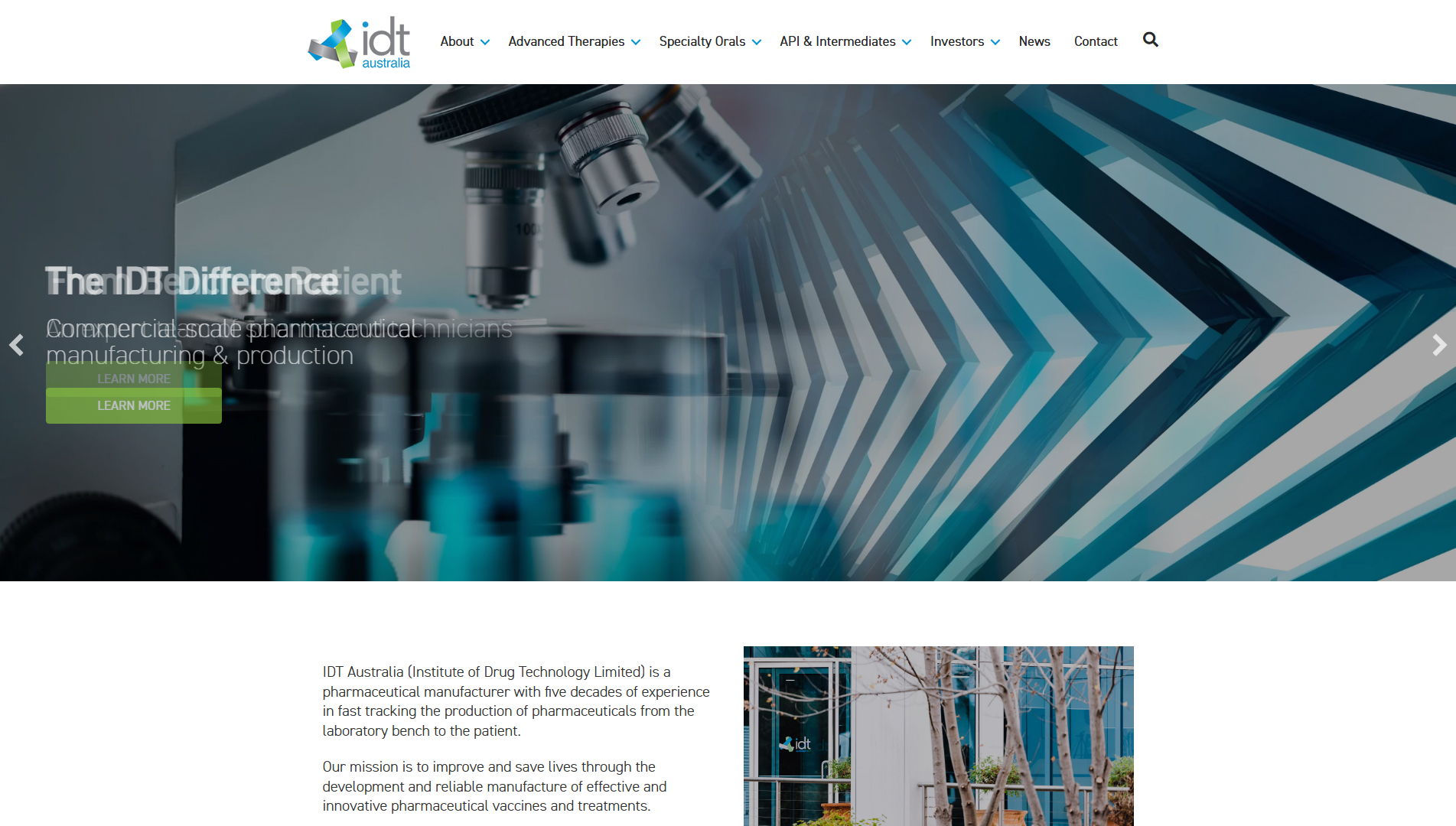
The IDT Australia website, developed by intuitiveit, positions itself as a key platform in the pharmaceutical industry, offering a comprehensive service that covers everything from the initial development of drugs to clinical trials. This site reflects IDT’s reputation as the preferred partner of leading pharmaceutical companies worldwide, including Pfizer, Johnson & Johnson, Roche, Teva, and Bayer.
The site’s design is characterized by its clean and modern approach, using a flat design style that allows for clear and effective navigation. The minimalist aesthetic not only enhances the visual appearance but also ensures that users can quickly find the information they need, which is crucial in such a complex sector as pharmaceuticals.
The horizontal navigation is another strong point of the design, providing easy access to the various sections of the site. This intuitive layout allows visitors to explore the different services offered by IDT, as well as information about their technical capabilities and commitment to quality. The header design is equally functional, ensuring that the brand identity is always present and easily recognizable.
The site’s structure is fully responsive, ensuring it adapts seamlessly to different devices, from mobile phones to desktop screens. This is essential to reach a wider audience and ensure that information about IDT’s pharmaceutical services is always available to those who need it.
In summary, the IDT Australia website, designed by intuitiveit, is an example of how well-executed web design can facilitate communication and interaction in the business and corporate realm. With its focus on technology, clean design, and optimized user experience, the site stands out as a valuable resource for pharmaceutical companies seeking a reliable partner in drug development.
Visit site: IDT Australia
Accordion
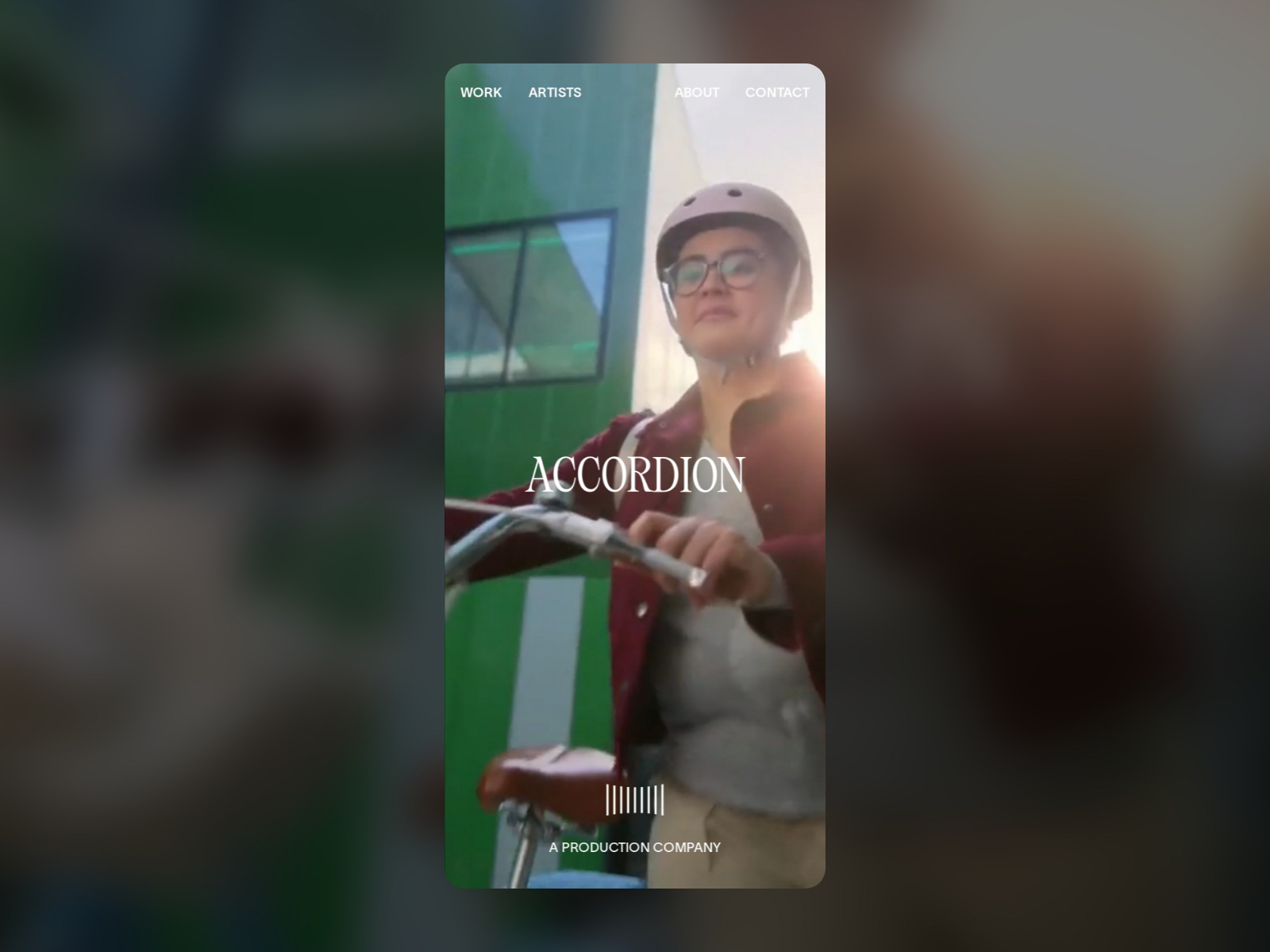
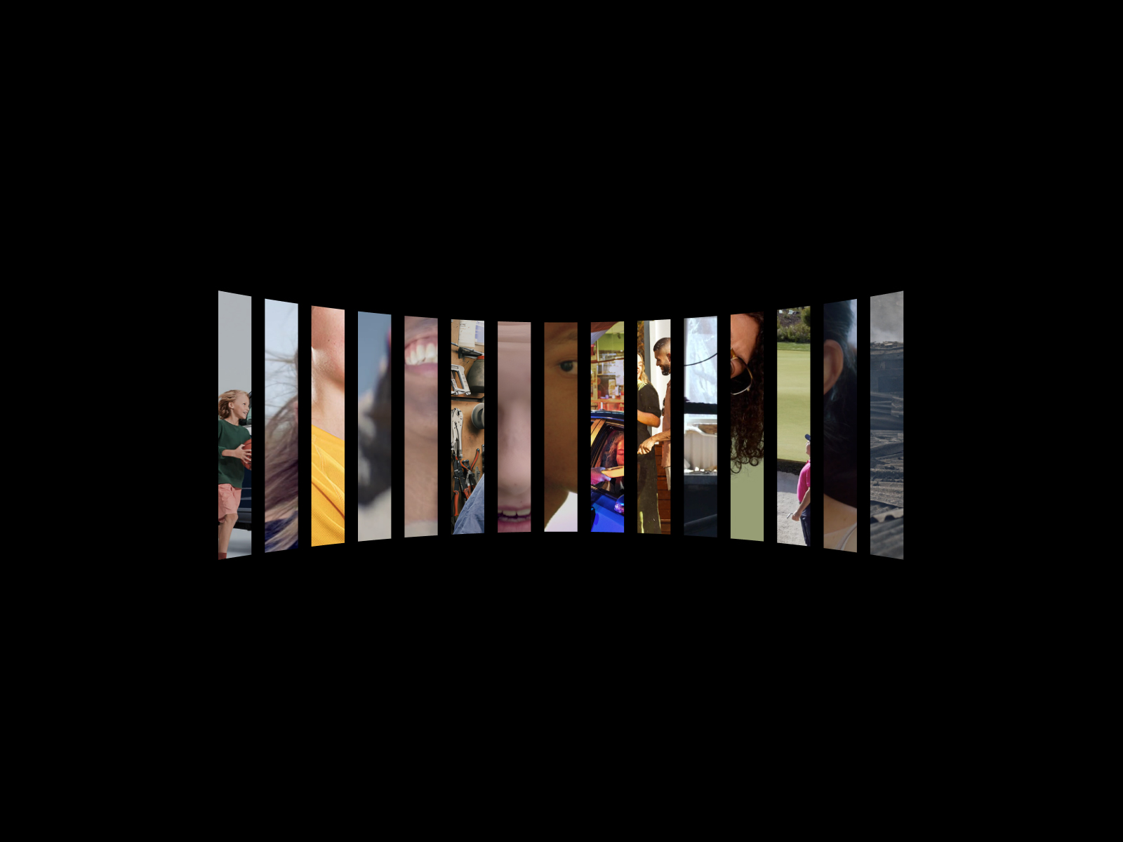
The website Accordion, created by HOLOGRAPHIK in collaboration with Ilja van Eck, is an impressive platform that redefines the brand’s visual identity and highlights its work alongside unique collaborators. This design focuses on creating a captivating and effective web experience, using a clean composition and moving graphics that capture the user’s attention.
The site’s color palette, composed of HEX #020202 and HEX #ffffff, offers a striking contrast that emphasizes both the elegance and sophistication of the brand. This monochromatic approach not only highlights the visual elements but also creates a minimalist atmosphere that allows the content to shine, emphasizing Accordion’s creativity and innovation.
The typography used, Tartuffo and Twk, adds a distinctive touch to the design, providing a mix of modernity and classic style. The clarity and legibility of these fonts ensure that Accordion’s message is effectively conveyed, while the clean graphic design complements the presentation of its portfolio.
The site incorporates elements of animation that enhance the user experience, making navigation more interactive and engaging. These moving graphics are not only visually appealing but also help guide visitors through the brand’s narrative, creating an immersive and dynamic user experience.
Additionally, the focus on UI (user interface) design translates into intuitive navigation that facilitates access to information about Accordion’s projects, as well as its history and work philosophy. The portfolio section is carefully designed to showcase its work with collaborators, ensuring that each project is presented in the most impactful way possible.
In summary, the Accordion website is an outstanding example of how a well-conceived web design can enhance a brand’s identity and highlight its creativity. With its effective use of typography, color palette, and animations, HOLOGRAPHIK and Ilja van Eck have created a platform that is not only visually appealing but also functional and representative of Accordion’s essence.
Visit site: Accordion
Botanic Expo
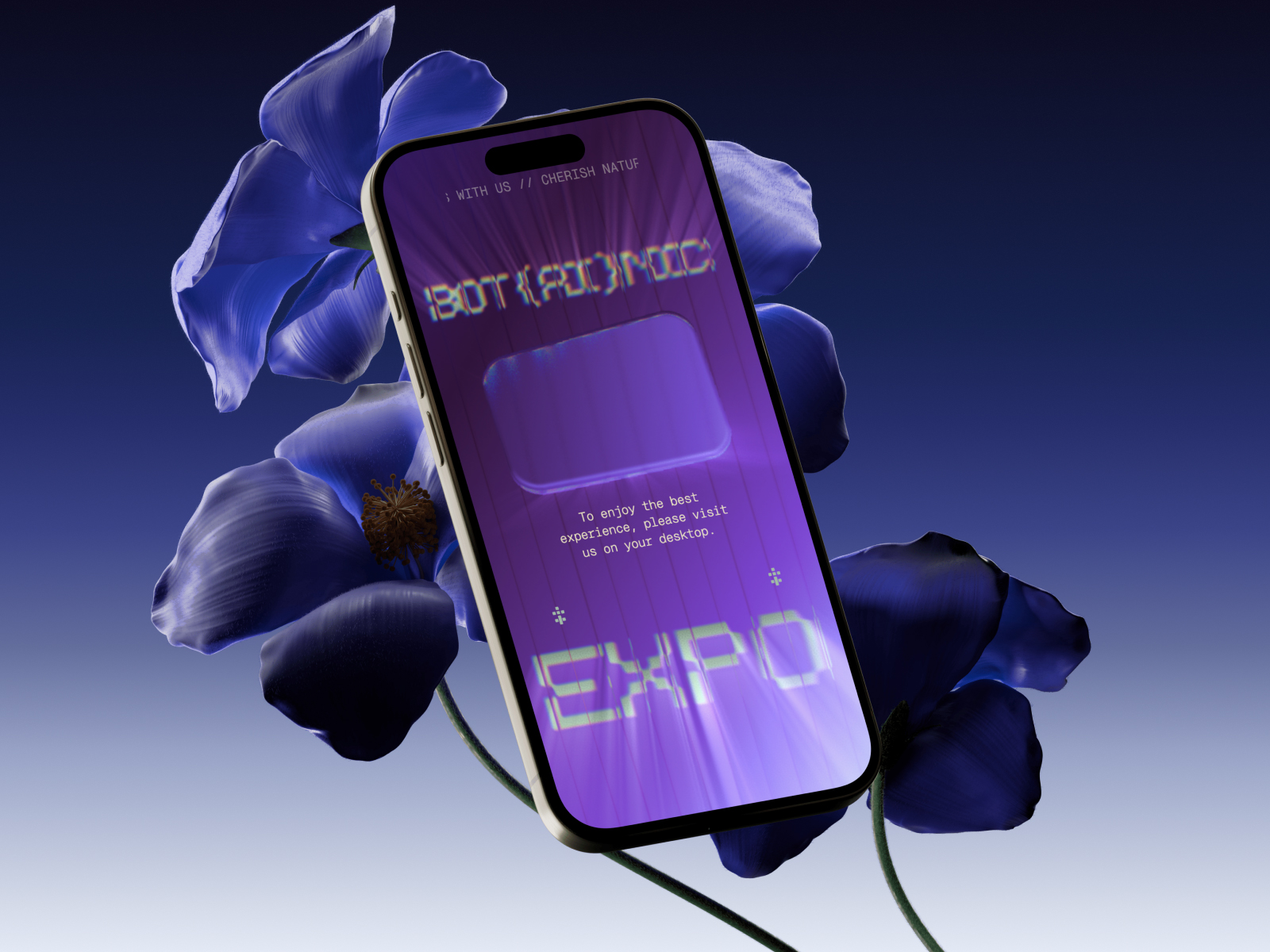
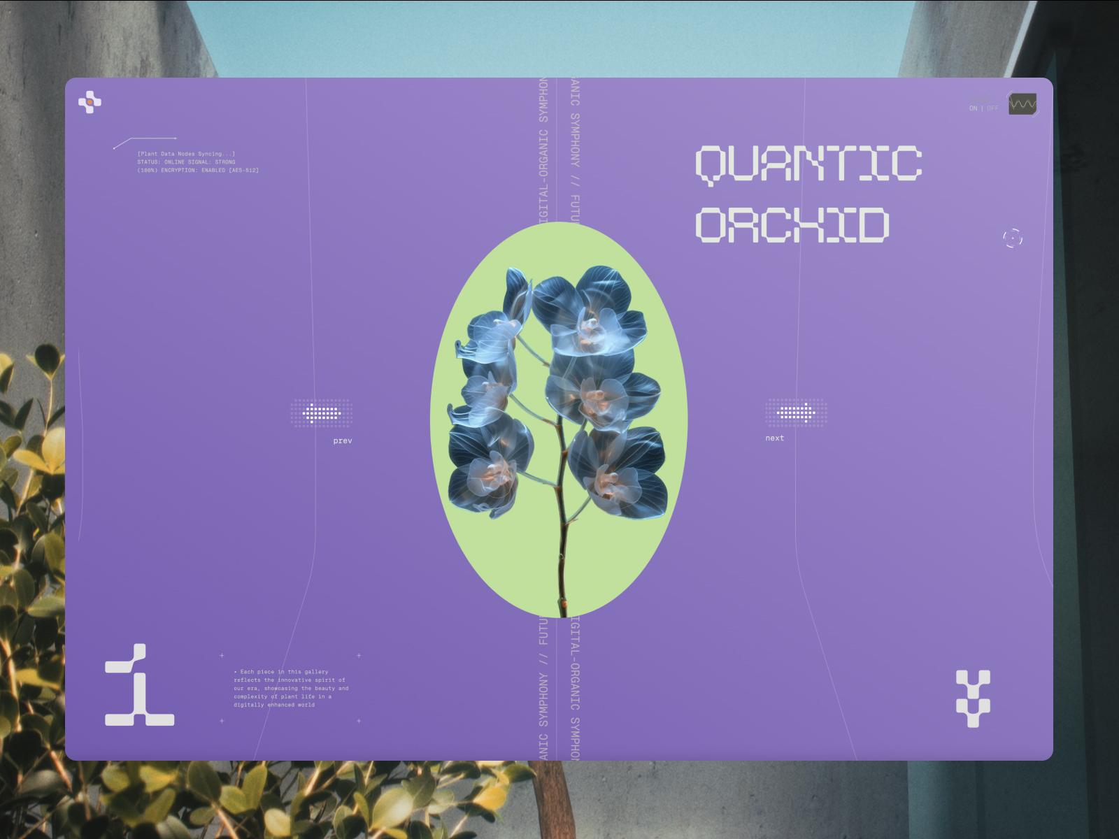
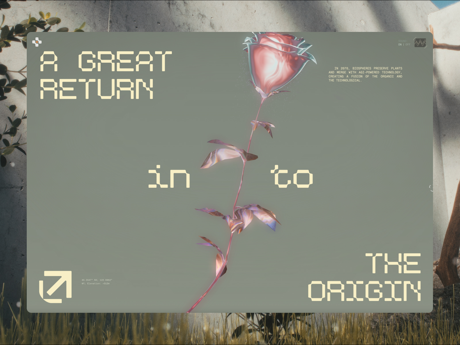
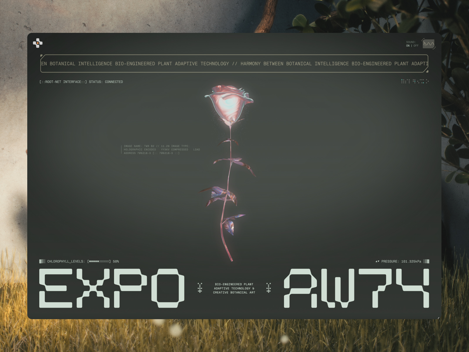
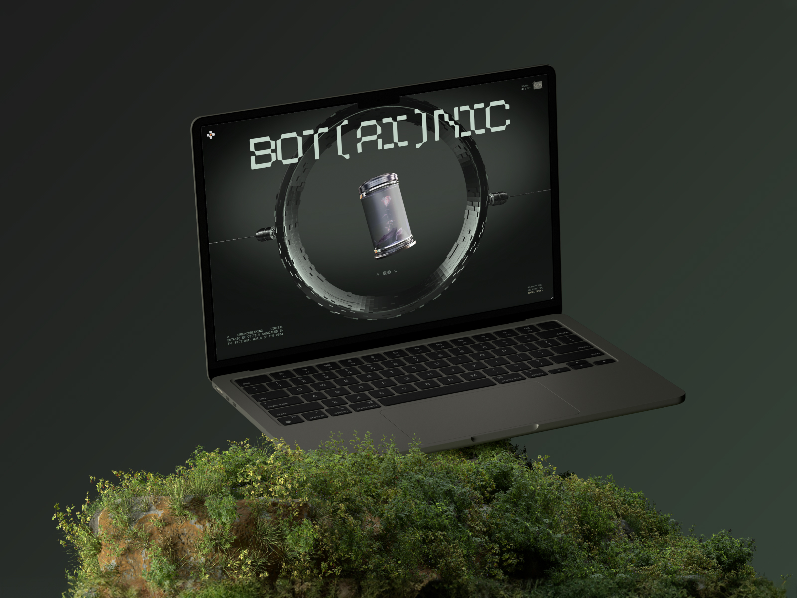
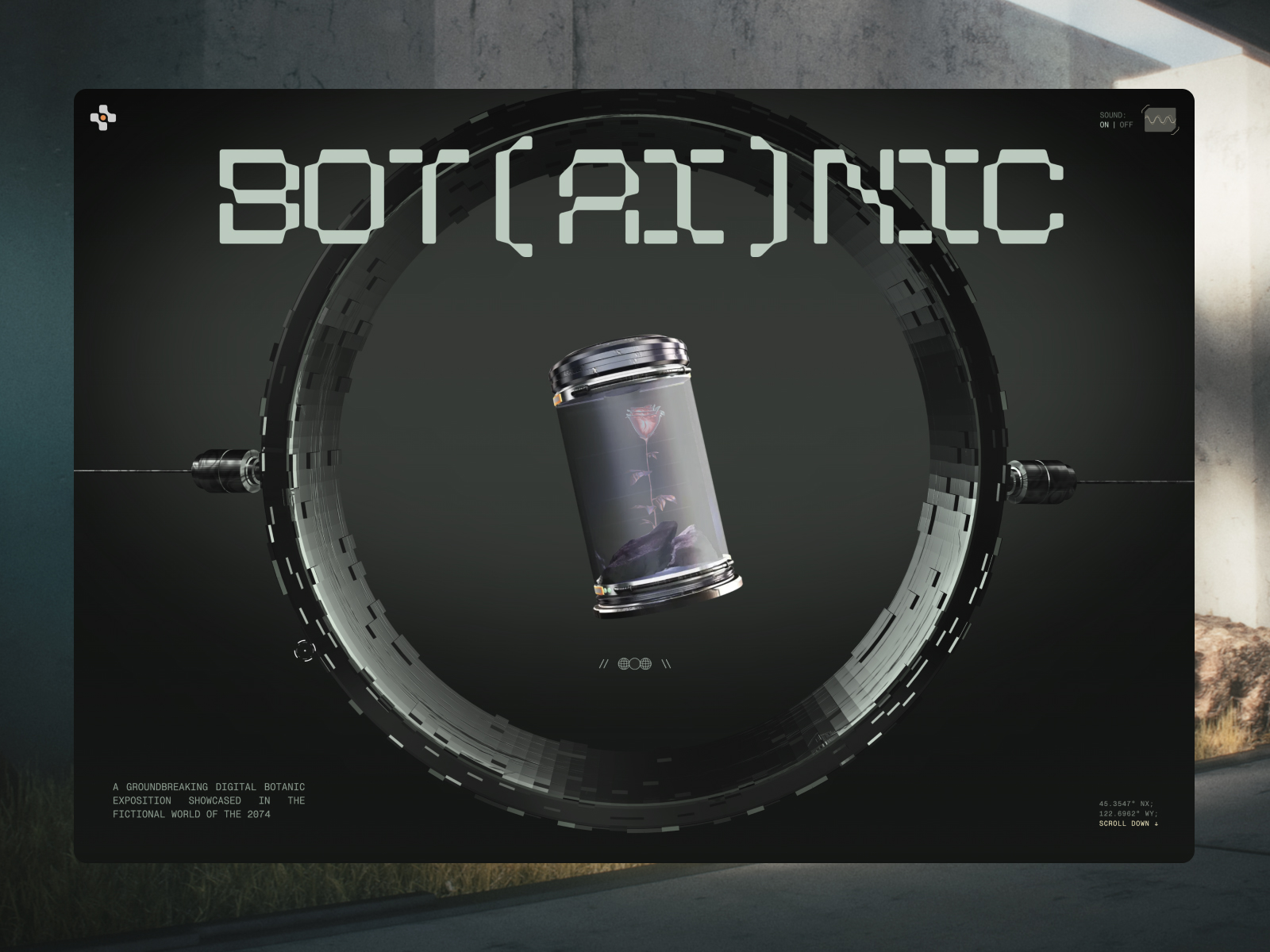
The Botanic Expo website, created by Enrico Deiana, is an innovative digital exhibition of futuristic plants that transports visitors to a fictional world set in the year 2074. This groundbreaking design combines elements of advanced technology and creativity, offering an immersive experience that challenges traditional web design conventions.
The color palette used on the site, which includes HEX #3F4E49 and HEX #CFC4A6, creates a unique atmosphere that blends nature with a modern touch. The darker color provides a rich and deep base, while the lighter tone adds brightness and contrast, contributing to the futuristic and organic aesthetic of the exhibition.
The selected typography, which includes Tiposka, Neue Montreal, and Space, brings a contemporary and experimental look to the design. These fonts, with their clean and distinctive shapes, complement the theme of the exhibition and allow for smooth reading of the content, enhancing the user experience.
The site incorporates web and interactive technologies that allow for dynamic and immersive exploration of the content. The experimental design includes unique scrolling techniques that invite visitors to dive into the narrative of the exhibition. Additionally, the integration of sound and audio in certain sections adds a sensory layer that enriches the overall experience.
One of the site’s highlights is the use of smooth transitions and 3D effects that provide a sense of depth and movement. These visual elements are not only attractive but also help guide users through the exhibition, making navigation intuitive and enjoyable.
Even creatively designed 404 error pages have been included, demonstrating a thoughtful approach to the user experience in every detail of the site.
In summary, the Botanic Expo website is a brilliant example of how digital design can merge creativity, technology, and storytelling into a unique experience. Enrico Deiana has succeeded in creating a platform that not only showcases futuristic plants but also transports visitors to an imaginary world, making this exhibition a memorable and immersive experience.
Visit site: Botanic Expo
Stewart & Partners
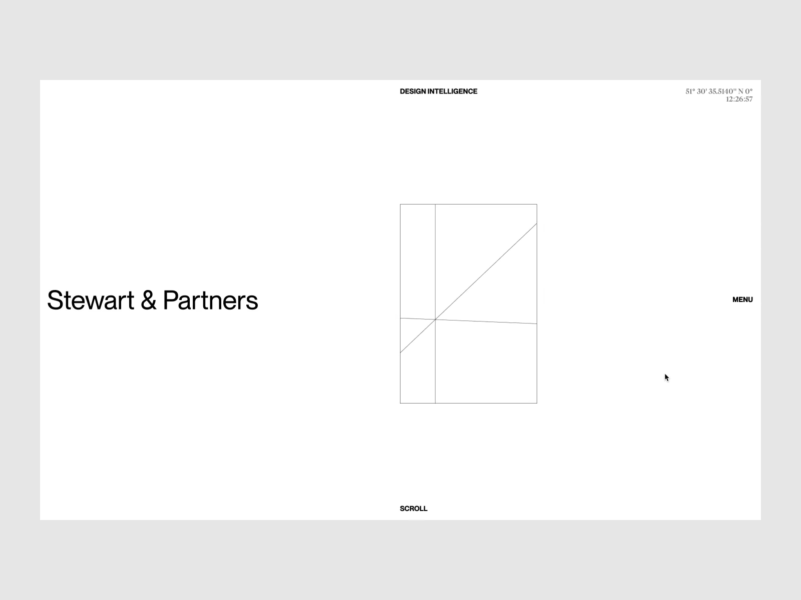
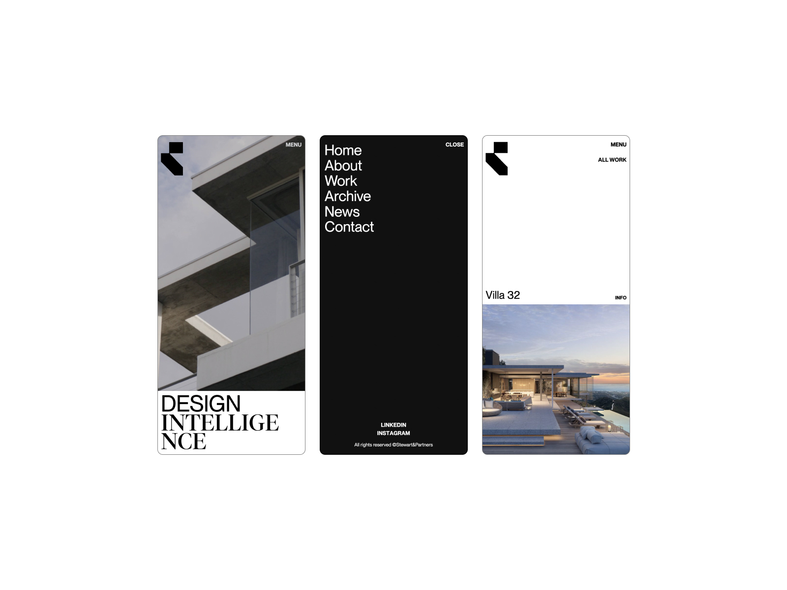
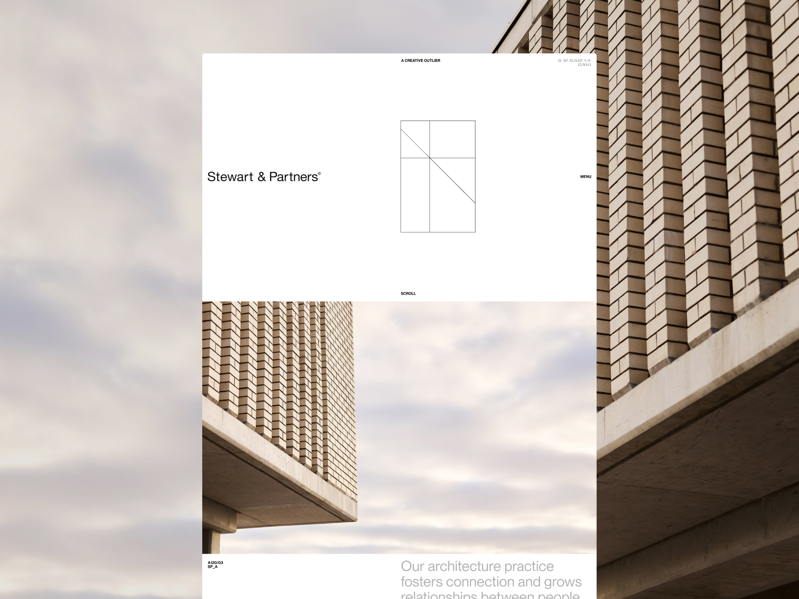
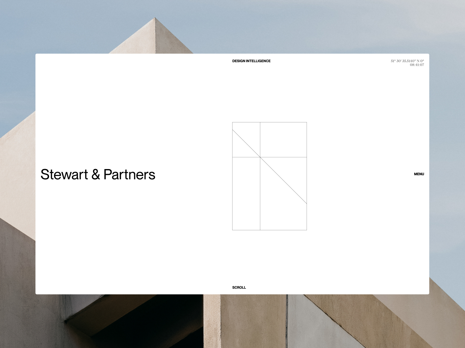
The website Stewart & Partners, created by Malvah and Geoff Dawes, represents a creative architecture studio based on collaboration and disruption, challenging the status quo of architectural design. This site not only acts as a portfolio but also as a home for the brand, presenting the studio’s philosophy and work in a clear and attractive manner.
The selected typography, Tiempos and PP, offers a timeless elegance that reinforces the studio’s professional identity. These fonts are ideal for conveying Stewart & Partners’ seriousness and commitment to excellence in architectural design, while also ensuring excellent readability throughout the site.
The color palette used includes HEX #000000 and HEX #FFFFFF, creating a strong and minimalist contrast that emphasizes the simplicity and sophistication of the design. This color scheme is not only visually appealing but also aligns with the studio’s minimalist philosophy, allowing the content and project images to take center stage.
The design is clean and flat, facilitating navigation and exploration of the portfolio. This minimalist approach ensures that visitors focus on the studio’s work without distractions, allowing the project images and descriptions to speak for themselves.
The inclusion of a minimalist design highlights the brand’s modern and professional aesthetic while facilitating a smooth and pleasant user experience. The layout of the elements is intuitive, allowing visitors to easily access information about the studio’s projects and design philosophy.
In summary, the website of Stewart & Partners is an excellent example of how a well-executed web design can effectively communicate the identity and vision of an architecture studio. With its use of elegant typography, a minimalist color palette, and a clean approach to presentation, Malvah PRO and Geoff Dawes have created a platform that is not only visually striking but also representative of the studio’s commitment to innovation and quality.
Visit site: Stewart & Partners
ZETR
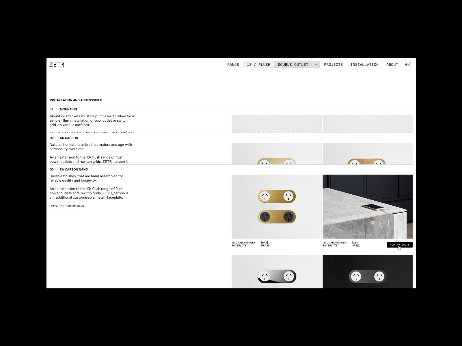
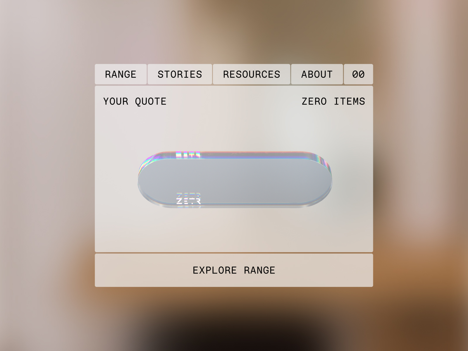
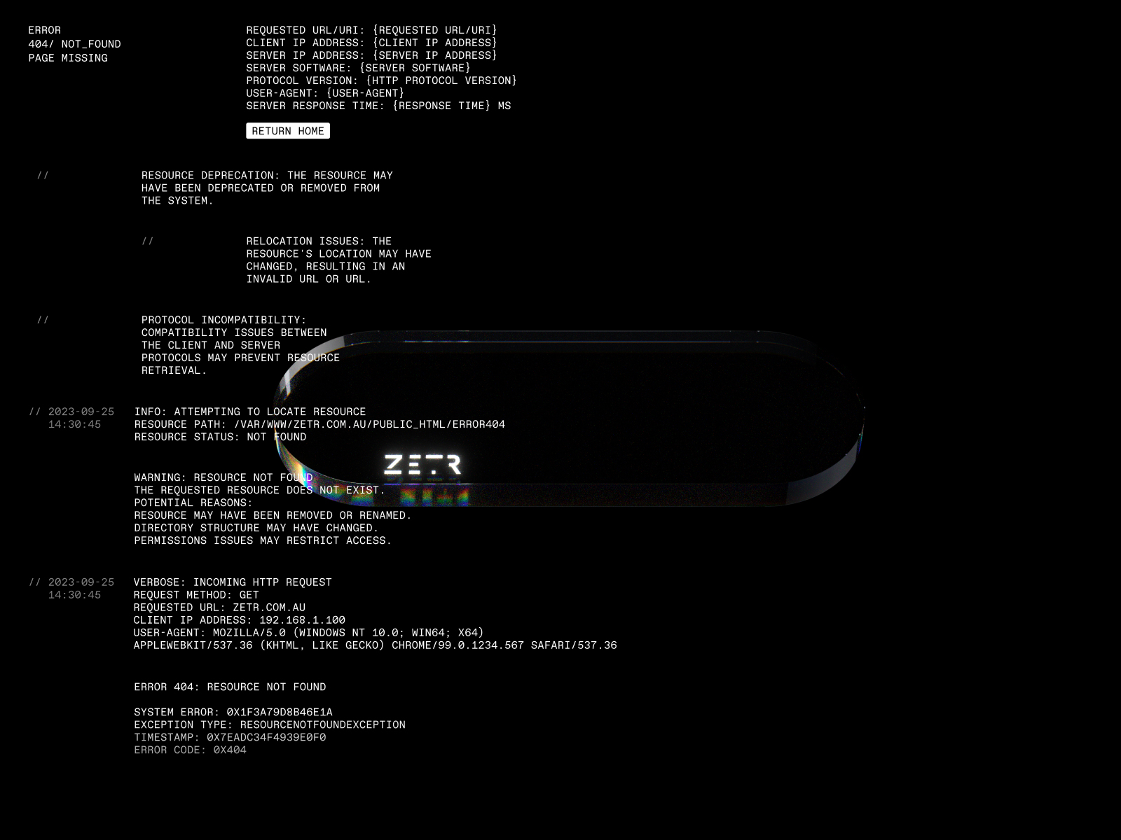
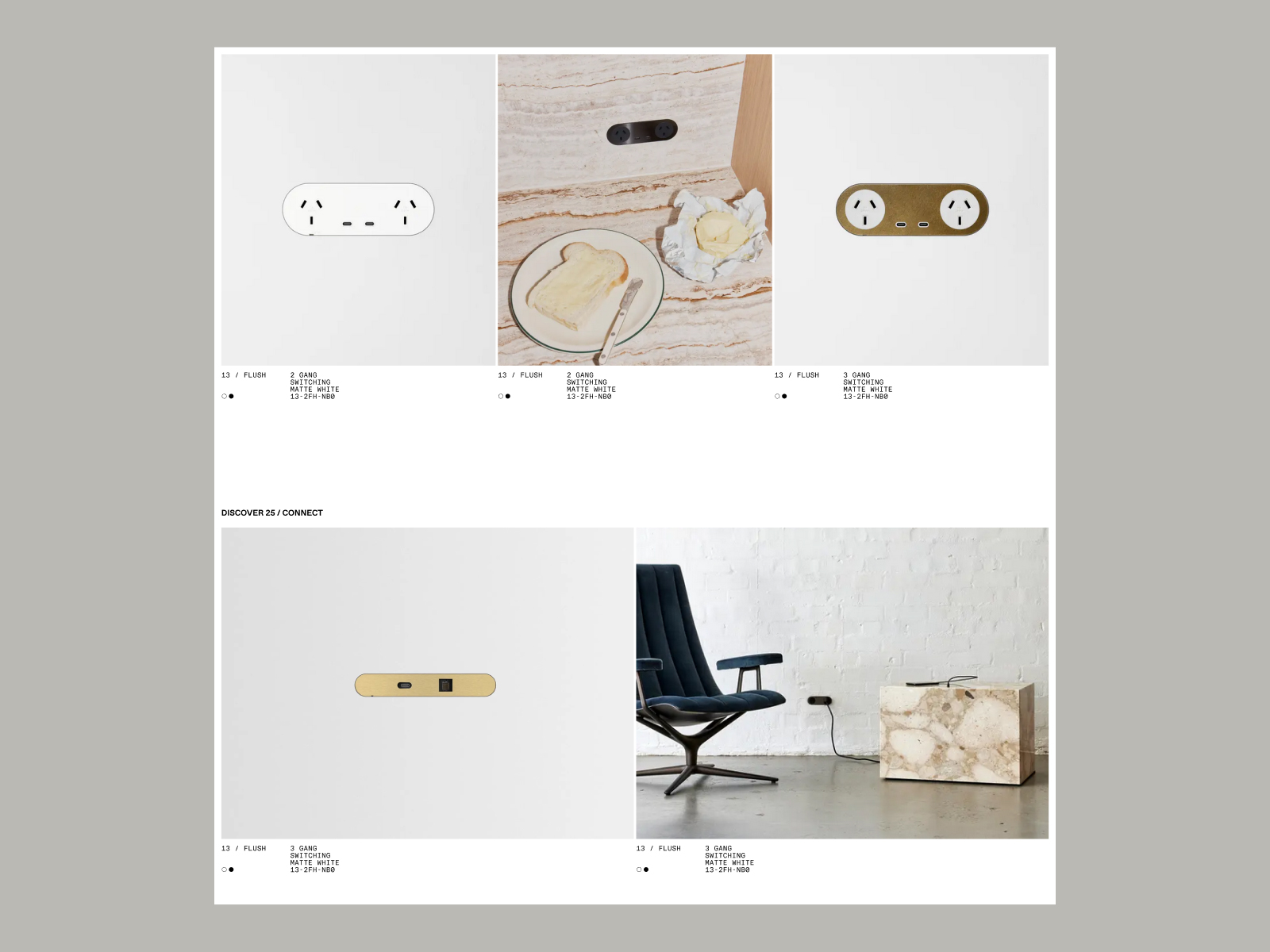
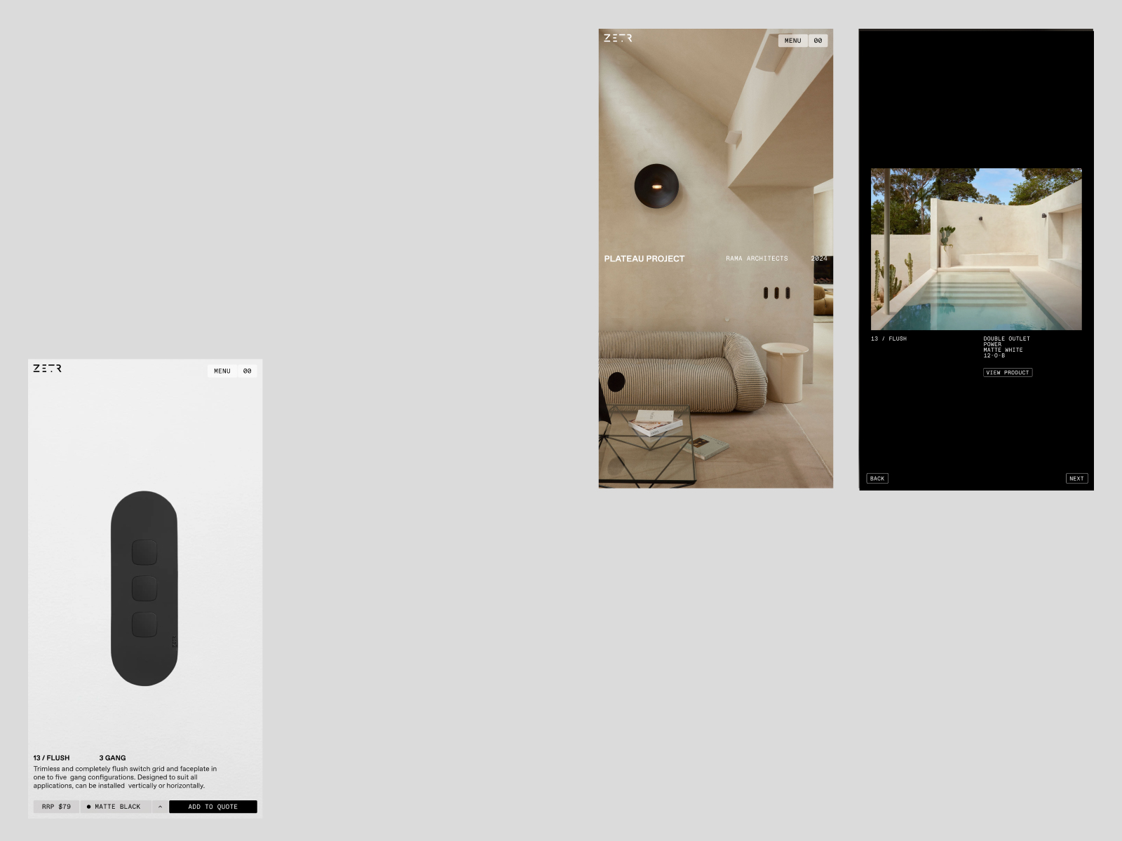
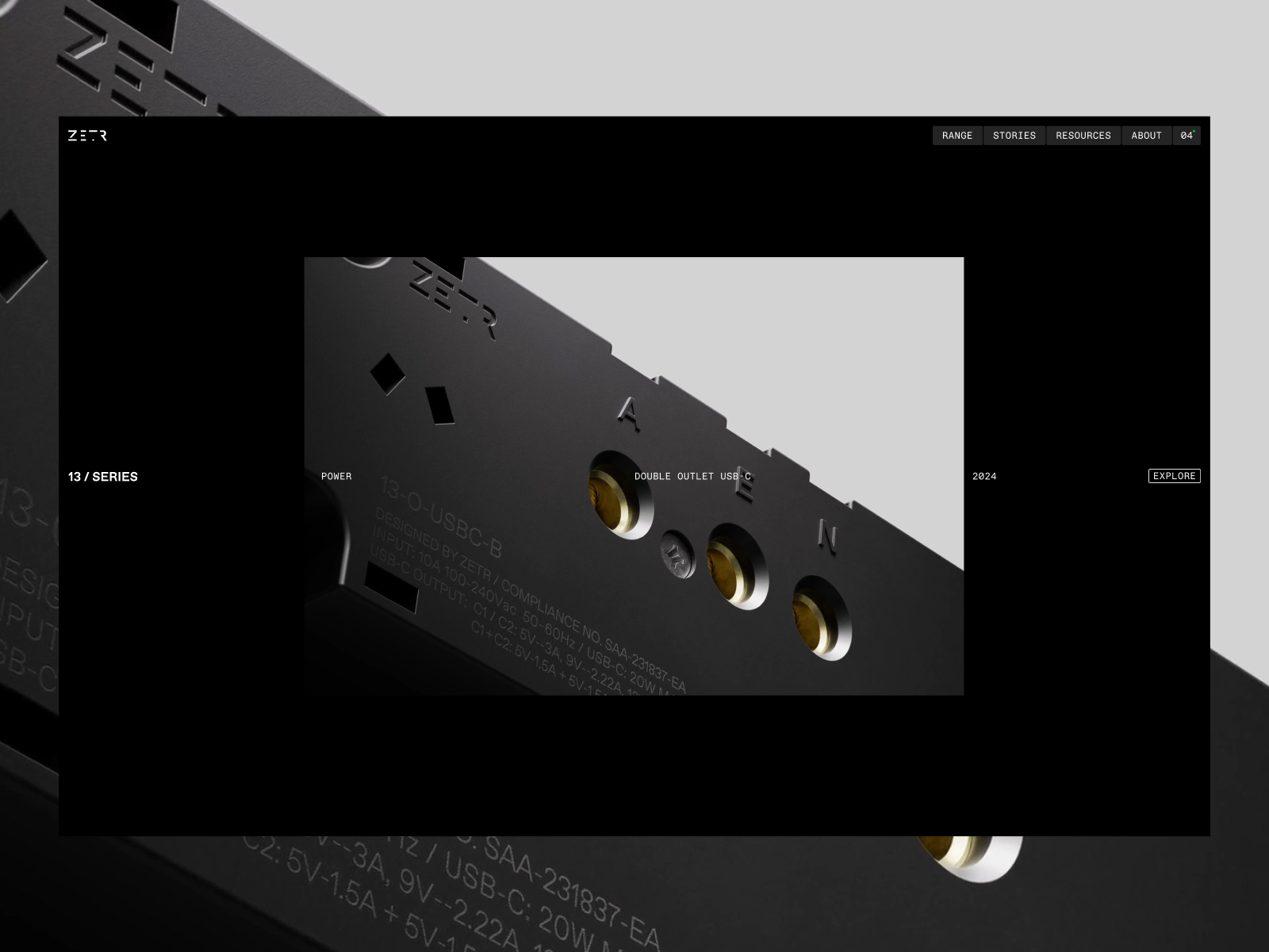
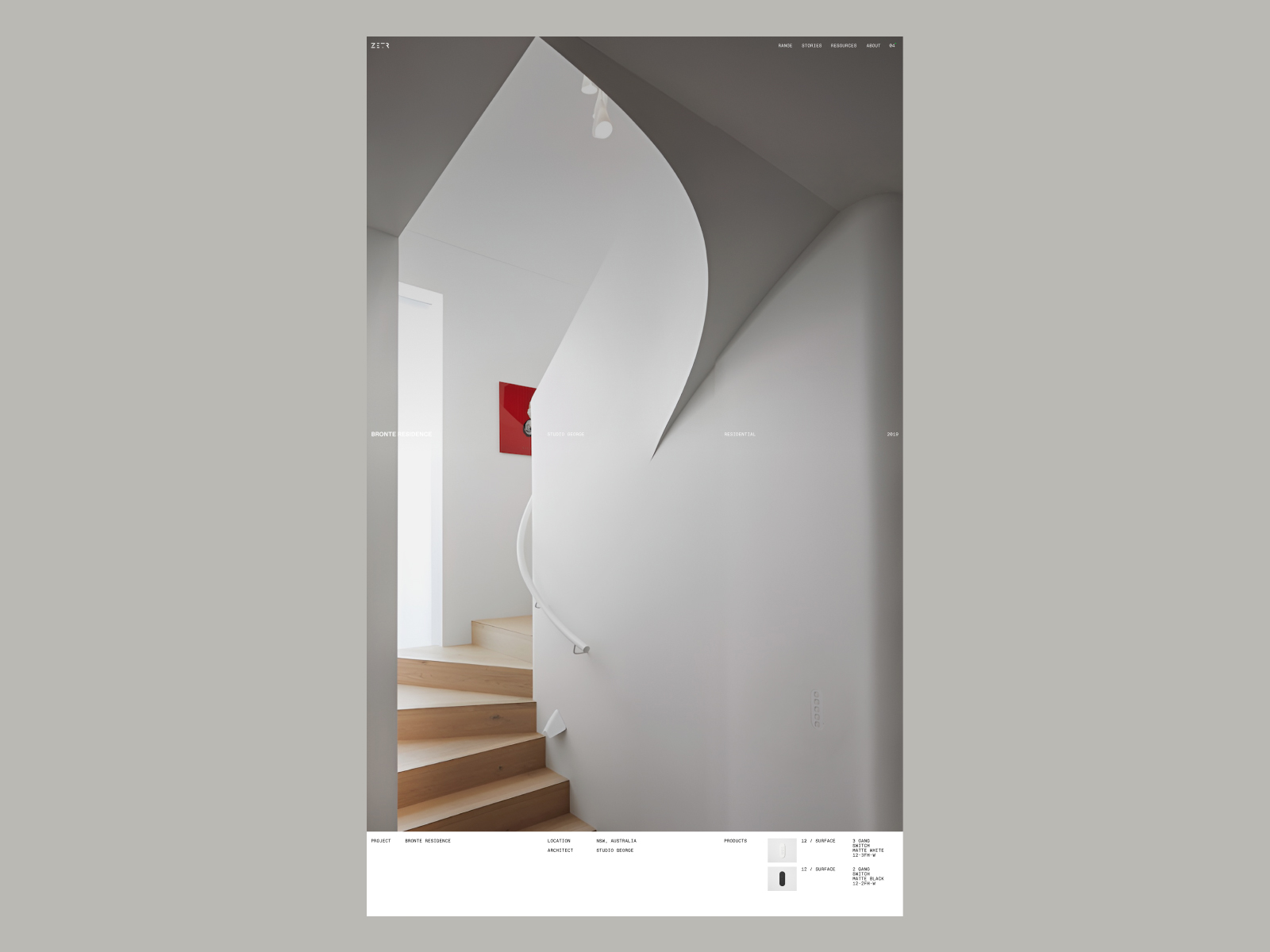
The website ZETR, developed by NIGHTJAR, represents a platform that embodies the essence of minimalist design, both in its product and its digital experience. ZETR is conceived to be the subtle detail in any room, and its website reflects this philosophy through a clean and elegant design.
The typography used on the site includes __bodyFont_f10707, __bodyFont_Fallback_f10707, __serifFont_aab3f1, and __serifFont_Fallback_aab3f1, creating a combination that favors readability and contemporary style. This typographic choice ensures that the content is presented clearly and attractively, aligning with the image of a product designed to integrate harmoniously into various environments.
The site’s color palette, which includes HEX #000 and HEX #fff, establishes a strong contrast that highlights the minimalist aesthetic. Black provides a solid and sophisticated base, while white brings brightness and clarity, allowing visual and textual elements to stand out without distractions.
The site’s design incorporates subtle animation and large background images that capture the user’s attention without overwhelming them. This combination of visual elements creates an immersive atmosphere that invites visitors to explore the content further, while the clean design and focus on UI (user interface) ensure a smooth and pleasant browsing experience.
Additionally, the site includes a carefully crafted header design that facilitates navigation and highlights the most important sections. Attention to details, such as 404 error pages, demonstrates a commitment to user experience in every aspect of the design.
In summary, the ZETR website is an outstanding example of how minimalist web design can reflect a product’s philosophy. With its effective use of typography, a contrasting color palette, and an intuitive user experience, NIGHTJAR has created a platform that is not only visually appealing but also functional and aligned with ZETR’s design principles.
Visit site: ZETR
Biological Preparations
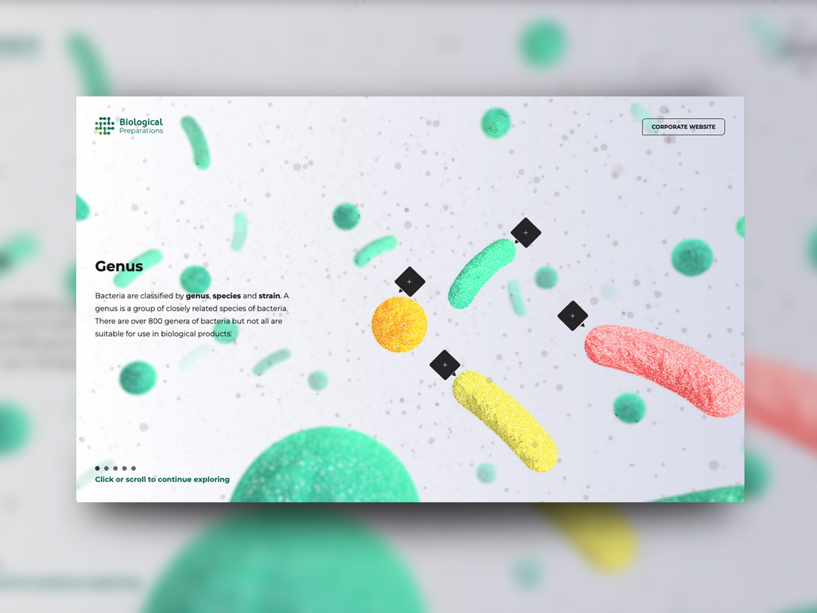
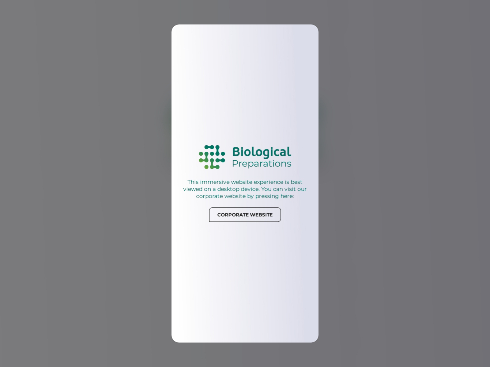
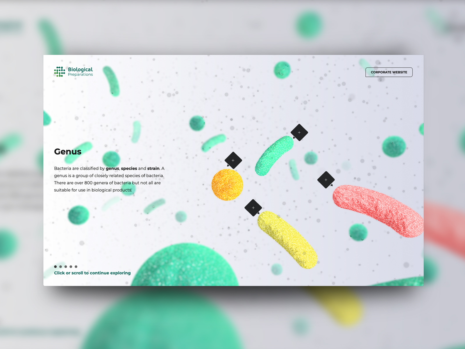
The website Biological Preparations, created by Red-Fern and OHZI Interactive Studio, offers an immersive journey to understand the science of biological technology and the global mission to replace harmful and non-renewable chemical technologies. This site stands out not only for its informative content but also for its interactive design that enriches the user experience.
The site’s color palette, which includes HEX #186F64 and HEX #0F0F10, establishes a fresh and professional atmosphere. The dark green symbolizes nature and sustainability, while the black provides an elegant background that allows visual elements to stand out. This color combination reinforces the site’s message about the importance of biological technology in a sustainable world.
The typography used, Corbel and Mont, offers a mix of clarity and modernity. These fonts are highly legible and add a contemporary touch, aligning with the site’s theme of technological and biological innovation.
The site’s design is interactive and animated, using scrolling elements that guide users through the content narrative. This storytelling technique allows information to be presented in an engaging and immersive way, making complex concepts more accessible and understandable.
Additionally, the inclusion of 3D elements enhances the visual experience, allowing visitors to explore scientific concepts in an innovative and dynamic way. The interaction design is carefully crafted, facilitating smooth navigation that keeps users engaged with the content.
In summary, the Biological Preparations website is an outstanding example of how web design can educate and inspire on topics of biological technology and sustainability. With its smart use of typography, a harmonious color palette, and an immersive interactive experience, Red-Fern and OHZI Interactive Studio have created a platform that not only informs but also motivates action towards a more sustainable future.
Visit site: Biological Preparations
KAI
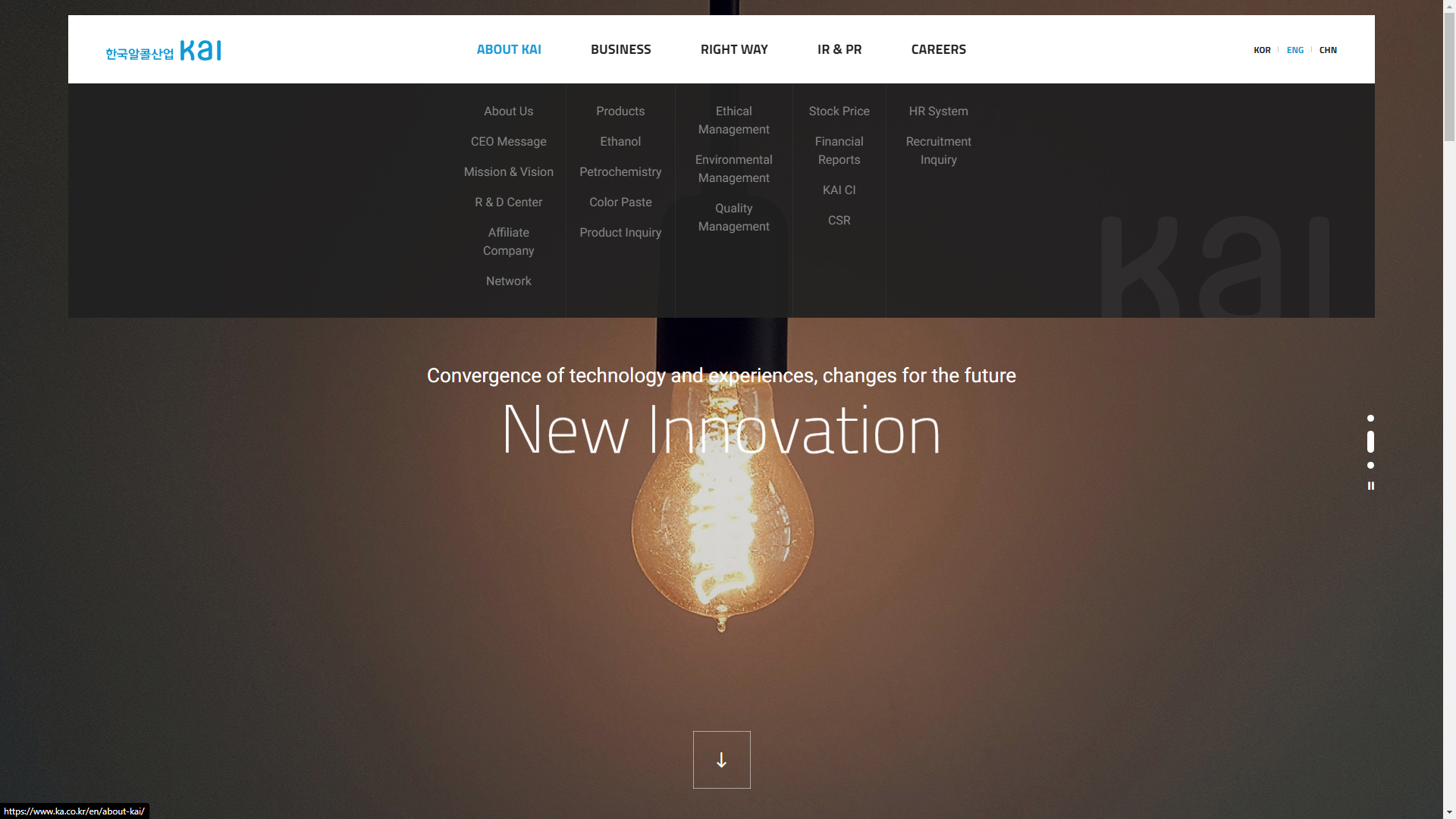
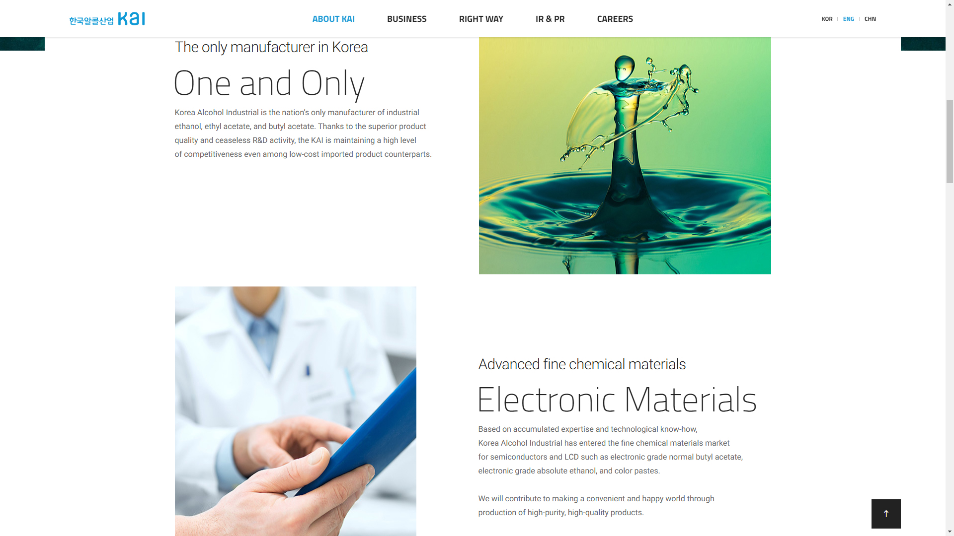
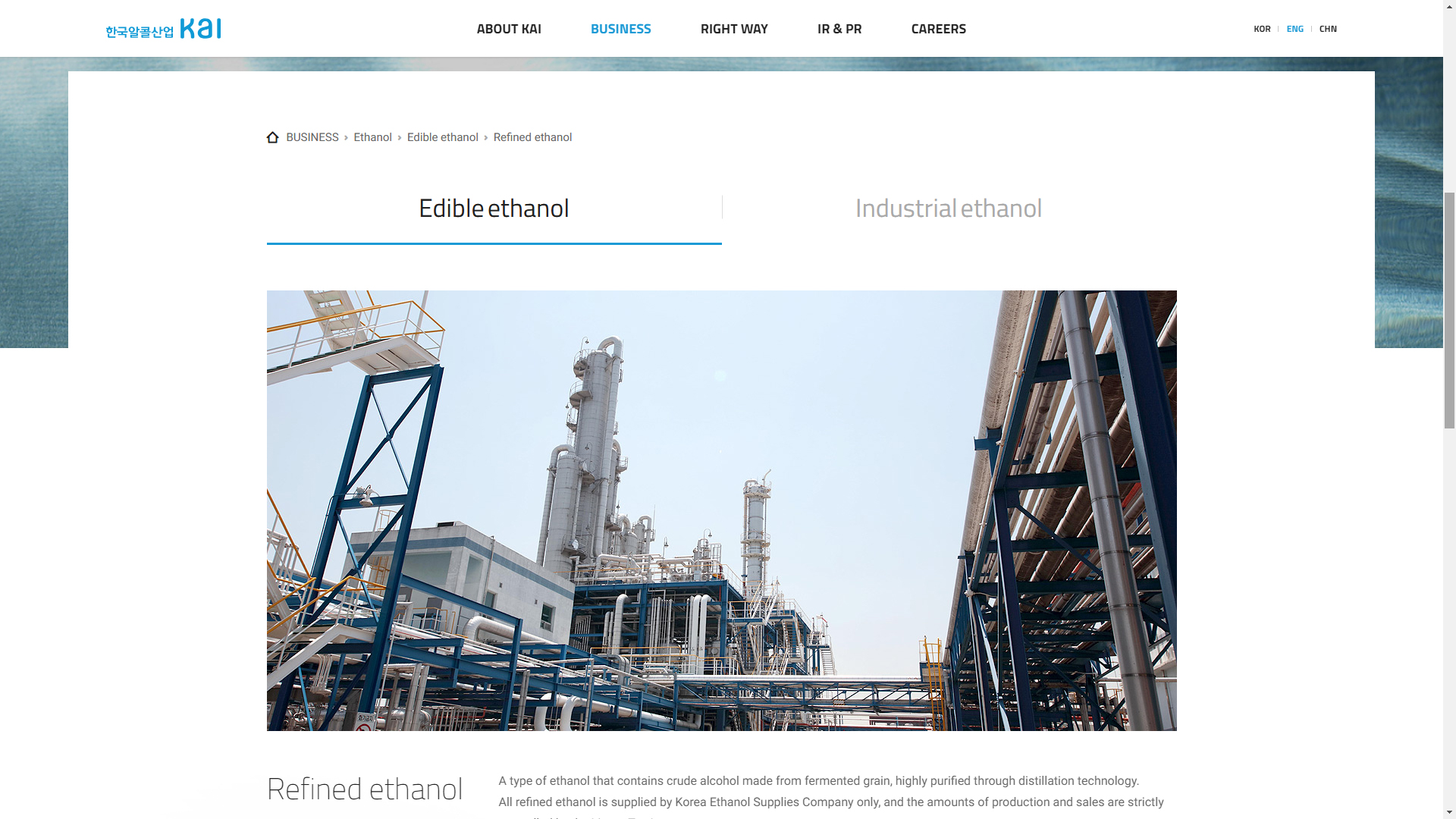
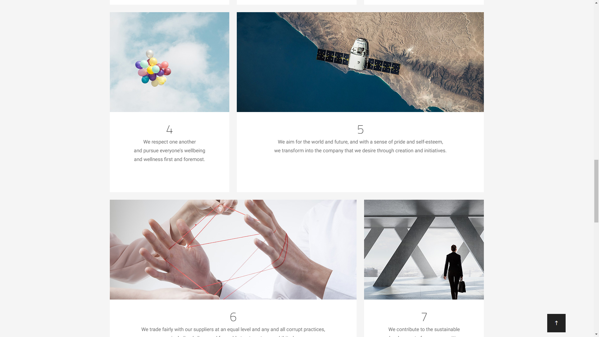
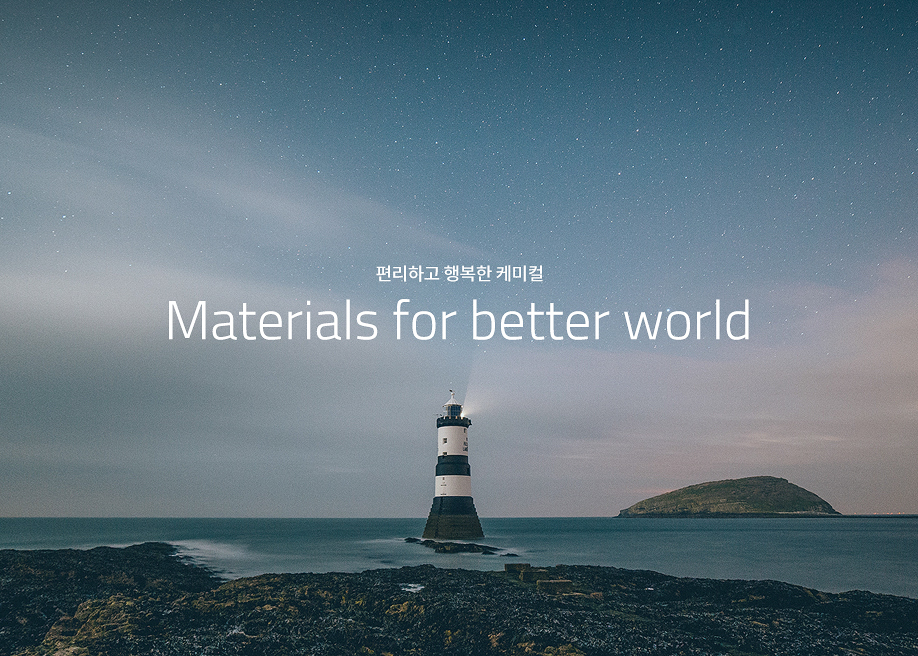
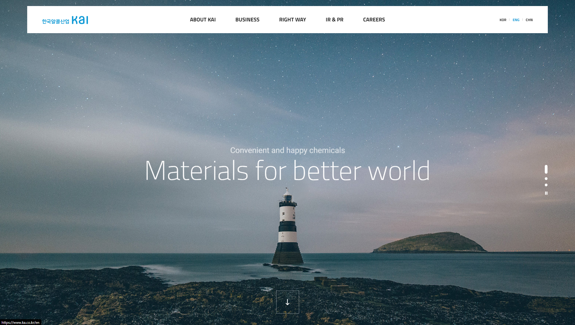
The website KAI, developed by STUDIO-JT, represents Korea Alcohol Industrial, the country’s leading chemical manufacturer. The company’s mission is to continuously grow to contribute to a more convenient and happier world, and its website reflects this philosophy through a modern and functional design.
The site’s design incorporates a parallax approach, allowing for an immersive scrolling experience. This visual effect not only enhances the site’s aesthetics but also provides a seamless narrative that guides visitors through the company’s story and values.
The site’s color palette is carefully chosen to project professionalism and trust, with tones that reinforce KAI’s image as a leader in the chemical industry. The visual elements are combined with a responsive design, ensuring that the user experience is optimal across all devices, from desktops to mobile devices.
The use of microinteractions adds a level of dynamism to the site. These small details, such as subtle animations when hovering or clicking, enhance user interaction and make navigation more intuitive and enjoyable.
The site is built using WordPress, CSS, and HTML5, ensuring a solid and flexible foundation for the site’s content and functions. This not only allows for a clean and attractive design but also facilitates future updates and adjustments.
In summary, the KAI website is a remarkable example of how effective web design can communicate a company’s values and enhance the user experience. With its use of parallax, responsive design, and microinteractions, STUDIO-JT has created a platform that not only informs but also inspires confidence in KAI’s mission to contribute to a more convenient and happier world.
Visit site: KAI
Rietveld Projects
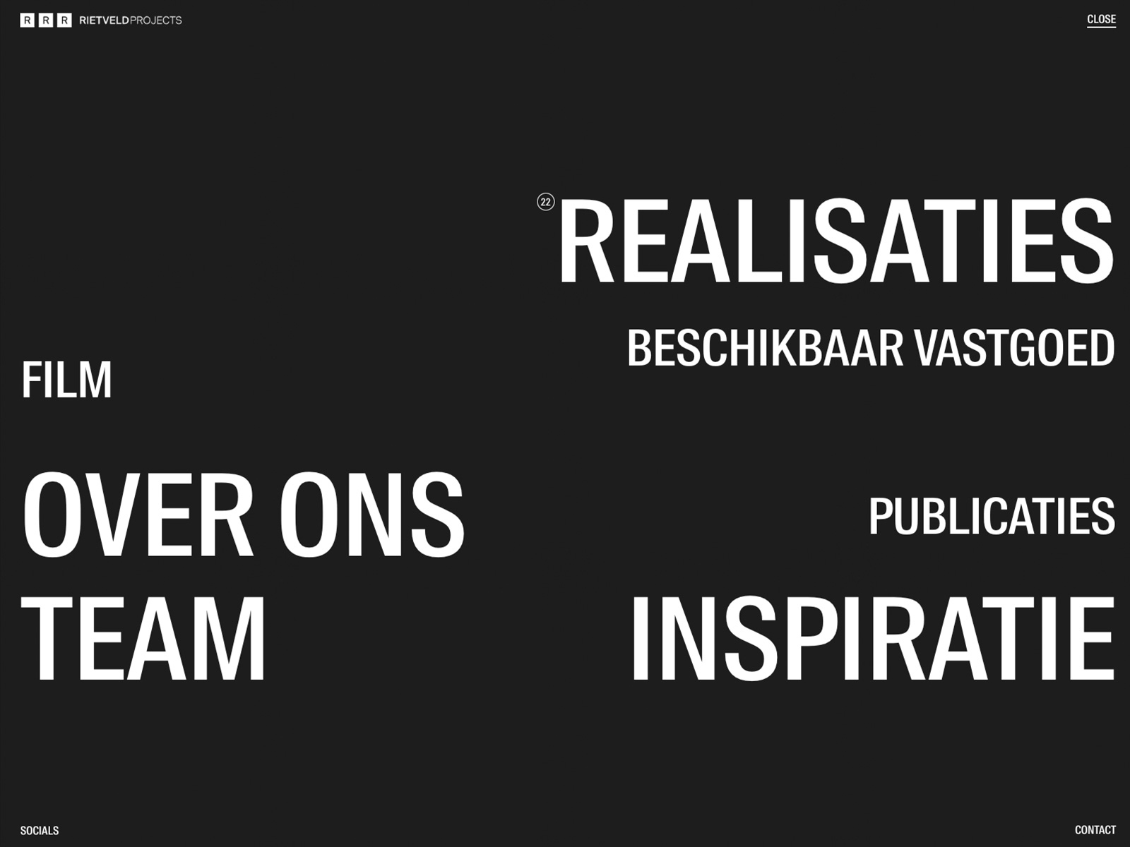
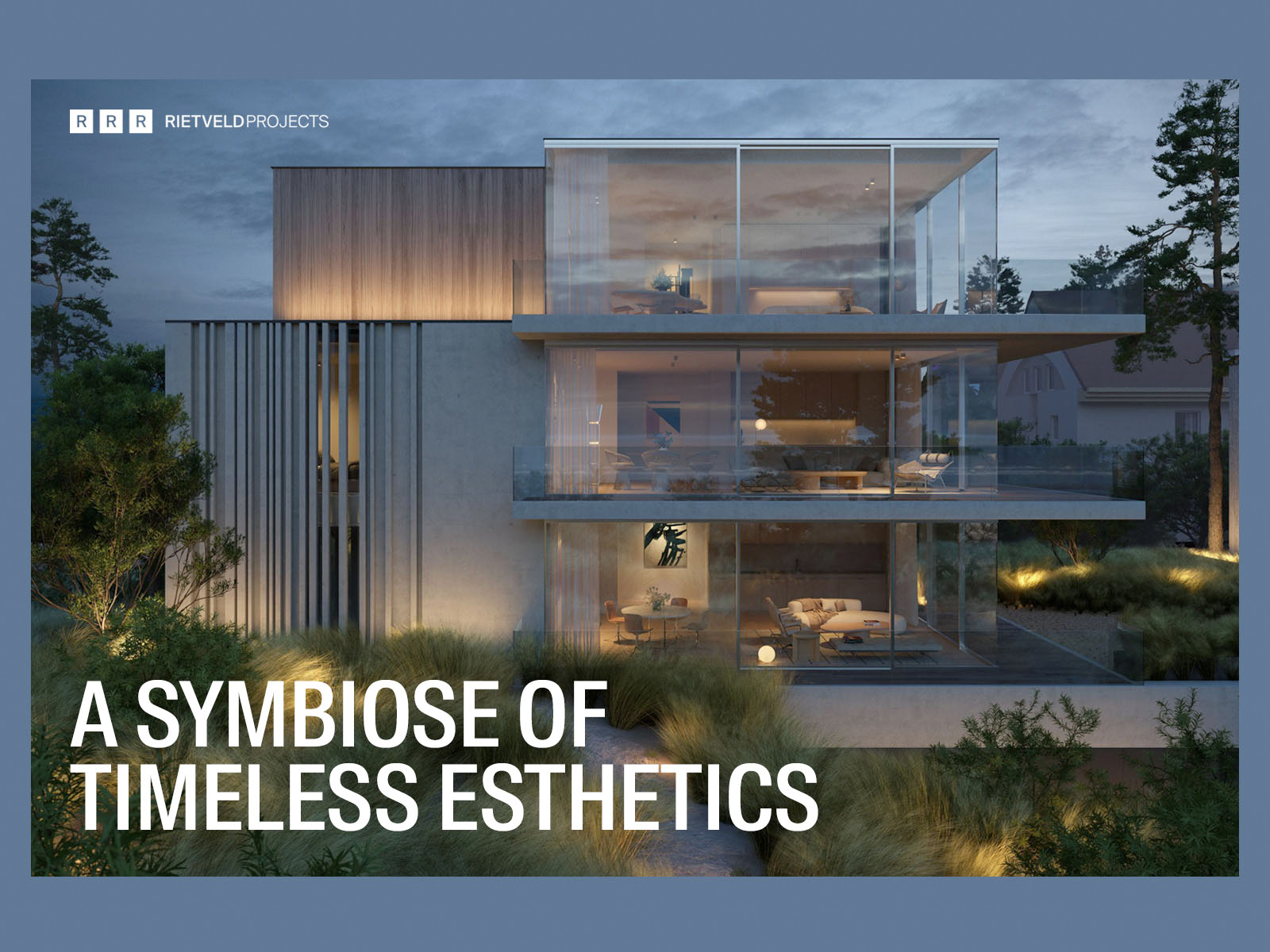
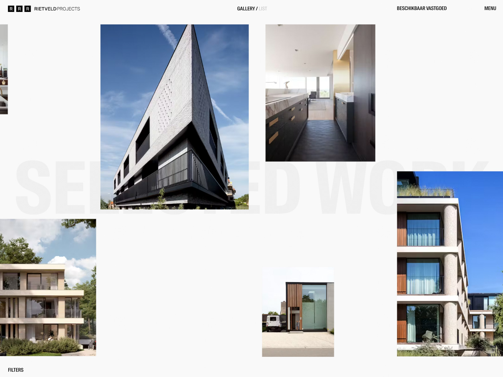
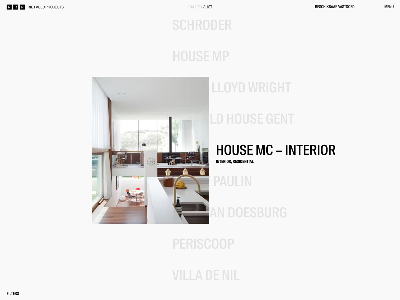
The Rietveld Projects website, created by Gewest13, is a portfolio platform representing Rietveld Projects, a hallmark of timeless architecture. This site stands out for its minimalist design and its focus on the clear and effective presentation of architectural projects.
The typography used is Suisse, a choice that brings elegance and clarity. This font is ideal for an architecture site, as it reinforces the brand’s professional and contemporary image while ensuring the content is easily readable.
The site’s color palette, which includes HEX #FFFFFF and HEX #1d1d1d, creates a strong contrast that highlights the visual elements. The pure white provides a sense of space and cleanliness, while the black adds depth and sophistication. This combination is not only visually appealing but also highlights the essence of the minimalist design that characterizes Rietveld Projects.
The site’s design is minimal and focused on navigation, making it easy for visitors to explore the portfolio intuitively. The navigation menu is designed to be clear and functional, allowing users to quickly access different sections of the site.
The smooth transitions and subtle animations enrich the user experience, providing a continuous flow as visitors navigate through the portfolio. The gallery is carefully organized to prominently display the projects, ensuring each one receives the attention it deserves.
In summary, the Rietveld Projects website is an exceptional example of how minimalist web design can effectively communicate the essence of an architecture brand. With its use of elegant typography, a contrasting color palette, and a smooth navigation experience, Gewest13 has created a platform that celebrates the timelessness and quality of architectural design.
Visit site: Rietveld Projects
Conclusions
In conclusion, the web designs of 2025 show us that creativity and innovation in the digital world have no limits. The 20 featured websites in this article have successfully combined aesthetics, functionality, and emerging technologies to create unique and memorable experiences for users.
This year we have seen how artificial intelligence is establishing itself as an essential tool in web design, enabling more personalized and dynamic interfaces. Likewise, augmented reality and virtual reality are no longer emerging trends but are becoming a standard in immersive experiences. At the same time, the focus on accessible and minimalist design remains key, but with an increasingly bold integration of vibrant colors, animations, and visual narratives.
Ultimately, web design continues to set the pace for digital evolution, and the examples we have presented are just a glimpse of the potential that awaits us in the coming years. At Code Barcelona, we are excited to continue exploring and creating quality web designs that will leave a mark on the future.
Disclaimer
All the projects presented in this article have been carried out by renowned design studios, designers, and web developers, who have been mentioned in the description of each one. The images used were obtained directly from the official pages of the creators or from sources where they have been recognized or awarded.
The purpose of this article is to inspire creatives, designers, and web design enthusiasts by offering them a window into the exceptional work being done around the world. We do not claim authorship of the mentioned projects, but rather celebrate their innovation and contributions to digital design.
- Shupatto Bags Brand Site
- AIM — AI Modernism of Kharkiv
- CPF Freiburg
- GOA Architecture
- Pharmacor
- Breaking
- Post Familiar Wine
- IDT Australia
- Accordion
- Botanic Expo
- Intrepid
- Fitonist
- Stewart & Partners
- ZETR
- Space Trash Signs
- NeoCultural Couture
- REFIRE
- Biological Preparations
- KAI
- Rietveld Projects
Related web design resources
Continue exploring our guides to the best web designs of 2026, outstanding web designs from 2025, and the main web design trends for 2026. For projects focused on conversion, see how much a landing page costs. Our web design studio in Barcelona applies these principles to custom digital projects.