Curious about the best in visual communication design? Stay with us and read on for a deep dive into three standout projects that set the benchmark for visual identity and communication design.
This week, we’re taking a more artistic turn, exploring three references that truly shine above the rest in the world of visual identity and communication.
Each project stands out for different reasons: their conceptual approach, the techniques used, communication channels, objectives, and results.
As always, I’ll use these examples to discuss the projects and share some practical tips for crafting these gems of design and creativity.
Let’s take a look at these three examples as we search for the best in visual communication design.
Interested in a similar project? Let’s talk.
Best Visual Communication Design
TED NAUKMA

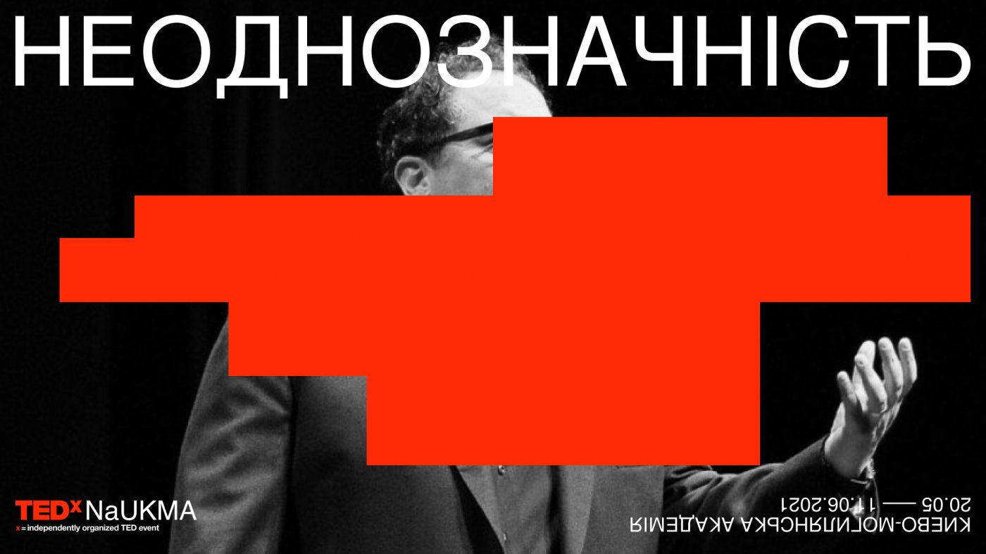
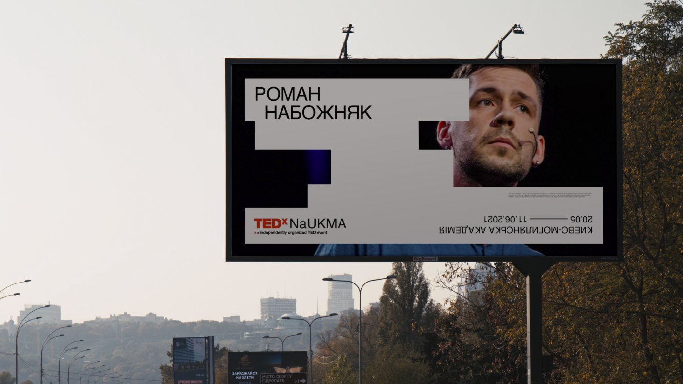
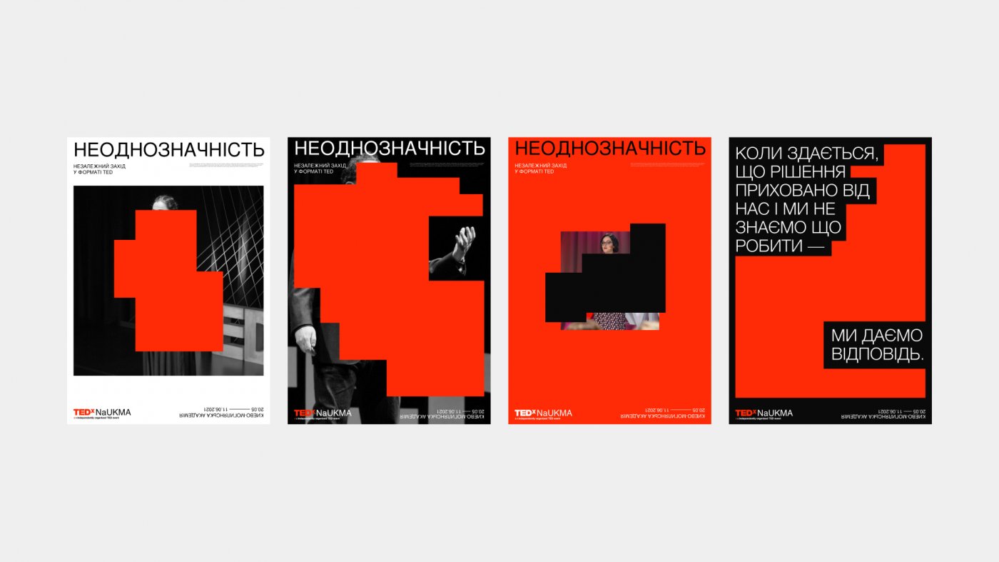
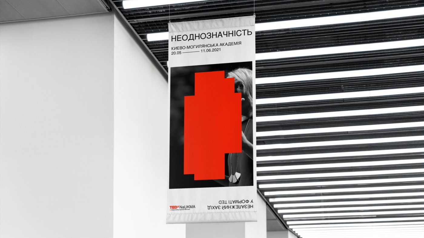
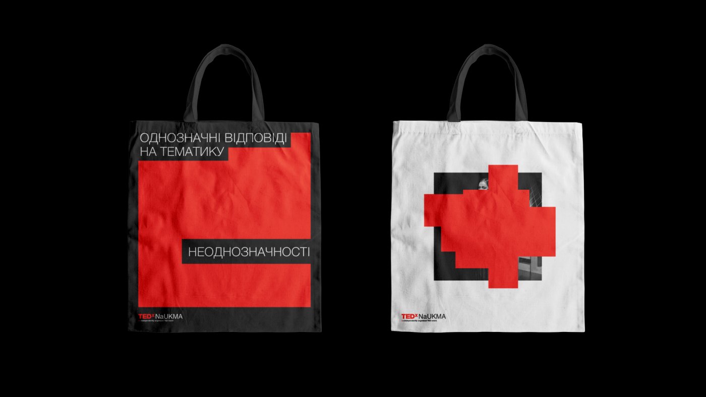
Visual communication design by Hexagon Agency
TEDx events are independently organized conferences hosted by cities and universities. This time, Ukraine hosted TEDxNaUKMA, with ambiguity as the central theme.
Hexagon, the creative design studio, was tasked with developing a visual identity that would connect this core concept to TED’s digital image.
The result is an abstract visual language, built with concise forms and inspired by the act of erasing graffiti—a process that symbolizes how erasure itself can create something new.
Tips for Creating Outstanding Visual Communication Design
When developing a visual communication identity, it’s crucial to clearly define your communication objectives from the outset.
Linking these objectives to the emotions and goals you want to achieve is essential for effective design.
Depending on the project, using abstract elements to symbolize and convey your objectives can be highly effective.
Your ability to distill ideas and express them visually is key to achieving excellence in visual communication design.
This is a major factor in creating the best visual communication design, but it’s not the only one—as we’ll see next.
Project Insights
One of the most interesting aspects is the use of overlapping elements in the visual identity.
It’s as if a paint roller is used to cover parts of the design, creating a new layer of communication for the viewer—now faced with an element that offers multiple layers of visual and temporal interpretation.
This project was awarded Bronze in the Graphic Communication category at the ADCE – Art Directors Club of Europe.
Click here to view the full project
Interested in a similar project? Let’s talk.
[superfeatured]7076[/superfeatured]
RESET
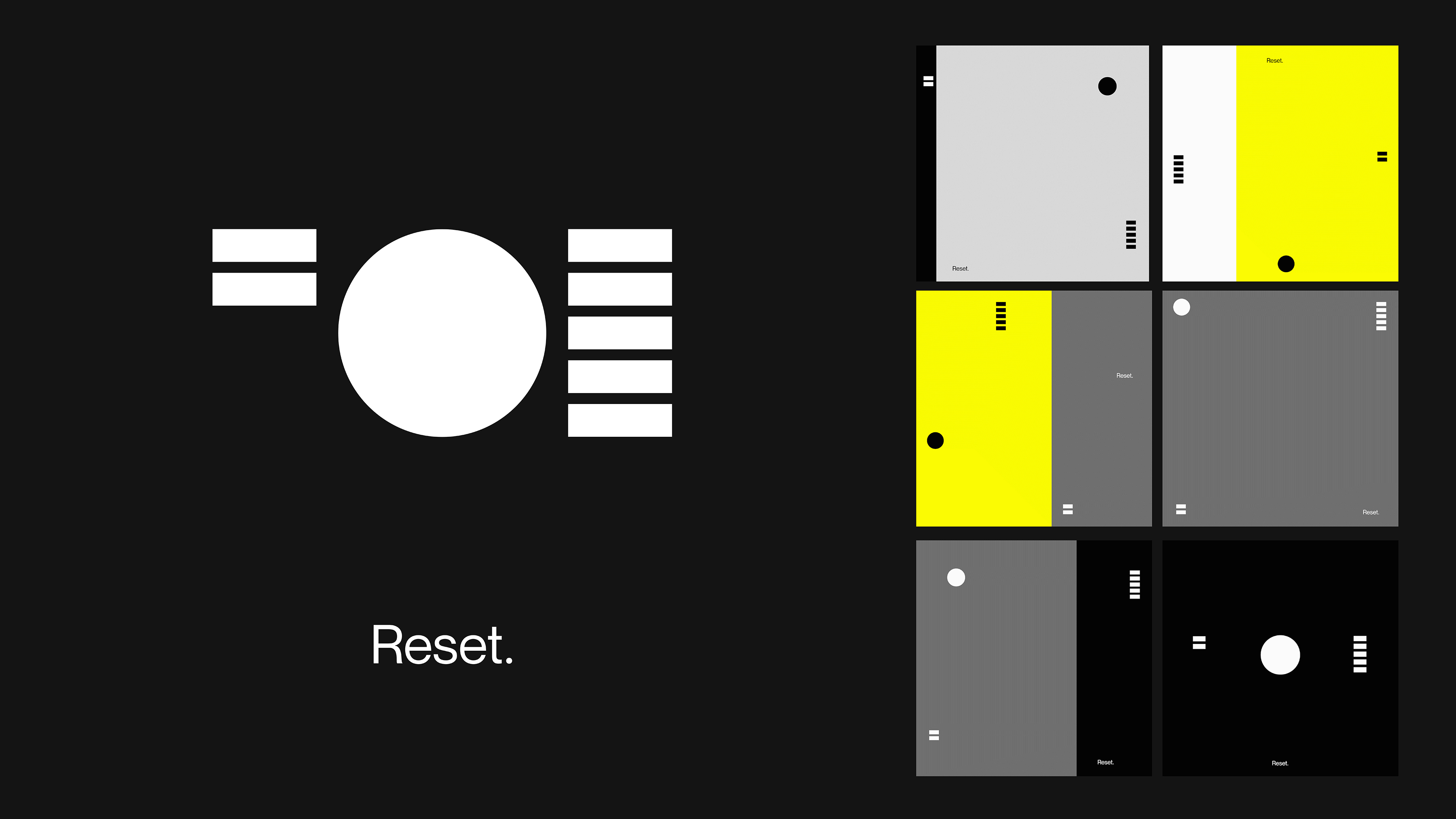
Visual communication design by OPX Studio
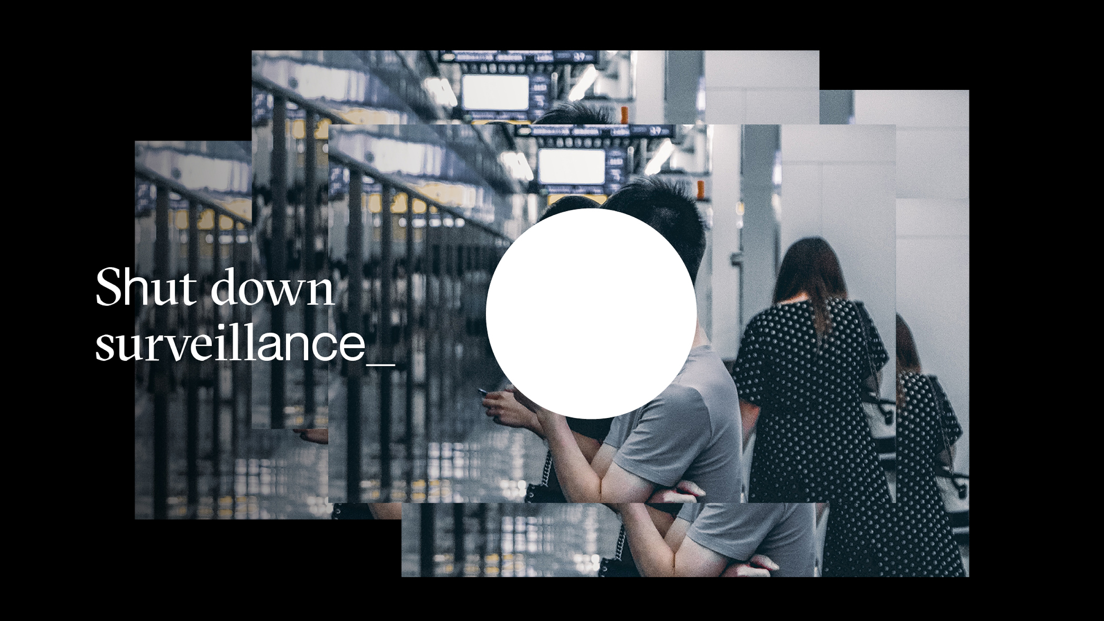
RESET is a fascinating initiative focused on programmatic work around technology and democracy. Its mission is to ensure that all companies follow rules that protect the public interest, preventing tech companies from profiting at the public’s expense by resetting the rules for online media.
Visually, the design is outstanding—from the initial concept behind the name, RESET, to the execution.
OPX Studio has crafted a visual identity with immediate impact, carefully balancing the seriousness of the issue with a sense of optimism and the confidence to do better.
The design needed to convey the urgency of an activist mindset, without framing it as a battle of ‘good vs. evil’. It had to inform the audience about the gravity of the situation without inciting fear or a sense of hopelessness.
Tips for Creating Outstanding Visual Communication Design
When working on visual communication design, it’s easy to fall back on clichés. Sometimes, we might just follow our intuition and jump straight into execution.
A good tip is not to settle for your first ideas or get swept up in the heat of the moment. Good ideas are there, but it never hurts to approach the project from different perspectives and test your concepts with other team members before moving forward.
Ideally, your creative team should include more than one person, allowing for diverse opinions and viewpoints. This is the best way to achieve top-tier visual communication design.
Project Insights
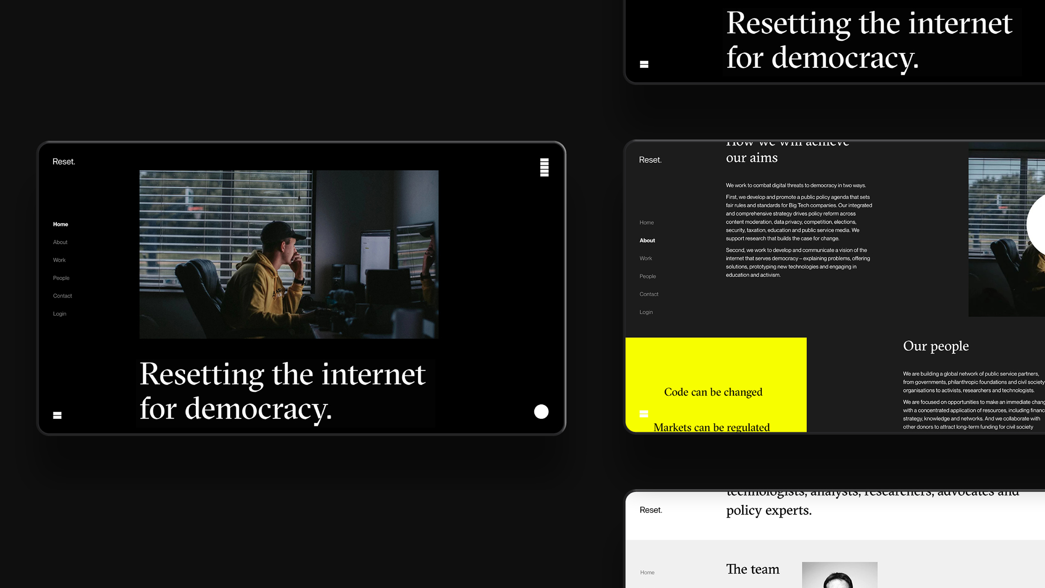
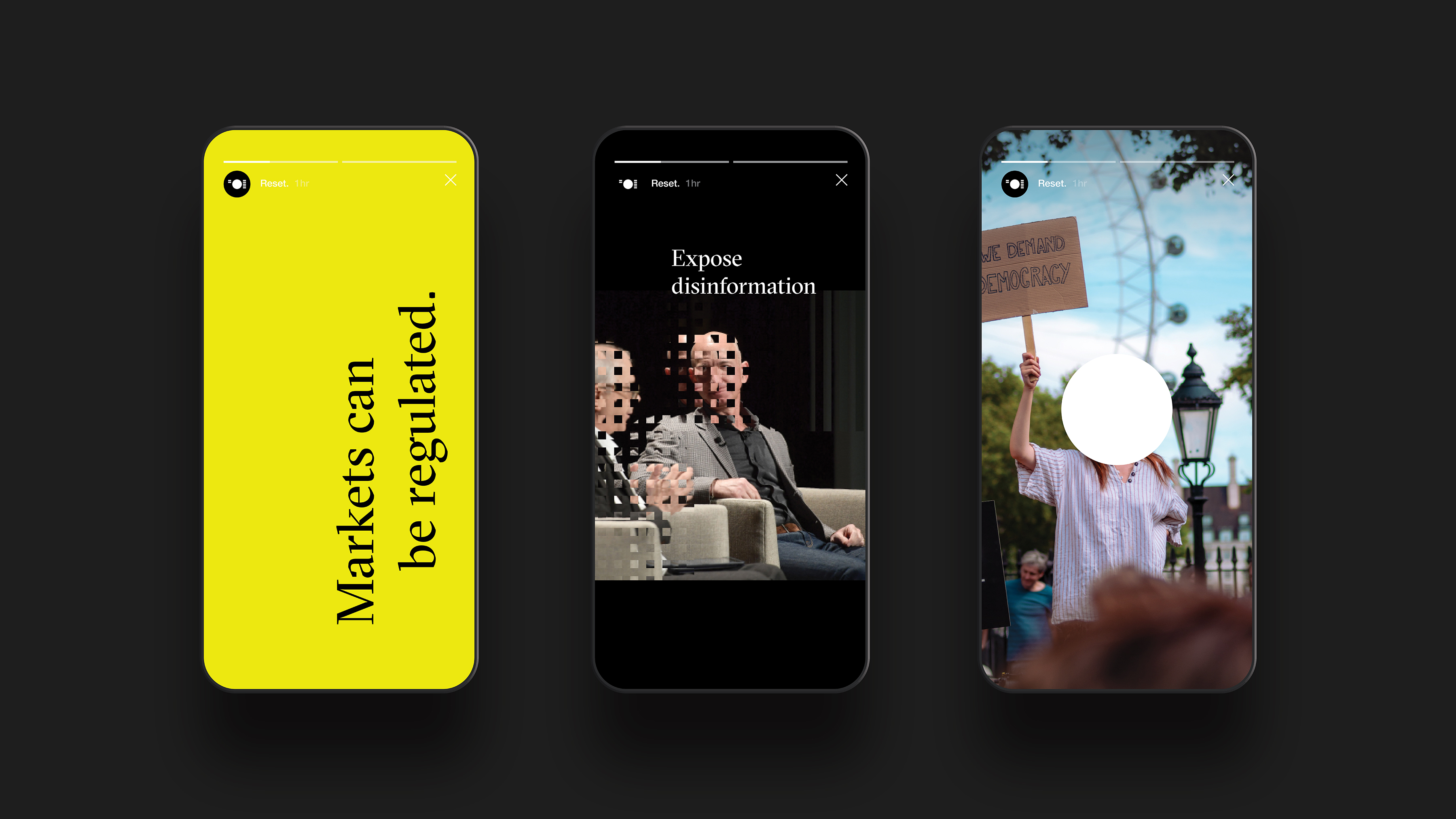
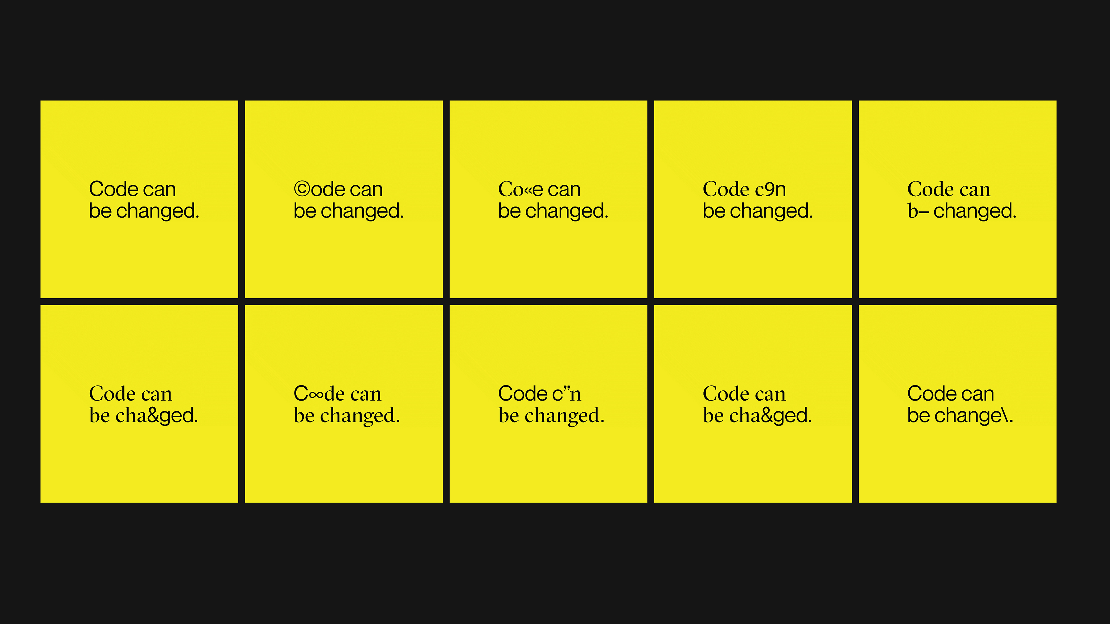
The design centers on the visual metaphor of a shield, with a white dot representing protection for the identities of those beneath it. At the same time, it alludes to the perspective of big tech companies and their attempt to reduce every customer to a mere data point. The text is intentionally rigid, with direct and commanding messages, while some images are distorted to suggest misinformation.
A complete reset
The name was chosen not only for its technological relevance, but also for the sense of returning to the beginning and starting anew. This is important because the organization is not anti-Internet. Reset recognizes that the Internet was originally created as a force for democratization. It’s not inherently bad, but urgently needs to return to its founding principles. The main icon also references the idea of resetting: its elements symbolize the digits 205—the Internet error code indicating content must be reset.
Part of Reset’s mission is to protect online privacy, so the organization intentionally collects only minimal data.
Click here to view the full project
Interested in a similar project? Let’s talk.
[superfeatured]7076[/superfeatured]
STILLEBEN STILL-LADEN
Visual communication design by Carosello Lab
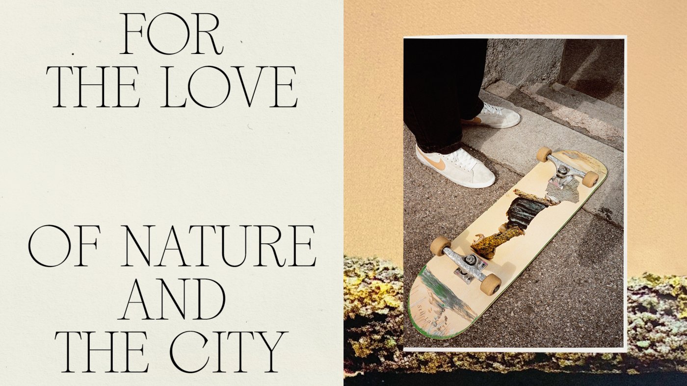
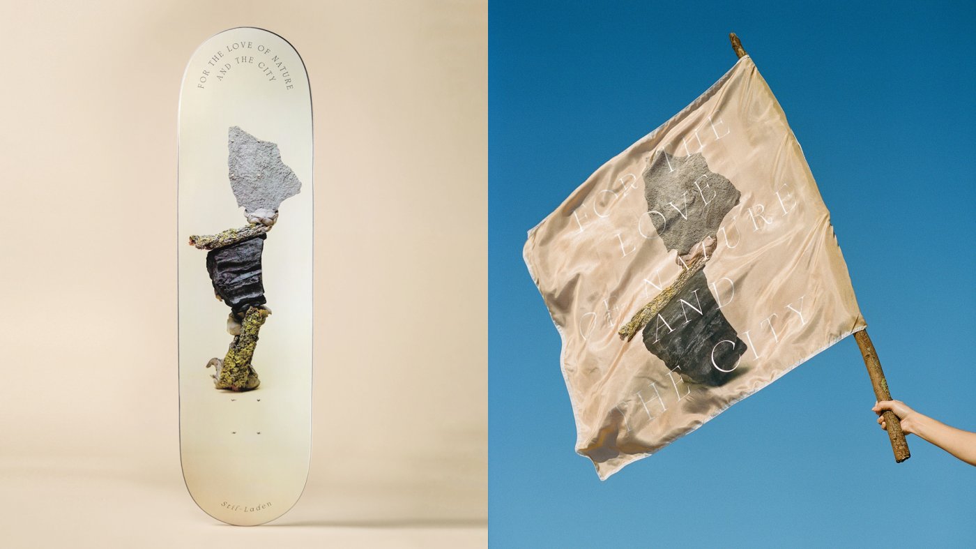
Stil-Laden is one of Vienna’s oldest skate shops, constantly reinventing itself since it first opened.
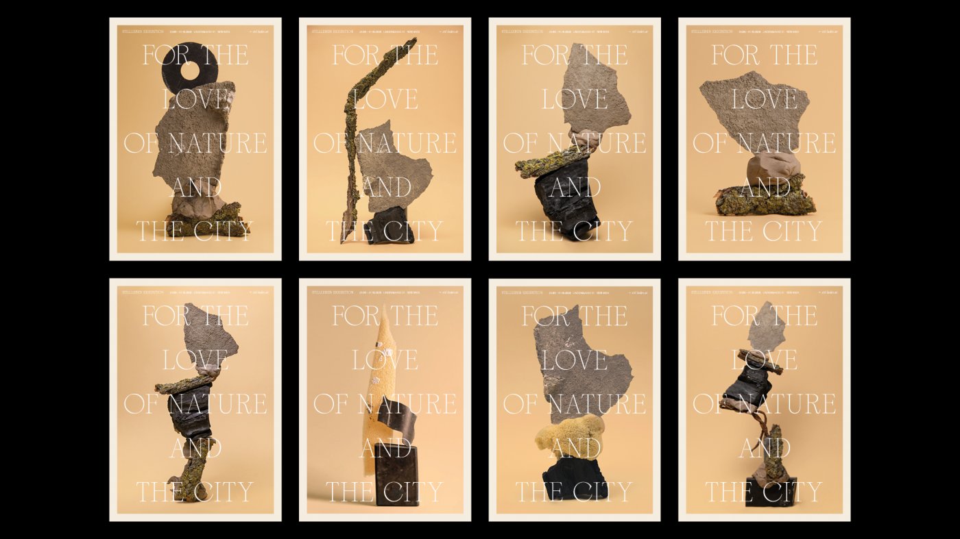
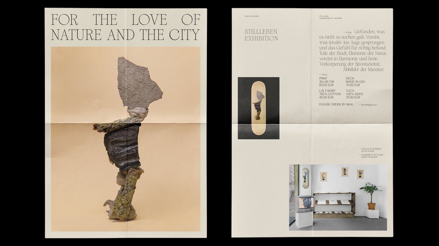
In 2020, a new store was launched, focusing on outdoor apparel. The motto “For the love of nature and the city” captures the values of both locations.
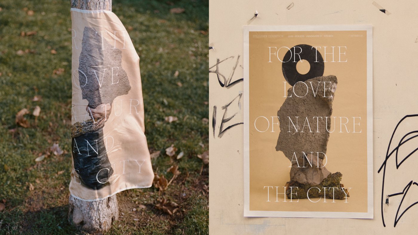
The harmony between city and nature is explored through still life photography, featuring a carefully curated collection of objects found in both urban and forest settings. A micro-campaign brought this concept to life.
Pairing raw, pure still lifes with delicate typography highlights the contrast and draws attention to the symbiotic relationship between city and nature. The atmospheric arrangements were developed using analog techniques.
Tips for Creating Outstanding Visual Communication Design
Finally, another key tip for visual communication design is to make the most of a variety of creative techniques.
Technical skill is a definite asset, but combining different creative approaches to meet real communication and outcome needs is what elevates your work to the next level.
Project Insights
This project won the ACDE – Member Club Gold Award for Graphic Communication.
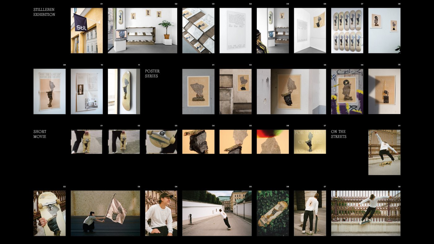
“STILL LIFE” is a call to reflect on our ecological footprint. The intersection of art and street culture was made tangible through an exhibition and on social media.
The campaign included wild poster placements in the city center. The exhibition featured a short film, fine art prints, silk scarves, t-shirts, and skateboards.
Click here to view the full project
Interested in a similar project? Let’s talk.
[superfeatured]7076[/superfeatured]
Our Conclusions
Now that we’ve explored these three examples of the best in visual communication design, it’s time to wrap up.
Personally, I found these three references exceptional in both concept and execution. It’s vital to understand the importance of visual communication for any business, product, or service entering the market. These elements are our silent ambassadors, speaking for us and our work even when we’re not present.
All references are properly credited. Code Barcelona is neither the owner nor the creator of any of these projects.