Some food brands try to look appetizing. Then there’s La Revoltosa, bursting onto the scene like a freshly opened soda: bold red, loud, visually effervescent, and unapologetically theatrical. Its website is built on a simple idea: if the product has character, the digital experience can’t behave like a timid catalog.
What makes it work is that everything plays by the same rules. Color, typography, bottle, illustration, motion, and copy all move in the same visual direction. There’s no separation between branding and UX/UI—the interface is part of the brand identity. For a beverage brand, that changes everything: the product stops being “just another option” and starts to carve out its own space in your visual memory.
As a source of inspiration for food and beverage web design, La Revoltosa stands out because it goes beyond a striking first impression. It has visual rhythm, purposeful composition, and subtle interactions that make browsing feel more like flipping through an editorial piece than scrolling a product sheet.
La Revoltosa — a hero section with editorial flair
The first impact is pure red. A rich, dominant, almost theatrical red. Against this backdrop, the tilted bottle takes center stage—not just as a product, but as a character. The oversized, bold white typography delivers a brand phrase you read in a flash and can’t forget: “La burbuja ibérica.”
The composition feels part poster, part blown-up packaging, part magazine cover. It doesn’t try to explain everything up front. Instead, it sets the mood, establishes the tone, and makes it clear this drink isn’t here to blend in. For food brands, that choice is more powerful than it seems: when the shelf is crowded with lookalikes, a distinctive visual direction helps sell before the user even dives into product details.
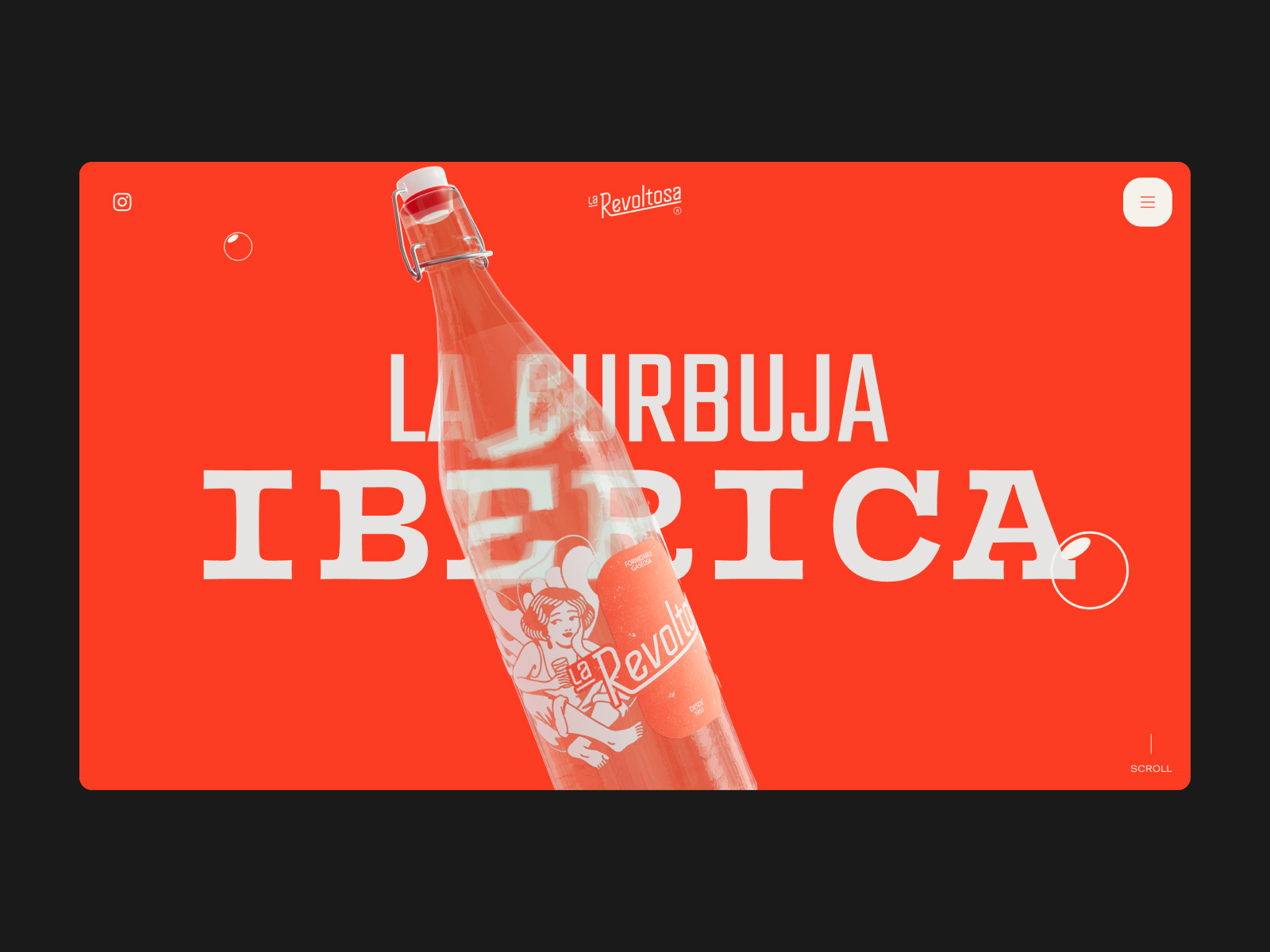
The hero section isn’t just about size. It plays with the tension between the real product and illustration. The bottle brings substance, label, and flavor; the illustrated character adds its own world. This mix keeps the site from feeling like a generic beverage landing page and brings it closer to a living brand campaign.
Bubbles and depth on entry
Motion adds a layer of enjoyment without disrupting the flow. The bubbles, depth, and movement reinforce the fizzy feel of the drink, but also set a playful tone. Here, animation isn’t just tacked on—it’s born from the product’s own promise.
Product and scroll with cinematic flair
Typographic scale gives the experience its rhythm. Not everything behaves like a standard interface. Some sections feel like campaign headlines—a great cue for any brand with strong packaging: your website can extend the product’s visual universe, not just display it in a neat grid.
La Revoltosa — motion, menu, and catalog with spark
An expressive identity lives or dies in the details. If the menu, view changes, or product cards were flat, the whole experience would fall flat. La Revoltosa keeps the energy up with consistent motion: bubbly transitions, purposeful state changes, and navigation that speaks the same visual language as the hero section.
Menu with brand continuity
The menu doesn’t feel like a functional interruption. It’s part of the same system: red, logo, bubbles, transitions. That continuity strengthens the sense of a well-crafted brand and makes navigation feel seamless. For users, moving through the site doesn’t mean leaving the visual universe; it’s just a scene change.
View changes with interface rhythm
Switching between views has that extra touch that separates a functional interface from one with personality. Not every interaction needs to be a spectacle, but the moments where users make choices deserve attention. A well-animated view change brings clarity, makes exploration more enjoyable, and reinforces the site’s quality.
Playful product cards
In the catalog, hover isn’t just a cue that something’s clickable—it’s a small visual reward. That gesture changes how users engage: instead of just “browsing products,” they play with them. And when the product has such a strong identity, that interaction sparks desire without heavy-handed sales messaging.
3D bottle as the star
The 3D interaction works because the packaging has presence. The bottle isn’t just inventory—it’s an object of desire. For food and beverage ecommerce, this matters: a good product page sells information, but great visual direction sells craving. If the product can spin, breathe, and take up space, its perceived value rises.
Illustration and scroll as storytelling
Illustration is key to keeping the experience from becoming just “product on a red background.” It brings humor, approachability, and a popular touch that matches the brand’s voice. The brand speaks as if it’s at the table with you, and the visuals match that easygoing spirit.
La Revoltosa — mobile finish with brand echo
The mobile version keeps the brand’s character without sacrificing clarity. The contact form opens with a direct, almost conversational question: “What brings you here?” It doesn’t sound like a formality—it feels like a natural way to start a conversation. That tone lowers friction and makes getting in touch feel like an extension of the brand’s personality.
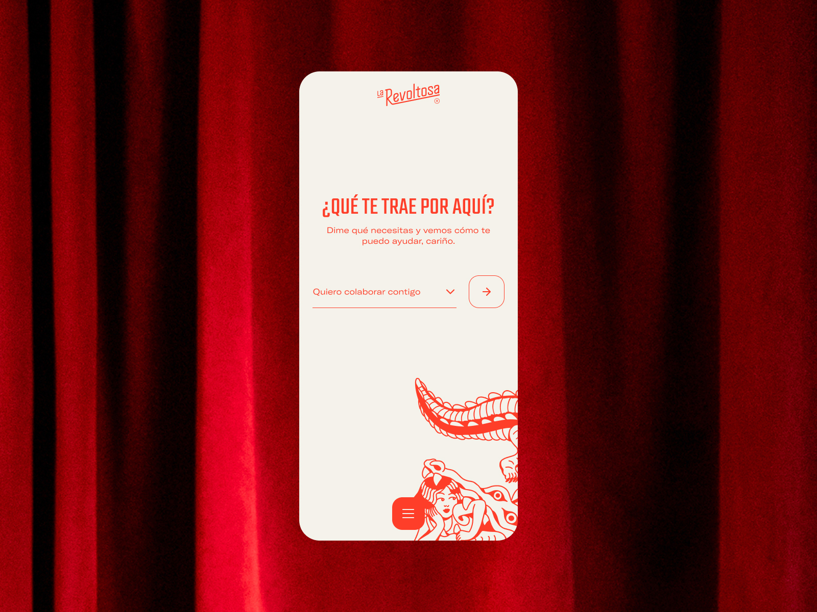
The red curtain background keeps that sense of stage, but the central card organizes the action. There’s a clear selector, a round button, and a simple hierarchy. It’s a good reminder for brands with strong personalities: having character doesn’t mean complicating every step. UX can be playful and still easy to use.
A footer that never fades
The footer keeps the energy going. Too many sites end with a sudden drop into admin mode: links, legal, contact, and not much else. Here, the ending still has atmosphere. That’s no small thing—the final stretch also builds memory, trust, and a sense of a well-crafted project.
La Revoltosa leaves a clear message: food and beverage web design wins when it stops imitating generic templates and starts acting as a true extension of the product. Color isn’t just decoration, typography isn’t just filler, motion isn’t just for show. Everything pushes in the same direction: giving a drink its own voice, presence, and visual memory.
The real takeaway isn’t to copy the red, the bubbles, or the 3D. It’s about understanding the principle: if a brand has flavor, the website should convey it before asking users to buy, contact, or explore. First, build desire. Then, let interaction do the rest.