A corporate identity that doesn’t feel corporate
Some company identities are born in a grey suit: proper, clean, predictable—and forgotten in three seconds. But then there are visual systems that get it: an internal brand can have pulse, visual rhythm, and a desire to be seen.
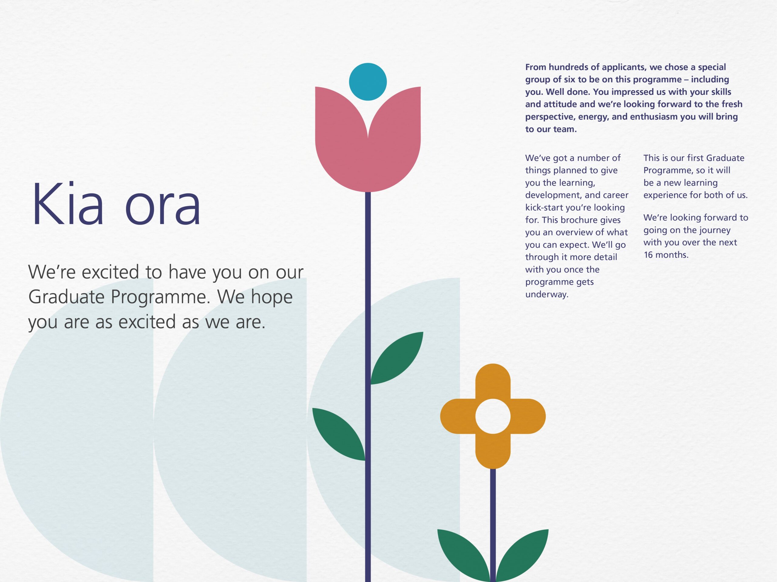
That’s exactly where NZ Super’s work stands out. It doesn’t try to dress up corporate messaging with color, but instead transforms the employee value proposition into a language that’s instantly recognizable. Bold typography, geometric shapes, authentic photography, concise messaging, and a palette with enough energy to break free from the mental PowerPoint that so often haunts corporate branding.
What makes this reference so enjoyable is its flexibility. It works as an identity, an internal campaign, a recruitment system, print collateral, digital asset, and physical object. Everything feels like it belongs to the same world, yet nothing is a carbon copy. That’s a huge difference: consistency doesn’t have to mean boring repetition; it can be well-directed visual memory.
NZ Super — a system that turns messages into presence
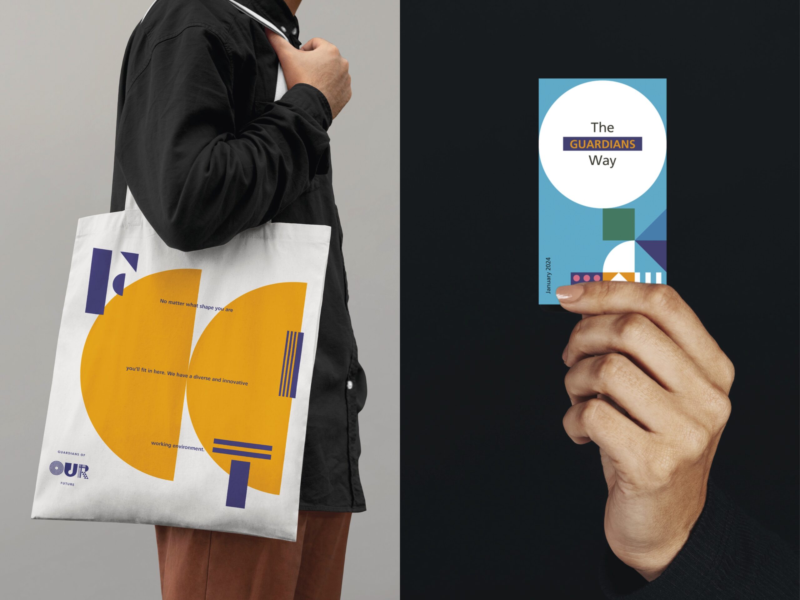
The first big visual decision is to treat typography as a stage. The letters don’t just speak—they hold, frame, crop, and activate human presence. The message “Our Future” carries weight because it’s not just an aspirational phrase; it’s filled with faces, gestures, and team energy. The identity stops talking about people and starts building from them.
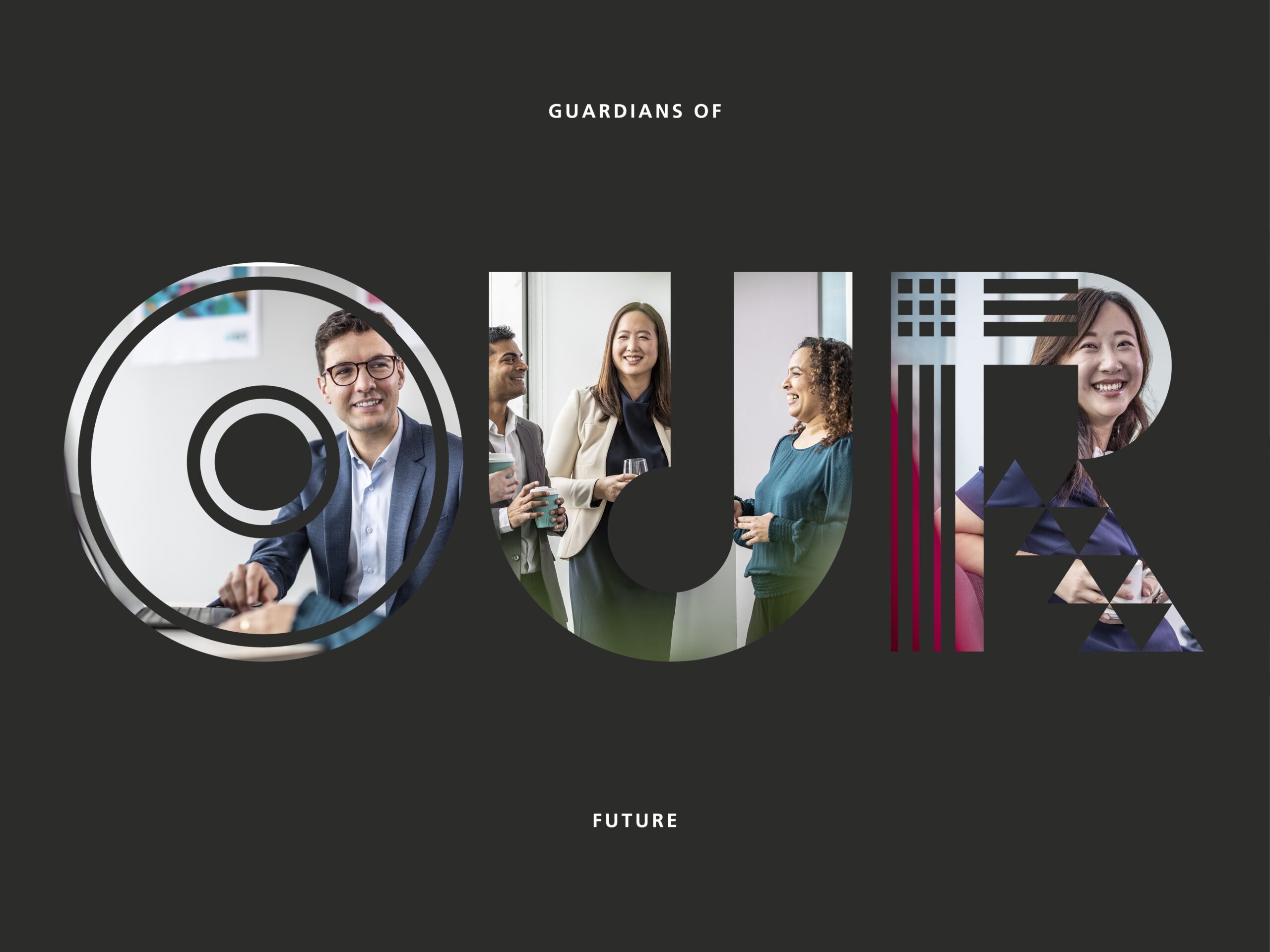
The dark background does quiet but essential work. It balances the palette’s intensity, adds contrast, and keeps the look from becoming too festive. Pink, blue, green, mustard, and purple come in strong, but never lose control. The composition maintains an underlying seriousness—crucial when a corporate identity wants to feel approachable without losing authority.
There’s also a clear sense of perceived value. When an employer brand presents itself with this level of visual direction, the message isn’t just content—it’s care. And care is instantly recognized. You sense organization, intent, confidence. For attracting talent, communicating culture, or building internal pride, that feeling matters more than many brands realize.
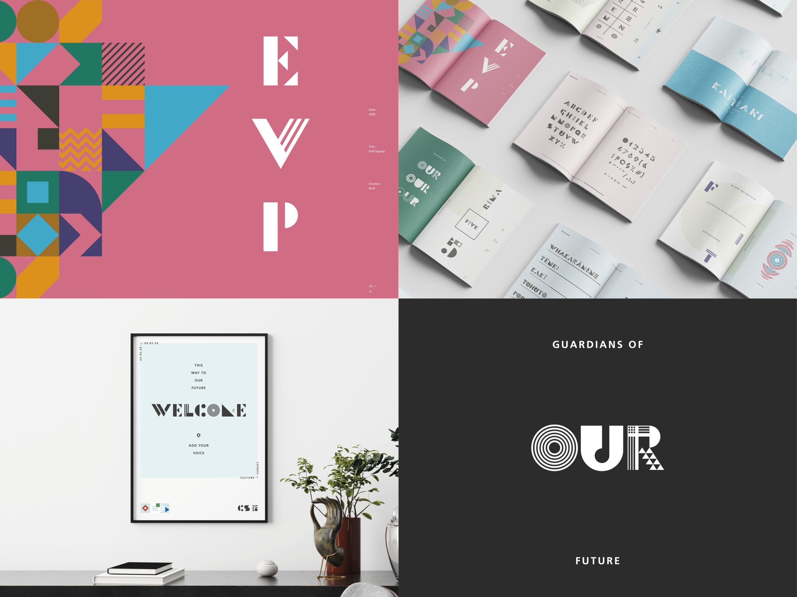
The geometric elements act as glue. Circles, diagonals, color blocks, and cutouts aren’t just decorative—they form a visual grammar. That repetition builds recognition, even as the medium changes. In corporate branding, this is gold: it lets you launch new pieces without starting from scratch or always relying on the logo for recognition.
The composition has a bit of poster, a bit of editorial system, and a bit of flexible toolkit. It doesn’t rely on a single hero piece, but on a logic that can generate endless variations. Here’s a valuable lesson for marketing teams: a strong identity doesn’t just solve the launch; it reduces friction for future campaigns, presentations, events, onboarding, and internal comms.
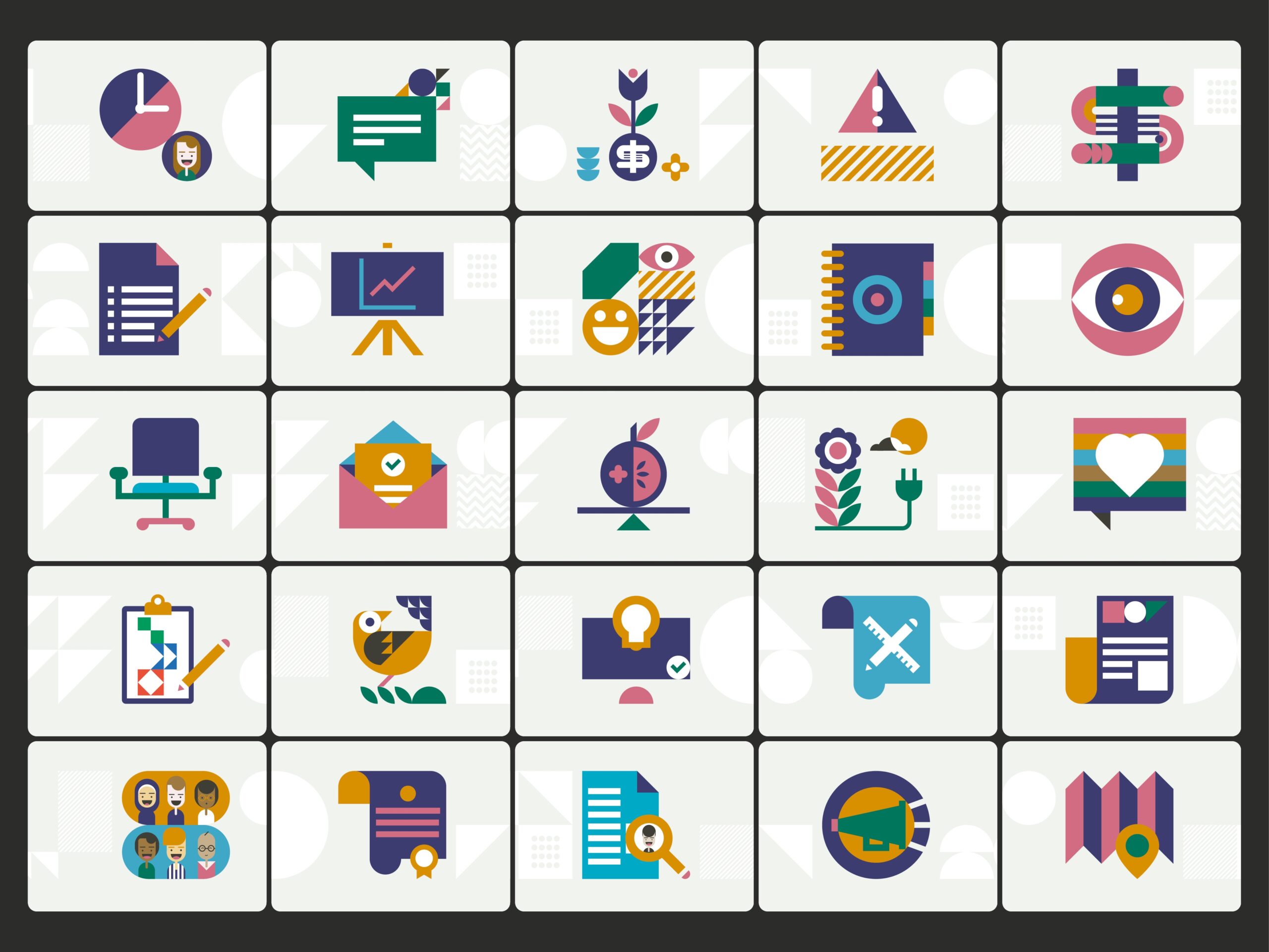
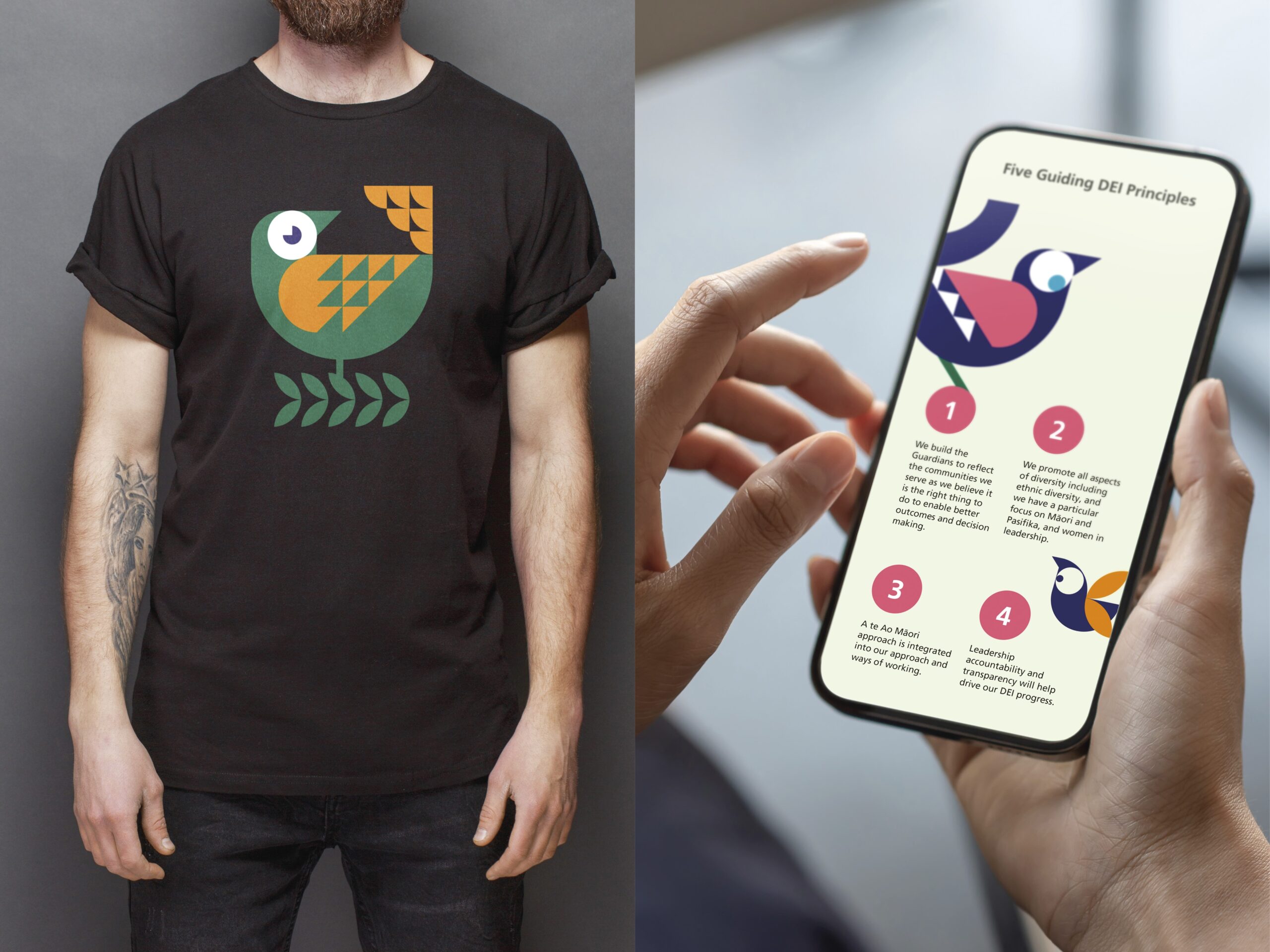
The iconography is especially interesting because it brings the system down to the smallest elements. When an identity holds up in big headlines and also in symbols, modules, and micro-elements, the brand gains real operational life. Here, icons add rhythm, allow for diverse topics, and maintain a shared atmosphere without always forcing the same visual solution.
The poster series proves that short messages can have real impact when design gives them structure. “Support,” “future,” “team,” and other internal culture concepts become quick, direct, almost sign-like pieces. There’s no text overload or corporate solemnity—just clarity and enough character to stick in your mind.
What I especially like is how the identity doesn’t stop at campaign aesthetics. It naturally extends to physical formats: editorial pieces, branded materials, objects that could live in an office, at an event, or in a recruitment drive. That tangibility makes the identity feel real—not just a flawless presentation. When a brand shows up on everyday objects without losing its edge, it starts to occupy mental space.
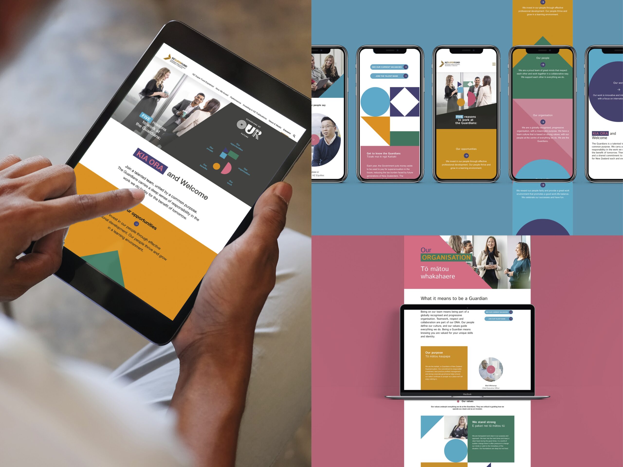
Digitally, the system shifts gears. The graphic energy remains, but it’s more restrained. Tablets and mobiles need hierarchy, breathing room, and block-based reading. The identity gets it: color and geometry stay, but the content has space to breathe. That adaptation is key for lightweight UX/UI—not every visual asset needs to hit with the same intensity across all formats.
The recruitment version adds another interesting layer. The identity becomes more functional without losing personality. Portraits, calls to action, and content blocks live alongside the core visual language. For a brand looking to attract talent, this is a real differentiator: it’s not enough to say the team matters—the experience must make it feel like there’s a thoughtful, well-crafted culture that’s easy to understand.

Another strength is how the system enables conversations about inclusion and culture without falling into the generic “corporate diversity” look. The mix of photography, principles, color, and formats keeps the tone human but not sugarcoated. There’s warmth, yes, but also design. That combination helps the message feel less like an institutional statement and more like a living part of the brand.
What’s most interesting, looking at the whole, is that every piece seems to have its own rhythm. The posters are more direct. Digital applications are more structured. Merch is more iconic. Iconography is more modular. The main piece is more emotional. That shift in intensity keeps things fresh and lets the system breathe. The brand doesn’t just apply a template—it interprets its own language for each context.
Takeaways for brands that want to stand out
NZ Super is a great source of inspiration because it proves that corporate branding doesn’t have to sound like an internal memo. It can have color, composition, distinctive typography, and an atmosphere that sticks in your mind. The key isn’t to make everything louder, but to build a system that knows when to make an impact, when to organize, and when to support.
For marketing teams, the practical takeaway is clear: a well-designed identity doesn’t just improve campaign aesthetics—it boosts efficiency for everything that follows. With a strong visual grammar, every new format—web, mobile, presentation, poster, onboarding, event, or physical piece—can grow from a common foundation. That saves time, reduces noise, and elevates perceived value.
The overall impression is a positive one: an institutional brand can be serious without being stiff, human without being soft, and flexible without losing presence. When the visual system has a clear point of view, communication stops feeling like a collection of parts and starts behaving like a true identity with memory.