Some industrial brands enter the scene with the brakes on: too gray, too rigid, too close to the technical sheet. Maestro Technologies doesn’t abandon precision, but reframes it. The brand moves into more editorial territory, with clean layouts, calm typography, measured color, and a visual presence that doesn’t need to shout to be remembered.
What’s beautiful about this project is how the system breathes. Black brings authority, blue-grays cool the atmosphere, light backgrounds create space, and orange delivers just the right burst of energy. This isn’t an identity designed to fill out corporate documents—it’s a brand built to live on screens, in presentations, at stands, in catalogs, and in visual memory with the same consistency.
An industrial identity that doesn’t want to look industrial
The real achievement here is breaking away from technical clichés without losing credibility. Maestro Technologies operates in a space where trust is everything: construction, technology, processes, precision, efficiency. The easy route would have been to lean on predictable codes: corporate blue, engineering icons, cold renders, and frictionless visual language. Instead, this identity takes a different path: more restrained, more graphic, more systematic.
That shift changes the perception of value. When a B2B company presents itself with an identity like this, it’s not just communicating what it does—it’s showing how it thinks. Order, method, control, ambition. The brand stops looking like just another technical supplier and starts to feel like a company with its own visual culture. For a marketing director, that difference isn’t just cosmetic—it impacts trust, recall, and perceived quality before any sales conversation even begins.
The work by Studio FM Milano stands out for its restraint: no over-the-top effects, no inflated visual storytelling, no forced innovation. The corporate design relies on clear decisions: a recognizable symbol, clean typography, a concise palette, and layouts with plenty of breathing room. Everything looks simple, but that simplicity is carefully crafted.
Maestro Technologies — identity with rhythm, contrast, and order
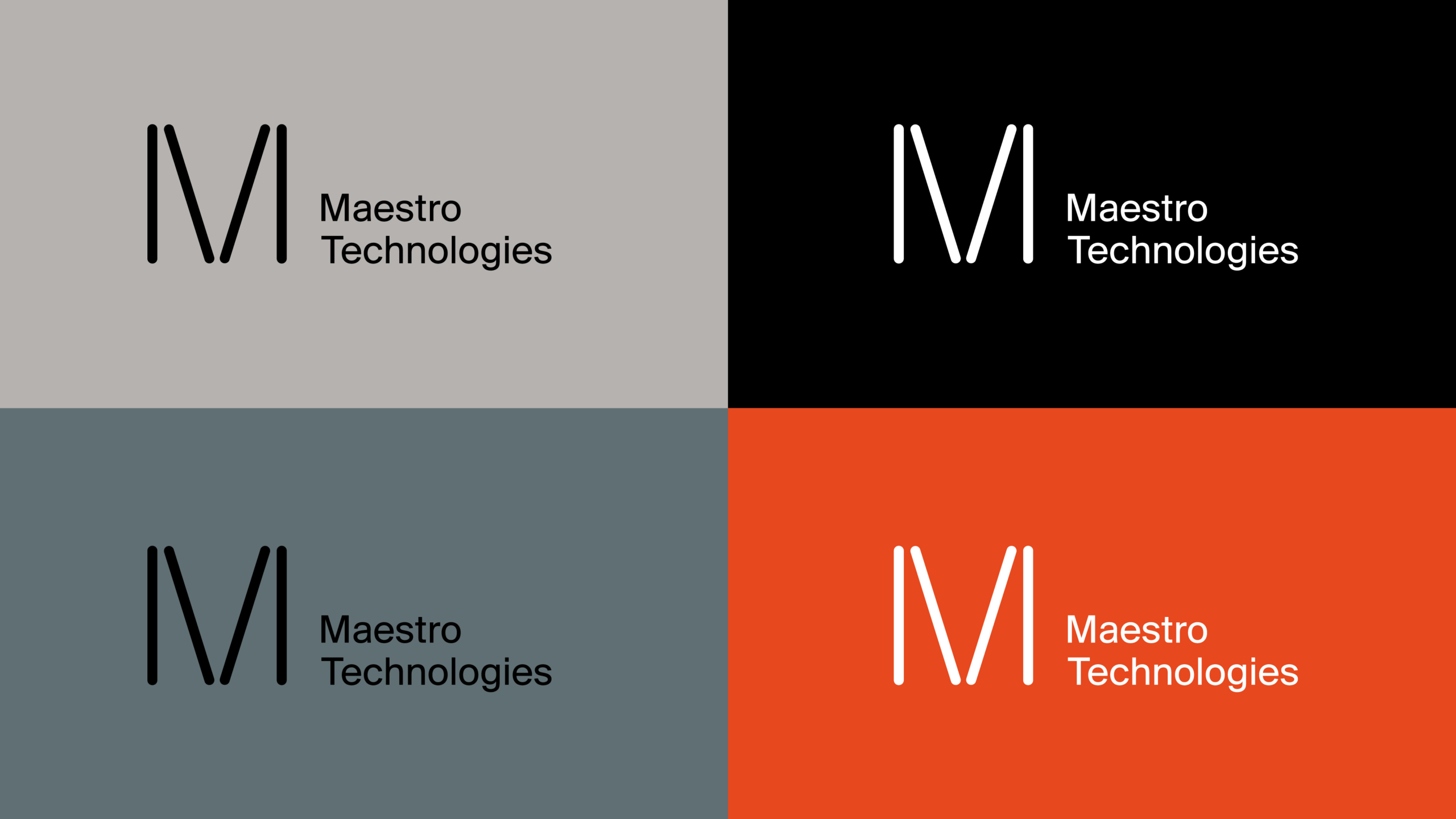
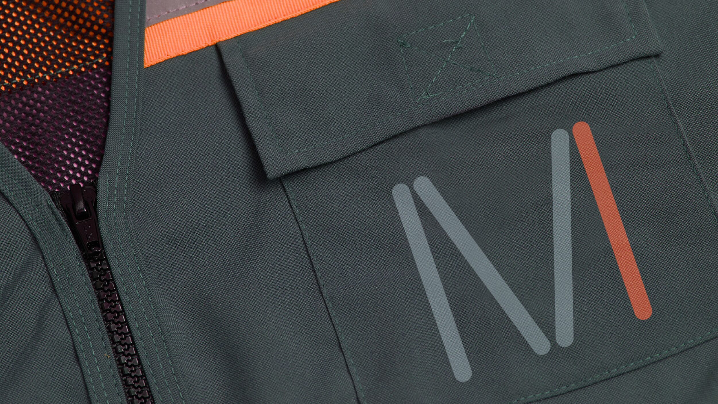
The first impression comes from contrast. The Maestro Technologies symbol works as an “M” built from rounded, almost modular strokes, suggesting assembly without being literal. It’s a mark that feels drawn from the process itself: lines, cuts, connections, precision. But it does so gently. The rounded ends soften the industrial edge, giving it a more human, tactile feel.
The wordmark supports without competing. The sans serif typeface has that clean tone so many tech brands seek, but here it doesn’t feel generic because the symbol anchors the personality. There’s a pleasing hierarchy: first the symbol, then the name, then the system. This sequence is key to building recognition. The brand works as a whole, can be reduced to the monogram, and can expand across applications without losing its rhythm.
The palette is concise but not flat. Light gray brings calm and precision; black adds authority; blue-gray gives a more technical feel; orange breaks the sobriety with energy. That orange is crucial—it keeps the identity from becoming too quietly elegant. It adds accent, memorability, and visual tension. In B2B branding, a well-placed color can do more for differentiation than twenty positioning messages.
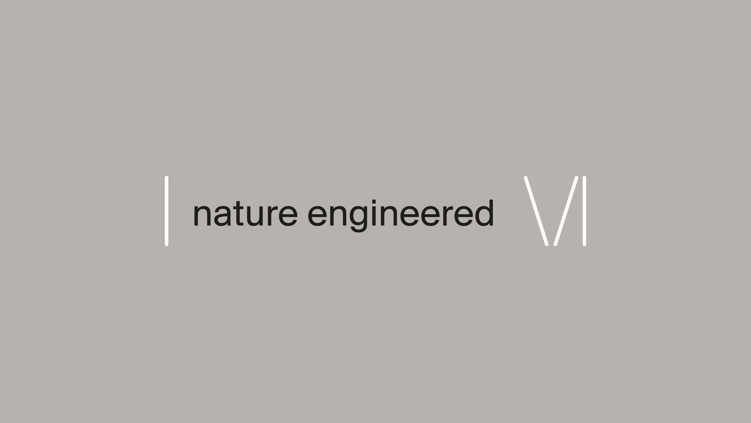
The phrase “nature engineered” opens up a powerful narrative. It’s not just a catchy line; it positions the brand between two worlds often seen as opposites: nature and engineering. This creates a productive tension for a technical company that wants to talk about efficiency, manufacturing, sustainability, and construction—without sounding cold. The visual identity supports this idea with a centered, almost ceremonial composition, where the message doesn’t need to shout.
There’s also a question of visual rhythm. Solid backgrounds allow each application to read as its own scene, yet all belong to the same universe. This ability to vary without breaking is one of the best signs of a strong identity. It doesn’t rely on a single hero piece. It adapts to changes in color, scale, format, and context. For a brand that needs to live in presentations, proposals, signage, web, documentation, and events, that’s invaluable.
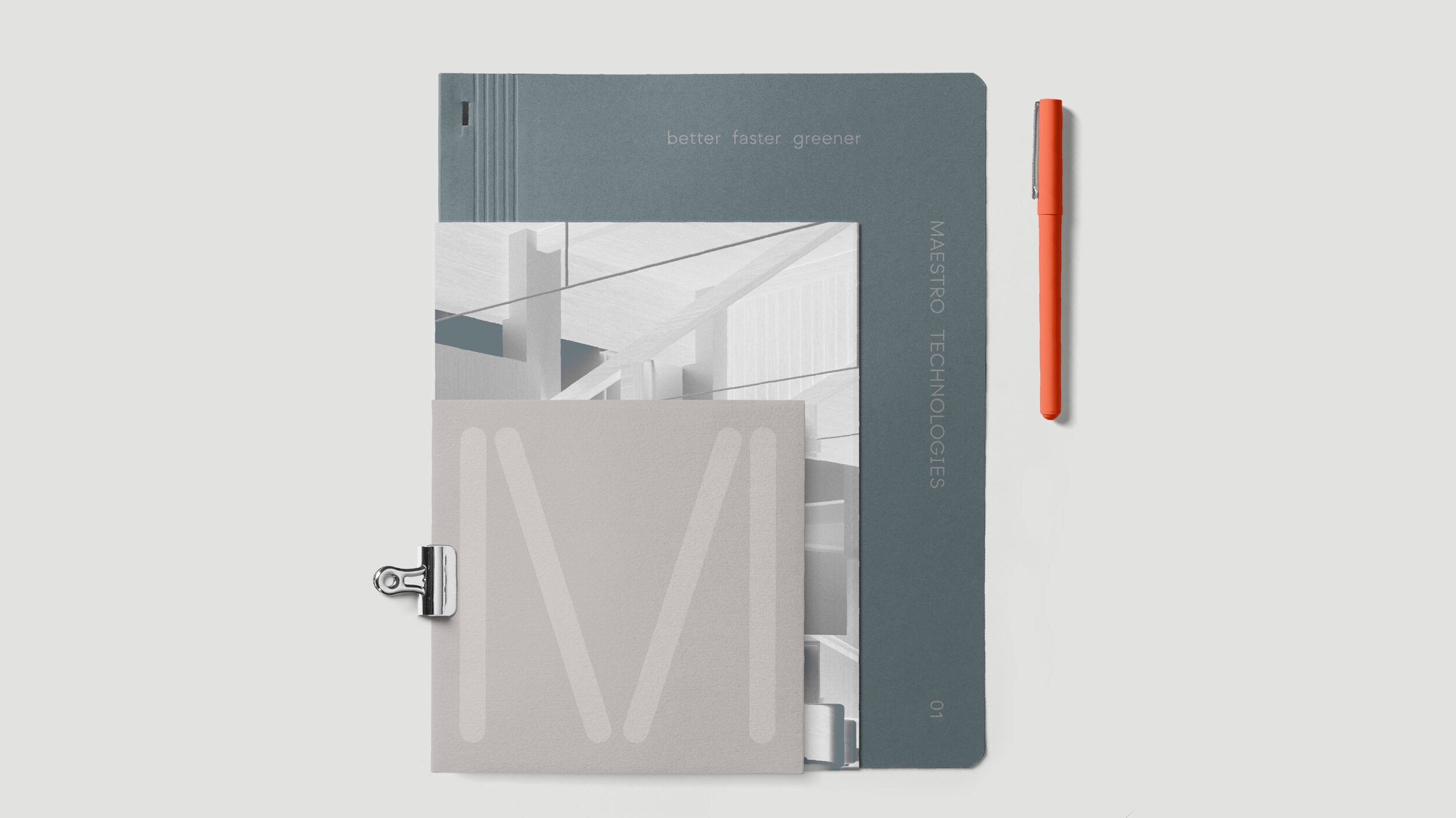
The series of covers and graphic compositions confirms this project goes far beyond a logo. There’s a visual grammar: lines, blocks, diagonals, scale, negative space. The system allows for pieces with different weights without losing identity. Some feel more like editorial material; others lean toward corporate presentations; some work almost as technical posters. That flexibility is exactly what separates great brand design from a simple visual identity exercise.
The composition has a musical quality. Not everything is centered, not everything carries the same weight, not everything seeks symmetry. There’s tension between mass and emptiness, between fine lines and color blocks, between restraint and bursts of color. That tension draws the eye. And when the eye moves with pleasure, the brand earns attention without asking for it.
Maestro Technologies — the brand in physical space
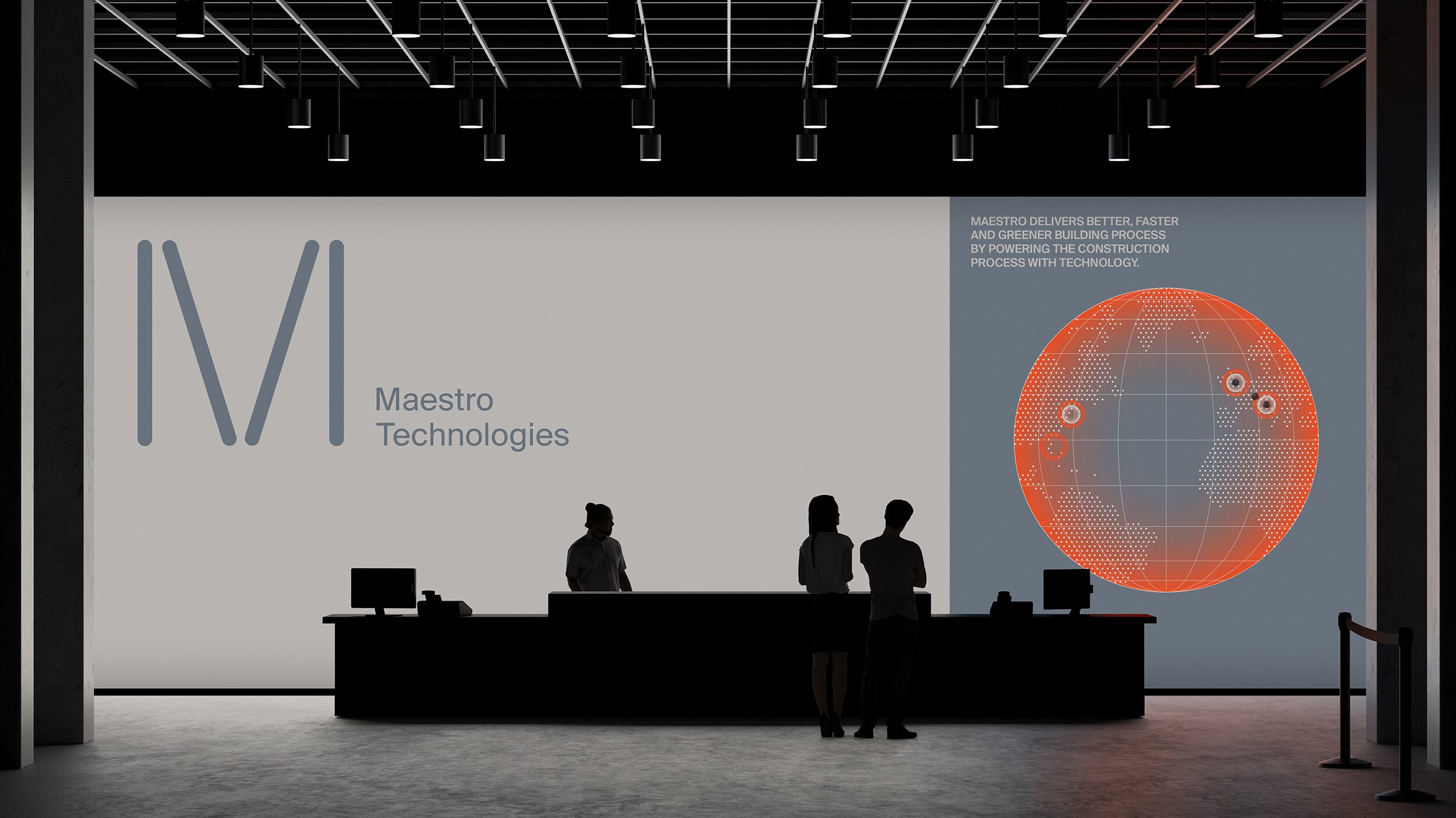
When the identity enters physical space, the project gains substance. The brand stops being a system on a flat background and becomes an atmosphere. The environment—with counter, people, and luminous graphics—introduces a new scale: this is no longer just a well-applied logo, but a company capable of building a recognizable experience around its name.
This kind of application is especially relevant for B2B brands with complex sales cycles. Trade shows, showrooms, events, investor presentations, business meetings—these are contexts where perception is formed in seconds. A spatially present identity helps the company appear more mature, more prepared, and more aware of its own value. It doesn’t close the sale by itself, of course. But it starts the conversation from a higher ground.
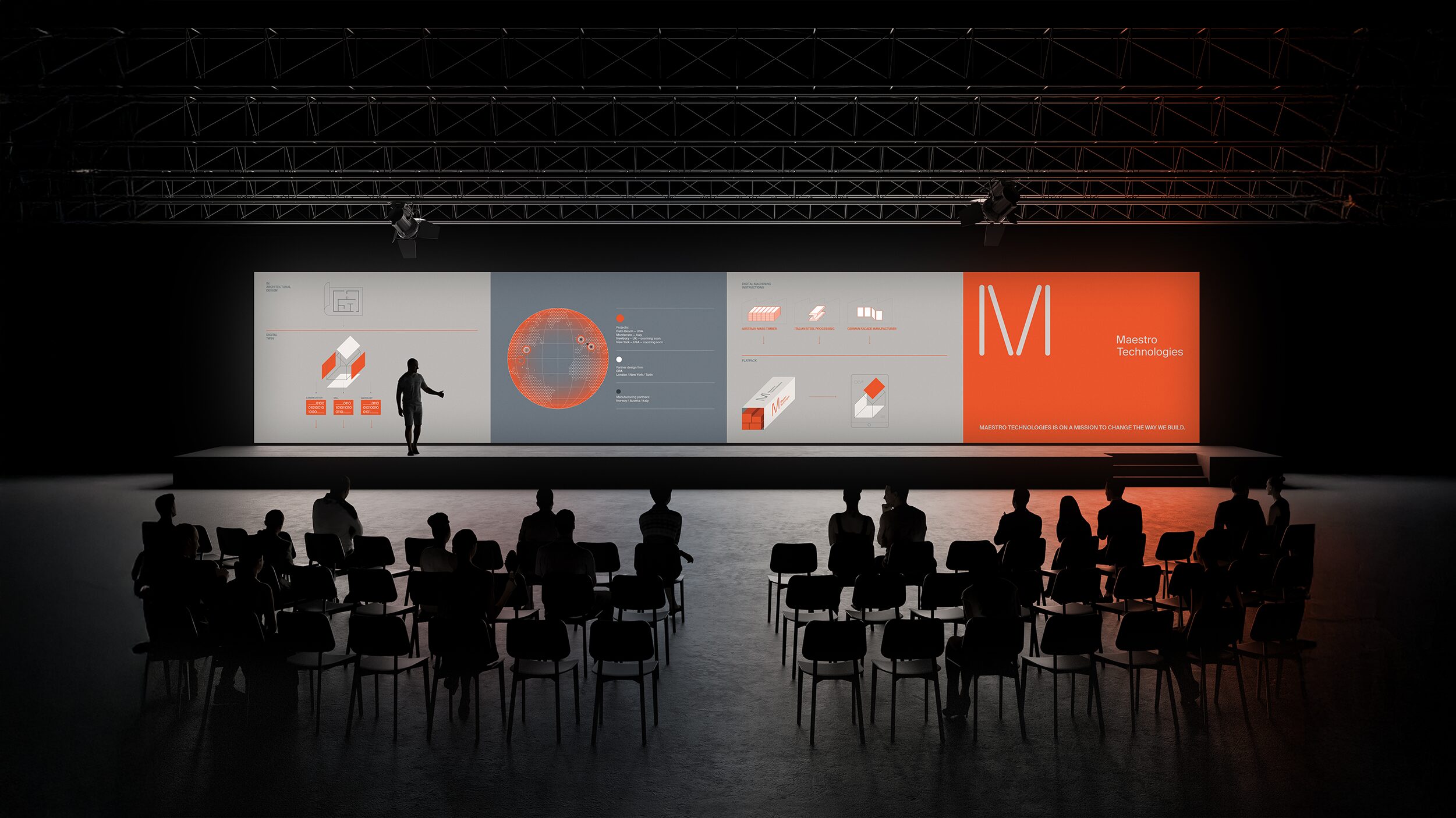
The dark staging works beautifully, turning the identity into something almost theatrical. The black background adds depth, panels organize the message, and the brand appears with authority, never overwhelming. There’s a keynote feel, a sense of launch, of a company that offers more than just a product—it has a story. In industrial sectors, where many presentations still look like internal documents blown up on a screen, that visual difference stands out.
Lighting and scale add a layer of mental motion, even if the scene is static: you imagine movement, entrance, pause, gaze. That’s visual direction at its best. You don’t need to animate everything for a brand to feel alive. Sometimes, it’s enough to compose a scene that suggests movement, depth, and tension.
The orange installation is probably the most visually striking moment of the set. Color becomes volume, the symbol turns into an object, and the brand takes on an almost exhibition-like quality. It’s a more expressive gesture, but still within the system. It doesn’t feel like decorative whimsy—it feels like a logical extension of the identity.
There’s a valuable lesson here for any industrial branding: restraint doesn’t mean lack of character. A brand can be precise, reliable, and technical without sacrificing memorability. In fact, when the market is crowded with similar codes, character becomes an advantage—not to grab attention for its own sake, but to ensure the brand is recognizable when competing for memory, budget, and preference.
What it means for a B2B brand aiming for greater solidity
Maestro Technologies succeeds because it understands that an identity isn’t just an isolated logo, but a sequence of coherent decisions. Symbol, typography, color, composition, applications, and atmosphere all push in the same direction. That consistency builds trust without the need for lengthy explanations.
The most useful inspiration lies in restraint. There’s no urge to fill every piece with information or to show off complexity. The system lets the symbol breathe, uses negative space as a perceptual tool, and allows each application to have its own visual rhythm. For a B2B company, that clarity is gold: it helps the brand appear more focused, more premium, and easier to understand.
There’s also a practical takeaway for marketing teams: if your brand needs to live across many platforms, a good logo isn’t enough. You need a language. You need backgrounds, proportions, color tone, composition rules, and applications that maintain the same energy on a website, in a presentation, at a stand, or in a proposal.
When corporate design is well executed, the sale starts before the pitch. The brand has already communicated something about how it works: order, discernment, ambition, precision. And in an industrial or tech environment, that can be the difference between looking like just another supplier or a company with real perceived value.