To stay ahead and deliver the best web designs to our clients, it’s essential to keep up with the latest web design trends.
Since we like to stay one step ahead, in this post we’ll take a look at the web design trends set to define 2018.
We’ve updated our series: discover the web design trends for 2026 that will shape the next generation of digital experiences.
Web Design Trends 2018: Performance & Interaction
Animated Vector Graphics
Vector graphics are more popular than ever—and they sell. When you add animation, you get a blend of simplicity and sophistication.
You can introduce interactive elements that respond to mouse hover or clicks, drawing users’ attention.
To implement these experiences, consider using SVG or the Canvas element.
We recommend checking out libraries like Lazy Line Painter for SVG and P5JS for Canvas.
Without a doubt, this will be one of the standout web design trends for 2018.
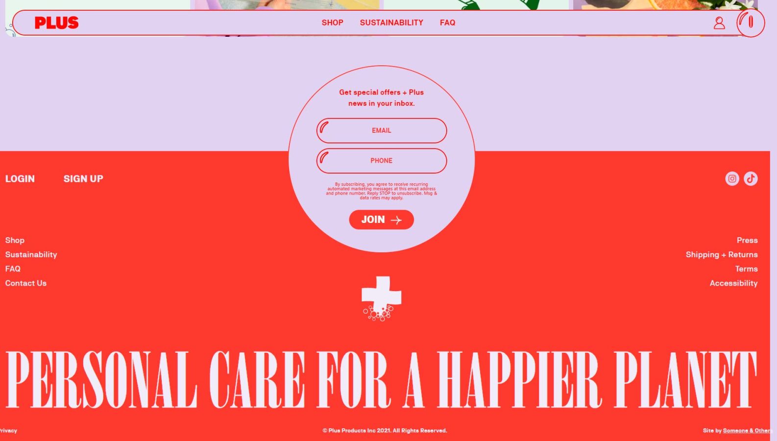
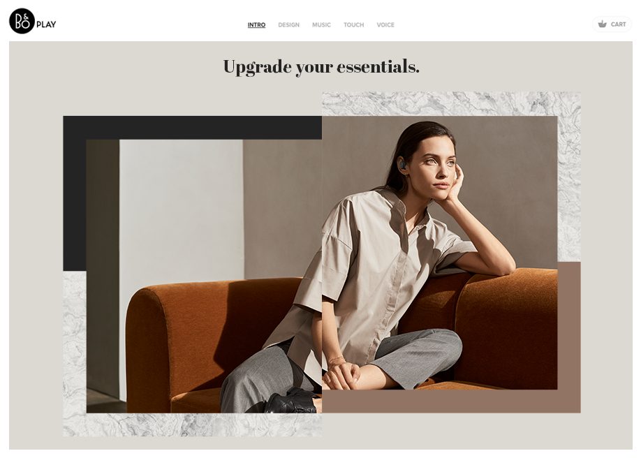
Embracing Negative Space
Negative space will play a major role in web design this year. Whether through images, videos, or typography, making smart use of negative space gives your site a fresh, contemporary feel.
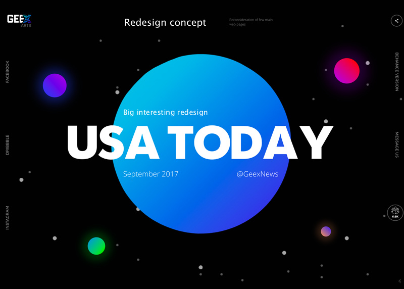
Bold & Characterful Typography
Strong, impactful typefaces continue to be on trend, as they have for several years now. The era of ultra-thin fonts is behind us—bold, weighty fonts are in.
Mixing Serif and Sans-Serif fonts will also be a big trend in 2018. If you combine them with a keen eye for visual balance and choose the right weights, you’ll achieve striking contrasts and a visually engaging result.
Cinemagraphs
Cinemagraphs blend a static image with subtle, looping video motion, creating a captivating visual effect that grabs users’ attention.
While cinemagraphs will be a trend in 2018, use them thoughtfully and with purpose. Since they often involve video elements, they can be heavy on bandwidth—something to consider for users with limited connections. Also, keep in mind that mobile users typically avoid video content when not connected to Wi-Fi.
A smart use of cinemagraphs might be as a hover effect on a block or as a header image. From there, we’re sure new and surprising applications will emerge that we haven’t even imagined yet.
Follow us on Facebook to stay updated whenever we post new inspiration—and stay tuned, because we’re preparing something special and exclusive for our followers at the end of 2018! Follow us!
Scroll-Based Animations
Progressive content loading as you scroll has been a growing trend in web design for several years, and it’s only gaining momentum.
Websites that reveal content as users scroll create a more immersive experience, making visitors feel engaged and part of the site. Animated content delivery as you scroll brings your site to life and makes it more appealing.
Sticky Elements at the Bottom of the Site
With mobile devices on the rise, we’re seeing a shift in web design: menus are increasingly being fixed to the bottom of the screen, rather than the top as in previous years.
The reason is simple: from a usability standpoint, it’s easier to navigate with your thumb, which naturally gravitates toward the bottom of the screen.
If we look to apps as the benchmark for mobile design and usability, it’s no coincidence—they all feature bottom navigation menus.
Interactive 3D Elements
Animated or interactive 3D objects continue to lead the way in cutting-edge web design. These elements grab users’ attention, as we’re not used to seeing them in browsers, and they draw visitors deeper into the site, making them feel part of the experience.
One of the most interesting libraries for creating 3D animations is Three.js. We highly recommend checking it out—it’s well worth your time.
You might also like…
Looking for more web inspiration? Check out our post on the best web designs of 2017–2018!