We now have the color trend that Pantone has chosen for 2016.
Pantone Inc., based in Carlstadt, New Jersey (USA), is the creator of the Pantone Matching System, the leading color identification and comparison system for the graphic arts.
It’s the most recognized and widely used system, so much so that “Pantone” has become synonymous with color standards.
Its influence is so extensive that some Pantone colors are even referenced in legislation, especially for flag colors.
This color system differs from CMYK and RGB, as Pantone colors are typically referred to as spot colors.
In 2007, the company was acquired by X-Rite Inc.
Pantone’s origins date back to 1962, when Lawrence Herbert ran a small business trading color cards for cosmetics companies. Recognizing the potential, he developed the first chromatic identification system that same year.
The system is both simple and effective: a palette or range of colors known as Pantone Guides.
Pantone, the New Jersey-based company responsible for creating, communicating, and standardizing the color system used in graphic arts, has selected the colors it believes will set the trend for 2016 across all areas of design—graphic design, interior design, fashion, product design, web design, logo design, branding, and more.
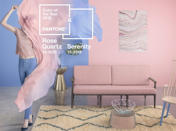
While last year, in 2015, a single color—Marsala—dominated, this year Pantone has chosen two colors to lead the way.
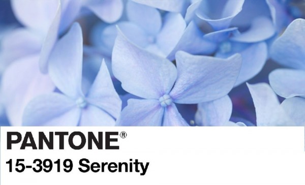
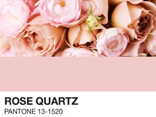
The selected shades are Rose Quartz and Serenity Blue, corresponding to Pantone 13-1520 and Pantone 15-3919.
Rose Quartz is persuasive yet gentle, suggesting sophistication from a natural perspective and evoking compassion. It’s the perfect touch of femininity, romance, and elegance.
Serenity Blue is light and airy, reminiscent of the sky above us. It inspires calm, even in challenging moments.
According to the Pantone Institute, the combination of these two colors represents “connection and well-being, as well as a sense of order and peace,” and boldly challenges traditional color pairings.
For the first time, Pantone has named two Colors of the Year, aiming to find a chromatic balance that conveys tranquility and peace.
The 2016 Pantone colors don’t stand alone—they’re accompanied by other shades that can be combined to create the perfect contrast, making this palette ideal for graphic design.
PANTONE 16-1548 Peach Echo Orange has been a standout in both fashion and design for several seasons. PANTONE 16-1548, Peach Echo, is an inviting shade with friendly qualities, radiating warmth and approachability. It’s a mellow companion in the playful orange family.
PANTONE 16-3905 Lilac Gray A must-have neutral for any season, this essential basic gets a distinctive edge from the subtle lilac undertone added to classic gray.
Now it’s up to us to apply these trends.