At Code Barcelona, we’re passionate about high-quality web design, and this year we’ve been inspired by true digital masterpieces. In this article, we showcase the 20 best web designs of 2025—a curated selection that stands out for its creativity, functionality, and trendsetting impact in the digital world. From minimalist interfaces to immersive experiences, these websites are redefining how we interact online. Read on to discover why 2025 is shaping up to be a revolutionary year for web design!
Best Web Designs 2025
Shupatto Bags Brand Site: Designed to Fold with a Snap
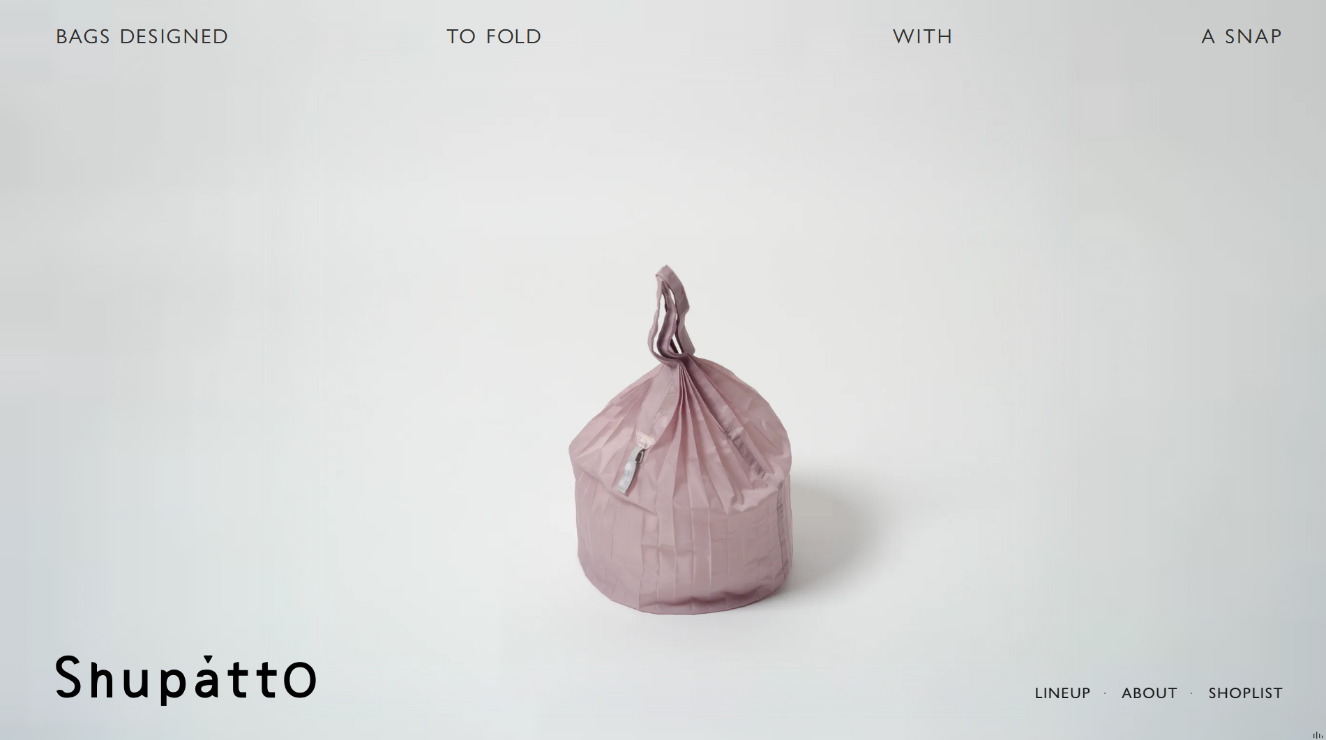
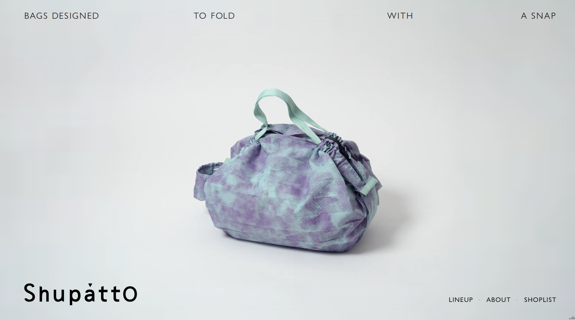
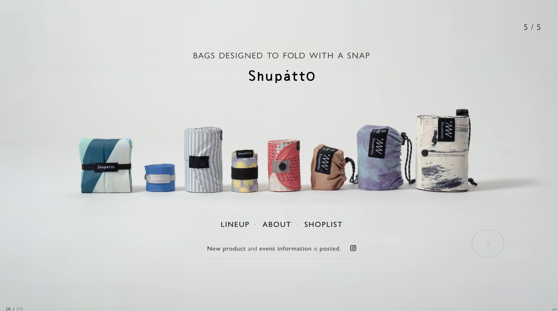
The Shupatto Bags Brand Site is a prime example of how web design can communicate both the functionality and spirit of a product through digital experience. Shupatto, a brand known for its foldable bags, partnered with mount inc. to create a visually striking platform that mirrors the unique design of its products.
Discover how we approach professional web design at Code Barcelona, a leading agency in Barcelona.
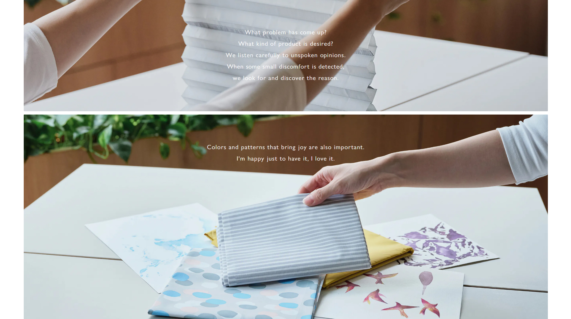
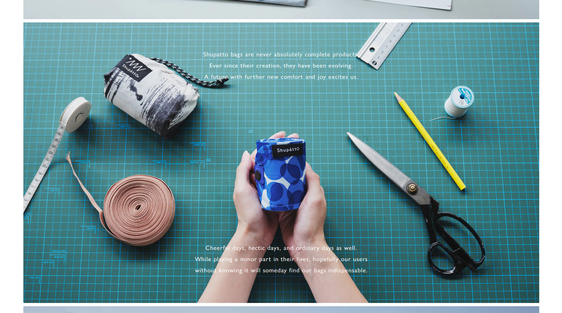
The site uses animated graphics to demonstrate how the bags fold effortlessly in a single motion, reinforcing the product’s core values: convenience and simplicity. This visual approach allows users to digitally experience just how practical and efficient Shupatto’s folding system is.
The design is minimalist and clean, with soft colors that evoke calm and ensure the product remains center stage. Smooth transitions between sections make navigation seamless, inviting users to explore both the bags’ features and the various collections on display.
Typography is modern and straightforward, ensuring clear, distraction-free reading. Smart use of product photography in action, paired with concise descriptions in each section, delivers an engaging and highly informative visual experience.
In short, the mount inc. team has masterfully combined flawless visual design with Shupatto’s product functionality, resulting in one of the year’s most memorable web experiences.
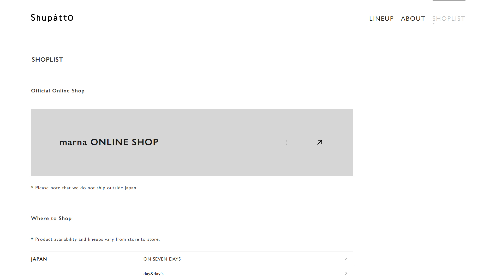
Visit site: Shupatto Bags
AIM — AI Modernism of Kharkiv
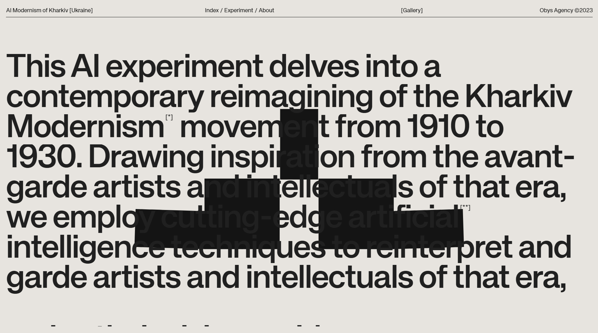
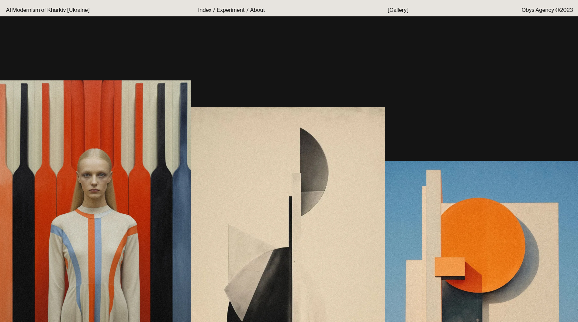
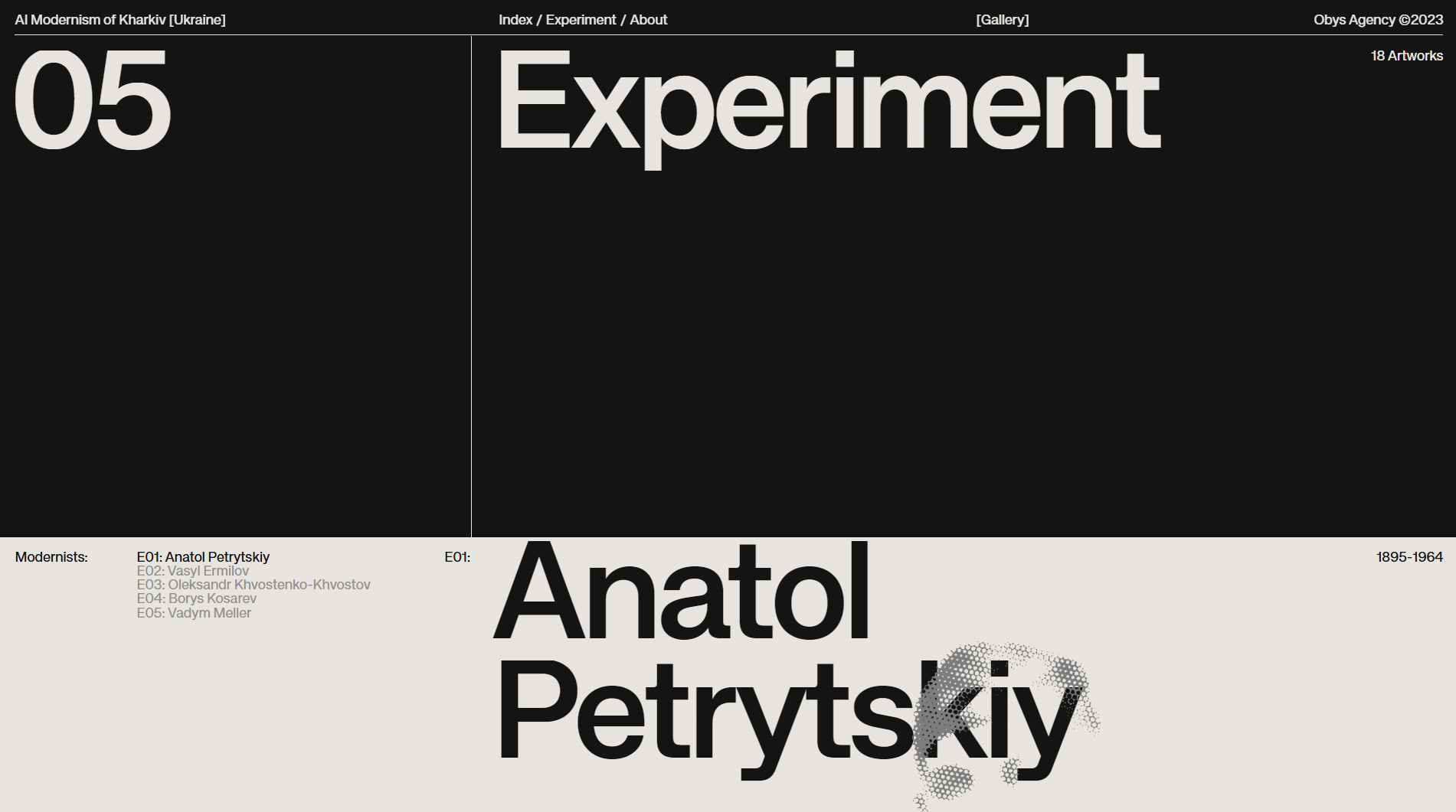
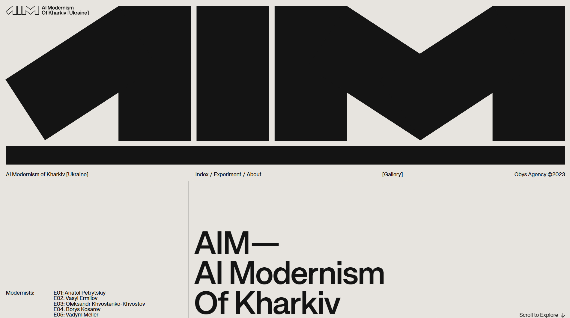
The AIM — AI Modernism of Kharkiv website is a visual tribute to the architectural modernism of Kharkiv, Ukraine, powered by artificial intelligence. Created by Obys Agency in collaboration with Viacheslav Olianishyn, the design captures the essence of the modernist movement while leveraging cutting-edge technology for a truly unique digital experience.
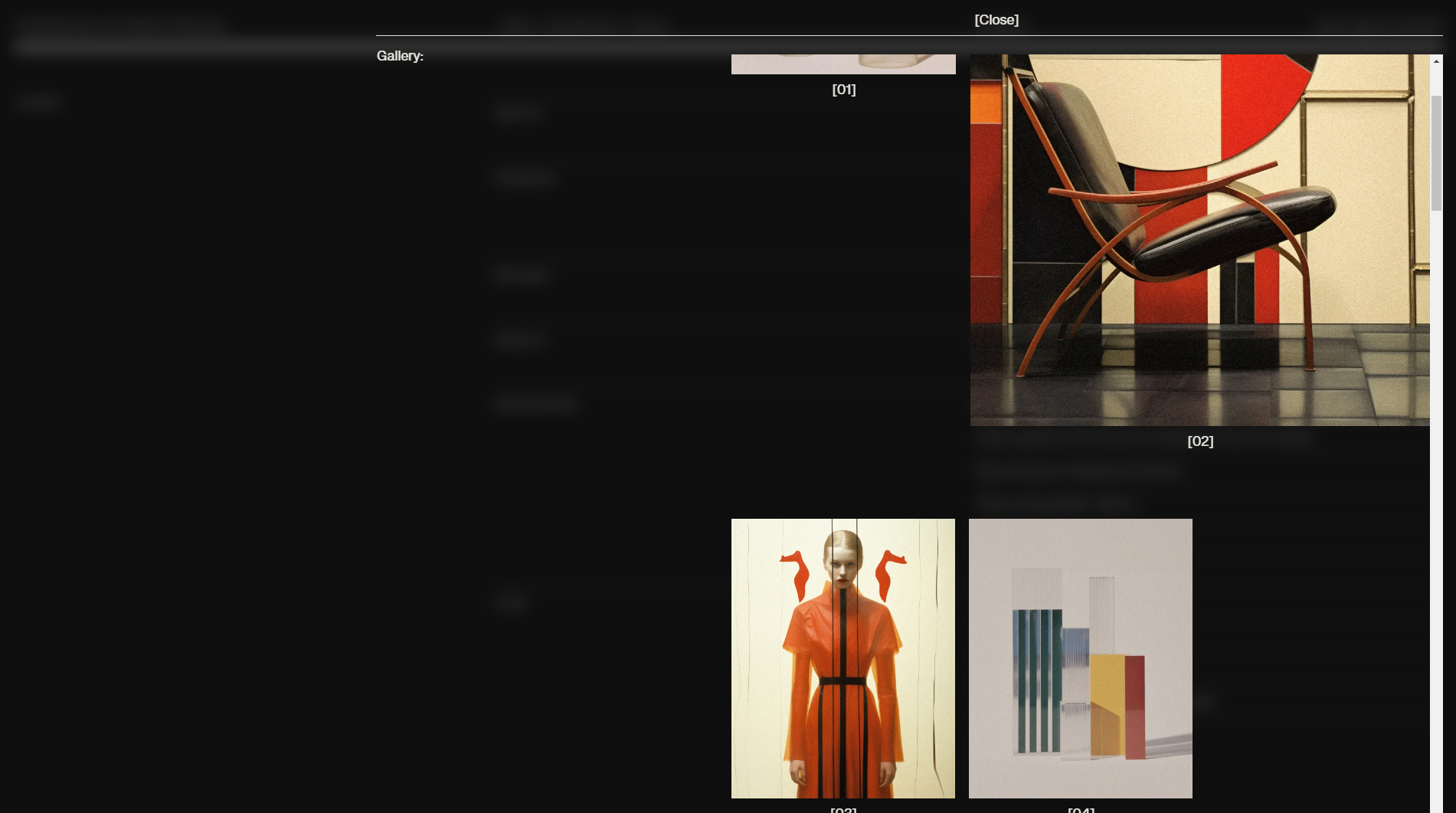
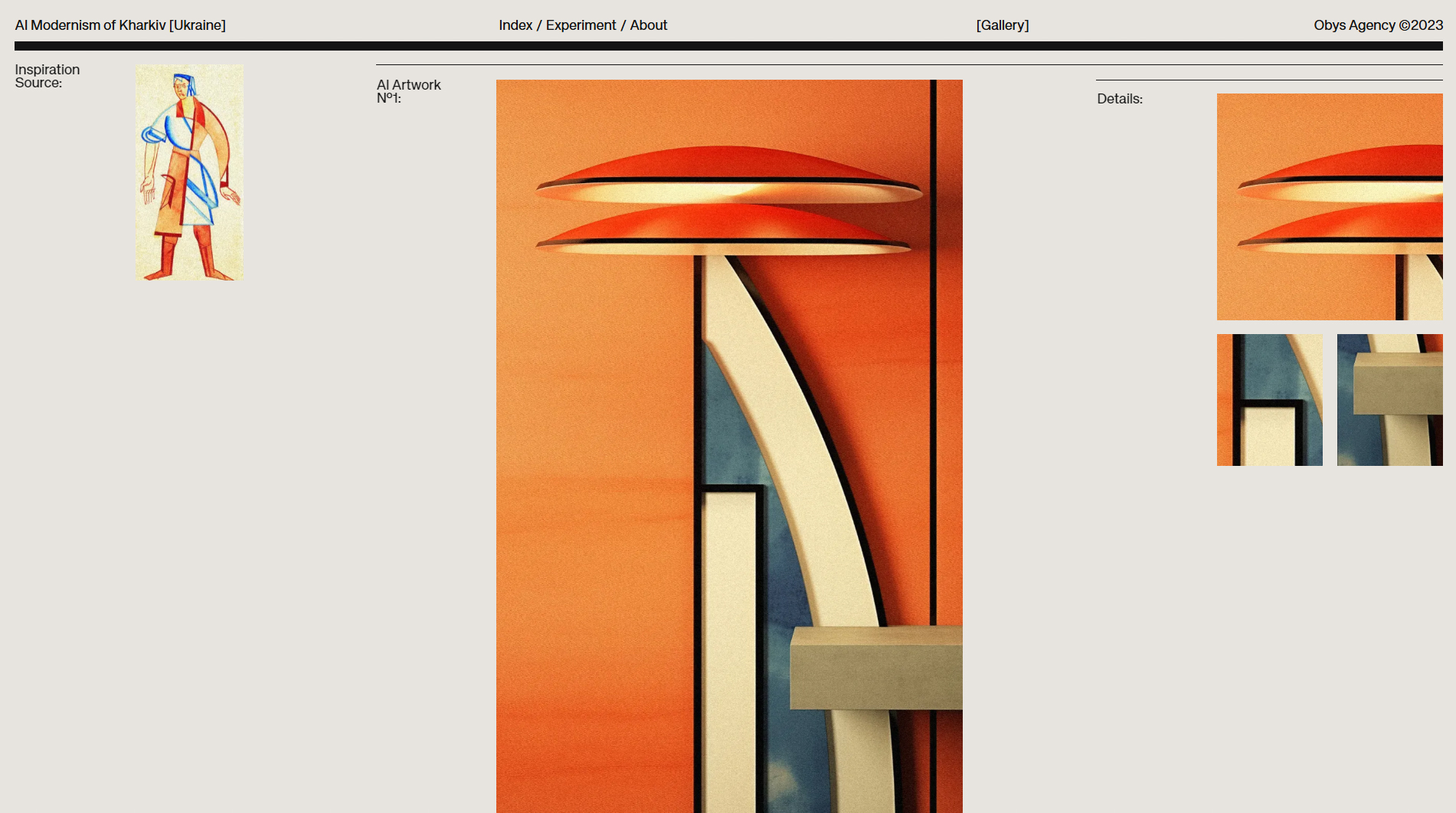
The site features a restrained, minimalist color palette—grays and blacks that highlight the elegance of modernism and the geometric precision of Kharkiv’s buildings. Subtle animations and smooth transitions invite users to explore architectural details with an almost artistic lens, while AI generates complex real-time visualizations that reinterpret the buildings.
Navigation is fluid and adapts seamlessly to both mobile and desktop, reflecting a strong focus on responsive design. Text is concise yet informative, allowing the visual content to take center stage. High-resolution images of Kharkiv’s architecture, combined with AI-generated graphics, create a perfect fusion of art and technology.
Bold, modern typography adds to the site’s sense of elegance and professionalism, complementing the architectural style. Each section is carefully structured to guide users through an immersive journey into Kharkiv’s modernism, delivering a visual experience that impresses with both creativity and sophistication.
In summary, Obys Agency and Viacheslav Olianishyn have achieved a seamless blend of architecture, art, and technology, making AIM one of the year’s most innovative and artistic web designs.
Visit site: AIM — AI Modernism of Kharkiv
Intrepid
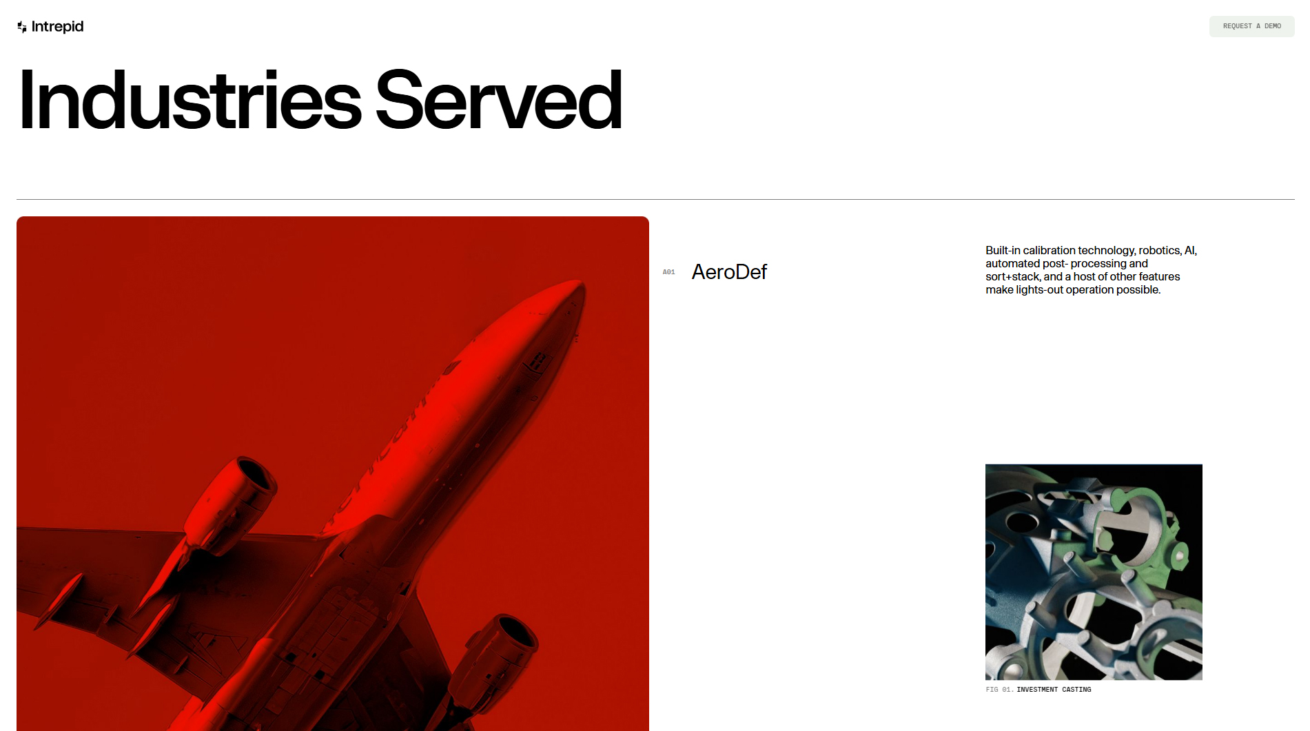
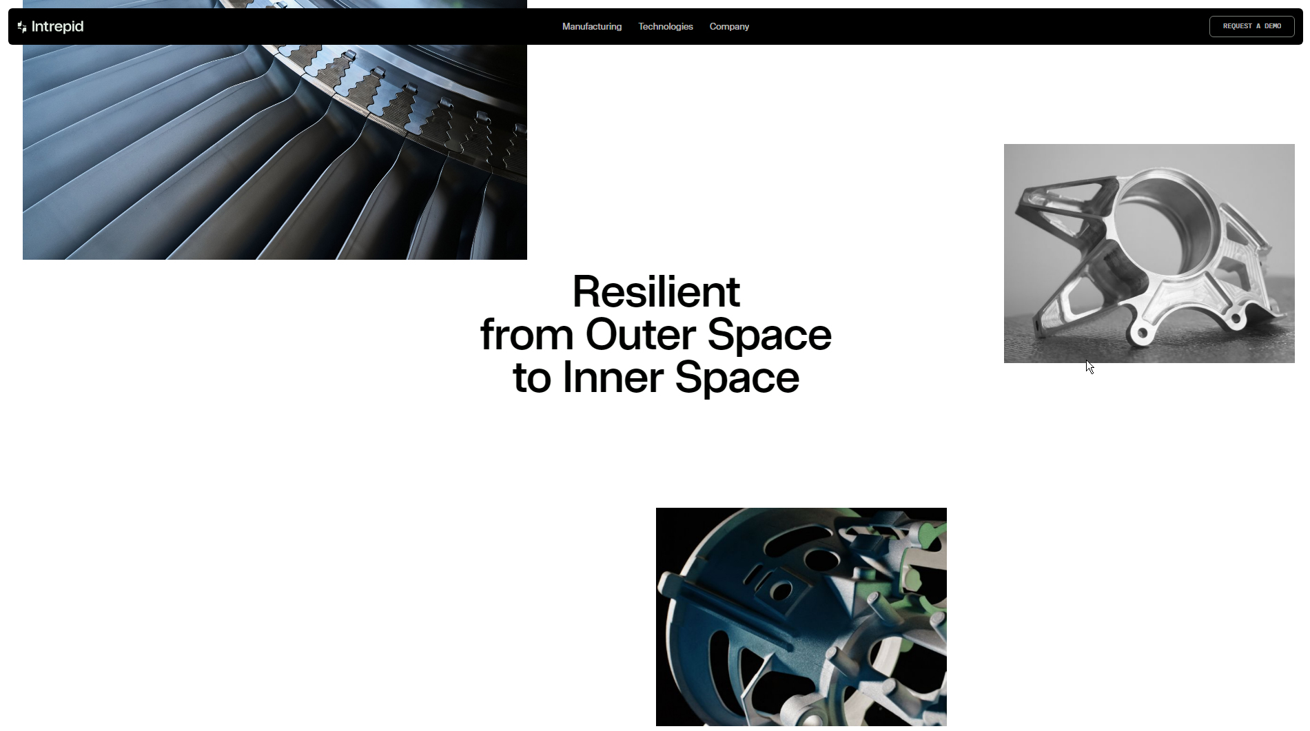
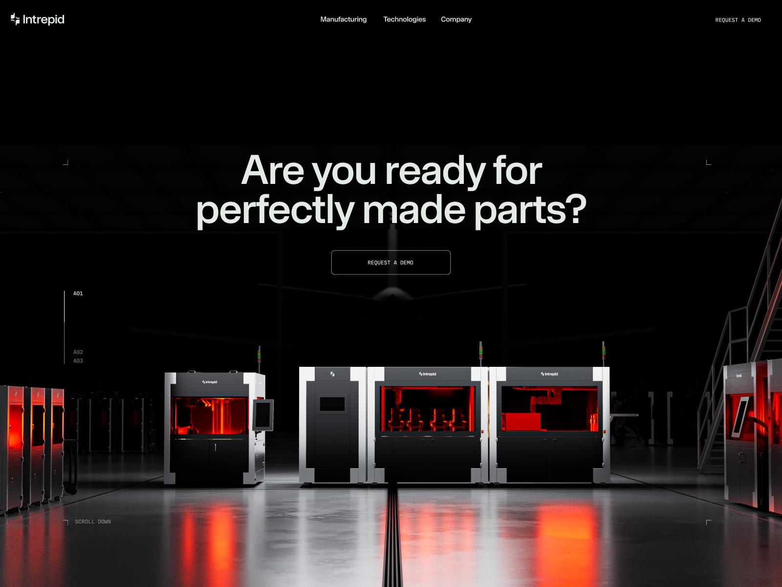
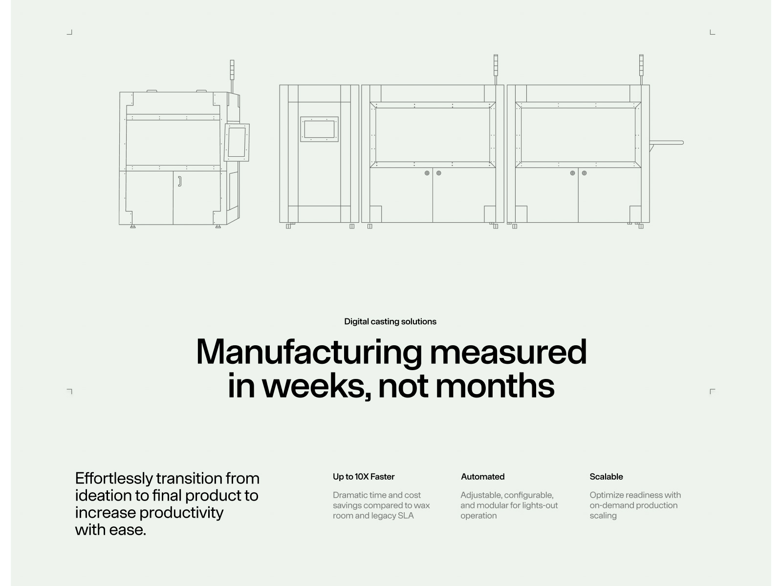
The Intrepid website, developed by REJOUICE®, is a dynamic platform offering innovative software, hardware, and process solutions to optimize manufacturing costs and timelines. With a focus on accelerating operational readiness, this site stands out for its vibrant, functional design that embodies the company’s mission.
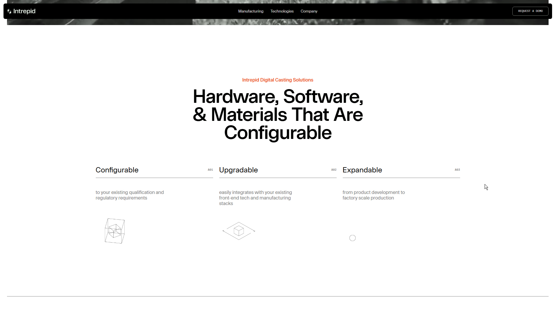
The site’s typography—__onsite_2032f6, __onsite_Fallback_2032f6, __mdio_e79ec6, and __mdio_Fallback_e79ec6—brings a contemporary, professional feel. These fonts were carefully chosen for readability and visual appeal, reinforcing the brand’s identity while effectively communicating its message.
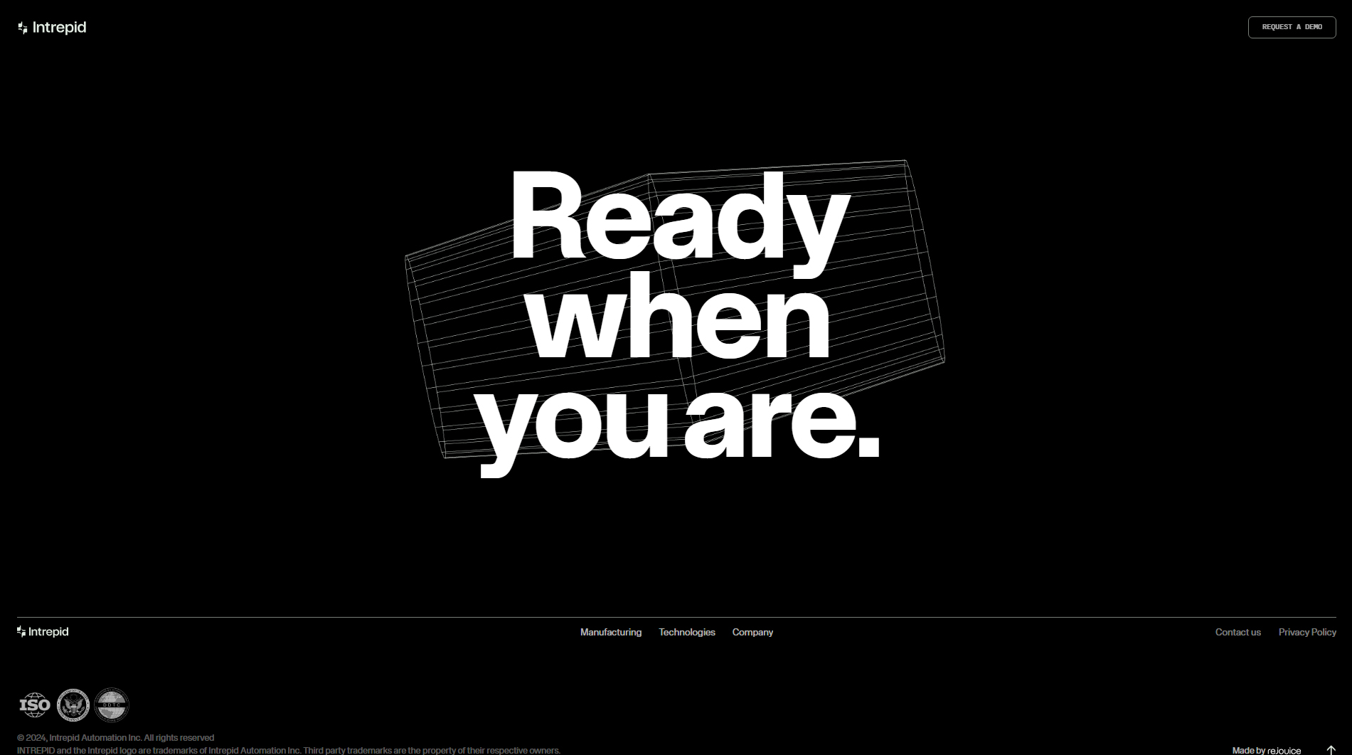
The design is energetic and colorful, immediately capturing user attention. A bold color palette reinforces Intrepid’s innovative, daring personality in the tech sector.
Animations add interactivity and enrich the user experience. Motion effects are not only visually engaging but also intuitively guide visitors through the content, making navigation more immersive and enjoyable.
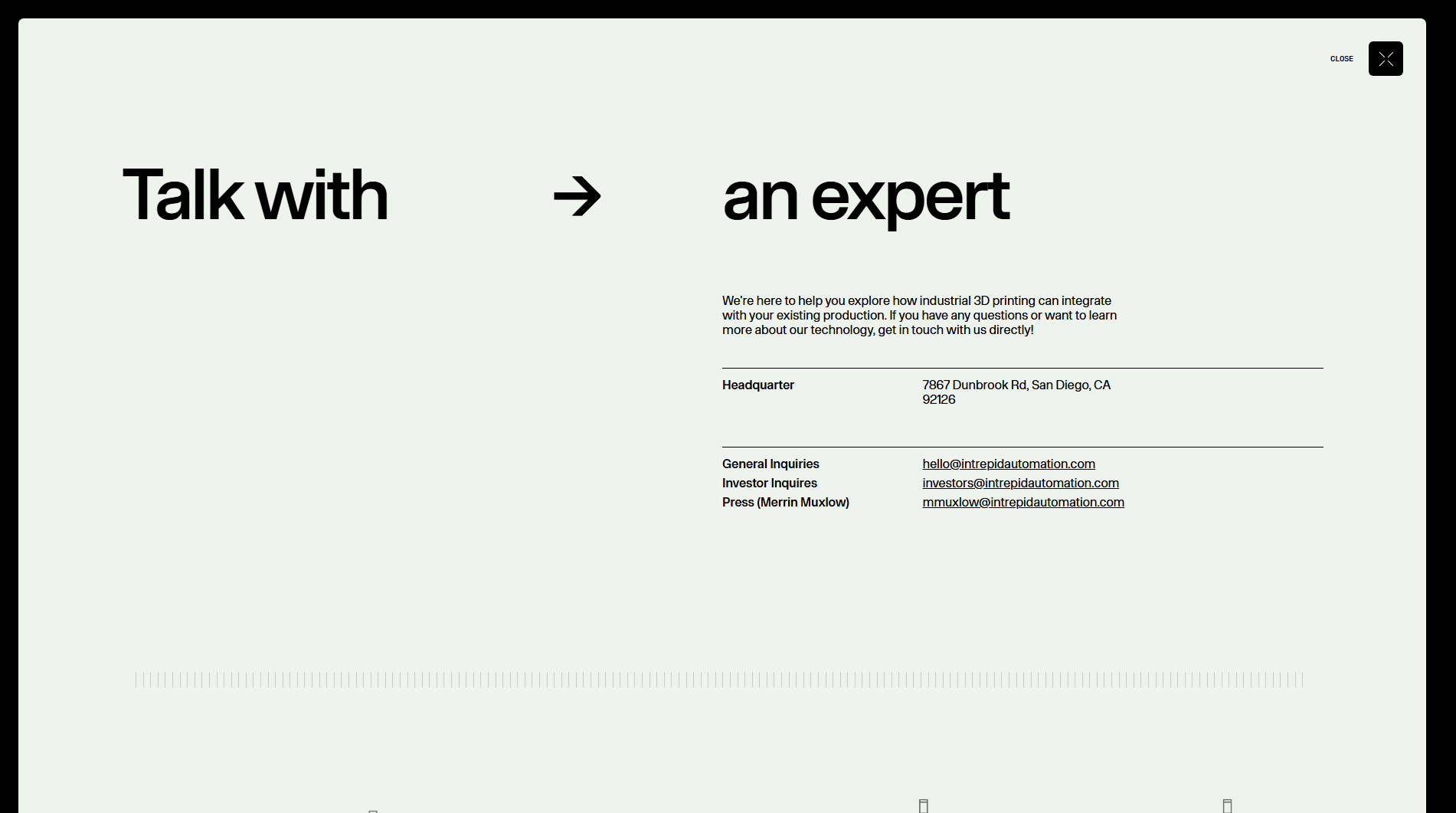
The fully responsive design ensures seamless adaptation across devices, from desktop to mobile—crucial for reaching a broad audience and ensuring product and service information is always accessible.
3D elements add an extra dimension, highlighting the brand’s innovative edge. These visuals not only impress but also help illustrate Intrepid’s solutions, making their value proposition easier to grasp.
In summary, the Intrepid website is a standout example of how well-executed web design can convey innovation and efficiency in the tech sector. With effective typography, dynamic animations, and a user-focused approach, REJOUICE® has created a platform that’s both visually appealing and highly functional—truly representative of Intrepid’s mission.
Visit site: Intrepid
Fitonist
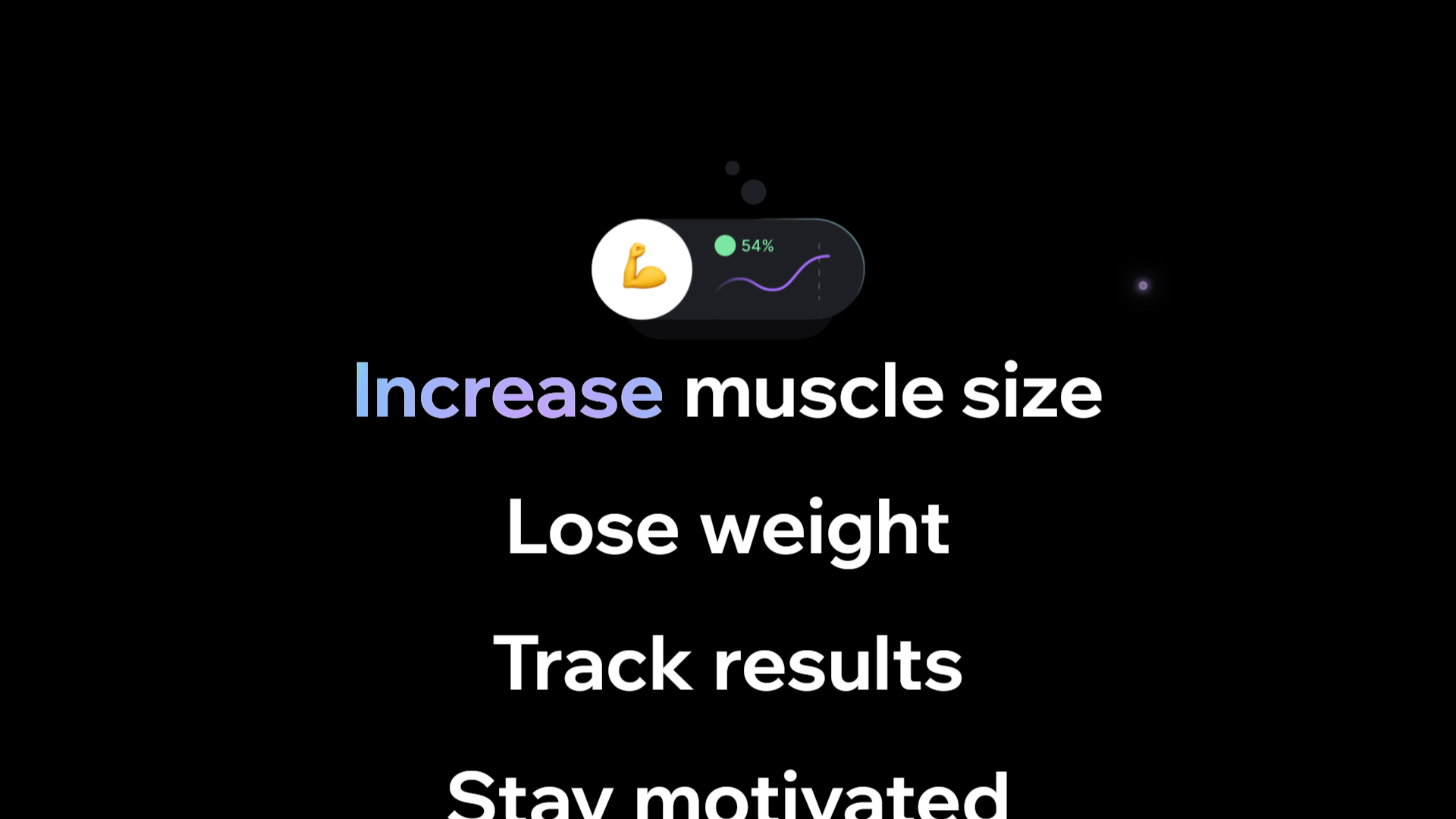
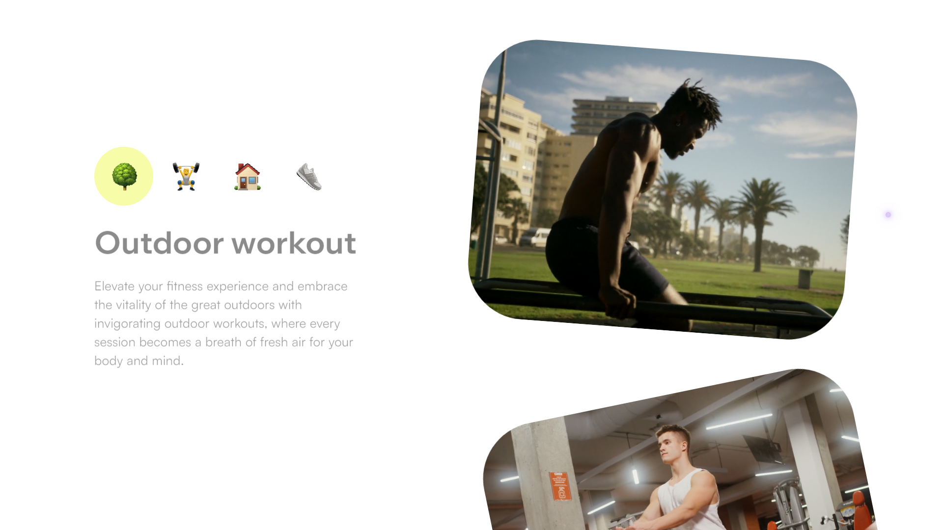
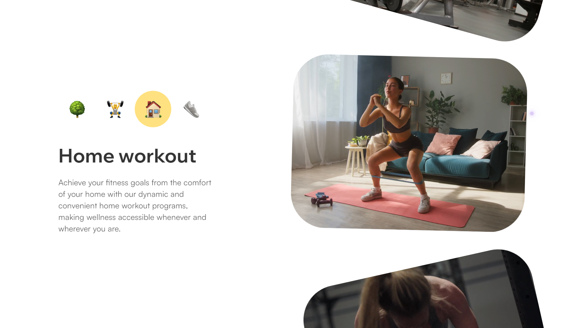
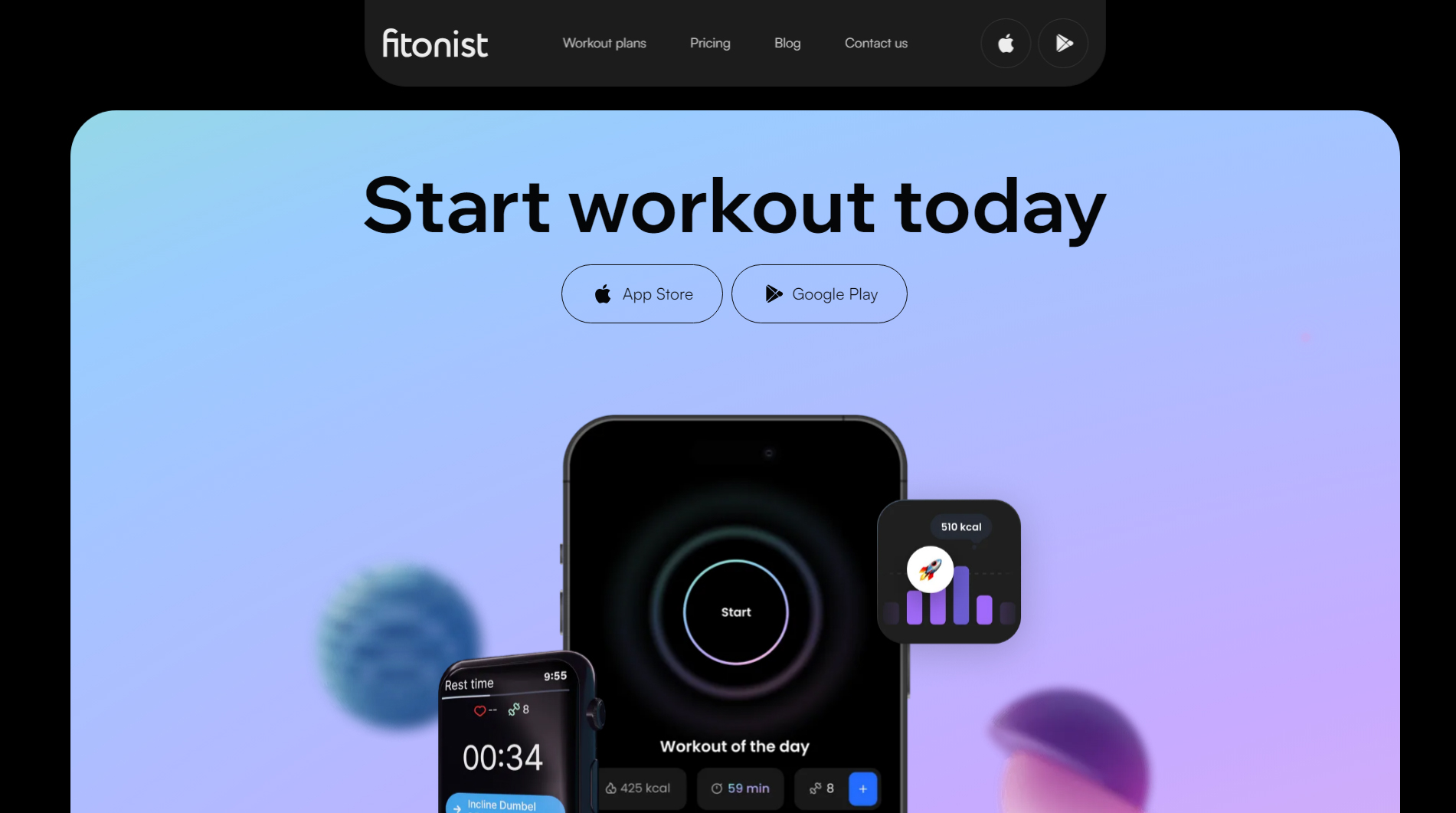
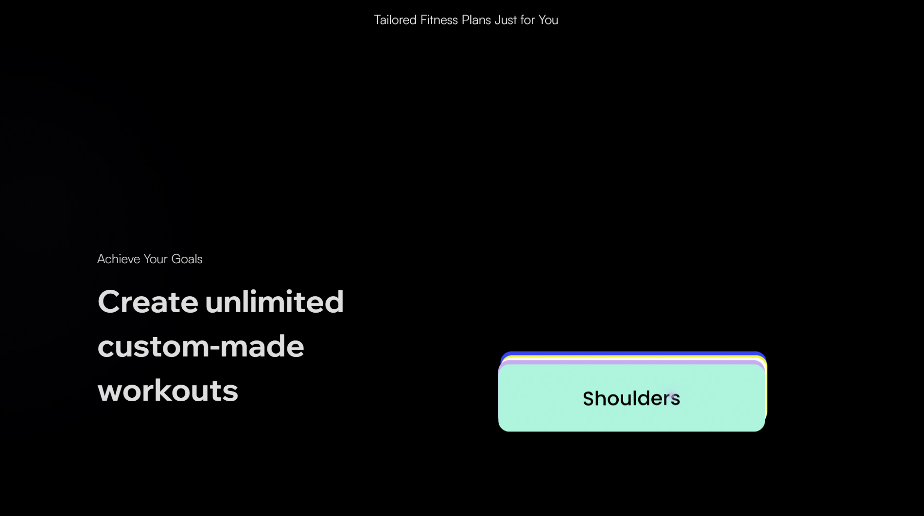
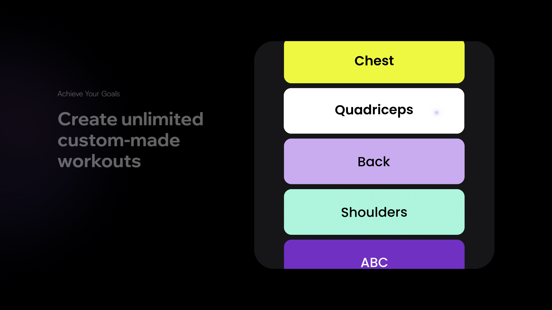
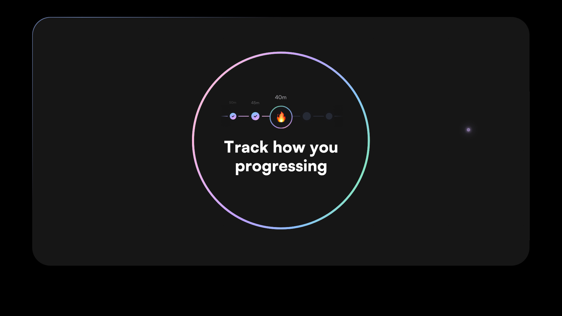
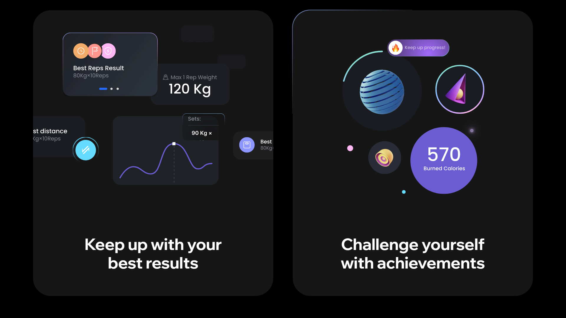
The Fitonist website, created by Outcrowd, is dedicated to promoting an innovative AI-powered mobile app designed to empower gym enthusiasts of all levels and deliver the ultimate workout experience.
The chosen font, Satoshi, is modern and versatile, adapting seamlessly to different sections while maintaining optimal readability. This typographic choice reinforces Fitonist’s contemporary, dynamic image, appealing to users seeking effective solutions for gym performance.
The color palette—HEX #000000 and HEX #C8ACF0—creates a striking, elegant contrast. Black provides a solid, sophisticated foundation, while lavender adds freshness and modernity. This combination is not only visually impactful but also reflects the app’s innovative spirit.
Animated elements make navigation more interactive and engaging. These animations enhance the site’s aesthetics and help guide users through the experience, ensuring they intuitively find the information they need.
Dynamic scrolling enables smooth content exploration, keeping users engaged and making it easy to understand the app’s features and benefits. Microinteractions throughout the site add another layer of interactivity, elevating the overall user experience and keeping visitors engaged.
A focus on interaction design and UI results in a user-friendly platform that encourages visitors to sign up and explore the app’s features—crucial for converting interest into action.
In summary, the Fitonist website is an excellent example of how thoughtful web design can propel an emerging health and fitness brand. With effective typography, an appealing color palette, and interactive animations, Outcrowd has crafted a digital experience that’s both visually compelling and perfectly aligned with the goals of gym enthusiasts.
Visit site: Fitonist
Space Trash Signs
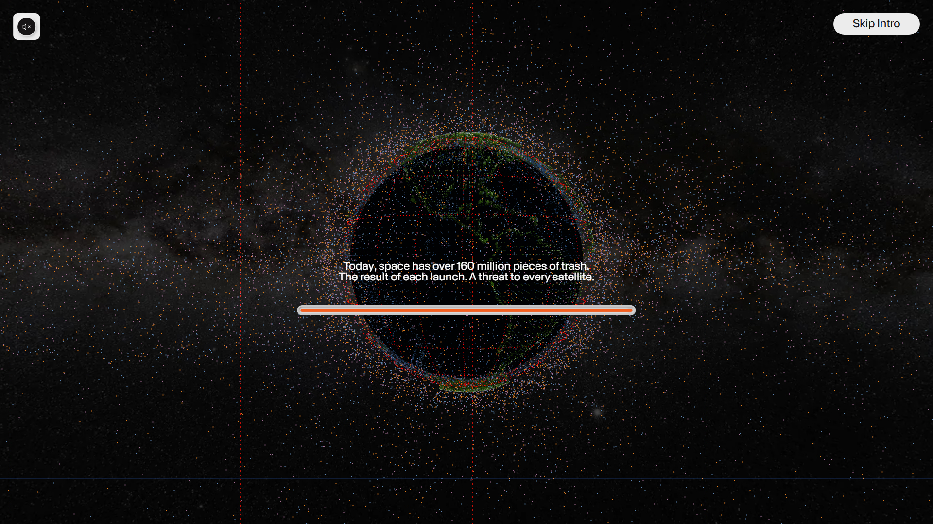
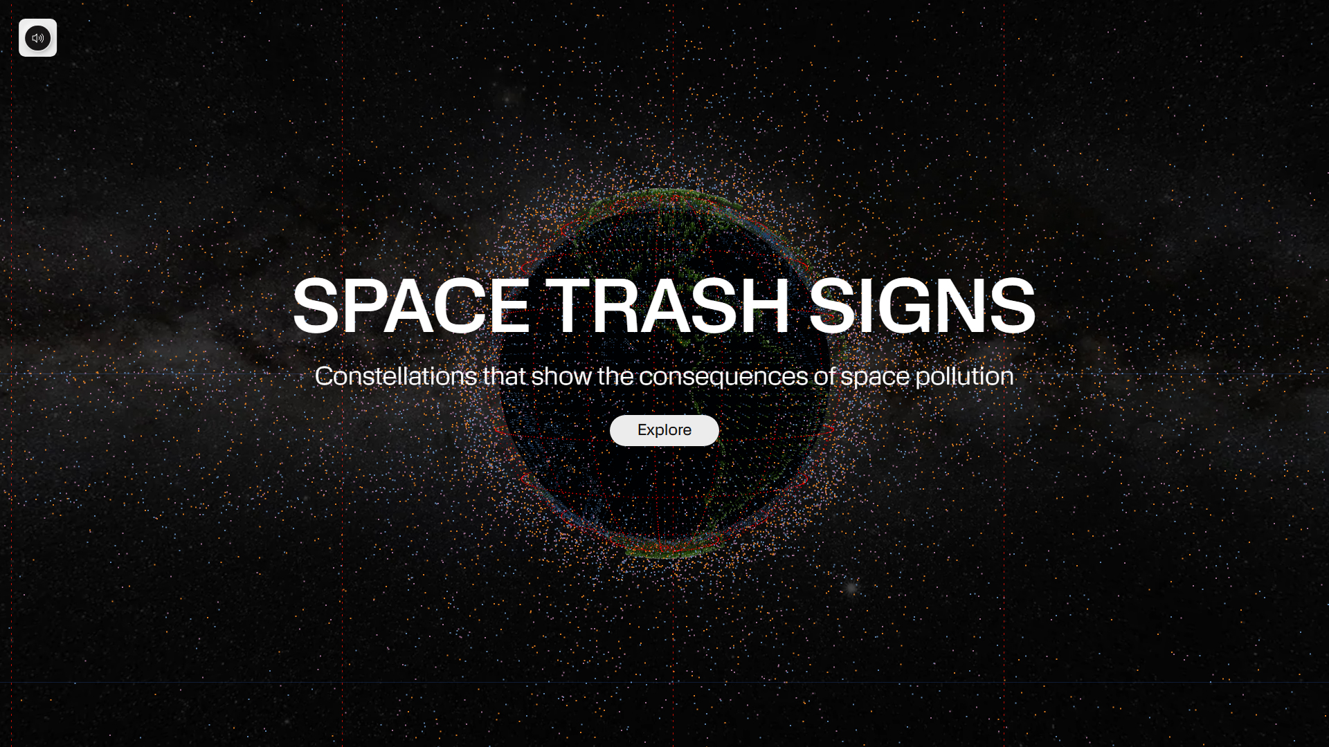
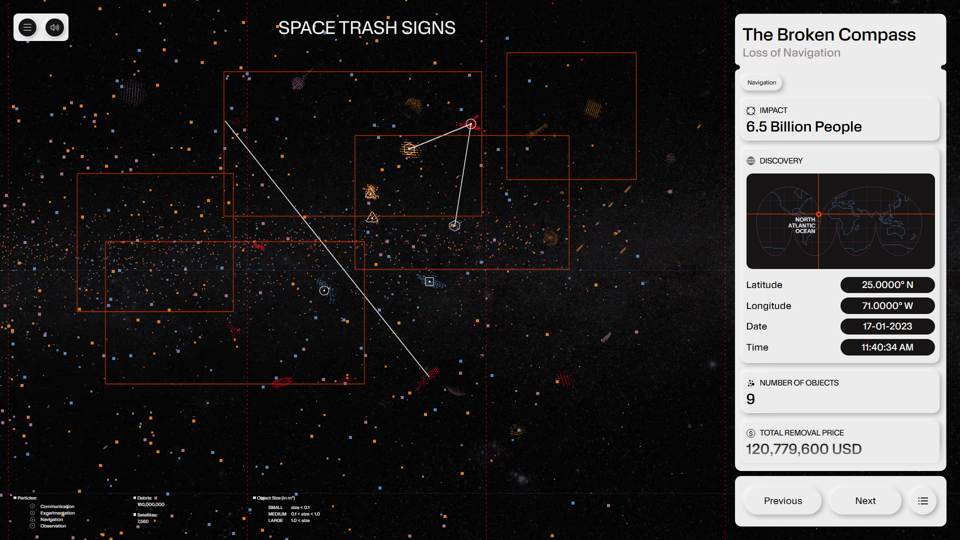
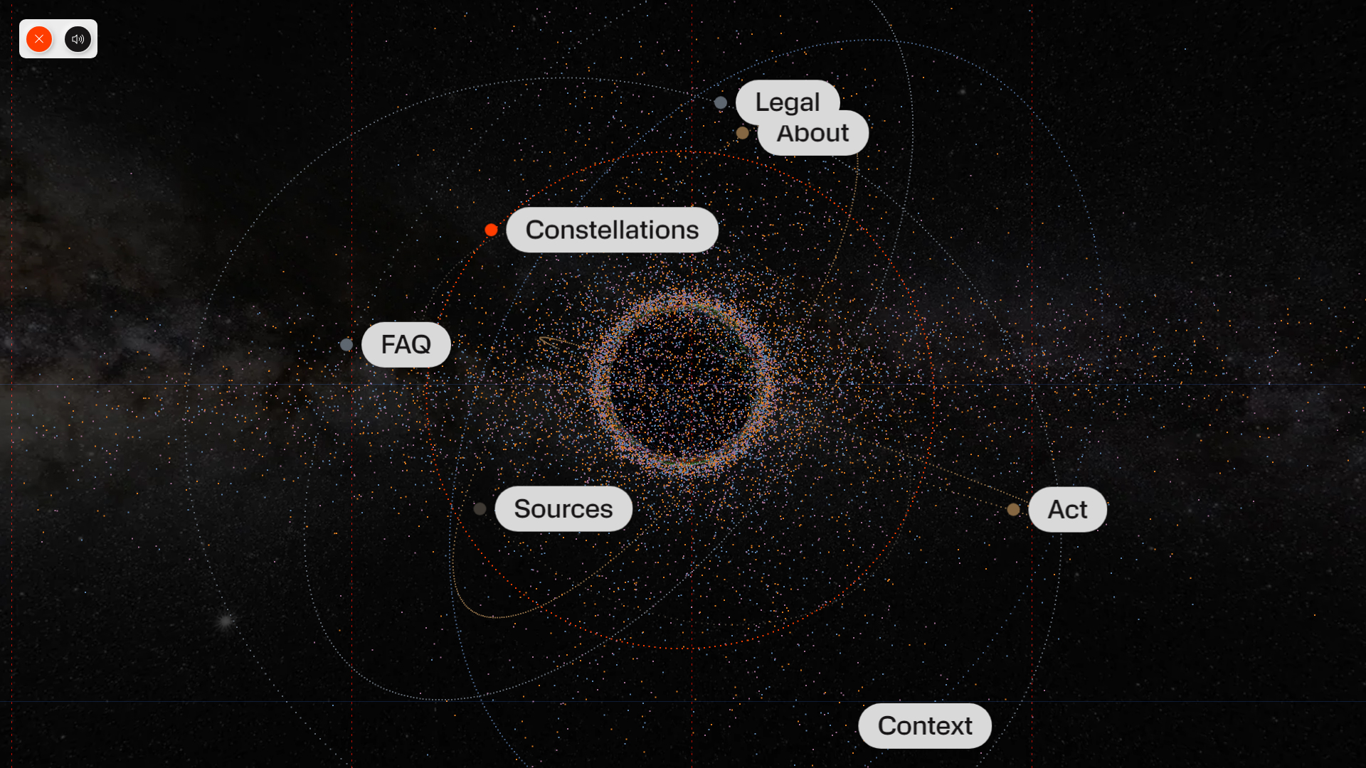
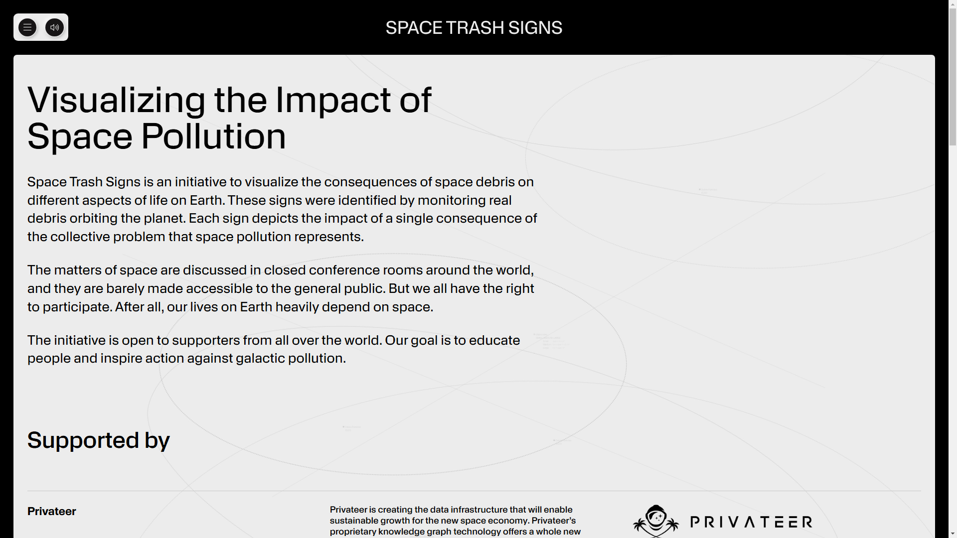
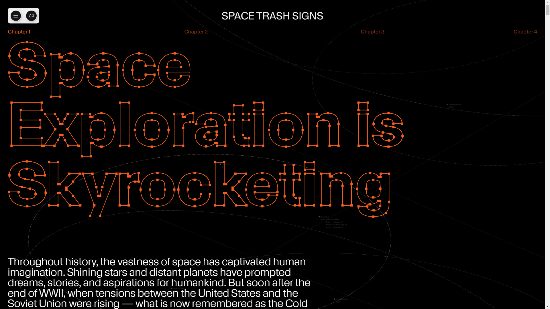
The Space Trash Signs website, created by Owls Department and Moby Digg, is an innovative 3D project visualizing the impact of space pollution through constellations formed by orbital debris. This design not only educates on a critical issue but also delivers an interactive, immersive experience that prompts visitors to reflect on humanity’s impact in space.
The KMR Apparat font brings a modern, experimental style that matches the project’s futuristic theme, ensuring content is both engaging and readable.
A color palette of HEX #000000 and HEX #ffffff creates high contrast, emphasizing the design’s clarity and simplicity. Black backgrounds provide depth, highlighting visual elements and debris constellations, while white is used for text and interactive elements for easy reading and navigation.
The design is experimental, featuring animation and transitions that enrich the user experience. These animated elements are visually striking and help guide visitors through the project’s narrative, making the exploration of space pollution dynamic and