Here’s our fourth and final edition of the year featuring the best web designs of 2017. As you may already know or guess, we’re rounding up the top web design highlights from this last quarter. Staying inspired and up-to-date is key to fueling our creative side.
Our selection is based on originality and creativity as well as design and usability. So, let’s dive in. Get ready to engage all your senses as we explore some truly immersive audiovisual experiences.
Best Web Designs of 2017 #4
La peau de l’ours
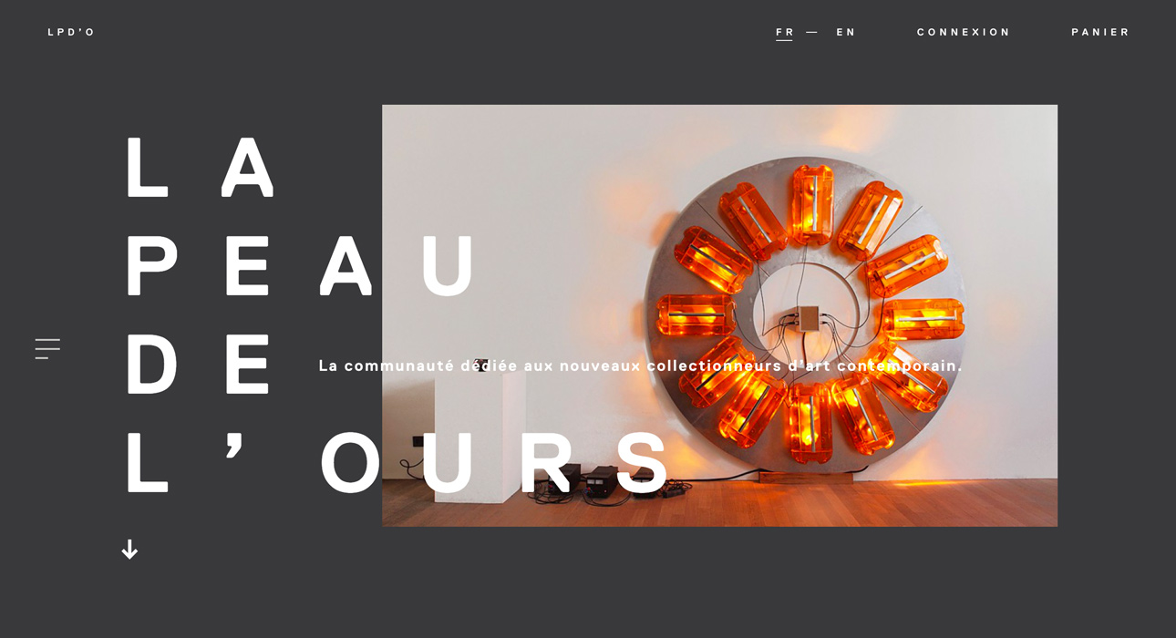
La peau de l’ours is a website dedicated to contemporary art collecting. With a minimalist design and an introductory slider, the entire site maintains a consistently elegant and appealing look. The navigation menu and its animation, along with the refined transitions, really caught our eye. While it may not stand out for its digital wow factor, we believe it’s worth highlighting a well-executed web design that doesn’t rely on unnecessary extras.
Pivovarov
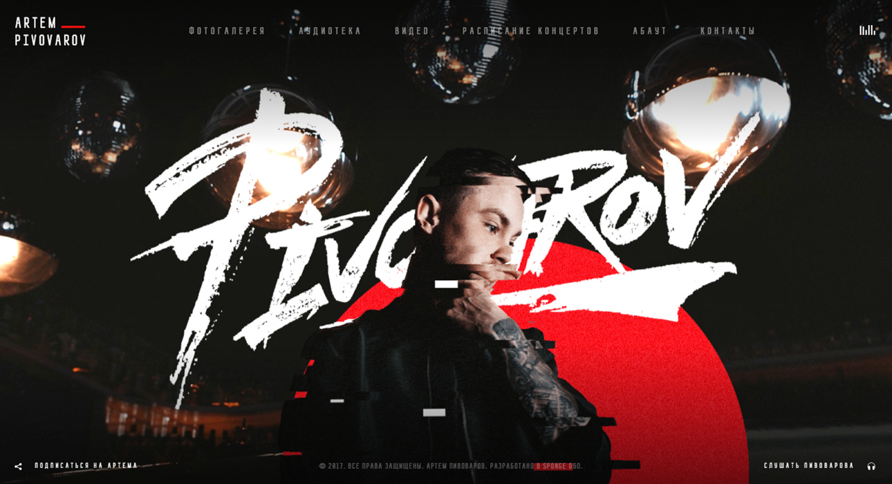
Pivovarov is a Ukrainian music artist. For his website, the team opted for a highly visual homepage, complemented by a music track—naturally, the artist’s own work. The central “glitch” effect and the parallax movement as you move the mouse across the screen are standout features.
TUX
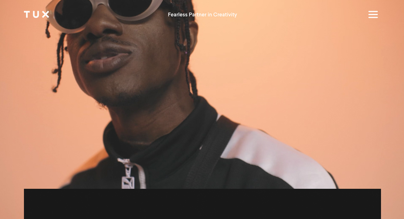
TUX is a creative agency based in Canada. The homepage, featuring an engaging video, gives the entire site an urban yet tech-driven vibe. For their case studies, we loved the creative use of a slider to showcase each project’s headline and subheadline. While fullscreen dropdown menus can spark debate over usability, we’re still fans of this bold and visually appealing navigation style.
Digital Asset
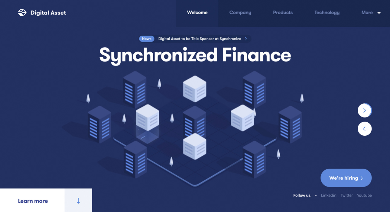
Digital Asset provides financial data solutions for institutions. We were especially impressed by the vector-style graphics used to illustrate their services—each element comes to life, making the offering easy to understand. A very attractive web design with a strong flat design aesthetic.
Looi Studio

Looi Studio specializes in interactive experience design. We love the animated lettering and color effects that appear as you hover and move the mouse over the text. The section transitions are also thoughtfully crafted and meet the high expectations set by the rest of the site.
Conclusions
Looking at the best in web design lately, we’re seeing a clear trend toward darker color palettes. It seems we’re gradually moving away from white backgrounds in favor of deeper, darker tones. Whether this is a lasting trend or just a coincidence remains to be seen—but we’ll save that discussion for another post, where we’ll explore web design trends for 2018.