In this article, I’m sharing a curated selection of the most outstanding pharmaceutical packaging designs we’ve come across in the industry so far.
The pharmaceutical sector is one of the world’s most powerful and reliable economic engines. It requires an enormous amount of branded materials, which are updated annually alongside product formulations. Failing to refresh a brand’s image can spell disaster for both the laboratory and its medicines. That’s why it’s essential for pharmaceutical companies to regularly update their product packaging as a symbol of progress.
Here, I’ve gathered some of the most inspiring examples of pharmaceutical packaging design.
The Best in Pharmaceutical Packaging Design
Smena Pharma
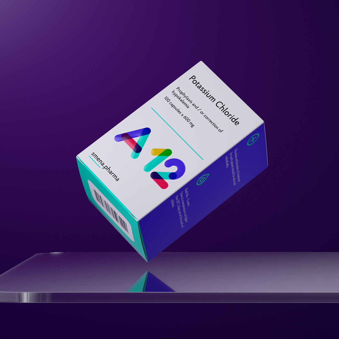
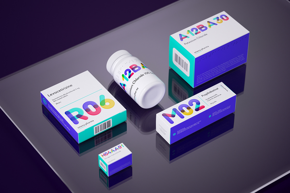
Design by Apus Agency & Isaev Vladimir & Saint Petersburg, Russian Federation & Daniil Solosyatov & Vitaly Afanasyev.
This packaging series stands out for its fresh, modern look, breaking away from the traditional, often dull and serious pharmaceutical packaging. The vibrant use of color and multicolored typography highlights the ATC classification of each medicine, cleverly incorporating the company’s brand colors to create a dynamic visual effect.
It’s undoubtedly one of the best pharmaceutical packaging designs we’ve seen in a long time.
To view the full project, click here.
Viva Pharm
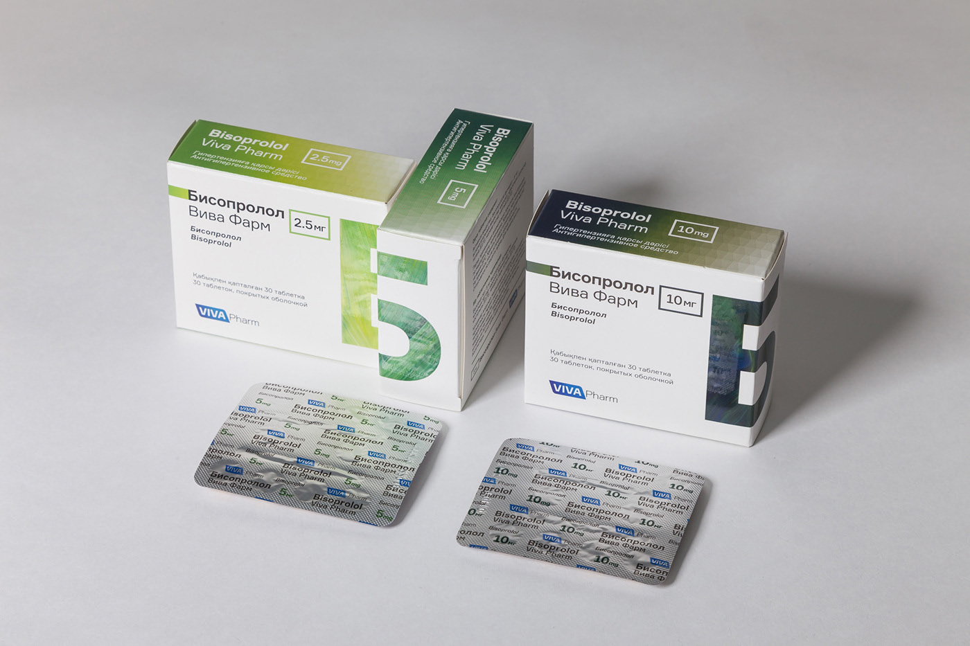
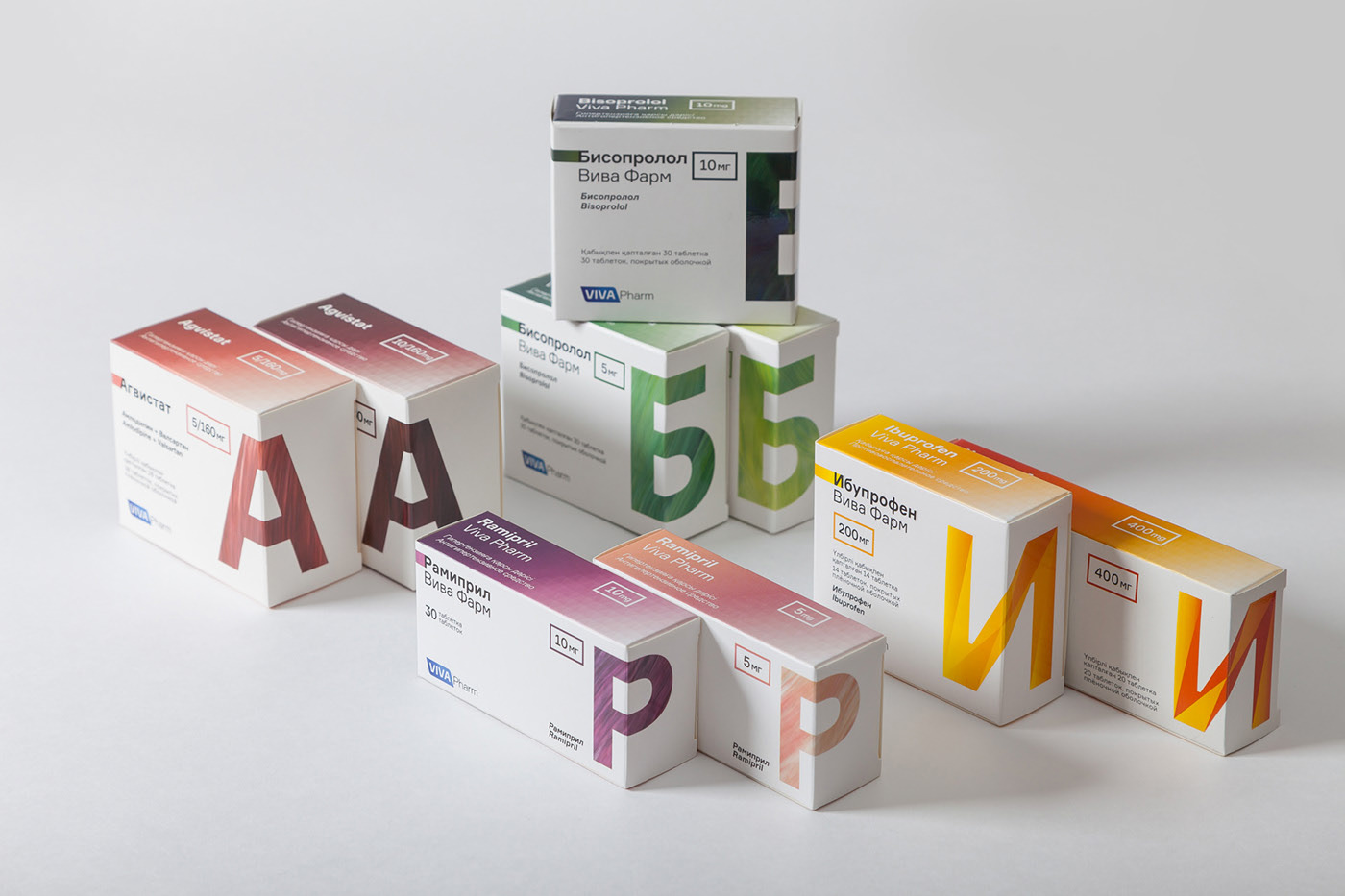
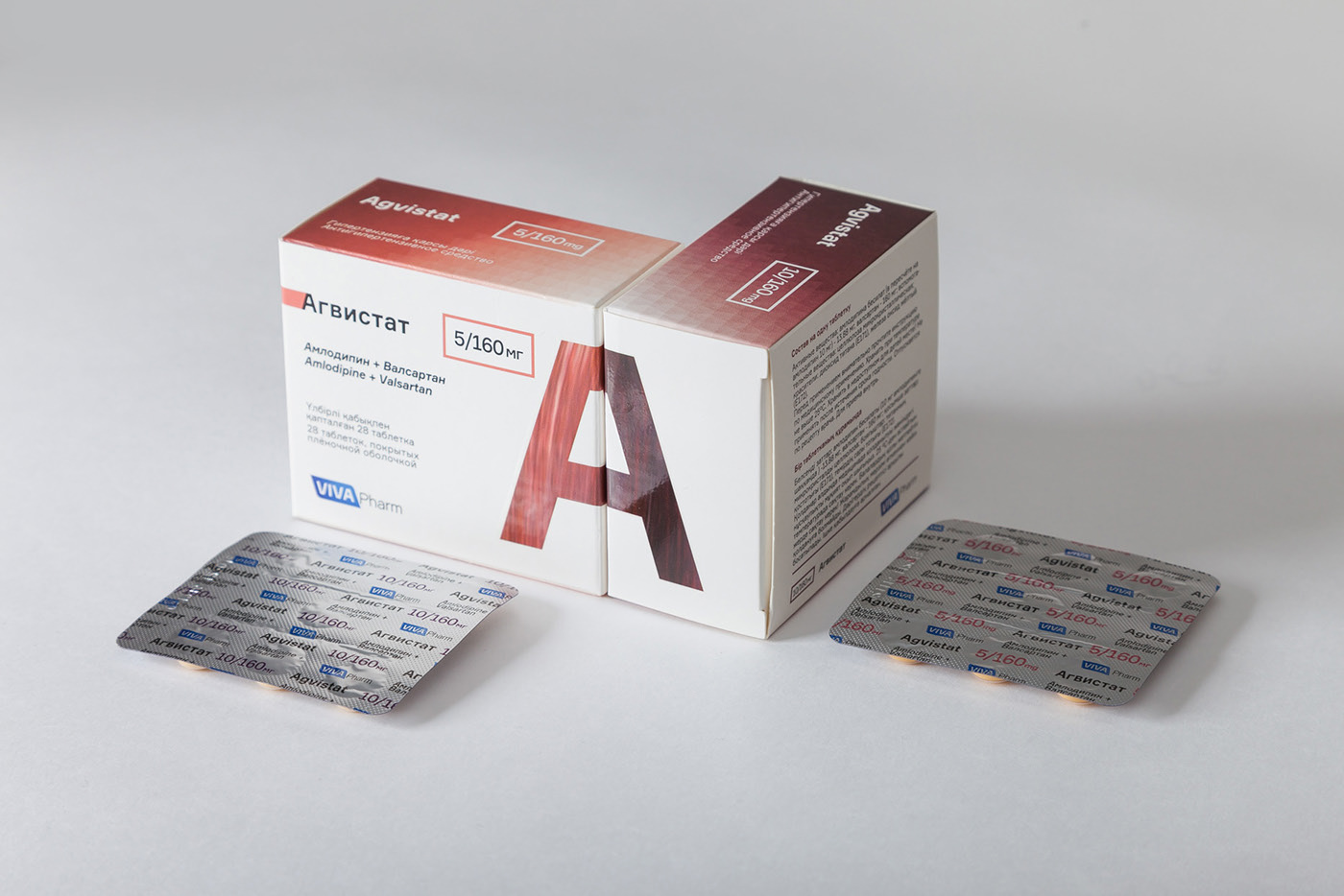
Design by Arys Arenov & Marjeanne Sybank.
In contrast to the previous example, this packaging for Viva Pharm by Arys Arenov & Marjeanne Sybank takes a highly technical approach. The design makes excellent use of gradients and the background behind the product’s initial letter, which serves as both an identifier and a distinguishing symbol for each product.
The series maintains a cohesive corporate look, while each product features unique details for easy identification both within the range and individually.
To view the full project, click here.
Metode
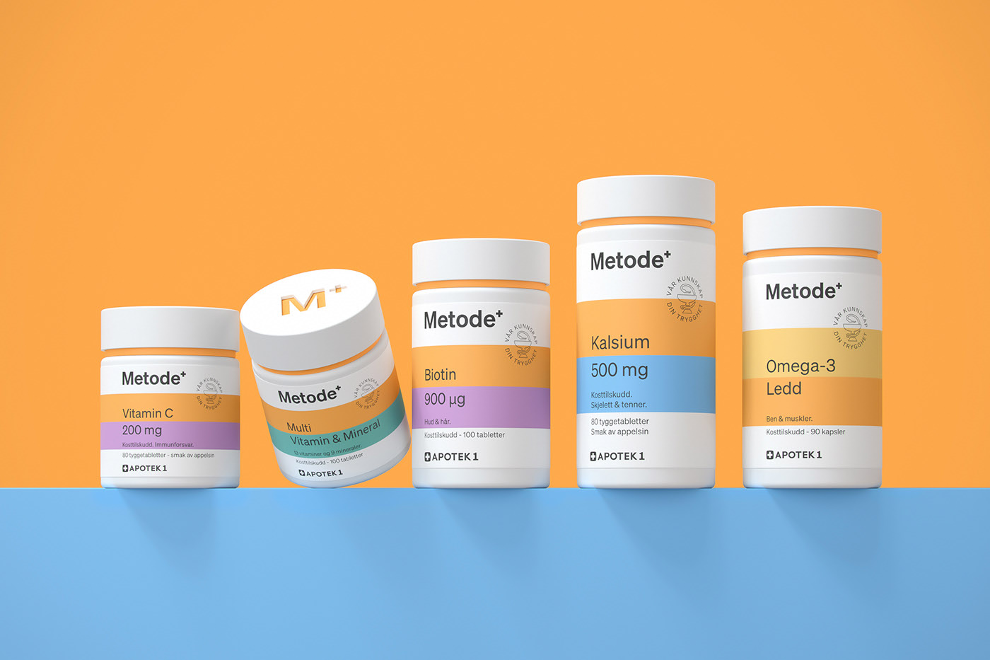
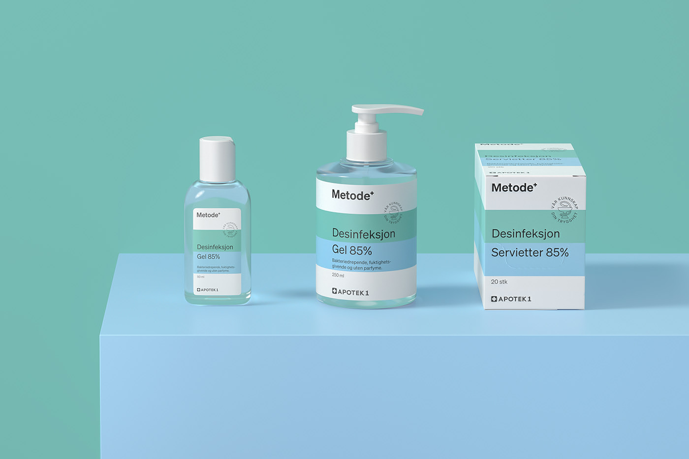
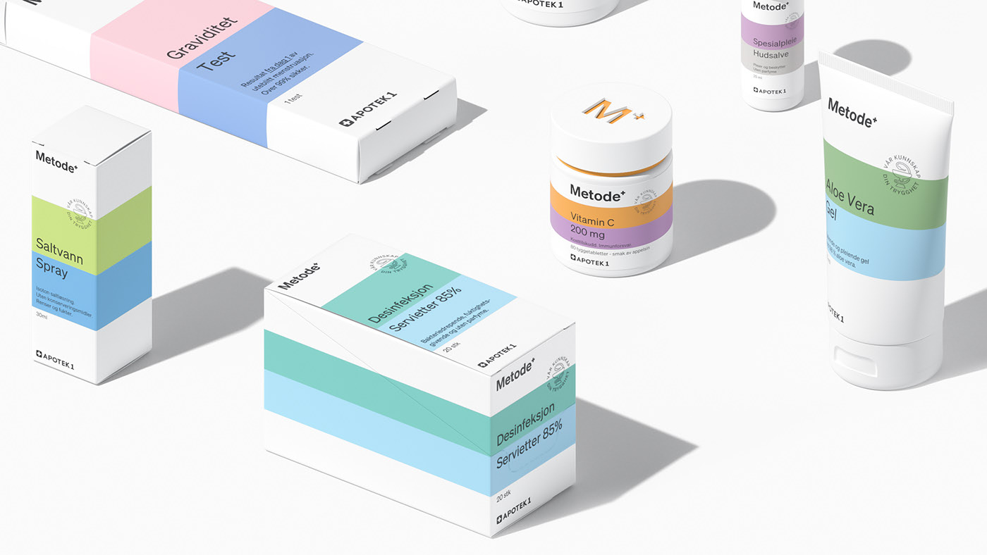
Design by Maxim Kadashov.
Maxim Kadashov’s work for Metode demonstrates a clear intent to move away from the classic, uninspired pharmaceutical packaging. The result is a contemporary design that still respects the conventions and requirements of the sector. Pharmaceutical brands must project a trustworthy, professional image, and because these products relate to health, their packaging must comply with strict regulations—sometimes at the expense of creative flair.
In this case, the design aligns perfectly with Metode’s brand identity, especially through the use of pastel color lines.
To view the full project, click here.
Periokin
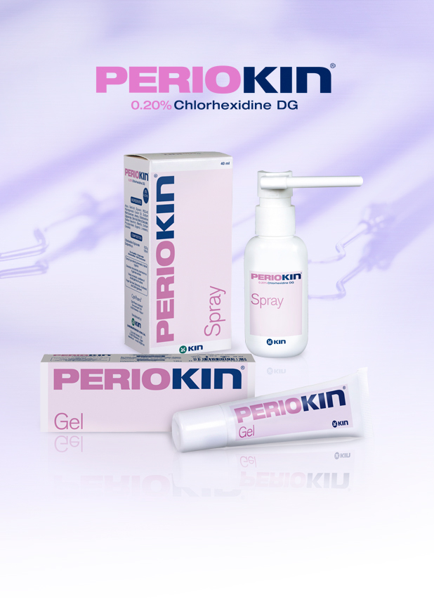
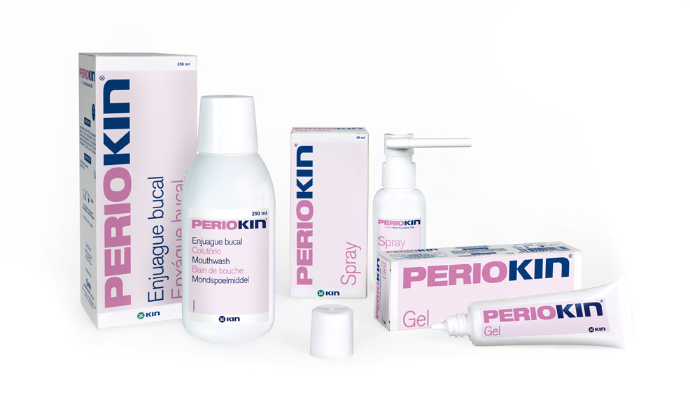
Design by Jordi Ferrándiz.
Jordi Ferrándiz presents a minimalist packaging design for Kin’s PerioKin dental care range. The bold typography and carefully chosen color palette perfectly complement the product type, resulting in a clean, modern look.
To view the full project, click here.
Brain Medical
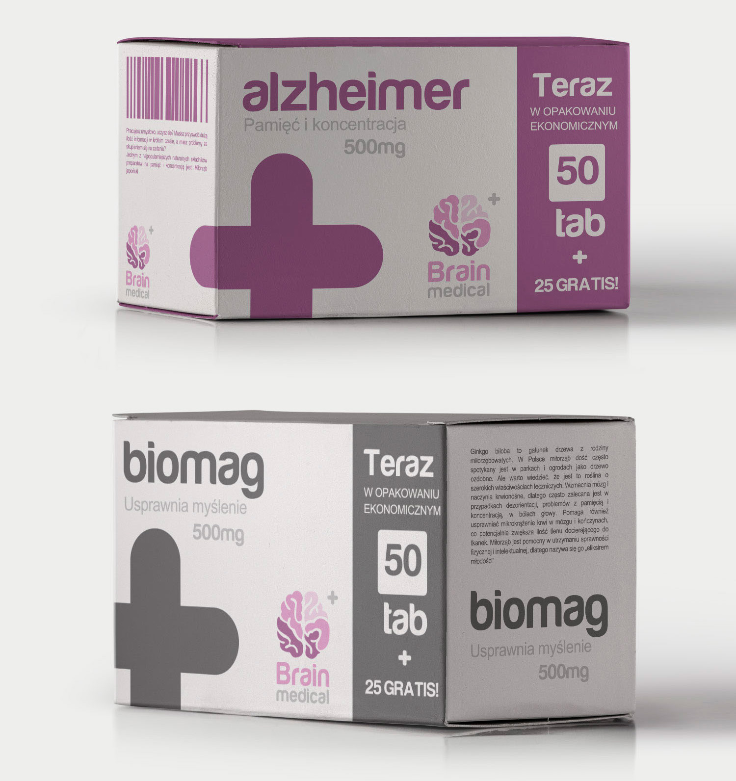
Design by Emil Sowiński.
This packaging for an Alzheimer’s treatment stands out for its minimalist approach, presenting all essential information at a glance. The design is intentionally austere, eliminating any unnecessary distractions so users can quickly identify and recognize the product.
To view the full project, click here.
OTC Medicines
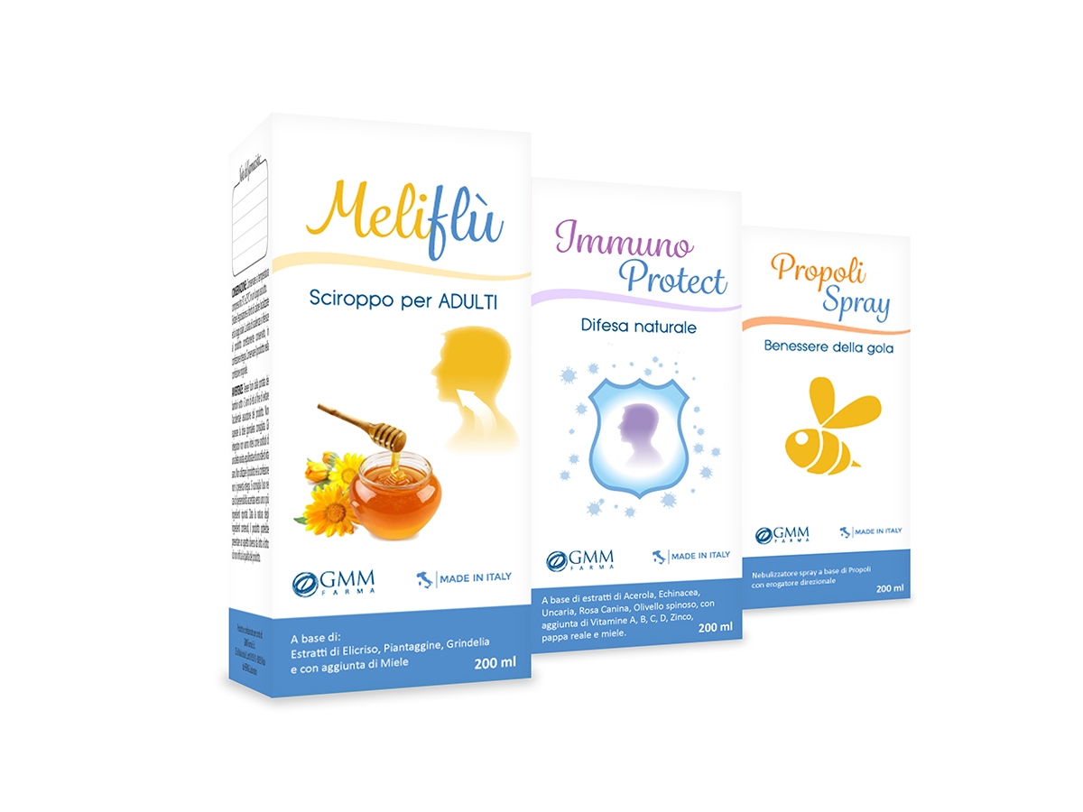
Design by Tanya Smirnova.
The OTC range from GMM Farma, designed by Tanya Smirnova, embraces a natural, classic, and traditional aesthetic. The use of illustrated icons clearly communicates the product contents, reinforcing the packaging’s approachable and trustworthy feel.
To view the full project, click here.
Umckaloabo
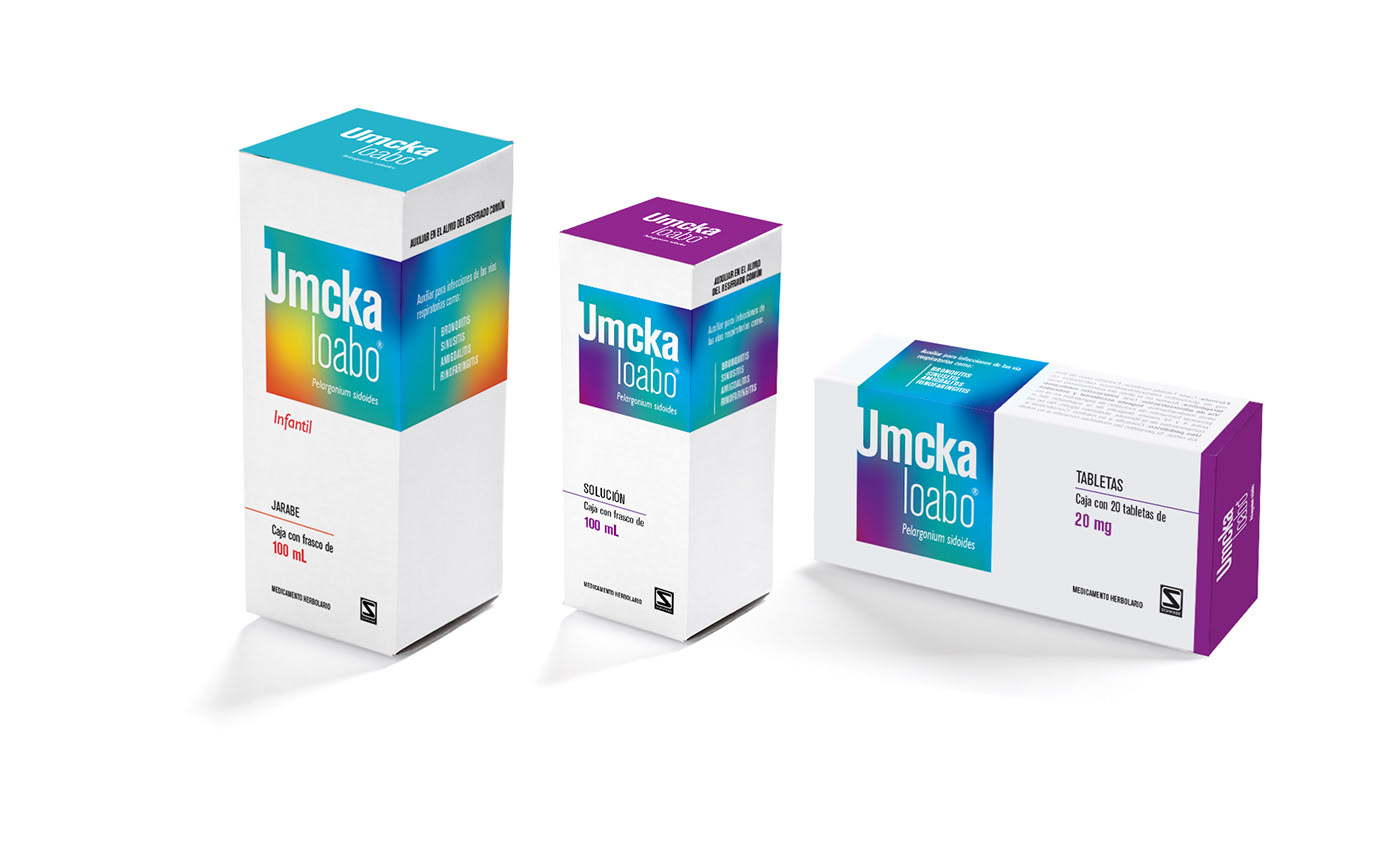
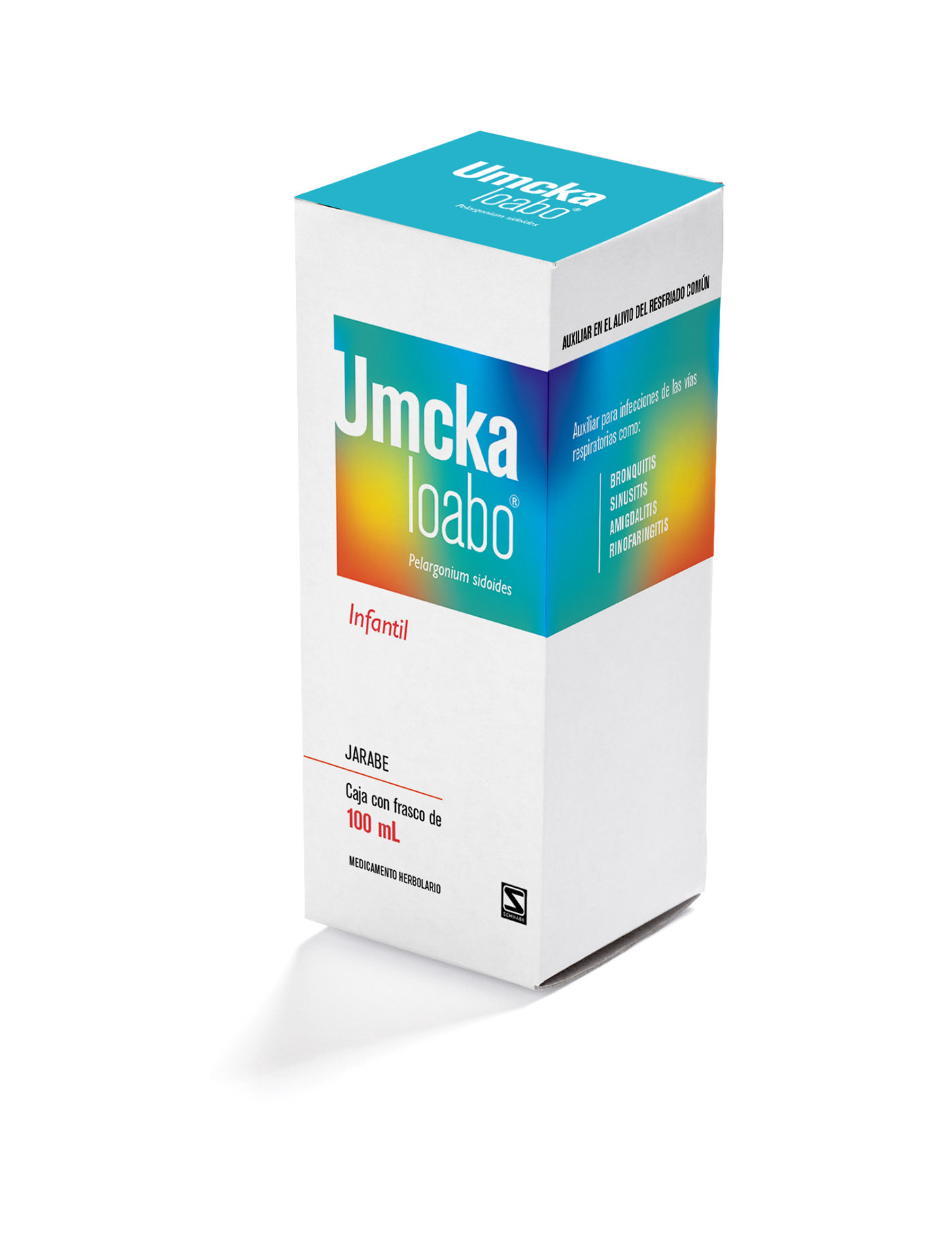
Design by Manu Cardenas.
This is another excellent example of minimalist, straightforward packaging. The rectangular prism box displays all the necessary information clearly and concisely. The typography is complemented by a multicolored highlight area, drawing attention to the product’s key feature.
To view the full project, click here.
VITAMIN C + Zn Viva Pharm
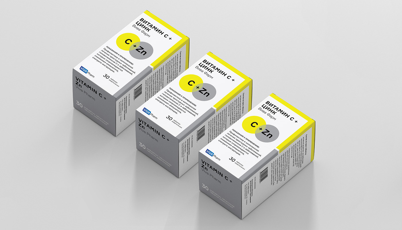
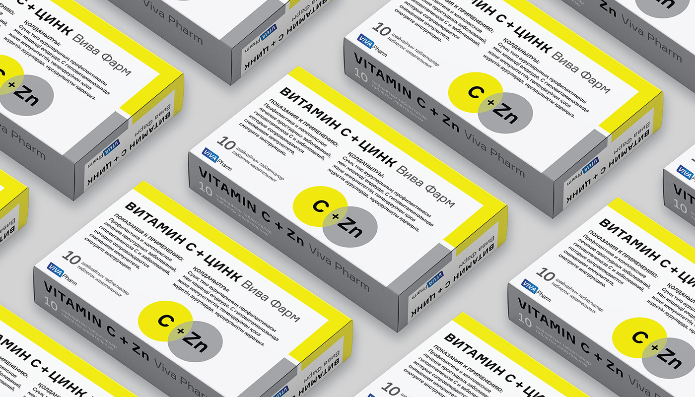
Design by Marjeanne Sybankulova.
This design for Viva Pharm by Marjeanne Sybankulova is one of my personal favorites. It’s a perfect modern update of the classic pharmaceutical packaging we all remember. The carefully selected typography and striking color palette create a strong contrast, giving the packaging a contemporary, trustworthy, and professional appearance. That’s why it’s the final highlight in this roundup of outstanding pharmaceutical packaging designs.
To view the full project, click here.