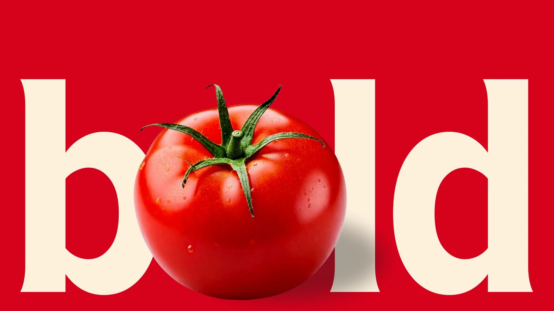
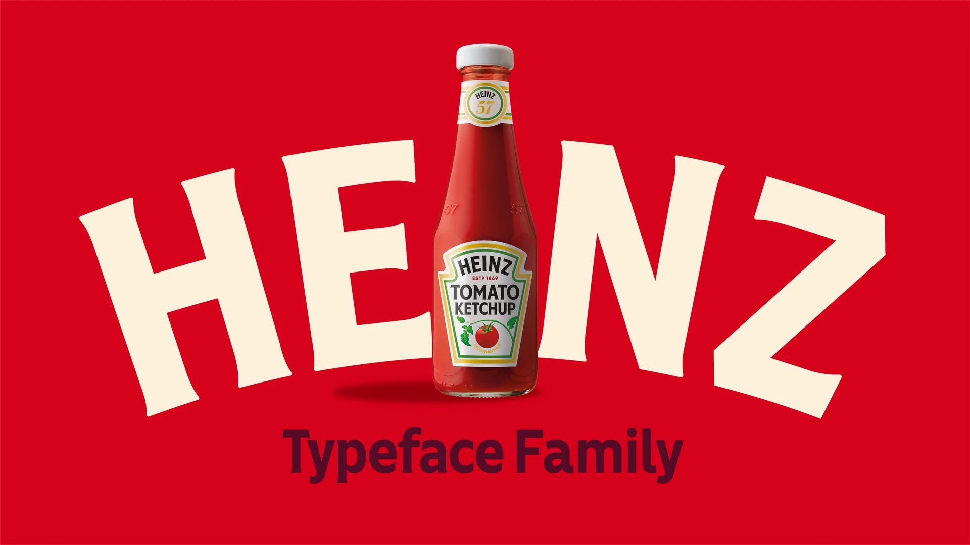
A custom typeface that strengthens one of the world’s most recognizable brand systems
When a brand has been part of global popular culture for over 150 years, any update to its visual identity demands almost surgical precision. The Heinz Typeface project, developed by Jones Knowles Ritchie in collaboration with Studio DRAMA for Kraft Heinz, is a masterclass in how type design can preserve an iconic legacy while evolving to meet contemporary demands. Winner of a D&AD Wood Pencil 2025, this project proves that typography remains one of the most powerful strategic assets in global branding.
From our perspective as a graphic design, branding, and visual identity agency in Barcelona—also specializing in web design and brand systems—Heinz Typeface stands out as an exceptional case study: a bespoke typeface that not only enhances consistency and legibility, but also reinforces the visual ownership of a brand present in over 200 countries.


Preserving and evolving: the starting point
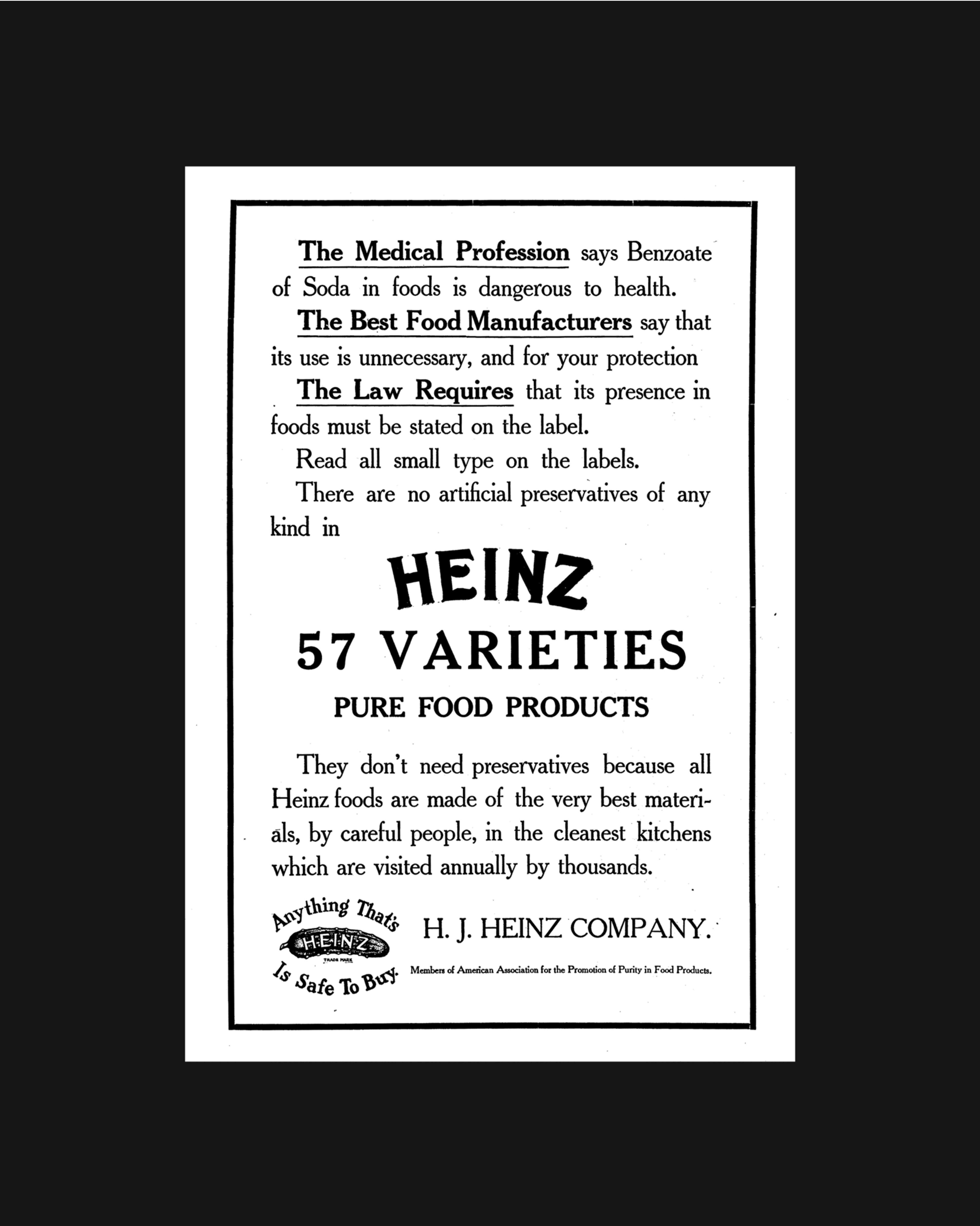
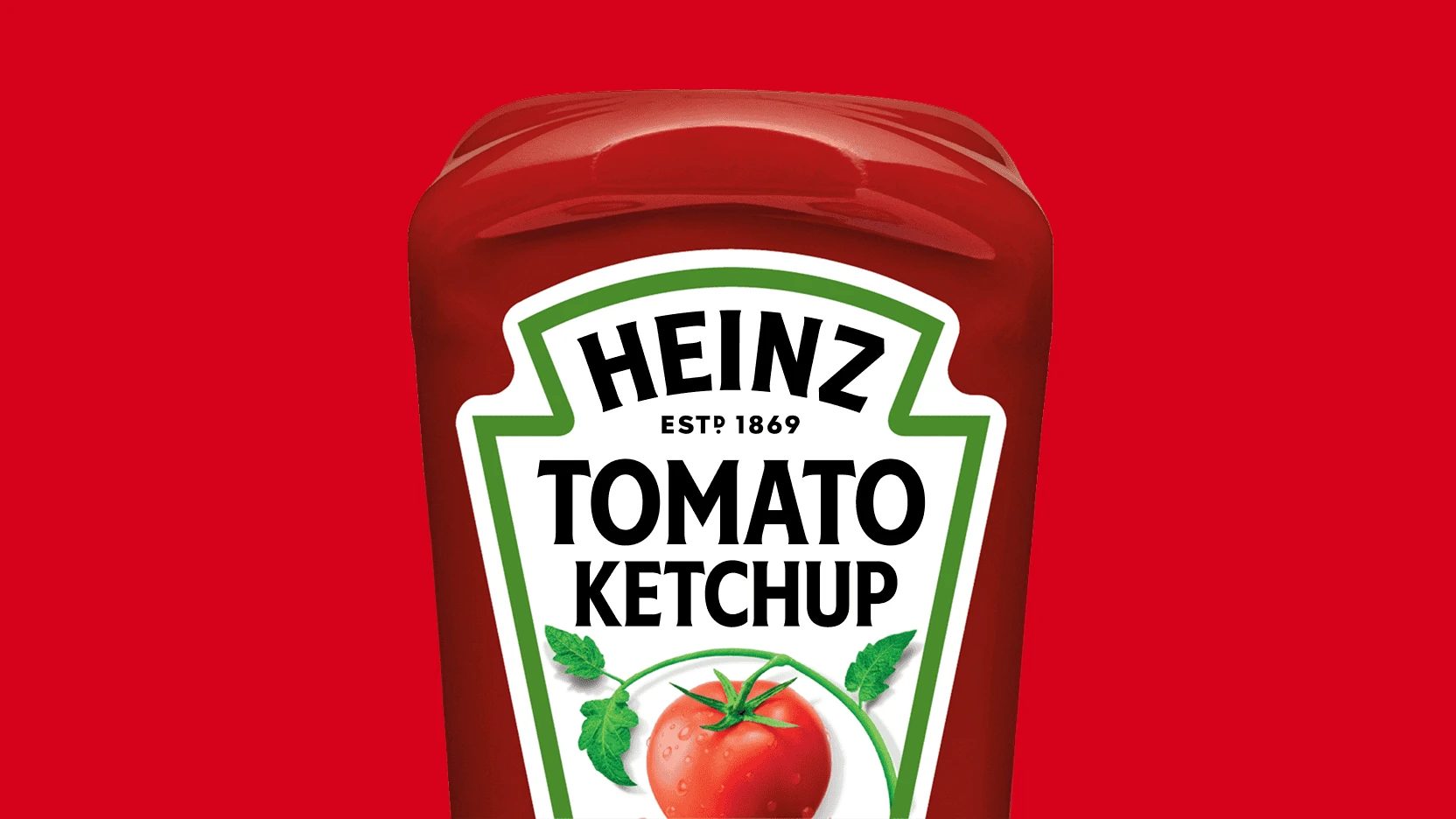
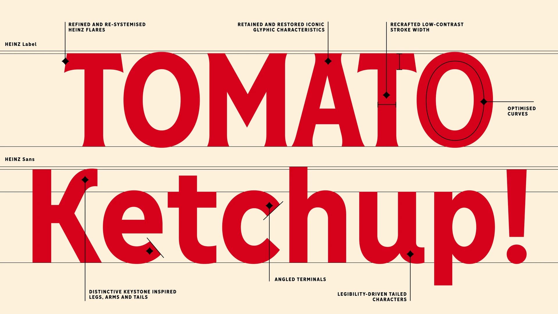
The project began with a challenge familiar to many heritage brands: over time, repeated use of the wordmark and various alphabets had led to inconsistencies. Heinz’s iconic uppercase letters, instantly recognized worldwide, needed a thorough review to restore rhythm, coherence, and clarity.
Rather than reinventing the brand, the team chose a path of quiet evolution. Every curve, angle, and terminal was meticulously redrawn to keep Heinz’s bold personality intact, while aligning it with modern typographic standards. It’s a subtle approach that doesn’t seek attention, yet makes a significant impact on the brand’s global perception.
This mindset is especially relevant for any graphic design studio working with established brands: it’s not always about breaking the mold, but about refining it.

Typography at the heart of global recognition
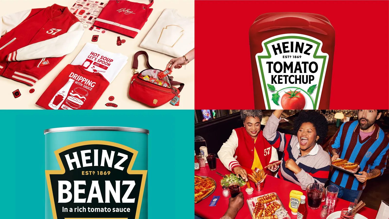
From Ketchup and Beanz to Mayo and Cream of Tomato, Heinz is a constant presence on supermarket shelves around the world. In such a vast visual ecosystem, typography serves as a crucial unifying element.
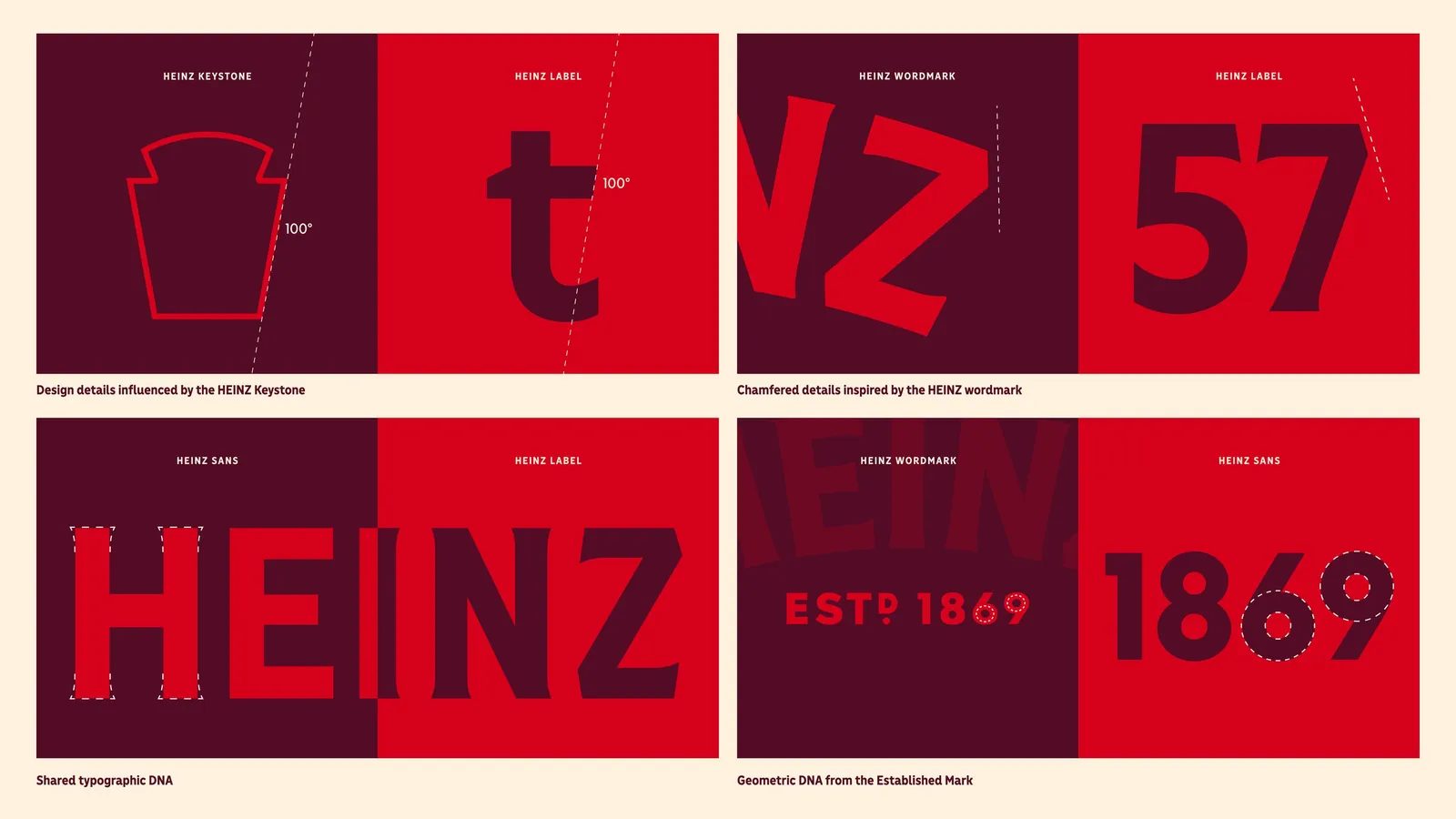
Heinz Typeface was crafted by aligning every letter with the brand’s most distinctive visual cues: the keystone, the label shape, the historic wordmark, and its unique rhythm. This consistency allows the typeface to act as visual glue across thousands of applications, languages, and cultural contexts.
For global brands—and for branding projects in Barcelona with international ambitions—this is key: a proprietary typeface can become the strongest pillar of brand identity.
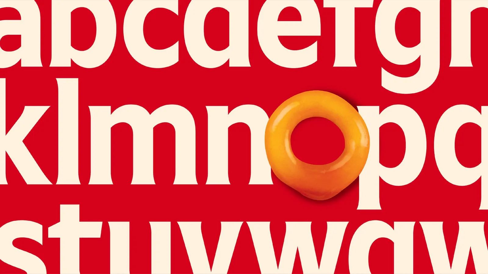
Unmistakably Heinz: letters with their own DNA
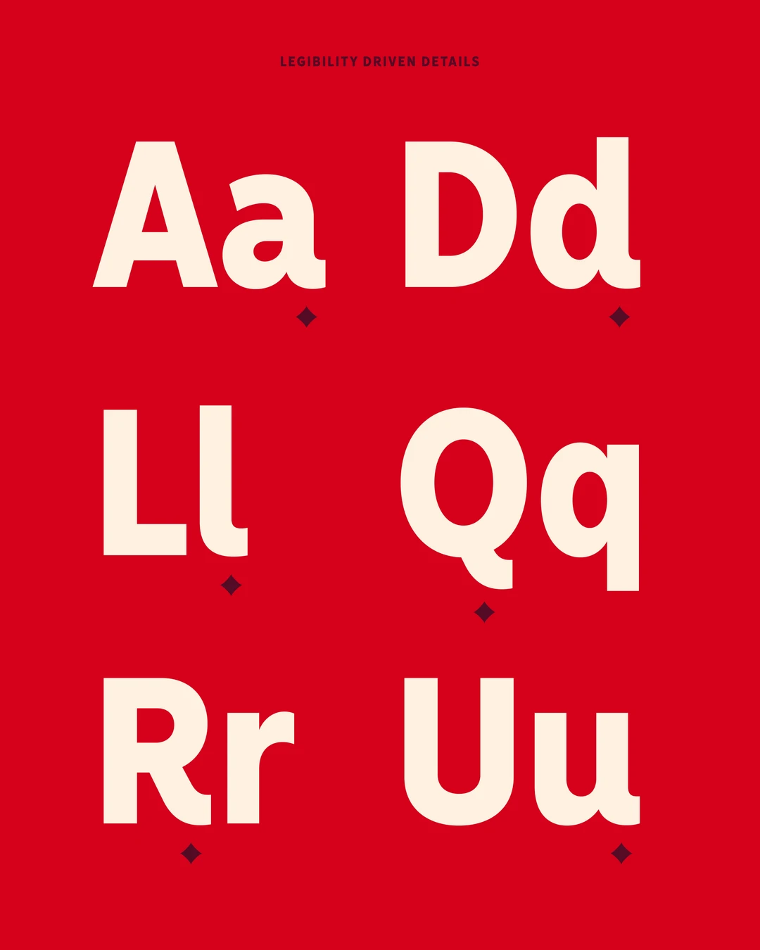
One of the project’s greatest achievements is that every letter is instantly recognizable—even in isolation. The rhythm of the original wordmark served as the guiding principle, ensuring the Heinz character shines through in every glyph.
The keystone—Heinz’s historic symbol—influenced the angles, cuts, and curves, creating a formal coherence that runs through the entire type system. The result is a visual voice as distinctive as Heinz’s flavor: hard to describe, impossible to mistake.
This level of “ownability” is a core goal of contemporary type design for branding.

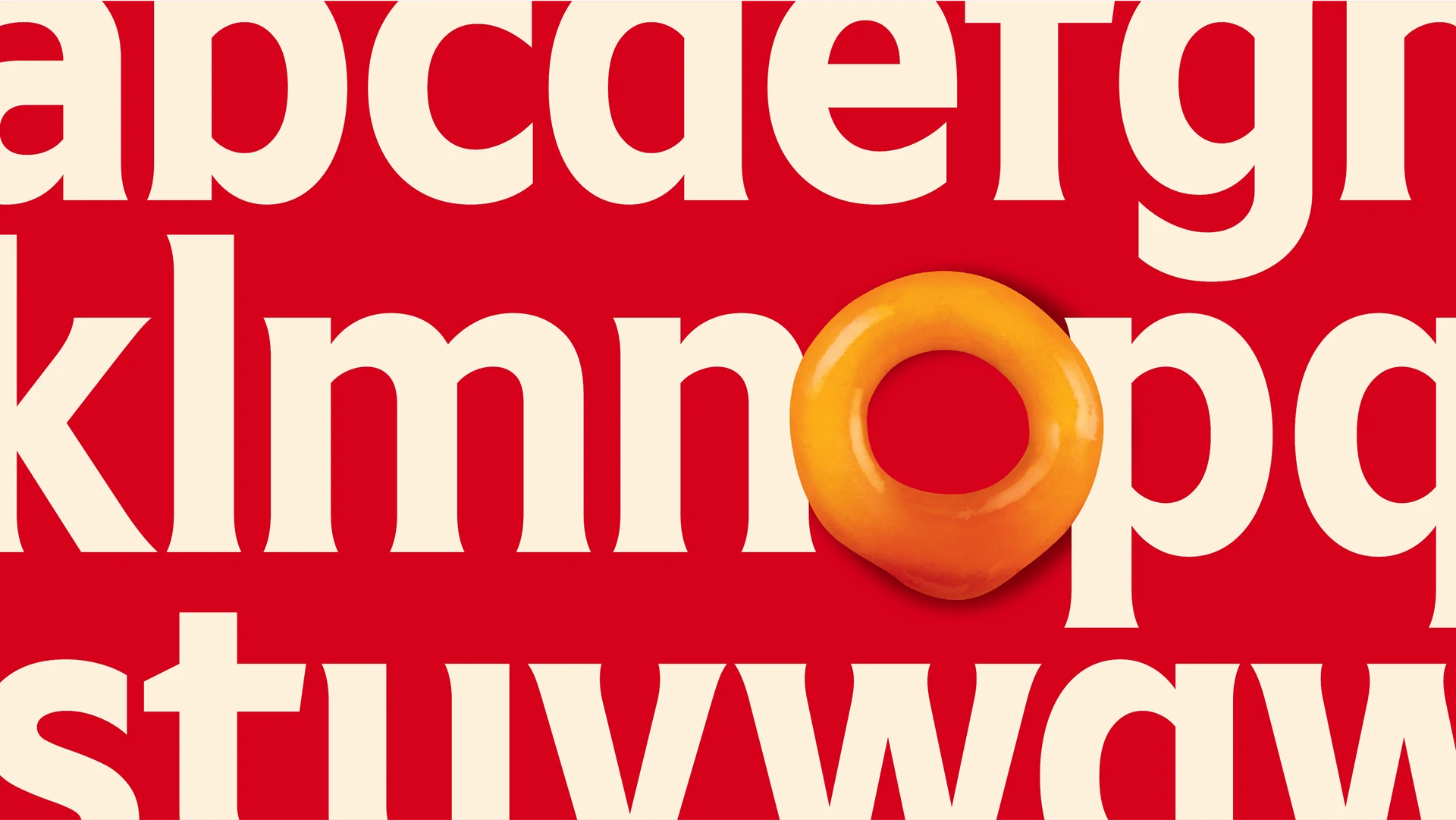
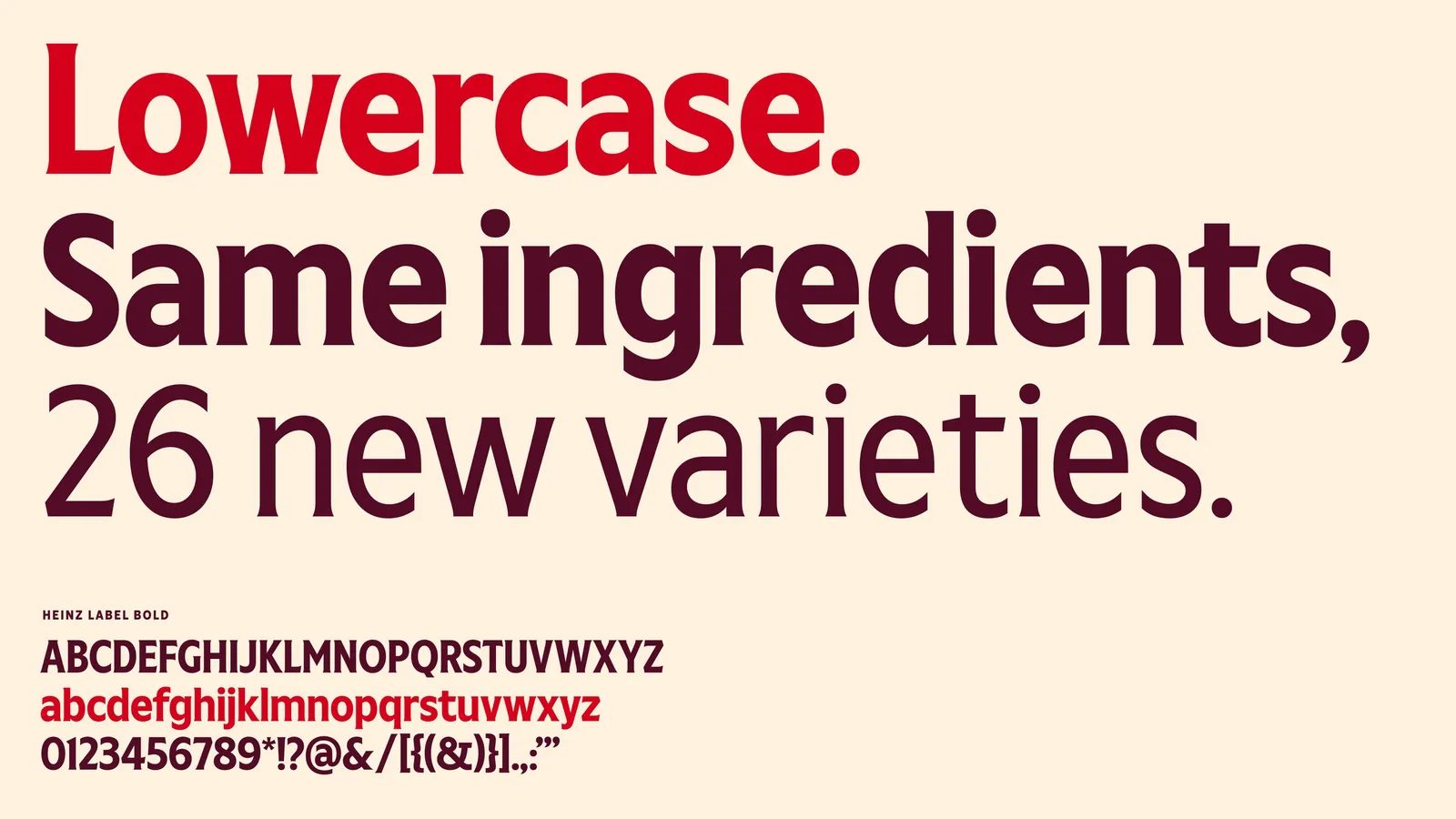
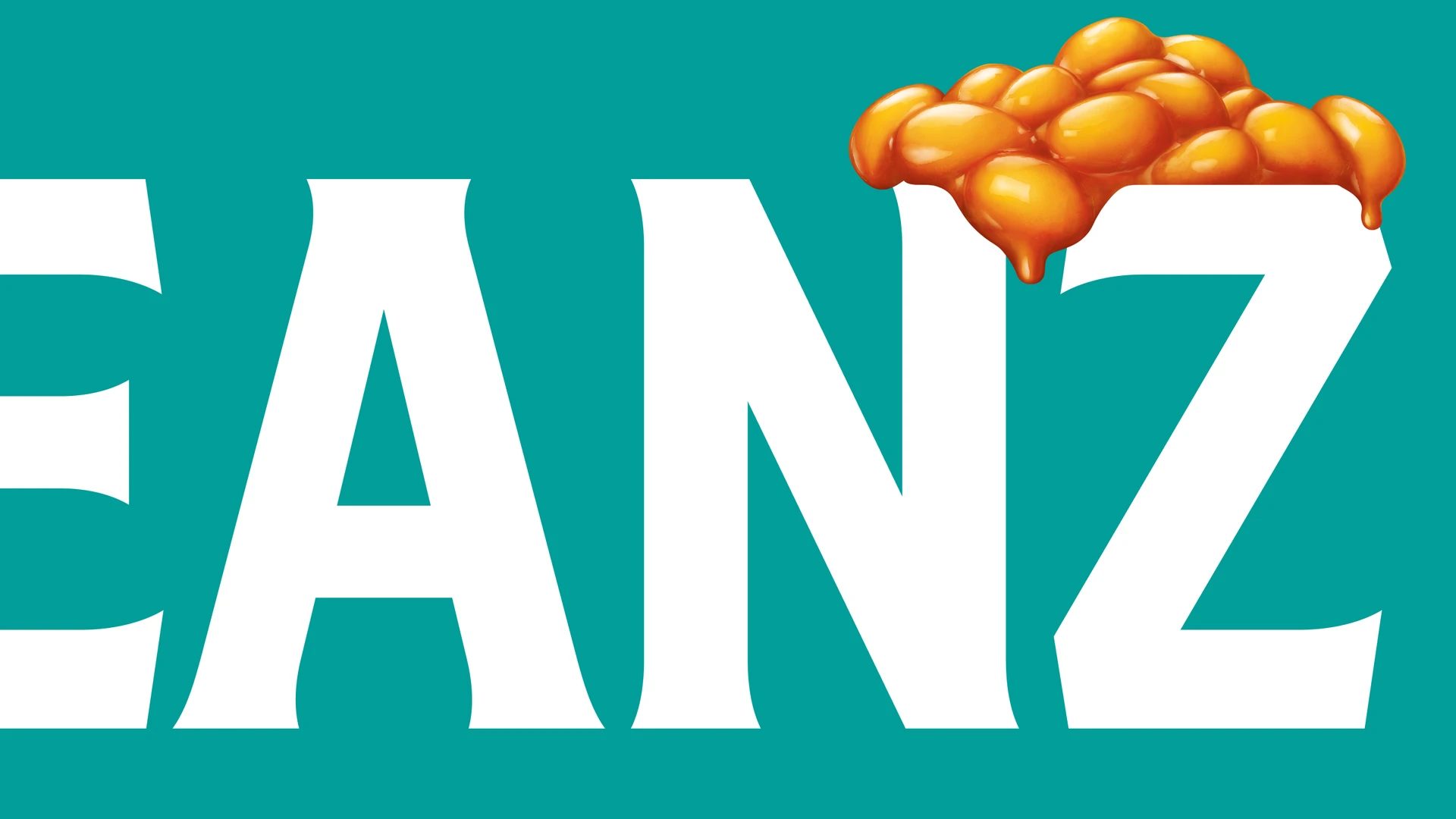
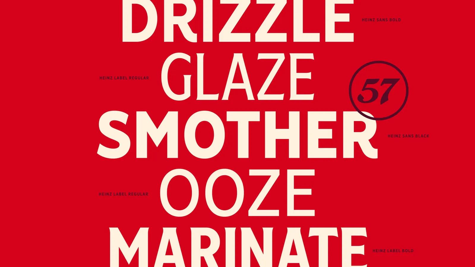
Label: a new expressive dimension
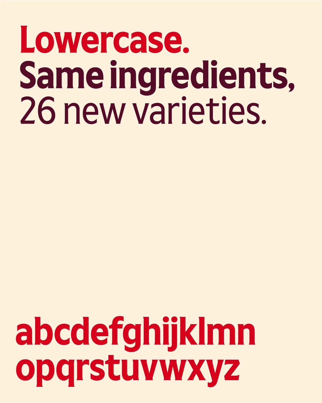
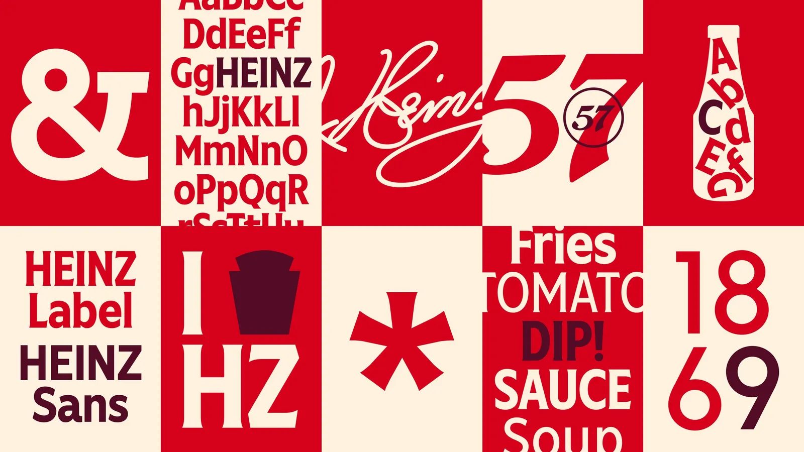
A major milestone of the project was expanding the original typeface with new lowercase letters, numerals, and punctuation. For the first time in its history, Heinz now has a complete type family capable of modulating its communication style.
This unlocks something unprecedented for a brand of this stature: the ability to whisper or shout with the same identity. From bold headlines to more narrative or informational text, Heinz can maintain consistency without sacrificing expressiveness.
This flexibility is especially relevant in the digital world, where tone of voice must adapt across platforms—from social media to ecommerce.


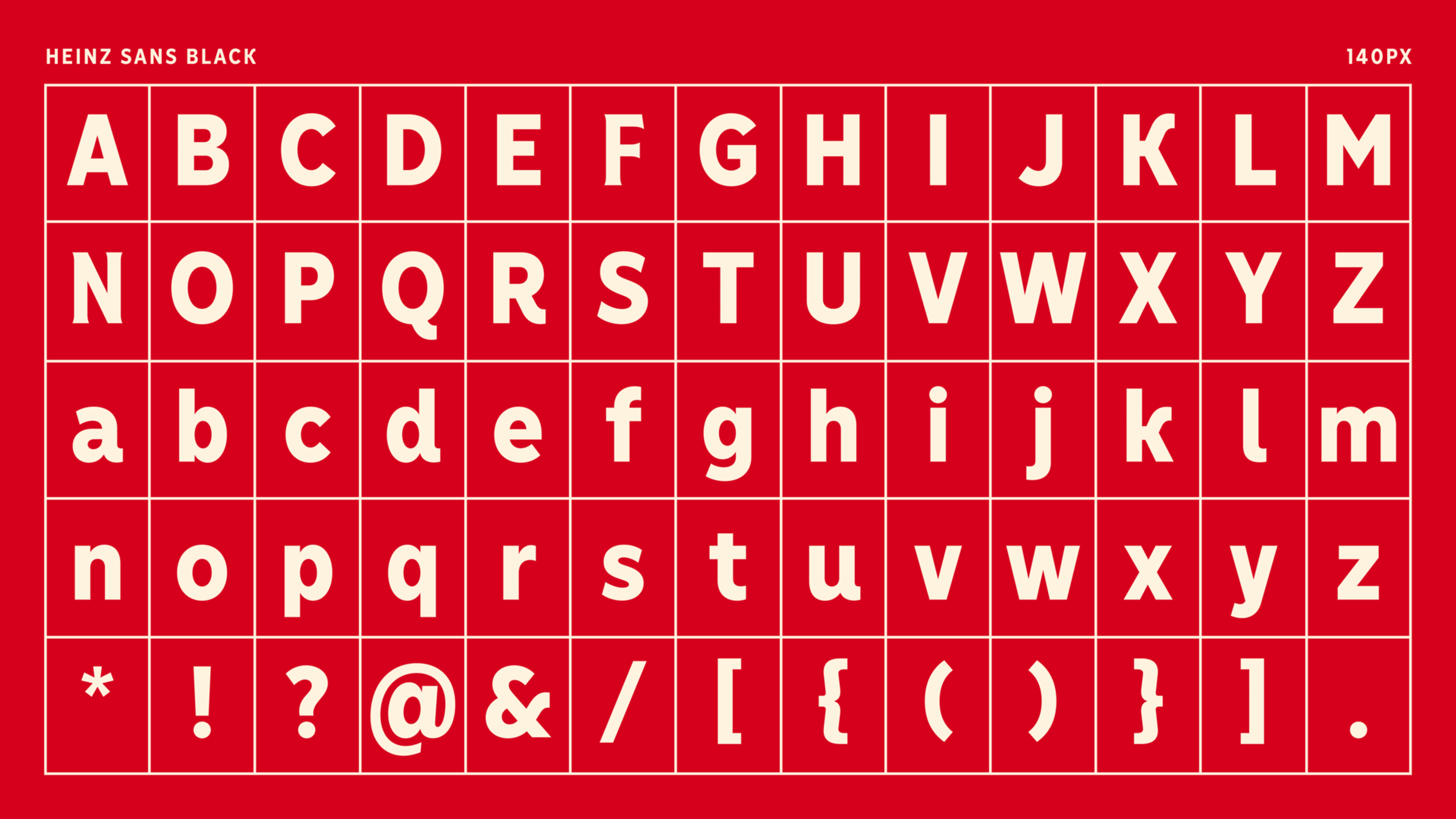
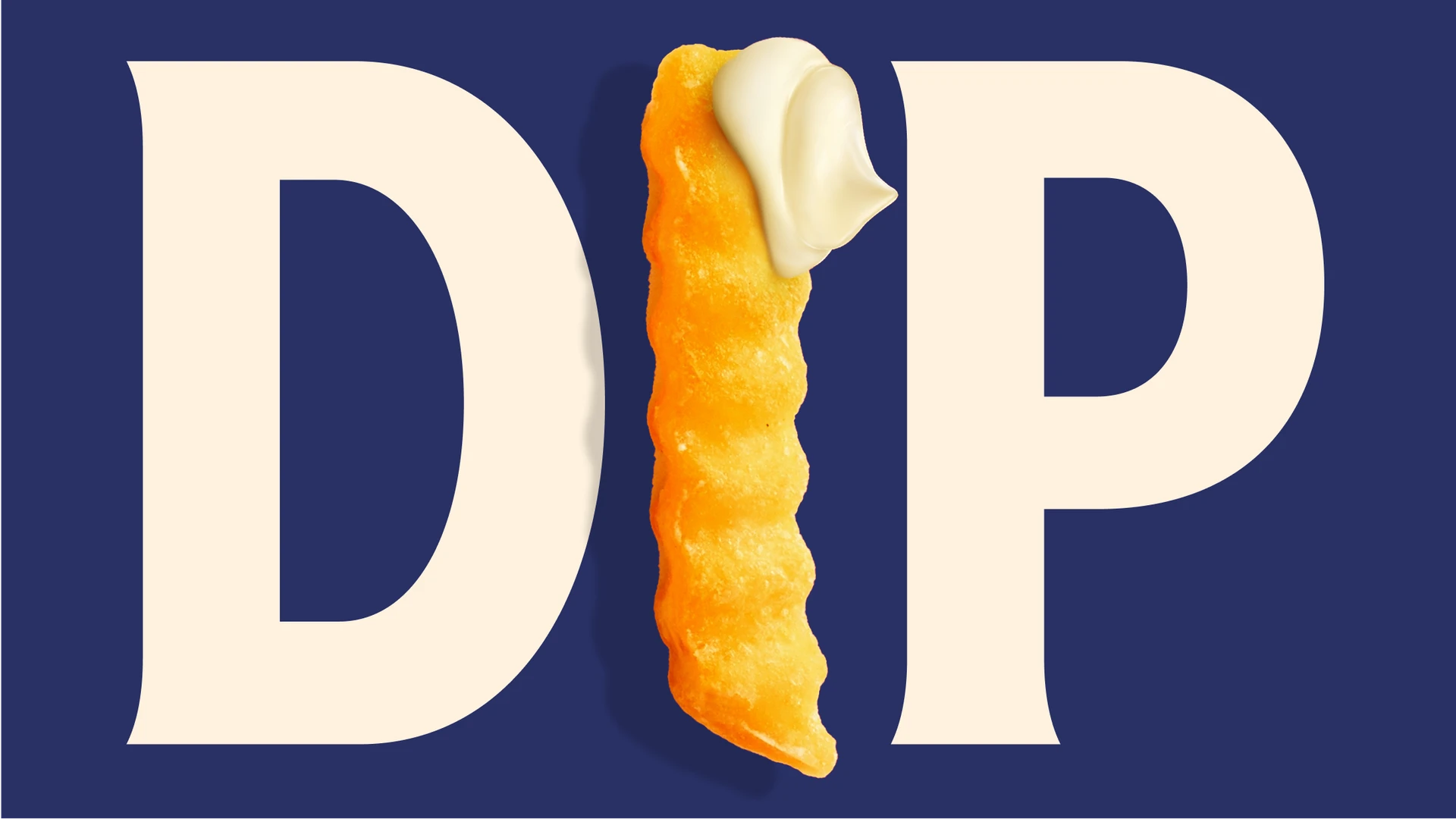
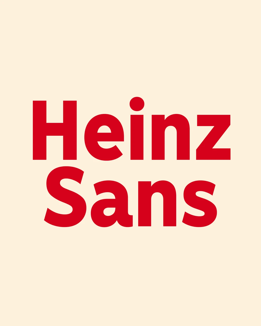
Heinz Sans: ultimate clarity for functional contexts
Complementing the Label style, the project introduced Heinz Sans, a completely new typeface designed for maximum legibility at small sizes and in functional settings.
Heinz Sans shares the brand’s visual DNA but is optimized for:
- legal text,
- nutritional information,
- back-of-pack details,
- digital interfaces,
- ecommerce and online campaigns.
This balance of personality and functionality is a key lesson for any web design or complex visual identity project.
From bottle to browser: a typeface built for every context
Heinz Typeface was designed to perform in any imaginable setting—from a bottle in the fridge door to a billboard campaign, or ecommerce carousels in Asian markets.
Beyond visual consistency, the type system delivers clarity, flexibility, and confidence. Three essential qualities for brands operating on a global scale, needing to maintain a strong identity across both physical and digital environments.

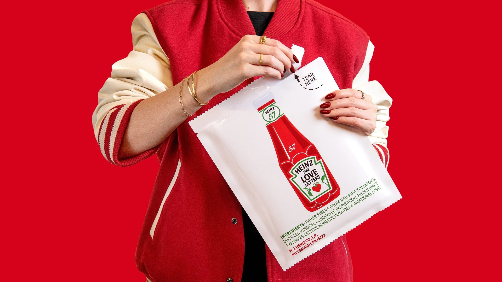
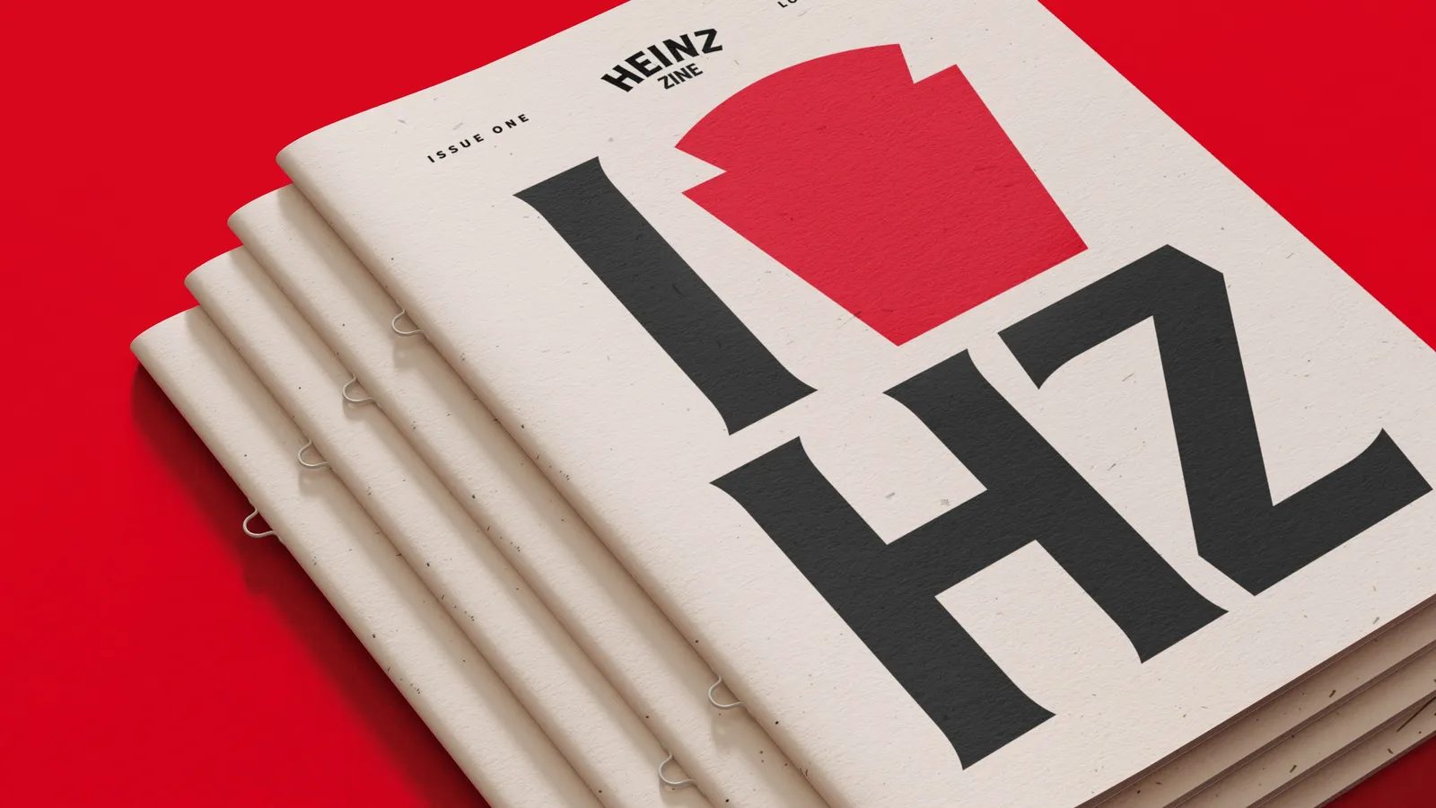
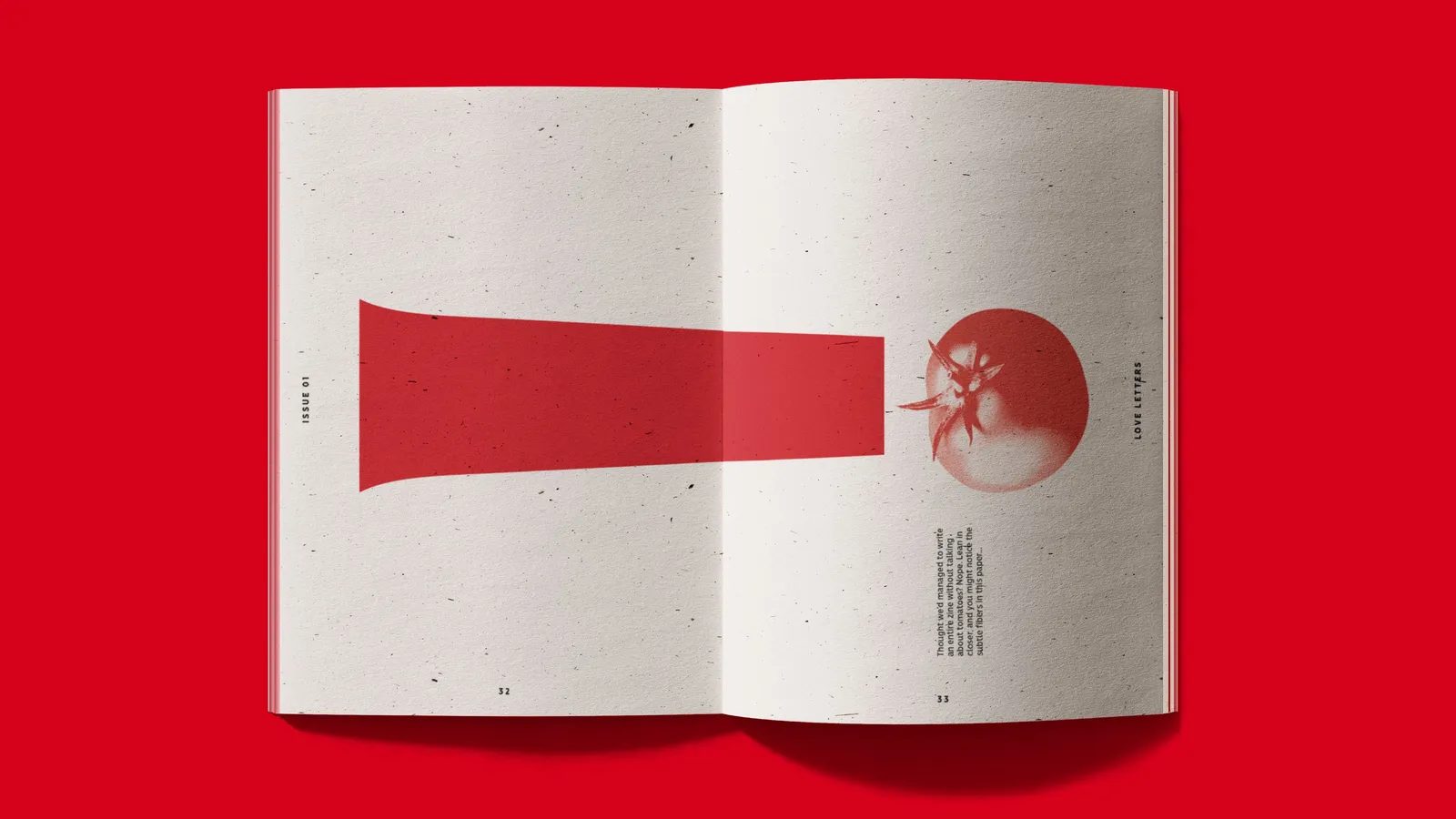
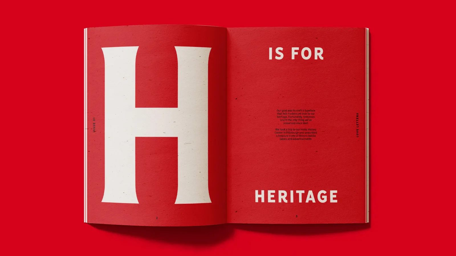
Typography as an emotional object: Heinz Love Letters
The dedication behind this project is remarkable. Over 600 hours of work went into shaping the type family. To celebrate this effort, the team created Heinz: Love Letters, an editorial zine that serves as a love letter to typography itself.
The book collects iconic stories, typographic experiments, and anecdotes that showcase the emotional bond people have with the brand. From Ketchup tattoos to marriage proposals written with Alphabetti, Heinz is a cultural phenomenon that goes far beyond the product.
This emotional connection reinforces a fundamental idea: when design is crafted with obsession and respect, it becomes part of people’s lives.
Awards and recognition
The Heinz Typeface project has received international acclaim for its typographic and strategic excellence:
- D&AD Awards 2025 – Wood Pencil
- Categories: Typography, Type Design & Lettering, Graphic Design
- Country: United Kingdom
Project credits
- Entrant Company: Jones Knowles Ritchie
- Studio: DRAMA
- Client / Brand: Heinz (Kraft Heinz)
- Credits: Chris Nott, William Richardson, Diego Aravena, Florian Runge, David Suid, Oliver Dell
- Services: Custom Typefaces, Animation
Conclusion: when typography becomes brand heritage
Heinz Typeface is much more than a type family—it’s a brand infrastructure built to last for decades. It’s an outstanding example of how graphic design, applied with rigor and sensitivity, can strengthen the recognition, consistency, and personality of a global brand.
For those of us working in graphic design, branding, and visual identity in Barcelona, this project is a clear reference point for where contemporary type design is headed: proprietary systems, deeply integrated into brand strategy, able to perform in any context and foster emotional connection.
In a world saturated with visual stimuli, Heinz proves that a well-designed typeface can be as iconic as the product it represents.