A rebrand that transforms tradition, sustainability, and cultural heritage
Each week, we spotlight an international project that shows how strategic branding can breathe new life into heritage brands and turn them into contemporary icons. Today, we travel to Fulong, Taiwan, to explore one of the year’s most significant rebrands: the visual and conceptual reinvention of Yilong Fulong Bento, a bento brand founded in 1957 and deeply woven into the region’s cultural and culinary identity.
The project, created by Cool Mai Design under the direction of lead designer Patrick Cheng and designer Clyde Lai, has received international acclaim, winning the Winner in Graphic Design / Branding award. It stands out for its cultural sensitivity, visual clarity, and its ability to reconnect a historic brand with the present. This rebranding is a testament to how design can bridge generations, tradition, and sustainability—especially in a world where brands strive to communicate authentic, lasting values.

A legacy since 1957: identity, family, and cuisine
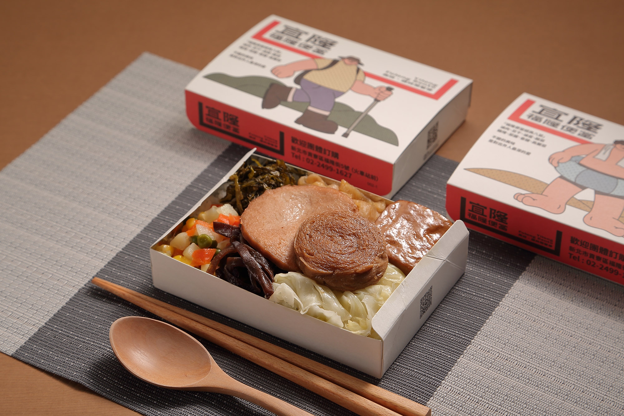
Yilong Fulong Bento was founded in 1957 by entrepreneur Grandma Wu, renowned locally for preparing wholesome, lovingly made bentos for fishermen, travelers, hikers, and coastal visitors. Her bentos—famous for their eight-dish format—offered a blend of energy, flavor, and homely warmth that became a symbol of the Fulong region.
That emotional legacy is at the heart of this rebrand. The brand doesn’t just serve food—it serves memories. Each box represents the gesture of a grandmother preparing a meal with love for those setting out early, a deeply human concept that remains relevant more than six decades later.
One of Cool Mai Design’s greatest achievements was listening to this story and translating it into a contemporary visual language.

The visual concept: a bento box as a universal symbol of warmth
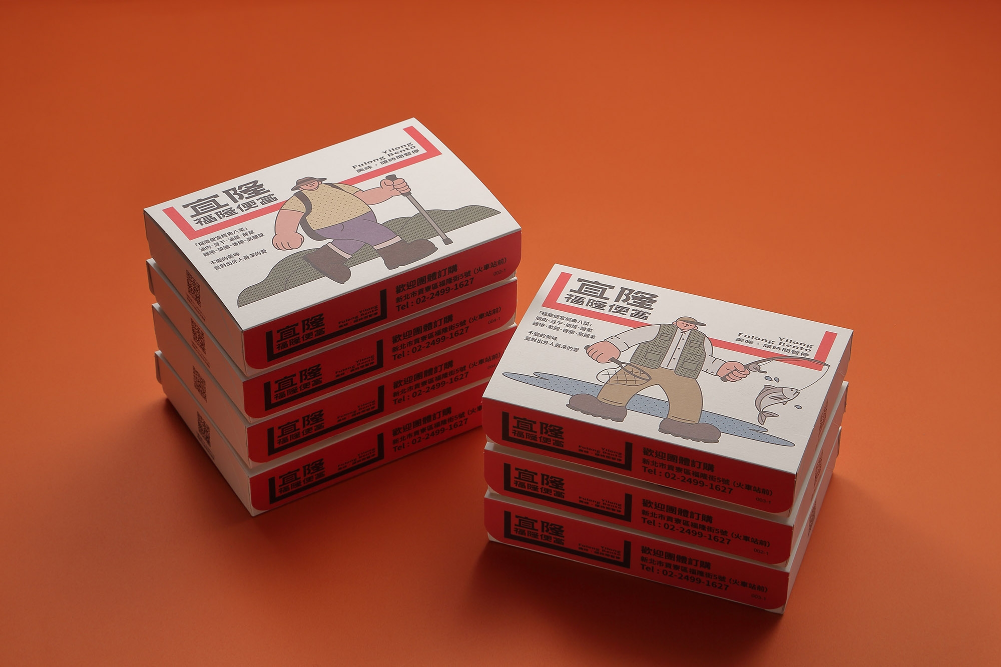
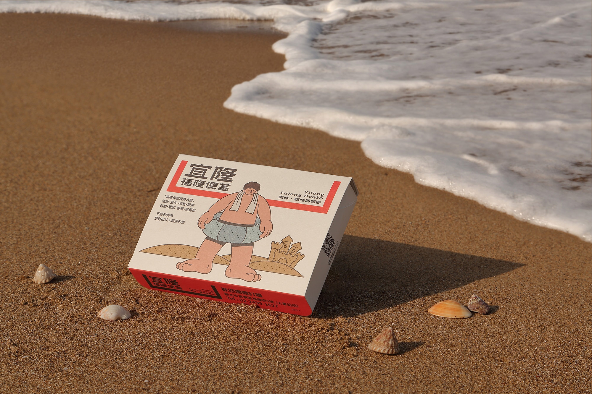
The centerpiece of the new branding is a logo shaped like a bento box. It may appear simple, but it carries deep symbolism: it’s not just a container for food, but for emotions, history, and family ties.
This symbol serves as a metaphor for:
- home and affection, evoking the grandmother’s presence;
- Taiwanese tradition, passed down through generations;
- regional identity, tied to coastal tourism;
- emotional closeness, essential in food experiences.
The logo doesn’t compete with the brand’s story—it embodies it. The bento shape makes the brand instantly recognizable and reinforces the idea of “coming home,” a message reflected in both the graphic and spatial design of the stores.
A minimalist identity that breathes history and modernity
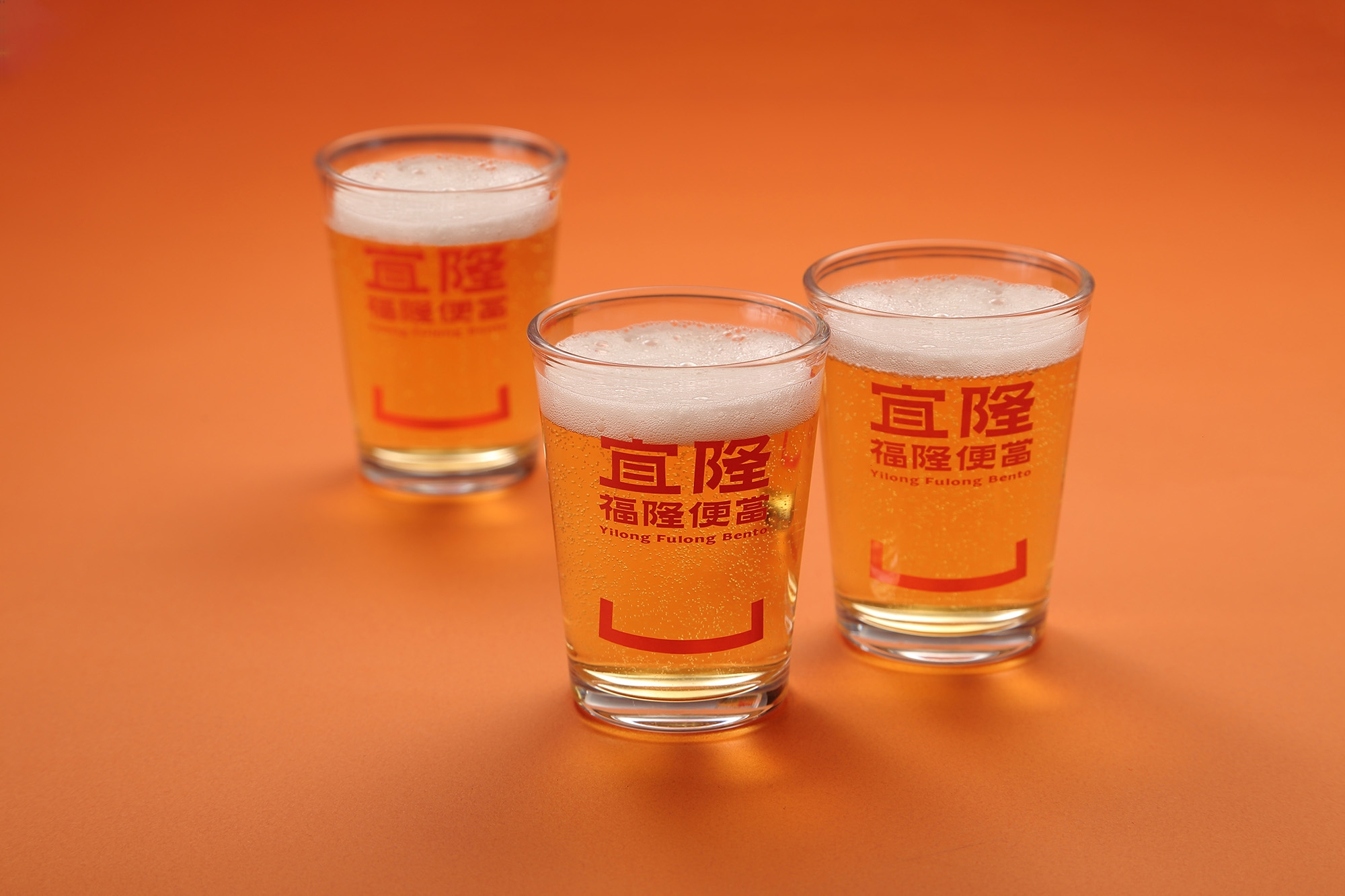
Cool Mai Design has crafted a visual system where tradition and modernity coexist. Simple lines, soft geometric shapes, and generous compositions create a warm, approachable visual language.
The color palette draws on earthy, warm tones inspired by:
- the wood of old Taiwanese kitchens;
- the steam rising from a freshly opened bento;
- the coastal sun of Fulong;
- the nostalgic aesthetic of traditional eateries.
The result is a visual identity that radiates calm, warmth, and authenticity. It doesn’t simply replicate the past, but reinterprets it with contemporary sensitivity for a new generation of consumers.
Storytelling rooted in emotion and place
What sets this project apart from other food rebrands is its narrative strength. The creative team worked on both design and copywriting, reinforcing the brand’s story through the founder’s own voice. This approach built an emotional narrative where the bento box becomes a symbol of:
- journey,
- care,
- local identity,
- cultural continuity.
The goal wasn’t to modernize for the sake of it, but to protect an emotional heritage while preparing the brand for the next 50 years. Here, design isn’t just decoration—it communicates values.
Physical space: environmental design that feels like coming home
One of the standout elements of the rebrand is the spatial design—a tool few heritage brands use so effectively. Cool Mai Design captures the essence of home through:
- house-shaped spaces,
- warm, natural materials,
- soft color palettes,
- patterns that evoke tradition,
- layouts designed for visitor comfort.
The aim: for every visitor to feel they’re entering a familiar, welcoming place.
Here, the space doesn’t just sell food—it creates emotion. And that emotion is fundamental to the brand’s value.
Sustainability as identity: the ESG commitment
This rebrand introduces a key differentiator for Yilong Fulong Bento: a clear ESG commitment.
The brand states:
“We care more for the environment and this region than other similar brands.”
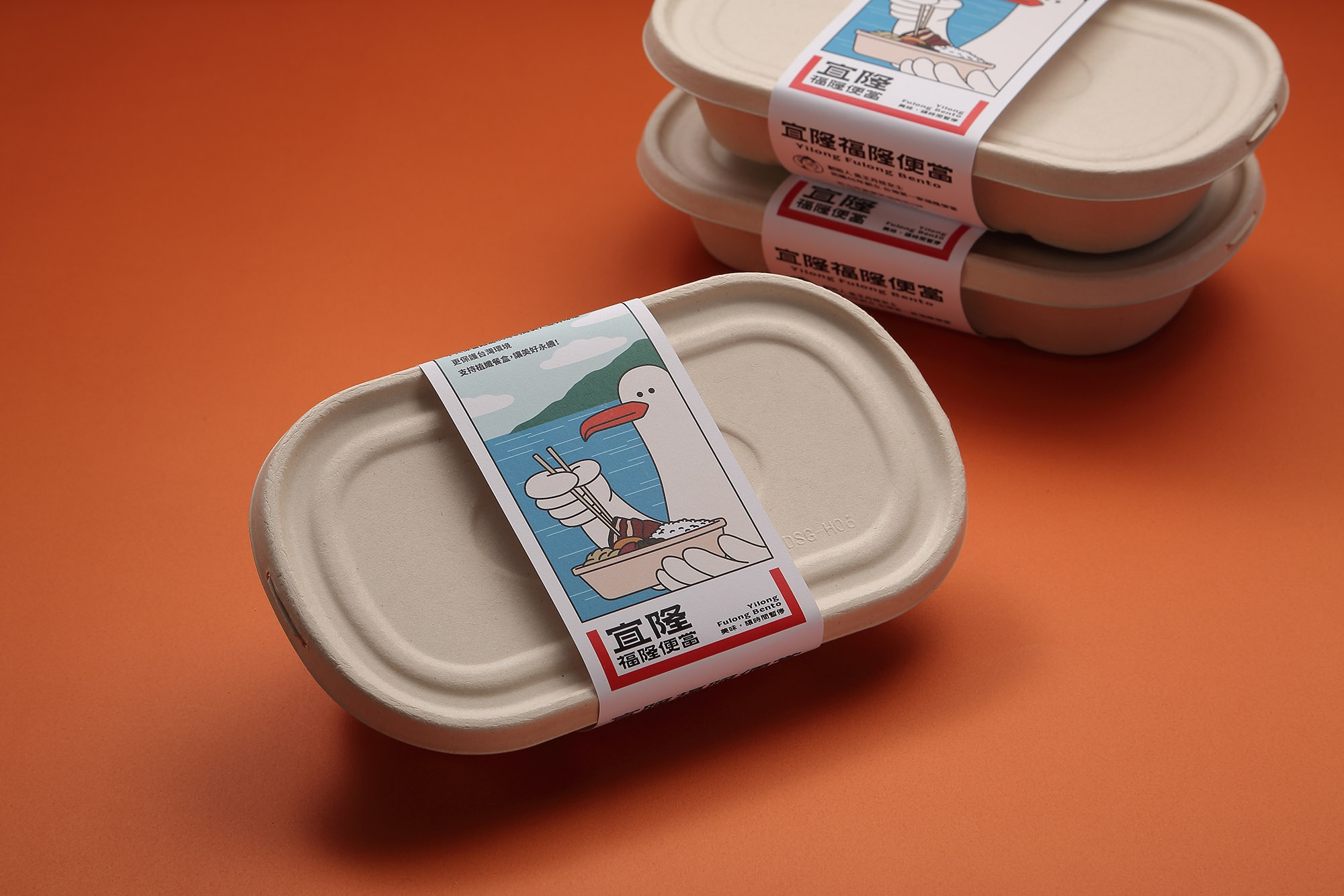
Cool Mai Design weaves this vision into the branding by introducing the plant-fiber lunchbox, a bento made from plant fibers that reduces environmental impact and reinforces:
- ecological responsibility,
- sustainable innovation,
- protection of the coastline,
- modernity without losing tradition.
The new packaging aligns with this vision: natural materials, organic feel, minimalist aesthetics, and a visual narrative that supports the cause.
This positions the brand not just as a cultural pillar, but as a sustainability leader in Taiwan’s food sector.
Visual applications: clarity, modularity, and aesthetic sensitivity
The rebrand’s visual system shows meticulous attention to graphic consistency:
- iconography inspired by the bento shape,
- modern yet humanist typography,
- clear, flexible grids,
- photography focused on texture, warmth, and humanity,
- printed materials with a consistent tactile feel.
Everything is designed to create a brand that feels:
- warm,
- approachable,
- traditional,
- yet modern.
The balance is exceptional.

A winning rebrand: international recognition in Branding
The project was awarded Winner in Graphic Design / Branding, recognizing Cool Mai Design’s work for:
- its ability to update an iconic brand,
- without losing its emotional legacy,
- while adding sustainability and visual innovation.
Awards like this validate strategic and creative work, and highlight the importance of design in revitalizing heritage food brands.
Project credits
- Client: Yilong Fulong Bento
- Studio: Cool Mai Design
- Lead Designer: Patrick Cheng
- Design Team: Clyde Lai
- Year: 2024
- Scope: Branding, Rebranding, Brand Strategy, Space Design
- Award: Winner in Graphic Design / Branding
Conclusion: a rebrand that honors the past, transforms the present, and prepares for the future
The Yilong Fulong Bento rebrand is a prime example of the power of design when approached as a cultural, emotional, and strategic tool—not just an aesthetic one. This project deeply respects the history of a brand rooted in 1957, while boldly projecting it into the future. Cool Mai Design didn’t just update a logo or modernize packaging; they reimagined the brand from its very origins, from the soul of the grandmother who lovingly prepared bentos for daily travelers.
This rebrand succeeds because it’s built on a fundamental truth: food brands don’t just sell meals; they sell care, memory, and belonging. When that emotional dimension is paired with strong strategic design, the result is timeless. The bento box as a symbol isn’t just a graphic device—it’s the visual embodiment of decades of stories, of hands preparing food at dawn, of generations who grew up with the brand as part of daily life. That level of connection is what makes Yilong Fulong Bento much more than a bento brand—it’s cultural heritage.
Another defining aspect is how the brand weaves sustainability into its identity. In a world where companies must take real responsibility for their impact, Yilong Fulong Bento makes a clear statement with its plant-fiber lunchbox. This move doesn’t just change packaging—it redefines the brand’s role in its community and aligns it with essential contemporary values. Branding here goes beyond the surface; it extends into practice, environmental impact, and long-term vision. In this way, the brand connects its legacy to a new generation seeking authenticity, responsibility, and transparency.
The visual execution—from logo to spatial design—creates a coherent, heartfelt narrative. The physical space, designed as a “home,” reinforces the sense of return, refuge, and warmth. It’s a brilliant demonstration of how branding transcends print and becomes a living experience. The minimalist aesthetic doesn’t erase tradition; it refines and elevates it. The result is an environment where tradition and modernity don’t compete—they embrace.
This project also offers valuable lessons for branding professionals: the importance of listening before designing, understanding history before creating a symbol, translating emotion into visual systems, not fearing minimalism when the concept is strong, and recognizing that a brand can evolve without losing its soul. Cool Mai Design shows that when branding is driven by purpose, not artifice, it becomes a bridge between generations.
That’s why Yilong Fulong Bento is more than a redesign—it’s a declaration of identity. It’s a brand that honors its legacy, adapts to the times, and prepares for the future. A brand that understands modernizing isn’t about erasing the past, but illuminating it from new perspectives. A brand that proves design, when used with respect and vision, can protect a story spanning nearly seven decades and, at the same time, open a world of new possibilities.
Ultimately, this rebrand doesn’t just beautify—it transforms. It doesn’t just communicate—it connects. It doesn’t just update—it revives.
And in that blend of emotion, strategy, and design lies the true greatness of this project.