A new identity connecting the global market: Thackway McCord reinvents Q4 with a dynamic, fluid, and digital visual language.
A financial brand redesign rarely sparks excitement beyond the corporate world. Yet the Q4 rebrand by Thackway McCord proves that even in the most technical environments, graphic design can be an emotional, modern force deeply attuned to the digital age. This project, awarded Branding Design of the Year 2025 at the Indigo Design Awards, redefines how financial services companies present themselves to the world: with movement, clarity, and purpose.
Q4: a platform built for connection
Q4 is a capital markets access platform designed to connect issuers and investors within a single digital ecosystem. In a landscape where information, trust, and speed are critical, the brand needed an identity that could reflect its role as a bridge between two worlds: institutional investment and technological innovation.
The challenge for Thackway McCord was to distill this complexity into a visual system that is coherent, intuitive, and compelling. It wasn’t just about updating a logo—it was about redefining the brand experience for a global, digital, and highly discerning audience.
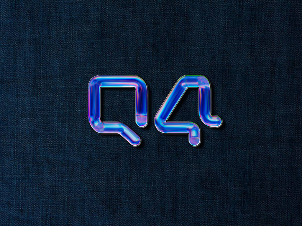
The core idea: connection and unity
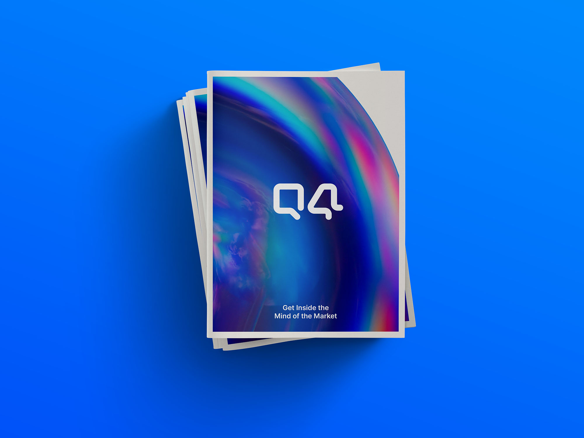
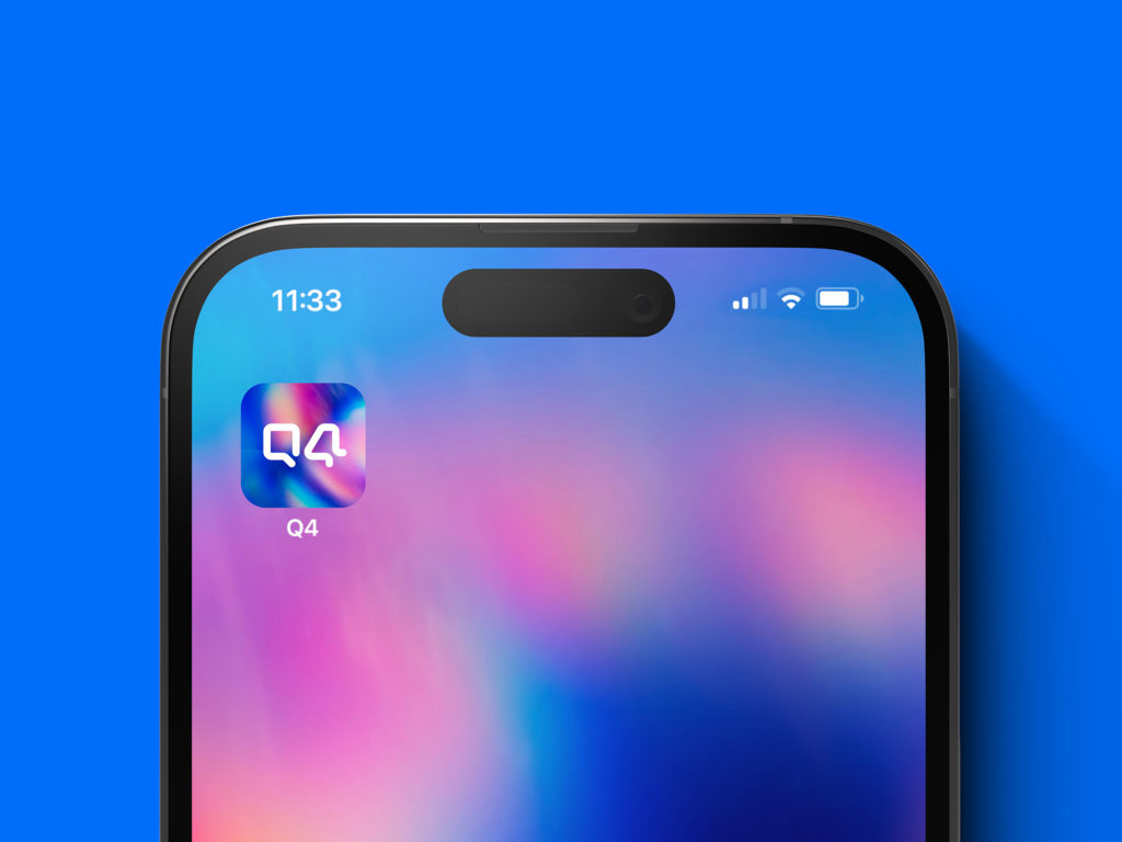
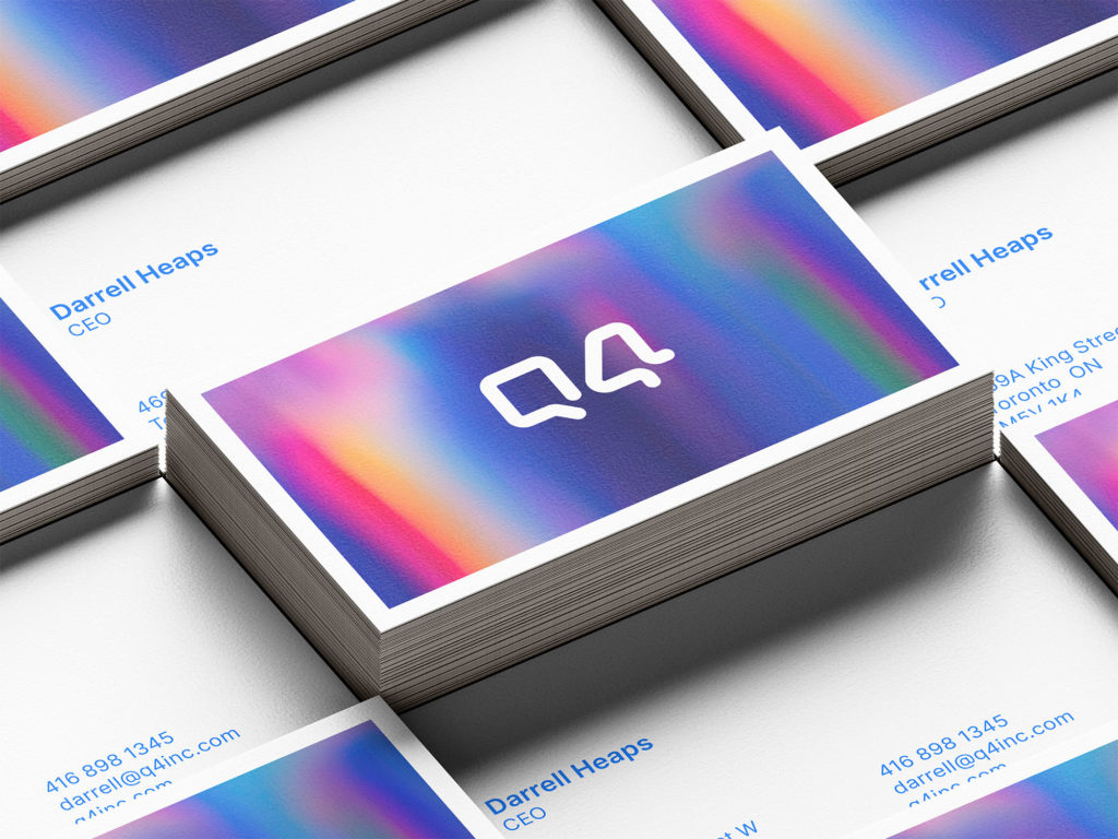
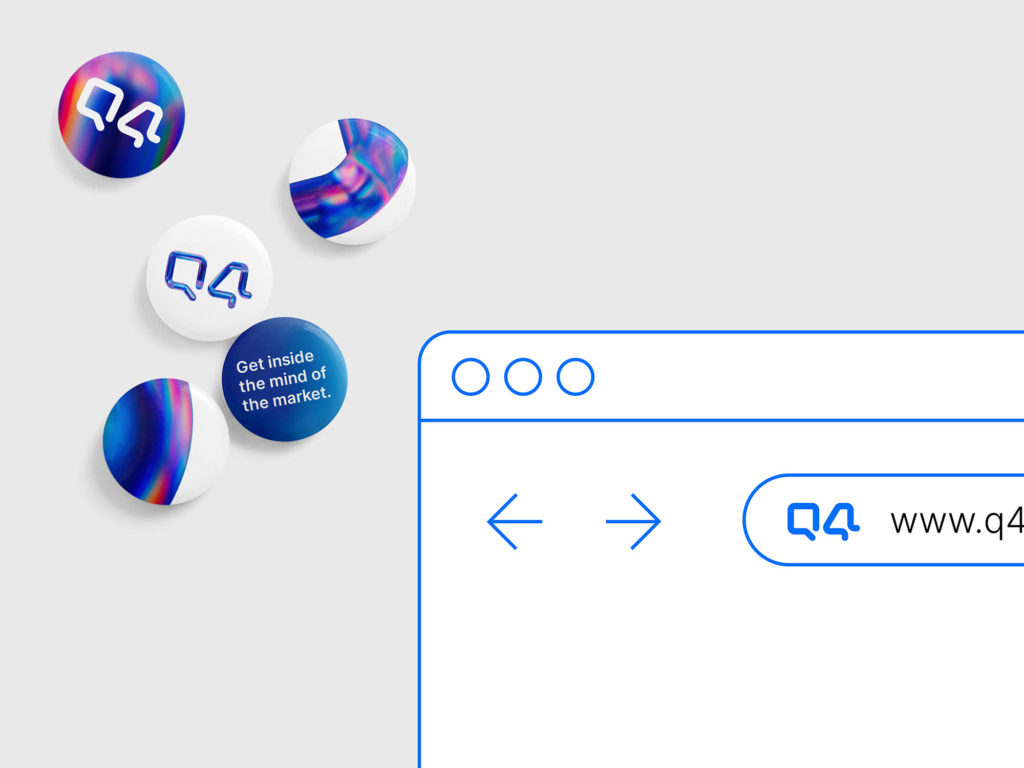
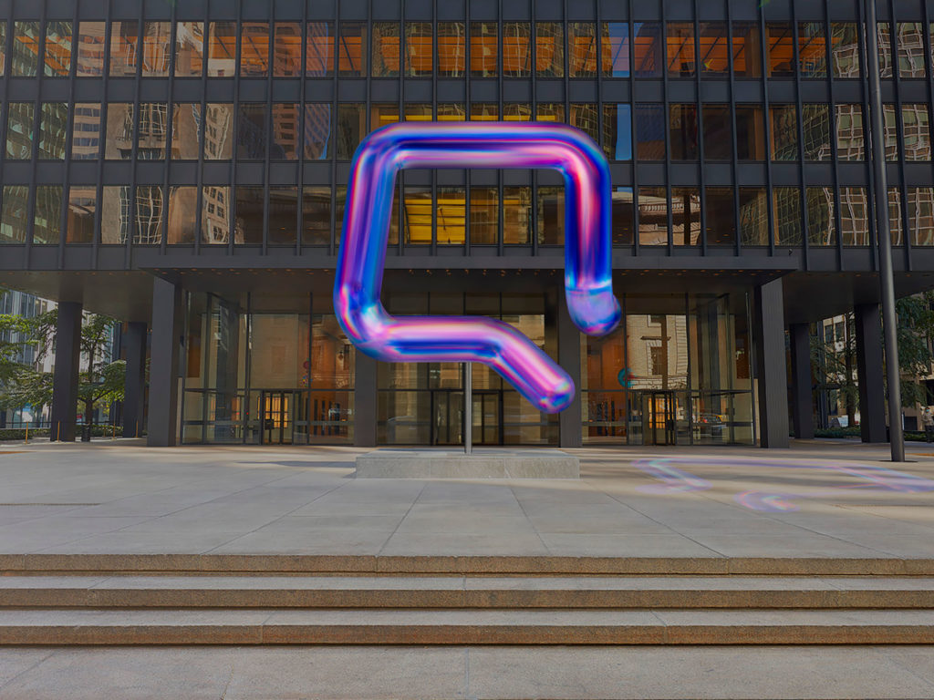
The new identity is built around a concept as simple as it is powerful: connection. The visual symbol—a “Q” that, when rotated, becomes a “4”—embodies the union of both elements in the name and the brand’s promise: “Where the market connects.” This duality—one form, two readings—expresses Q4 as the meeting point for investors, companies, and technology.
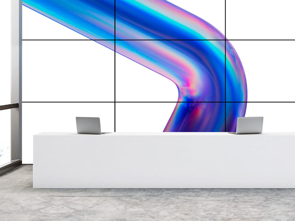
The animated logo reinforces this idea through fluid, continuous motion that evokes the dynamism of financial markets. This isn’t just decorative animation—it’s a visual metaphor for the constant flow of information and capital. This approach positions Q4 as a truly digital-native brand, designed to thrive and evolve in interactive environments.
Digital-first design: form, rhythm, and movement
From the outset, the brand was conceived with a digital-first strategy. Every element—typography, color, animation, and spatial arrangement—was designed with its on-screen behavior in mind. In this context, movement isn’t an add-on; it’s an essential visual language.
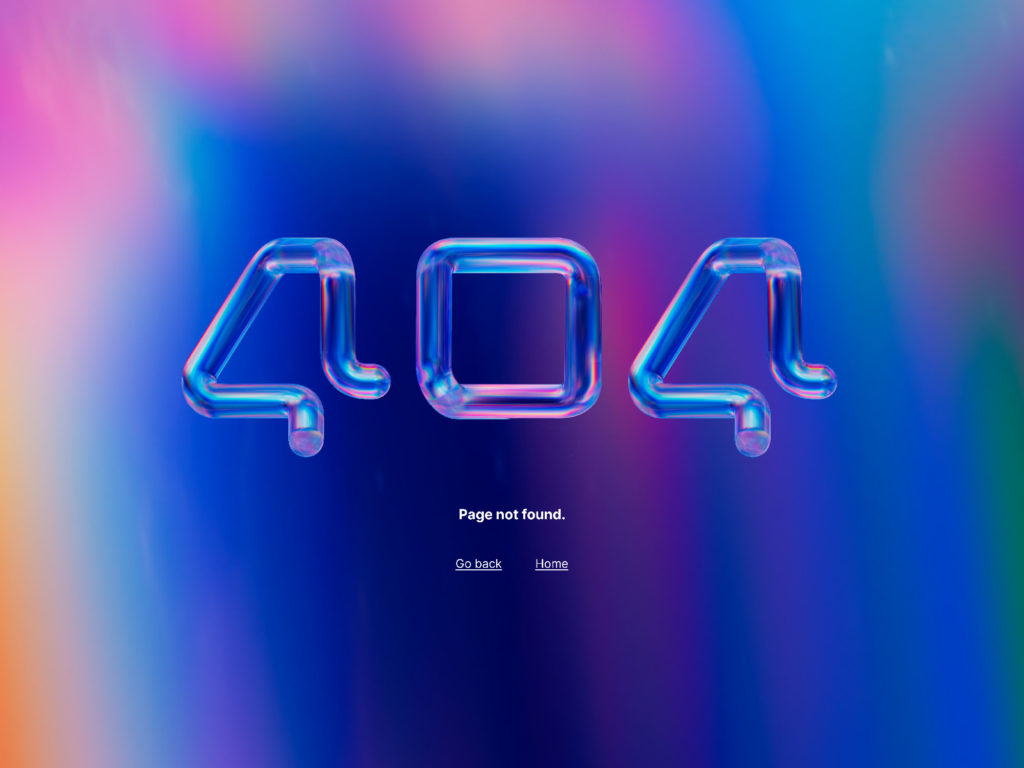
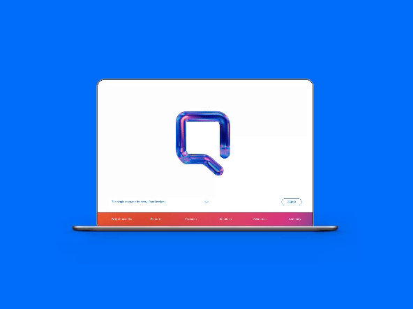
The “Q4” animation is especially emblematic. As it rotates, the letter transforms without losing legibility—a visual device that reflects the interoperability and adaptability of the Q4 system. Smooth transitions and the synchronization of symbol and text create a sense of technological precision and coherence—key attributes in today’s financial sector.
A modern, strategic color palette
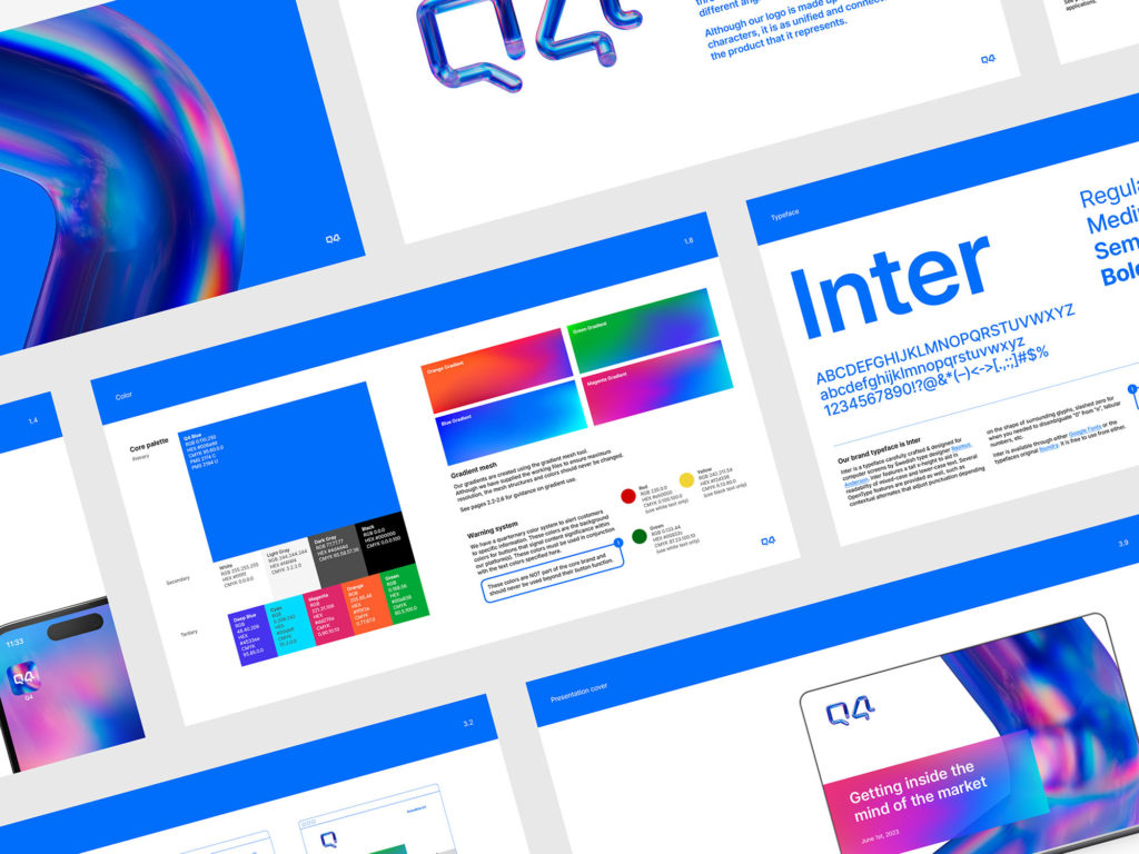
Color plays a pivotal role in shaping the new brand’s perception. Thackway McCord chose a refined palette dominated by deep blues, metallic greys, and bright whites. These tones evoke trust, stability, and professionalism—core values in finance—while their contemporary treatment adds a touch of freshness and modernity.

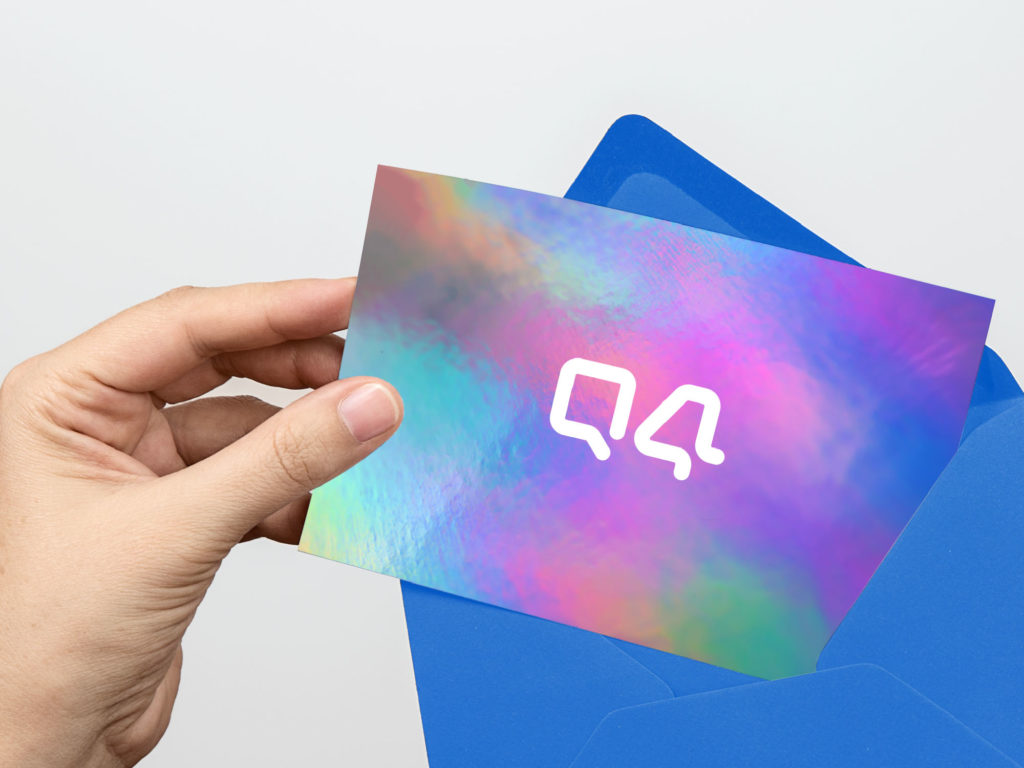
On digital interfaces, dark tones contrast with luminous accents that guide the eye and reinforce information hierarchy. This color strategy not only enhances readability but also creates a sense of visual flow that echoes the logo’s movement.
Typography and visual structure
The typographic system, based on a highly legible geometric font, strikes a balance between formality and approachability. Rounded shapes and generous spacing communicate accessibility without sacrificing rigor. The carefully calibrated size hierarchy reflects the clarity and transparency Q4 aims to convey as a brand.

The layout is clean, modular, and adaptable. Generous margins and precise alignment reinforce a rationalist aesthetic, while balanced proportions create a calm, controlled visual experience. This visual architecture gives the sense that every element is exactly where it belongs—a direct parallel to the precision of the financial world.
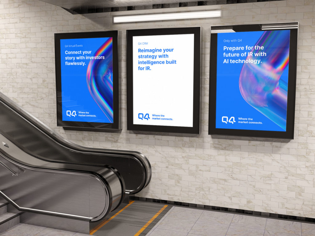
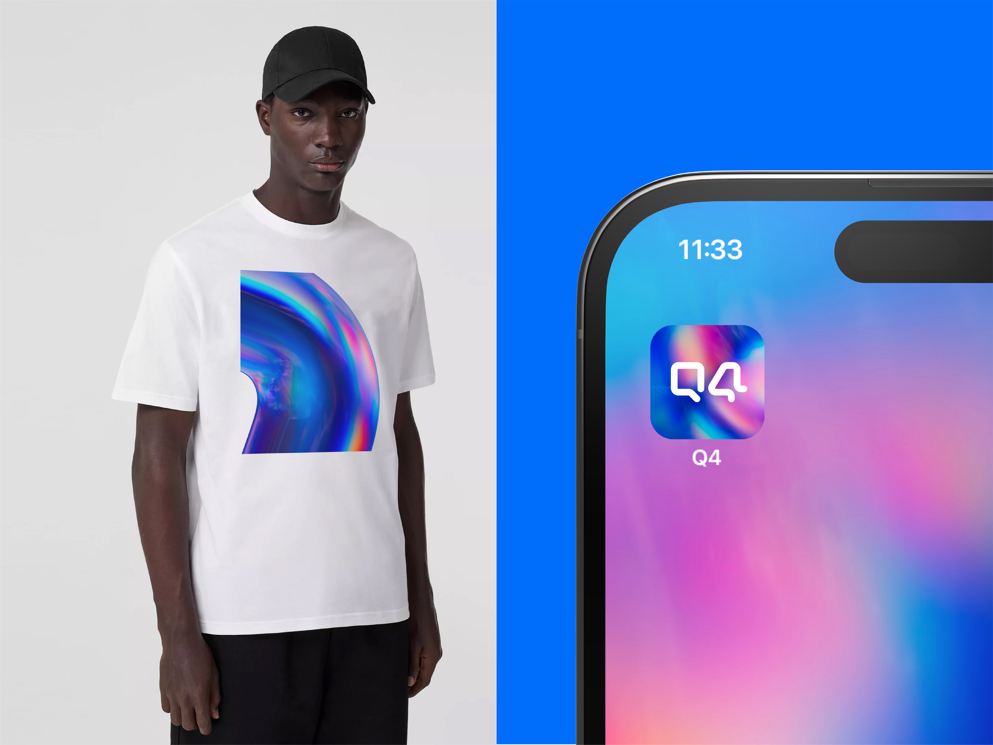
A flexible visual system
The new branding goes far beyond a logo; it’s a comprehensive visual system that adapts seamlessly to any medium, physical or digital. From corporate presentations and interactive interfaces to marketing campaigns and printed materials, the identity maintains impeccable consistency.
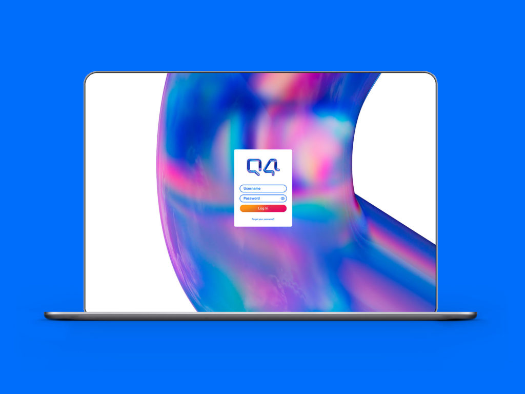
The Thackway McCord team developed a set of application guidelines to ensure both consistency and flexibility. The brand can expand or contract depending on the medium without losing impact, thanks to a modular structure and strategic use of negative space. This adaptability is essential in a digital ecosystem where brands exist across multiple platforms simultaneously.
Emotional branding in finance
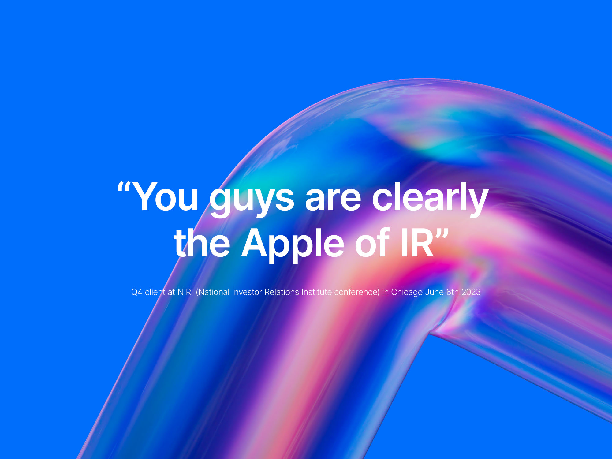
One of the project’s most remarkable achievements is its ability to introduce emotion into a traditionally rational sector. Q4 is presented not just as a technology platform, but as a space where human relationships matter. The fluid motion, the tone of communication, and the visual clarity all foster empathy and approachability.
The underlying message is clear: Q4 is not just about technology, but about trust. Not just data, but human connection. This balance between rationality and emotion is what sets the project apart in the competitive world of financial branding.
Alignment between identity and purpose
Consistency is at the heart of this rebrand’s success. Every design decision is driven by a strategic intent: to represent the unity between issuers and investors in a digital platform that fosters communication and transparency. The integration of concept and execution is so seamless that the visual identity becomes a natural extension of Q4’s value proposition.

The animated logo and the tagline “Where the market connects” are two sides of the same idea: interconnectedness. Visually, the design translates the corporate mission into a tangible experience. Conceptually, it redefines what it means to belong to a digital market.
Impact and international recognition
The project was widely celebrated at the Indigo Design Awards 2025, earning multiple honors: Branding Design of the Year, Gold Winner in Branding, Gold Winner in Logos, and Gold Winner in Branding for Banking & Finances. It also received a Silver Award in Integrated Graphic Design, cementing its status as one of the year’s most robust and consistent works.
These accolades highlight the project’s value as an international benchmark for financial brand design. Q4 demonstrates that visual innovation and seriousness can go hand in hand—and that a well-crafted digital identity can directly influence perceptions of trust and leadership.
Conclusion: the new elegance of corporate design
The Q4 rebrand by Thackway McCord marks a turning point in how financial companies communicate their identity. It’s a masterclass in balance: technique and emotion, precision and flow, stability and movement. All coexist in a visual system that breathes modernity without losing its institutional character.
Beyond the awards, this project shows that brand design can bridge the gap between the intangible and the human. It can translate the complexity of the market into a visual experience that is understandable, inspiring, and beautiful. When this happens, design ceases to be mere decoration—it becomes strategy.
Credits
Project: Q4 Rebrand
Studio: Thackway McCord
Client: Q4
Creative Director: Tim Woolliscroft
Design Team: Kat McCord, Steve Clarke
Awards: Indigo Design Awards 2025 – Branding Design of the Year, Gold Winner in Branding & Logos, Silver Winner in Integrated Graphic Design