Some campaigns start out overblown and quickly lose steam: too many messages, too many promises, too much need to look big. This one takes a different approach. It takes a cleaning tablet and turns it into a complete scene—almost as if a tiny team comes ready to work inside the product.
The beauty is in the instant clarity. There’s no need for lengthy explanations or a laundry list of benefits. The metaphor does the heavy lifting: compact product, visible action, imagined result. That kind of clarity is invaluable in marketing—it bridges the gap between what the brand offers and what the audience understands.
There’s also a clear sense of tone. Miniaturization could easily tip into gimmick, but here it’s handled with sophistication: clean composition, well-applied brand color, straightforward typography, and a professional atmosphere that maintains credibility. There’s visual playfulness, yes, but it never loses authority.
That’s why this campaign serves as a source of inspiration. Not just for its cleverness, but because it proves something essential: when a campaign lets you see the benefit before you read it, perceived value rises. The brand stops presenting just a tablet and starts building a stronger mental image—one with more visual memory and greater sales potential.
Ecolab ReadyDose — a visual metaphor with editorial flair
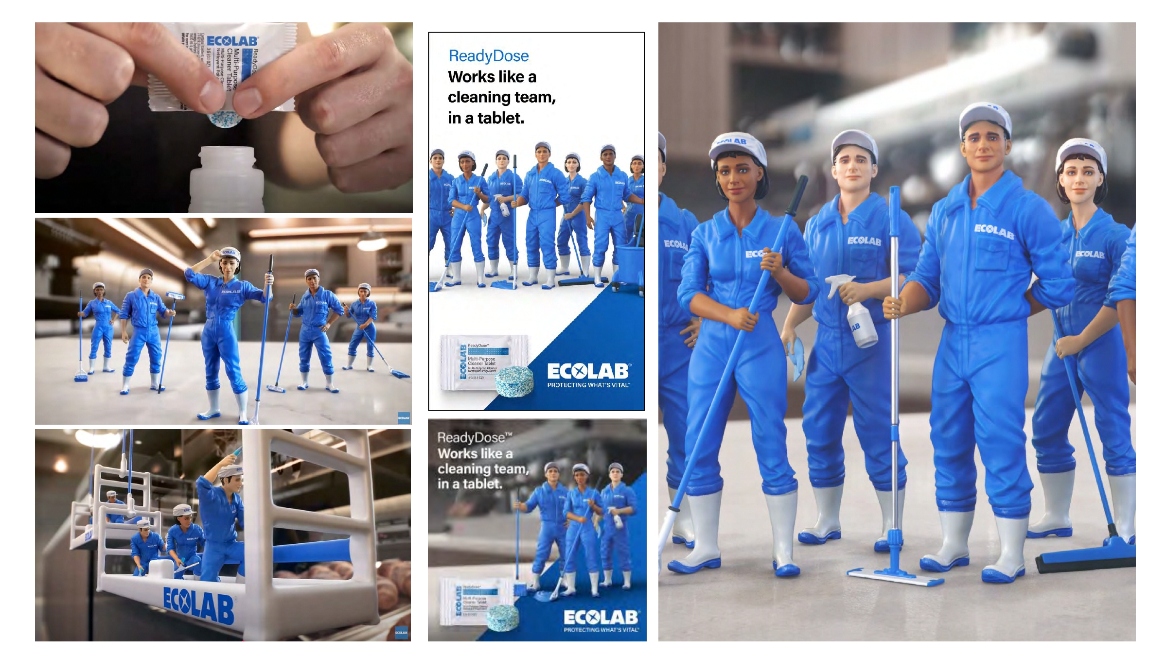
Ecolab ReadyDose builds its campaign around a highly effective trio: the tablet, the pack, and a small cleaning crew dressed in blue. Three elements, one immediate read. The composition keeps the idea focused. The product isn’t an afterthought at the end of a story; it’s anchored at the heart of the message, surrounded by a scene that translates function into image.
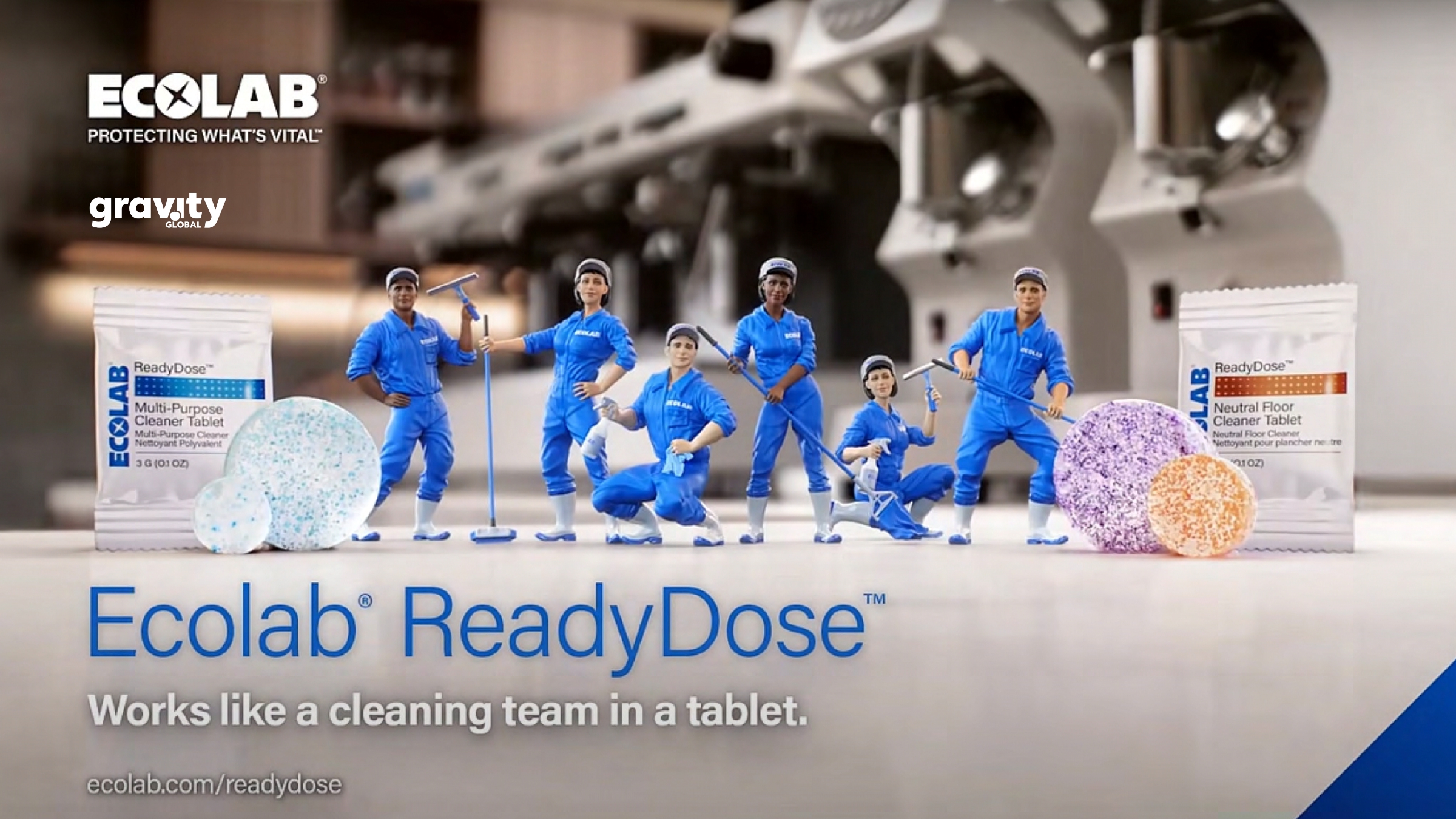
The first visual has the feel of a cinematic poster applied to an industrial product: a deep background, controlled lighting, miniaturized figures, and a signature blue that runs through the brand, the uniforms, and the overall campaign tone. That blue isn’t just a branding device; it guides the eye, unifies the visuals, cools the atmosphere, conveys a sense of hygiene, and reinforces the precision expected from a professional solution.
Typography is direct and unfussy—bold when making a promise, secondary when supporting, always with a clear, scannable hierarchy. Here, UX/UI takes on an advertising role: it’s not about menus, forms, or complex navigation, but about instant comprehension. The eye first takes in the scene, then the benefit, then the object that delivers it. That order is crucial in B2B marketing, where attention is scarce and messages compete with countless functional stimuli.
Miniaturization delivers the visual punch, but it’s not played for laughs. The tiny workers have tools, posture, scale, and intent. They look like they’re genuinely working. That detail shifts the atmosphere: the campaign feels clever, not childish. And that distinction is key. A brand can use visual humor without losing authority if the composition, lighting, and product maintain a professional tone.
The product as a miniature action scene
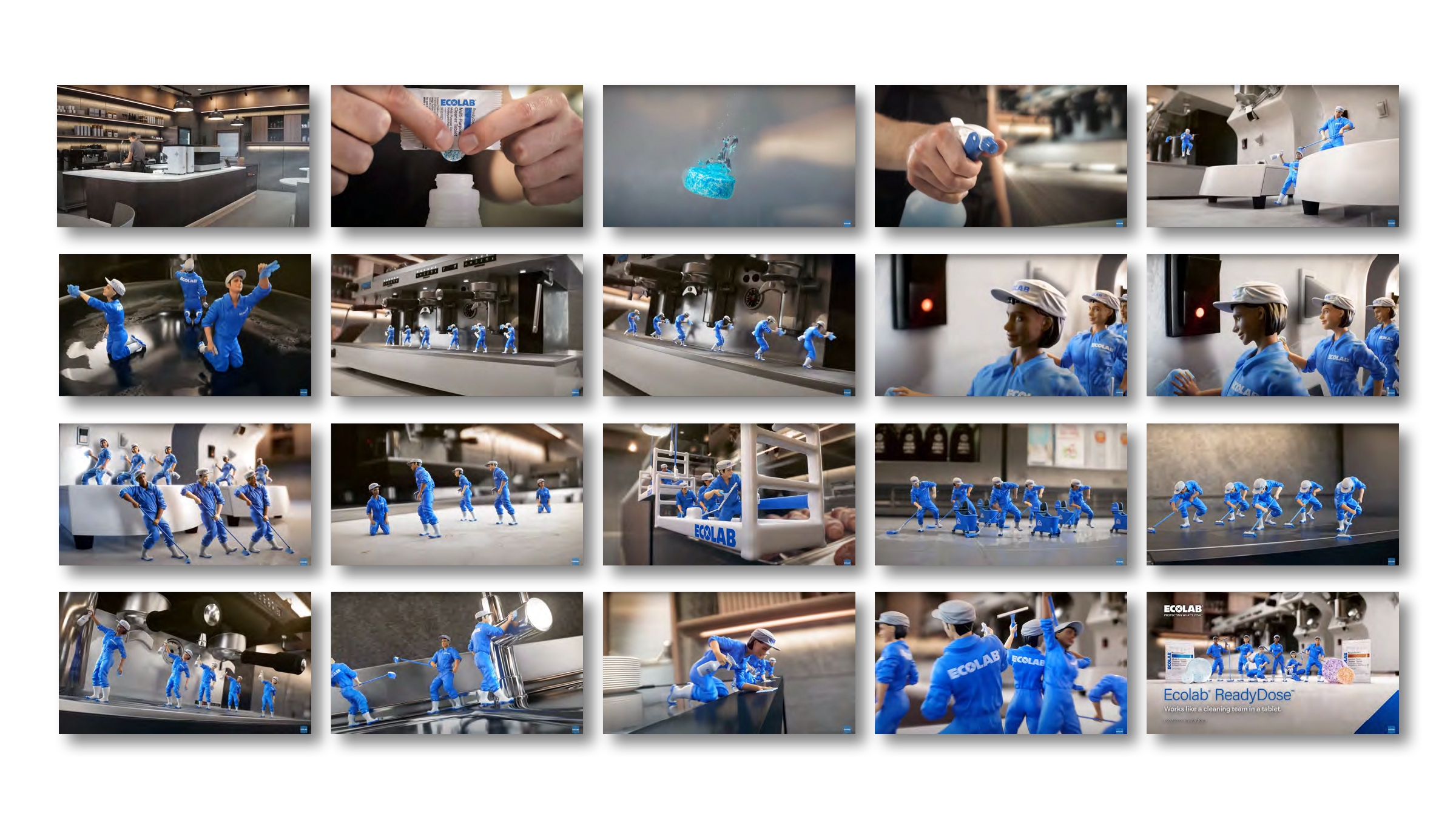
The sequence of visuals has an almost animated rhythm. Even though the pieces are static, the campaign suggests movement: tablets activating, surfaces being cleaned, teams springing into action, small tasks happening around the product. That sense of implied motion is powerful. Not everything needs to literally move to feel dynamic; sometimes, a composition that lets the viewer complete the action in their mind is enough.
There’s also a smart choice in settings: kitchens, metal surfaces, industrial spaces—the background provides context without stealing the spotlight. The product isn’t shown in a sterile catalog void, but in a world where its use makes sense. That builds trust. The brand isn’t selling an abstract promise of cleanliness; it places the benefit in a recognizable setting, with texture, tools, and real tasks.
Perceived value grows because the campaign turns something compact and seemingly simple into a solution with a team, a process, and real effectiveness. That’s the visual magic: a tablet stops looking like a mere consumable and starts to look like a system. For a brand, that shift can mean the difference between competing on price and competing on trust.
A system that adapts across formats without losing its soul
A strong visual idea has to work beyond its hero piece. If it only works on the main poster, it’s not a system—it’s a one-off. Here, the campaign holds up because its ingredients are instantly recognizable: packshot, concise claim, dominant blue, tiny figures, and a work scene. With these, you can build a whole family of assets without reinventing the campaign each time.
Multi-format adaptation works because the composition is built with hierarchy. The pack can shift, the scene can change, the claim can scale, but recognition remains. That’s a key lesson for marketing teams: consistency isn’t about repeating the exact same design, but about maintaining a clear visual logic. When the system is well-constructed, every new piece feels like part of the same universe.
The campaign also understands the power of contrast: controlled backgrounds, crisp whites, bold blues, and the product separated from visual noise. These choices may seem minor, but they preserve legibility as assets move from poster to social, from sales deck to digital creative. Clarity isn’t a finishing touch—it’s built in from the start.
From an efficiency standpoint, this is hugely valuable. A visually scalable campaign reduces internal friction: fewer doubts when adapting formats, less loss of identity across channels, fewer pieces that look like they came from different teams. And while there’s no need to get overly corporate here, the reality is simple: when an idea is deployed with coherence, the brand comes across as more mature.
The campaign as a visual family
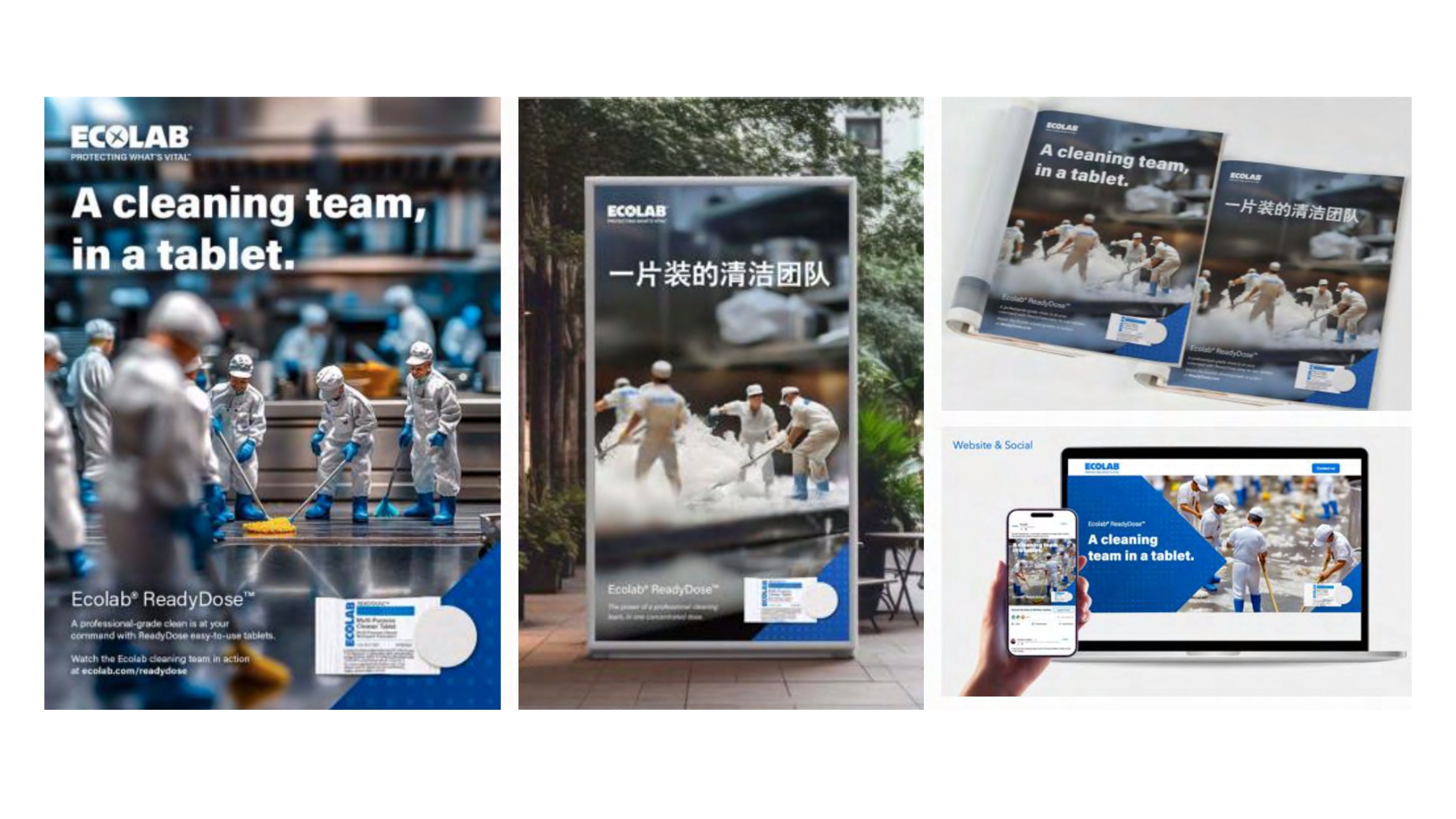
The rollout pieces have that polished campaign feel: they don’t just resize the key visual, but adapt the idea to each medium with intent. Some versions focus more on the product, others are more promotional, others designed for quick impact. The identity holds because the concept is easy to recompose.
Localizing some messages adds another interesting layer: the campaign doesn’t rely on fragile wordplay. The visual metaphor travels better than most taglines. For brands with international markets, that’s no small thing. An idea that’s understood before it’s translated has more reach, more efficiency, and a better chance of building visual memory in different contexts.
The real strength is that every format maintains a delicate balance between cleanliness and a touch of fantasy. The atmosphere stays professional, but the scene has charm. That mix is hard to get right. Too much realism and the campaign falls flat; too much fantasy and the product loses credibility. Here, the balance is spot on: enough imagination to be memorable, enough order to inspire trust.
What it means for brands aiming higher
The takeaway isn’t “let’s put tiny characters around the product.” That’s copying the device, not understanding it. The real insight is how a well-focused visual idea turns a functional feature into a memorable scene. The campaign doesn’t list features—it shows them. And when a brand does that, the message lands faster and sticks longer.
For any B2B product at risk of seeming too technical, there’s a valuable lesson here: clarity can have a visual direction. You can be precise without being flat. You can talk about efficiency, cleanliness, or performance through color, composition, scale, typography, and a touch of playfulness. That mix makes the brand feel more confident, not less serious.
Perceived value shifts when the product stops appearing as an isolated unit and starts to feel like a complete solution. A tablet on its own might seem small. A tablet surrounded by action, context, and expertise feels capable of powering an entire process. That’s the leap: you’re not just selling an object, but the sense that there’s a system, a method, and trust behind it.
There’s also a highly practical lesson for digital campaigns, landing pages, and sales assets: if the benefit needs too much explanation, it probably doesn’t have a visual form yet. A strong metaphor reduces friction. It helps marketing, it helps sales, and it helps the user instantly understand where this solution fits in their world.
In the end, great campaign design doesn’t just decorate a promise—it gives it substance. Here, composition brings order, blue builds identity, typography supports without noise, and the atmosphere stays professional. It’s a small idea in scale, but big in intent: making sure the benefit isn’t just read, but remembered.