Autonomous robotics faces a unique challenge: the more advanced it gets, the easier it is to feel cold and distant. Sensors, routes, efficiency, logistics—everything can sound flawless, yet still fail to spark curiosity or trust. That’s where web design moves beyond being a mere showcase and takes on a subtler role: translating complex technology into presence, confidence, and desire.
Serve Robotics, under the visual direction of WILD PRO & Mach Studio, understands this tension perfectly. The robot isn’t presented as a block of engineering, but as a character with its own identity. It has a silhouette, expression, light, even a touch of charm. The website builds a dark green, polished, urban atmosphere around it, letting the product breathe as if it were part of a premium campaign rather than a technical explainer.
What stands out is the balance. There’s motion, 3D, thoughtful composition, clean typography, and careful control of visual rhythm—yet nothing tips into overblown futuristic demo territory. The experience knows when to impress and when to dial it back. For a robotics brand, that restraint is invaluable: before asking for trust, the interface is already shaping the perception of value.
Serve Robotics — hardware-friendly with a strong brand pulse
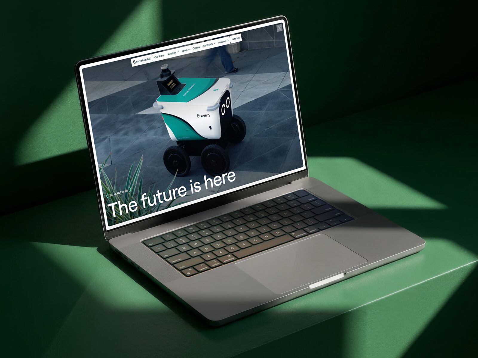
The first impression is immediate: the robot takes center stage. It doesn’t compete with busy backgrounds, overloaded interfaces, or walls of text trying to justify its existence. The design gives it space, light, and silence. That decision transforms how the product is perceived: it stops being just a functional object and starts behaving like a recognizable icon.
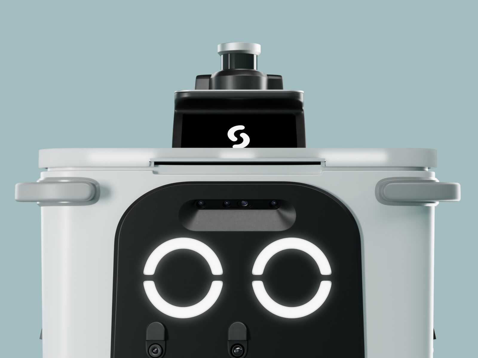
The robot’s front has an almost facial quality. Two luminous points, seamlessly integrated sensors, a crisp black-and-white volume, and green accents that evoke sustainability and urban movement. This is an identity built from the product itself, not something tacked on. When the hardware has its own features, the brand gains something money can’t buy: recognition.
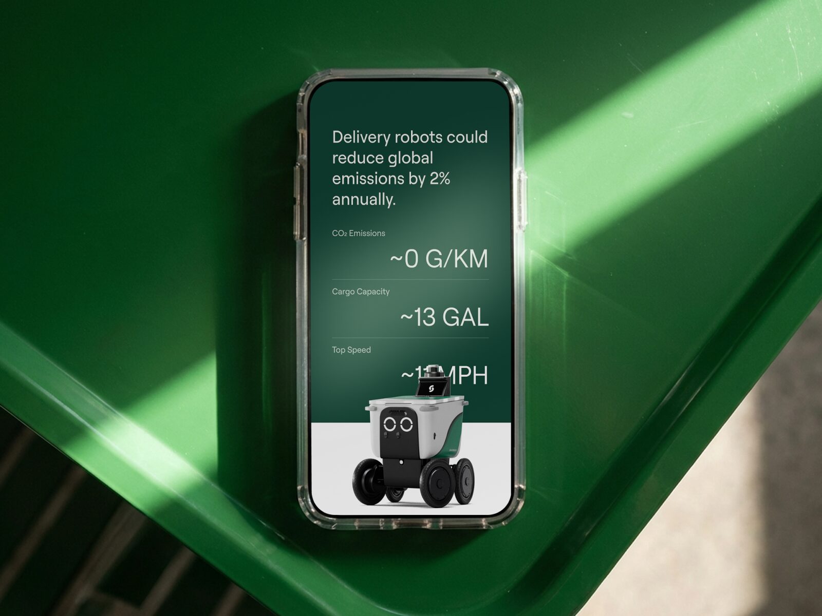
Color is used with clear intent. The greens aren’t just an obvious eco-friendly touch—they set the atmosphere. They appear in backgrounds, reflections, and accents to create a futuristic visual temperature without veering into cheap sci-fi. The contrast with deep blacks and polished whites lets the robot breathe and makes every technical detail feel more precise.
The composition has that quiet luxury so many tech brands seek but few achieve. Plenty of negative space, simple hierarchies, bold product visuals, concise text. The typography is a clean sans serif, supporting the message without stealing the spotlight. This helps the message land quickly and ensures the interface doesn’t disrupt the sense of a well-designed product.
Real-world context grounds the abstraction. Seeing the robot next to a person and a building entrance shifts the emotional scale. It’s no longer just a flawless render: it’s a tangible, everyday service. For autonomous technology, that transition is crucial. The brand doesn’t just need to look advanced—it needs to feel ready to coexist with people.
A start with product, scene, and promise
Motion isn’t there for show—it bridges the gap between concept and use. The delivery scene adds credibility while maintaining a carefully curated visual direction: the product moves within a simple narrative, never losing its elegance. It’s a delicate balance. Too much spectacle, and the brand feels like advertising; too much explanation, and it falls flat.
3D as a way to experience the hardware visually
The 3D close-up works because it’s not just about showing off a pretty object. It makes the robot feel designed, calibrated, almost tangible. The camera lingers on sensors, wheels, and the front, with a rhythm that turns engineering into identity. Here, technical detail isn’t explained—it’s felt. And that sensation elevates the perception of quality.
For a B2B or tech brand, this kind of presentation is a huge advantage: it reduces mental friction. If the product is visually understood, users are better primed for the commercial message. There’s no need to bombard them with features in the first second; it’s enough to build a strong, clear, memorable first impression.
An interface that knows how to breathe
Even the more restrained sections have their own appeal. After the visual impact of the robot and 3D, the layout becomes more modular, more contained, more interface-driven. This breathing space prevents everything from being in constant hero mode. UX/UI excels when it recognizes that not every section needs to shout. Sometimes, the most premium gesture is simply organizing information well and letting users move forward without fighting the layout.
The laptop introduces another interesting layer: the website appears within its own brand narrative. It’s not shown as an isolated mockup, but as part of the product’s visual ecosystem. The message of the future is wrapped in a clean composition, with the robot as visual proof of the promise. It’s campaign branding with digital product logic.
Modularity ensures that aesthetics don’t overpower clarity. When a tech brand has a lot to say—environmental impact, logistics, autonomy, safety, efficiency—the temptation is to fill the screen with arguments. Here, the visual direction opts for a smarter route: first, desire and trust; then, data and explanation.
That order makes commercial sense. An interface that leads with composition, color, and motion can set up the sale better than a page obsessed with listing advantages. Perceived value rises when the product feels considered from every angle: physical form, narrative, interaction, and visual system.
Key takeaways for tech brands
Serve Robotics succeeds because it doesn’t treat robotics as a cold domain. It turns it into an experience with personality: a friendly robot, a distinctive palette, purposeful motion, restrained typography, and a composition that knows when to impress and when to step back.
The lesson isn’t “make 3D renders” or “add animations.” The bar is higher: if the product is complex, visual direction must make it more desirable without making it confusing. Motion should guide attention. Color should build visual memory. The interface should uphold the promise without feeling like a dressed-up PowerPoint.
For robotics projects, industrial SaaS, mobility, climate tech, or any B2B brand with a hard-to-explain product, this reference offers a powerful clue: before asking for trust, design a presence that earns it. And here, that presence starts long before the sales pitch.