The nautical sector is a magnet for clichés: literal waves, anchors, compasses, tourist-brochure blues. HIWING MARINE avoids that path and lands somewhere more interesting—a maritime identity that’s instantly recognizable, but doesn’t dress up as a seafaring postcard.
The secret is restraint. A direct symbol, a carefully chosen palette, plenty of white space, and a layout that prioritizes order over spectacle. For a brand rooted in the sea, navigation, and training, this visual calm makes sense: it’s not just selling adventure, but trust, precision, and control.
What’s refreshing about this approach is that it doesn’t overload the screen with visual tricks. It relies on visual rhythm, repetition, and a clean direction. There’s a touch of yacht club, a hint of premium spec sheet, and the polish of a well-tuned corporate identity. Understated, yes—but with strong visual recall and a sense of value.
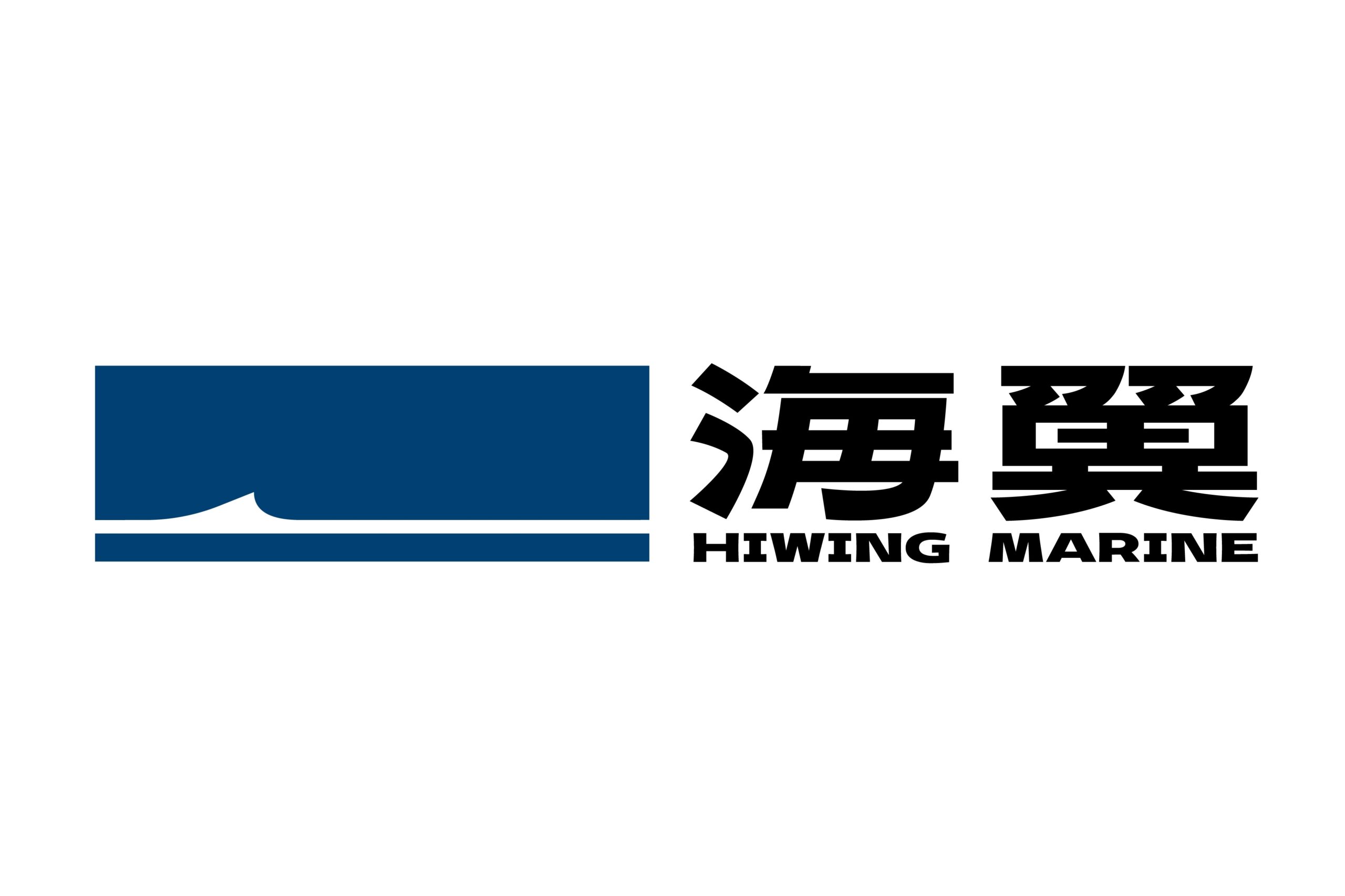
HIWING MARINE — deep blue, simple symbol, and brand presence
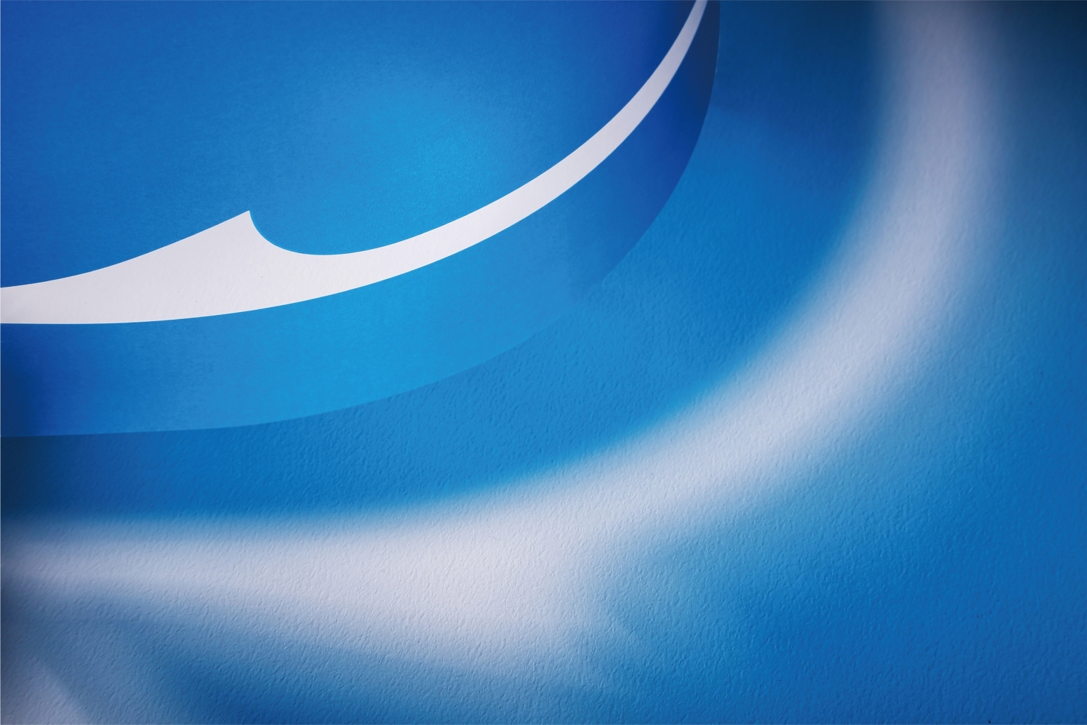
The symbol makes the first impression. A compact blue shape, sliced by a white curve that could be read as a wave, a sail, a wake, or a navigation line. It doesn’t spell everything out—and that’s its strength. The abstraction lets it move between technical and aspirational territory without getting stuck in a literal depiction of the sea.
The blue signals trust. It’s not playful or touristy; it’s deeper, more institutional, the kind of blue a brand uses when it wants to be taken seriously. The white adds clarity and contrast. Together, they create a highly recognizable identity—easy to apply, hard to mistake, whether on neutral backgrounds or corporate materials.
The bilingual logo composition carries weight. The Chinese characters have a bold presence, while HIWING MARINE stands as a clear, stable verbal block. This coexistence of writing systems could feel heavy without breathing room, but here, the white background organizes the hierarchy and lets each element breathe.
The typography isn’t aiming for delicacy—it’s aiming for authority. That boldness reinforces a sense of a strong brand, especially important in sectors where decisions are based more on trust than impulse. This identity doesn’t wink at you; it tells you it knows what it’s doing.
There’s also a thoughtful approach to space. Nothing feels cramped. The brand allows for margins, white space, and silence. This kind of composition elevates perceived value because it suggests a system, not improvisation. In B2B branding, that nuance matters: an organized brand feels more ready to sell, serve, and sustain business relationships.
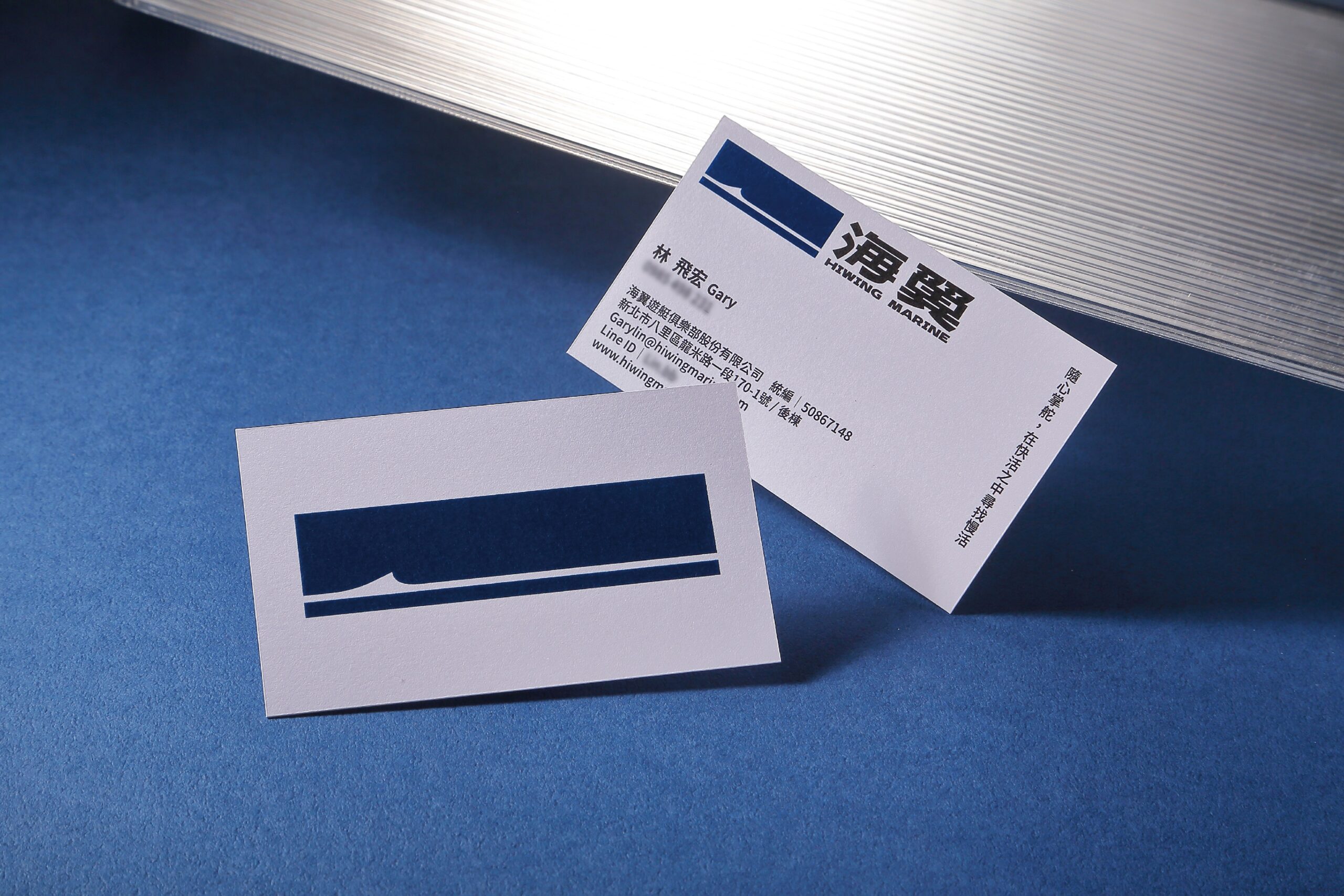
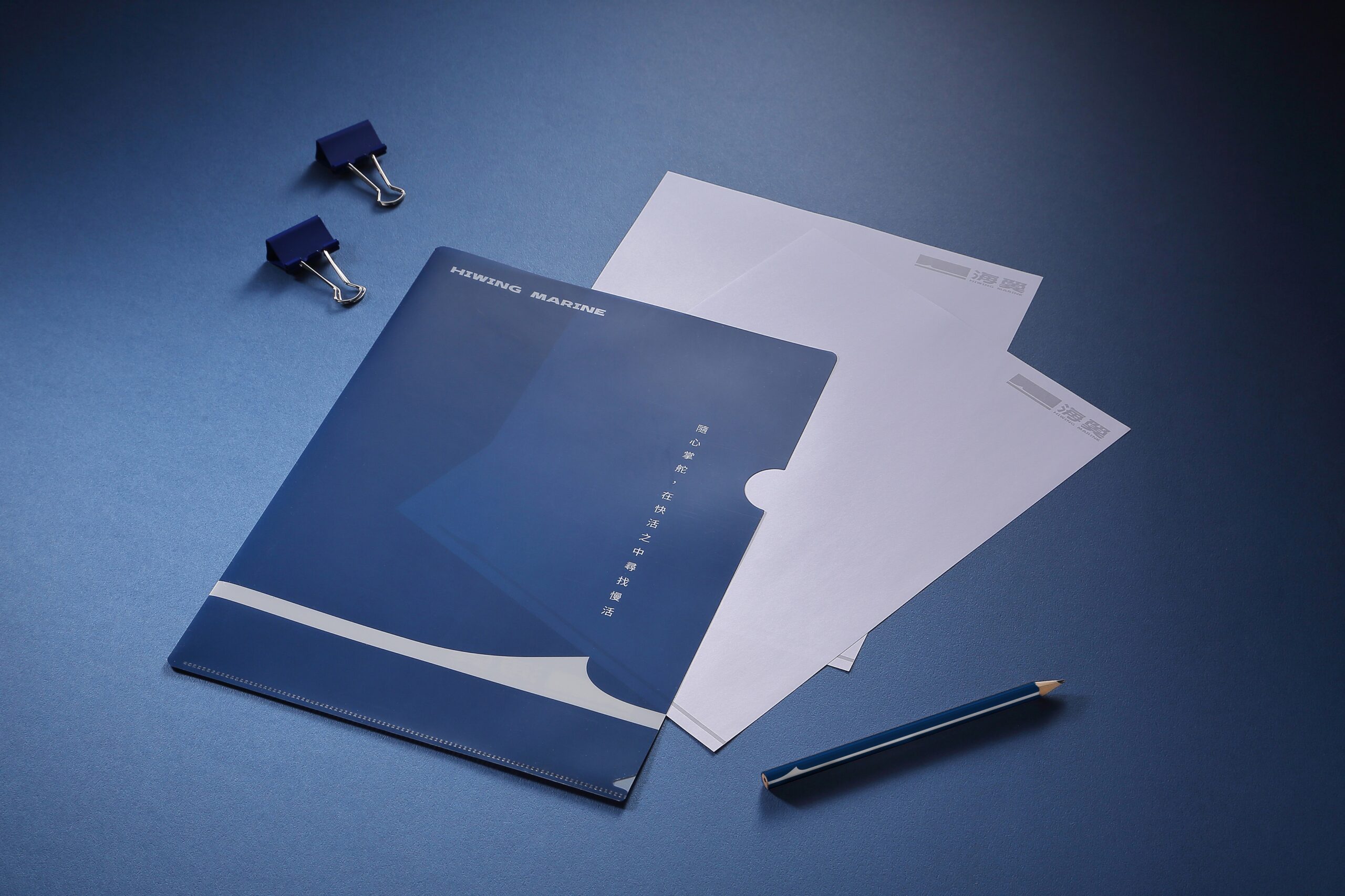
Stationery and physical assets: where the identity holds up
Stationery is where many identities fall flat. A logo might work at scale but fail on a business card, folder, or letterhead. HIWING MARINE makes the leap because the system doesn’t rely on a single flashy layout—it’s built on contrast, repetition, and proportion.
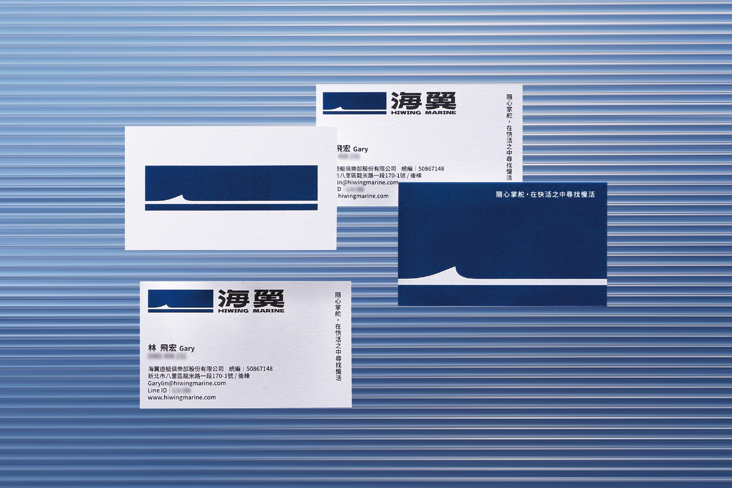
The business cards strike a balance: small but serious. Blue, white, logo placed just right, information neatly arranged. They’re not trying to be collector’s items—they’re built to do their job and leave a mark. Done well, that has real commercial power. A clear card doesn’t just share details; it reinforces the idea of a company with a method.
Folders, documents, and office materials reinforce the sense of a well-assembled corporate kit. There’s no color scatter or unnecessary decorative flourishes. The restrained palette makes everything feel like part of the same family, and that consistency makes the brand easier to remember.
The most interesting part comes when the identity leaves the page. On textiles and merchandise, the symbol holds its character. That’s not always the case—some brands work in presentations but lose impact on everyday materials. Here, the graphic motif keeps its presence, even when it becomes more tactile.
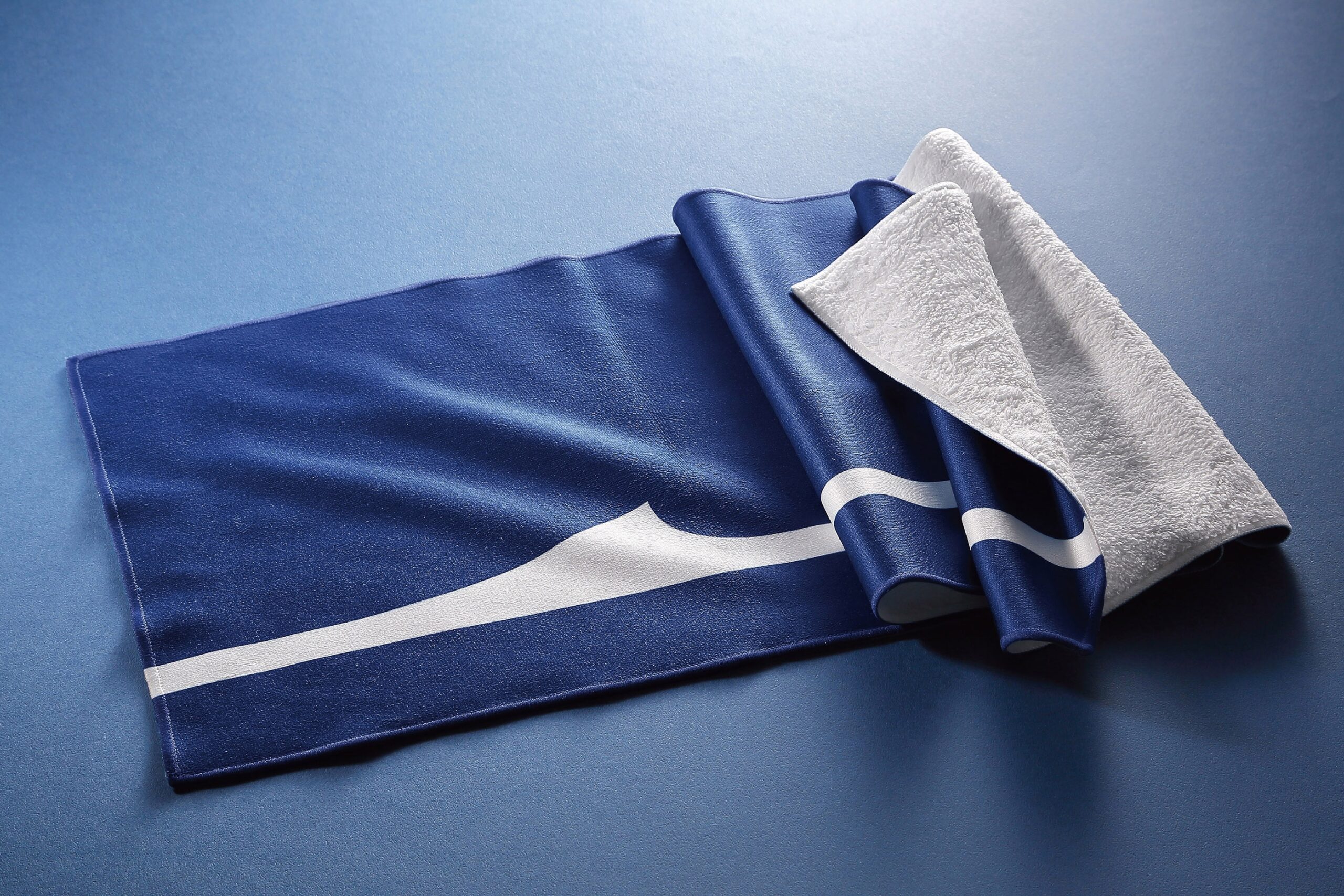
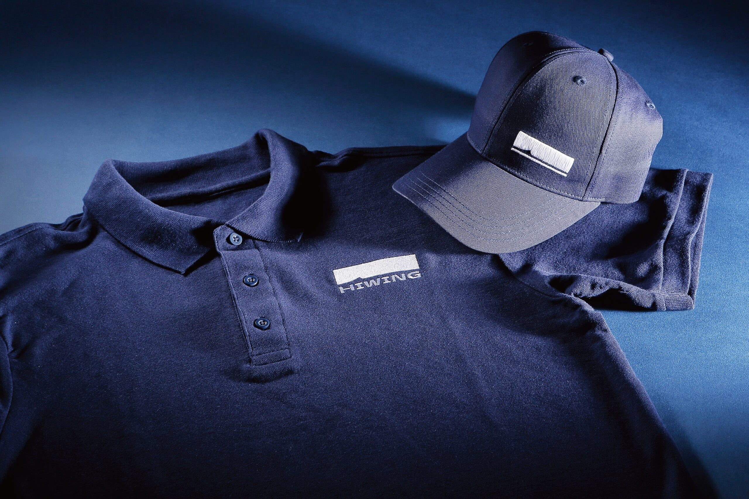
That move to physical assets matters more than it seems. A visual identity doesn’t just live in the brand manual. It lives in meetings, events, folders, emails, uniforms, cards, and sales presentations. The better it adapts to these different scales, the easier it is to build recognition. And with recognition, sales come with less friction.
From sea to lifestyle: when atmosphere sells more than the icon
Open-sea visuals change the pace. The identity shifts from being just a system to becoming an atmosphere. The boat, the water, the horizon, and the light introduce movement—even without actual motion. The brand is placed in a desirable context: sailing, moving forward, cutting through water, breaking from stillness.
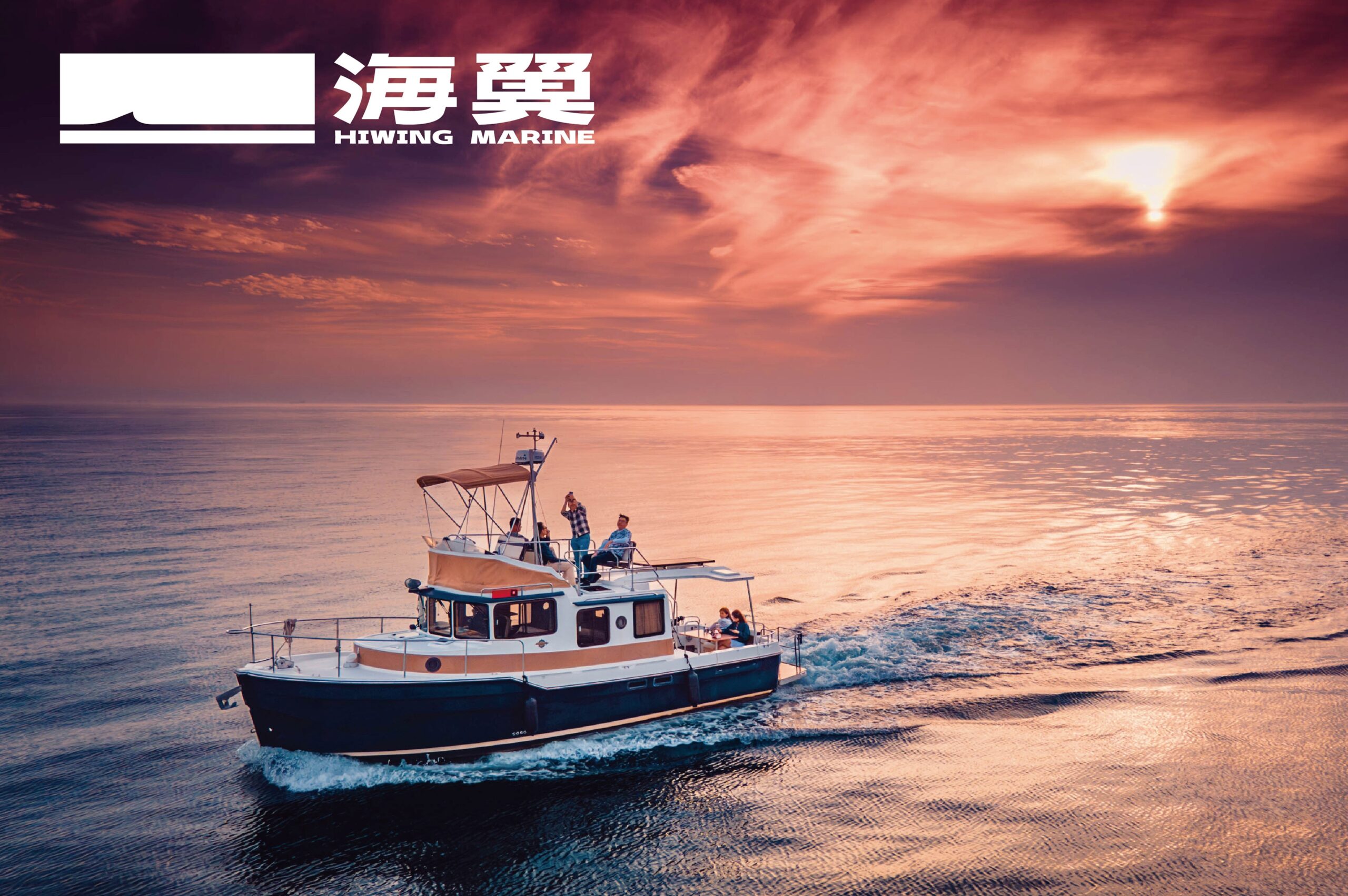
This kind of composition is key to keeping a nautical brand from feeling too rigid. The logo brings order; the sea imagery brings desire. A brand that’s only about order can feel cold. A brand that’s only about emotion can feel soft. Here, the two forces coexist well: visual precision and a sense of freedom.
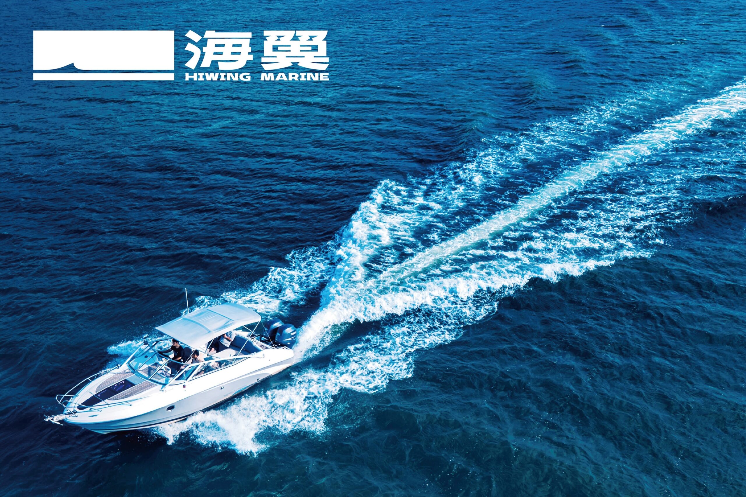
From a business perspective, it’s simple: it’s not enough to explain what you do. Your identity needs to make people want to trust you. In a sector tied to training, navigation, and on-water experience, that trust can’t be one-dimensional. It needs structure, yes—but also a subtle visual promise of controlled adventure.
What this case study offers brands seeking greater confidence
HIWING MARINE works because it doesn’t mistake personality for excess. The identity wins through clarity, composition, and a focused palette. Everything is designed for instant recognition and a stable sense of value across different applications.
The most valuable lesson is balance. A memorable symbol doesn’t have to say everything. A bold typeface doesn’t have to overpower the system if there’s enough visual breathing room. A B2B brand can be understated and still have atmosphere. And a nautical identity can evoke the sea without falling back on easy tropes.
When a brand looks organized, consistent, and well executed, it sells before it even starts selling. Not because design closes the deal on its own, but because it reduces doubt, signals discernment, and leaves a cleaner visual memory. HIWING MARINE is a reminder of something fundamental: trust is designed, too.