Brand identity redesign for a company specializing in sequestering and chelating agents. The existing logo was reimagined with a more technical approach, enhancing legibility, scalability, and alignment with its industrial context.
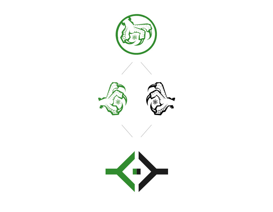
The original idea of chemical “sequestration” is preserved, but reinterpreted through a more controlled geometric language. Two symmetrical shapes symbolize the process of capturing and separating matter.
The symbol is built on clear axes and balanced proportions, removing unnecessary complexity to ensure a precise, technical interpretation.
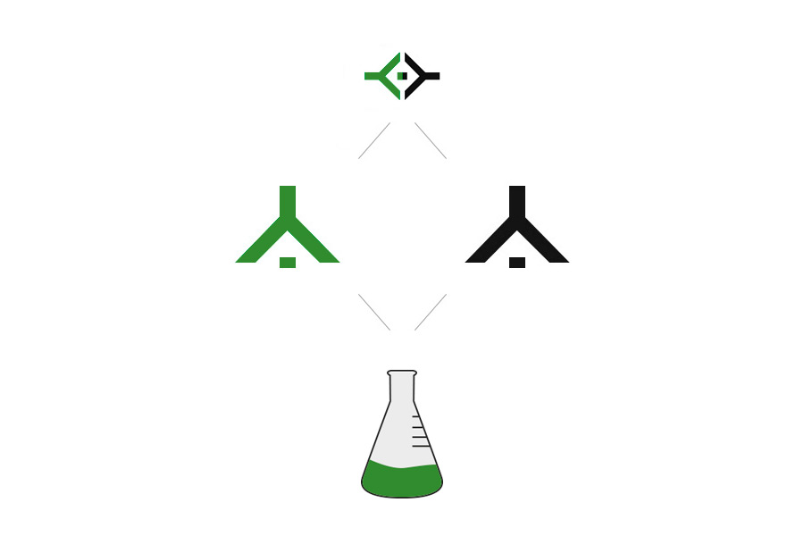
The logo offers a second interpretation: when rotated, it reveals a chemistry flask. This conceptual layer strengthens the connection to the field without relying on obvious elements.
We review your current situation and define the next step.
Contact now
We analyse your context, objectives and digital presence. We define the architecture and key priorities before design begins.
We create the visual identity and organise the content—always focusing on clarity, consistency and an optimal user experience.
We implement the project to high standards of performance and stability and, where needed, ensure integration with other systems.
We continuously monitor, optimise and improve your digital project to support its growth alongside your business.
We will review your current digital situation. We will get in touch to understand your context and jointly assess which areas to analyze, after which we will prepare an audit including key findings and recommendations.