Logistics usually wears the same uniform: maps, routes, fleets, efficiency, punctuality. Truck’N Roll® takes a different route. It transforms trucks, highways, and backstage into a bold, poster-like identity—closer to a tour than a corporate profile.
That’s the point: operational precision without flat aesthetics. Everything exudes control, expertise, and muscle, but the visual direction adds drama, rhythm, and campaign flair. Black and white, oversized type, authentic photography, and modular layouts give technical services real presence—without pretending to be something else.
For B2B brands that think “there’s nothing visual about what we do,” this is a wake-up call. Almost any business has visual potential if you know where to look: a machine, a texture, a routine, a person, a tool, a well-placed phrase. Here, logistics stops being invisible and starts to build atmosphere.
Truck’N Roll® — logistics with a poster’s punch
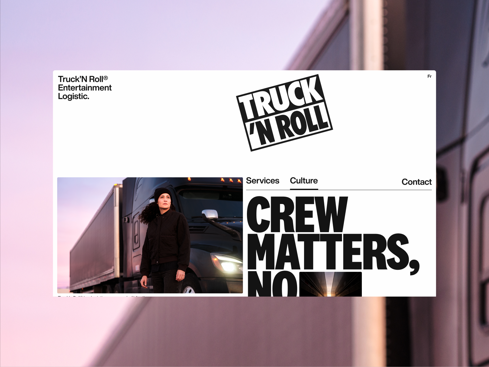
The first impression hits hard. There’s no timid intro or generic supplier look. The website puts the name, the service, and the attitude front and center, with a layout that feels almost like a magazine cover: few elements, high contrast, and a hierarchy that guides your eye.
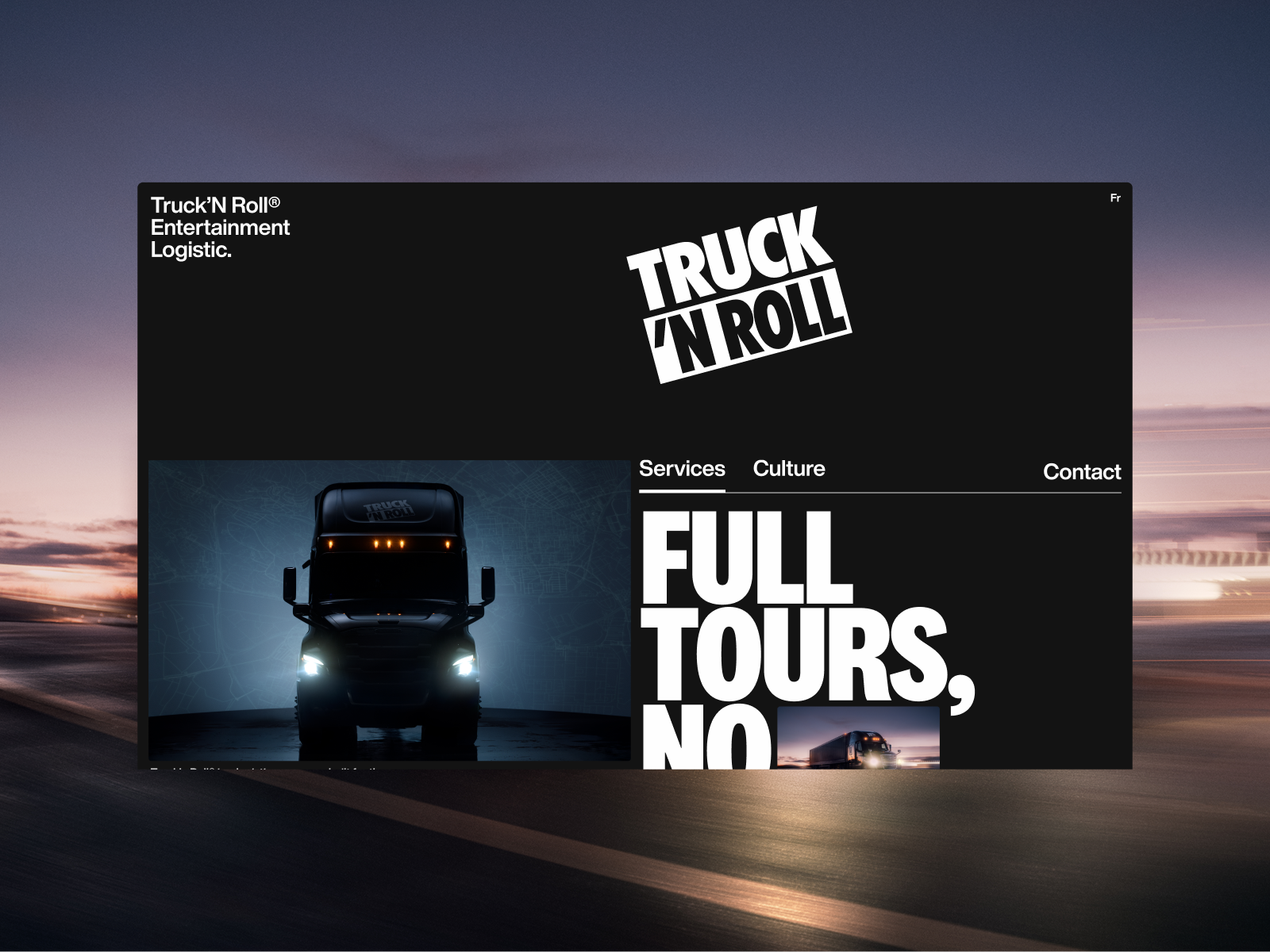
Black isn’t just an elegant background—it’s a stage. It makes the truck feel part of a nighttime narrative, a tour, a road, a load that needs to arrive before the lights come on. That atmosphere positions the brand far from the logistics catalog and closer to the world of live events.
Typography leads the way. Big, compact, direct—statements that read like campaign taglines. It’s not there to “decorate” the interface; it builds a voice. In a category where most companies compete on the same claims—speed, safety, experience—a distinctive visual voice shifts the value perception before users even get to the service details.
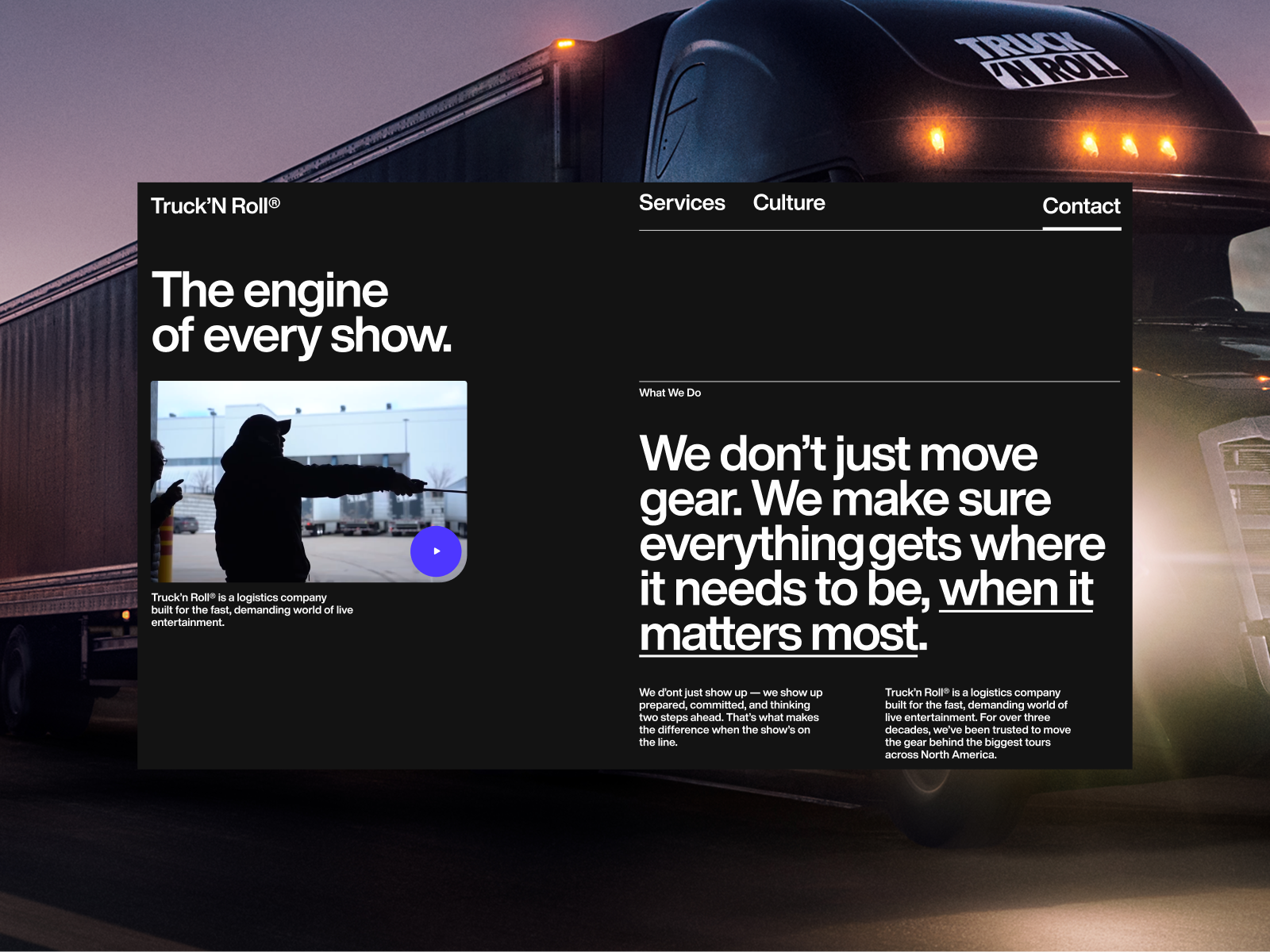
The services section keeps that editorial energy without losing practical clarity. There’s text, explanation, operational context—but all within a visually strong composition. The brand doesn’t drop its identity when it’s time to explain what it does. That’s harder than it looks: many sites start with an ambitious hero and then fall into generic blocks. Here, the visual direction holds steady.
The blend of road imagery and backstage language works brilliantly. It doesn’t sell “transport” in the abstract; it sells the confidence that makes a show possible. That shift in focus is key. In B2B, design needs to clarify the risk being solved. It’s not just about moving gear—it’s about making sure the tour goes on.
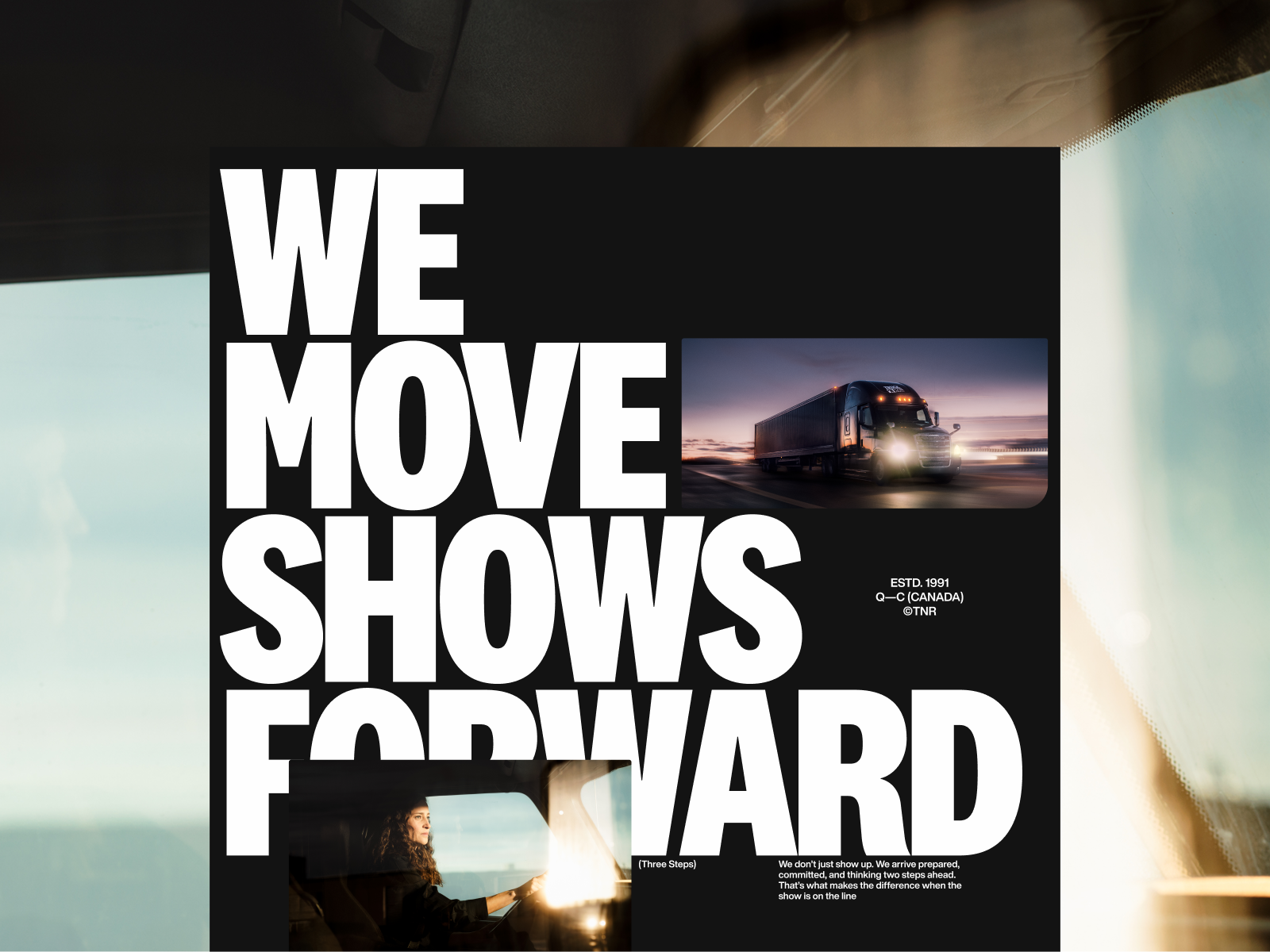
The poster-style blocks are some of the most enjoyable elements. The layout slices the screen into pieces that could live beyond the web: a banner, a crew t-shirt, a campaign asset, a card, an editorial page. That ability to leap across formats signals a strong identity. When a visual idea works beyond the layout, it starts to build a real brand.
Black and white brings discipline. It avoids distraction, sets a serious tone, and lets photos stand out without competing with a noisy palette. But it never feels cold—the energy comes from scale, framing, and the tension between text and image.
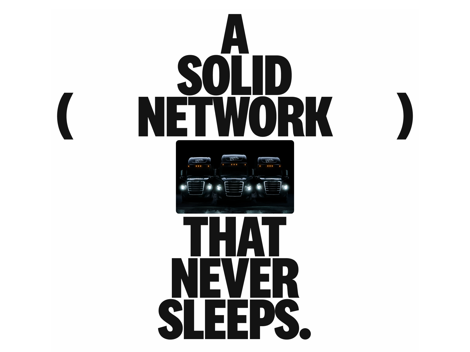
Transitional headers feel almost like manifestos. They act as big breaths in the scroll: less information, more presence. The phrase takes up space, the truck appears as an operational icon, and the page gains rhythm. In UX/UI, these moments aren’t just visual flourishes—they help shape the experience and make key ideas memorable, without turning the page into an endless spec sheet.
Navigation is intentionally restrained. Few entry points, lots of vertical depth. It fits an experience meant to be explored, not skimmed. For a brand with strong storytelling, scrolling becomes a tool for visual direction: it sets the pace, controls the order, and lets you move from impact to proof, from atmosphere to argument.
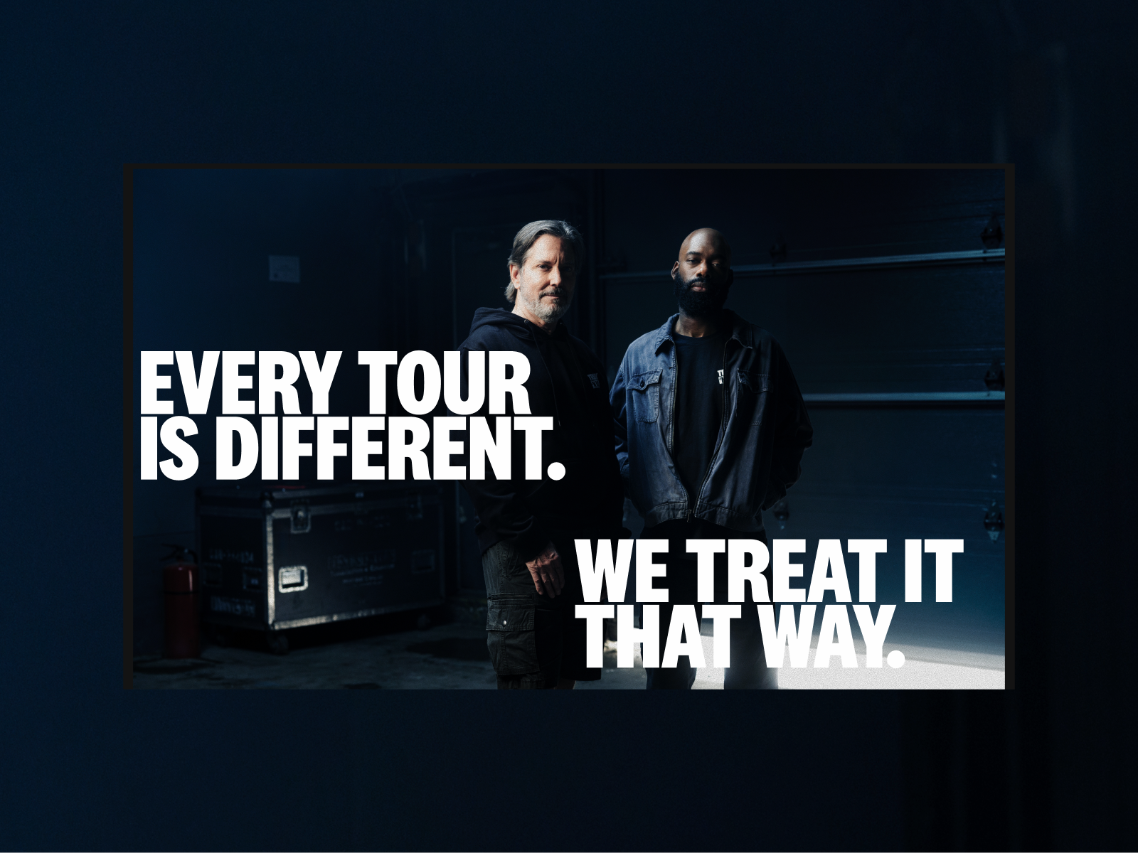
Team photography adds a crucial layer of trust. In logistics, the promise depends on people who anticipate problems, drive, coordinate, respond. Showing faces, attitude, and human presence breaks the coldness of operations and turns service into culture. It’s not “we have a team”; it’s “these are the people who make the show happen.”
The culture page follows the same logic: clean structure, bold type, images with character. It doesn’t try to seem friendly with soft tricks. It prefers to build respect. And for certain B2B brands, that’s far more valuable than trying to sound artificially approachable.
There’s an interesting detail in how calls to action appear. CTAs aren’t tacked on as lonely buttons at the end of a block—they’re integrated into the composition. They’re part of the poster. That changes the feel: the action doesn’t interrupt the experience, it completes it.
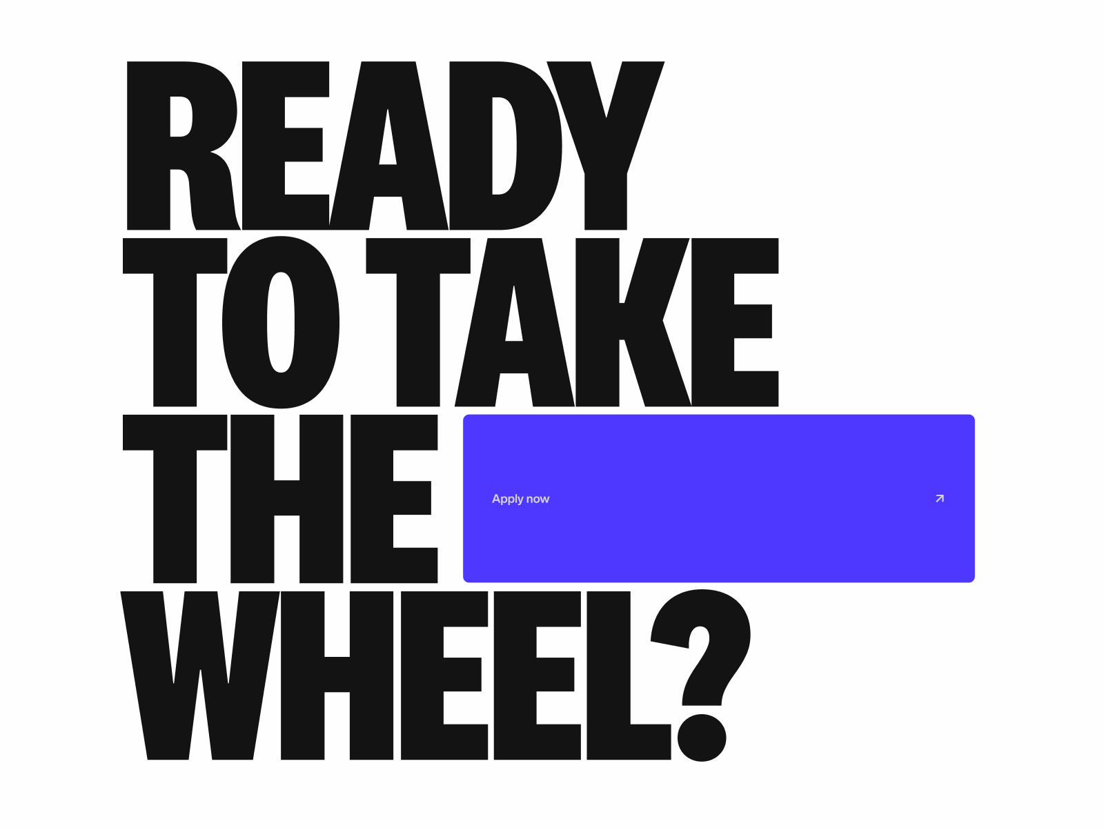
The purple button intentionally breaks the monochrome discipline. Precisely because almost everything lives in black and white, that color carries weight. It doesn’t have to compete with a dozen other accents. It’s a simple, effective decision: when everything is contained, a single pop of color becomes direction.
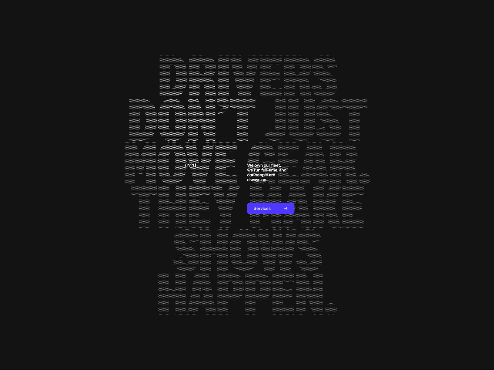
The visual finale is a phrase that makes drivers part of the show. That’s where the identity finds its strongest idea: logistics isn’t something that happens in the background—it’s what makes everything else possible. That’s great brand design: finding a business truth and making it visible.
What B2B brands can learn from this visual approach
The first lesson is clear: a B2B website doesn’t have to choose between clarity and character. It can explain clearly and still build a unique visual presence. In fact, when the market is full of similar messages, visual direction becomes a fast way to filter perception: who looks solid, who looks generic, who’s worth a conversation.
The second is about typography. Using it as a brand asset—not just a text container—changes a brand’s entire tone. A big, well-composed, and distinctive headline does more for visual memory than a set of neutral icons.
The third is about visual proof. Real photography, when well directed, doesn’t just show “what’s there”—it conveys scale, expertise, and trust. In operational services, that matters a lot. A truck, a team, a route, or a workspace can be more persuasive than an abstract promise.
And the fourth: CTAs are stronger when they’re part of the system. If a button feels tacked on as an afterthought, it shows. If it’s part of the visual rhythm, conversion feels more natural. You don’t need to shout louder; you need to compose better.
A reference for your “brands with craft” folder
Truck’N Roll® leaves a rare impression—in the best way: a logistics company that could have settled for being merely functional, but chooses to have a voice, an atmosphere, and graphic flair. The site doesn’t try to look like another industry; it understands its own world—roads, tours, pressure, night, crew, punctuality—and turns that into identity.
For marketing teams, founders, and brands with complex services, there’s a clear takeaway: technical doesn’t mean invisible. And when that image is well crafted, it doesn’t just decorate. It shapes perception, raises perceived value, and makes a brand easier to remember when it’s time to choose.


