MO Museum didn’t need a new identity in the traditional sense. It already had a logo, an architectural presence, strong recognition, and a well-established cultural role. What it needed was something more challenging: a way for an increasingly complex brand to keep evolving without losing coherence.
That’s where Sons & Daughters ID began. Instead of erasing what existed, they built upon it. The logo remains, the integrity of the artworks is preserved, and the geometry of the “M” and the building’s angles become the foundation for a visual system that lives across posters, publications, signage, motion, digital tools, and collaborations.
The driving idea is shifts: movements, changes in perspective, planes that open, intersect, and reorganize space. It’s more than a graphic device. It aligns with how the museum sees its cultural role: as a place that sparks conversation, challenges assumptions, and invites people to see things from a new angle.
That’s where the project gains depth. The real achievement isn’t just how MO looks, but how the identity is designed to keep working as more people, more formats, and more content come into play.
MO — an identity built for change
The first visual impact comes from the interplay of geometry and space.
The slanted planes aren’t an afterthought. They’re rooted in what was already there: the logo and the building’s architecture.
This makes the identity feel inevitable.
When a visual system finds its rules within the brand itself, it tends to age better than one based on fleeting trends. Here, diagonals, cuts, and shifts can appear on a poster, a screen, a publication, or an animation—no need to keep explaining their origin.
Architecture is part of the work. The identity responds in kind.
That dialogue is likely one of the project’s best decisions.
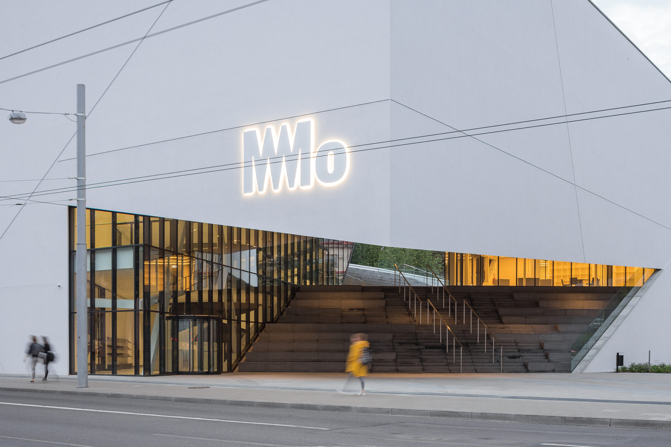
The facade makes this relationship clear. The mark doesn’t sit on the building as a separate layer. Its forms echo the angular, clean, and striking architecture.
That doesn’t mean the identity and the building have to look identical. The connection is subtler: both share a spatial logic.
When architecture and graphic language start speaking the same grammar, it stops feeling like a brand applied to a place. It feels like a complete project.
A system that didn’t need a logo redesign
One key requirement was clear: the existing logo had to stay.
That changes the question.
Instead of asking, “How do we redesign MO?”, Sons & Daughters ID approached it differently: What can we build from what MO already has?
The answer is a system much broader than the symbol itself.
The studio developed a logo architecture designed to coexist with the museum’s expanding ecosystem—especially with the many partners involved in exhibitions, events, and projects.
This might seem secondary, but it quickly becomes crucial as an institution grows.
A simple identity works well when there are only:
- a main logo,
- a handful of applications,
- a small team,
- and a limited number of people creating communications.
But the landscape changes when you add:
- external collaborators,
- educational programs,
- temporary exhibitions,
- partners,
- events,
- sub-brands,
- campaigns,
- publications,
- and an internal team producing content continuously.
At that point, an attractive brand isn’t enough.
You need rules.
MO establishes these rules without turning them into a visual straitjacket. The identity can adapt to different content and collaborators, shift formats, and absorb new situations while maintaining a recognizable structure.
That’s much harder than designing a single spectacular piece.
The concept of shifts: changing perspective
The idea of shifts isn’t just about creating interesting compositions.
It’s conceptually tied to MO Museum itself.
Since opening in Vilnius in 2018, the museum has evolved from one of Lithuania’s leading private art collections into a much broader cultural space, with exhibitions, educational activities, and conversations around topics like mental health, intimacy, and LGBTQ+ issues.
The museum sees itself as a place that can shift perspectives in society: challenging norms, opening up conversations, and offering new ways of seeing.
Sons & Daughters ID translates this idea without illustrating it literally.
Planes shift.
Compositions move.
Information appears from different angles.
Content seems to constantly reorganize the space.
There’s no need to write “change of perspective” on every poster. The identity itself behaves that way.
At this point, the concept becomes more than a branding explanation—it becomes a design principle.
Movement as brand behavior
Here we find one of the project’s most distinctive layers.
Motion isn’t tacked on at the end to make things look more digital.
It’s part of the language.
Angled planes can shift, open, enter, disappear, or reveal content. The identity develops its own behavior.
This adds a compelling dimension.
In a static identity, we recognize elements like:
- color,
- typography,
- composition,
- form,
- photography,
- illustration.
But when movement enters, another question arises: How does this brand behave over time?
MO uses time to reinforce the idea of shifting perspectives.
Movement doesn’t need to become a spectacle. What matters is that it’s recognizable.
The same principles that structure a poster can structure an animation. A plane that organizes two elements on paper can, on screen, become a transition that reveals one and hides another.
That’s where true coherence between graphic design and motion begins.
It’s not a static identity plus a separate collection of animations.
It’s the same system speaking across different media.
The artwork always retains its integrity
The second major constraint directly affected the museum’s content: artworks could not be distorted.
This was also a legal requirement.
It forced the graphic language to clearly understand its role.
There’s always a certain tension in cultural institutions between the museum’s identity and the identity of what it exhibits. The brand needs personality, but it shouldn’t visually distort or appropriate the artworks.
MO resolves this by using the system as a frame.
Planes can surround an image, divide space, organize information, or create tension around a piece.
But the artwork keeps its proportions.
The identity is present without using the artwork as a malleable graphic element.
That’s a true test of maturity for any cultural system: knowing when to step forward and when to step back.
From visual system to everyday interaction
The digital entry point is where identity stops being just a presentation and becomes part of the user experience.
A mobile ticket has a fairly unglamorous job:
- identify the visit,
- display the necessary information,
- enable validation,
- and facilitate access.
Here, the system doesn’t try to turn this task into a graphic showcase. The hierarchy remains clear, the code is functionally prominent, and information is easy to grasp.
But the experience still feels like MO.
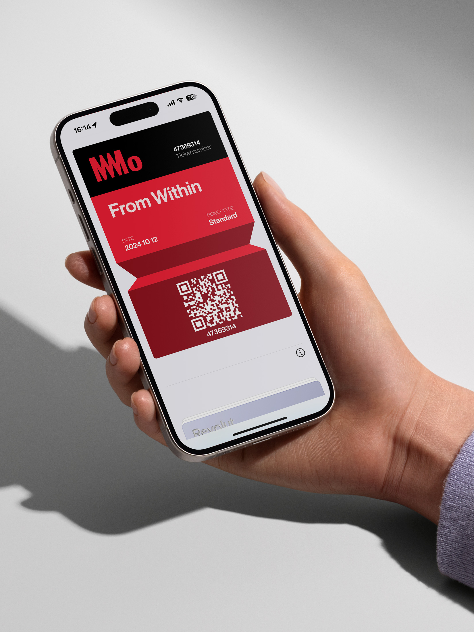
This detail matters more than it seems.
Many brands work perfectly in a campaign but disappear as soon as the user enters a functional interface.
You end up with one identity on the poster and a different one on the product.
MO avoids that disconnect.
The identity remains, but turns down the volume and serves the user’s needs.
Posters that seem to move
Outdoors, the system regains intensity.
The mix of photography, color planes, typography, and angled cuts creates compositions with a sense of movement—even when the piece is completely still.
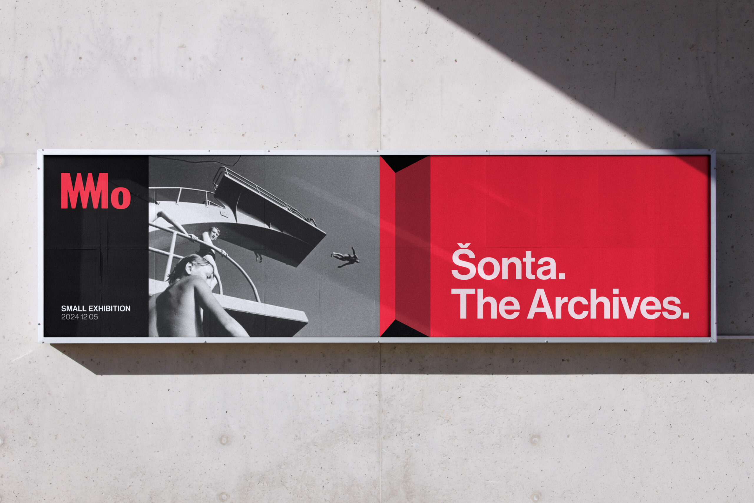
There’s something interesting here: motion has a static version.
You don’t need to play an animation to recognize its logic.
The eye fills in part of the movement.
Planes seem to enter and exit the composition, diagonals guide the gaze, and information is organized through spatial tension.
For an institution with a constantly changing program, this kind of system is invaluable.
Content can change constantly without each new exhibition requiring a brand-new graphic personality.
Content changes.
The system remains.
That’s one of the fundamental differences between a campaign and an identity.
A campaign might last a few months.
An identity needs to keep delivering for years.
A tool for identity that outlives the studio
Here’s one of the project’s most interesting decisions.
Sons & Daughters ID didn’t just deliver a closed set of designs.
They developed a generative tool that allows the museum team and collaborators to create new:
- patterns,
- layouts,
- compositions,
- and motion-ready assets.
All within the system’s rules.
This fundamentally changes the traditional logic of an identity project.
The designer stops trying to personally control every future piece.
Instead, they design the conditions for others to create without breaking the brand.
This makes particular sense for an organization like MO Museum, where communication is constant and the people creating content may change.
You can’t rely on the original studio for every poster, story, program, collaboration, or event.
But you also don’t want each department creating its own version of the identity six months later.
The solution is to create enough freedom within clear rules.
The generative tool turns the graphic language into infrastructure.
And here’s a particularly contemporary idea: an identity doesn’t have to be just a manual explaining what can and can’t be done.
It can also be software that helps you do it.
Editorial design without losing character
When the system moves into print programs, its intensity shifts.
The piece becomes more editorial, more informative, and closer to the act of opening, reading, referencing, and returning.
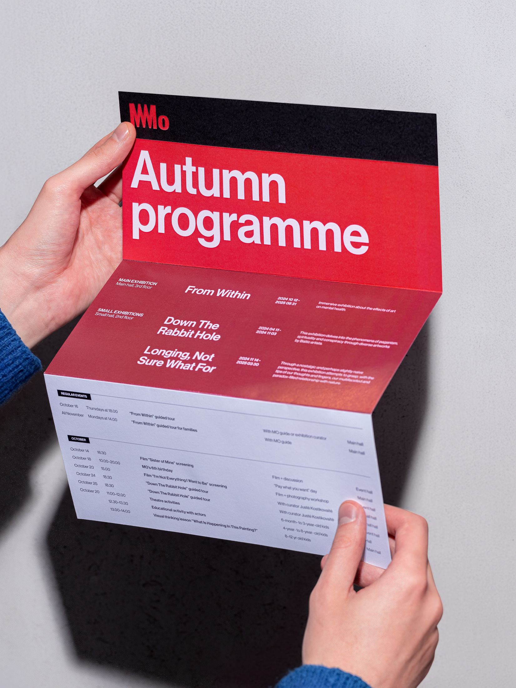
Typography continues to structure the piece, but the layout gives more space to content.
Not everything needs to speak at the same volume.
A strong identity also knows how to modulate its voice.
This is especially important for a museum, because the system can’t rely solely on pieces with three huge words and an image.
It needs to accommodate:
- opening hours,
- curatorial texts,
- practical information,
- credits,
- programming,
- descriptions,
- and much denser editorial content.
That’s where many visually striking systems start to struggle.
MO maintains enough structure for content to grow without losing its personality.
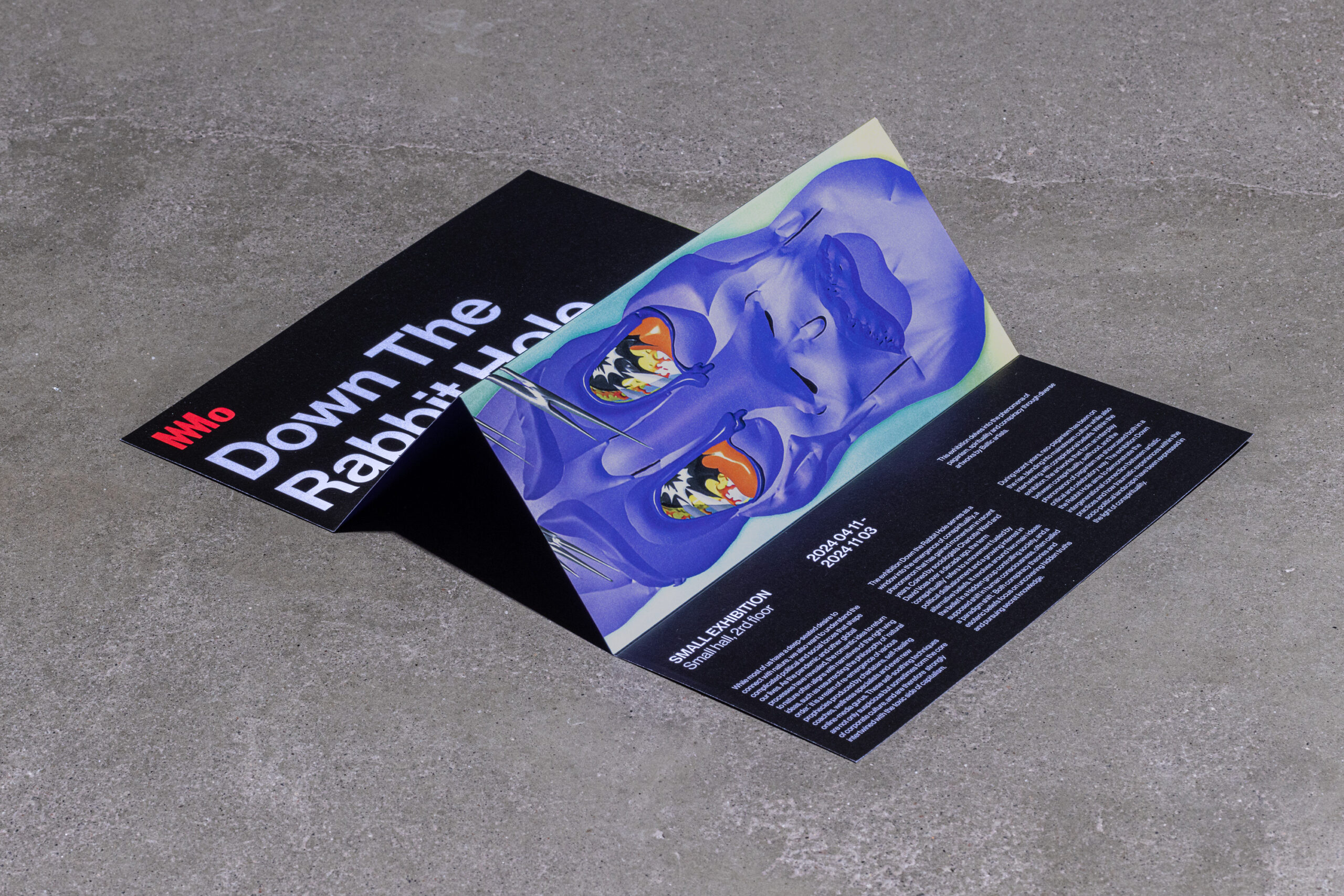
The leaflet adds a physical dimension.
Folds, information blocks, artworks, and slanted planes turn a small piece into an extension of the system.
The identity becomes tangible and tactile.
It doesn’t feel like a scaled-down poster.
It feels like another voice in the same language.
Architecture and identity sharing geometry
The relationship with the building deserves another look, as it underpins much of the project.
The angles of the graphic system directly echo MO Museum’s architecture.
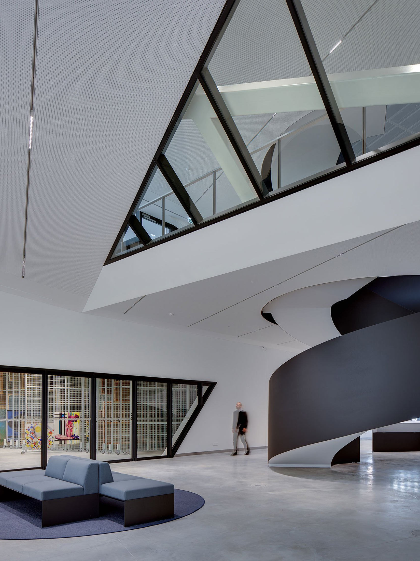
This creates a rare sensation: the brand doesn’t end where the facade begins.
Visitors encounter a similar logic in architecture, signage, and communications.
But the identity doesn’t need to cover every surface to prove the connection.
It works precisely because it knows when to step back.
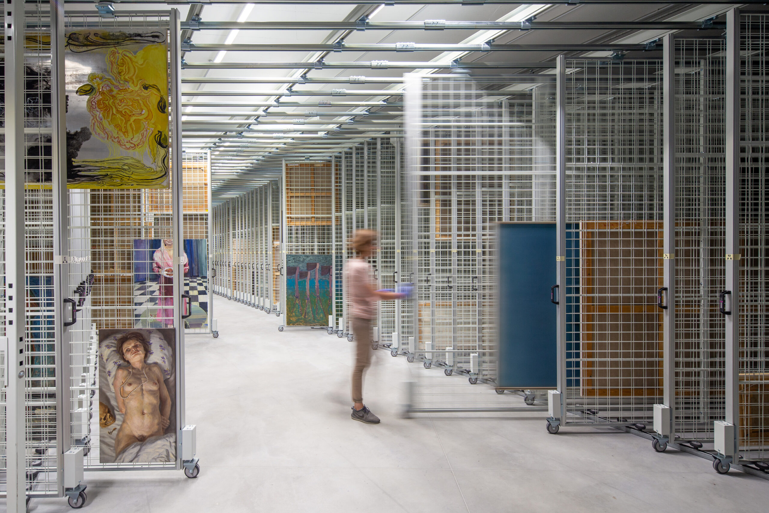
In galleries and spaces where the artwork needs to take precedence, the system can recede.
In navigation, programming, or communications areas, it returns.
This modulation keeps the experience from becoming overwhelming.
A strong identity doesn’t need to constantly prove its strength.
A grammar designed for changing content
Programming materials reveal another quality of the system: it can absorb very different images, colors, and content without losing recognition.
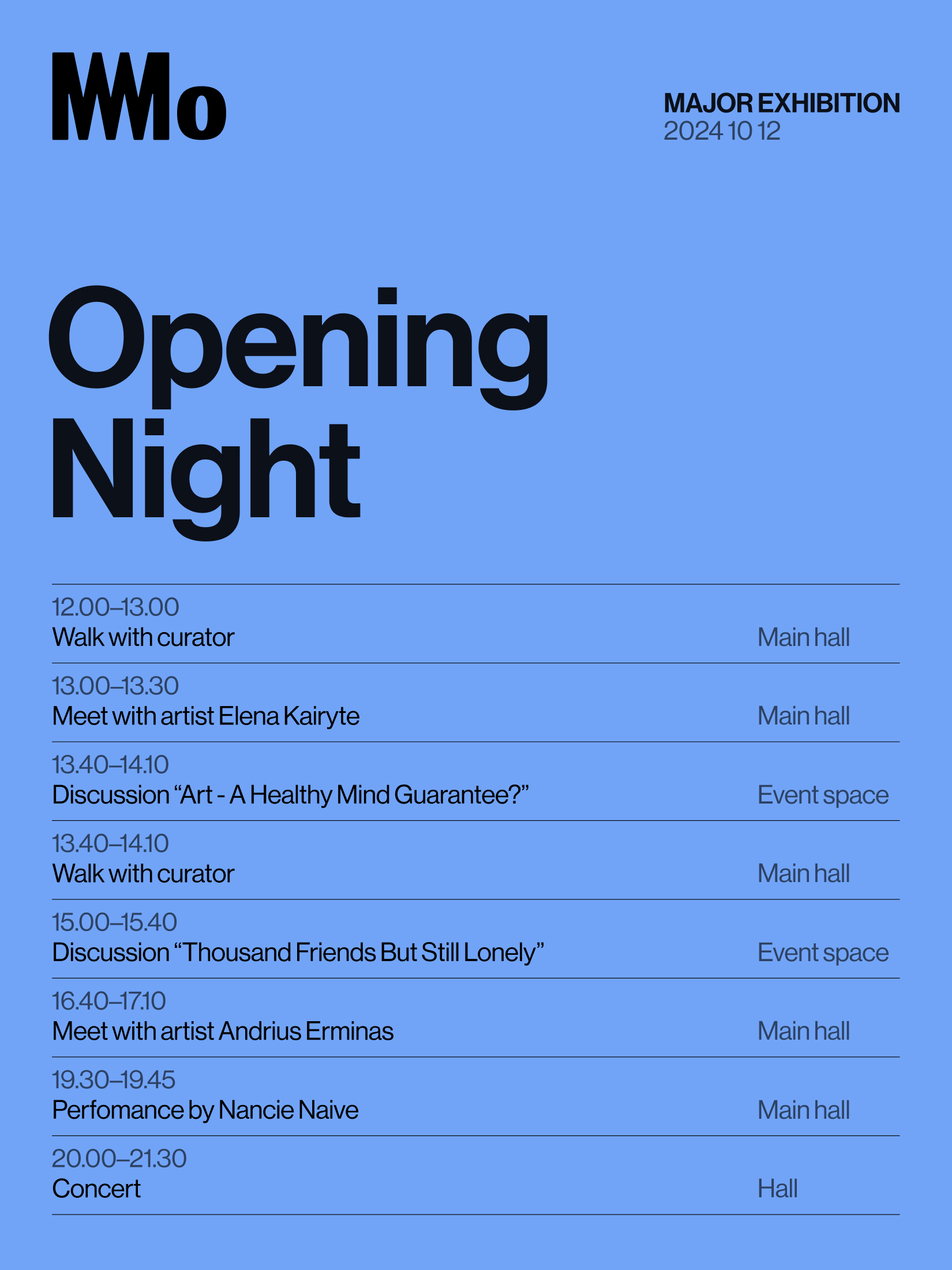
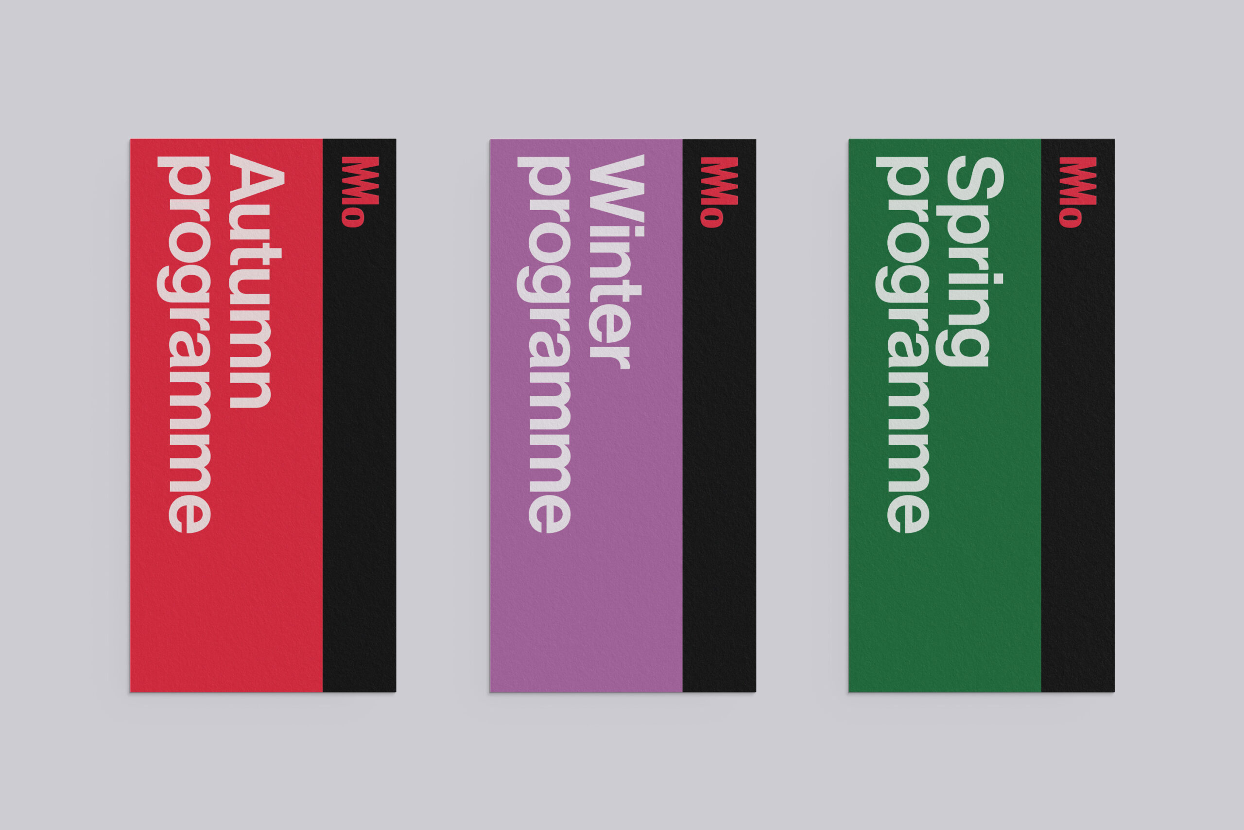
It never feels like you’re just filling in a template.
There are shared visual rules that allow for different solutions.
That difference matters.
A template repeats. A grammar generates.
The first can be efficient, but quickly tires as content volume and diversity grow.
The second allows for variation while maintaining recognition.
MO can change images, proportions, formats, color, and information density because there’s a common underlying structure.
That balance between freedom and control is one of the biggest challenges for any contemporary identity.
From museum to ecosystem
This entire system also responds to a shift within the institution itself.
MO had grown.
What began as a major private collection of Lithuanian art had become a much broader cultural center, with exhibitions, education, events, collaborations, and conversations around contemporary social issues.
And growth inevitably brings complexity:
- more people,
- more content,
- more partners,
- more formats,
- more channels,
- and more chances for an identity