Want to see another round of pharmaceutical logos?
After our first showcase of pharmaceutical logo examples, we received plenty of requests to feature more designs from other companies.
So, after a short break to avoid logo overload, we’re back with 10 more standout logos from leading pharmaceutical laboratories.
As a bonus, we’ve also included each company’s corporate video so you can get a sense of their communication style.
Interested in expert advice on this topic? We have extensive experience in this sector and have delivered outstanding results. Click here for a consultation to boost your online presence. We’ll analyze your project and present a tailored action plan for improvement.
[superfeatured]7906[/superfeatured]
ASTRA ZENECA
Logo design for ASTRA ZENECA pharmaceutical laboratory
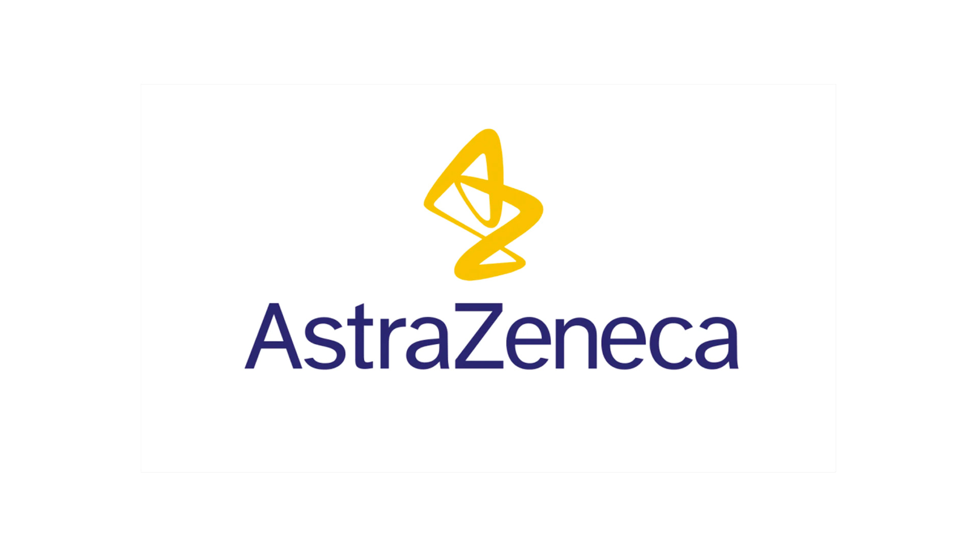
We begin with the instantly recognizable logo of AstraZeneca.
This design stands out for its visual composition and color choices, creating a striking contrast between the icon and the name. The name itself combines two words—Astra (the Swedish subsidiary) and Zeneca (the UK subsidiary)—reflecting the company’s origins.
AstraZeneca’s logo is a textbook example of how color, typography, and form can communicate a brand’s purpose, mission, and values.
EISAI
Logo design for EISAI pharmaceutical laboratory
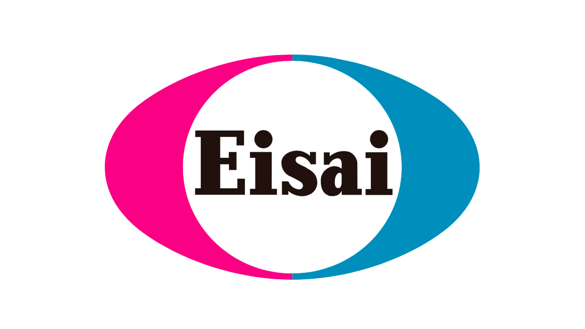
Eisai specializes in the research, production, and distribution of health products.
With the motto “no one left behind” and the mission “human health care,” the company puts patients and their families at the heart of everything they do.
Their logo features a two-tone ellipse containing the company name.
While the shape is interesting, we find the choice of typography less successful.
SANOFI
Logo design for SANOFI pharmaceutical laboratory
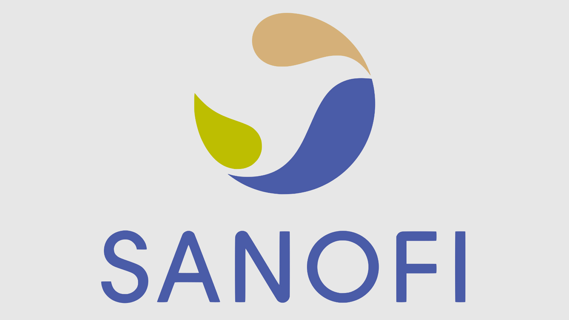
Sanofi is a global biopharmaceutical company focused, as you’d expect, on improving people’s health.
The Sanofi logo is the result of years of evolution and refinement.
It features the silhouette of a bird in negative space within a tricolor circle, complemented by the company name in a soft, organic typeface.
Interested in expert advice on this topic? We have extensive experience in this sector and have delivered outstanding results. Click here for a consultation to boost your online presence. We’ll analyze your project and present a tailored action plan for improvement.
[superfeatured]7906[/superfeatured]
IMMATICS
Logo design for IMMATICS pharmaceutical laboratory
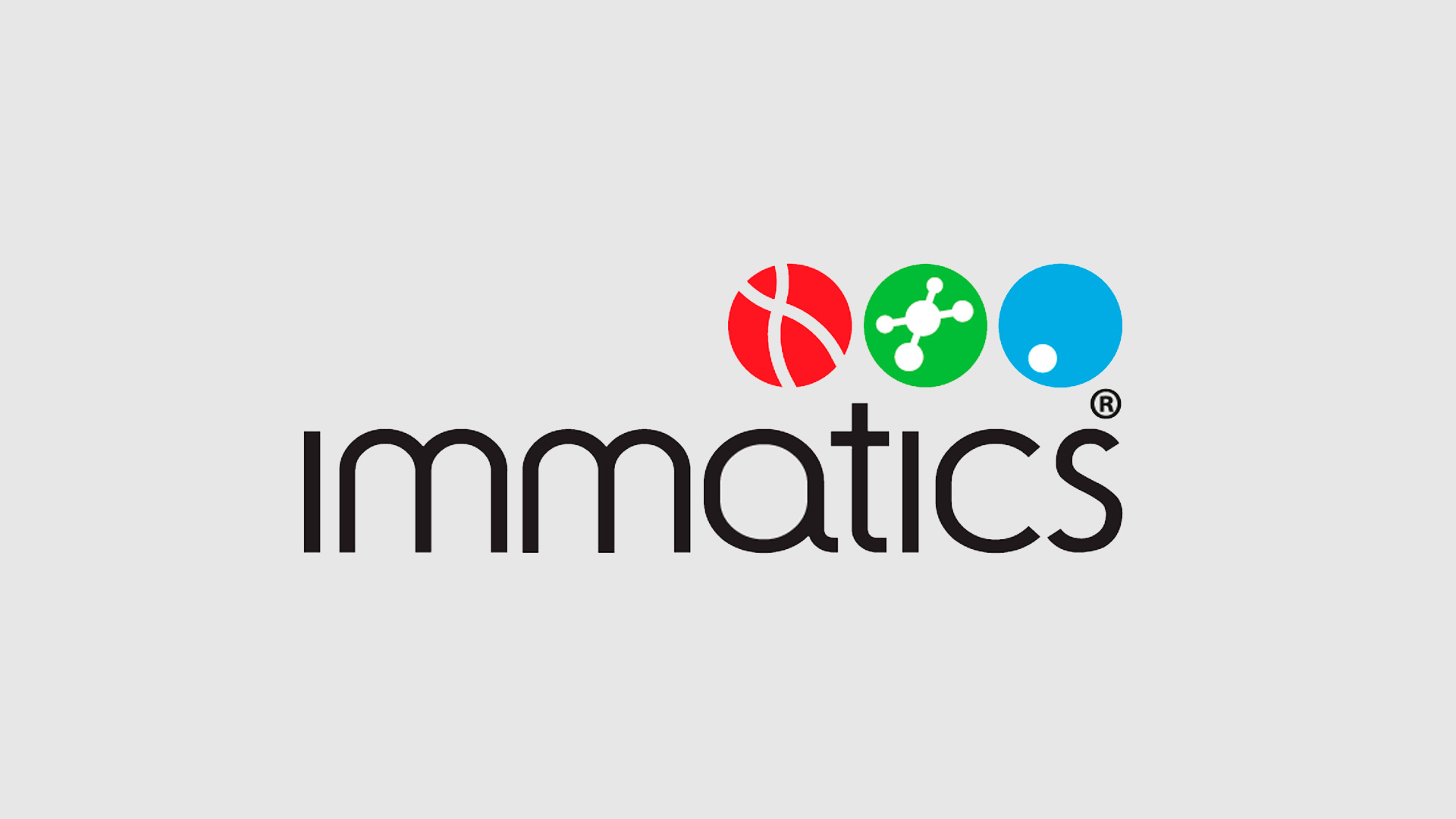
Perhaps one of the more understated logos on this list.
Immatics’ logo is notably conservative, likely reflecting the company’s relative youth and limited focus on building a strong, distinctive brand identity.
BIONTECH
Logo design for BIONTECH pharmaceutical laboratory
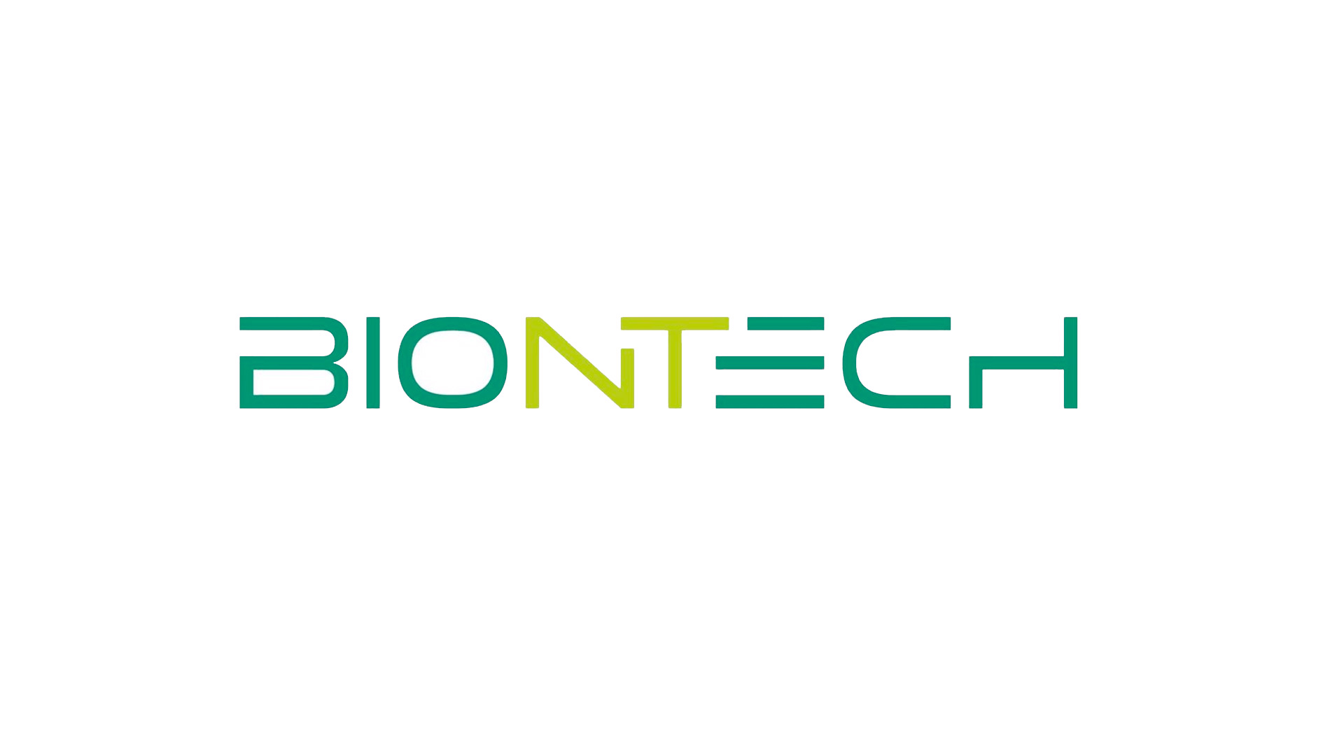
Biontech is a next-generation pharmaceutical company, focused on developing personalized treatments through genetic research.
The company is widely recognized for its work on a Covid-19 vaccine and, prior to that, for its cancer therapies and medications.
Its logo is highly technical, built around a palette of green tones.
VIIV HEALTHCARE
Logo design for VIIV HEALTHCARE pharmaceutical laboratory
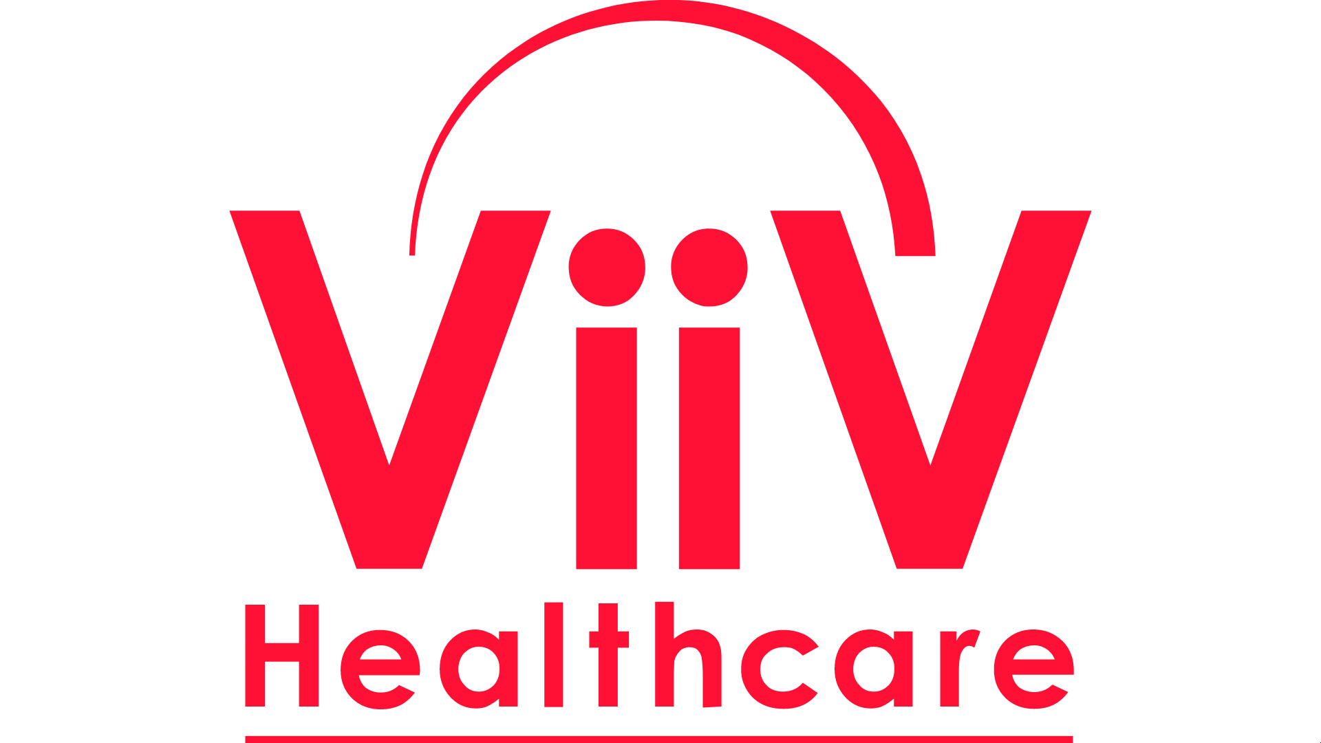
ViiV is fully dedicated to researching and developing treatments for HIV, focusing on people affected by the disease.
The logo cleverly uses lettering and an upper arc to depict two figures—one representing the company, the other the disease.
While the design is quite literal, it succeeds in creating an approachable, people-first image.
VAXART
Logo design for VAXART pharmaceutical laboratory
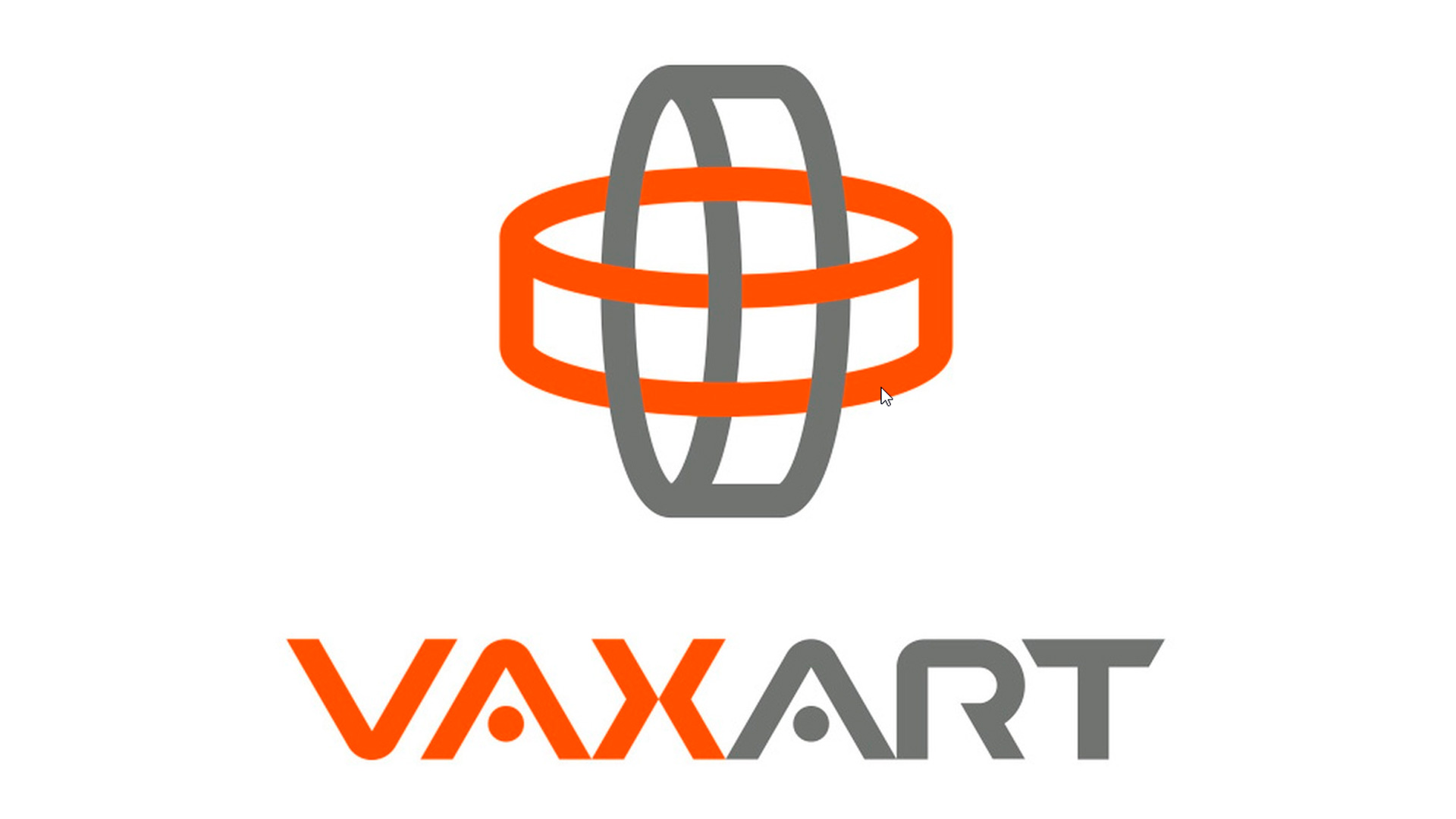
Vaxart is a US-based biotech company focused on researching and developing medicines with global reach.
They’re especially known for their work on oral vaccines that don’t require extensive transport or refrigeration, making them accessible worldwide once approved.
Their logo is particularly striking, depicting a polygonal globe in two colors with intersecting horizontal and vertical lines—reminiscent of airline routes.
The bold typography complements the geometric graphic element.
Interested in expert advice on this topic? We have extensive experience in this sector and have delivered outstanding results. Click here for a consultation to boost your online presence. We’ll analyze your project and present a tailored action plan for improvement.
[superfeatured]7906[/superfeatured]
JANSSEN
Logo design for JANSSEN pharmaceutical laboratory
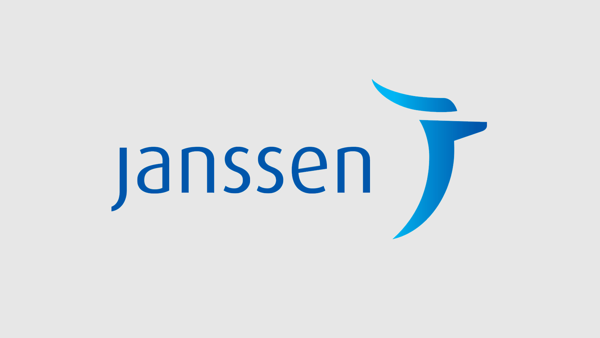
Janssen’s logo is another standout in the industry.
It reflects the company’s thoughtful approach to corporate identity.
This logo draws its strength from both its form and its underlying meaning.
GILEAD
Logo design for GILEAD pharmaceutical laboratory
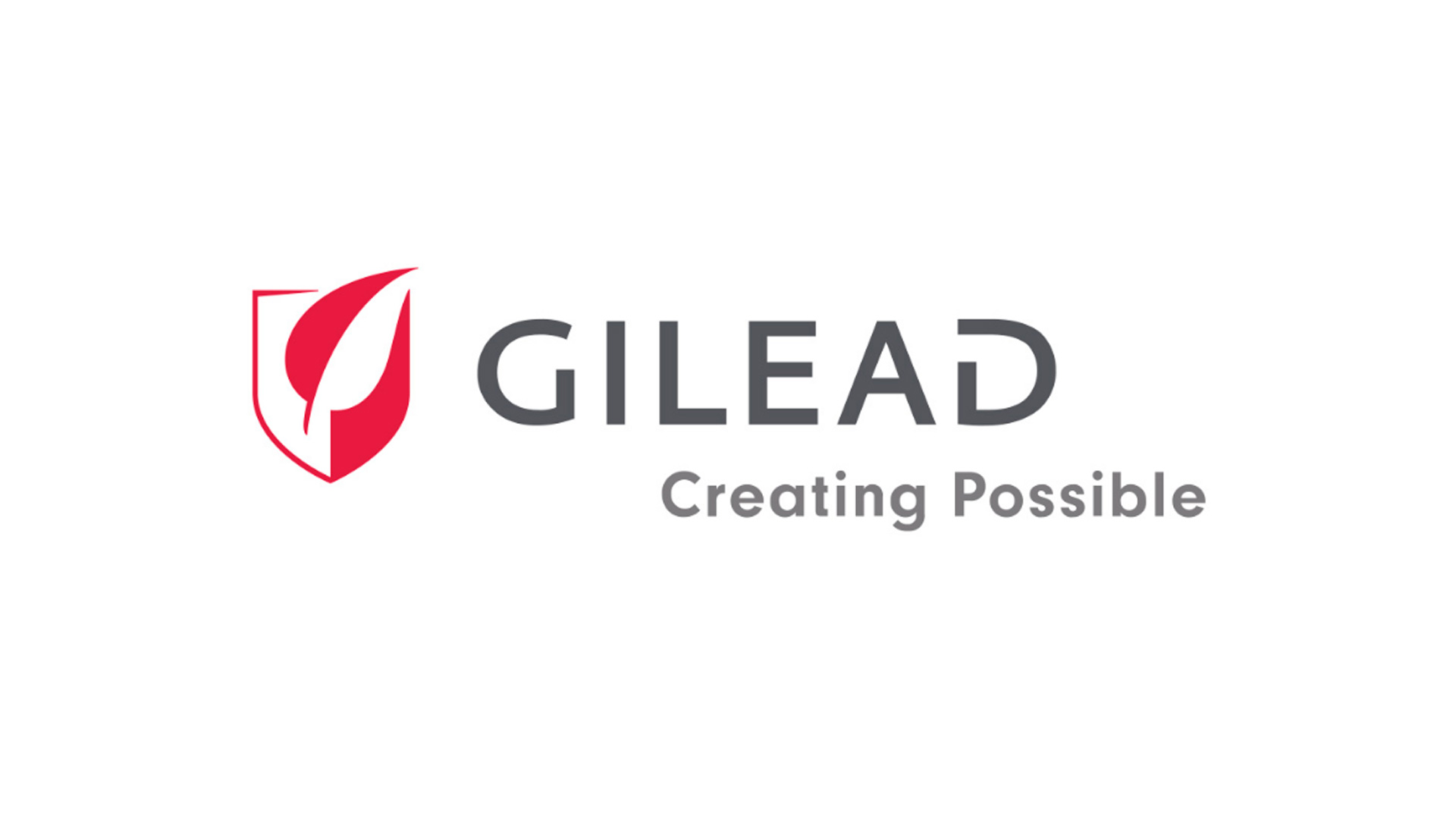
Gilead’s logo is another fascinating example.
The design features a two-tone shield with a leaf in negative space.
The result is a distinctive logo that combines a sense of protection with a gentle touch.
We appreciate its boldness and originality.
BAYER
Logo design for BAYER pharmaceutical laboratory
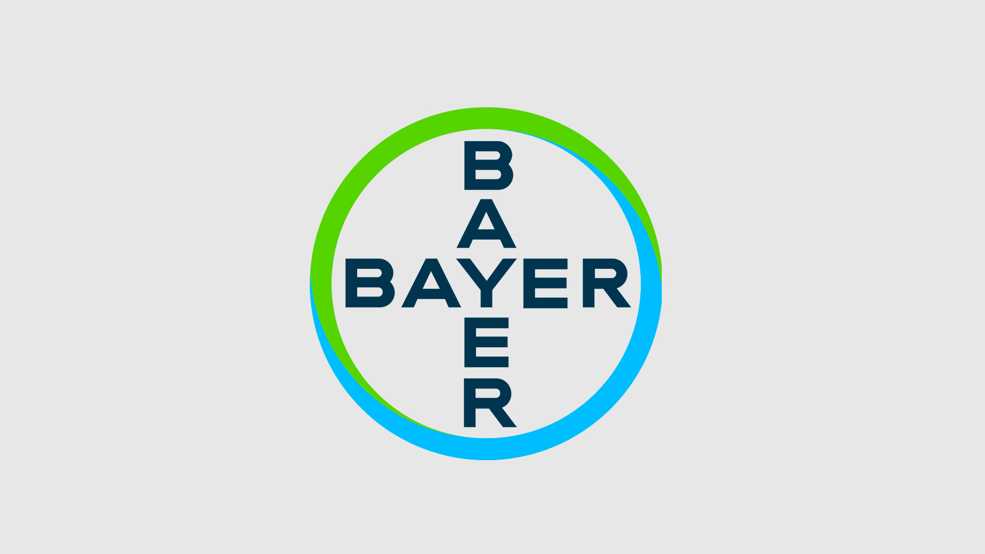
We wrap up this selection with the iconic Bayer logo.
The German pharmaceutical giant boasts one of the most enduring and recognizable logos in the industry.
Aspirin has helped this logo stand the test of time, spanning generations—though its prominence has waned with the rise of generic medicine.
The two-tone design features a protective circle with the company name at its center.
Conclusions
As you can see, this second roundup includes both familiar and lesser-known pharmaceutical logos. Each one offers something of interest—and some aspects that might inspire debate among creative professionals.
Interested in expert advice on this topic? We have extensive experience in this sector and have delivered outstanding results. Click here for a consultation to boost your online presence. We’ll analyze your project and present a tailored action plan for improvement.
[superfeatured]7906[/superfeatured]