If you’re as passionate about packaging as we are, we invite you to check out this curated list of the very best in original packaging from recent years.
With these seven examples, you’ll get a taste of some of the most creative and original packaging designs being developed around the world.
So, without further ado, let’s unwrap these gifts and discover how each of these original packaging concepts presents its product.
Our Top Picks for Original Packaging
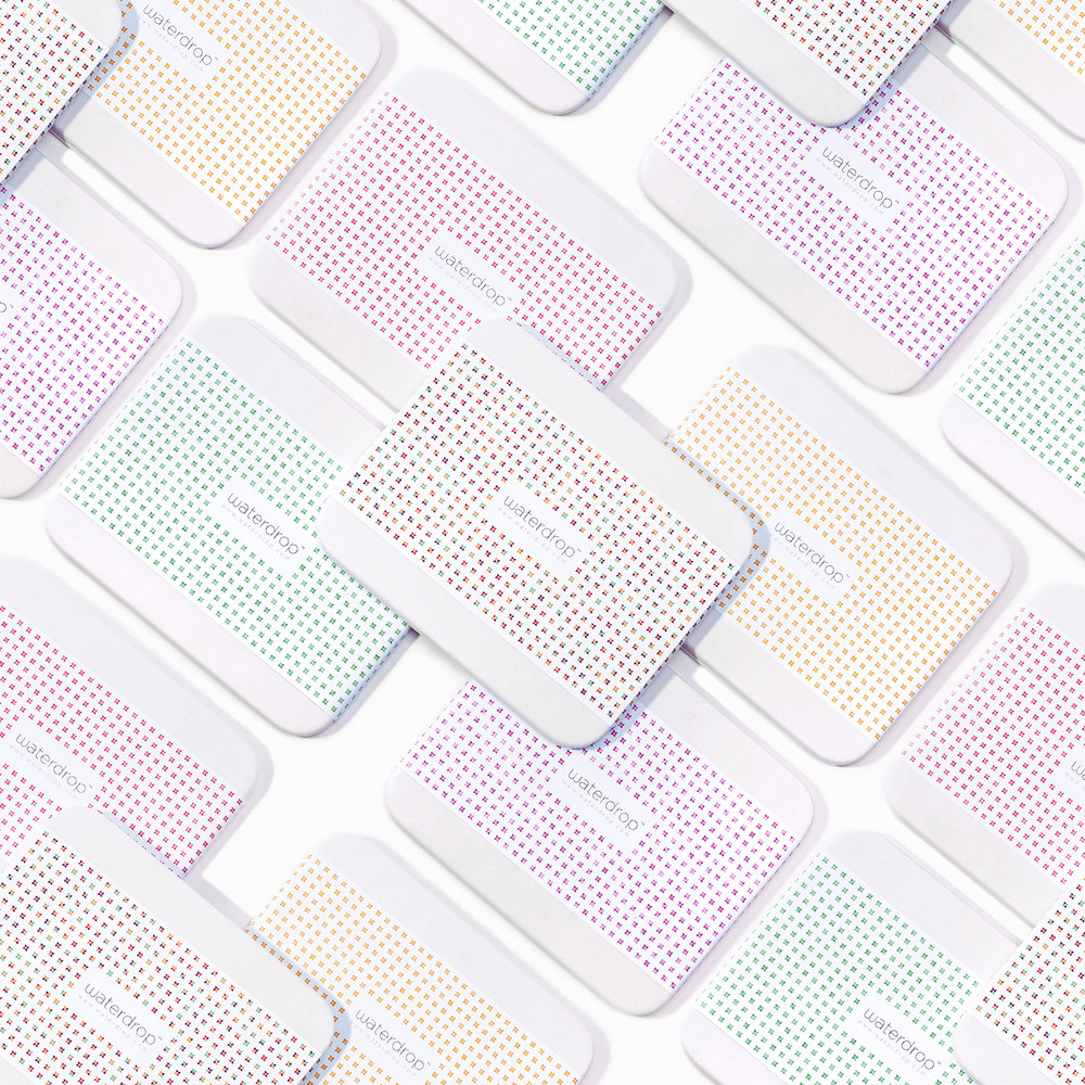
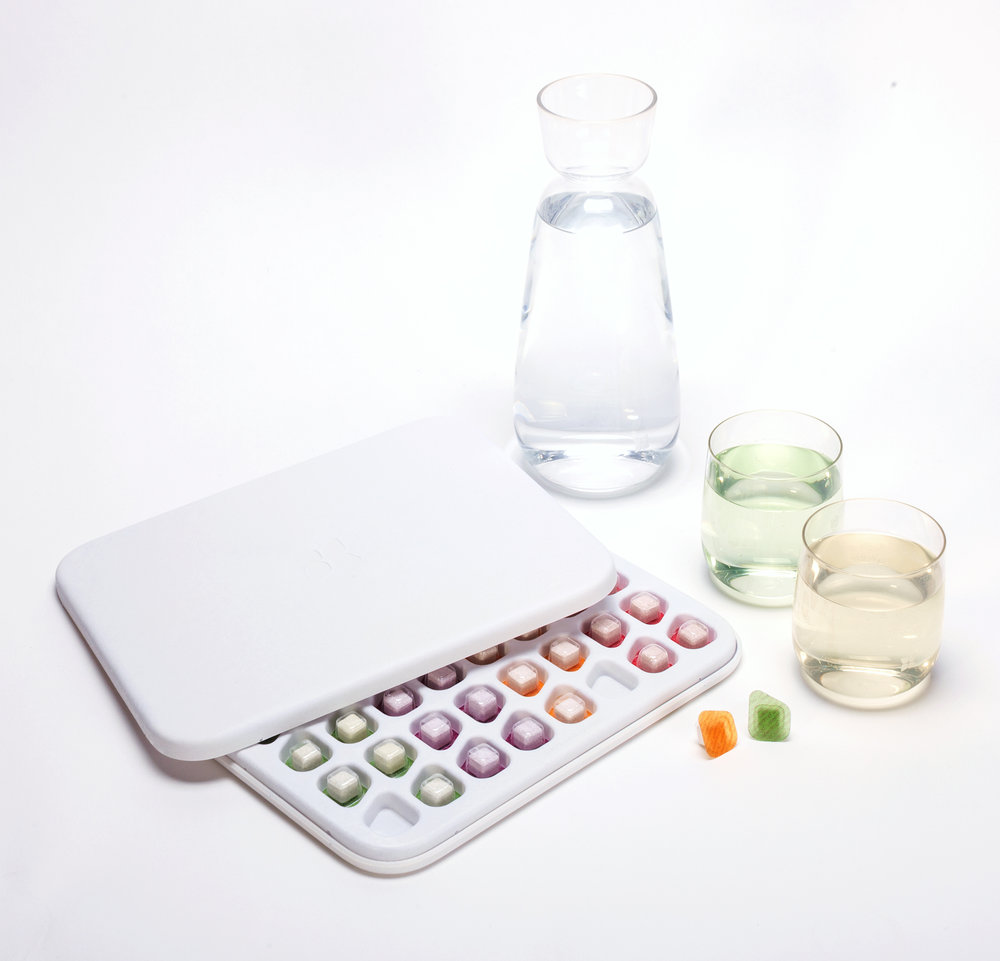
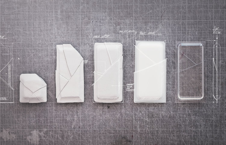
Waterdrop
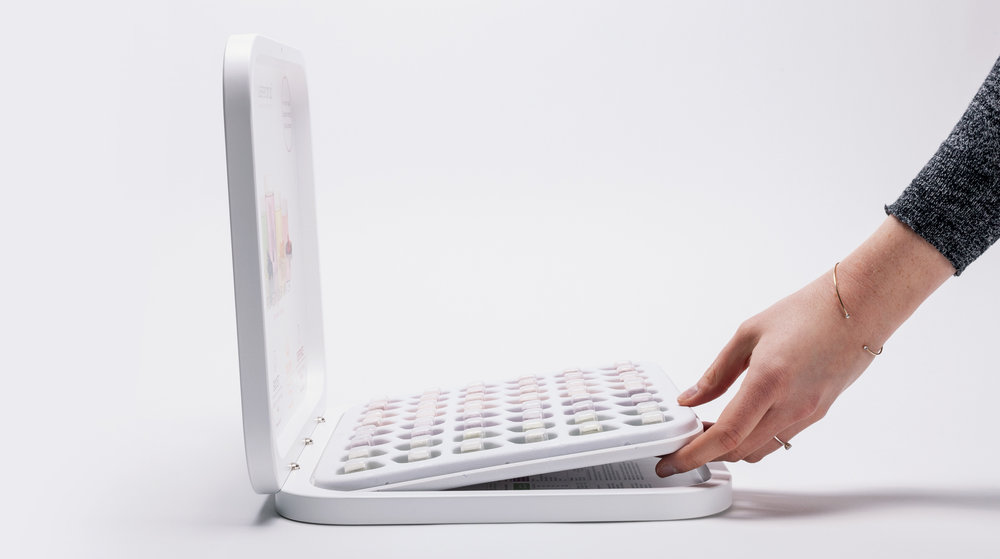
This is one of the most striking examples: Australian water company KVELL has designed and developed the Waterdrop brand.
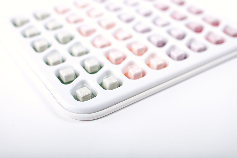
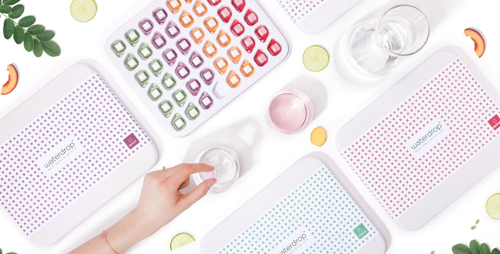
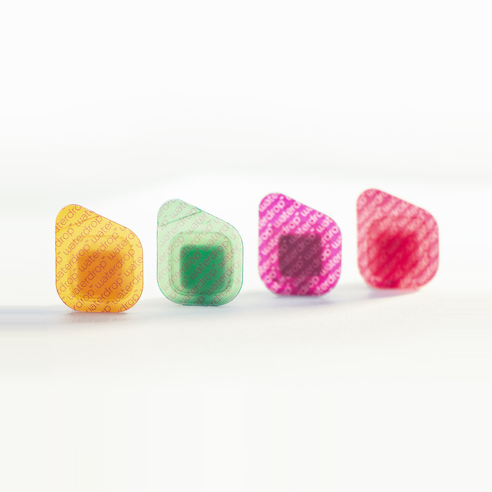
Waterdrop is the world’s first microdrink.
It’s a small, compressed cube, each with its own flavor and vitamins for your water.
Now that you know the product, let’s talk about the packaging design.
The packaging design is a true celebration of creativity.
Made from 100% biodegradable PaperFoam® materials.
With this original packaging, they showcase a deep commitment to sustainable solutions without sacrificing design and creativity.
It’s undoubtedly a benchmark in original packaging.
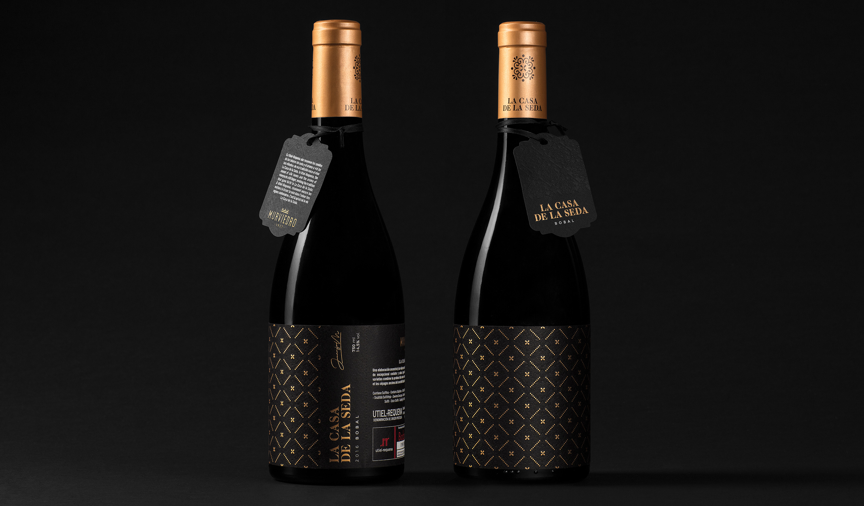
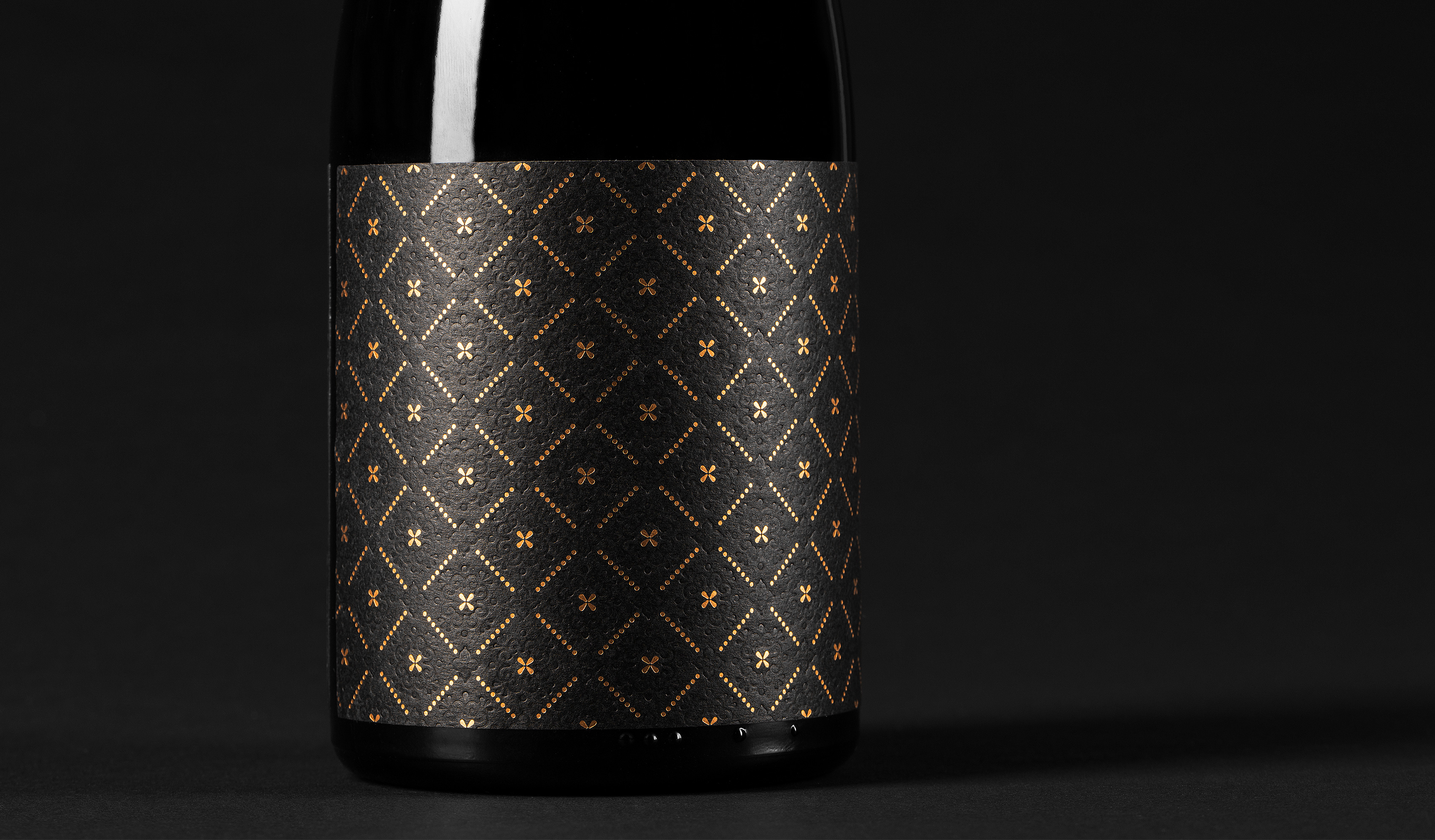
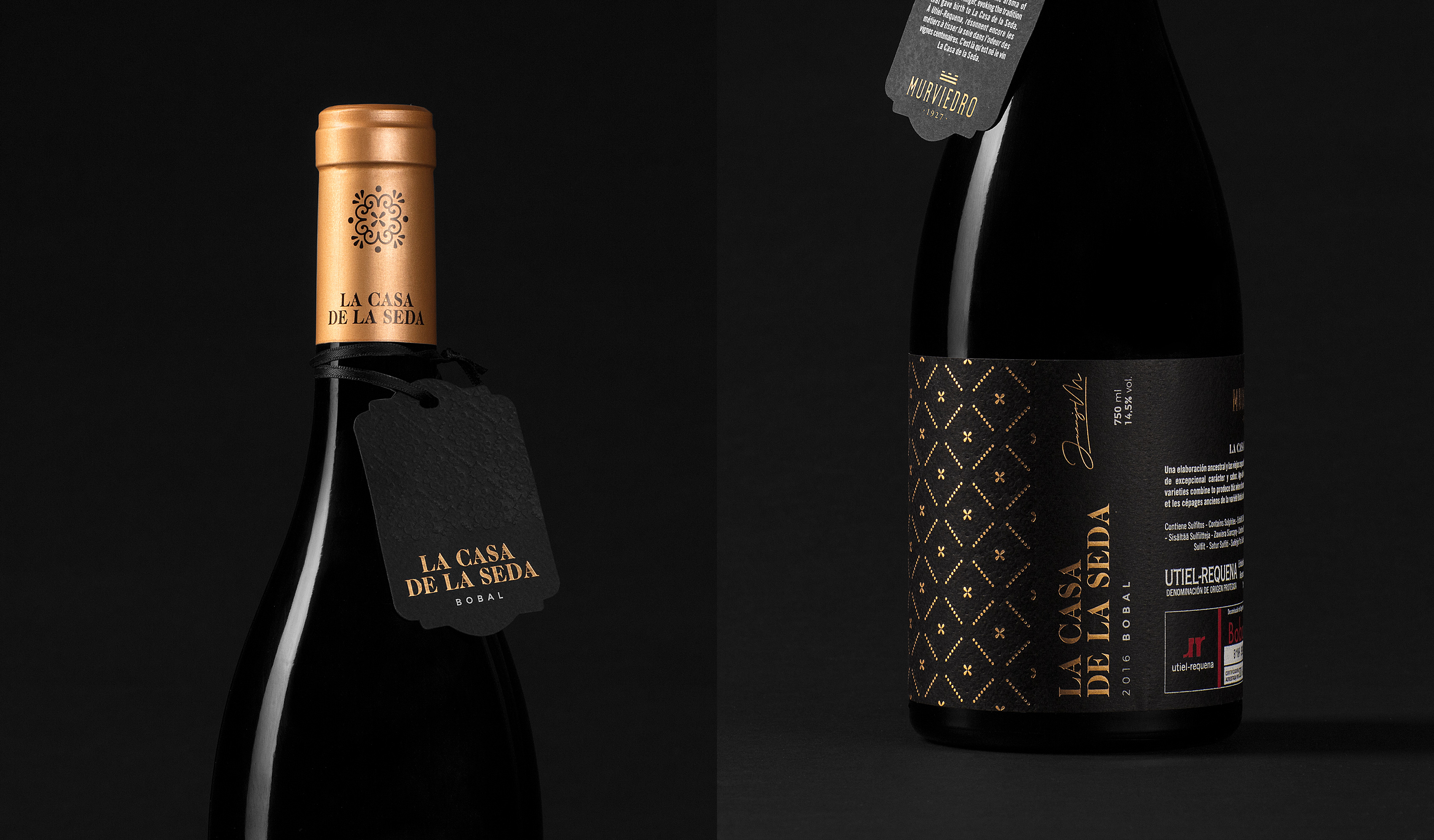
La Casa de la seda by Bulldog Studio
Second on our list is a packaging masterpiece full of meaning.
To mark the opening of the newly restored house-museum by Bodegas Murviedro in the heart of Requena, our friends at Bulldog Studio created a stunning packaging design for one of their bottles.
The packaging blends formal and aesthetic elements to evoke the sensations of a bygone era.
Back when Requena was renowned across Europe for its silk industry and fine textiles.
It’s an exceptionally elegant packaging design, with meticulous attention to detail—as you’ll see in the images.
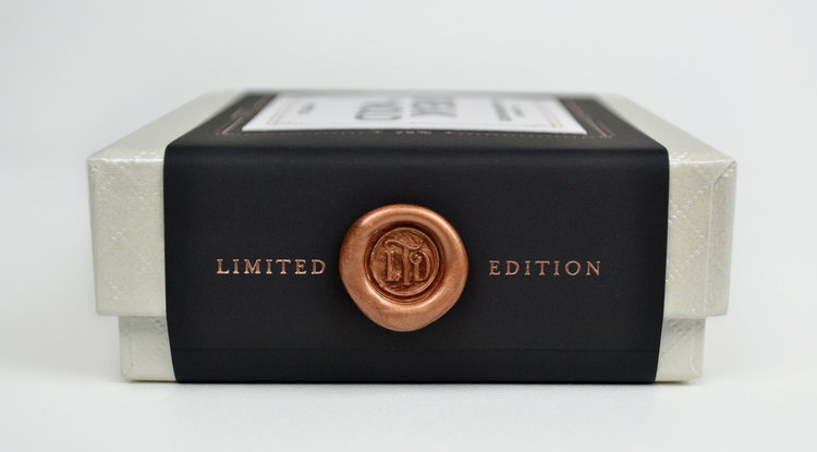
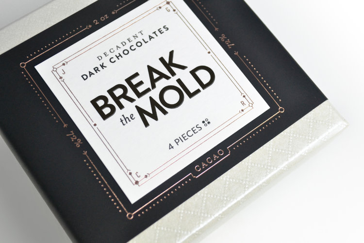
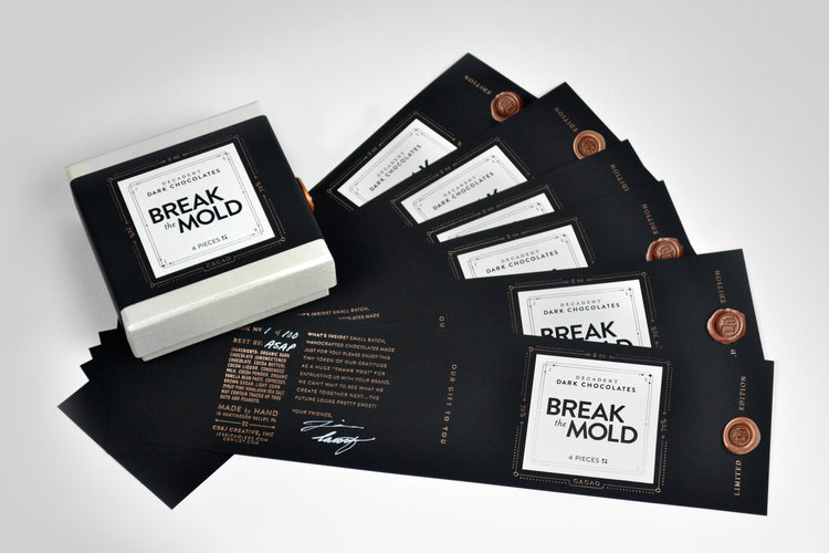
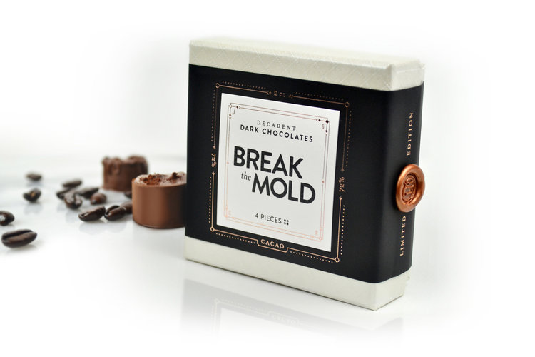
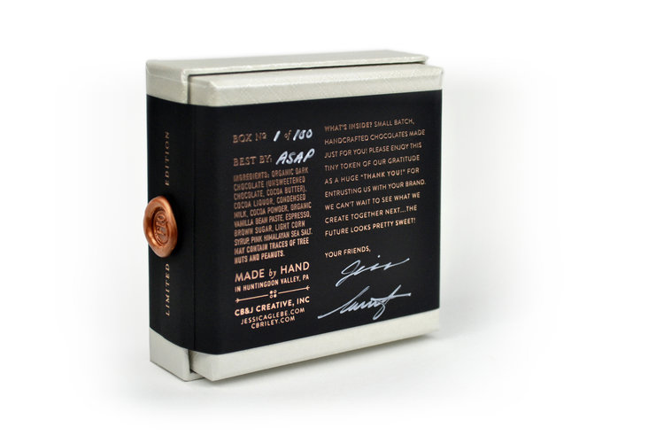
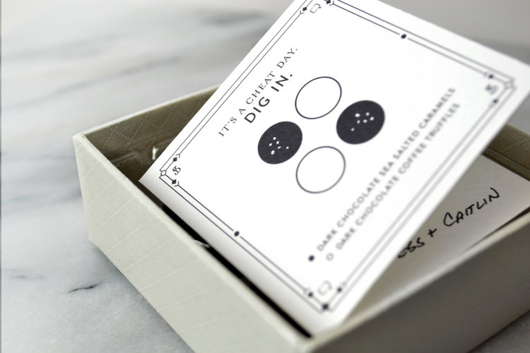
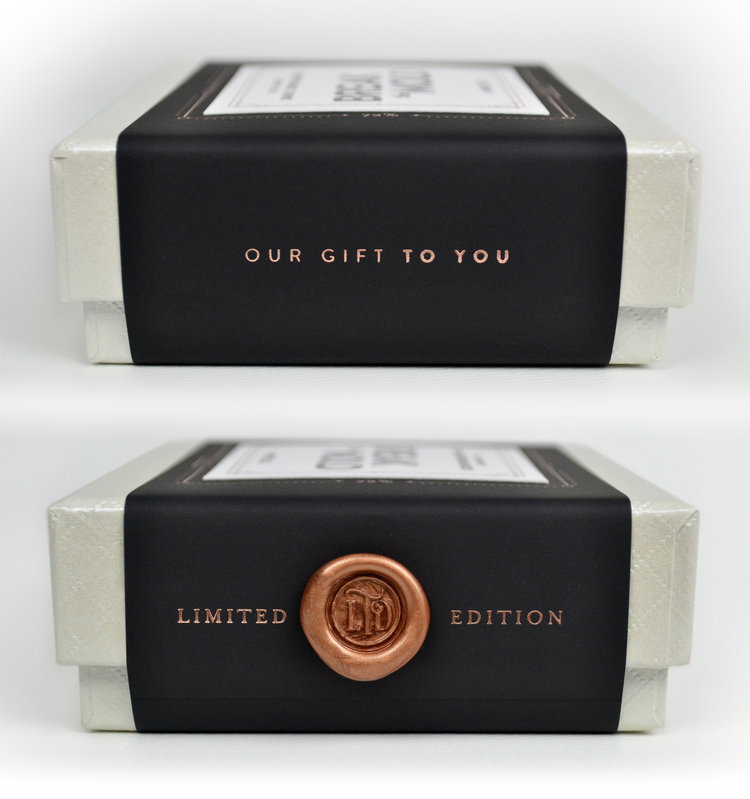
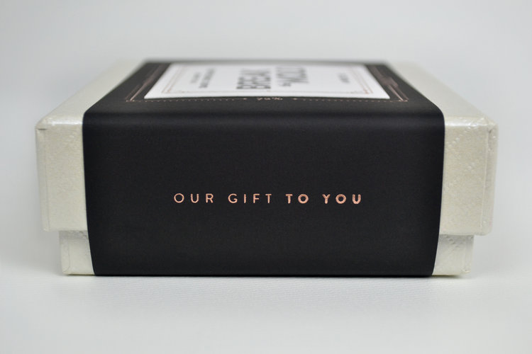
Break the Mold Limited Edition Chocolates
This original packaging design immediately caught our eye.
It’s a fantastic example of how to create packaging that’s both original and personal.
Every element of this packaging has been carefully considered, with each detail meticulously crafted to convey its unique concept.
The result feels intimate and inviting—you can’t help but want to try one.
The packaging consists of a small, off-white box sealed with a black band.
All the product information is displayed on this band.
The typography and color palette are outstanding—elegant and luxurious.
A “Limited Edition” seal appears on the side of the band, reinforcing its exclusivity.
Open the box and you’ll find a small, handwritten folded card—leaving no doubt this is a premium, made-for-you product.
What do you think? Doesn’t it deserve a spot on this list of original packaging?
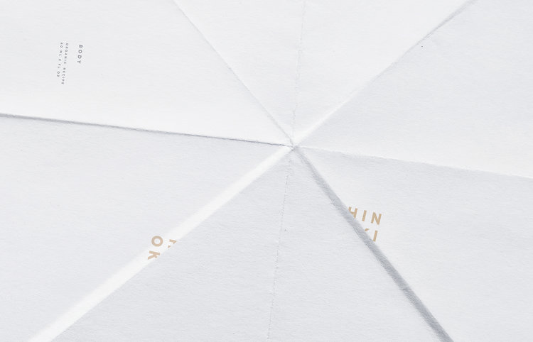
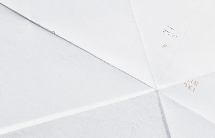
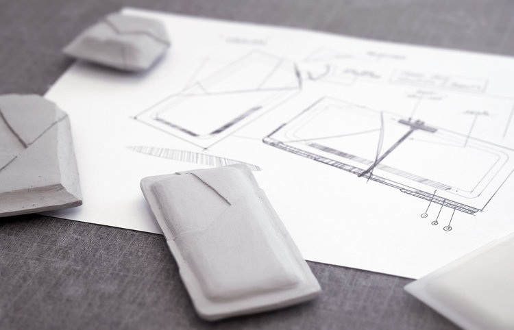
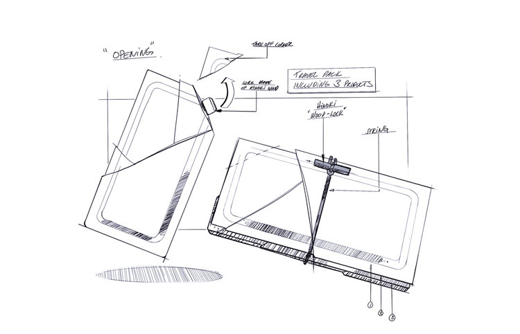
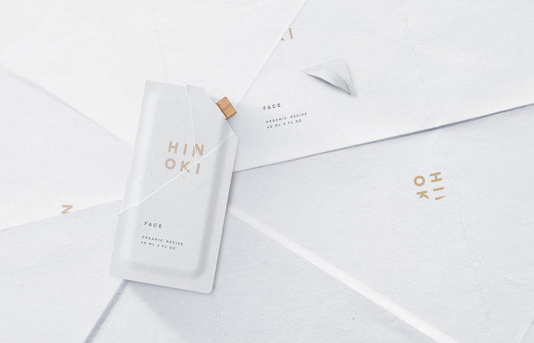
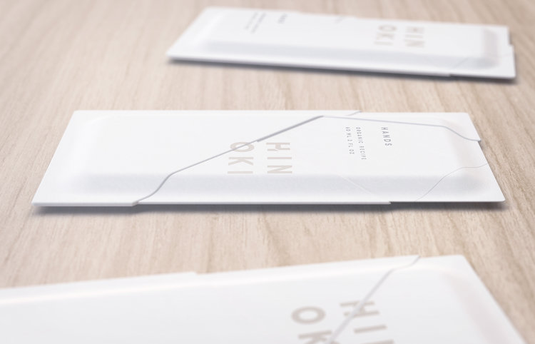
Hinoki
The third original packaging design on our list is dedicated to Hinoki.
This design rightfully earns its place among the best in original packaging because it delivers on several key points:
- Creativity—lots of it.
- Marketing focus.
- Innovation.
- Execution.
Hinoki specializes in skincare creams.
As you’d expect, this packaging is fully biodegradable and reflects the company’s strong environmental values.
It’s inspiring to see how original packaging design can be achieved while respecting the environment.
Without a doubt, it’s a standout example on this list of the best in original packaging.
Looking closer at the packaging, you’ll notice a minimalist design that conceals the complexity of a truly great concept.
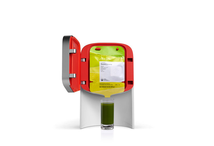
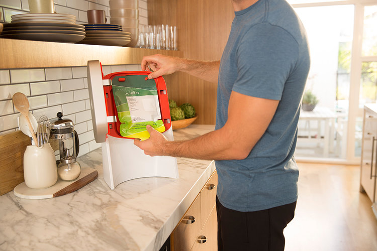
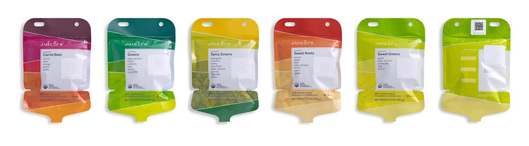
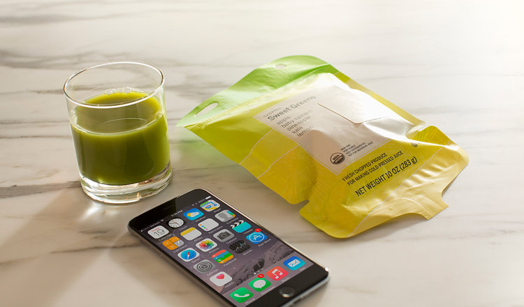
Juicero
Juicero’s approach is bold—so before you dive into the images of their original packaging, you might want to put on your mind-blown helmet.
This company produces and distributes fruit juices for homes worldwide.
Naturally, their packaging reflects the brand’s vision through its design.
It’s a vibrant, colorful packaging that captures the passion for quality products in today’s world.
It’s the closest thing to eating fresh fruit—if you were living on a spaceship.
The packaging design is energetic, lively, optimistic, and dynamic—a truly original packaging concept that earns its place in our selection.
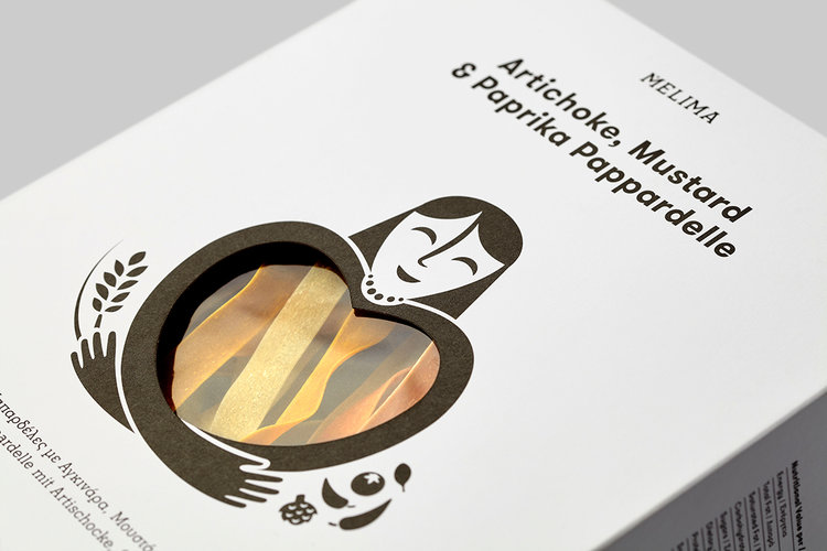
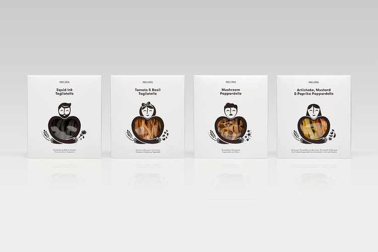
Melima
This company specializes in producing and distributing premium pasta.
They’ve chosen a packaging design that truly deserves a spot on this list of the best in original packaging.
Melima is a Greek word meaning “care,” in the sense of looking after someone.
Their packaging strikes a perfect balance between minimalism and retro design for an original packaging look.
The full set features 25 completely unique characters.
They symbolize the people around us who care for us, and whom we care for in return.
Each character is shown figuratively embracing a heart—a message that’s clear both in form and meaning.
Through the heart-shaped window, you can see the product inside the packaging.
An original packaging concept designed to appeal to lovers of healthy, organic food.


on your project?
We review your current situation and define the next step.
Contact nowWe will review your current digital situation. We will get in touch to understand your context and jointly assess which areas to analyze, after which we will prepare an audit including key findings and recommendations.