The website of MERSI Architecture, developed by the creative studio FLOT NOIR, is one of those projects that shows how web design can become a natural extension of architecture, interior design and brand identity. Recognised as Site of the Day at Awwwards, this digital experience stands out for an extremely difficult combination to achieve: visual sophistication, narrative calm and impeccable editorial precision.
From the very first scroll, it is clear that this is not a traditional portfolio. There is no visual overload, excessive effects or unnecessary animation. The whole project is built around a very specific idea: translating the concept of quiet luxury into digital language. The result is a silent, elegant and deeply immersive experience that becomes a clear reference for any premium web design studio or agency specialising in contemporary digital branding.
Quiet luxury turned into a digital experience
MERSI’s philosophy is defined as “quiet luxury interiors shaped by true stories”, and that idea runs through absolutely every decision on the site. Luxury here is not communicated through spectacle or technological excess, but through something much more sophisticated: absolute control of rhythm, visual precision and editorial sensitivity.
The interface uses very generous negative space, extremely careful typographic hierarchies and a slow visual rhythm that conveys calm from the very beginning. Every transition feels measured with architectural precision. There are no unnecessary elements or aggressive calls for attention; everything breathes order, silence and balance.
This approach is especially relevant within contemporary web design for premium brands, where more and more creative studios understand that true digital luxury does not come from excess, but from restraint.
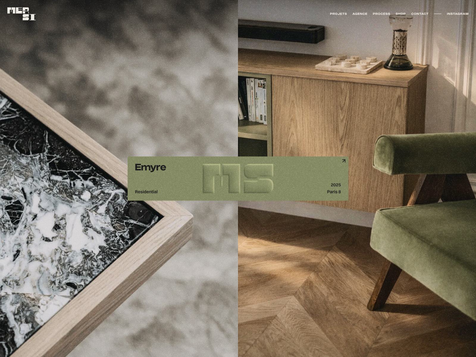
A horizontal navigation that turns the portfolio into a spatial journey
One of the most interesting elements of the project is the decision to use horizontal navigation within the project pages. Instead of traditional vertical scrolling, FLOT NOIR introduces a lateral system that completely changes the user’s perception.
The spaces stop feeling like a simple image gallery and become carefully directed architectural sequences. The user does not “consume” projects quickly; they move through them.
Each transition has a specific tempo. The images appear within extremely controlled compositions, and the movement creates a much more cinematic and editorial feeling than most current architecture portfolios.
These kinds of decisions are especially interesting for studios specialising in web design for architecture and interior design, as they show how navigation can become a narrative tool, not just a functional one.
Sophisticated minimalism and extremely precise art direction
Many minimalist projects end up feeling generic because they reduce the visual language too much. MERSI’s website completely avoids that problem thanks to extremely solid and coherent art direction.
The visual identity is built through:
- Editorial typefaces with strong presence.
- Carefully balanced empty spaces.
- A highly restrained use of colour.
- Extremely clear visual hierarchies.
- Compositions that recall contemporary editorial design.
Nothing feels improvised. Even the visual silences have intention. This level of precision is precisely what differentiates projects developed by premium web design studios from more generic or overloaded proposals.
The website achieves something especially difficult: being minimalist without losing personality.
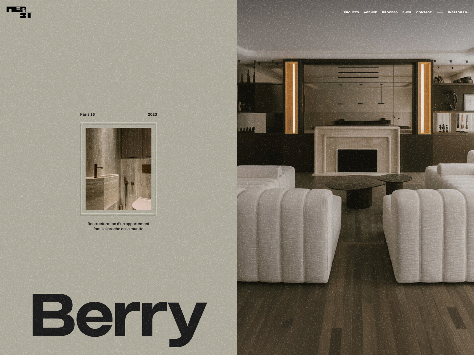
Editorial design applied to UX/UI
One of the strongest aspects of the project is how it adopts codes from contemporary editorial design. The experience feels much closer to an architecture magazine or a luxury interiors publication than to a traditional corporate website.
The texts breathe, the images have space and the compositions are built with an editorial layout logic. The user moves through the content slowly, almost contemplatively, which fits perfectly with the brand’s sophisticated positioning.
This editorial approach is increasingly relevant within web design for premium brands because it allows for much more emotional and memorable experiences.
Instead of constantly accelerating navigation, the site slows the user down and invites them to observe. And that is precisely where the feeling of luxury appears.
Silent UX: an experience designed to convey calm
The user experience is designed with an extremely coherent logic. There are no unnecessary interruptions, invasive menus or elements that break the visual flow. The whole system seems designed to reduce noise and encourage a much calmer navigation.
This requires much more work than it appears. When superfluous elements are removed, every detail becomes more important: spacing, timings, transition speeds, typographic rhythm and visual hierarchy must work with absolute precision.
It is an excellent example of how a studio specialised in UX/UI and digital branding can use simplicity as a strategic tool, not just an aesthetic one.
Webflow and GSAP: invisible technology, perfectly integrated
On a technical level, the project combines Webflow with advanced animations developed using GSAP. What is interesting is that the technology never becomes the visible protagonist. Everything serves the feeling of fluidity and precision.
The animations are smooth, perfectly synchronised and extremely restrained. They do not seek spectacle, but sophistication. This kind of elegant and silent motion design is becoming one of the major trends within premium web design and digital experiences for architecture and contemporary luxury.
Performance is also especially well handled. Despite working with large images and complex transitions, navigation remains light and stable. This shows a deep understanding of how to balance art direction, technology and performance.
The importance of rhythm in contemporary web design
One of the great lessons this project offers is the importance of rhythm within the digital experience. Many current websites try to capture attention through constant speed, permanent stimuli and excessive movement.
MERSI does exactly the opposite. It uses pauses, empty spaces and slow movements to build a feeling of control and sophistication.
This ability to modulate rhythm is precisely what makes the experience memorable. The user feels that the website has its own personality and that every transition is designed to accompany the studio’s architecture.
In today’s premium web design, luxury is no longer expressed through visual saturation; it is expressed through clarity, precision and silence.
A digital identity fully aligned with the studio’s architecture
Probably the greatest merit of the project is its absolute coherence. The website does not feel like a marketing tool added on top of the studio; it feels like a natural extension of its architectural philosophy.
Everything connects:
- The way space is used.
- The visual composition.
- The slow rhythm.
- The horizontal navigation.
- The editorial tone.
- The absence of visual noise.
This level of coherence is precisely what turns certain projects into real references within contemporary web design and digital branding for premium brands.
Conclusion
The MERSI Architecture website demonstrates that it is still possible to build sophisticated digital experiences without relying on technological excess or immediate visual impact.
Its strength lies in conceptual precision, visual clarity and the ability to transform an architectural philosophy into a coherent and memorable interactive experience.
For any designer, creative studio or agency specialised in premium web design, digital branding or editorial UX/UI, this project works as an excellent case study on how to build digital identity through sensitivity, restraint and rhythm.
In a landscape dominated by increasingly noisy interfaces, MERSI Architecture achieves something much more difficult: creating a silent experience capable of staying in the user’s memory long after leaving the website.
Project credits
Project: MERSI Architecture
Creator: FLOT NOIR — Clément Merouani & Thomas Carré
Client: MERSI Architecture
Recognition: Awwwards — Site of the Day
Technologies: Webflow + GSAP


