A digital experience that proves simplicity reveals, rather than diminishes, the essence
In a digital landscape crowded with effects, speed, and visual noise, some projects choose a different path: one of silence, clarity, and light.
The new Impronta website is a prime example. Crafted with remarkable sensitivity, it captured the attention of the Awwwards, FWA, and CSS Design Awards juries in 2025, earning Site of the Day honors on all three platforms.
At Code Barcelona, we selected it as our featured web design of the week because it masterfully embodies what web design should be in 2026:
a seamless blend of brand soul, fluid experience, and visual clarity. A website that doesn’t aim to impress, but to connect.
Listening before designing
Empathy was the starting point for this project. As its creators explain,
“The key is at the beginning. It’s not just about understanding the technical requirements for a functional website, but about capturing the brand’s soul.”
That phrase sums up the philosophy behind Impronta: design as a translation of identity, not as an artifice.
Before touching a single pixel, the team listened, observed, and understood what the brand needed to convey: technical precision, architectural aesthetics,
and a close relationship with light—the element that gives meaning to its products: windows, enclosures, and surfaces that filter and reflect their surroundings.
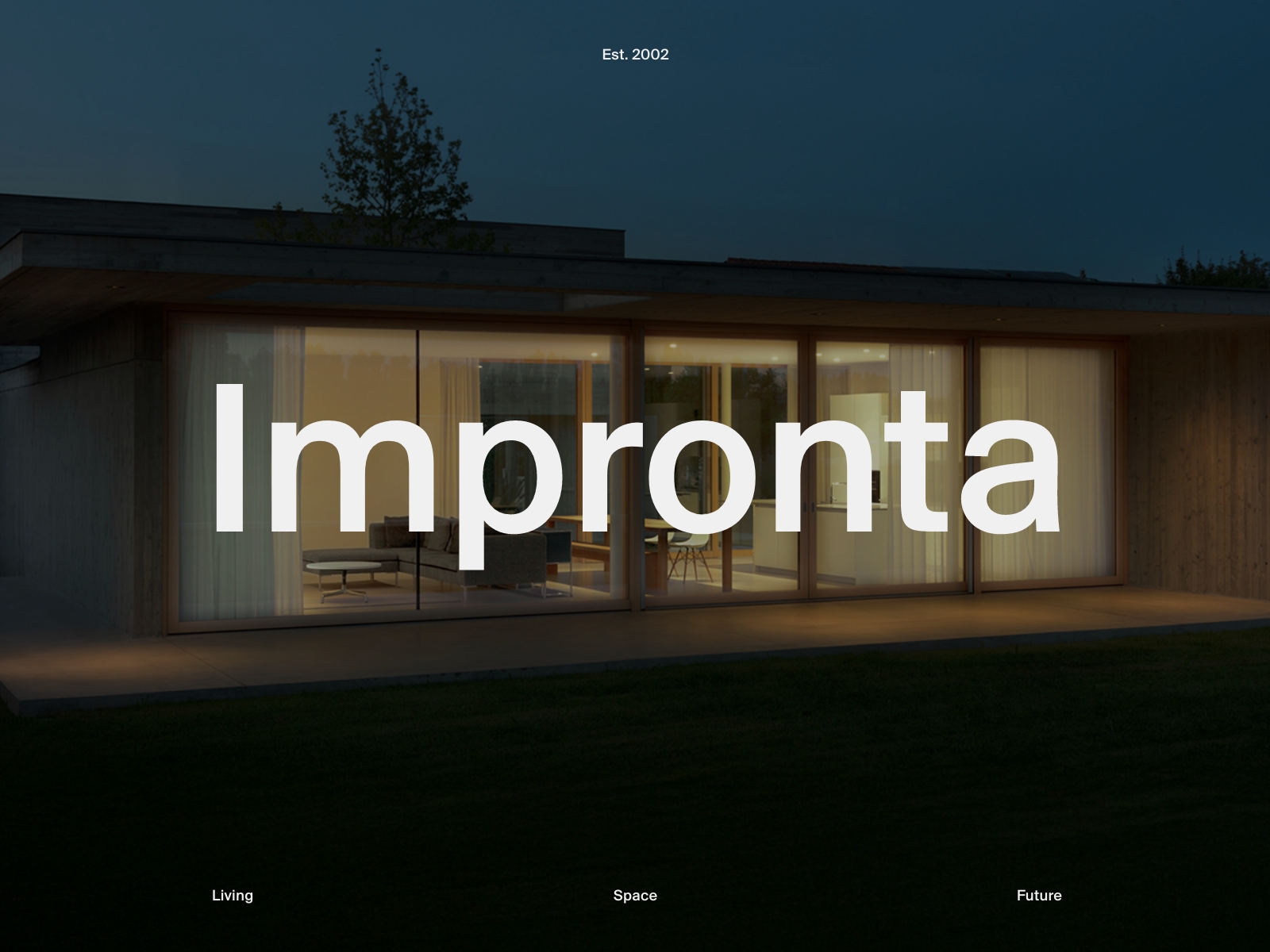
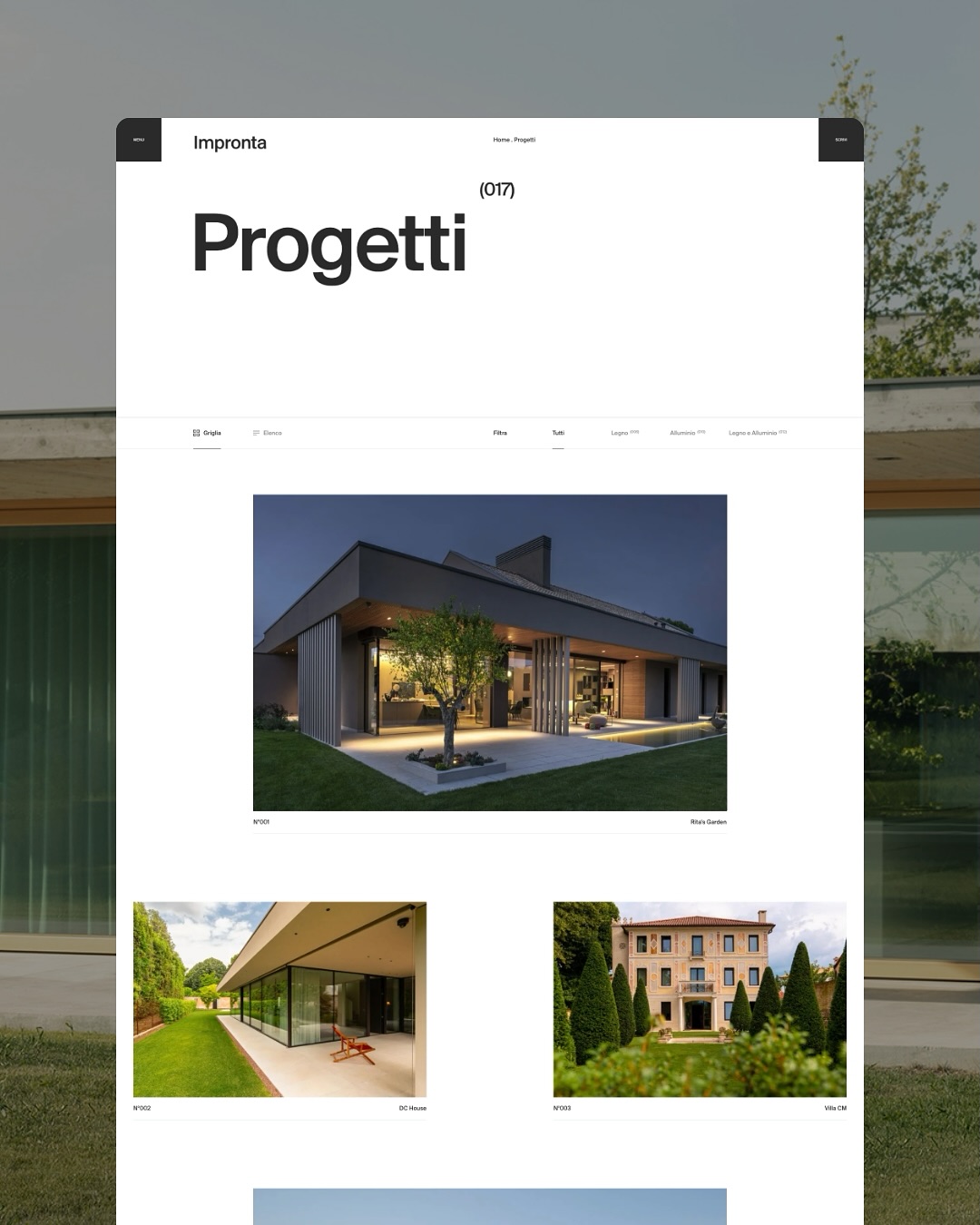
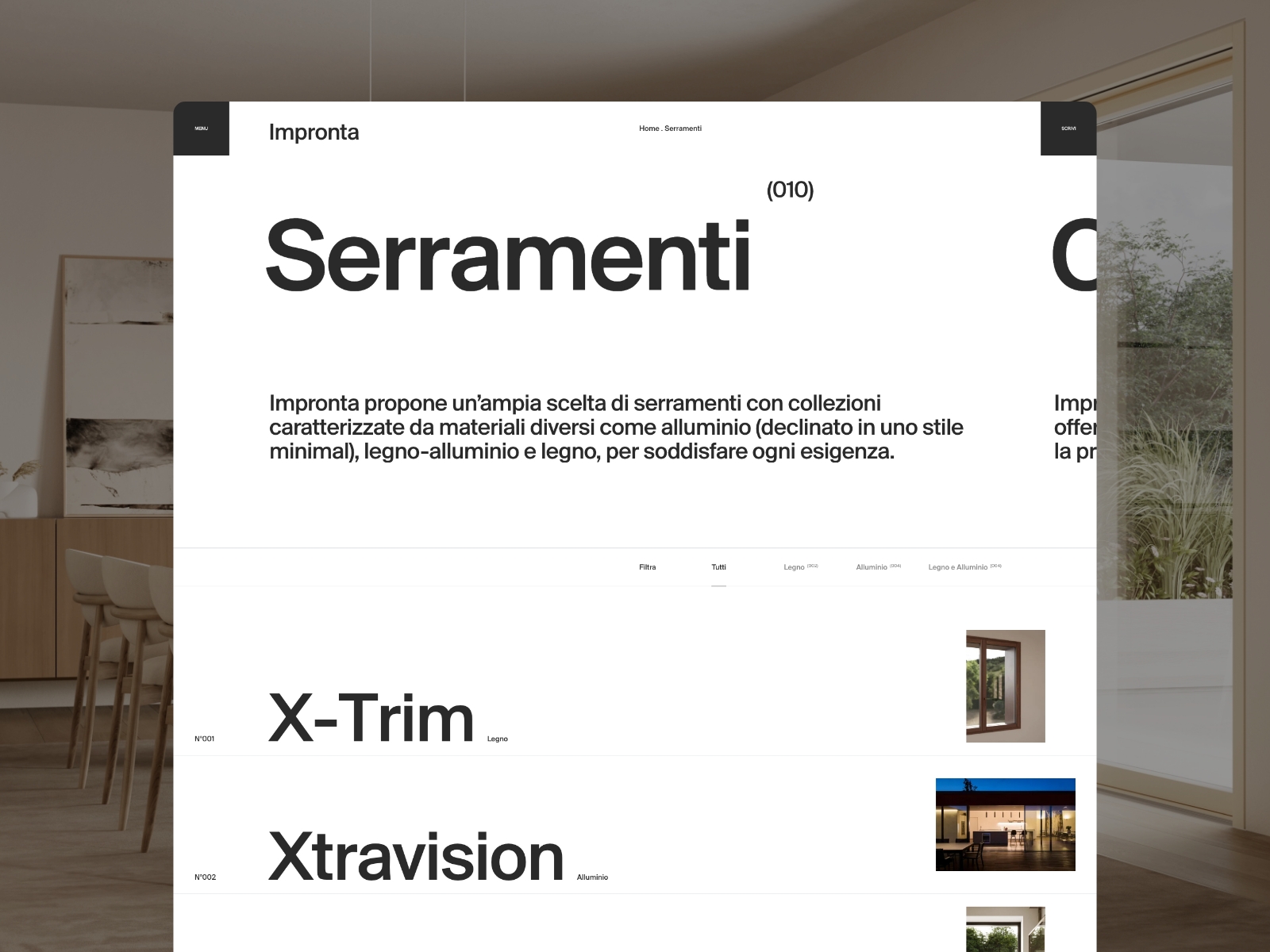
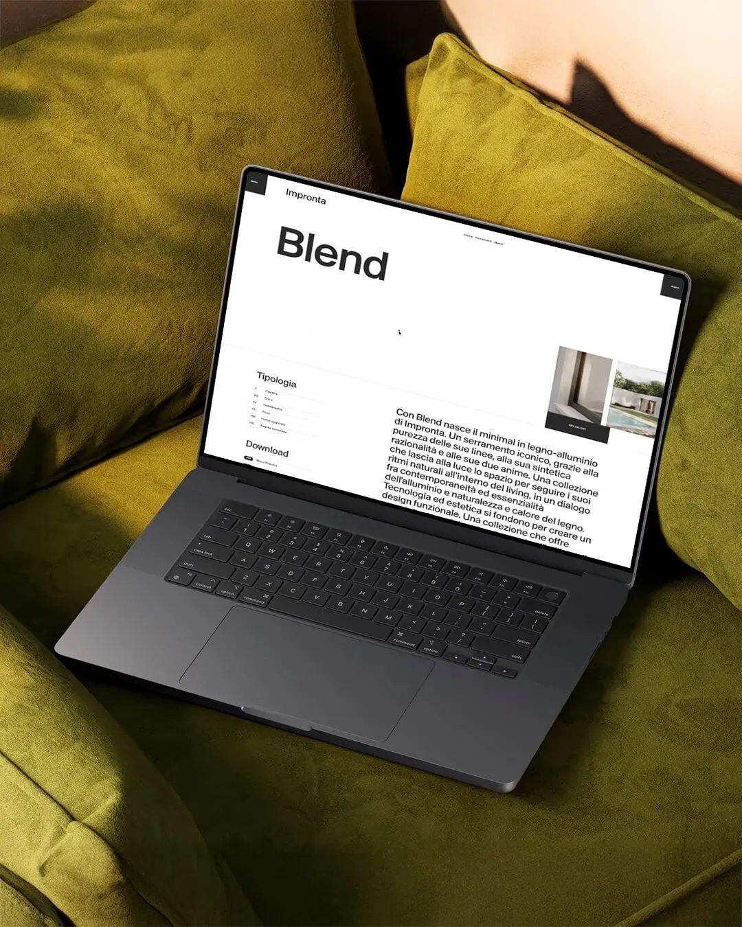
The Impronta homepage uses light as a visual identity, guiding attention without gimmicks.
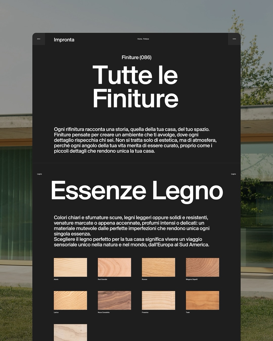
Visual concept: light as raw material
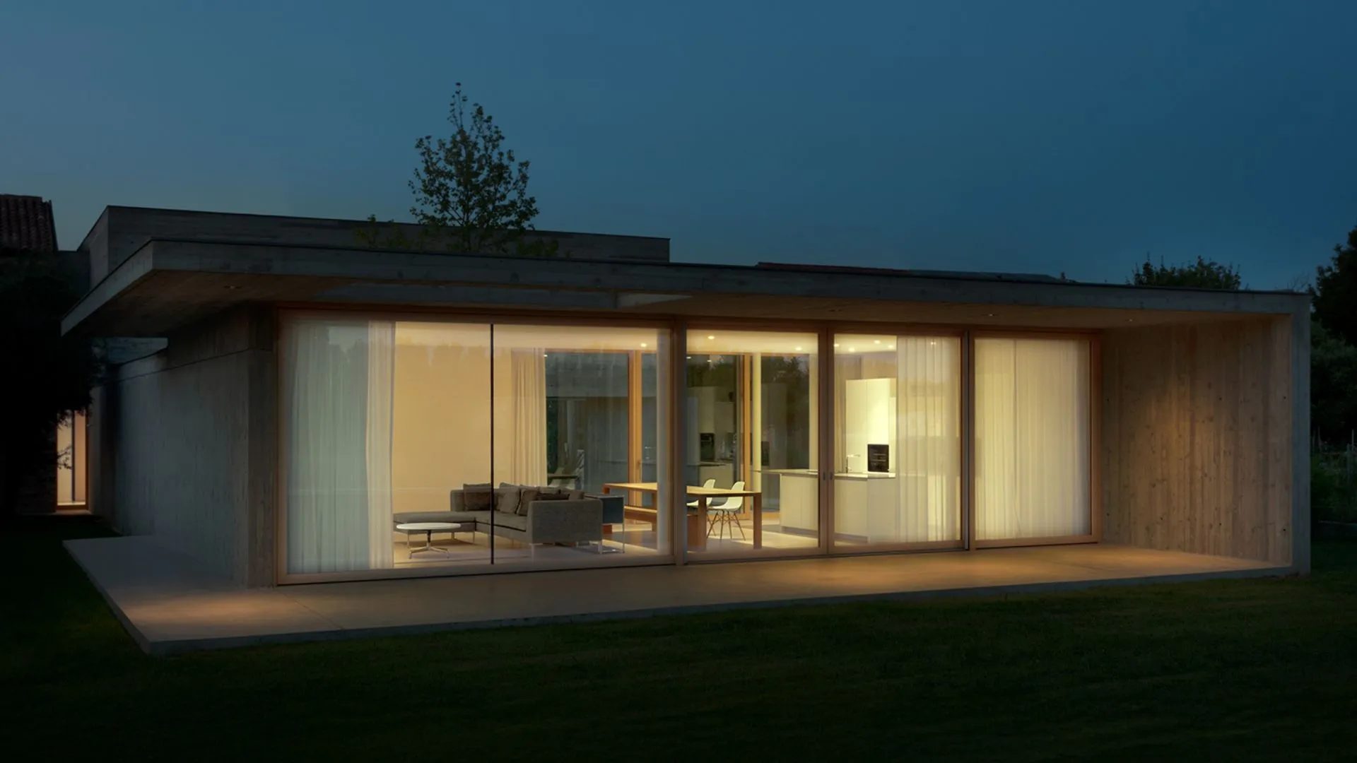
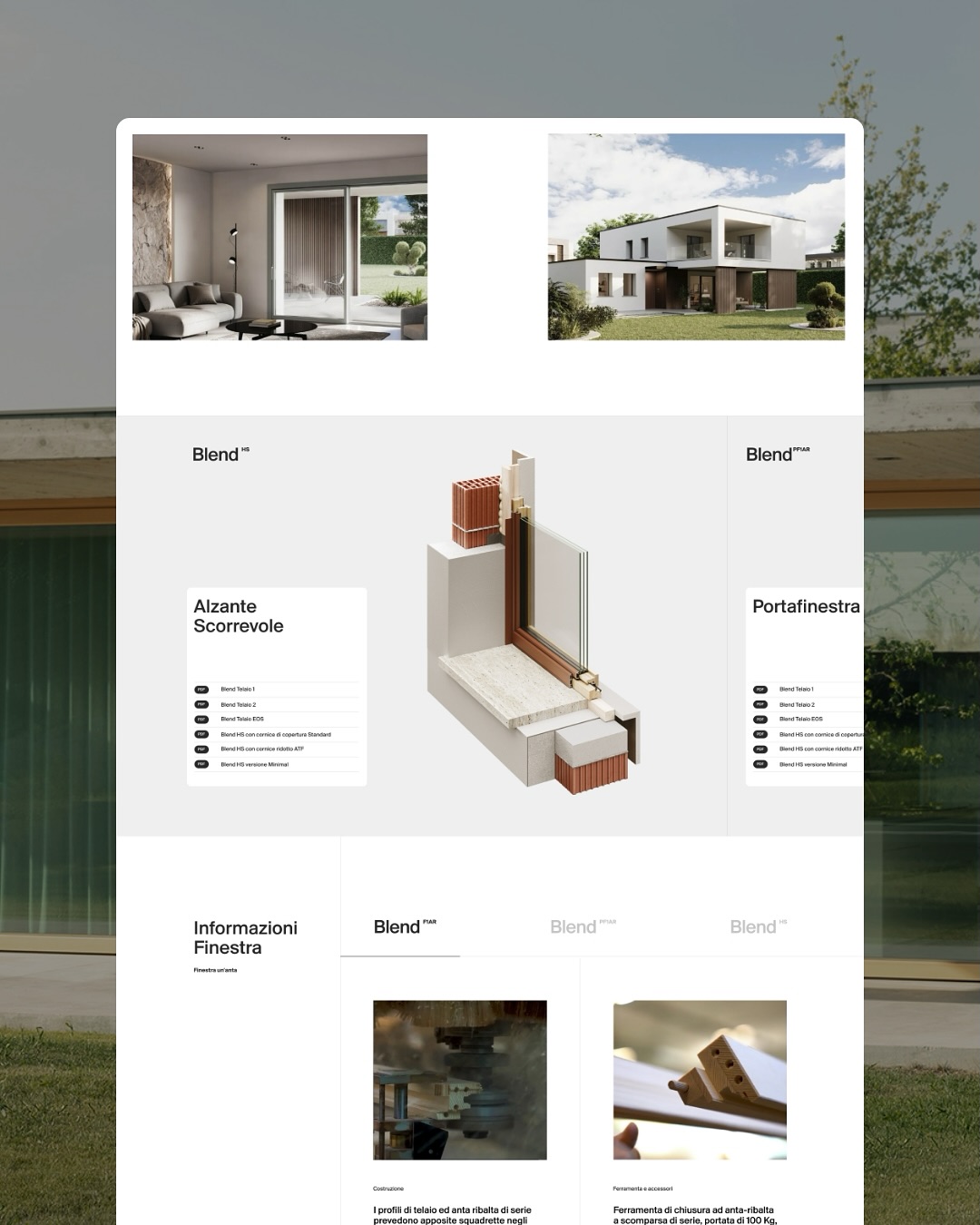
In the world of windows and architectural structures, most brands showcase materials, hardware, or technical specs.
Impronta takes the opposite approach: it speaks through light. In its visual universe, glass isn’t explained—it’s felt.
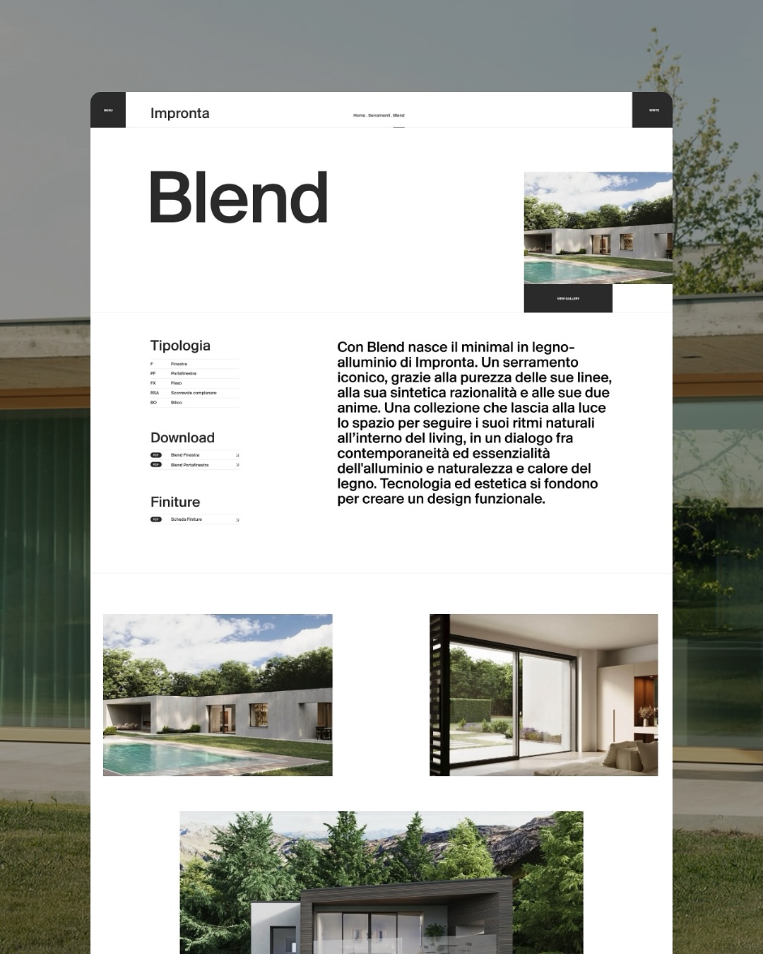
Neutral tones, expansive whites, and soft shadows create a sense of openness and calm.
The site feels like a quiet gallery, where space breathes and every element is perfectly placed.
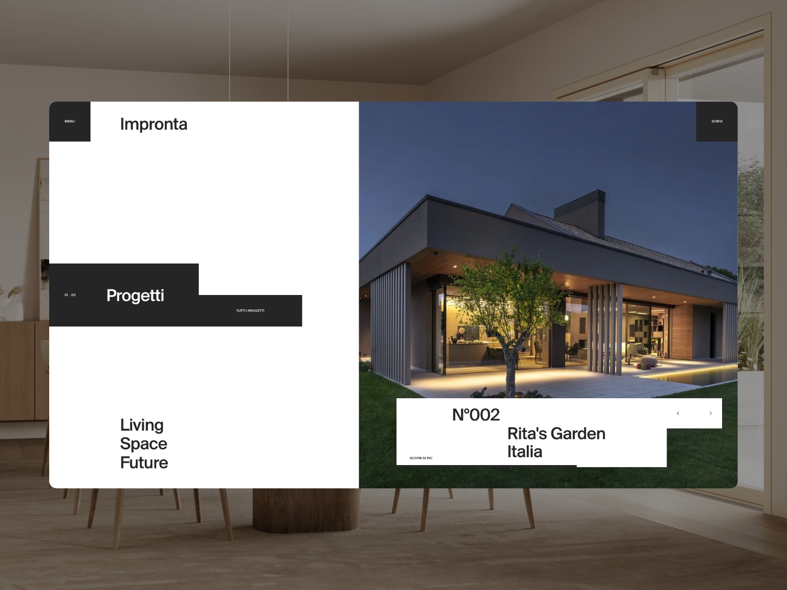
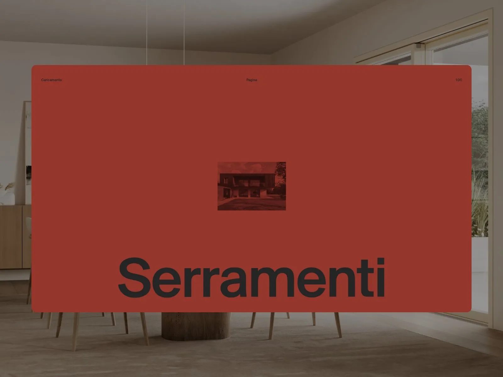
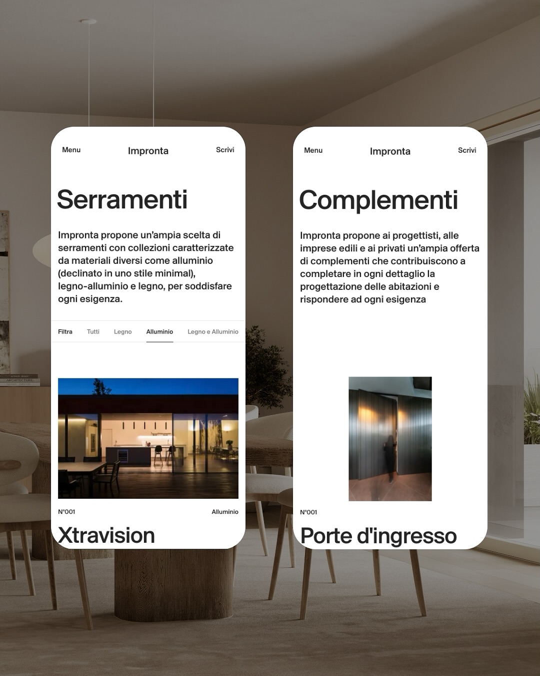
The art direction relies on asymmetric composition, clean typography, and a monochrome palette that evokes noble materials—metal, stone, air.
The result is an aesthetic that is both ethereal and tangible, a rare achievement reserved for projects where design is almost invisible.
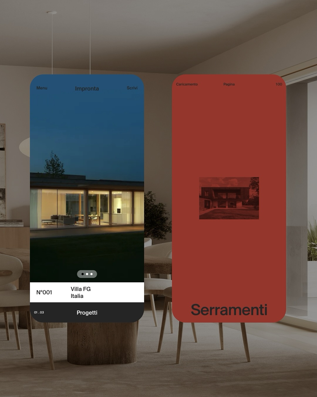
Impronta’s visual structure breathes with architectural rhythm: modular, quiet, and precise.
User experience: clarity and rhythm
The user journey on Impronta is engineered with the precision of a finely crafted mechanism.
Nothing is left to chance. Transitions are smooth, scrolling has a measured pace, and text appears like whispers on white backgrounds that never overwhelm.
The site doesn’t try to hold users with visual fireworks, but guides them with a carefully structured narrative.
Movement is calibrated: motion design serves understanding, not distraction.
Every animation has a purpose—to show, to guide, to reveal.
As the creators put it:
“We turned needs into clear design choices, smooth interactions, and a clean layout that holds all the necessary information.”
A perfect definition of conscious design.
Minimalism with intent
Impronta’s minimalism isn’t just an aesthetic trend—it’s a communication philosophy.
Every decision—from spacing to typographic hierarchy—reflects a core principle: less is more.
The site says only what’s necessary, and that’s precisely why every word resonates.
As the agency quotes Bruno Munari:
“The hardest part is to simplify.”
In this sense, the project is a tribute to the Italian rationalist school,
reinterpreted for the contemporary web: light, accessible, emotional.
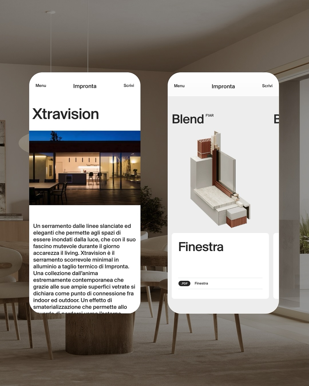
Typography acts as typographic light: thin, precise, and perfectly legible on any device.
Interaction design and microtransitions
Impronta’s microinteractions deserve special mention.
Every movement—from an image fading in to a headline sliding into place—follows a pattern of
progressive transition that mimics the passage of natural light.
Nothing jolts; everything flows.
This level of detail not only elevates the sense of quality, but also reinforces a feeling of control and calm for the user.
Navigation becomes a tactile, almost sensory experience that conveys understated sophistication.
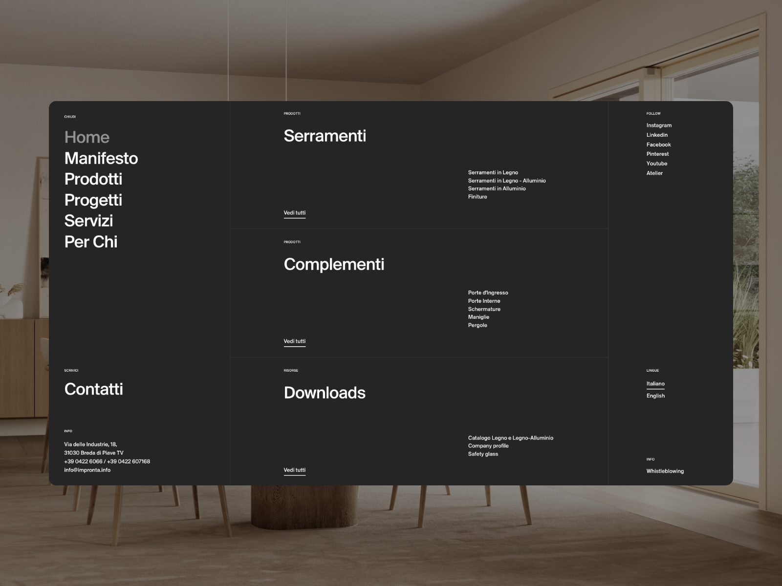
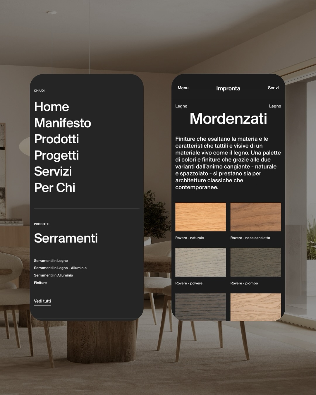
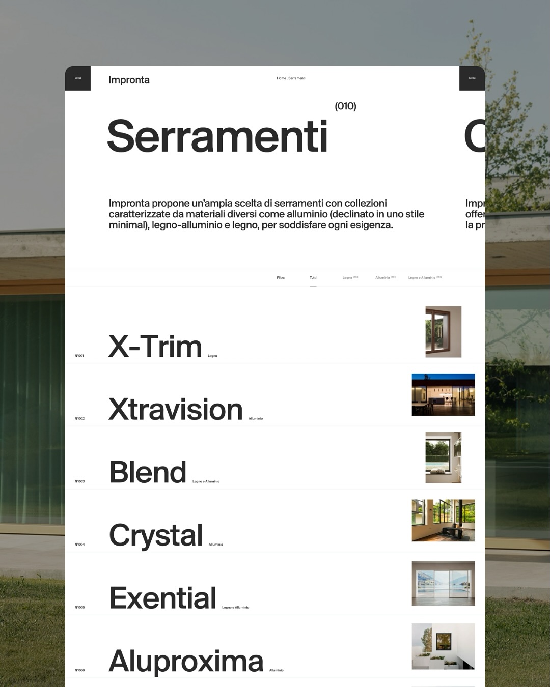
Content and narrative structure
Unlike traditional product sites, Impronta avoids technical jargon and dense catalogs.
Instead, it uses immersive photography and evocative copywriting to transform functional information into
an emotional experience.
Each visual block responds to a concept: transparency, fluidity, space, detail.
The user doesn’t just read—they interpret. They don’t just browse—they explore.
The content architecture is designed as a sensory journey, where elements are revealed one by one, with a
visual tempo reminiscent of light entering a room.
Vertical scrolling guides the experience, creating a visual narrative where scrolling is part of the design.
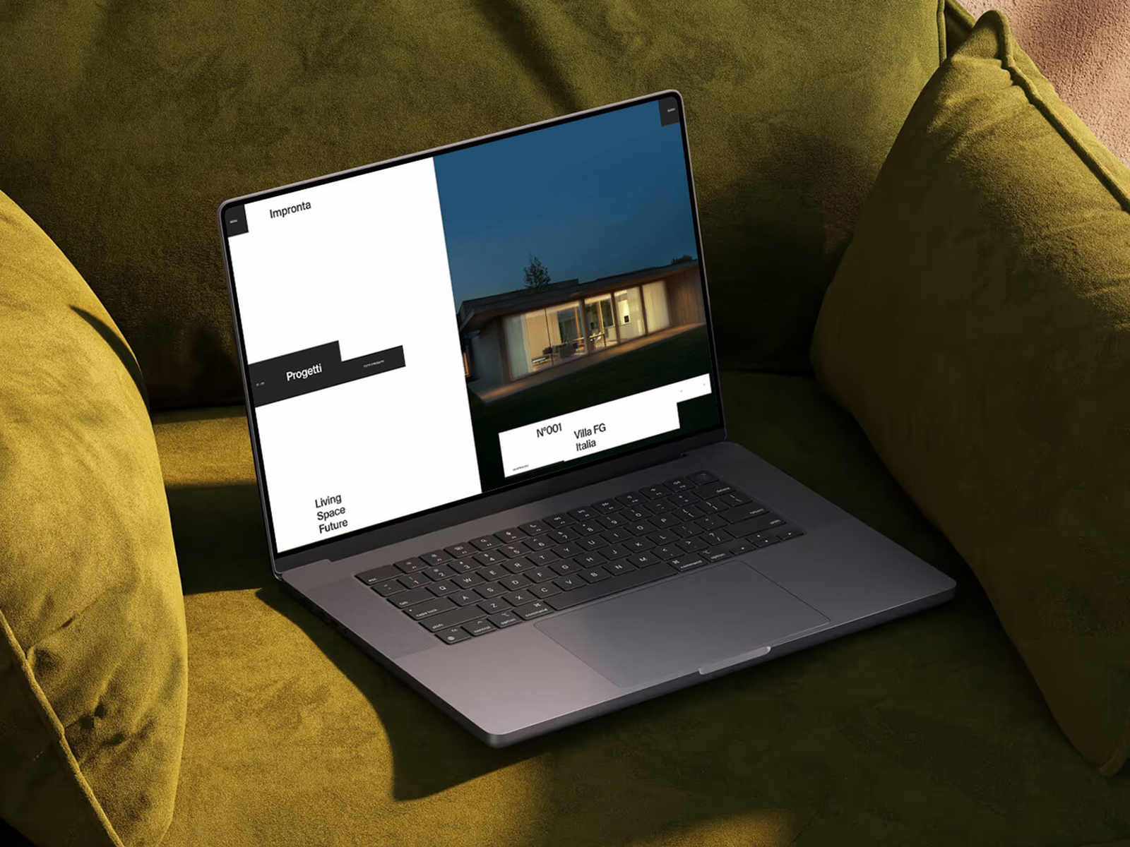
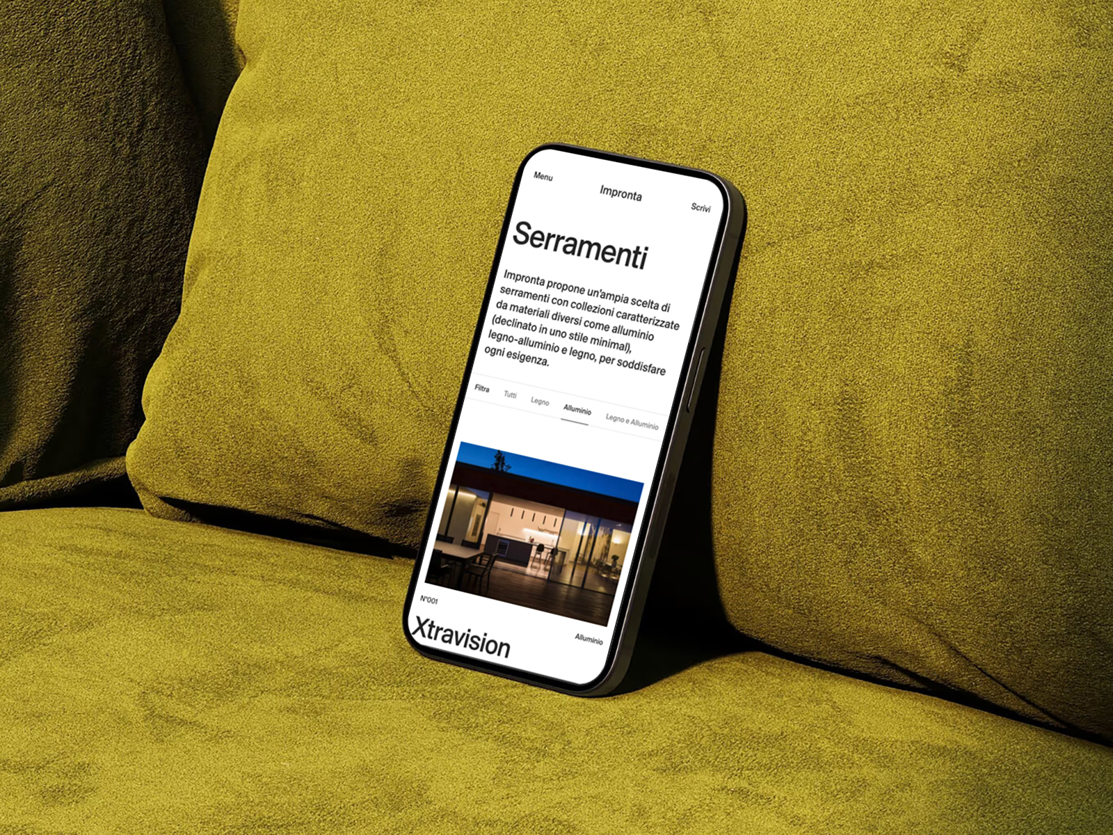
Responsive design and performance
Impronta’s website is built with a fully responsive structure and optimized animations.
Its mobile performance is flawless: it maintains visual hierarchy and reading rhythm,
while adapting margins and scales to ensure a smooth experience on smaller screens.
This level of technical refinement demonstrates a deep understanding of the balance between design and performance.
The site doesn’t sacrifice speed for aesthetics; instead, speed becomes an aesthetic value.
Fast loading is part of the experience.
Digital branding and brand consistency
At its core, Impronta is a textbook case of digital branding.
Everything—from art direction to microtypography—
reinforces a coherent and sophisticated identity: precision, elegance, confidence.
The website doesn’t just showcase products—it communicates a brand attitude.
A company that masters technique, yet expresses itself with subtlety.
A brand that understands contemporary luxury is no longer about ornament, but about clarity.
Impronta’s digital branding finds in light its universal visual code: coherence, balance, and modernity.
International recognition
In 2025, the Impronta website received three of the world’s most prestigious digital design awards:
- Awwwards — Site of the Day
- The FWA — Site of the Day
- CSS Design Awards — Website of the Day
These honors are more than trophies—they confirm a clear trend.
The future of web design isn’t about adding, but about knowing what to remove.
Impronta reminds us that true luxury lies in well-executed simplicity.
Conclusion: design that breathes
The Impronta site is a masterclass in visual honesty.
It shows us that design doesn’t have to shout to be memorable.
That clarity can move us.
And that true innovation often means removing everything that isn’t essential.
That’s why we’ve chosen it as our featured web design of the week:
because it lights the way forward for the future of digital design.
A future where light enters not just through windows, but through the interface itself.


