Featured Branding of the Week: Πyrá — Minimalism, Fire, and Tradition in a Brand Identity That Reimagines Cretan Culture
Each week, we spotlight a project that pushes the boundaries of contemporary branding. This time, we dive into the Mediterranean spirit and the primal force of fire to explore one of the year’s most inspiring works: the visual identity for Πyrá, a bakery and pastry chain specializing in Cretan pies and pastries, created by A.S. Strategy Branding & Communication under the creative direction of Antonia Skaraki.
Winner of international accolades such as the Packaging Awards 2025 (Bronze) and a standout at the DNA Paris Design Awards, Πyrá is a masterclass in how minimalist, deeply strategic branding can transform culinary tradition into a contemporary visual experience. For studios like ours, specializing in branding, visual identity, graphic design, and brand strategy in Barcelona, this project is a benchmark for uniting tradition, place, and design into a cohesive, memorable system.
A Name That Sparks Meaning: Design Born from Fire
The project is rooted in a fundamental concept: fire as the origin of flavor, tradition, and Cretan collective memory. The word “Πyrá” (Πυρά in Greek) literally means “fire”—a name that not only references the wood-fired ovens used for traditional pies, but also evokes the emotional warmth of Mediterranean cooking, the ritual of sharing, and the flavors passed down through generations.
With this foundation, A.S. Strategy set out to create branding that avoids folkloric clichés and the typical Greek visual stereotypes. Rather than relying on tourist iconography or decorative motifs, the studio chose a minimalist, almost ascetic approach, allowing raw materials, texture, and craftsmanship to take center stage. Fire inspires not just the narrative, but the entire visual system: warmth, earth, restrained energy, and honesty.
This conceptual decision sets Πyrá apart from other food brands. It doesn’t try to look traditional; it IS traditional—reimagined with a contemporary, refined, and strategic lens.
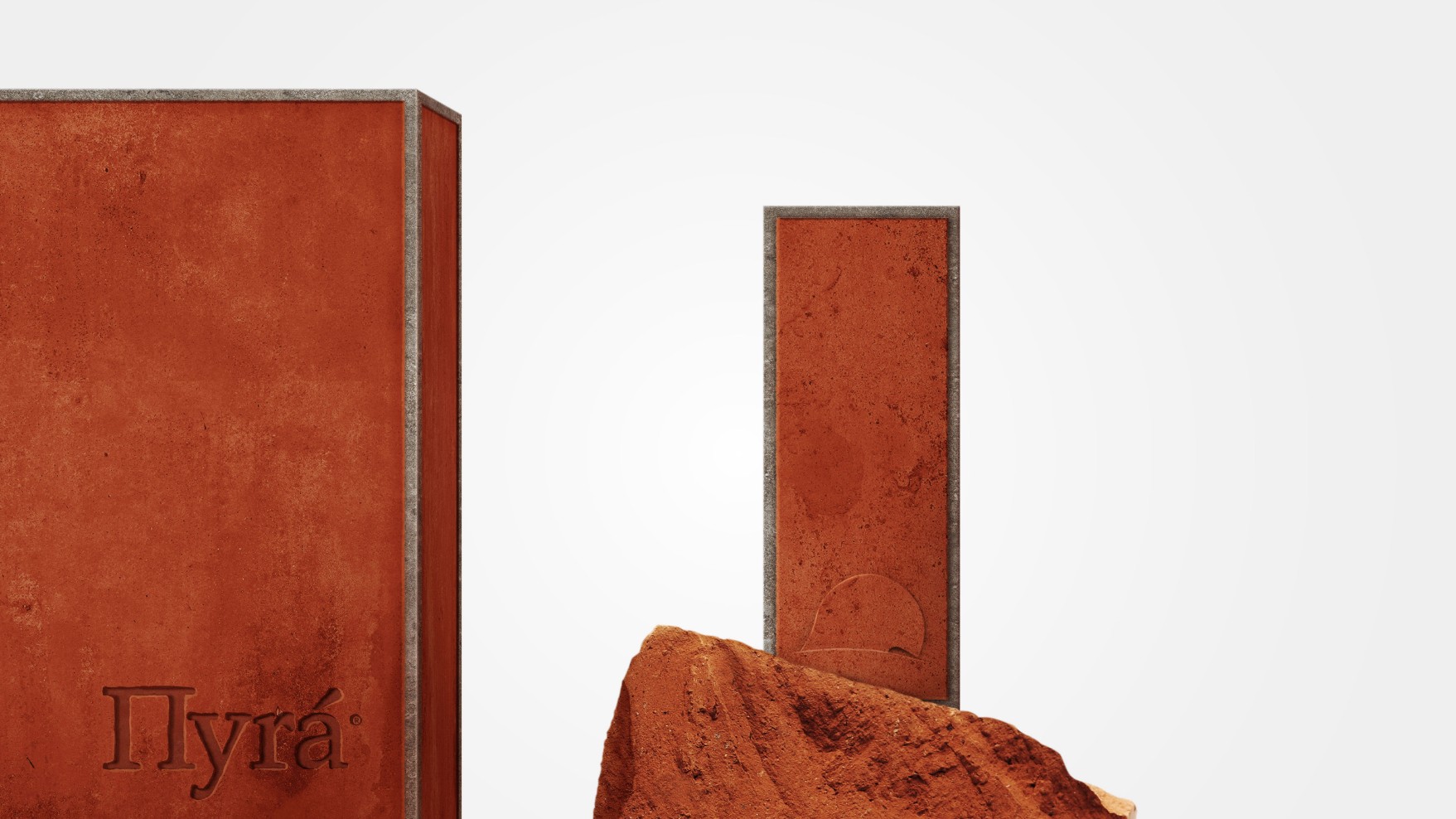
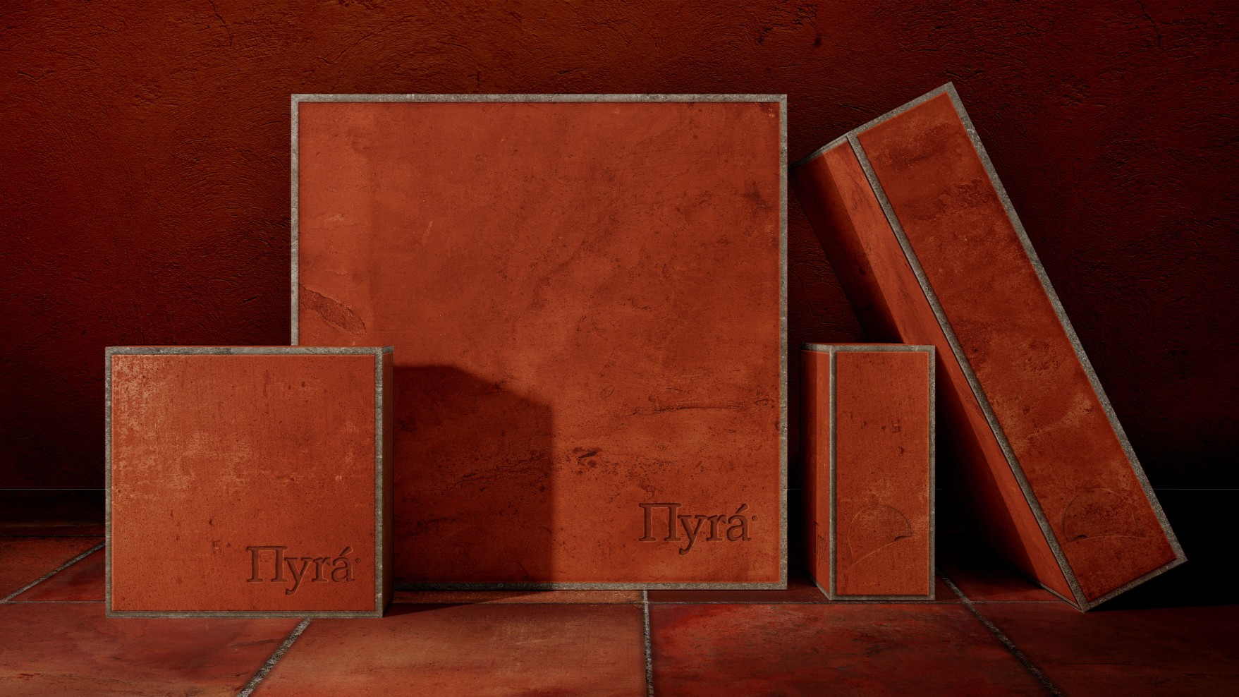
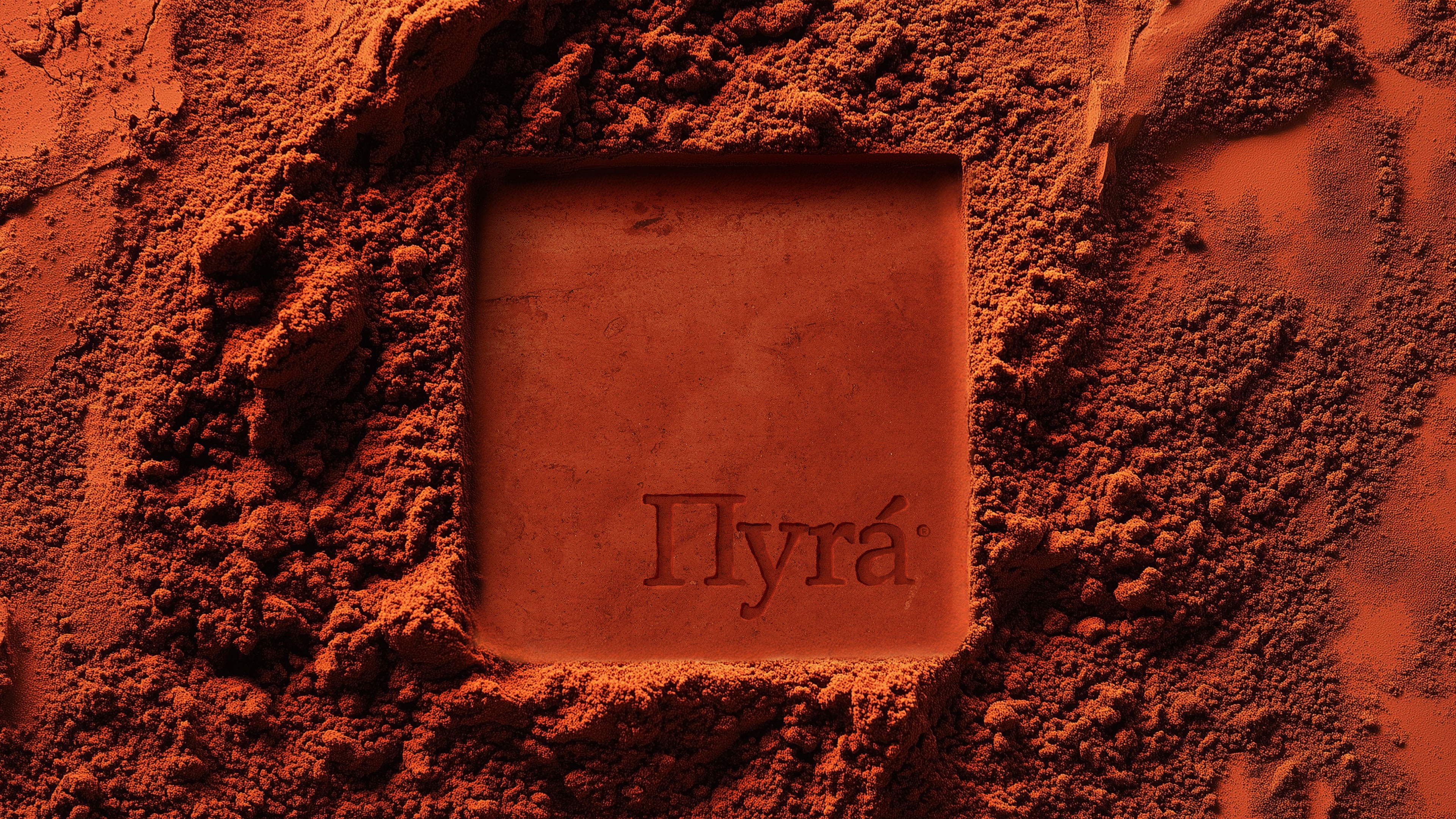
Terracotta as Identity: Color, Texture, and Material Truth
One of the project’s most distinctive features is its primary color: terracotta. This warm, mineral shade is drawn directly from the fire bricks of Cretan ovens, the reddish earth of the Mediterranean landscape, and the visual trace of fire on clay.
Terracotta becomes the heart of the identity because it:
- embodies authenticity and roots;
- evokes Greek artisanal tradition without literal symbols;
- adds a warm, tactile presence to packaging and retail spaces;
- pairs perfectly with natural textures like kraft, uncoated paper, or canvas;
- creates a sensory environment where the product feels honest and handmade.
Combined with deep blacks and off-whites, the color palette strikes a balance between rusticity and modernity—crucial for positioning the brand in the premium gourmet retail segment.
This use of color is in line with current gourmet branding trends, where pared-down, organic-inspired palettes communicate sustainability, craftsmanship, and quality.
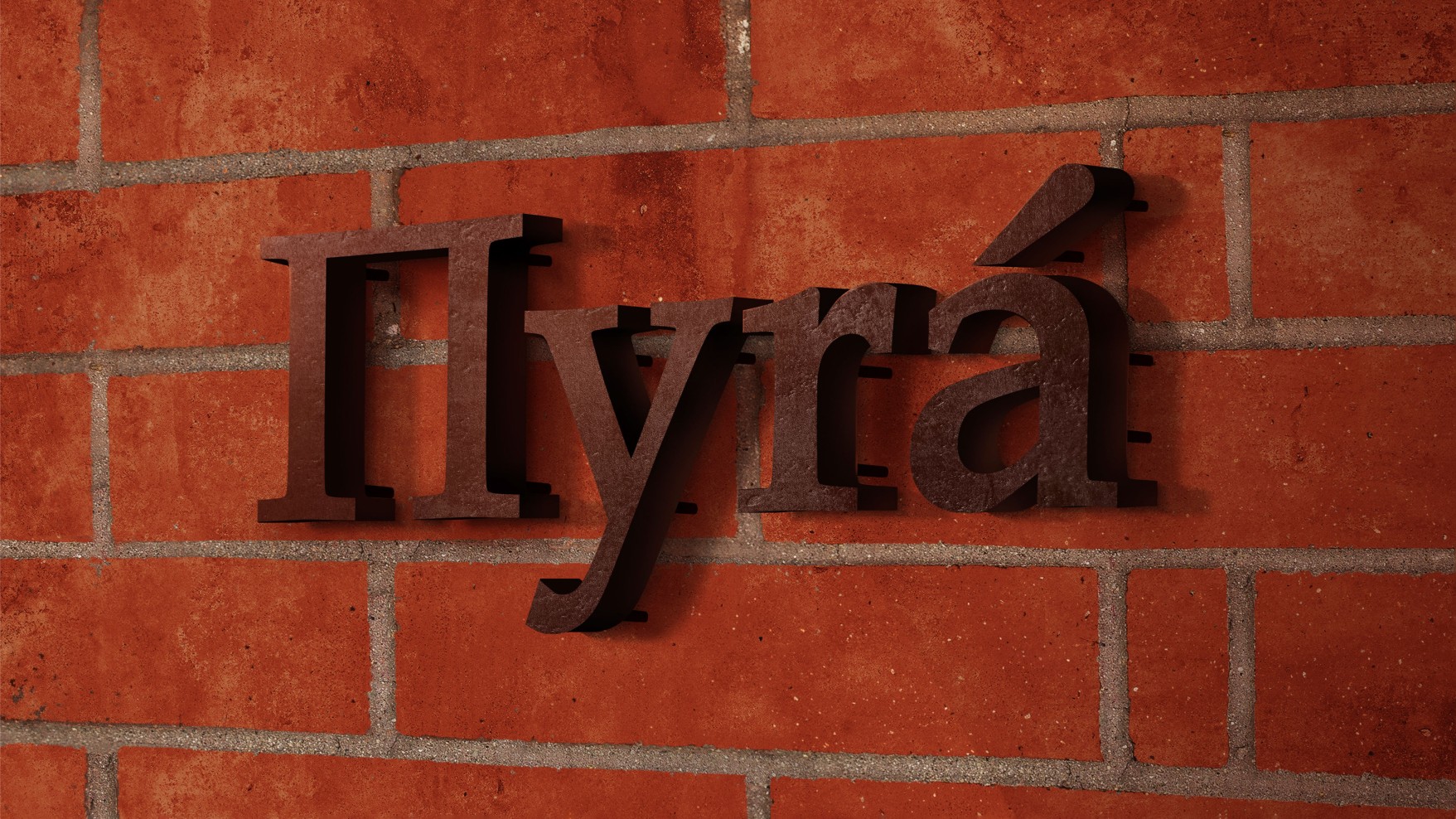
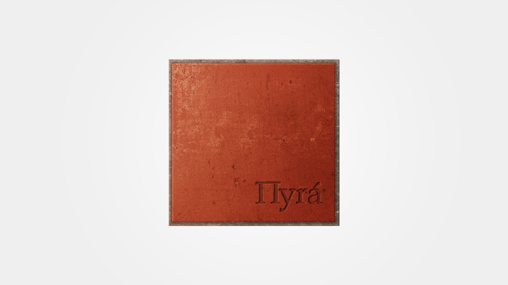
A Logo Branded by Fire: Typography as a Primal Gesture
The Πyrá logo is a custom wordmark that blends soft curves—echoing the roundness of Cretan pies—with sharp cuts reminiscent of marks left by hot tools, wood carvings, or red-hot irons.
A.S. Strategy designed a logo that:
- feels timeless, without falling into folkloric references;
- conveys craftsmanship without appearing rustic;
- functions as a seal, a firebrand, or an ancestral signature;
- is perfectly suited for embossing, hot-stamping, and engraving;
- integrates seamlessly into packaging, signage, and communications with understated elegance.
This approach ensures the logo doesn’t overpower the brand. It isn’t about filling space; it’s about leaving a mark.
Like fire itself.
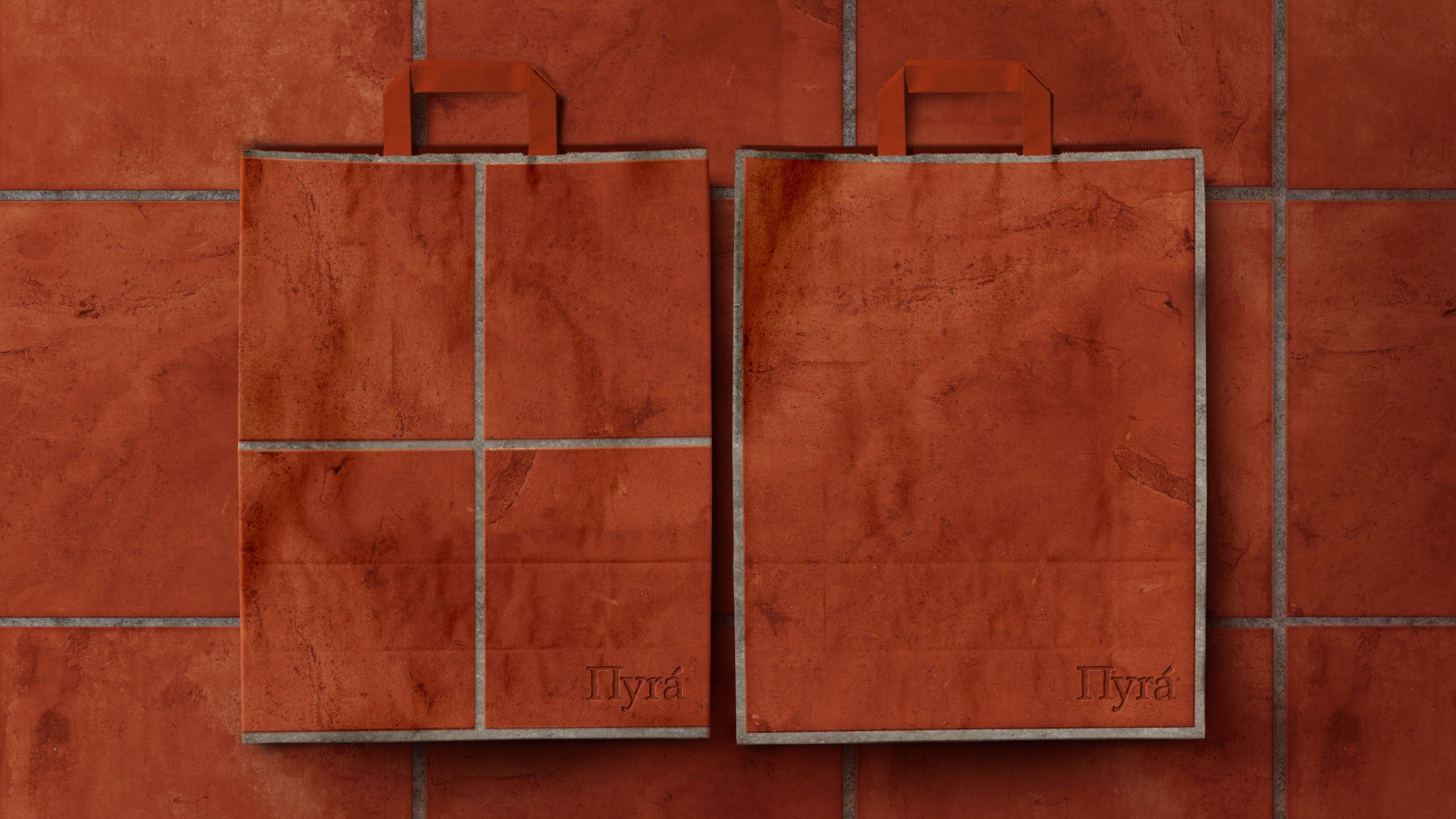
Packaging: Earth, Fire, and Functionality in Service of the Product
In the world of Πyrá, packaging acts as a bridge between tradition and its contemporary reinterpretation. There’s no gloss, lamination, or showiness here. Instead, the studio uses:
- uncoated papers,
- natural kraft,
- raw textures,
- functional bags and wraps,
- thermal embossing,
- minimalist inks,
- subtle markings reminiscent of the oven’s touch.
The result is packaging that not only wraps the product, but also tells the story of raw ingredients, artisanal processes, and respect for Cretan tradition.
This packaging has earned international recognition, winning a Bronze Award at the Packaging Awards 2025 for its material honesty and alignment with the brand’s core concept.
Retail and Physical Experience: A Space Designed Like a Contemporary Oven
Πyrá’s physical space is an extension of its branding. The shop’s aesthetic blends traditional Cretan elements—earth, clay, iron, aged wood—with a minimalist execution of clean lines, neutral surfaces, and restrained geometry.
Inside the retail space you’ll find:
- a palette dominated by terracotta and earthy tones,
- clean structures reminiscent of an oven’s interior,
- a carefully controlled sense of warmth,
- understated, functional signage,
- contemporary yet approachable typography.
The goal isn’t to recreate a Greek taverna or a rustic setting.
The aim is to convey honesty, origin, and serenity.
A space where the focus remains on the baker’s hands, the clay that holds the fire, and the tradition that lives on in every recipe.
Strategic Branding: A Brand Built on Meaning, Not Decoration
Πyrá is an outstanding example of strategic design applied to gourmet retail.
Its strength lies in three core decisions:
- Avoiding folklore and cliché.
No Greek patterns, columns, blue ceramics, or “Mediterranean” fonts. - Building identity from essential elements.
Fire, earth, clay, texture, warmth, origin. - Creating a minimalist system with deep symbolism.
The design isn’t decorative—it’s conceptual, tactile, and emotional.
This approach ensures the brand is timeless, avoids fleeting trends, and can grow organically across formats—from packaging to interiors to digital content.
Ultimately, it’s a perfect example of how a contemporary branding agency should work when building brands with real meaning.
Naming, Narrative, and Brand Architecture
The project by A.S. Strategy goes far beyond graphic design. It encompasses key decisions in:
- brand strategy,
- brand definition,
- brand story,
- brand development,
- brand architecture,
- design strategy.
The brand doesn’t arise from a logo or a color, but from an identity built on purpose:
to celebrate Cretan pie through the essence of fire.
The naming is direct, symbolic, and universal.
The narrative is minimal but powerful.
The architecture is clear: product → origin → ritual → physical presence.
This kind of multidisciplinary approach is what sets enduring brands apart.
International Awards and Recognition
The Πyrá project has been recognized at several major competitions:
- Packaging Awards 2025 — Bronze Award
- Marketing in the Greek Market
- DNA Paris Design Awards — Branding & Packaging
These awards highlight the project’s strategic and aesthetic strength, cementing its place as one of Europe’s most compelling food brand identities in 2025.
Project Credits
- Creative Agency: A.S. Strategy Branding & Communication
- Creative Direction: Antonia Skaraki
- Industry: Bakery & Pastry Chain Stores
- Deliverables: Brand Identity, Branding, Identity System, Logo Design, Packaging Design
- Target Market: Gourmet retail, European consumers
- Location: Athens, Greece
Conclusion: Branding That Honors Tradition Without Imitation
Πyrá is one of those projects that proves great branding doesn’t need embellishments, clichés, or gimmicks.
Its strength lies in its clarity.
In the sensitivity with which A.S. Strategy interprets fire, earth, and Cretan tradition.
In its ability to transform an ancient recipe into a contemporary, warm, and deeply tactile visual system.
For those of us working in branding, graphic design, and visual strategy, Πyrá is a reminder that the most powerful brands are built not on decoration, but on meaning.
Minimalist yet emotional.
Restrained yet intense.
Sophisticated yet accessible.
An identity that, like the fire that inspires its name, leaves a lasting mark.


