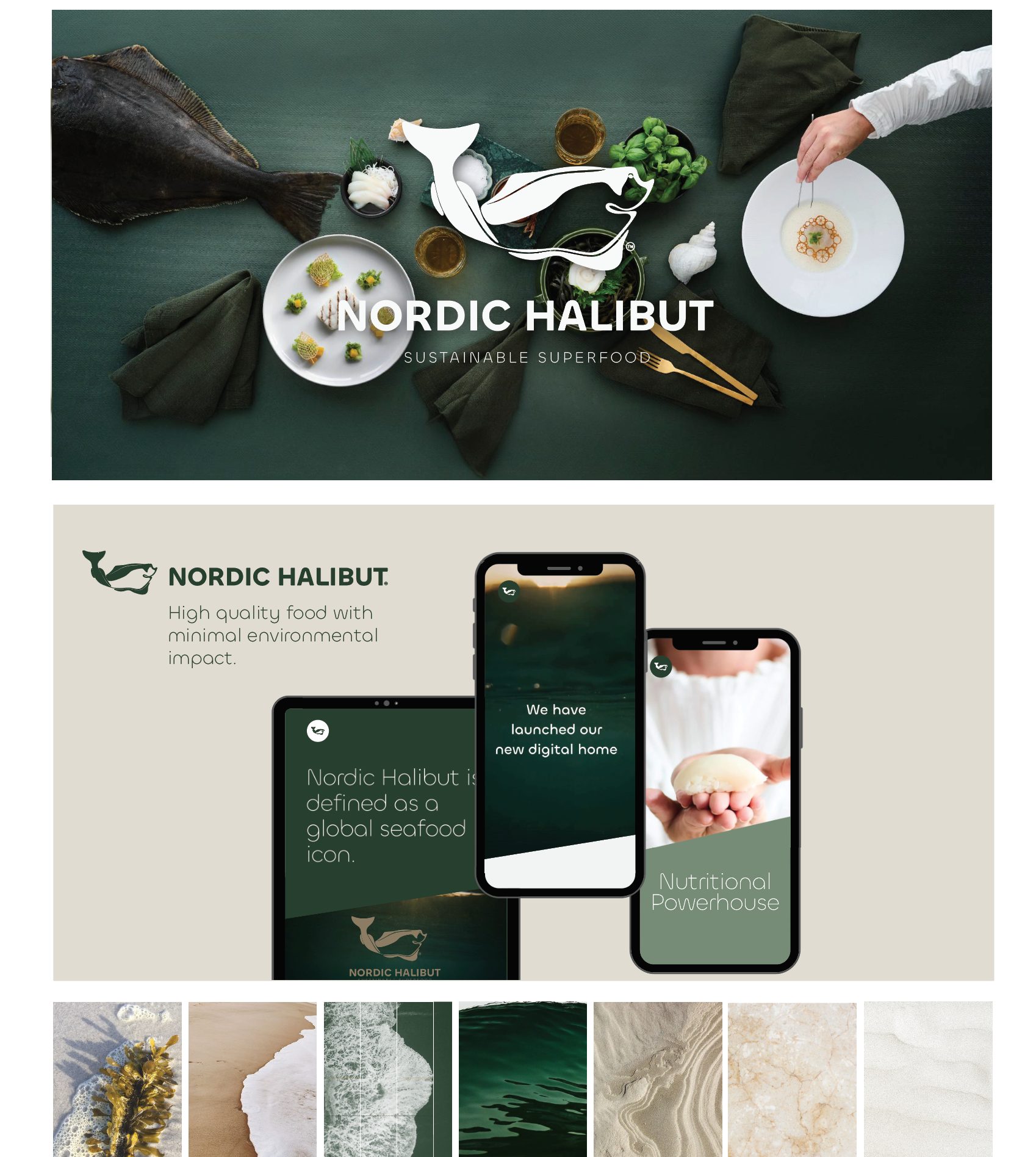
Nordic Halibut — From the depths of the sea to the world’s finest tables: a rebrand that defines excellence
Each week, we spotlight an international branding project that stands out for its ability to transform, reposition, and elevate a brand’s perceived value. This edition takes us to Northern Europe to explore the remarkable rebranding of Nordic Halibut, a Norwegian sustainable halibut brand supplying the world’s top fine dining restaurants.
The new identity, crafted by HUE Creative Studio under the direction of Christine Blass, was awarded the DNA Paris Design Award 2025 in the Branding / Graphic Design category—an international recognition celebrating excellence and innovation in design, architecture, and visual communication.
This project is a masterclass in how strategic vision, refined aesthetics, and deep respect for the product can turn a local business into a global fine dining benchmark. For branding agencies, graphic design studios, and visual identity professionals—including those of us working in branding from Barcelona—Nordic Halibut is a lesson in coherence, sophistication, and purpose.
A brand born from the sea: premium product, sustainability, and a sense of place
Nordic Halibut is based in Nordmøre, Norway, and is dedicated to the responsible production of halibut of exceptional quality. Its product is highly prized in elite gastronomy for its firm texture, purity, balanced flavor profile, and versatility in contemporary cuisine, sushi, sashimi, and precision cooking techniques.
A core pillar of the branding is its connection to place. In its official communications, Nordic Halibut emphasizes its commitment to sustainability, animal welfare, controlled production cycles, and full product traceability. The halibut is raised in the cold, pristine waters of northern Norway and processed under strict quality standards to ensure absolute freshness. This ethical and environmental dimension is central to the brand’s value proposition.
For a company with such a strong offering, the previous visual identity no longer reflected the true nature of the product. It failed to convey sophistication, added value, or international distinction. Hence the need for a comprehensive rebrand—one capable of repositioning the brand in both the local and global fine dining markets.
Creative direction: minimalist elegance inspired by the halibut’s habitat
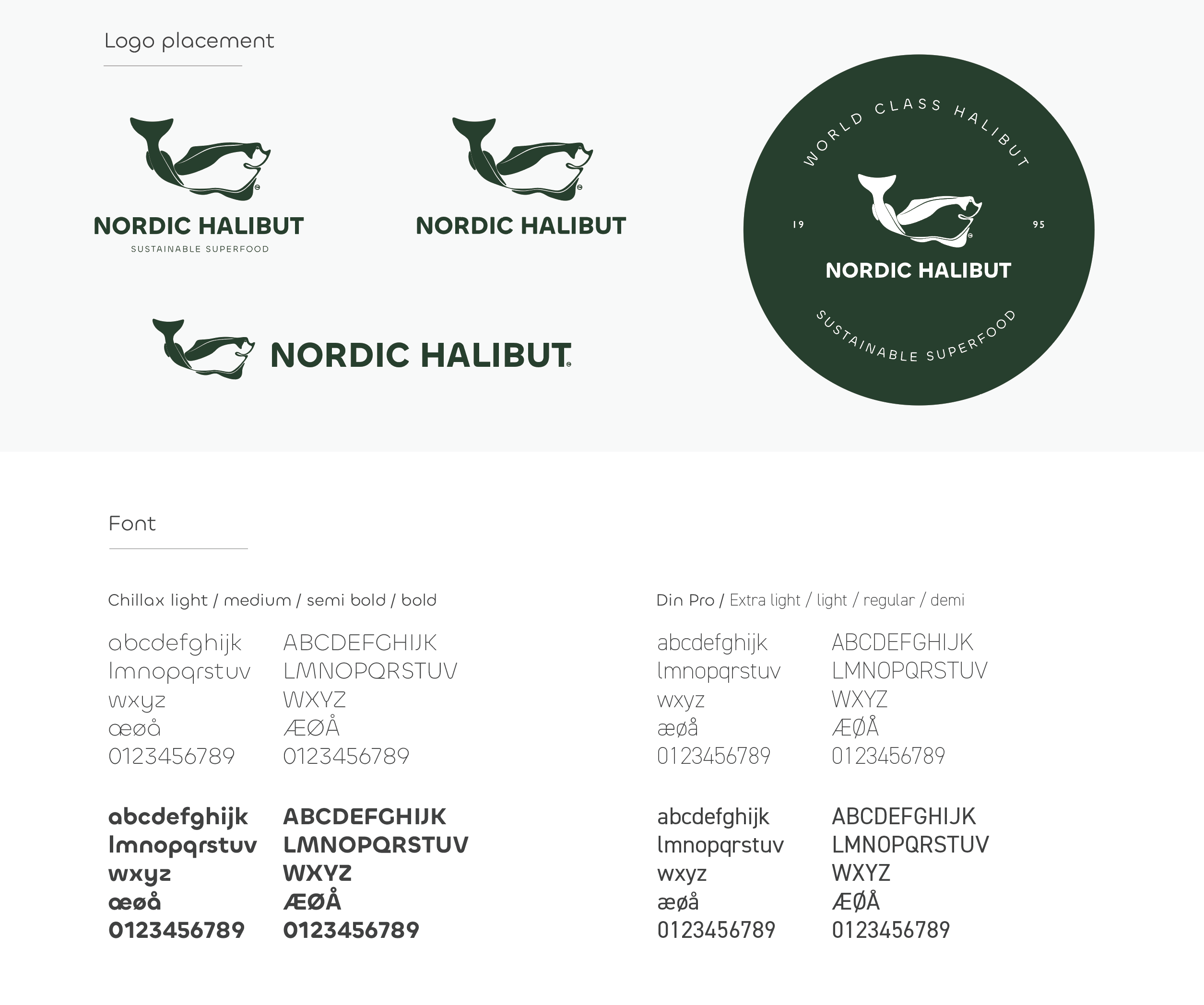
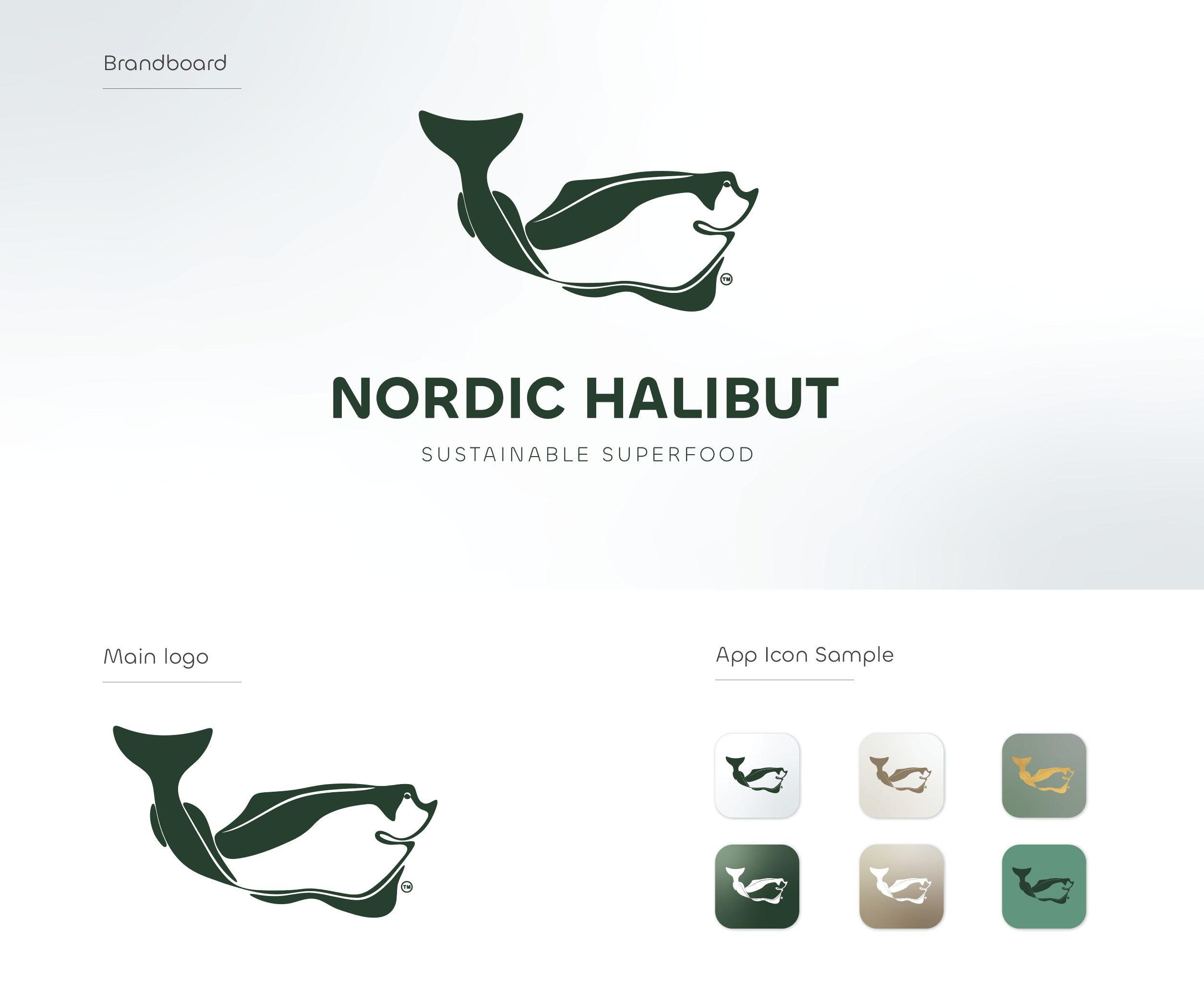
The HUE Creative Studio team started with a clear premise: to create a visual system that embodied the purity of halibut, the depth of the ocean, and the brand’s premium character. The new identity is built on a minimalist, refined, and highly adaptable visual language.
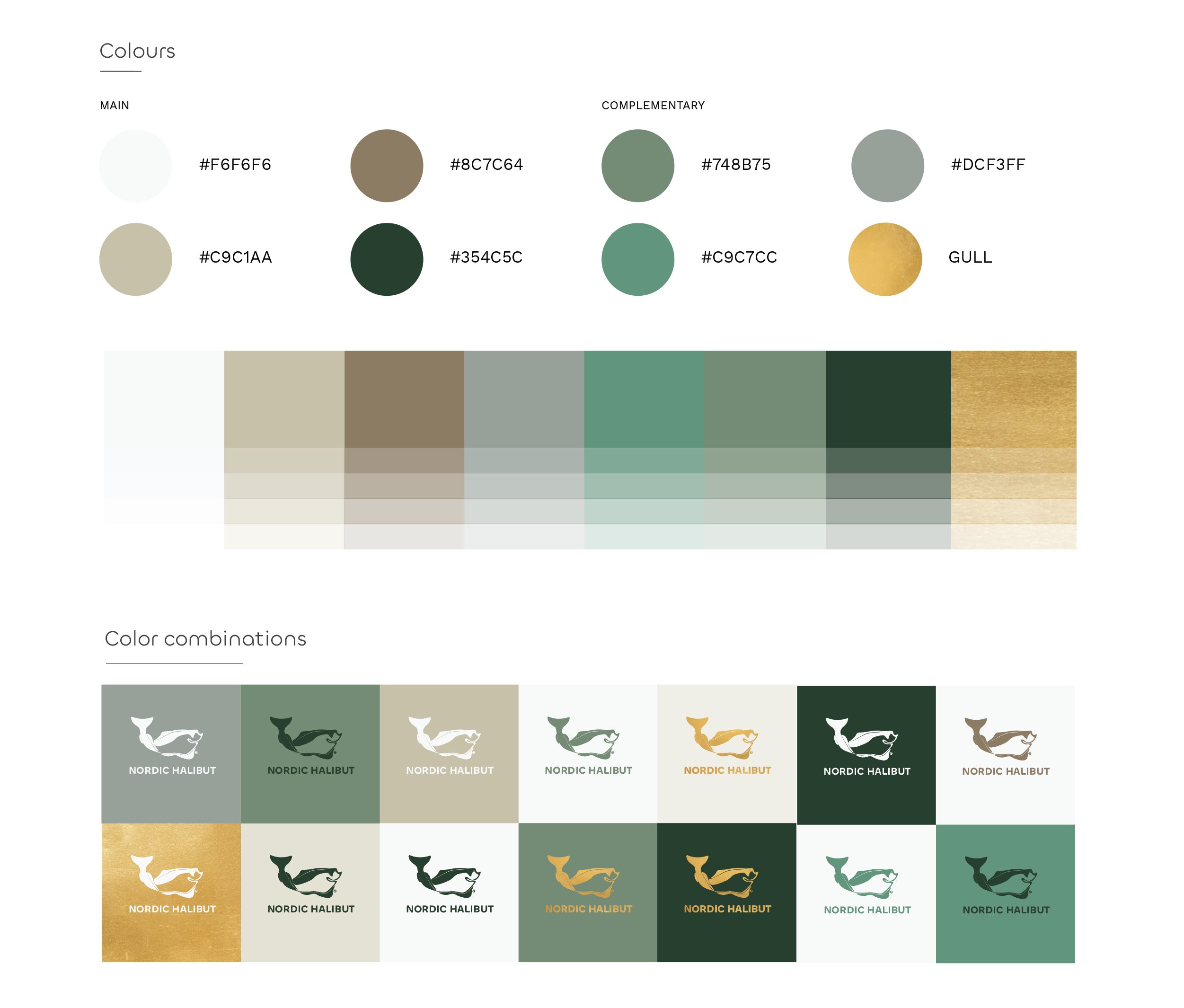
The use of deep seagreen tones—inspired by the cold northern waters—paired with soft beige accents creates an elegant contrast that communicates calm, balance, and sophistication. This color approach avoids maritime clichés and positions the brand in a contemporary, elegant, and global context.
The identity takes a holistic approach: logo, color palette, typography, patterns, and photographic style all coexist in perfect harmony. Every element is designed to communicate quality, precision, sustainability, and a strong sense of origin. Nordic Halibut is presented not just as a seafood supplier, but as a brand with a clear vision and defined purpose.
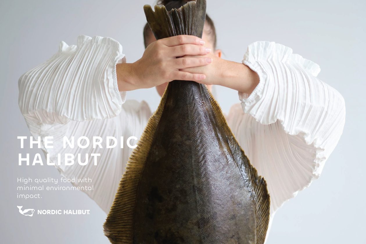
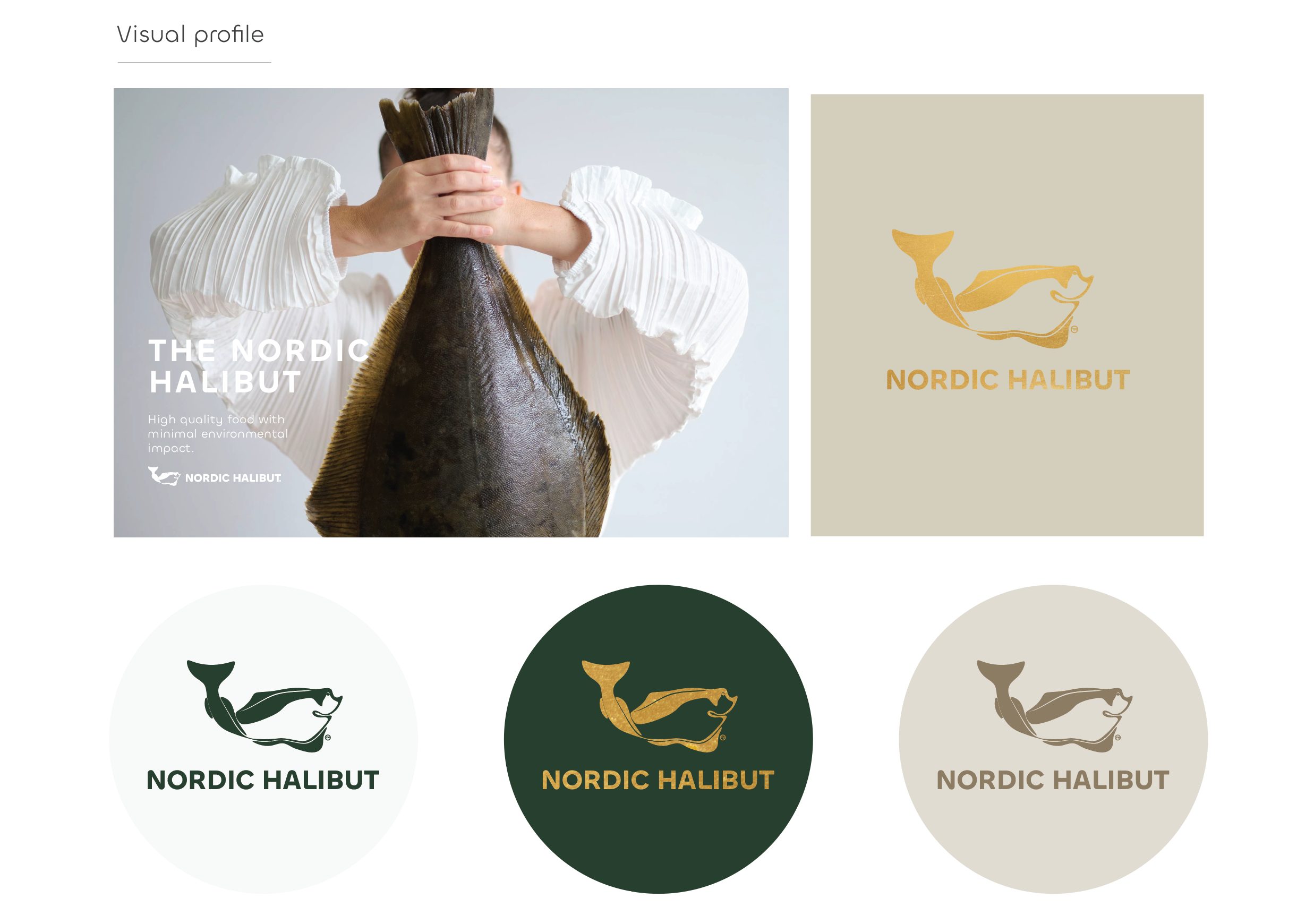
An identity that elevates the product to culinary luxury
At the heart of this rebrand is its ability to transform an ingredient into an experience. The visual identity conveys the delicacy of halibut through graphic elements that evoke:
- the depth of the ocean as a symbol of purity and origin;
- the tranquility of water as a metaphor for sustainability and respect;
- the halibut’s muscular structure interpreted through subtle lines and abstract motifs;
- the understated luxury characteristic of contemporary Nordic gastronomy.
The typography—elegant, modern, and understated—reinforces this concept. It doesn’t compete with the product; it complements it. Every detail is designed to communicate balance, confidence, and precision. The brand breathes the aesthetic of the luxury sector, but with a minimalist touch that reflects Scandinavian values.
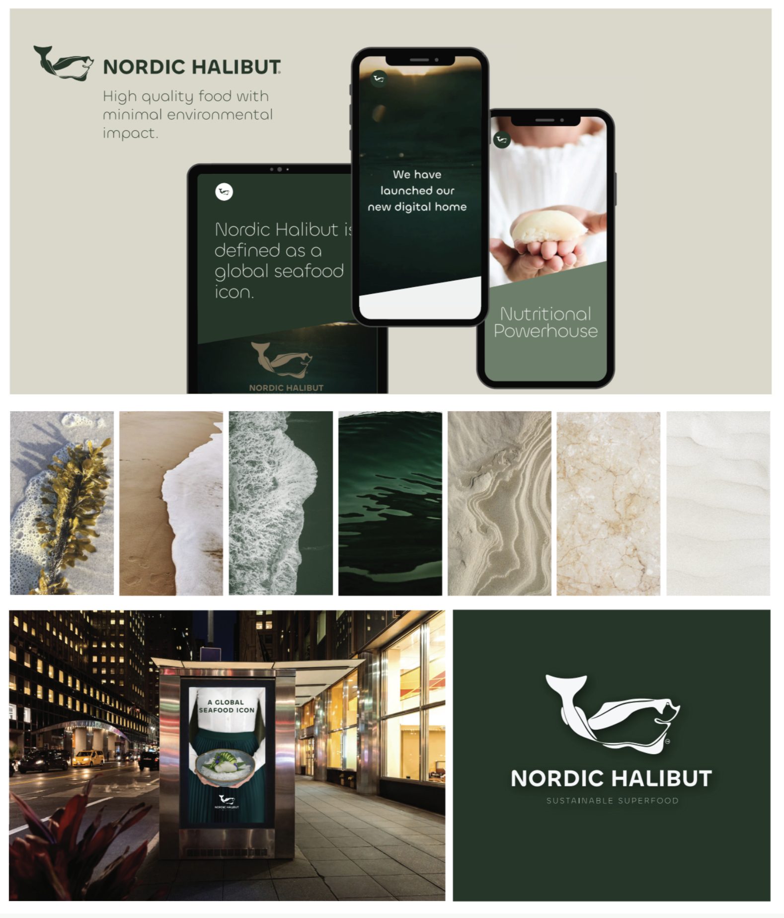
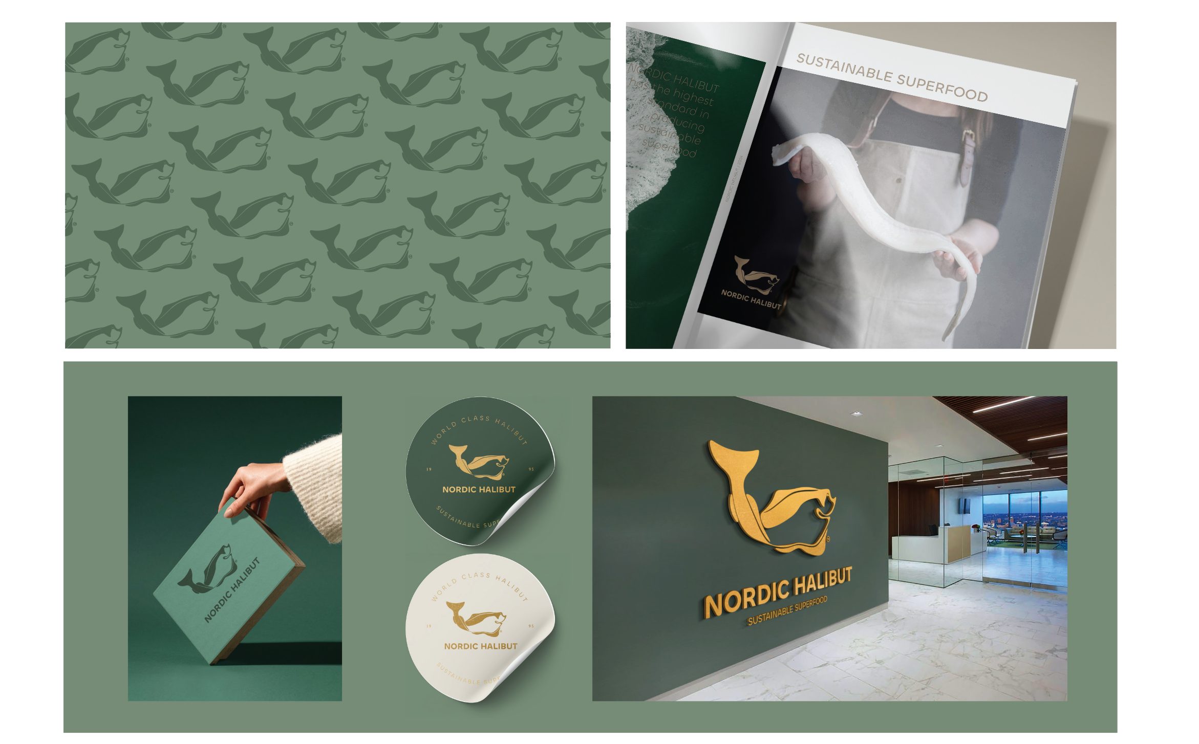
Packaging and applications: minimalism, structure, and total coherence
Packaging is one of the areas where the new identity truly shines. From boxes and labels to promotional materials and technical documentation, everything follows a well-ordered, functional visual system.
HUE Creative Studio has developed a visual language that allows the product to be presented clearly and professionally, reinforcing the premium quality perception required by chefs, distributors, and international restaurants.
The design maintains a minimalist aesthetic, where color, typography, and generous white space work together to communicate seriousness, origin, and care. Deep green tones add character, while beige softens and frames essential information. This visual balance ensures a consistent experience across every touchpoint.
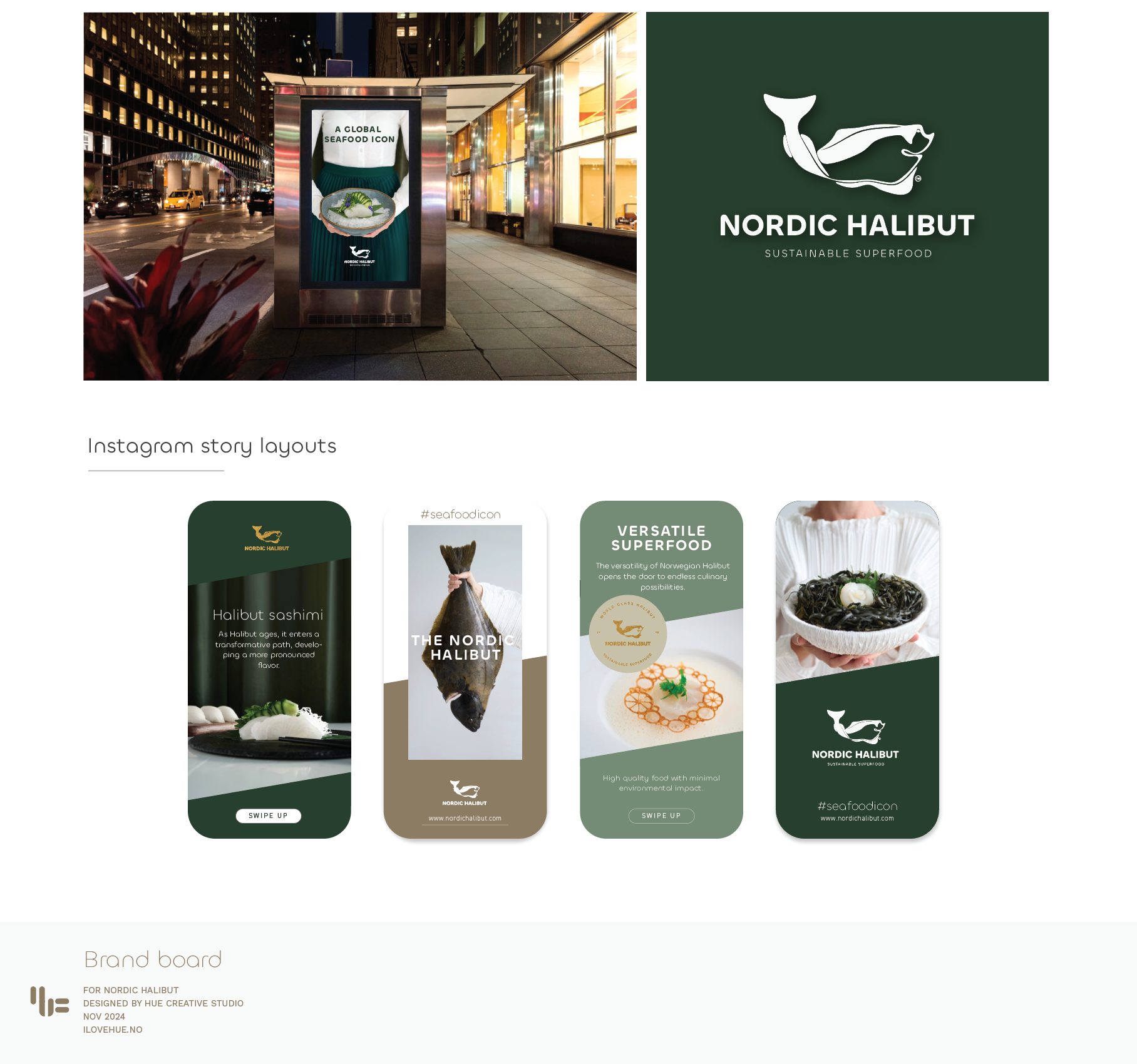
Digital experience: a global brand with a sophisticated presence
Nordic Halibut’s official website is a direct reflection of the rebrand. Navigation is clear, seamless, and elegant. Sections on sustainability, traceability, nutritional quality, and gastronomy position the brand as a benchmark for transparency and excellence. The digital design maintains the visual system’s aesthetic, reinforcing the perception of global quality.
This kind of online presence enables Nordic Halibut to connect with chefs, distributors, and international markets, building trust and credibility. The consistency across branding, packaging, storytelling, and digital experience is a prime example of how a well-crafted identity can drive commercial strategy.
International recognition: DNA Paris Design Award 2025
The new identity was named Winner in Graphic Design / Branding at the DNA Paris Design Awards 2025. This award celebrates the most influential projects in graphic design, architecture, interior design, and product.
HUE Creative Studio shared a meaningful message when announcing the win: this recognition validates not only the design, but also the values the brand stands for. Nordic Halibut is a deeply local product, born in the waters of Nordmøre, yet its impact is global. The brand celebrates sustainability, innovation, a sense of place, and culinary excellence. Receiving such an international award signals that design can amplify cultural identity and turn it into a universal language.
This approach is especially inspiring for branding agencies and studios specializing in brand identity: it proves that design can bridge tradition, place, and the future.
A project that connects local values with global ambition
A key strength of this rebrand is its ability to transform a local product into a global brand without losing authenticity. Nordic Halibut embodies Norwegian values—purity, sustainability, respect for nature—while positioning itself as a star ingredient on the world’s finest tables.
The visual design acts as a vehicle. Each element communicates the brand’s values:
- the marine palette as a symbol of origin and transparency;
- refined typography as a mark of professionalism;
- minimalist composition as an expression of contemporary luxury;
- visual harmony as the foundation of a global narrative;
- respect for the sea as the emotional core of the project.
This kind of branding goes beyond beautifying a product; it elevates it to a new level.
What this case teaches those of us in branding
From the perspective of a studio specializing in brand design, visual identity, and strategic branding, the Nordic Halibut case offers key lessons:
- Design should amplify the product’s real value, not reinvent it.
- Simplicity is a powerful tool when backed by a clear strategy.
- A global identity requires visual and narrative consistency across all channels.
- Branding can serve as a cultural ambassador.
- Award wins are not the goal, but the result of well-aligned work.
For gourmet brands, premium food producers, or companies focused on sustainability, this rebrand is a model of excellence and clarity.
Project credits
- Brand: Nordic Halibut
- Studio: HUE Creative Studio
- Design direction: Christine Blass
- Award: DNA Paris Design Award 2025 — Branding / Graphic Design
- Location: Nordmøre, Norway
- Applications: Visual identity, branding, packaging, digital, B2B and B2C content
- Industry: Fine dining, sustainability, premium seafood
Conclusion: a rebrand that elevates the local to global excellence
The Nordic Halibut rebrand demonstrates the power of strategic design to transform product perception, reposition it in international markets, and communicate deeply rooted values. HUE Creative Studio has succeeded in creating an identity that honors the product’s Norwegian origins while placing it on the global stage of culinary luxury.
Minimalism, coherence, depth, and a visual narrative that celebrates the ocean: this is the essence of the new Nordic Halibut. A project that undoubtedly deserves its place as branding highlight of the week—and as a benchmark for anyone who believes in the transformative power of design.


