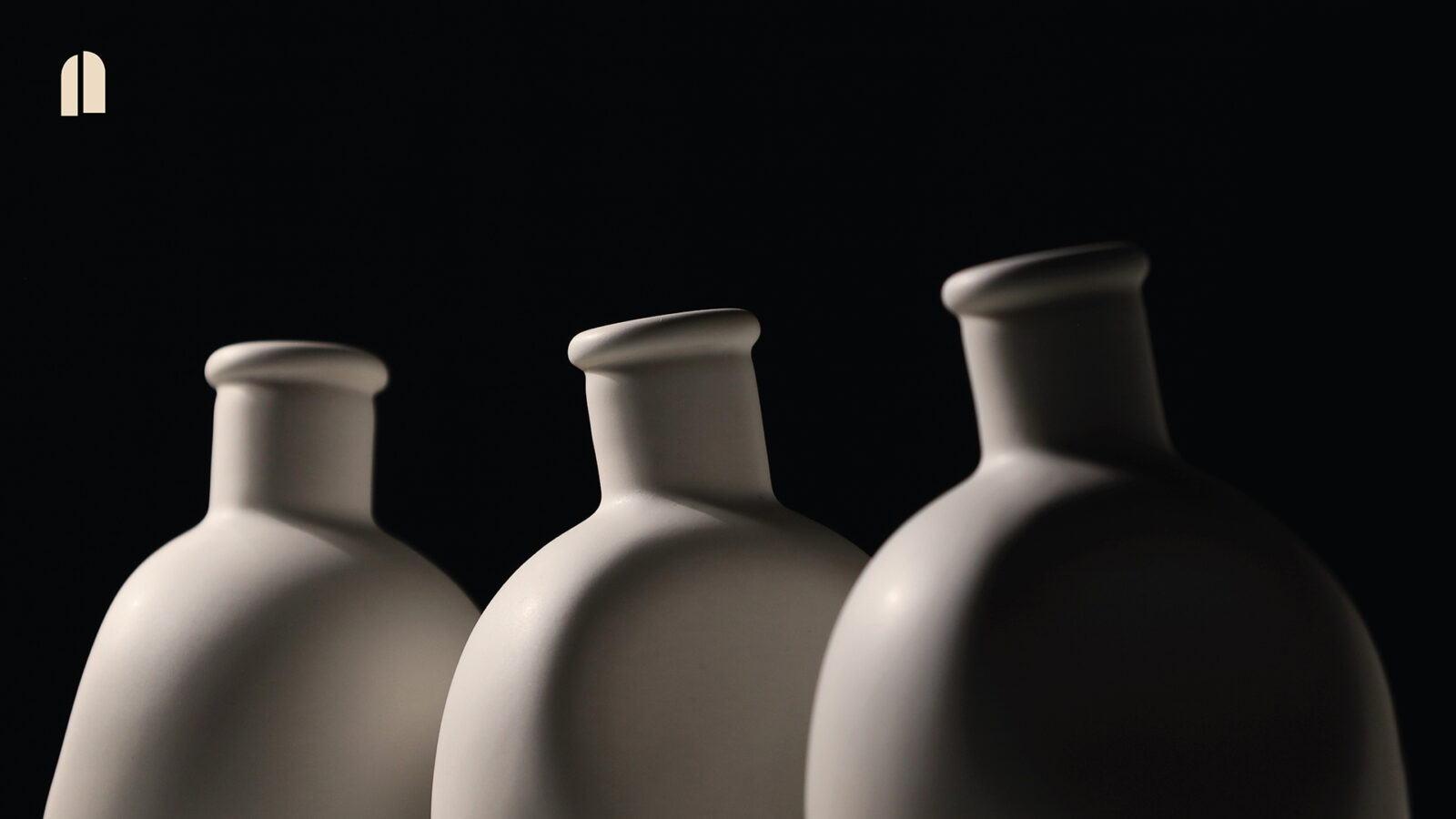
An identity that breathes memory: how FACTORY transformed SIPF 2024 into a digital and physical sensory experience
Communication design has the power to express what words cannot: emotions, memories, fragments of time. In Search of Lost Time, created by FACTORY for the 9th Singapore International Photography Festival (SIPF), is a remarkable example of how visual identity can become an immersive, multisensory, and deeply narrative experience.
Winner of the DNA Paris Design Award 2025 in the Graphic Design / Communication Design category, this branding system exemplifies the excellence of contemporary graphic design in cultural communication, seamlessly integrating motion graphics, digital design, signage, print identity, and user experience into a single, cohesive language.
For those of us working in branding, graphic design, web design, digital communication, and creative campaigns from Barcelona, this project stands as a masterclass in how a visual campaign can fuse concept, emotion, and technology to build a unique universe.
Context: a festival that turns photography into living memory
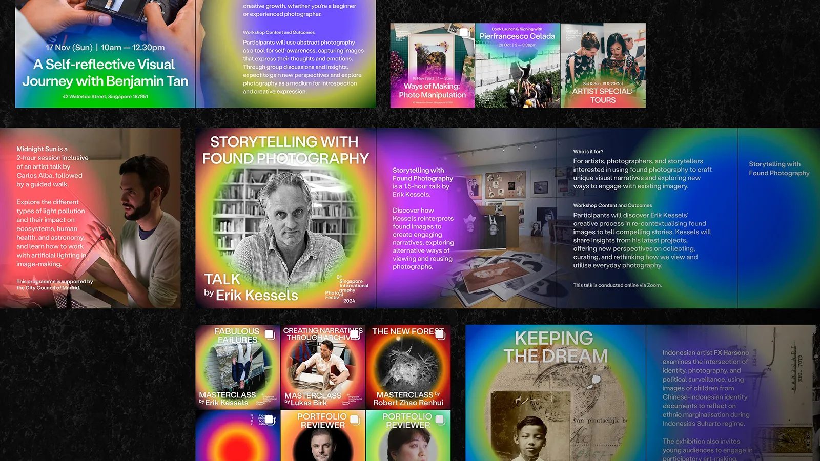
The Singapore International Photography Festival is one of Asia’s leading visual arts events, featuring exhibitions, talks, publications, educational programs, and experimental spaces. Each edition revolves around a central concept that shapes both its curatorial and communication approach. For 2024, the chosen theme was In Search of Lost Time, inviting audiences to explore time, memory, and the fleeting nature of human experience.
The challenge for FACTORY was significant: how do you translate memory—an abstract, emotional, and ever-changing concept—into a visual identity that is both functional and adaptable? How can the festival’s communication guide audiences on a sensory journey through memories, emotions, and elusive perceptions?
This challenge was heightened by the event’s multifaceted nature. The identity needed to work seamlessly across:
- web and digital platforms;
- motion graphics and animated banners;
- print: posters, programs, brochures, and catalogs;
- signage and wayfinding across multiple venues;
- exhibition spaces;
- social media campaigns.
For a design agency in Barcelona, projects like this represent the ideal: a holistic system where visual identity, web design, digital communication, and conceptual storytelling converge into a single experience.
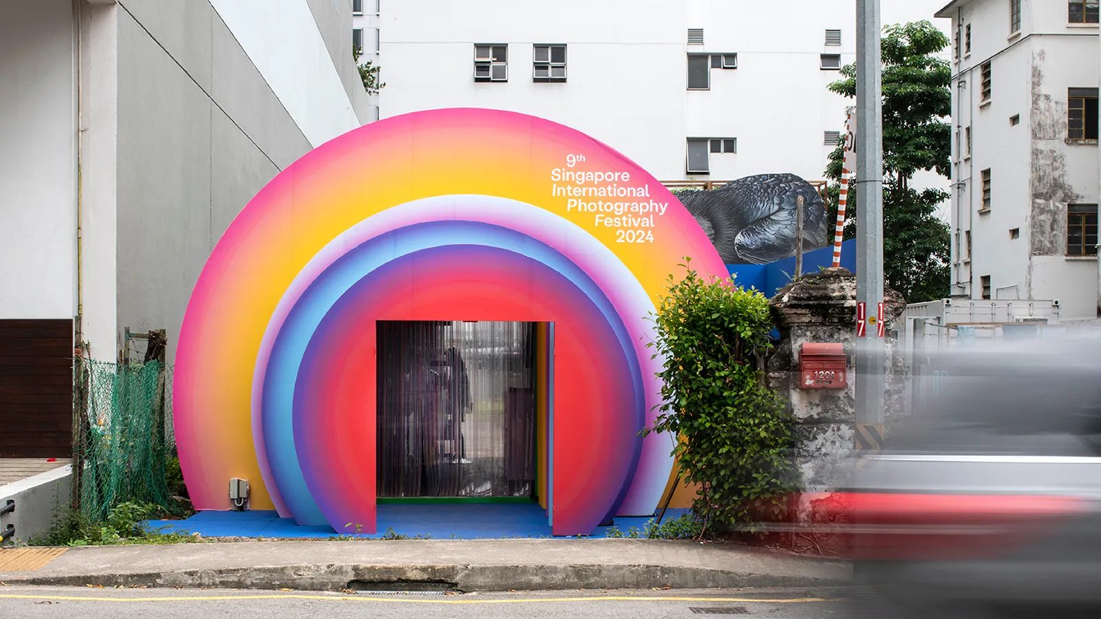
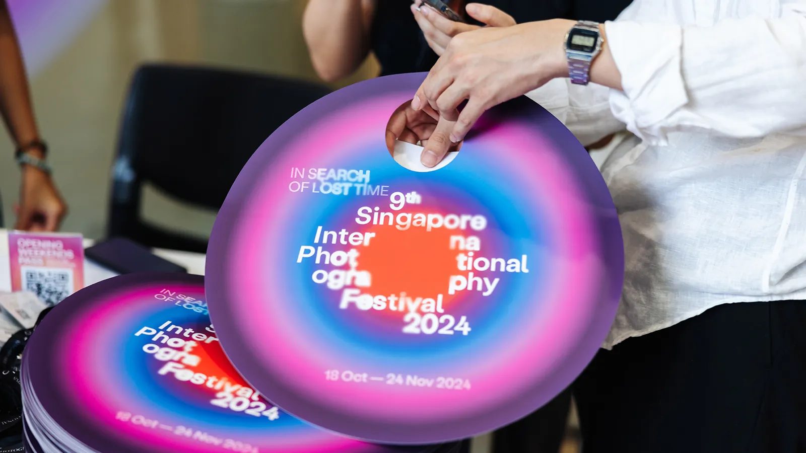
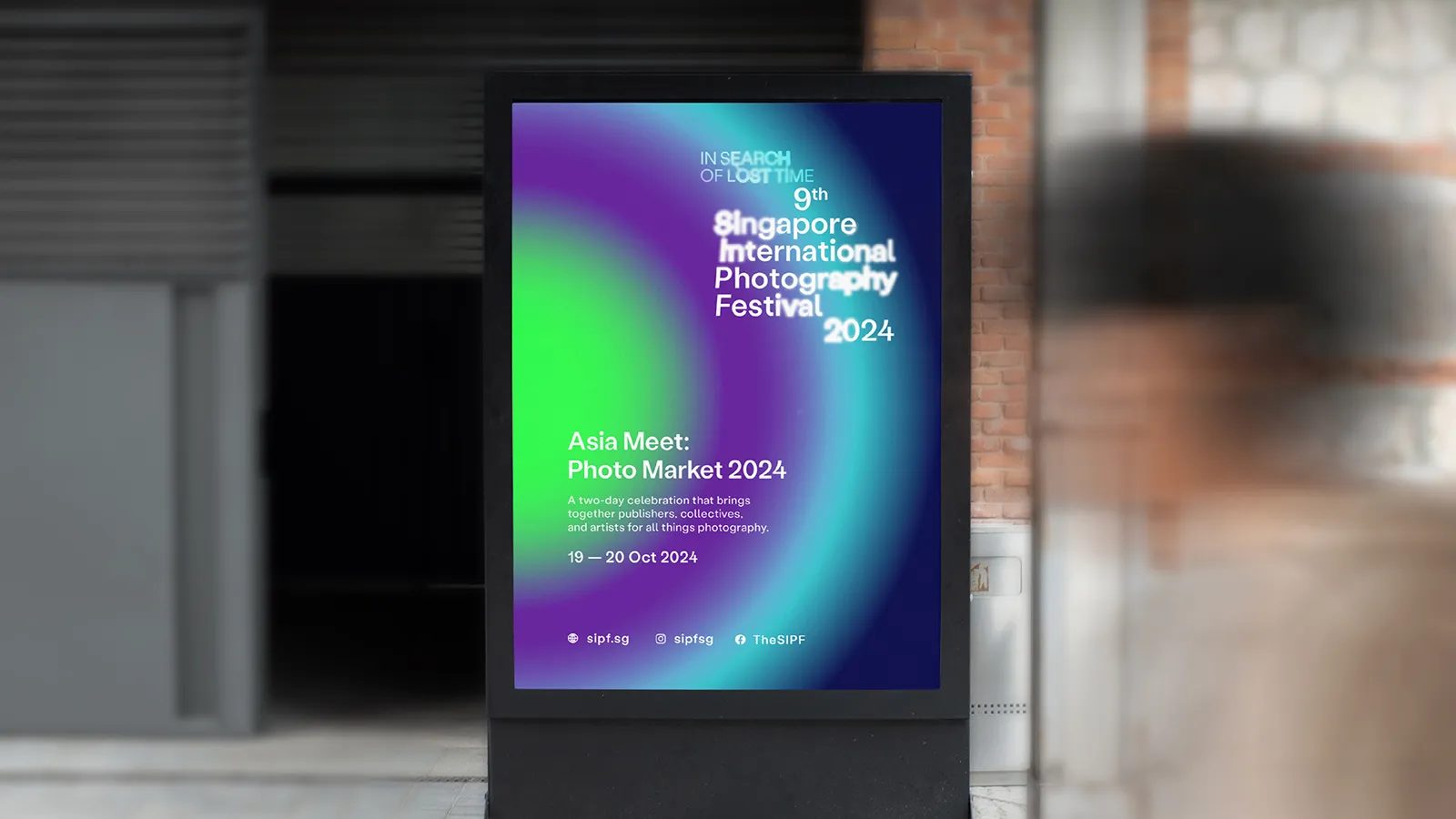
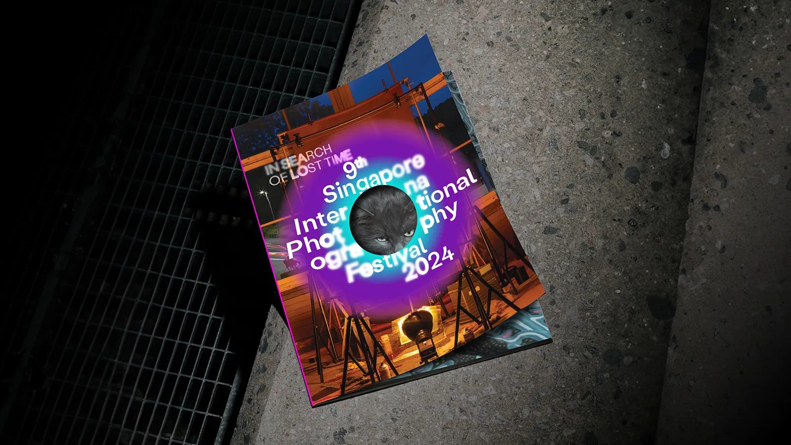
The concept: moving portals as a metaphor for time
The FACTORY team—led by Roy Wang with Sandra Lau, Tamelia Lim, Lin Chi Chen, Joelle Puah, and Chrystal Lim—built the identity around a powerful metaphor: the portal. This element symbolizes the journey between past and present, between fragmented memories and fleeting perceptions that surface and fade.
Portals are at the heart of the festival’s visual language. They are not static: they expand, contract, stretch, and dissolve. Each movement reflects the fluid nature of memory. This conceptual choice visually expresses how memories surface, blur, and return with new meaning.
In a digital communication campaign, where movement is key to capturing attention, these portals serve as dynamic assets adaptable to:
- promotional videos,
- web interactions,
- animated banners,
- reels and stories,
- immersive screen experiences.
The identity doesn’t just “show” the festival’s theme—it embodies it. It is movement, transition, and shifting memory. A lesson in contemporary design.
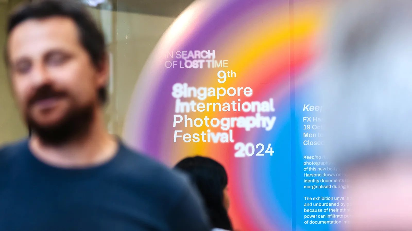
Visual design: between minimalism and poetic distortion
The graphic system is built on a careful balance between modern minimalism and subtle distortion. FACTORY reimagines the festival’s logo through typographic variations: stretched letters, visible pauses, gentle curves, and fading effects that evoke breath and contemplation. This typographic intervention encourages viewers to pause, directly connecting with the festival’s curatorial intent.
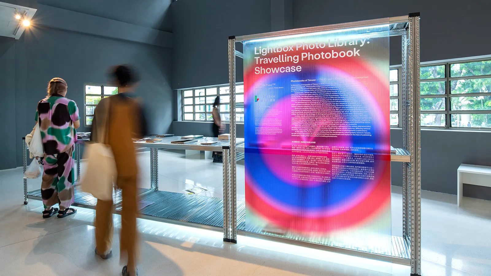
Compositions use layering, soft gradients, and transparency to suggest emotional depth. Portals act as gateways to different levels of interpretation, setting the visual rhythm for both print and digital pieces.
Each festival venue adopts a distinct color palette, allowing for:
- a unique identity for each space,
- easier visitor navigation,
- the creation of specific emotional atmospheres.
This color strategy turns the campaign into a user-centered experience while providing narrative cohesion. For a visual communication studio in Barcelona, this use of color as a storytelling tool is especially inspiring.
Movement as essence: a living identity
What sets FACTORY’s work apart is its focus on animation as a core element of branding. Movement is not decorative—it is the language itself. In motion, the portals come alive, evoking memories emerging from the mists of time.
In a crowded digital landscape where campaigns must capture attention in seconds, this dynamic identity stands out immediately. It flows, breathes, and invites you in. Rather than imposing information, it creates atmospheres. This transforms SIPF’s digital communication into an emotional experience rather than a purely informational one.
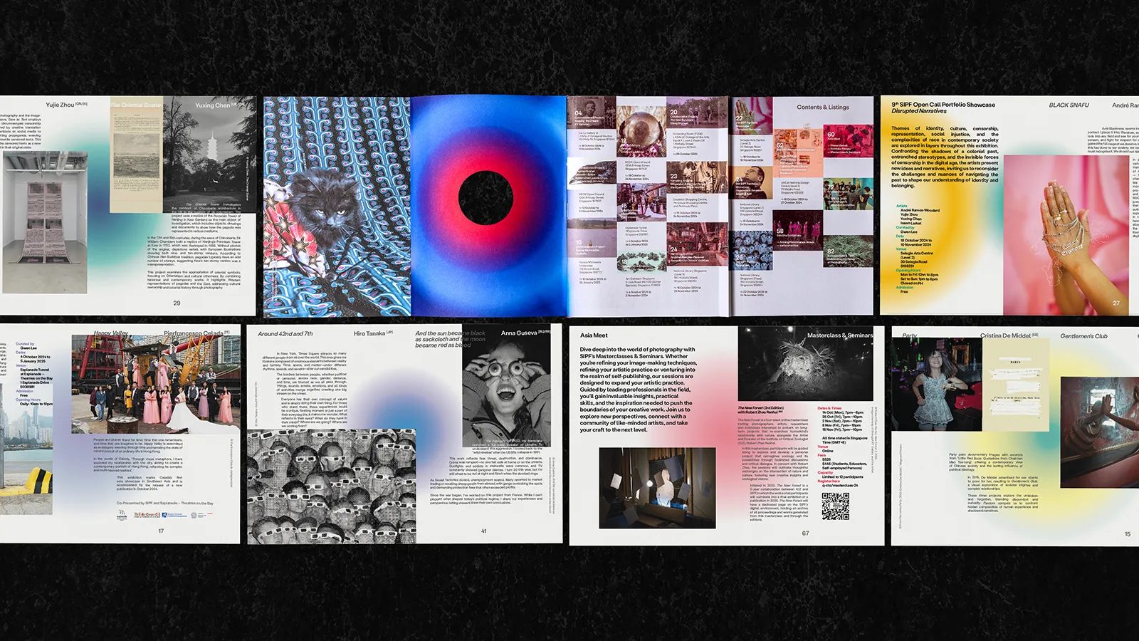
Editorial and spatial application: design that shapes the experience
In print, portals serve as conceptual frames, opening windows onto the festival’s works, texts, and themes. Typographic layouts remain clean and measured, ensuring that the content—photography—remains at the heart of the narrative.
Within the exhibition space, the graphic identity becomes a wayfinding system. Enlarged or transformed portals guide visitors through different rooms. Each color introduces a distinct atmosphere, reinforcing the curatorial narrative.
This integration of branding and physical space is essential in any contemporary cultural campaign. From an experiential design perspective, FACTORY demonstrates a keen sensitivity—not only to the visual, but also to the spatial, emotional, and practical dimensions.
Digital communication: when branding builds a narrative
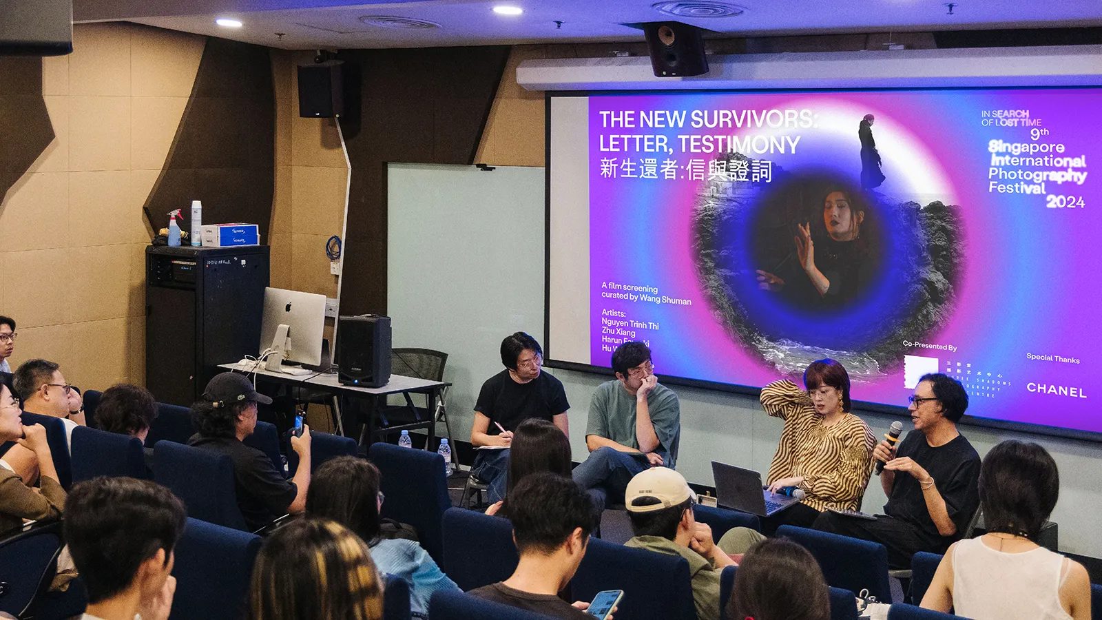
SIPF 2024’s digital campaign is a natural extension of the visual system. Social media assets adopt the moving portal aesthetic, creating a consistent visual flow. Animations are used to introduce artists, announce venues, or promote related activities.
This turns the branding into a narrative ecosystem that accompanies audiences before, during, and after their visit. Across the festival website and social platforms, the identity delivers continuity and emotional cohesion.
For those of us developing digital campaigns in Barcelona, this project is a standout example of how a strong concept can elevate online communication when applied with clarity, sensitivity, and consistency.
Impact and international recognition
FACTORY’s work was honored with the DNA Paris Design Award 2025 in the Graphic Design / Communication Design category, one of the most prestigious accolades in contemporary design. The jury praised the project’s conceptual depth, visual coherence, and the way the identity transformed the festival into a sensory journey.
The award recognizes not only the project’s aesthetic quality but also its value as an integrated communication campaign. It’s a testament to how graphic design, branding, and digital communication can create memorable experiences when guided by a clear vision.
Conclusion: design that turns time into experience
In Search of Lost Time is an outstanding example of contemporary cultural branding. FACTORY didn’t just design a visual identity—they created an atmosphere. A universe where time, memory, and perception intertwine, inviting audiences to pause, observe, and feel.
From our perspective in branding, graphic design, and digital communication in Barcelona, we see this project as a benchmark for how a profound concept can be transformed into a comprehensive campaign that breathes coherence, sensitivity, and emotion.
Credits
Project: In Search of Lost Time – 9th Singapore International Photography Festival
Studio / Company: FACTORY
Lead Designer: Roy Wang
Design Team: Sandra Lau, Tamelia Lim, Lin Chi Chen, Joelle Puah, Chrystal Lim
Client: DECK Photography Art Centre
Award: Winner – Graphic Design / Communication Design, DNA Paris Design Awards 2025
Year: 2024
Instagram: @work.byfactory