This time, we’re highlighting the best packaging design that caught everyone’s eye here at the Code Barcelona studio—a packaging design we believe deserves special recognition as October’s standout, earning the title of Best Packaging Design for October 2018.
Best Packaging Design of October 2018
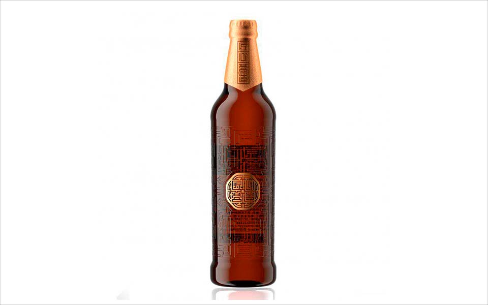
The project that has earned this distinction is the packaging design created by Shenzhen Tiger Pan Packaging Design Co., Ltd. for the Chinese beer brand Snow Beer.
The designer, Yan Dong, under the creative direction of Tiger Pan, has crafted a true masterpiece in packaging design for a beer bottle.
Let’s break it down, as this project deserves a closer look at every detail.
Here are the key aspects we’ll cover:
- Inspiration
- Uniqueness and project description
- Functionality, process, and interaction
- Project timeline and location
- Production and technology used
- Specifications and technical properties
- The creative process
- The challenge
- Credits
Let’s start at the beginning.
Inspiration
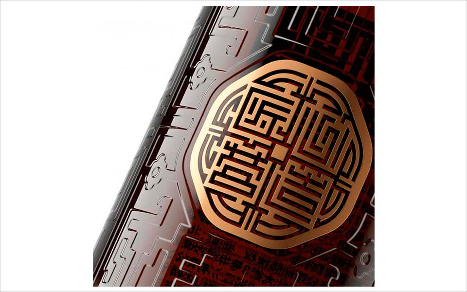
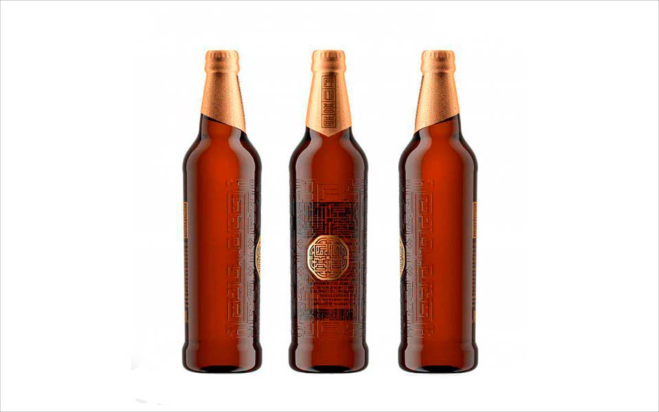
As you can see, the bottle features an intricate pattern both embossed directly into the glass and in the central gold logo.
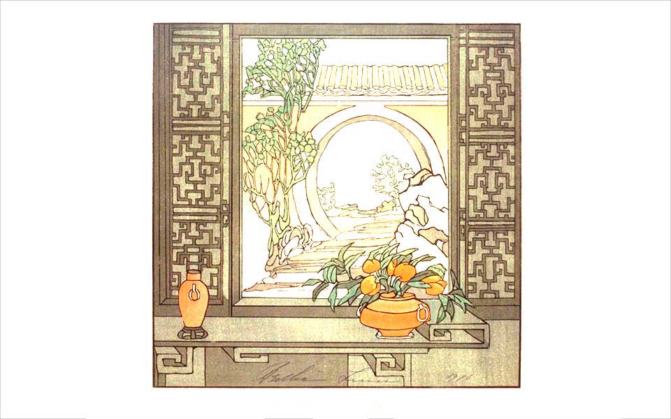
This design draws inspiration from traditional Chinese window lattices, which symbolize the pursuit of a better quality of life.
A window brings in light and air, but when adorned with ornate latticework, it becomes a symbol of luxury.
This concept is brought to the bottle, elevating its packaging design to a level of sophistication worthy of October’s top honor.
Uniqueness and Project Description
Most of the bottle’s packaging is defined by a traditional Chinese lattice, carved directly into the glass.
This carving was achieved by adapting an ancient technique known as “bubujin.”
The four Chinese characters “匠心营造”—meaning “INGENUITY”—are subtly embedded vertically within the pattern.
Every detail is meticulously crafted, just as the characters suggest.
Functionality, Process, and Interaction
The graphic design is crafted to convey a blend of ingenuity and originality—qualities encapsulated in the Chinese concept of Jiang Xin (匠心).
One of China’s great inventions is the compass, and this sense of balance is reflected in the packaging, with the latticework also improving the grip on the bottle.
Project Timeline and Location
The project was completed in September 2017 in Shenzhen and produced in Beijing. In 2018, it received the Gold Pentagon Award for Best Packaging of 2018.
Production and Technology Used
Several distinctive elements give this packaging project the depth needed to stand out as an award winner.
Both the central logo and the bottle cap are finished in gold, a universal symbol of luxury.
The central logo in particular evokes a seal or ancient Chinese compass, created using hot stamping on glass.
Technically, the bottle features both concave and convex surfaces for enhanced grip.
Specifications and Technical Properties
The glass bottle holds 500ml and follows the standard size for a beer bottle.
The Creative Process
This packaging design was custom-created for the client, Snow Beer.
The window-inspired lattice was also designed specifically for this project by an illustrator.
The Challenge
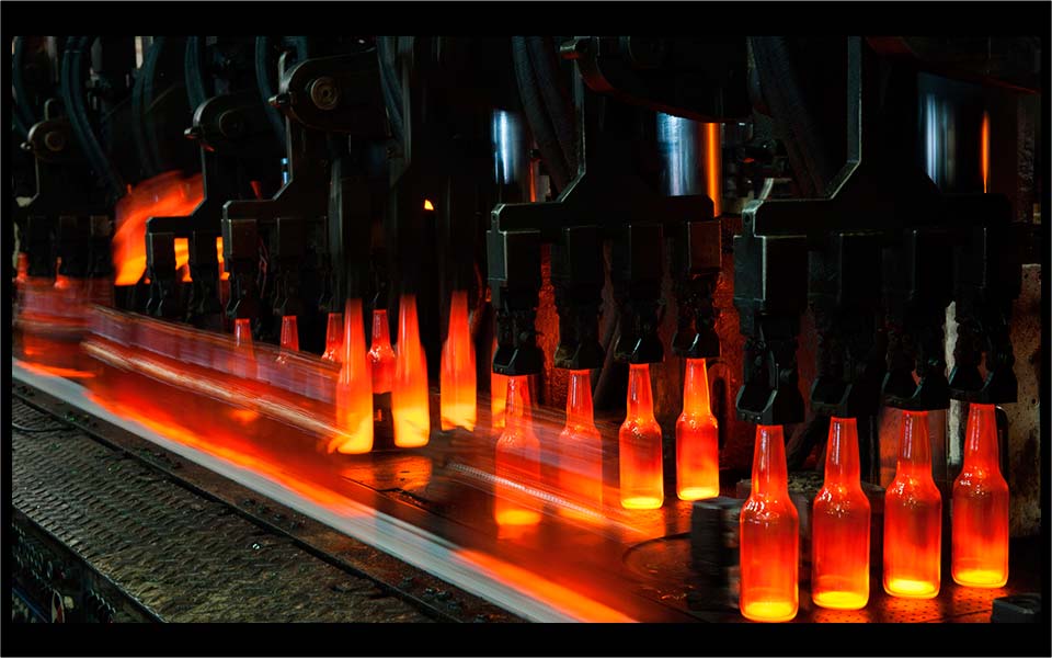
The greatest challenge faced by the creators of the best packaging design was the complexity of the technique used.
It’s a demanding process that requires significant time and expertise.
Nevertheless, it’s the most suitable production method for a packaging project of this caliber, and it posed no issues for mass production.
Credits
The brewery’s name: China Resources Snow Breweries.
Snow Beer is a world-class beer brand, widely recognized throughout China, especially in the south.
The creators of October 2018’s best packaging design are:
Design by Tiger Pan
Illustration by Ping Yi
Assistance by Qian Chi
Conclusions:
As always, this is a space to showcase the very best.
This month, we’ve had the pleasure of featuring October 2018’s best packaging design.
The winners are original projects that address real needs—bold graphic design concepts that go beyond mere aesthetics and bring fresh ideas to the ever-crowded packaging market.