Today we’re diving into the world of law firms to explore what’s trending in law firm logos in Spain and around the globe.
In this article, we’ll take a closer look at the unique aspects of graphic design for law firm logos.
We’ll discuss some of the key visual and symbolic elements used in the legal sector, and later, we’ll showcase a selection of the top law firms in Spain.
Are you a lawyer or run a law firm? Click here for expert advice on elevating your brand image. We’ll review your corporate identity and provide a tailored action plan for improvement.
After that, we’ll present our curated list of the best law firm logos we’ve seen to date.
No spoilers, but trust us—these are worth a look.
The Best Law Firm Logos
Before we get to the highlights, let’s set the stage with some background on the industry.
Like any sector, law firms have their own distinct characteristics and are rich in symbolism, much of which is reflected in law firm logo design.
Symbolism
- Ostrich feather
- Scales of justice
- Palm tree
- The number XII, symbolizing perfection
- Gavel or bell
Ostrich Feather
This symbol dates back to ancient Egypt and represents Maat, the goddess of truth and justice.
Ostrich feathers are straight and uniform, symbolizing impartial judgment.
In ancient Egyptian courts, judges would point a feather toward the party deemed to be in the right.
Scales of Justice
As you might expect, the scales represent the balance of justice.
They weigh different perspectives on the same issue.
Often, the scales are depicted with a central sword.
Palm Tree
This Christian symbol represents uprightness and transcendence, reaching toward the heavens and standing above us all.
XII, the Number of Perfection
This number is associated with absolute perfection and, in law, symbolizes the ability to give each party what they deserve.
Gavel or Bell
The gavel is of Anglo-Saxon origin and is familiar from movies, while in Spain, the bell is used—a symbol with Christian roots.
Beyond these, there are other, less common symbols you might encounter in law firm logo designs, such as:
- Lions
- Columns
- Fountain pens
- Ties
- Globes
- Wading birds
- Reptiles
- Worms
- Set squares
- Compasses
- Doves
- Horses
As you can see, the legal profession is steeped in symbolism, offering a wealth of elements to use—or avoid—when creating a law firm logo.
Now, let’s take a look at some of the leading law firms in Spain.
I’ve selected a few well-known firms and gathered a showcase of their logos.
Spain’s Most Renowned Law Firms
Arriaga Asociados
Manuel Conthe
Roca Junyent
Fundación Fernando Pombo
Are you a lawyer or run a law firm? Click here for expert advice on elevating your brand image. We’ll review your corporate identity and provide a tailored action plan for improvement.
Marcos García Montes Law Firm

Vila Torres
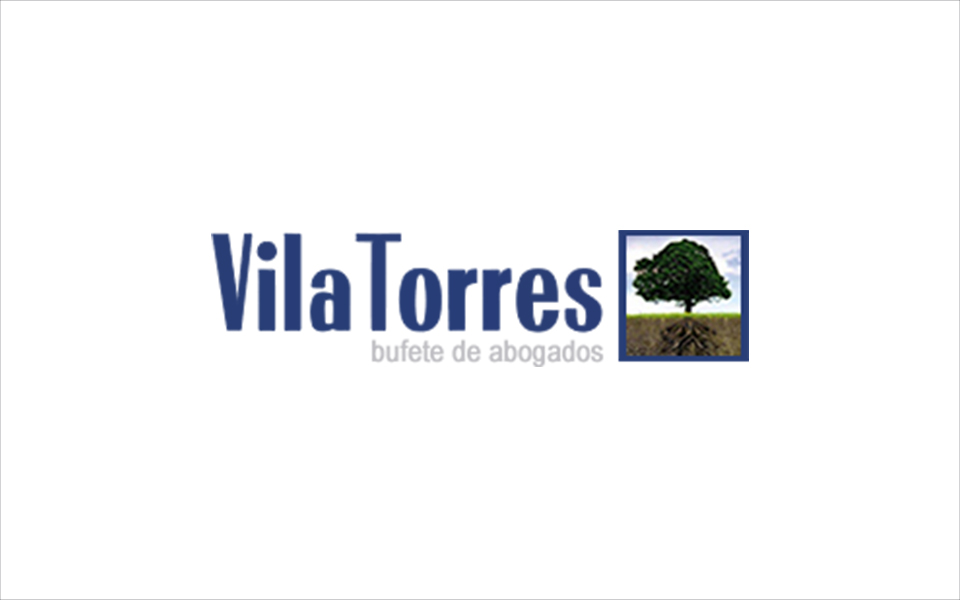
As you can see, there’s plenty of room for improvement (just being honest). There’s still a lot of work to be done in Spain, which is encouraging for a graphic designer like me, but it’s a shame that the visual identity doesn’t always reflect the quality of the services offered.
With that in mind, let’s move on to our own selection of the best law firm logos.
Are you a lawyer or run a law firm? Click here for expert advice on elevating your brand image. We’ll review your corporate identity and provide a tailored action plan for improvement.
The Best Law Firm Logos
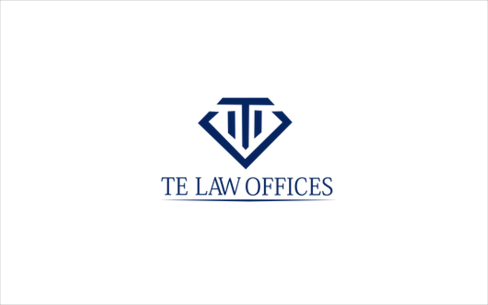
1. Te Law Offices
This logo design breaks away from traditional legal symbols, focusing instead on the firm’s initial, stylized as a column.
It’s a minimalist logo that conveys strength and confidence.
Exactly what you want when entrusting someone with your legal security.
The chosen typography also reinforces this sense of strength and reliability.
If I’m ever accused of stealing a chicken, I know who I’ll call.
A standout logo that deserves its place among the best law firm logos today.
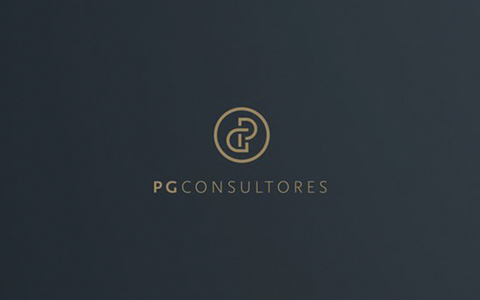
2. PG Consultores
This logo is another excellent example for our list of the best law firm logos.
Like the previous logo, this logo design also avoids clichés.
By playing with the “P” and “G” in the name, they’ve created a shape that symbolizes unity and purpose—all within a powerful circle.
The typography is a well-chosen, modern sans serif that complements the design.
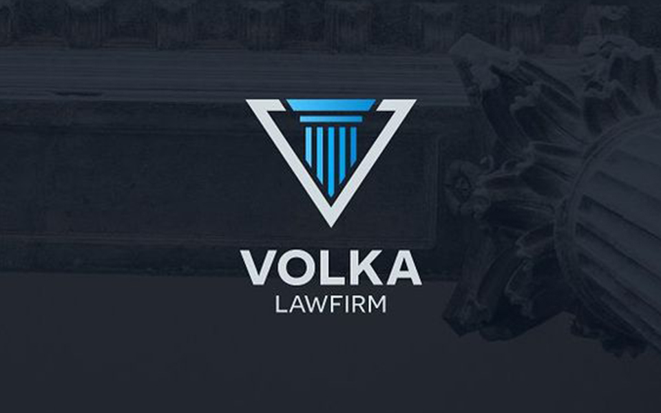
3. Volka Lawfirm
This law firm’s logo also caught our attention.
Volka Lawfirm uses less common symbols—a column and a divine triangle—to create a logo design that earns its spot among the best law firm logos.
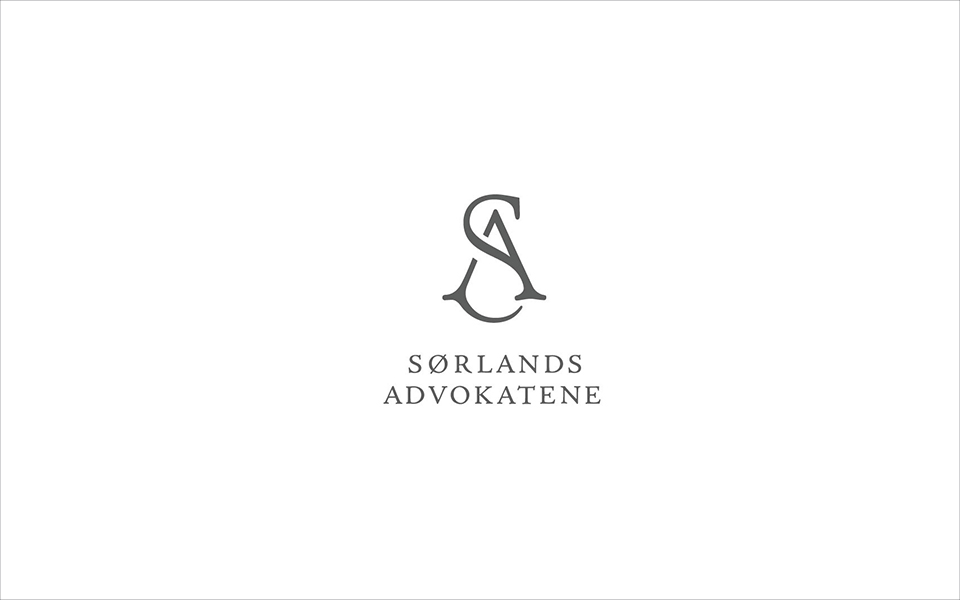
4. Sorlands Advokatene
One of my personal favorites from this list of best law firm logos, Sorlands Advokatene stands out with a highly distinctive design that breaks away from the usual law firm logos.
A bold choice for anyone who wants a law firm that truly stands apart from the competition.
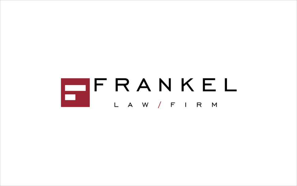
5. Frankel Lawfirm
Finally, we have the logo design for Frankel Lawfirm.
This design is minimalist in both concept and execution, making it a strong contender for our list of the best law firm logos.
The logo features an abstract “F” that can also be seen as a stack of law books.
The typography is highly functional—perhaps not the most distinctive, but it certainly conveys strength and unity.
Conclusions:
As we’ve seen, the legal sector is unique, with its own symbols and traditions.
Our tour of the best logos worldwide also highlights that, in Spain, there’s still plenty of room for improvement when it comes to law firm logos.
It’s a promising field where a talented graphic designer can truly make an impact.
But above all, if you ever find yourself in trouble, make sure to hire a top firm to protect your interests.


