We’ve cleansed our faces and set out to discover the best beauty packaging and product of the month. Care to join us?
In this article, we’ll explore one of the most dynamic sectors—a true playground for creatives of every discipline, especially those specializing in product design and packaging design.
In the beauty industry, the line between packaging and product design is increasingly blurred, merging into a single, inseparable entity. The final product must seamlessly unite both disciplines to deliver maximum impact.
Let’s dive into our monthly picks as we search for the best beauty packaging and beauty product design of the month.
The best beauty packaging
CHIOTURE
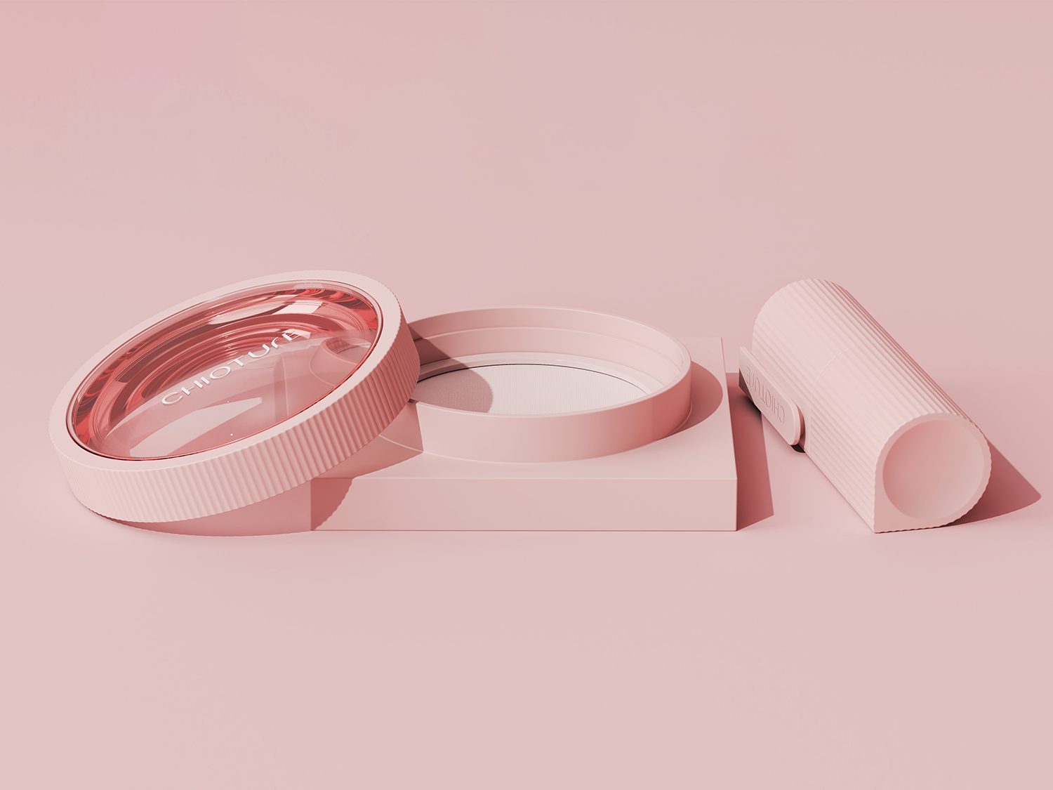
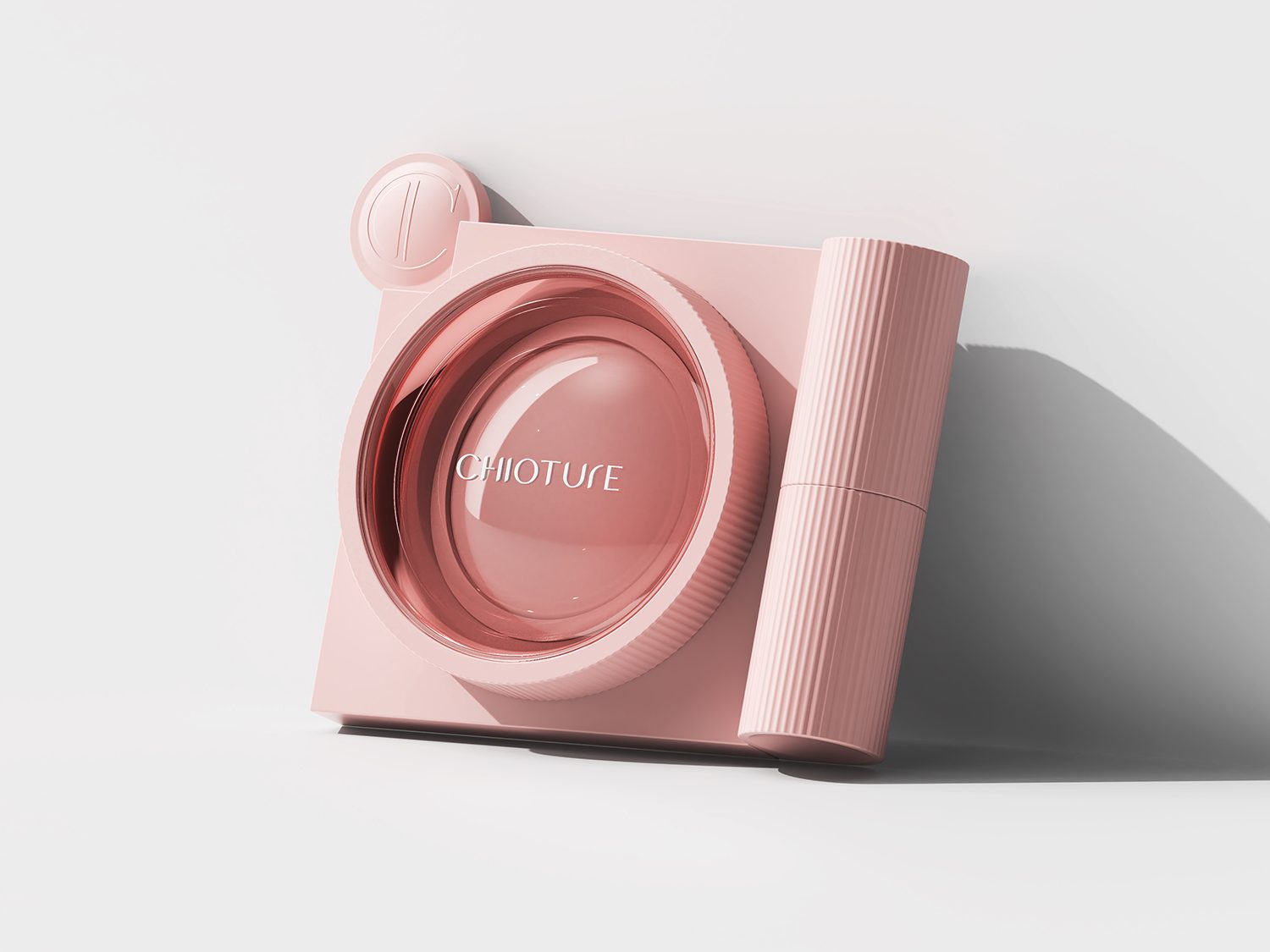
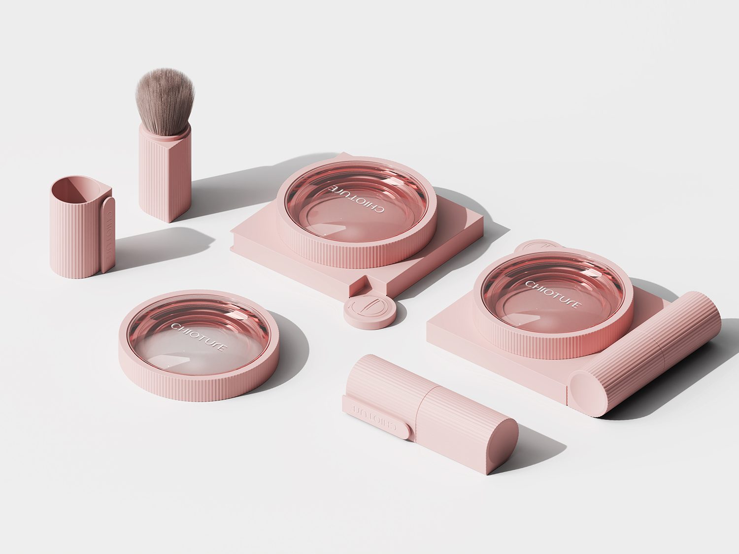
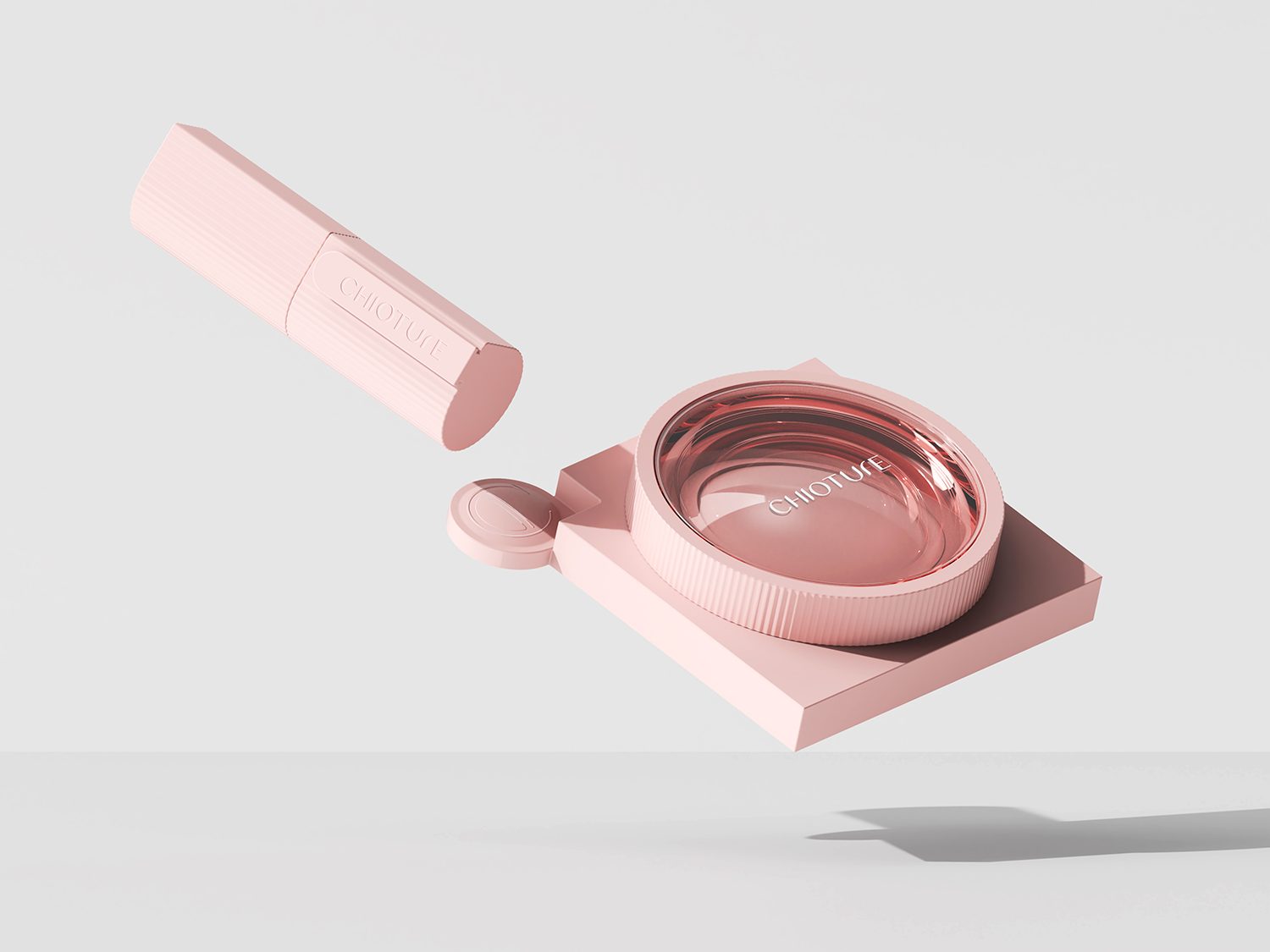
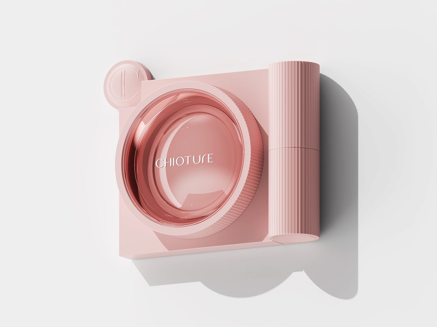
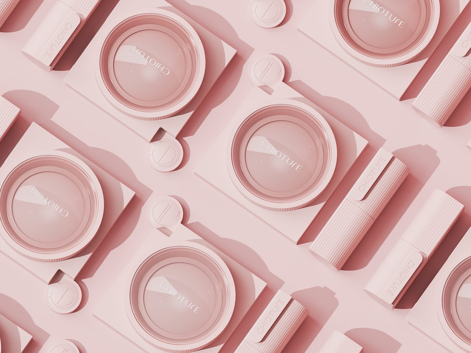
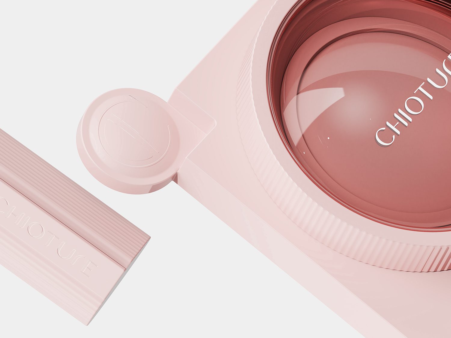
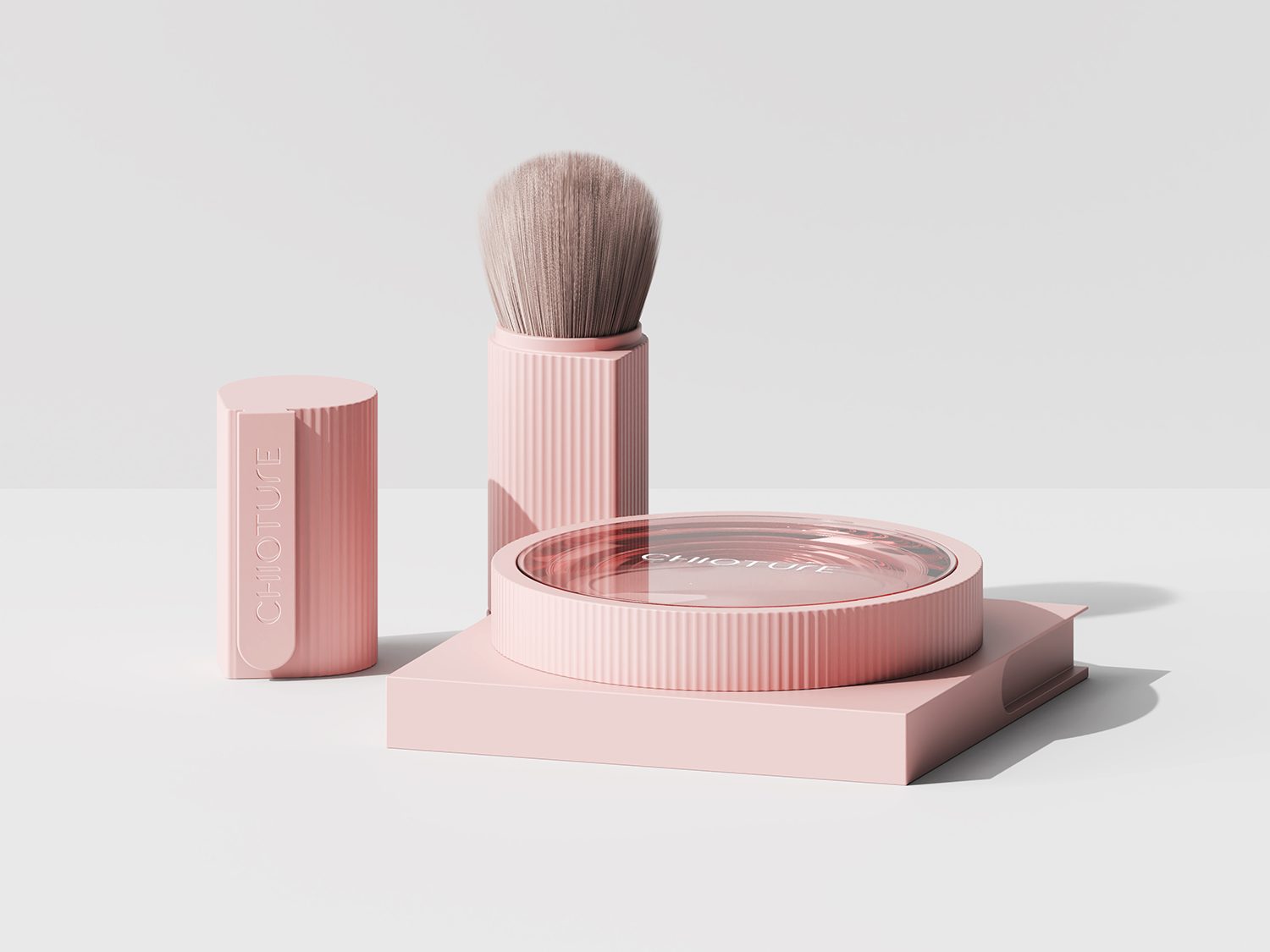
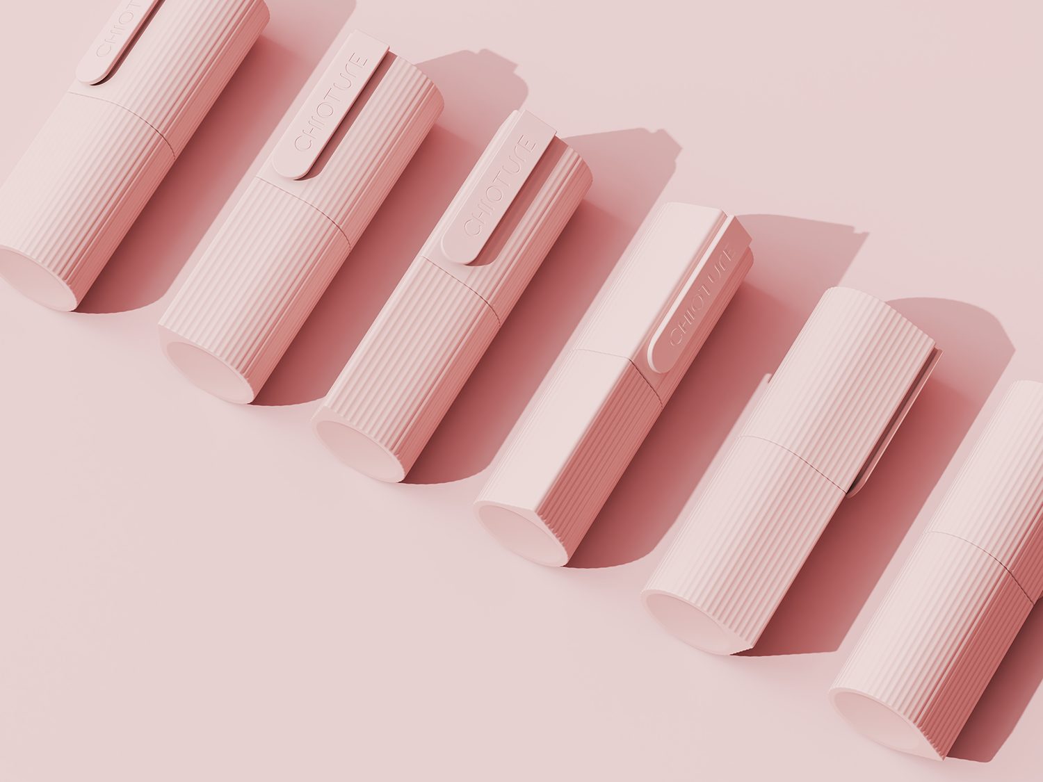
Beauty product design by creative studio Nx Creative
A highly appealing beauty product design for this makeup brand, targeting a young and energetic audience.
The product’s soft lines contrast with its interactive features, creating a unique beauty experience.
Project highlights:
- Color selection
- Logo and product name integration
- Transformative elements
- Visual appeal
This beauty sector product design has received:
Truly among the best in beauty packaging and product design right now.
Project insights
The beauty packaging design draws inspiration from a camera.
To open the product, you unscrew the lens from the light.
The brush handle can be placed in the “brand icon viewfinder.”
The name “Chioture” is a blend of “Chic” and “Capture.”
SIMPLY COSMETICS
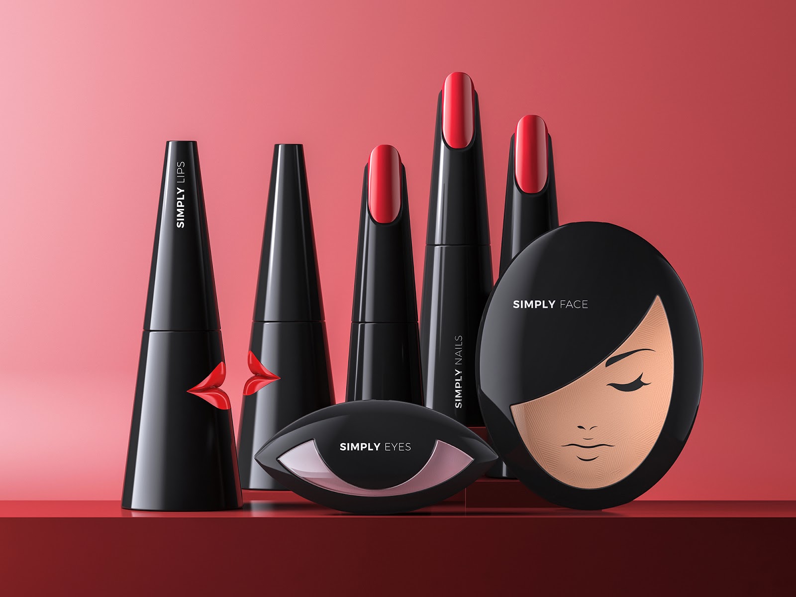
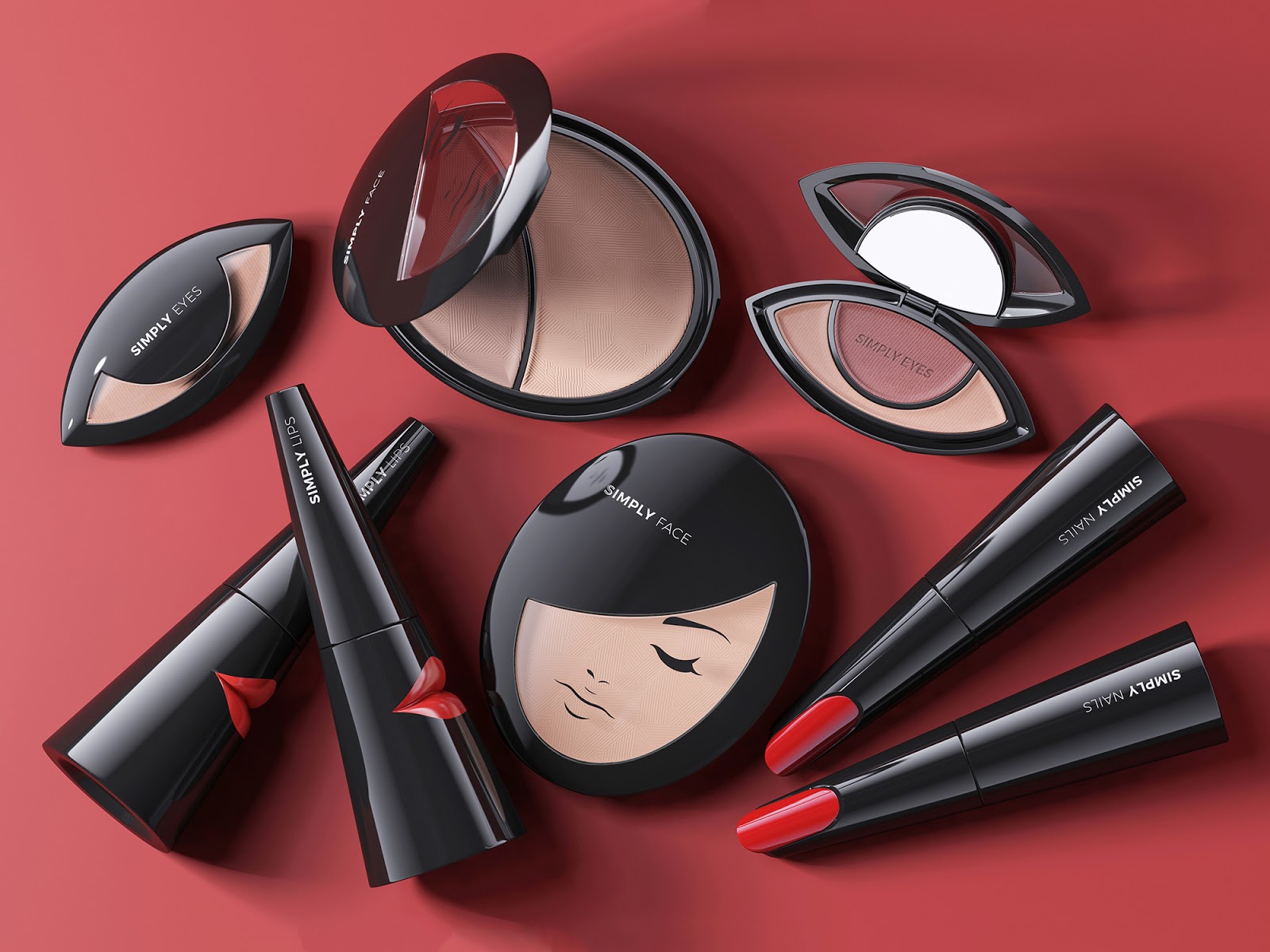
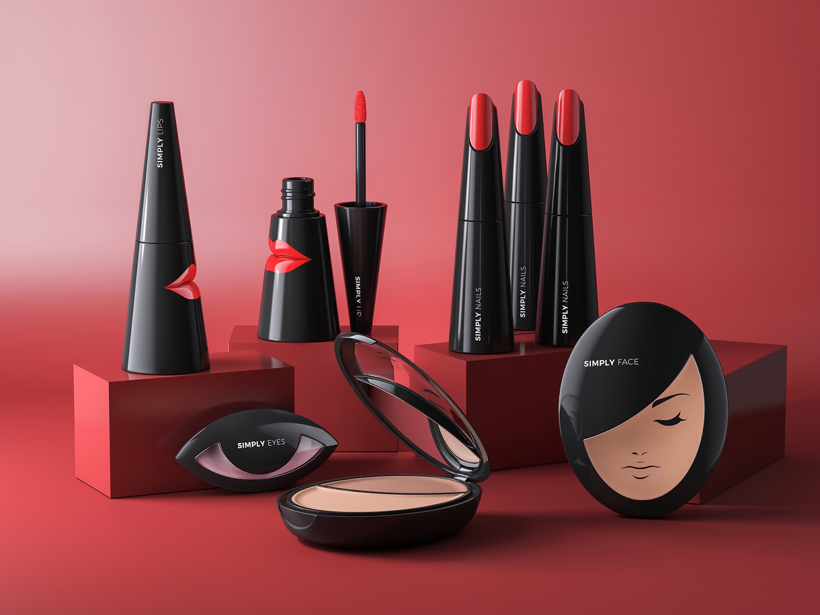
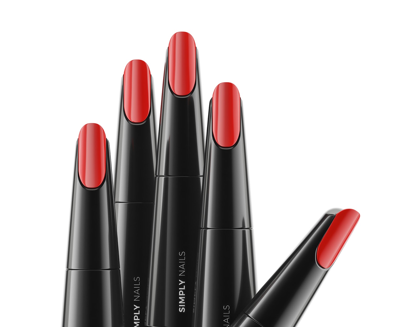
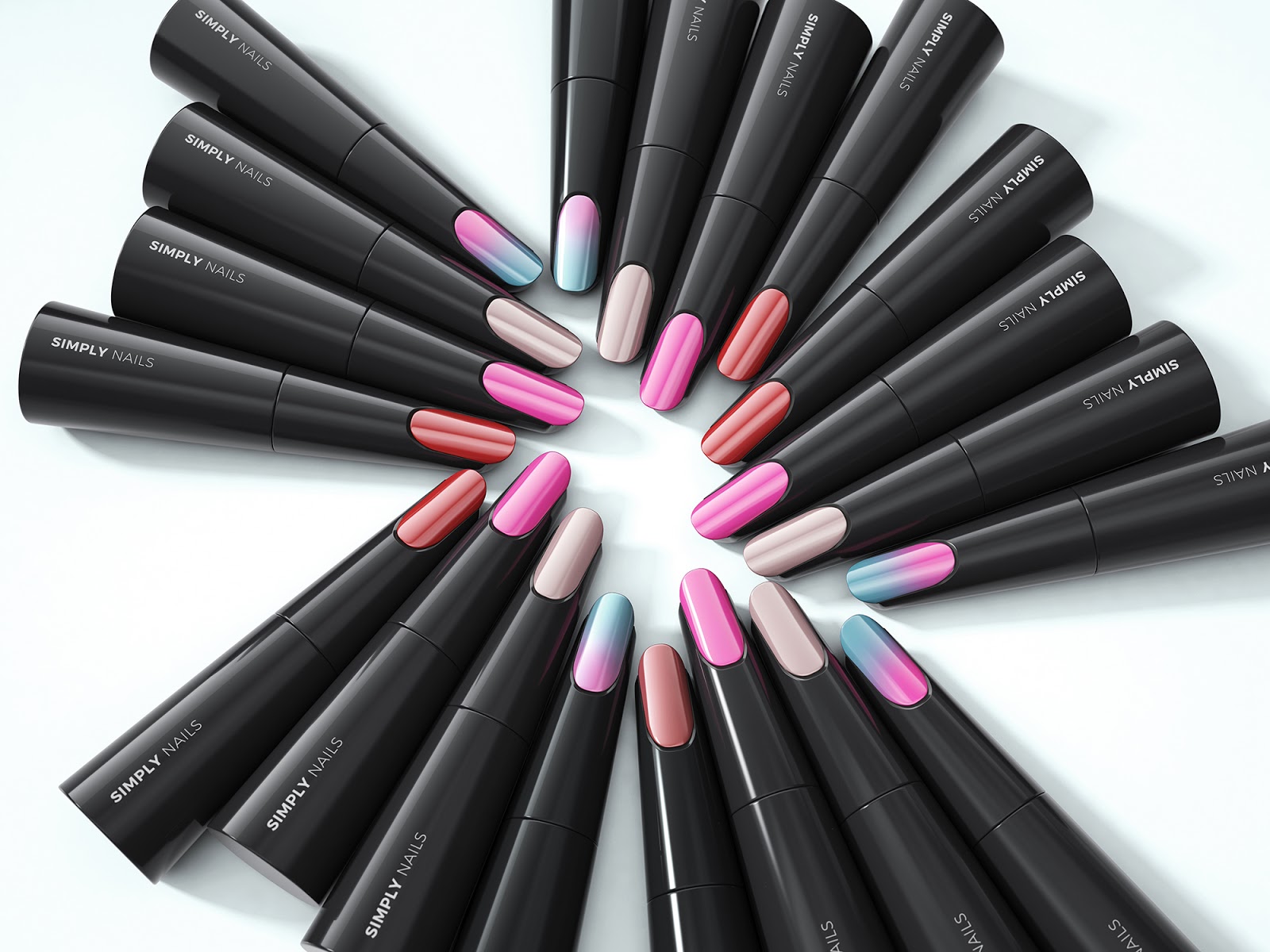
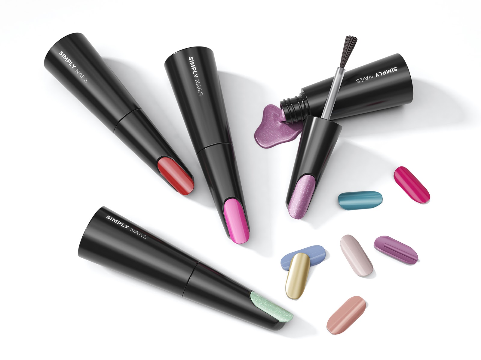
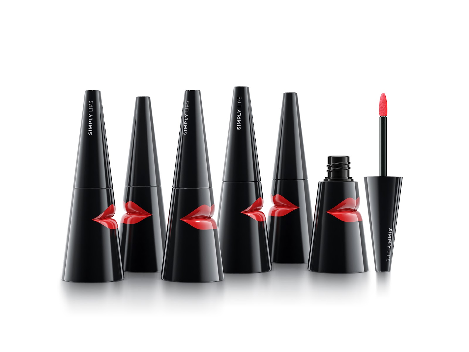
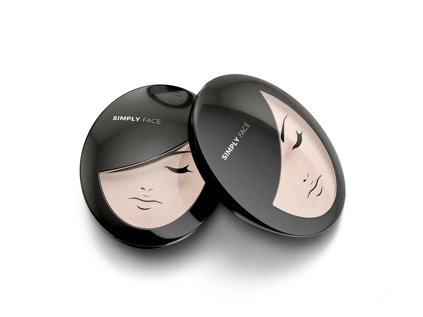
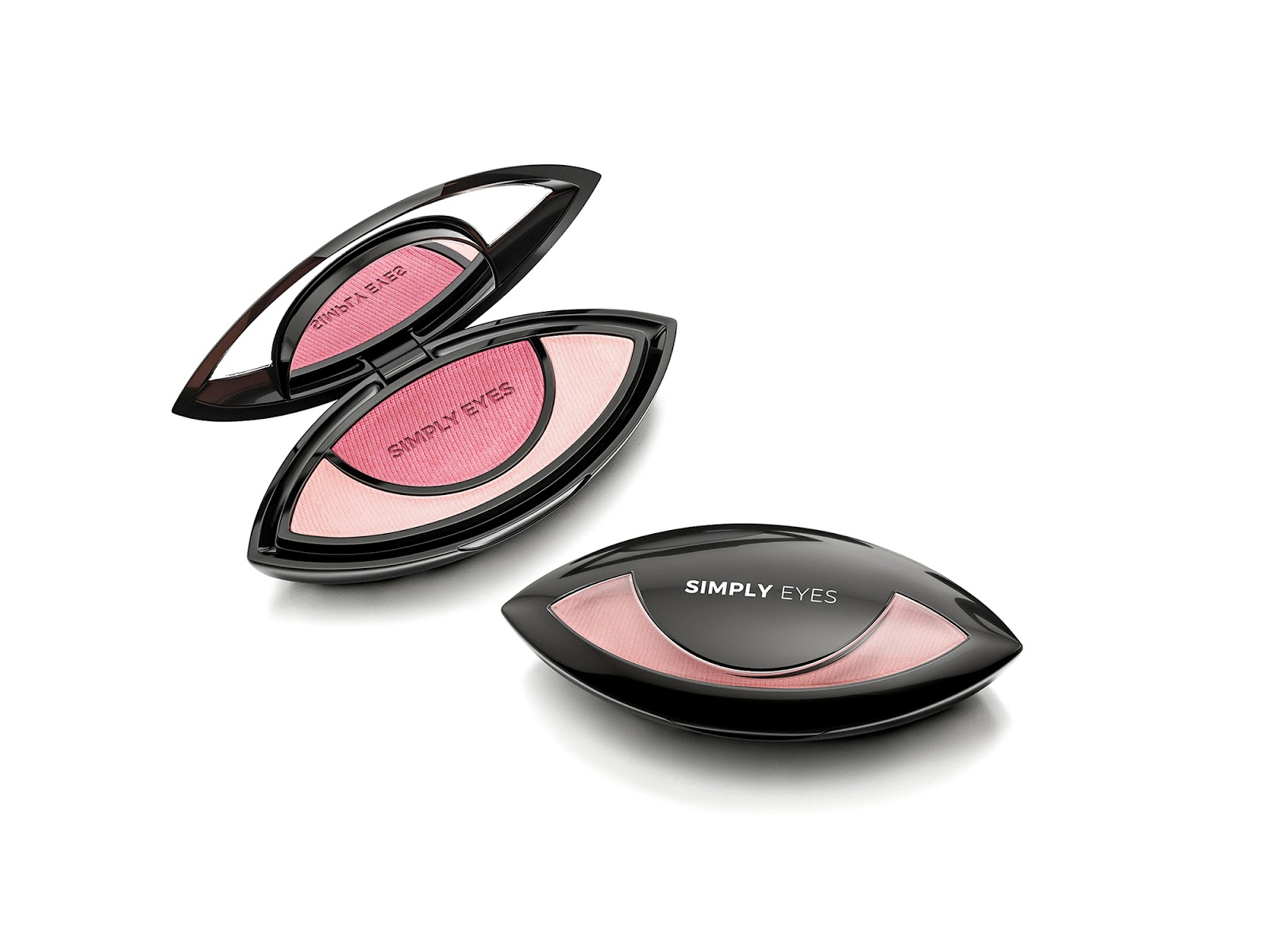
Packaging and product design for the beauty sector by packaging design specialists Sol Benito
The aim was to create an innovative line of cosmetics, with each product communicating its purpose in a simple, distinctive way.
Each item in the range has its own unique shape and design, perfectly aligned with its function. The result is a collection that’s visually striking, dynamic, and fresh.
Project highlights:
- Design of each element
- Product branding
- Product finishes
- Color palette
- Shape
- Product concept
This graphic design has been awarded:
And also featured in:
Another packaging design worthy of our monthly selection—truly among the best beauty packaging for July.
Project insights
The concept: sometimes a product doesn’t need words—it should speak for itself.
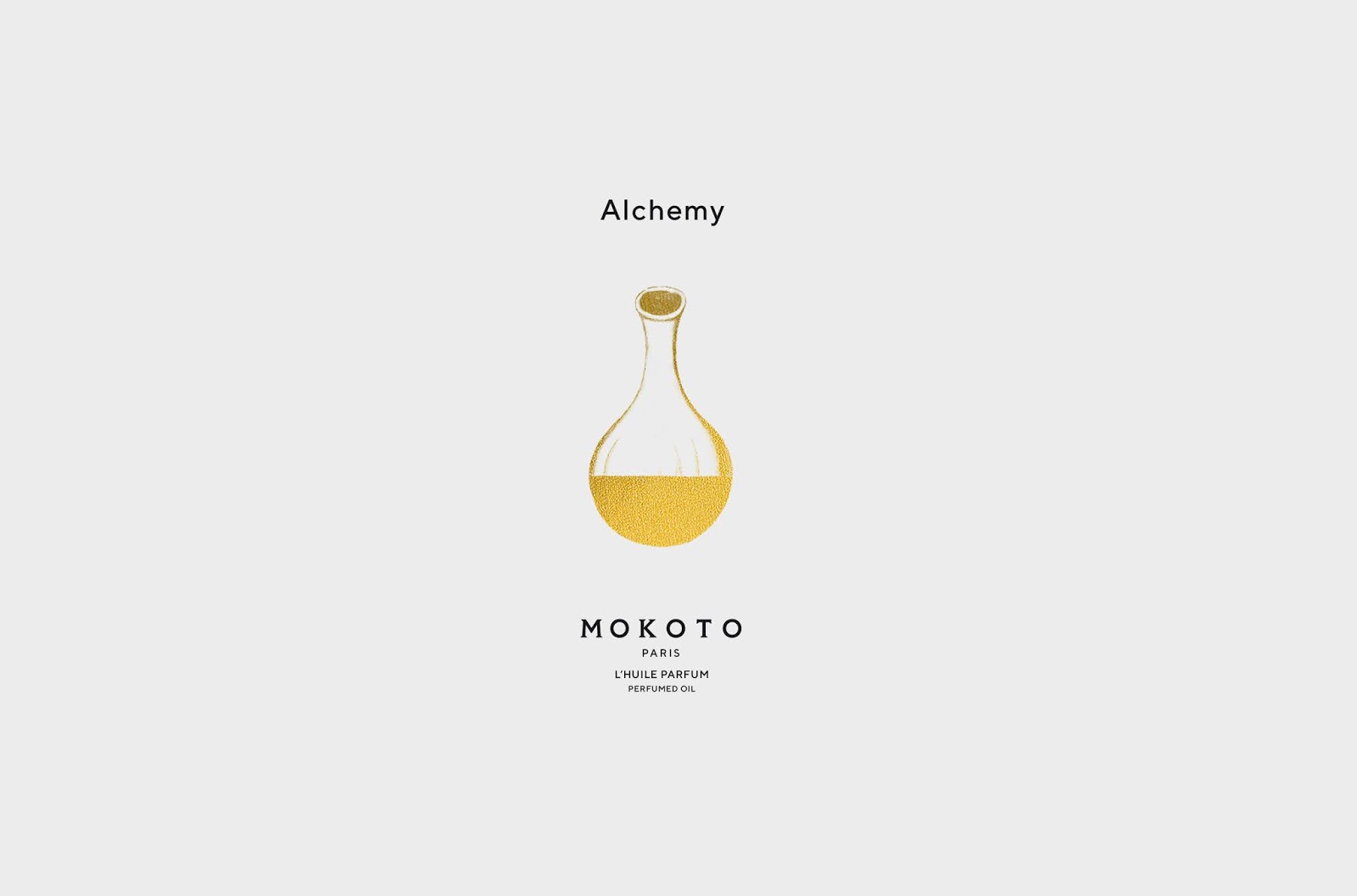
MOKOTO
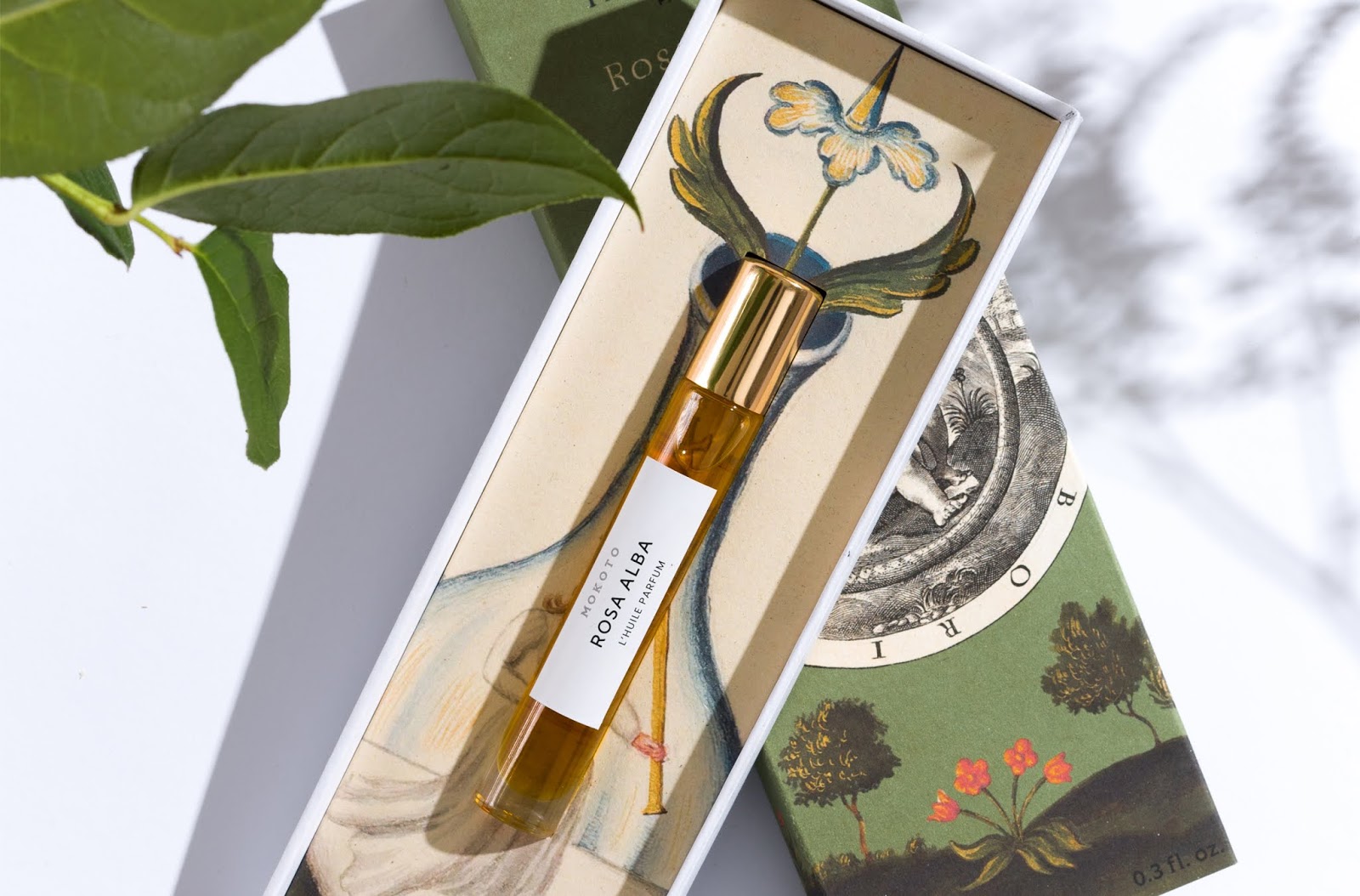
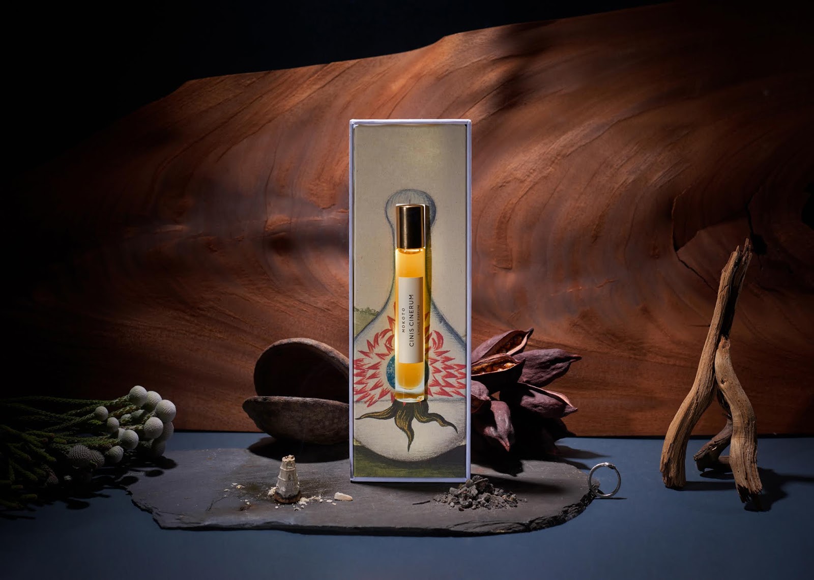
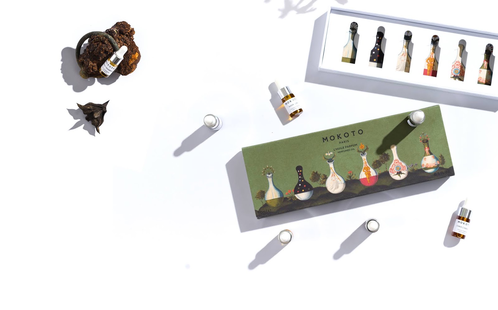
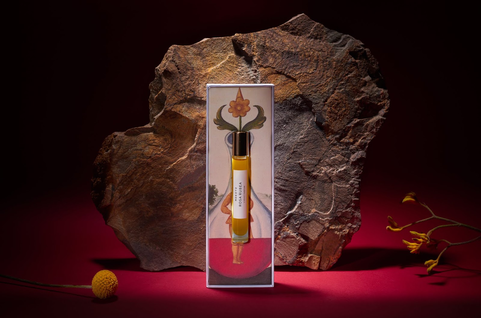
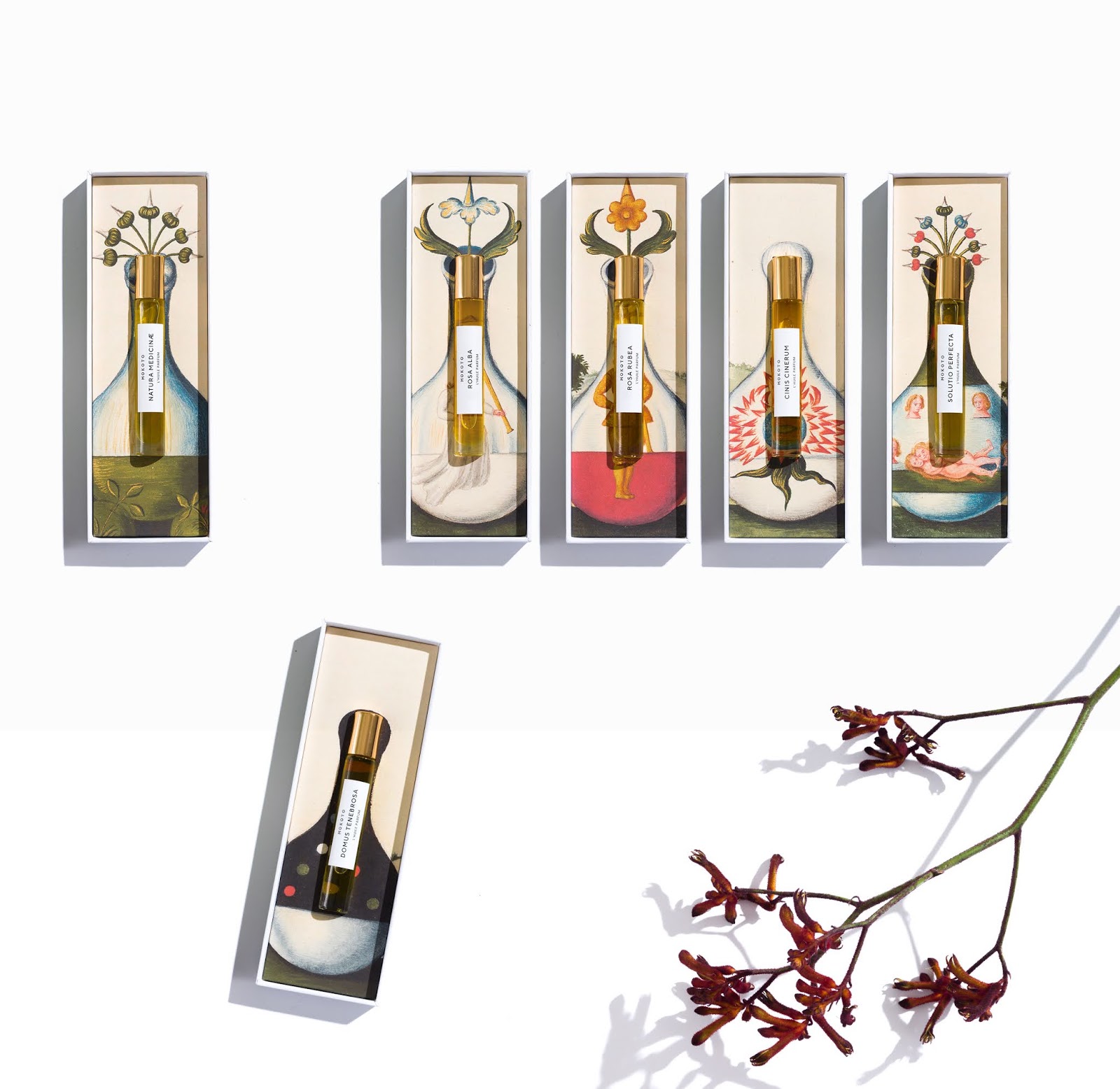
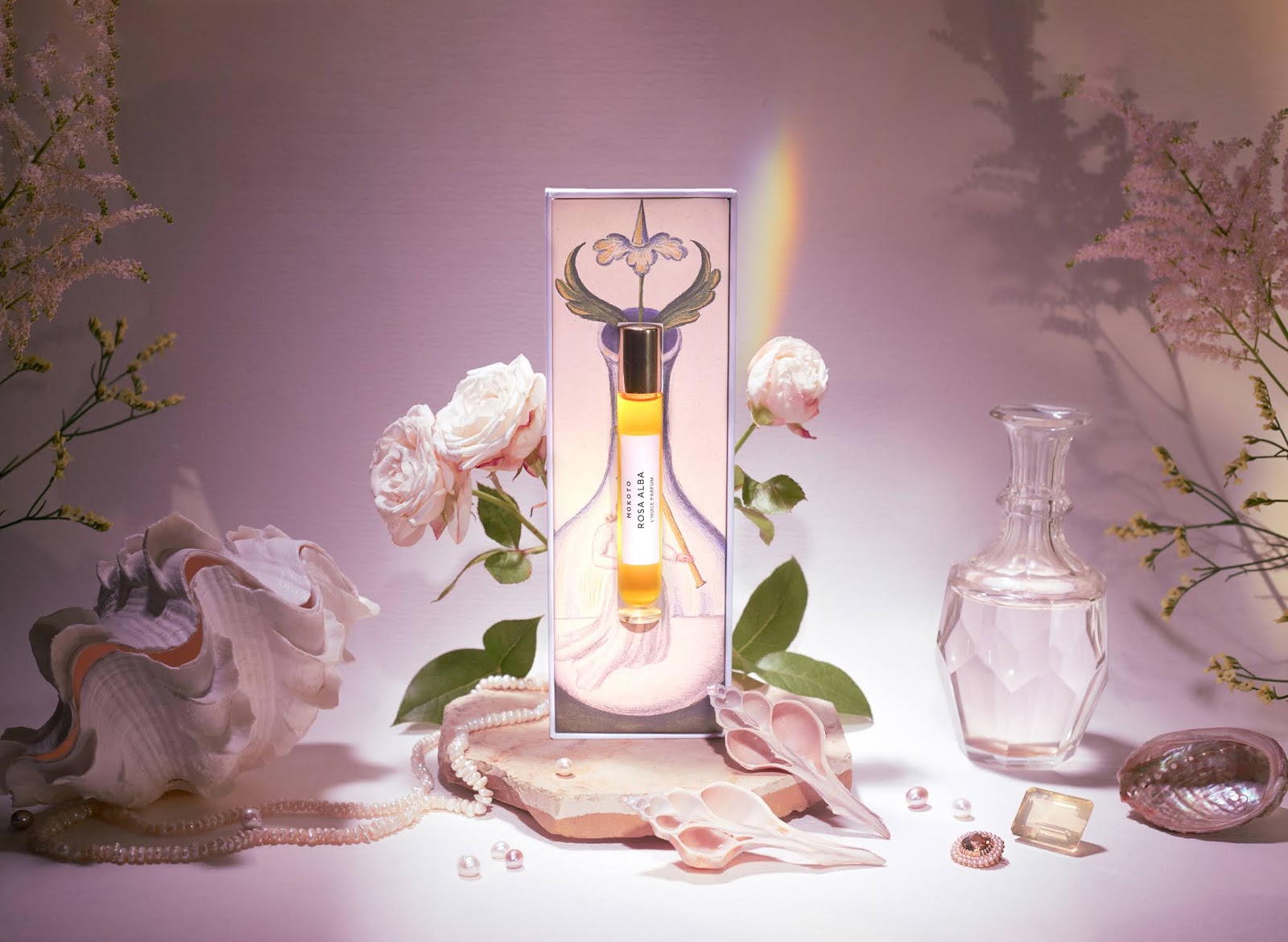
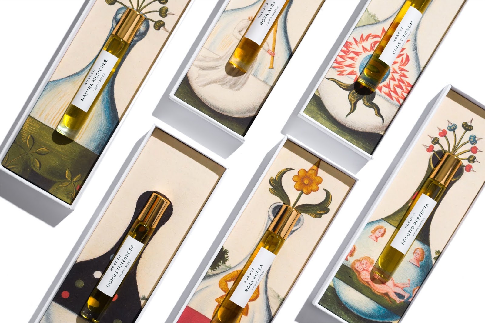
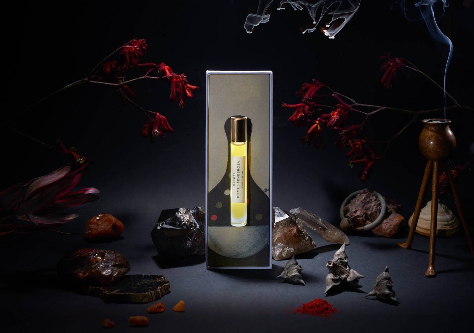
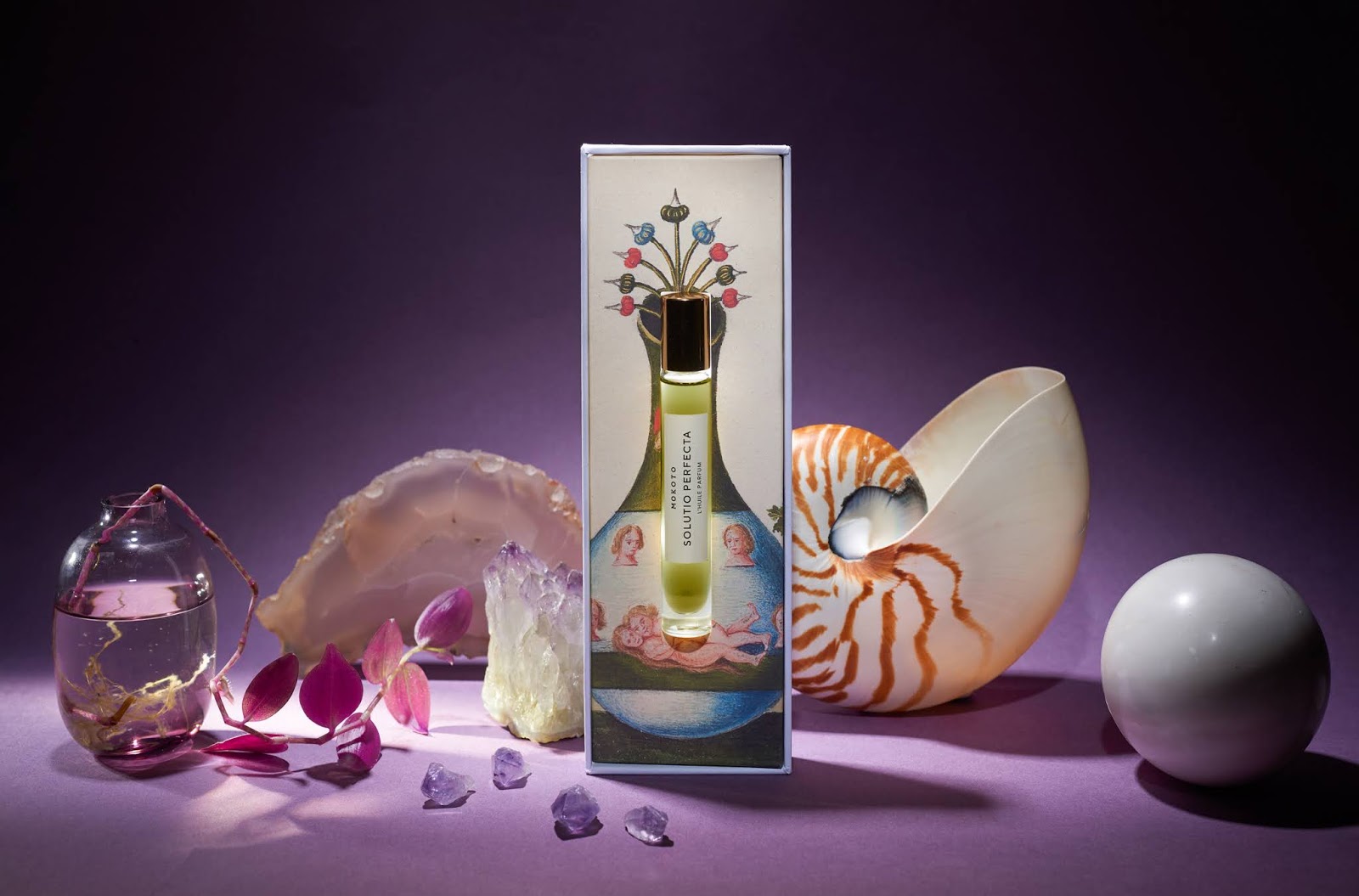
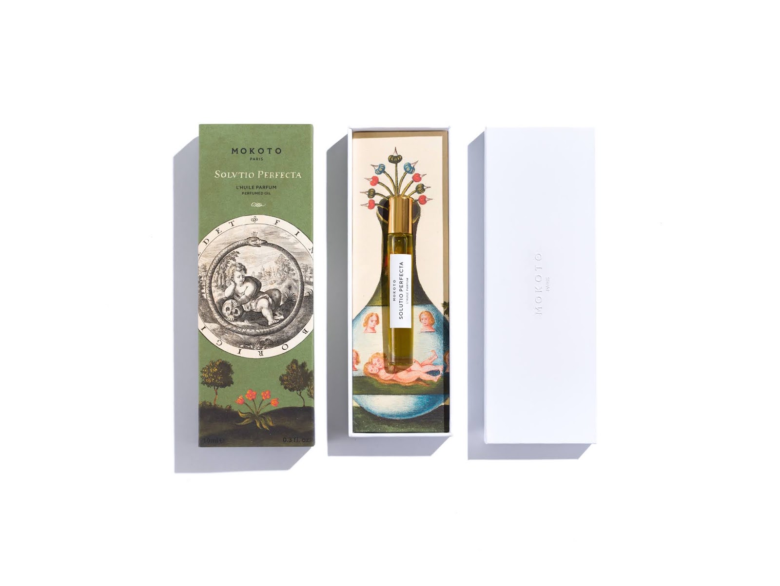
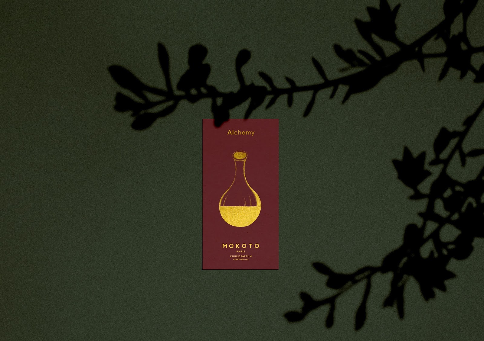
Graphic design by Igor Kubik
The packaging design and beauty product design feature soft, muted colors. The box is crafted from high-quality white corrugated cardboard.
The bottle is simple, elegant, and transparent to showcase the natural color of the beauty oil.
The packaging box comes in a printed sleeve made from uncoated recycled paper, reminiscent of vintage packaging.
Project highlights:
- Product line
- Set of illustrations
- Visual treatment
- Product presentation
- Bottle selection
- Finishes and materials used
This project was selected as one of the best beauty packaging by:
Project insights
The illustrations are inspired by six images created by Georgius Aurach in 15th-century Argentina.
Each image represents a step in the alchemical process to create the philosopher’s stone.
All production is done by hand to minimize energy use and reduce environmental impact.
SK:LK SKIN CARE
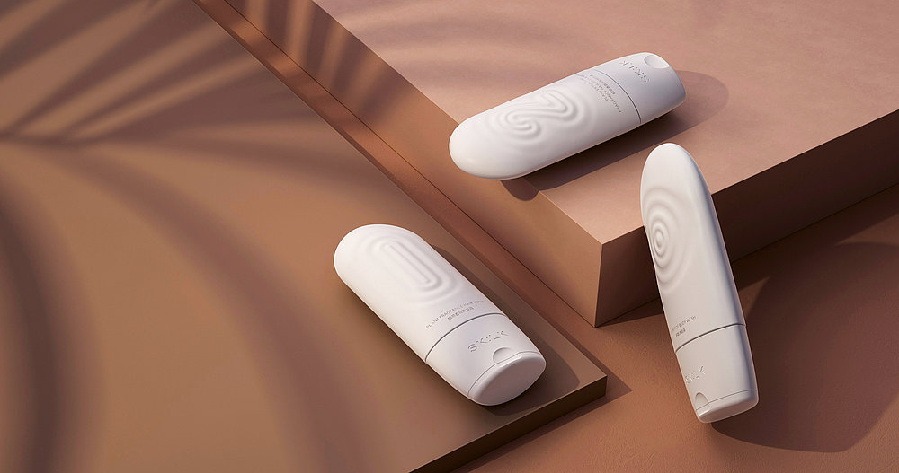
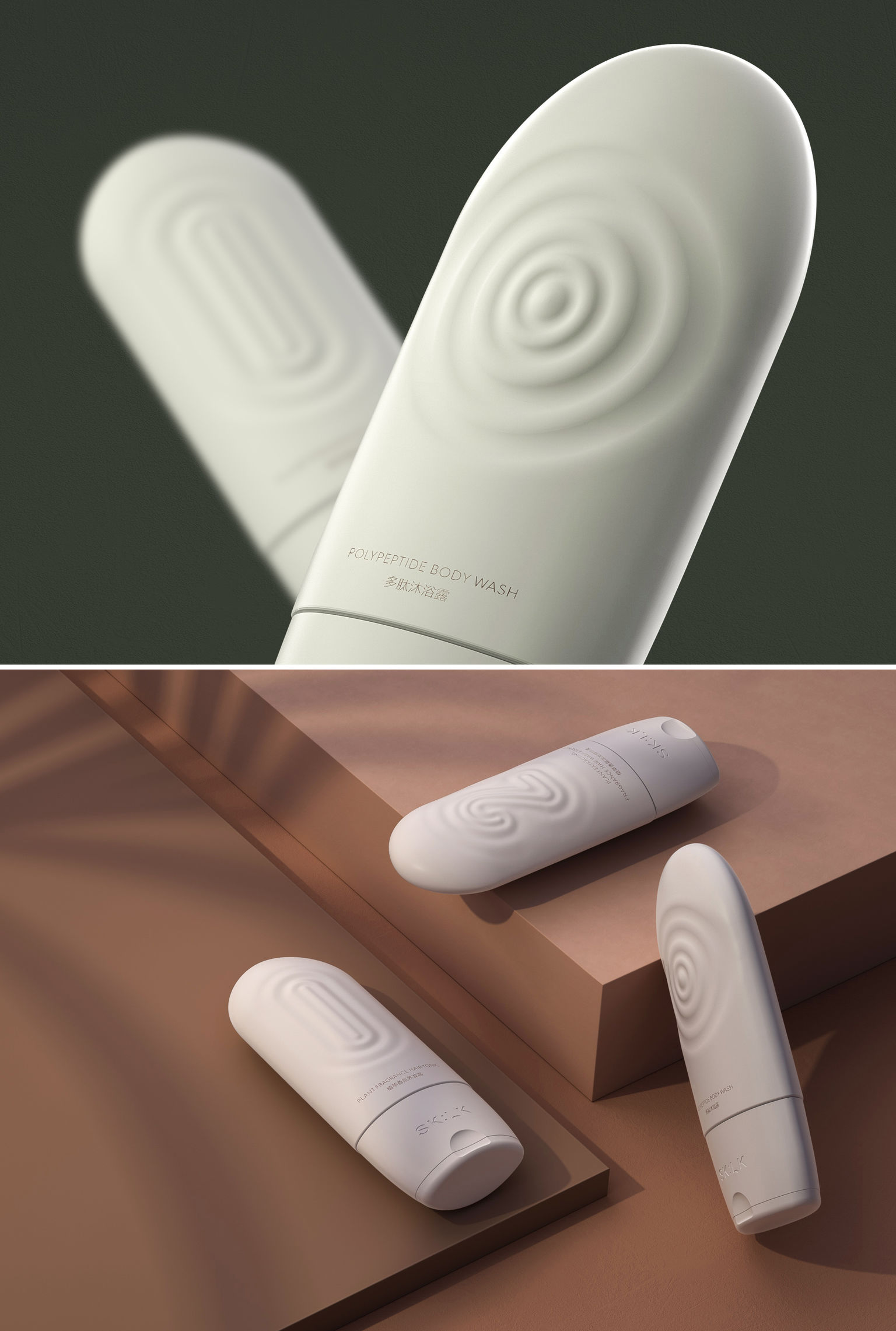
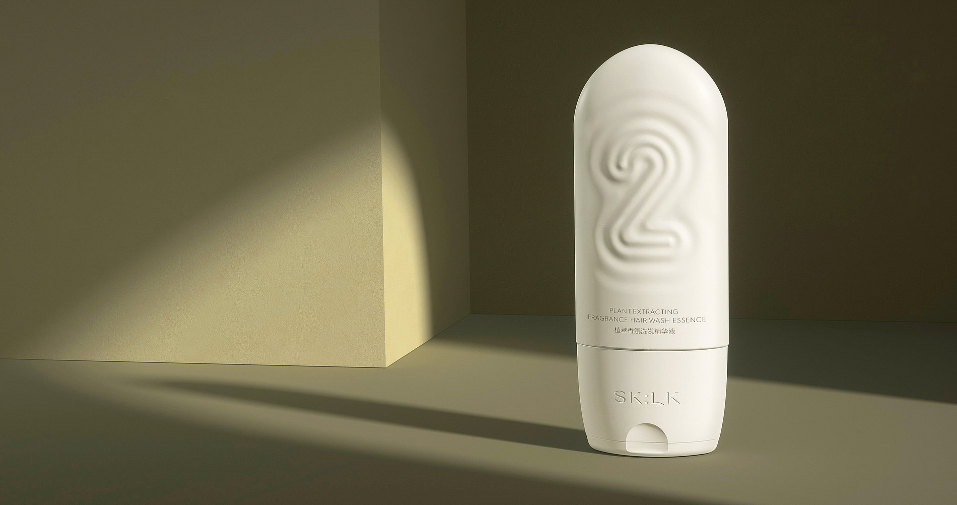
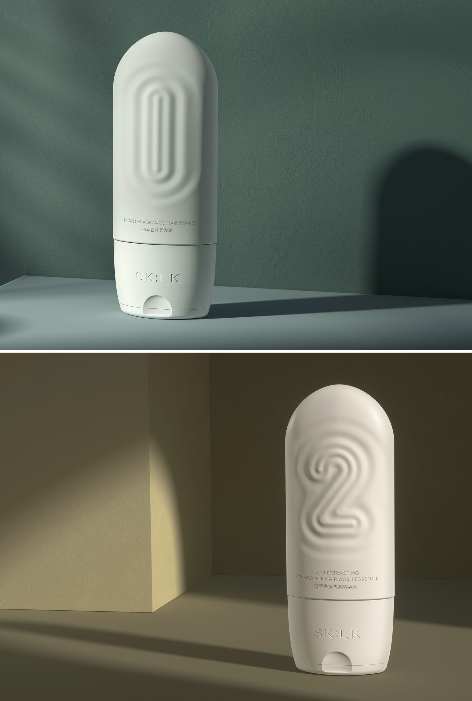
Graphic design by Shanghai Version Design Group
This body care series includes three products, all part of a cohesive packaging and beauty product design concept.
The design language is simple, clear, and instantly recognizable, with matte finishes and eco-friendly materials.
Project highlights:
- Visual appeal
- Design of each element
- Product branding
- Product finishes
- Color palette
- Shape
- Product concept
This beauty packaging has been recognized and awarded by:
BRONZE EDAWARDS – EUROPEAN DESIGN in Branding and Digital Identity Application
A refined packaging design, well-deserving of its place among the best beauty packaging this month.
Project insights
Each product is assigned a number from 0


