A crypto piece that doesn’t act like a crypto piece
AliceNet sidesteps the usual blockchain tropes: no cold neon, no stiff financial charts, no visual complexity masquerading as credibility. This is a different game. Deep purple, triangular geometry, crisp white, digital forms with rhythm, and a layout that feels more like an editorial campaign than a technical product.
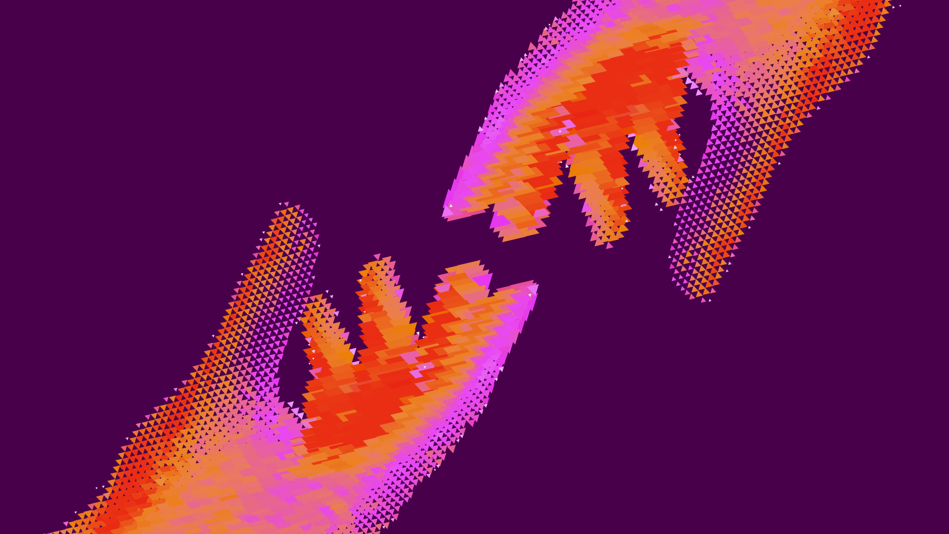
The magic lies in turning a hard-to-sell idea into something memorable. The identity doesn’t try to explain everything; it creates an atmosphere. And for a B2B brand, that’s invaluable: when the product is abstract, visual direction can open doors before any sales pitch.
This is a reference to enjoy. Color, visual rhythm, typography, composition, implied motion, identity, and that sense of a finely tuned system. We’re not here to dissect it like an audit. We’re here to appreciate it as you would a standout piece of visual direction: looking for what makes it recognizable, desirable, and impossible to confuse.
AliceNet — an identity that turns geometry into personality
The first impression is like a poster for sleek technology. No dashboard overload, no cheap futurism, no off-the-shelf crypto iconography. AliceNet builds its presence from a highly distinctive palette: a near-night purple background, high-contrast white, and warm gradients of orange, magenta, and red. It’s a combination that pushes the brand into more editorial territory, away from the purely financial.
Triangular geometry is the organizing gesture. It appears as symbol, texture, creature, 3D object, pattern, and campaign language. This gives the identity a huge advantage: it’s recognizable before you even read it. In a space where many tech brands sound the same, having a unique shape is a way to claim mental real estate.
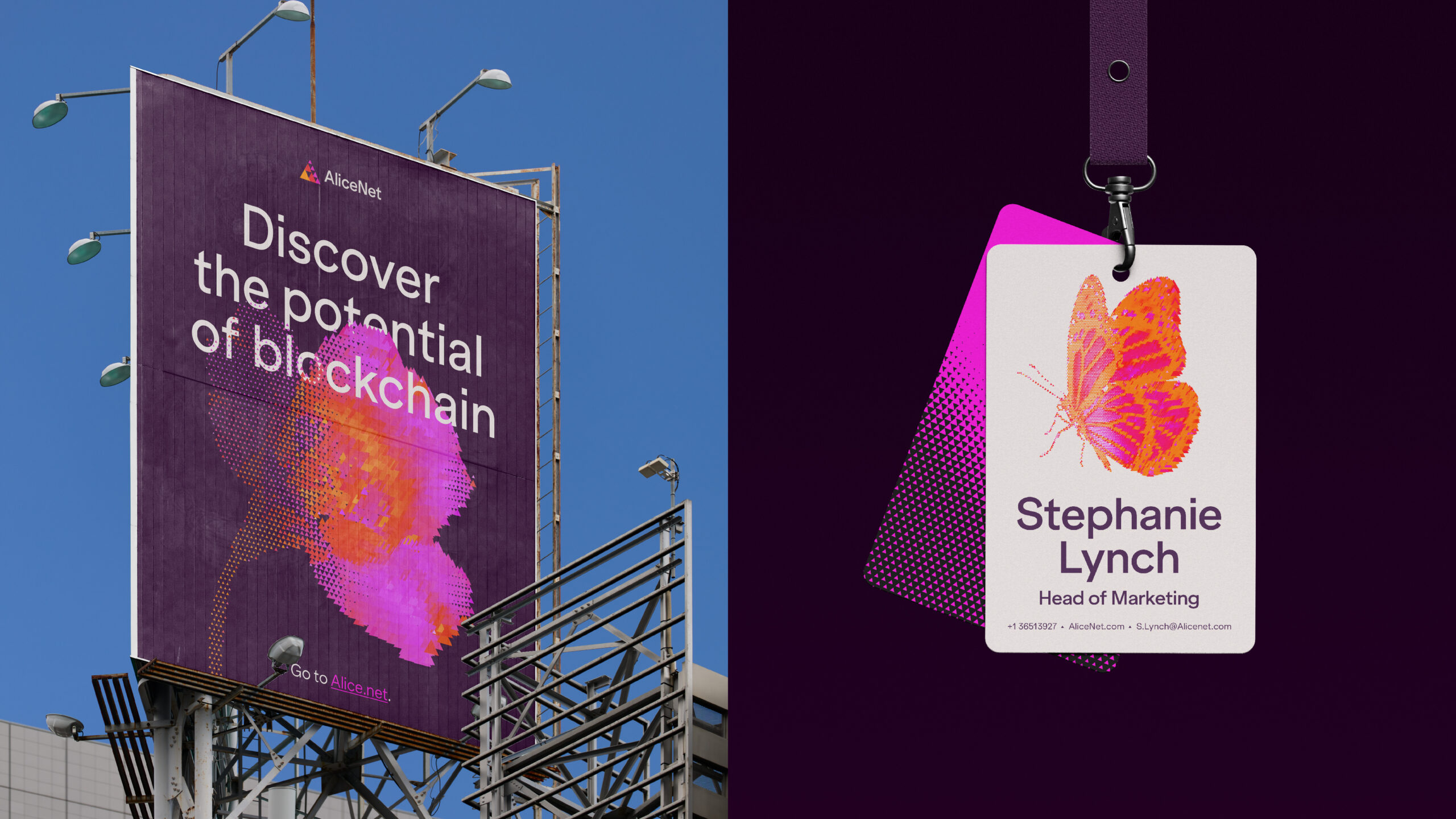
The system works because it’s not confined to a screen. The brand shows up on billboards, badges, laptops, graphic pieces, and elements that feel generated by its own visual engine. This blend of physical and digital gives it scale. It doesn’t look like a one-off landing page: it feels like an identity built for campaigns, products, events, sales, and corporate presentations.
The composition borrows from editorial showcases. The pieces breathe in generous blocks, with clean backgrounds and objects staged like the stars of a magazine spread. The design doesn’t try to tell everything at once. It prefers to set a mood and let the eye connect the dots: logo, headline, shape, texture, device, application. That visual rhythm makes the experience easy to navigate.
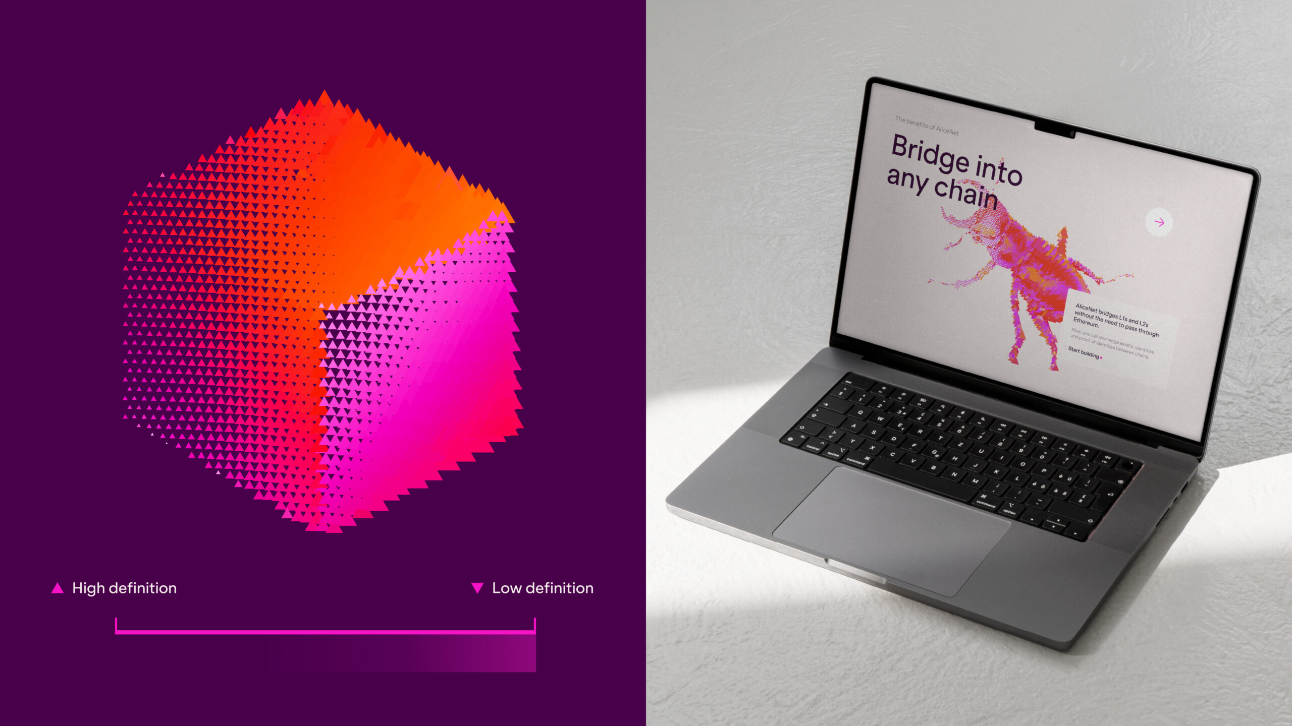
Here, the interface doesn’t compete with the identity—it complements it. The laptop acts almost like a window: enough to suggest a digital experience, but without turning the piece into a functional demo. For UX/UI, the clarity is in the hierarchy: strong contrast, few elements vying for attention, and a visual direction that guides without overwhelming.
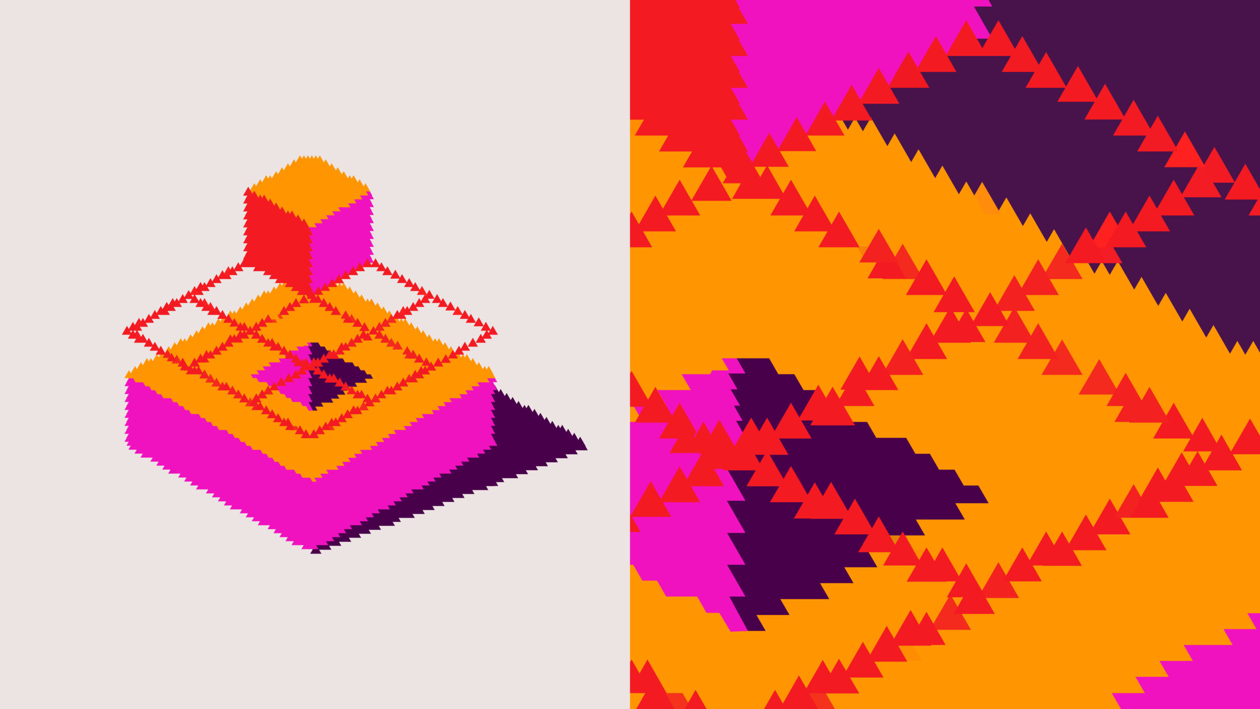
The 3D objects have a unique quality: they sit between technical structure and organic form. They’re not just abstract decorations. They have texture, volume, density, and an energy that hints at transformation. Even without animation, motion is implied. The shapes seem to morph, open, assemble, or shift definition.
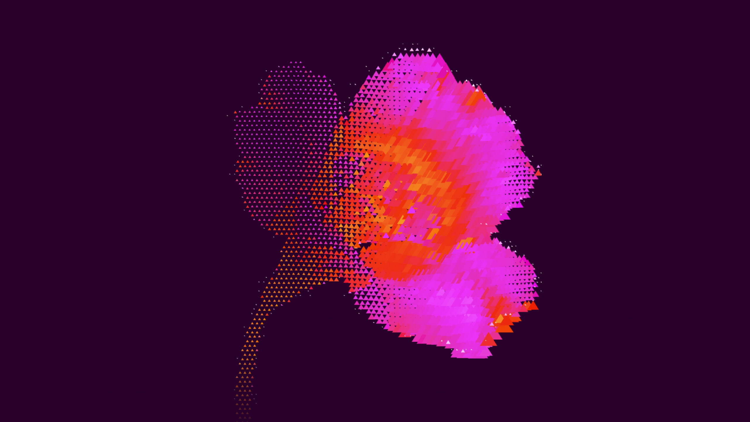
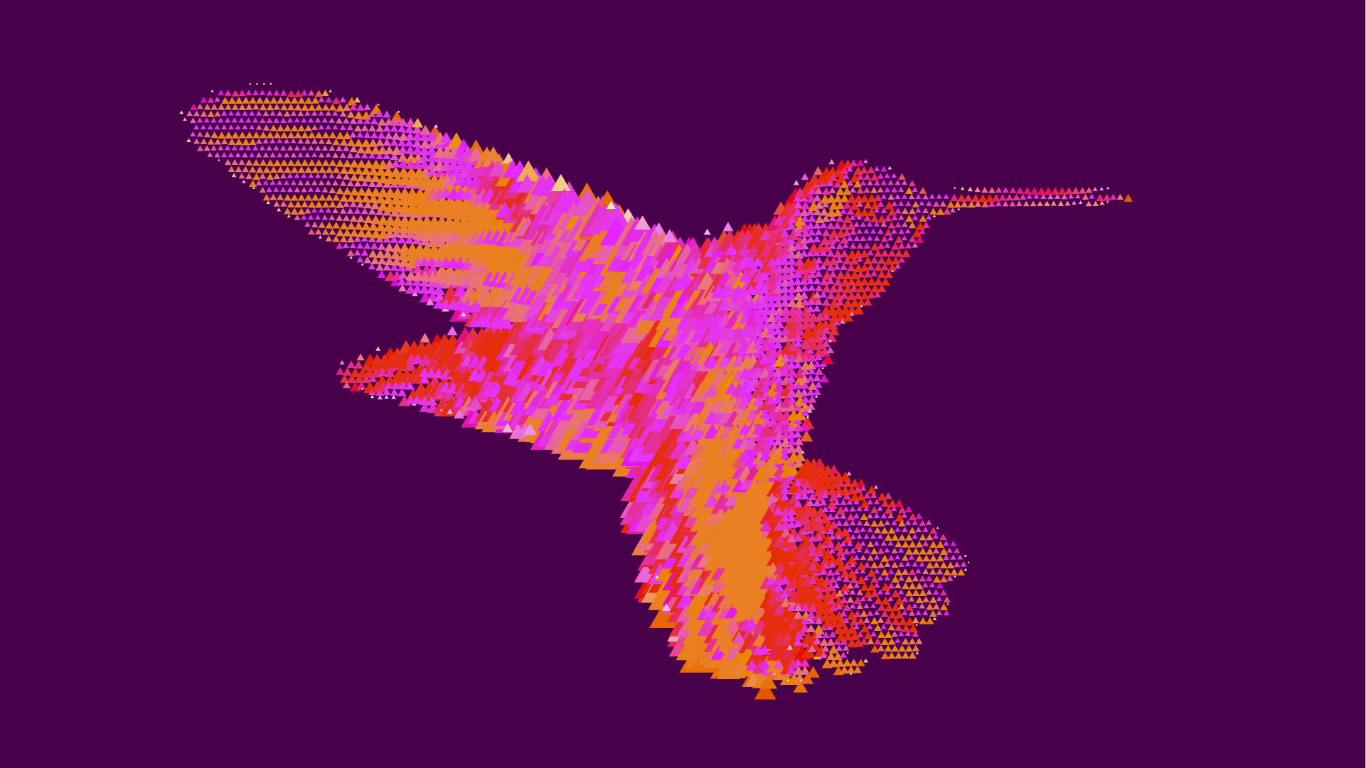
This kind of visual language is especially powerful for brands with abstract products. Blockchain, infrastructure, interoperability, or security can feel cold when explained only with words. AliceNet translates those concepts into forms that are recognizable, almost tangible. The result doesn’t oversimplify the product into something generic; it makes it easier to imagine.
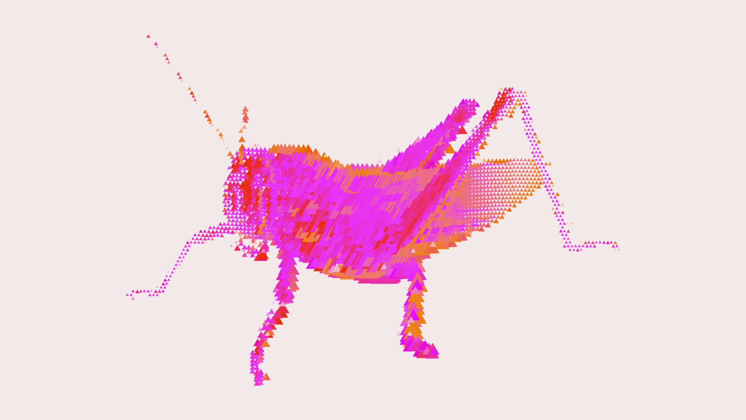
There’s a subtle touch: the identity isn’t limited to technical symbols. It also allows for almost natural figures, like insects or organic shapes built from triangles. That choice softens the brand’s temperature. Technology doesn’t appear as a closed machine, but as an ecosystem. For perceived value, that nuance matters: the brand feels sophisticated, but not distant.
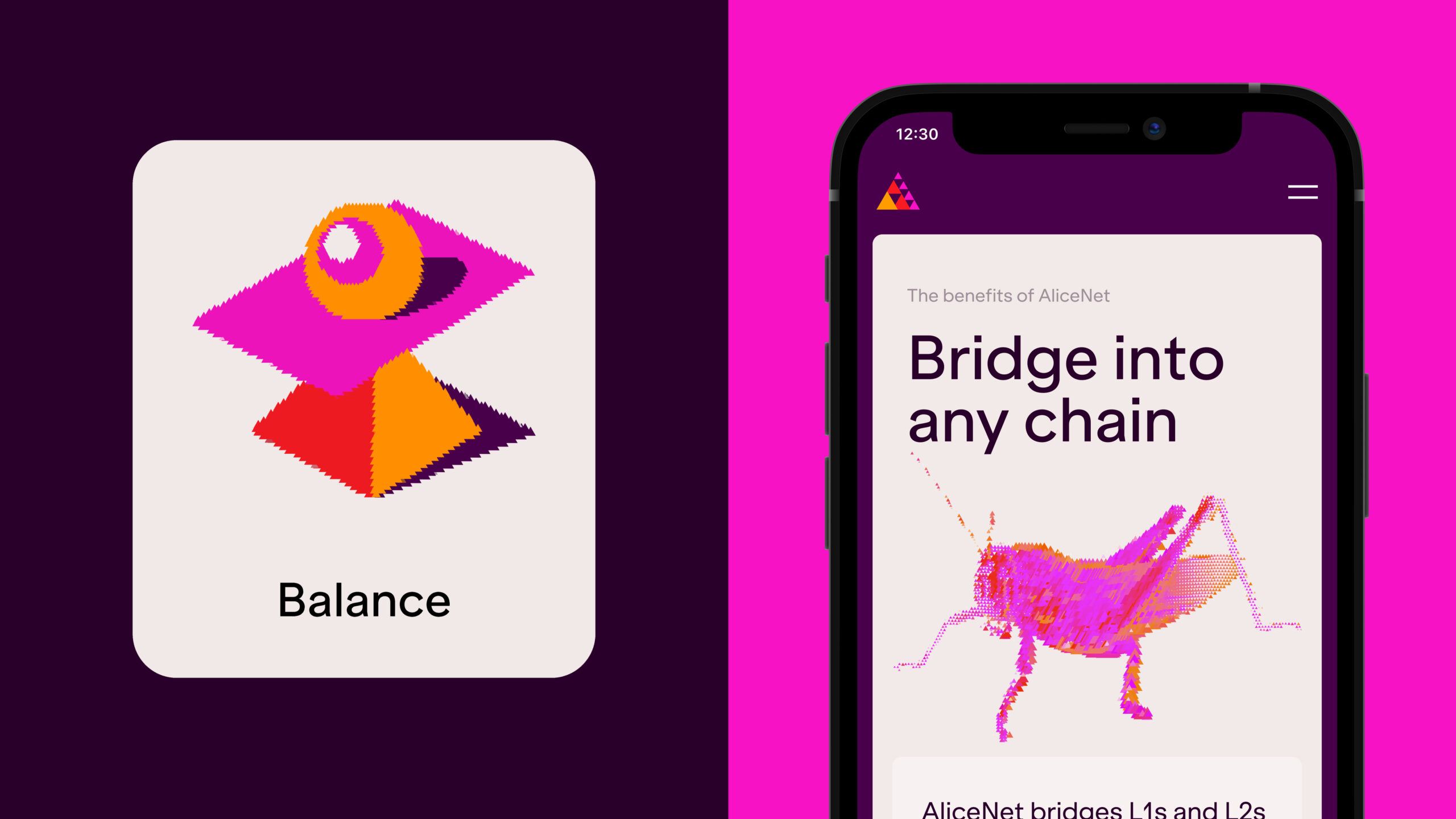
Typography plays a quiet but crucial role. Clean sans serif, generous headlines, and plenty of white on purple. It doesn’t seek attention through quirkiness, but through clarity. That restraint is important because the rest of the visual universe is already intense. When color and geometry shout with style, typography needs to support, not compete.
The transition from metaphor to visual architecture is also handled well. Geometric modules explain concepts without resorting to flat diagrams. Each piece feels like a small product sculpture: interlayer, bridging, datastores, architecture, connections. The brand gives technical information visual presence without turning it into a dry infographic.

For a marketing team, this is one of the most valuable aspects of the reference. A strong logo isn’t enough if every application feels disconnected. Here, there’s a system: a palette, a formal logic, a graphic tone, and a way of composing that repeats without feeling repetitive. That makes campaigns, presentations, social content, and sales materials much more cohesive.
Outdoor presence adds another layer. Seeing an identity like this in a public space changes perception. The message gains substance. The brand stops feeling like a product trapped on a screen and starts behaving like a company with public ambition. In B2B, that visual gesture matters: it sells not just functionality, but confidence, scale, and control.

There’s a finely tuned relationship between texture and scale. From afar, the shapes work as luminous, memorable marks. Up close, you see the triangular construction, the pixel, the digital material. This dual reading gives the identity depth. It doesn’t exhaust itself at first glance.
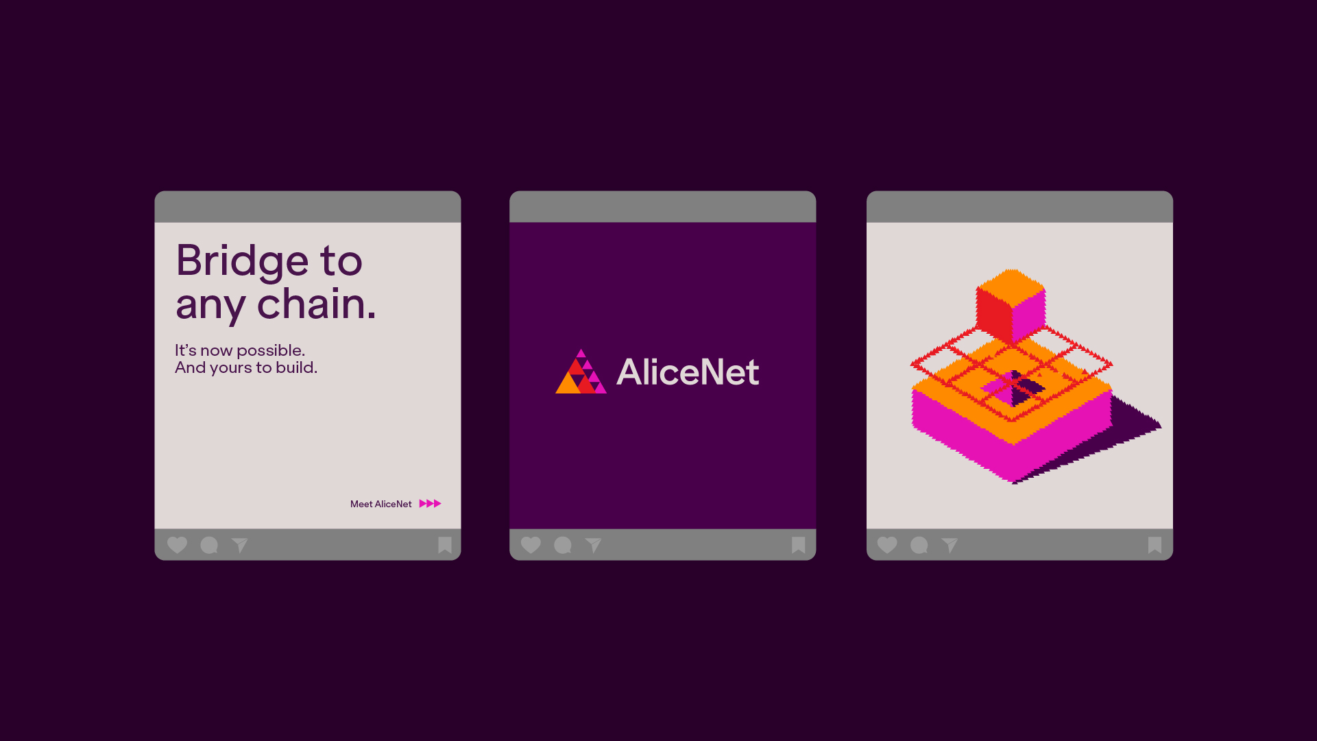
Social and mobile extensions keep the same energy. They don’t lose identity when adapted to smaller formats—a pitfall many brands discover too late. Here, the symbol, color, and composition still work vertically, in content pieces, and on smaller screens. That adaptability is no minor detail: it’s what lets a visual direction live beyond its initial use case.
The best thing about AliceNet is that it doesn’t try to look “more tech” by piling on obvious visual codes. It does the opposite: it chooses a clear gesture, develops it with intent, and rolls it out with consistency. That’s why the piece has visual memory. And when a tech brand manages to be memorable without becoming simplistic, it’s a major win.
What this reference offers a B2B brand
AliceNet is a reminder of a simple idea: a complex brand doesn’t need to look complicated to be credible. It needs visual direction that can organize the story, elevate perceived value, and build trust before the sales pitch even begins.
The lesson isn’t to copy the purple, the triangles, or the 3D finish. It’s about building a system with its own rules. Purposeful color, typography that serves readability, editorial-style composition, and graphic resources that work across web, campaigns, presentations, social, and physical formats—without losing identity.
When a B2B brand works this way, it stops relying solely on rational arguments. The aesthetics start to sell the context: ambition, focus, quality, precision. And for products that are hard to explain, that can be the difference between a brand that’s understood and a brand that’s remembered.