The most interesting hotel brands don’t compete only through location or services. They compete through imagination. Monastik understands this perfectly: every visual decision feels designed to build a sense of place before the first room even appears. And that’s where this identity becomes especially intelligent.
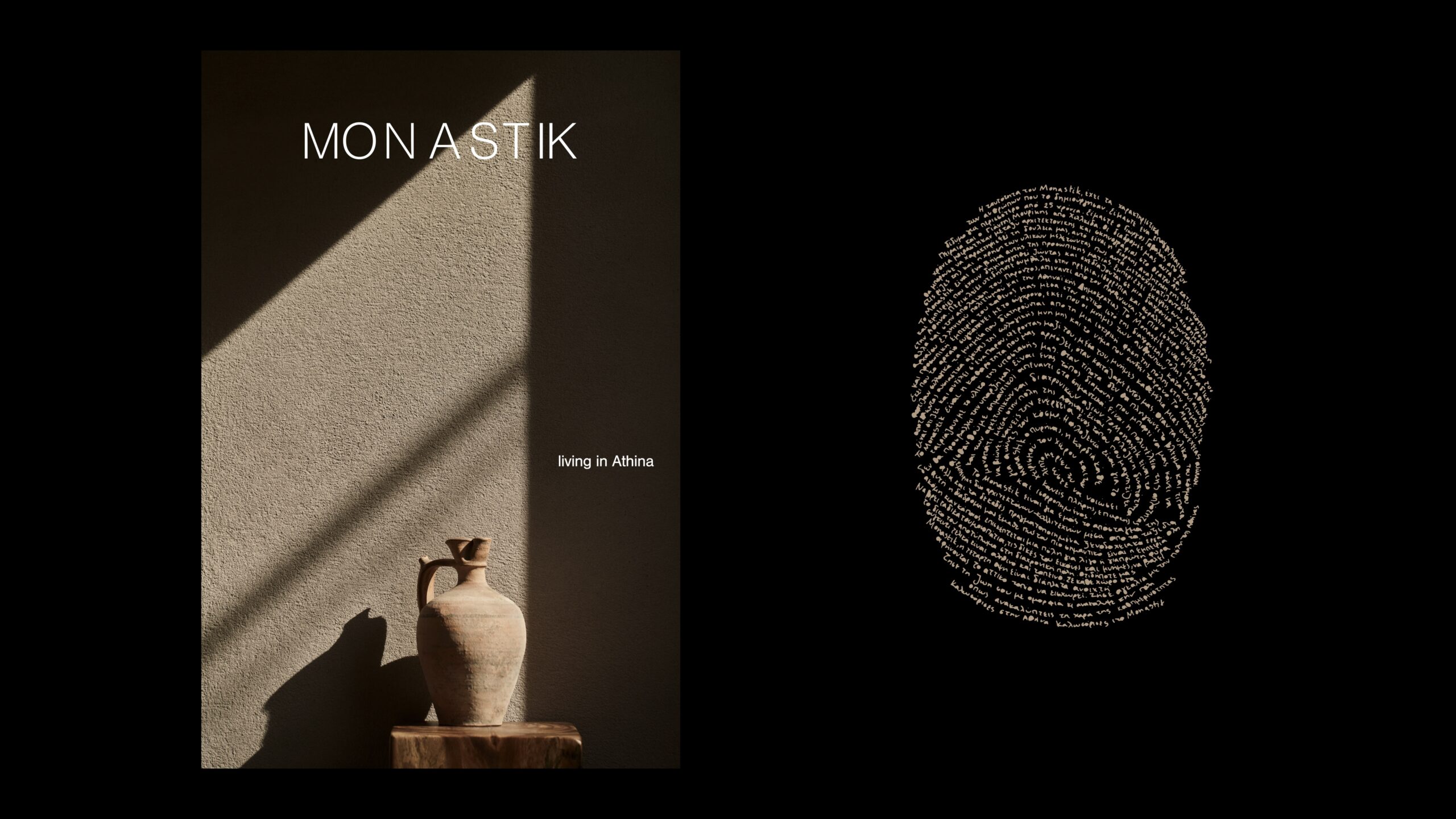
What’s striking isn’t that it looks premium—it’s that it never needs to say so. The layout breathes, the typography enters with understated elegance, and the color palette resists any hint of Mediterranean cliché. In hotel graphic design, this restraint is powerful: less noise, more perceived value.
Monastik understands that a hospitality brand shouldn’t just inform—it should spark desire. When the visual identity sets a slow, deliberate, almost editorial pace, guests begin to imagine a physical experience with that same rhythm. The booking process starts long before the button; it begins when the brand makes you want to step into its world.
Every visual gesture is intentional. Nothing feels like filler. Negative space is active, shadows have weight, materials are present, and the typography never tries to steal the show. It all adds up to a sober, mature identity with lasting visual memory.
Let’s look at it from that perspective: savoring the calm, the composition, the color, the materiality, and those subtle details that make a hotel feel less like accommodation and more like a dream. A delightful reference for boutique brands seeking character without raising their voice.
Monastik — Mediterranean calm with visual memory
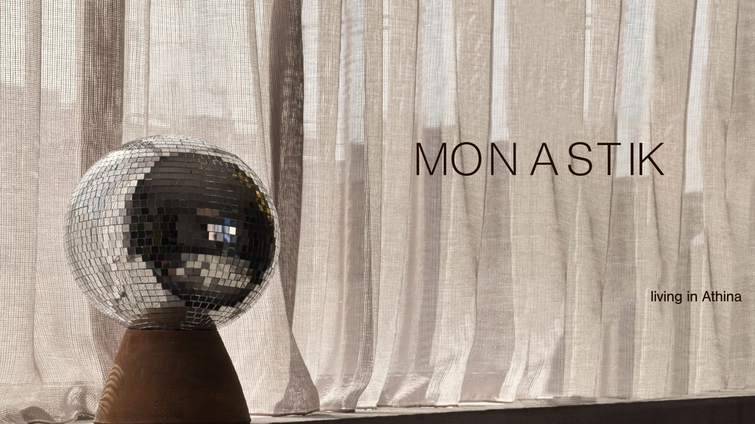
The very first image places Monastik in a distinct territory: this isn’t a tourist identity, but a brand with an editorial spirit. The reflective sphere, translucent curtain, and pedestal create a silent, almost suspended scene. There’s a touch of interior design, a hint of art installation, and the poise of a well-composed magazine cover.
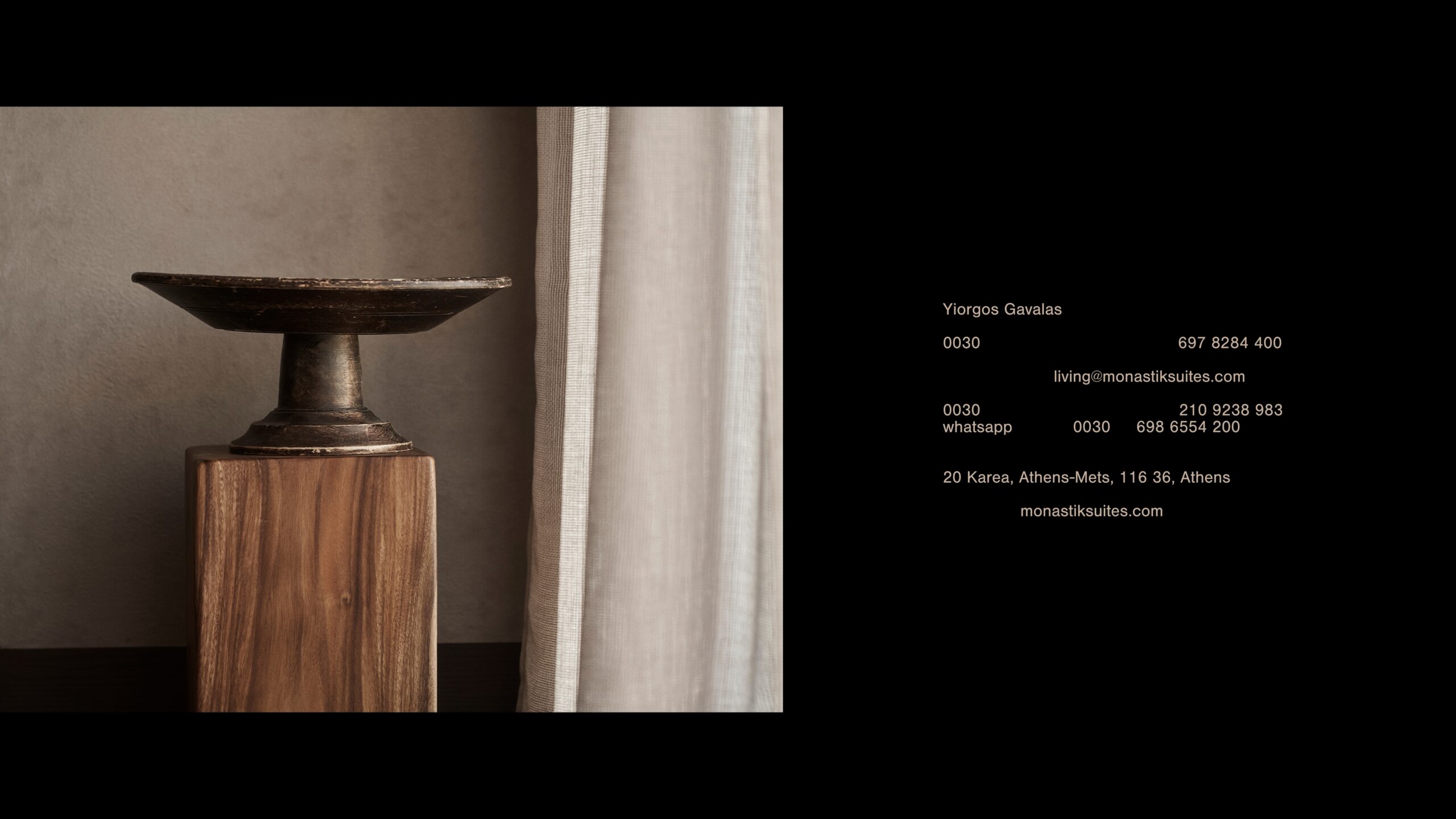
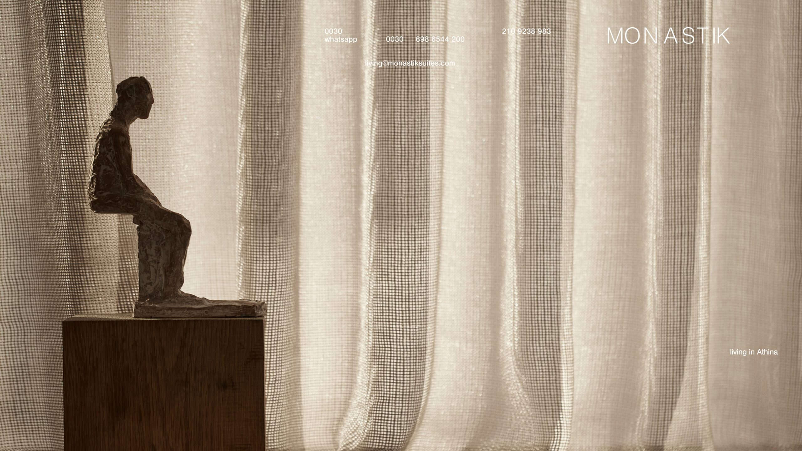
Perhaps the most interesting move is how the composition uses emptiness. Negative space doesn’t feel like absence, but like luxury. It lets the eye wander in, unhurried, and that changes the relationship with the brand. In hospitality, this visual pause can be more persuasive than a list of amenities: when an identity controls the tempo, guests trust the experience will be equally considered.
The typography supports without competing. The uppercase, slender, widely spaced wordmark is quietly confident; it doesn’t seek personality through quirkiness, but through proportion. The subtitle “living in Athina” acts as a subtle narrative key: it’s not about sleeping, but about inhabiting. That nuance shifts the brand from functional to aspirational territory.
The color palette is also expertly handled. Warm tones, deep black, soft greys, and filtered light create an atmosphere of stone, shadow, and fabric. Nothing feels accidental. The identity is tangible, almost tactile, reinforcing a core truth in hotel branding: the more material a brand feels, the easier it is to believe in.
Typography, color, and material: grounding the system
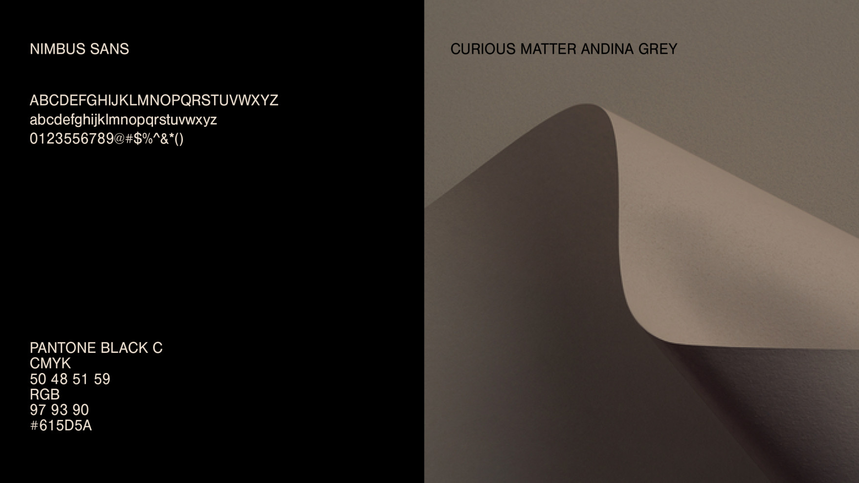
This identity goes beyond a pretty picture. The visual system is anchored in concrete choices: a clean typeface, a tightly curated palette, and materials that evoke a sense of place. Here, the graphic design doesn’t feel layered on top of the hotel—it feels drawn from its architecture, its light, its temperature.
Nimbus Sans brings a cool elegance that pairs beautifully with warm materials. It’s a typeface that doesn’t need tricks to convey sophistication. Its clarity keeps the brand refined and adaptable, but demands precise art direction: with such fine lines and generous spacing, any misstep is immediately visible.
The palette avoids the easy route of saturated Mediterranean hues. No obvious blue, no postcard clichés. Instead: black, beige, greys, stone, shadow. This restraint is intentional—it places Monastik in a more mature, urban realm, connected to Athens as substance, not just as destination. For a hotel, this is gold if you want to stand apart from generic vacation aesthetics.
References to paper and texture add a compelling layer of materiality. The design speaks of surface, touch, and fold. In a sector where the physical experience is everything, the identity wins when it can be felt before you even arrive. This is one of Monastik’s great lessons: a hotel brand shouldn’t just look good—it should promise a sensation.
Stationery and print: when identity becomes believable
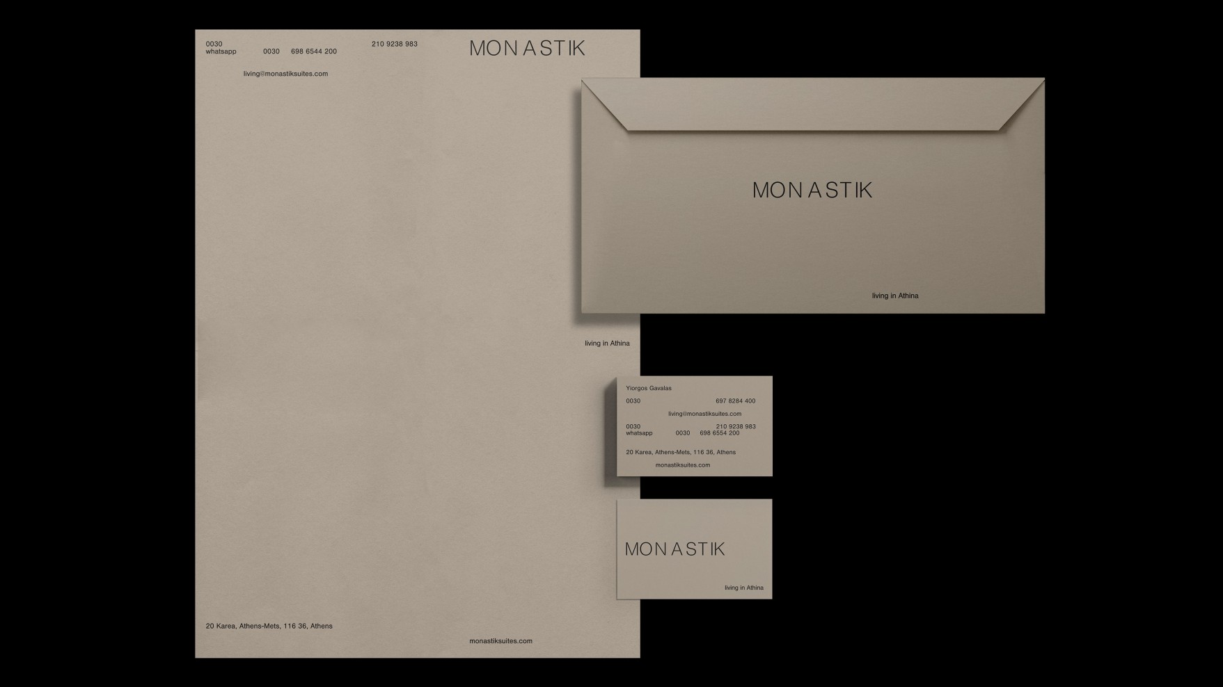
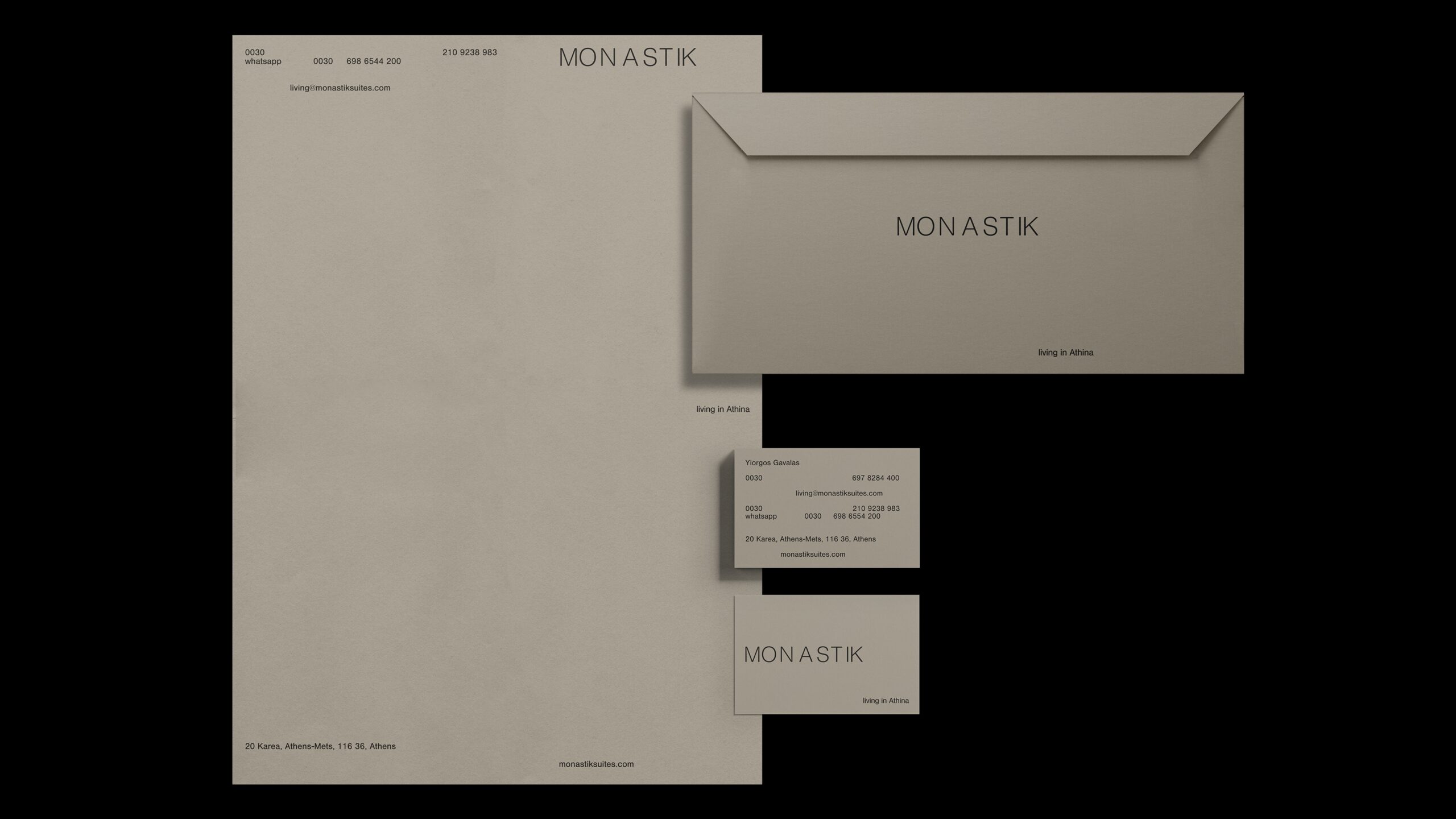
Print applications have something many digital brands forget: they demand consistency. A card, an envelope, or a letterhead can’t hide behind motion, scrolling, or effects. Everything depends on proportion, contrast, spacing, and visual tactility.
At Monastik, the stationery reinforces a sense of a serious, boutique, and well-governed brand. Beige on black, pieces separated by generous space, and an almost ceremonial composition make every item feel like part of a ritual. There’s no information overload—just presence.
This directly builds trust. In a premium-positioned hotel, the smallest touchpoints aren’t secondary—they’re signals. A printed confirmation, a card at reception, a note in the room, or a corporate piece can elevate or undermine perceived value. When the graphic system keeps the same rhythm across all these points, the brand stops feeling like a façade and starts to feel like a complete experience.
The identity also understands the difference between minimalism and lack of content. There are few elements here, but each one carries weight. The logo breathes, margins do their job, color anchors the scene, and the typography keeps a clear line. That precision is what makes a sober visual direction so desirable.
Storytelling without clichés: Athens as atmosphere, not souvenir
Monastik has a rare virtue among hotel brands: it evokes place without turning it into a backdrop. Athens appears as energy, history, light, substance, and urban rhythm—not as a catalogue of familiar symbols. This choice makes the identity feel more sophisticated and less reliant on tourist clichés.
The “living in Athina” narrative works because it broadens the promise. It doesn’t just invite you to book a suite; it invites you to experience a way of being in the city. Here, design stops being a decorative layer and becomes positioning. The brand isn’t just competing for rooms or location—it’s competing for imagination.
There’s also an interesting relationship between visual silence and aspiration. Many premium brands fall into the trap of over-explaining: more claims, more benefits, more proof, more icons. Monastik does the opposite. It relies on a restrained visual narrative and lets the whole composition build authority. That confidence in its own language is often the mark of a mature brand.
Awards and credentials add value, but never take over the story. They serve as support, not spectacle. For marketing directors, this distinction matters: awards can build trust, but perceived value is born earlier—in how the identity guides the eye and how every visual decision upholds a coherent promise.
What Monastik leaves behind when viewed through a brand lens
Monastik is a reminder worth keeping close when working on hotel visual identity: sobriety isn’t cold if there’s atmosphere. It can be warm, memorable, and deeply persuasive when the art direction treats light, composition, typography, and material as a single system.
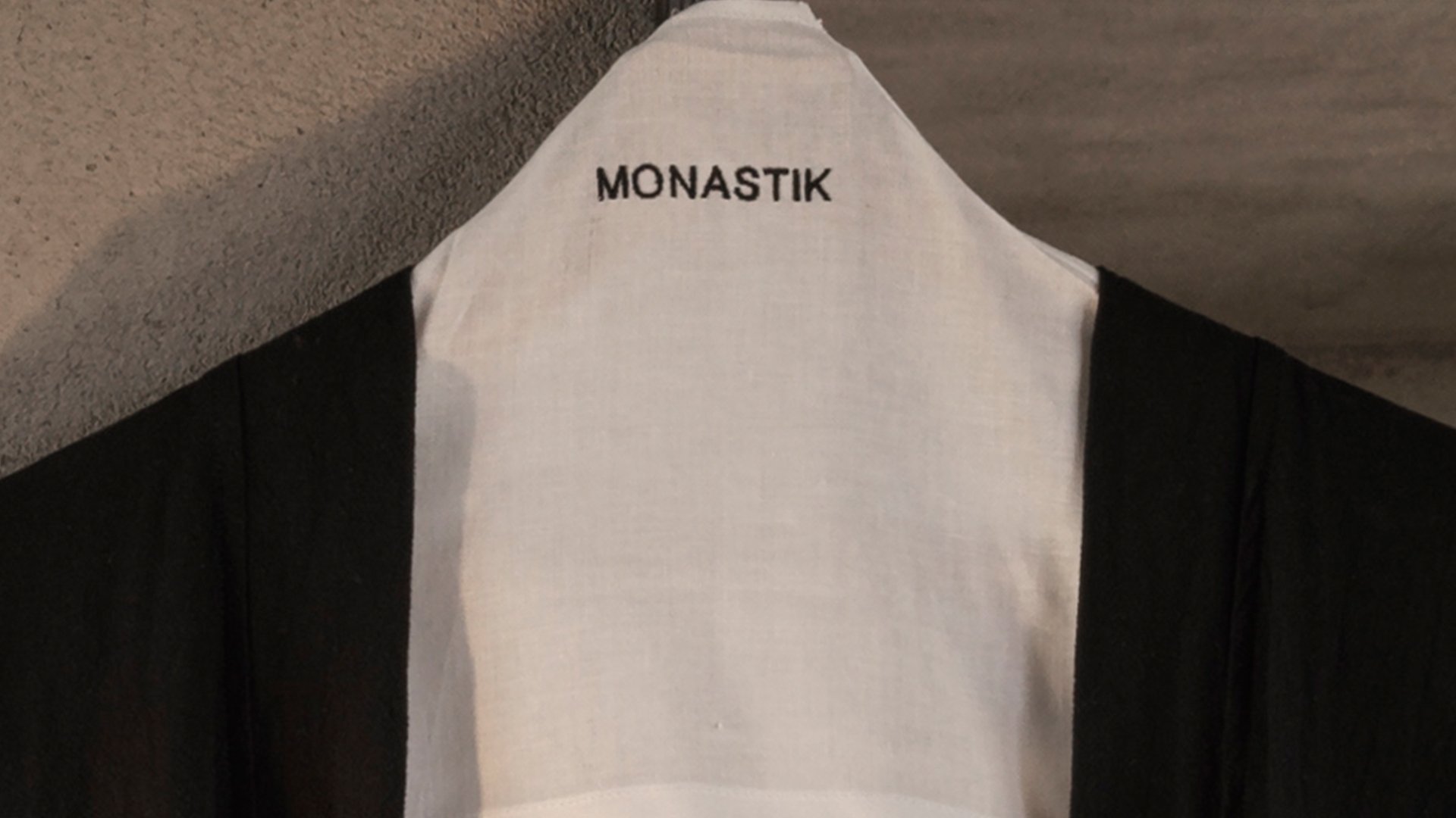
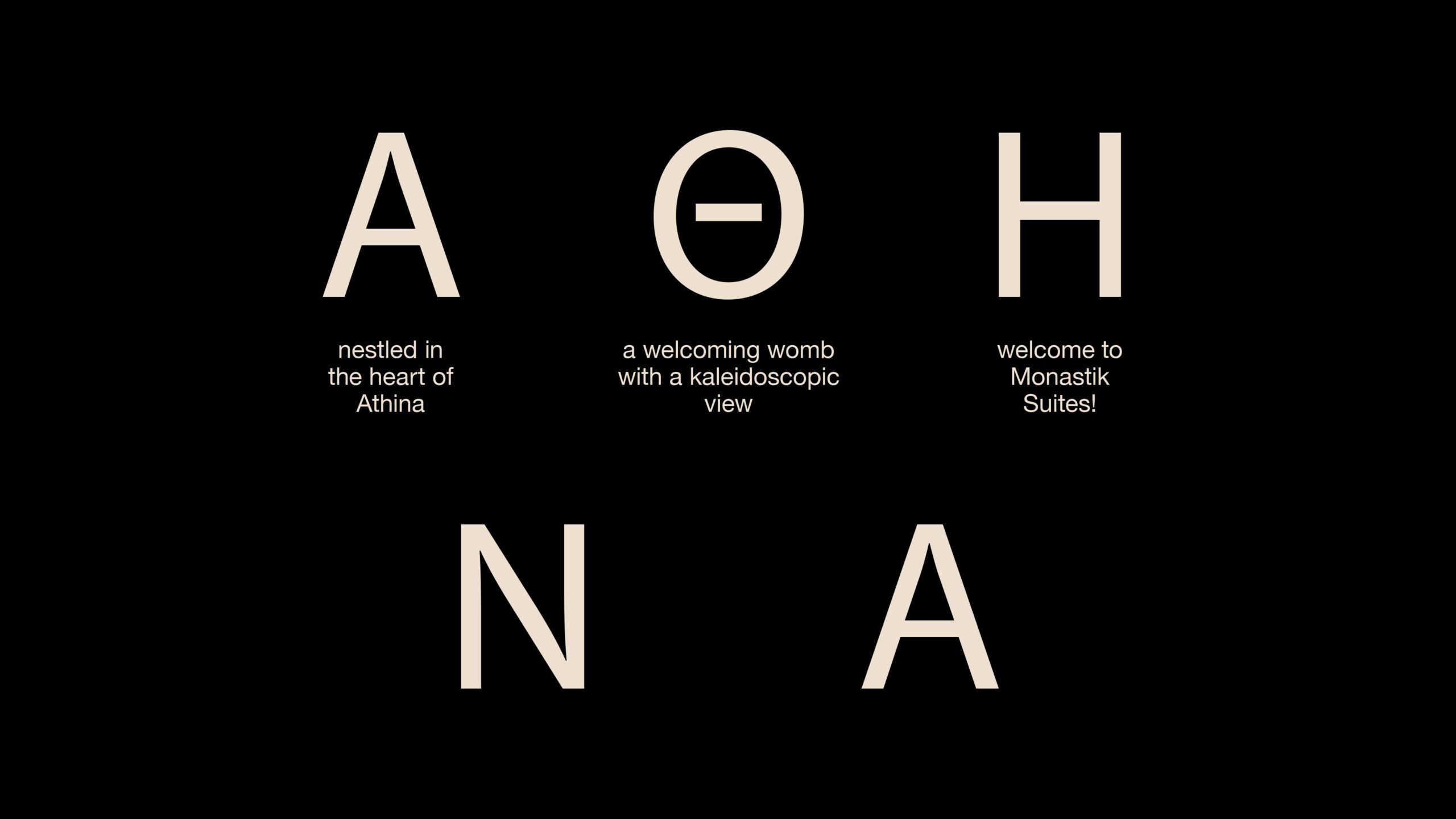
The key lesson is control. Control of space, tone, color, visual rhythm, and the amount of information. This restraint doesn’t diminish the brand—it elevates it. It makes everything feel chosen, and when a brand feels carefully chosen, guests assume the experience will be, too.
For hospitality, lifestyle, or real estate projects, Monastik is a beautiful reference point, proving that desire doesn’t always come from impact. Sometimes it comes from silence. From a well-spaced letter. From a soft shadow. From paper that seems to have its own temperature. From an identity that doesn’t try to convince you all at once, but lingers in your visual memory just a little longer than usual.