There are institutional campaigns that stick to the right tone, the friendly photo, the responsible message. And then there are projects like Reserva Regia, which understand something deeper: a cause can also have character, visual rhythm, and brand appeal.
The key is not to treat conservation like a public notice. Here, the mountain becomes identity. The landscape isn’t just a decorative backdrop—it’s the raw material for a visual system that moves from the outdoors to the object, from signage to digital, from environmental messaging to visual memory.
A campaign that doesn’t just illustrate the mountain: it renames it
Reserva Regia is built on a simple but powerful idea: if a place is to be cared for, it must first be remembered. And to be remembered, it needs more than good intentions. It needs composition, voice, color, typography, and a recognizable atmosphere.
The campaign creates this presence through a carefully balanced mix of natural landscape, editorial aesthetics, and almost collectible graphic codes. There’s a touch of postcard, a hint of tourist stamp, a bit of local manifesto, and a nod to cult merchandise. This blend gives it an energy that’s less bureaucratic and more approachable, without losing institutional authority.
The real takeaway for any marketing team isn’t to copy the style, but to understand the underlying decision: a conservation campaign can also elevate perceived value. When the visual direction is intentional, the message stops sounding generic and starts to feel unique.
Reserva Regia — editorial landscape with its own voice
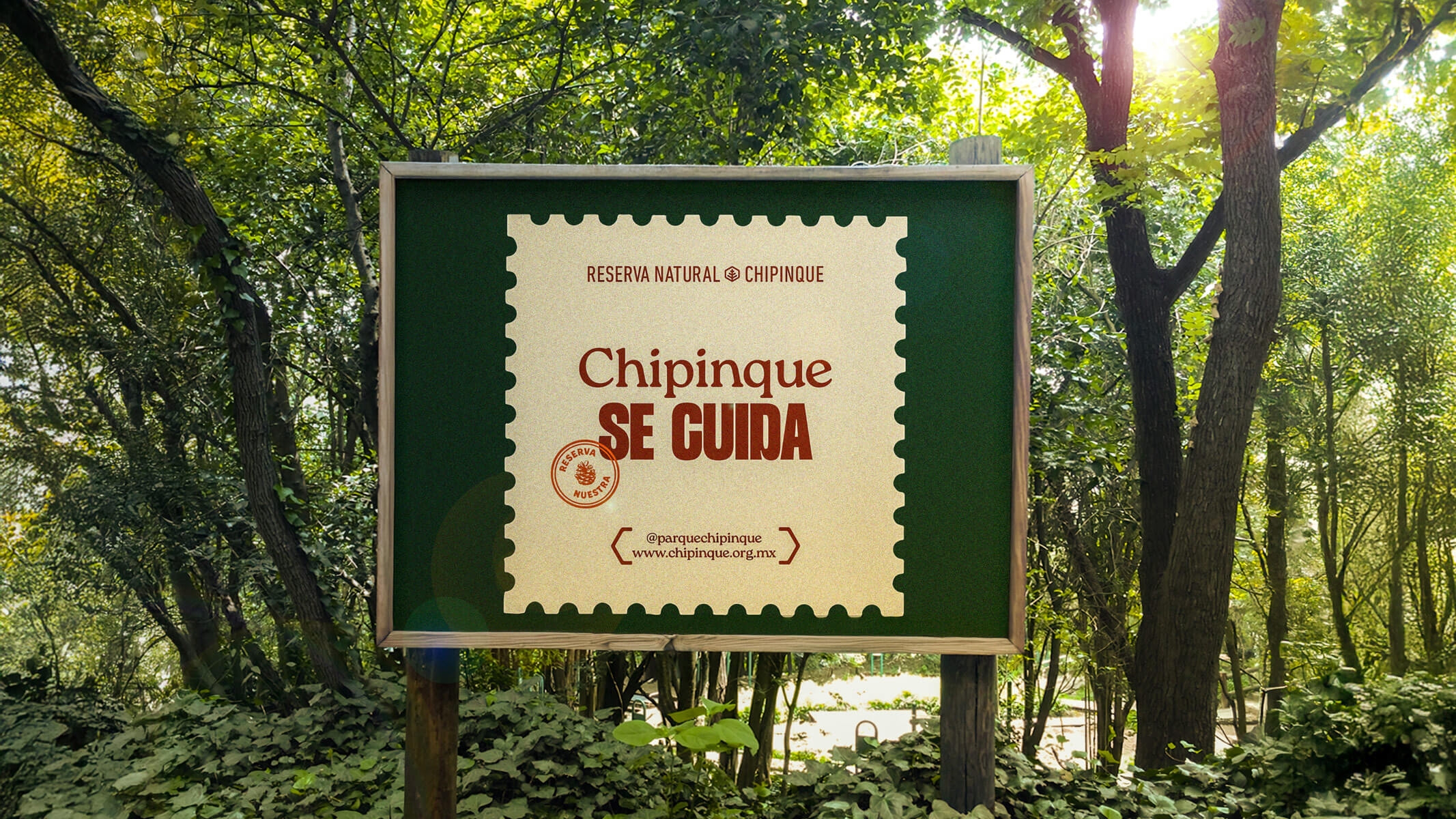
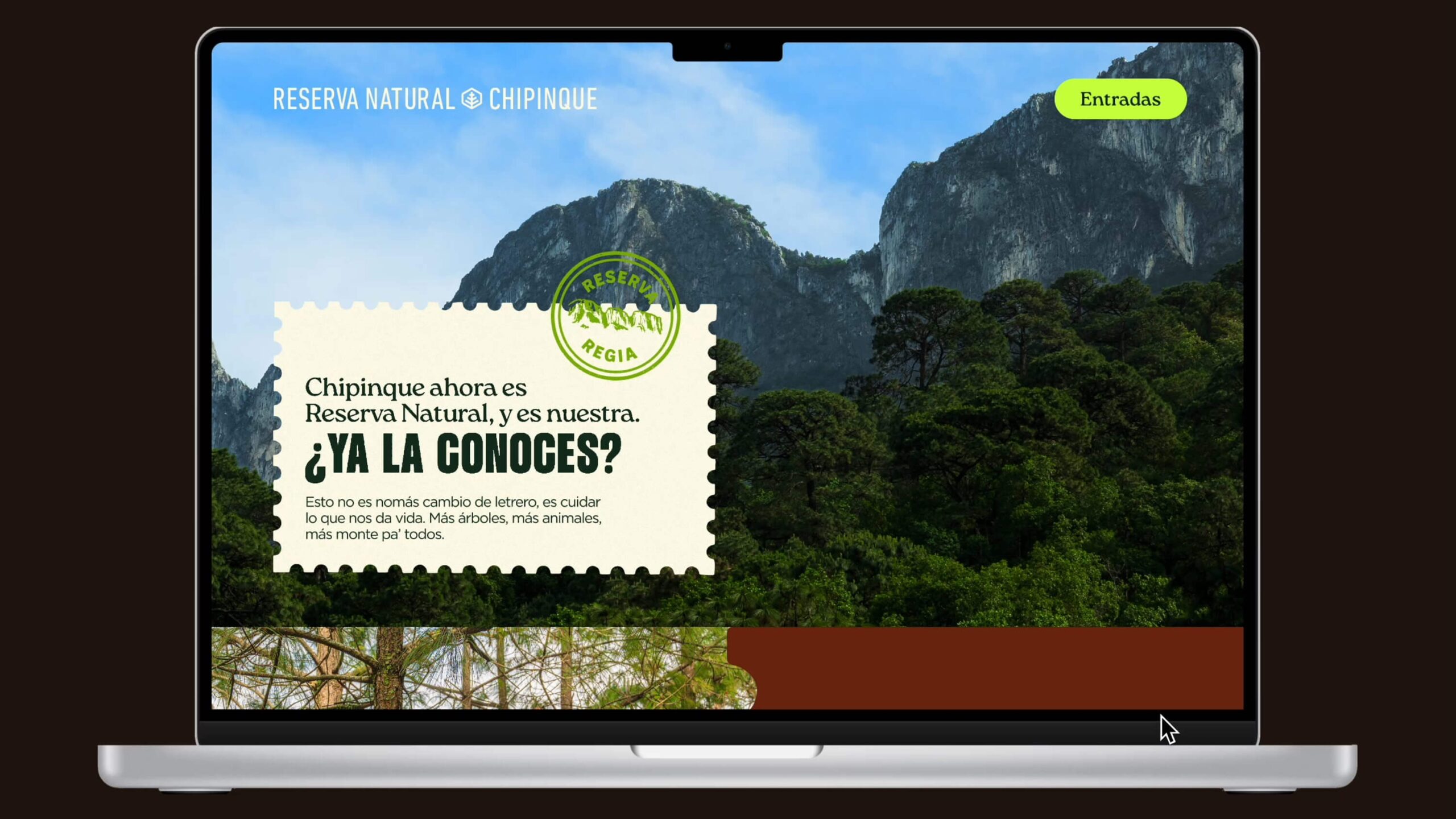
The first piece works thanks to its scale and instant readability. A sweeping landscape, a bold headline, a graphic seal, and a clean hierarchy. Nothing feels forced. The mountain takes its rightful place: presence, context, and emotion. The text carries enough weight to stand out, without overwhelming the scene.
The composition has that elusive quality of great outdoor pieces: it looks simple, but it’s highly considered. The brand sits at the top, the message commands the center, and supporting information stays at the bottom, never demanding the spotlight. For a fast-moving medium, that visual economy is gold. It doesn’t try to say everything; it plants an idea.
Typography sets much of the tone. The mix of editorial serifs, impactful lettering, and circular seals avoids the coldness typical of many environmental campaigns. There’s authority, but also a local accent. It’s a public message, but with a more human voice. That balance is what makes the campaign feel less like an institutional obligation and more like an invitation with personality.
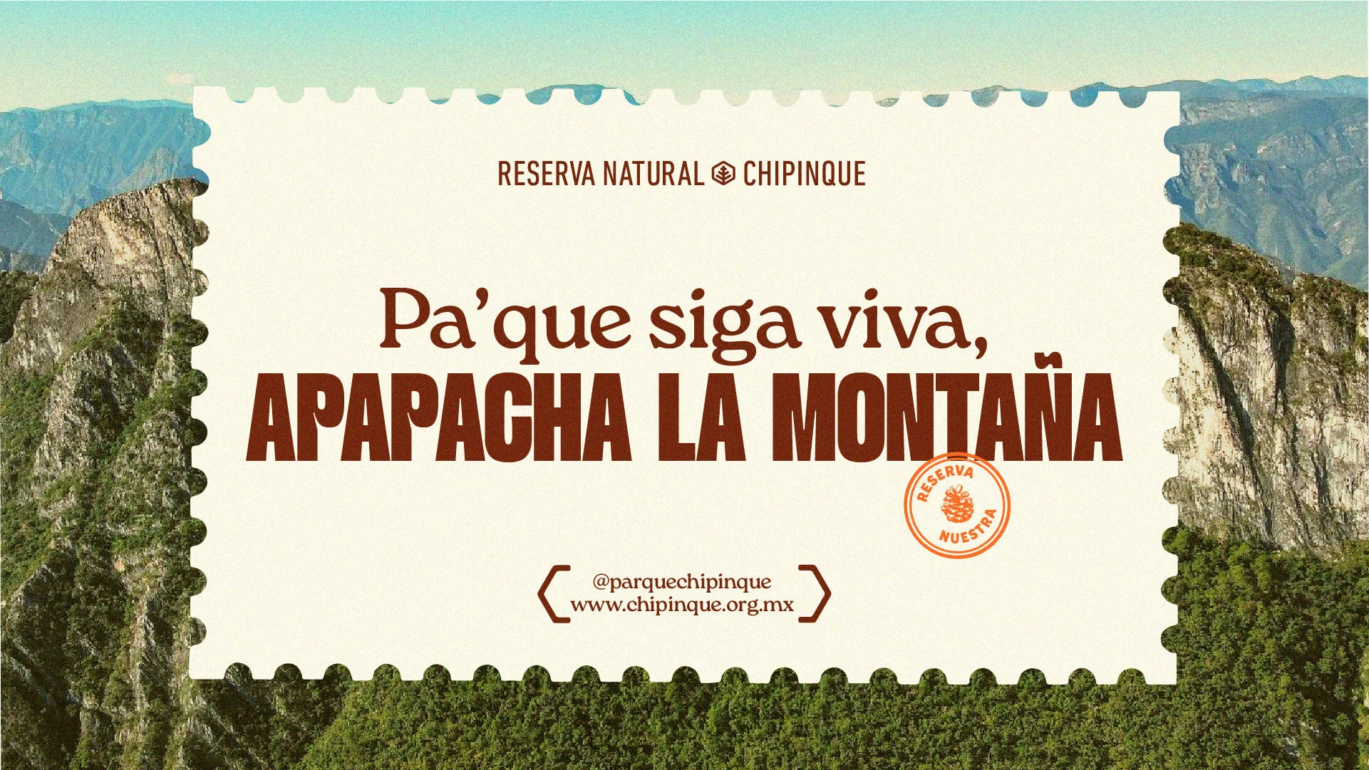
The graphic seal is one of the system’s best decisions. It works as a signature, an emblem, and a small visual object that can travel. It isn’t tied to a single application. It can live on a photo, a postcard, apparel, a label, or a digital piece. That flexibility is crucial when a campaign needs to stay consistent across many touchpoints.
The palette also works in favor of the territory. Terracottas, creams, greens, and warm accents evoke nature without defaulting to “eco” green. The color is more textured than literal. This gives it a more premium, cultural feel—less like a tourist brochure.
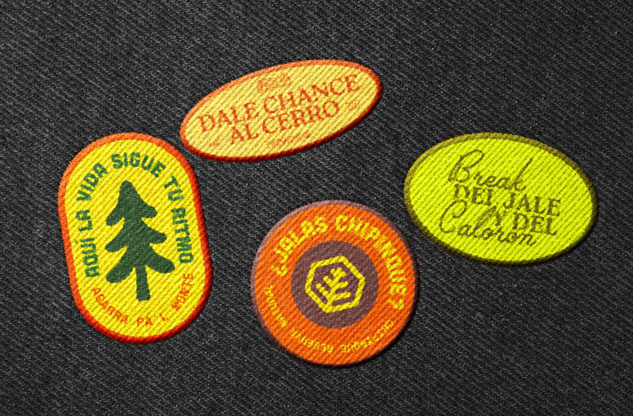
These badges are small but mighty. They distill language, tone, and color into pieces that could almost be souvenirs for a cause. That’s a powerful layer: when an identity becomes an object, it stops being just communication and starts building belonging.
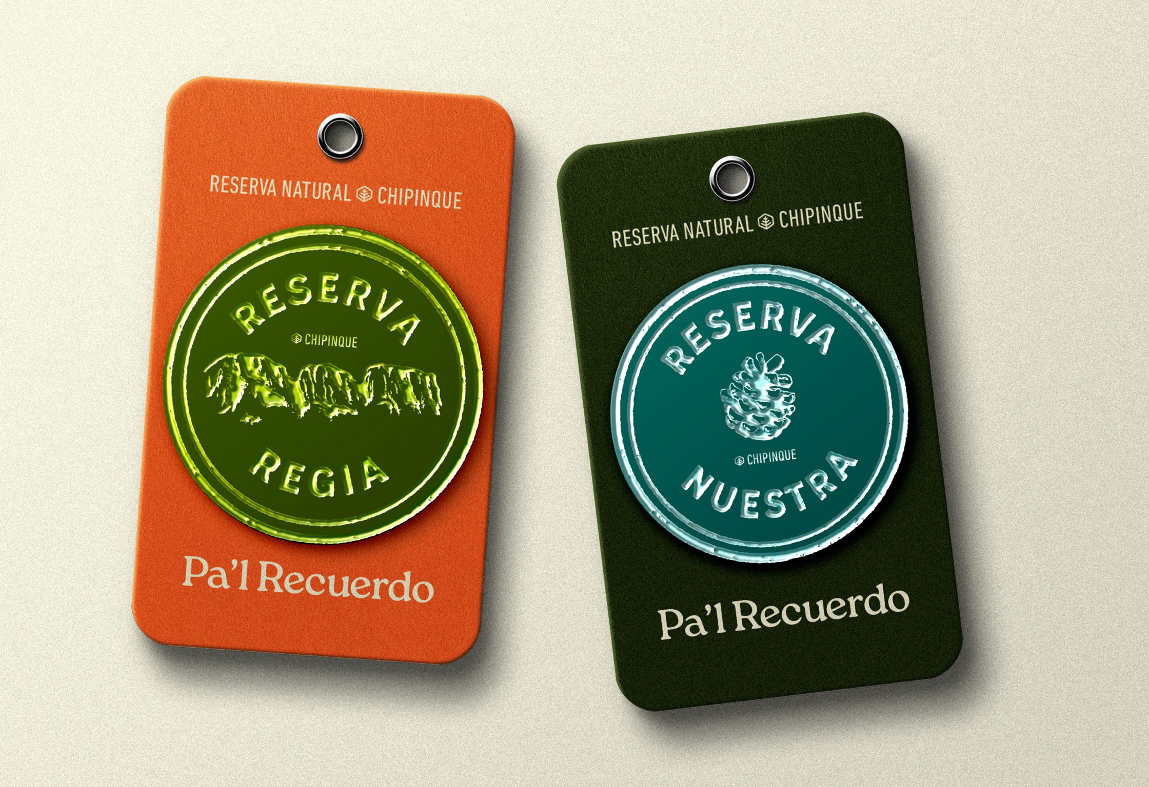
Tag-style pieces reinforce the sense of a living system. They change color, material, and texture, but keep the core code. The seal, centered composition, typographic contrast, and warm hues remain. That consistency is what makes the campaign feel like a designed universe, not just a collection of disconnected applications.
When the system enters the forest, the campaign gains another layer. It no longer speaks about the place from the outside; it coexists with it. Wood, vegetation, and signage create a more grounded, less commercial atmosphere. Here, the identity doesn’t interrupt the space—it accompanies it with a recognizable presence.
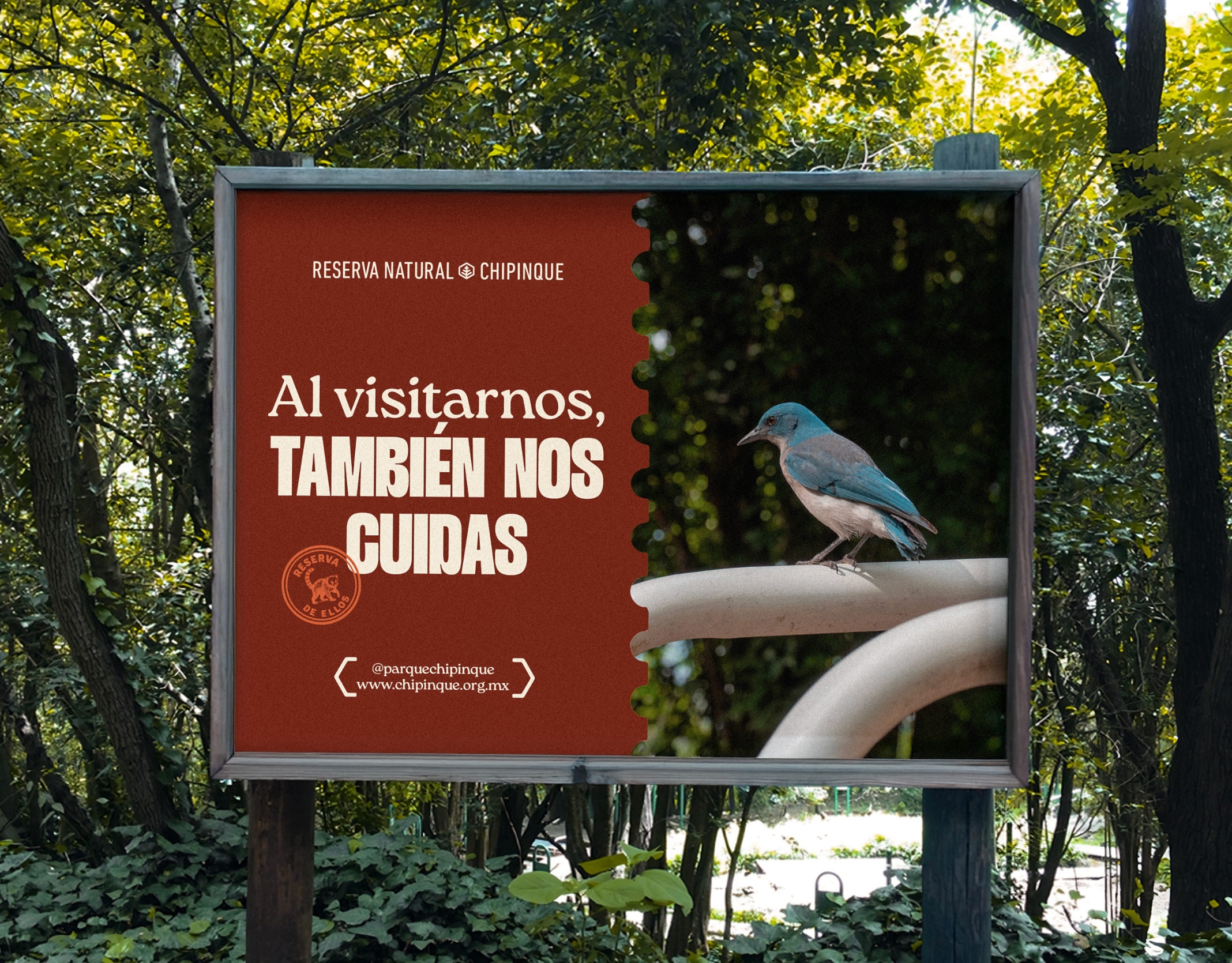
The bird billboard shifts to a more educational register but keeps the editorial pulse. The split composition helps organize the message: emotionally charged photography, a graphic block with campaign voice, and direct reading. It doesn’t aim for excessive solemnity. It maintains that blend of care, approachability, and character that runs throughout the identity.
One important detail: the system has an implicit sense of motion, even in static pieces. The eye moves across seals, headlines, cutouts, color blocks, and deep photographs. This visual rhythm gives each application its own internal choreography. Not all motion needs animation; sometimes, a composition that guides you from point to point is enough.
From poster to merch: when the message becomes wearable
The move into merchandise doesn’t feel like an afterthought. The t-shirt brings together slogans, emblems, and sticker-like graphics as if they were community patches. This shifts the perception of the campaign: it doesn’t just inform—it invites you to belong.
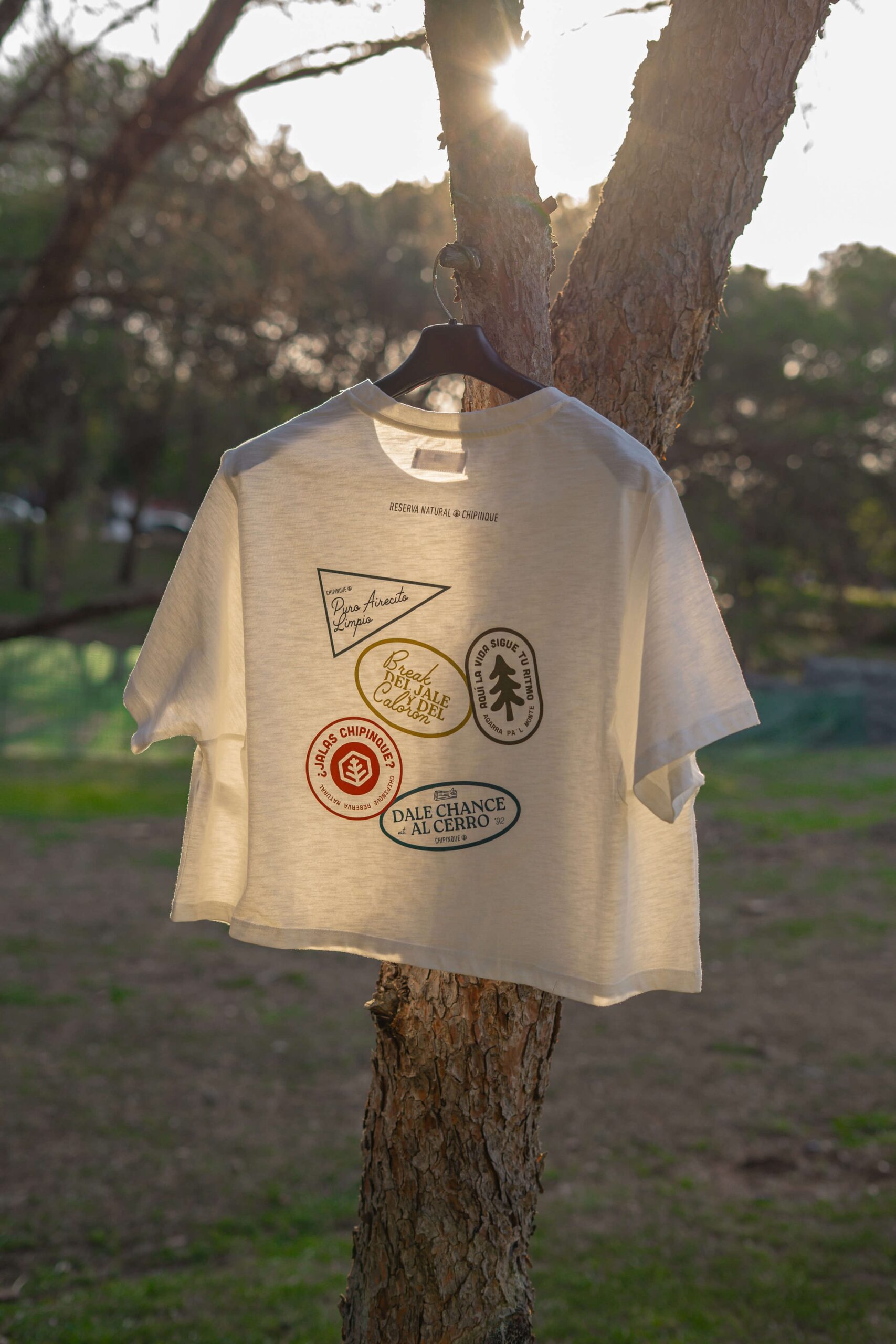
For an institutional brand, this leap is especially valuable. The physical object extends the life of the message and multiplies its contexts. A piece on the street makes an impact; a piece worn by someone circulates, sparks conversation, and recommends—without feeling like an ad. Here, the identity works more subtly, but also more durably.
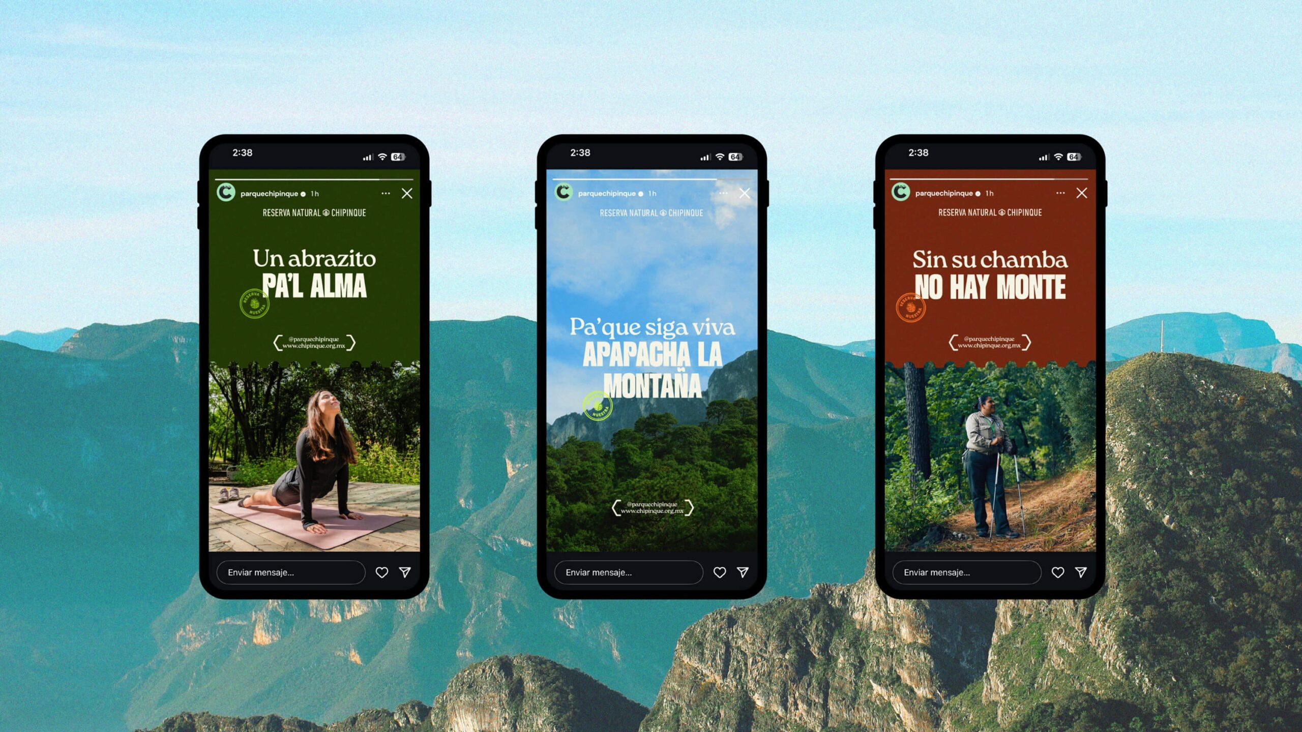
In vertical format, the campaign breathes easily. The graphic system adapts to stories without falling apart: big headlines, landscape photography, seals, and short messages. The UX/UI here is light, almost invisible, but crucial: reading is instant, the brand is recognizable, and the format doesn’t force a reinvention of the language.
The digital extension adds an interesting dimension: the visual universe isn’t limited to awareness. It can also support concrete actions, like checking or buying tickets. The highlighted button sits comfortably within the editorial tone. This blend of atmosphere and utility is where many brands build trust: the experience feels considered, but never loses sight of guiding the user.
What it leaves behind for an ambitious institutional brand
Reserva Regia works because it doesn’t separate emotion from system. The mountain inspires, typography organizes, color anchors, seals create memory, and the formats multiply. Each piece stands on its own, but all belong to the same world.
The lesson isn’t about making a “prettier” campaign. It’s about building an identity with enough intention that the message gains authority and appeal. When an institution cares about its visual direction, it also shapes how its mission is perceived. And that perception impacts trust, recall, legitimacy, and brand value.
For marketing teams, founders, or purpose-driven brands, this case leaves a clear message: a good purpose isn’t enough. You have to give it intentional visual form. A well art-directed system can turn a public message into something people recognize, share, and want to keep.
And that, in the end, is design doing its job: not just decorating a cause, but making it truly present.